10,000 search results
(0.033 seconds)
- Tetris Quadrate by Melissa Lapadula,
$19.95This font is influenced by the advancement in graphic computer technology that has evolved since the first basic pixilated computer games. This typeface aims to be bold and brazen. The fonts primary function is heading use. - Bandes by Sealoung,
$20.00 Bandes is a bold, thick lettered, retro styled display font. Whether you use it for cartoon related designs, children games or just any creation that requires a lovely touch, this font will be an amazing choice.
 - Factory Heroes by Ali Hamidi,
$10.00 Factory Heroes is a cool, playful and friendly display font. Whether you use it for cartoon related designs, children games or just any creation that requires a lovely touch, this font will be an amazing choice.
 - Amazingly Beautiful by Ali Hamidi,
$10.00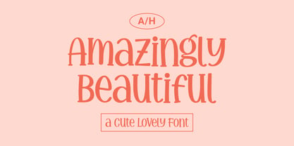 Amazingly Beautiful is a cute, quirky and whimsical display font. Whether you use it for cartoon related designs, children games or just any creation that requires a lovely touch, this font will be an amazing choice.
 - Shifty Notes by Ali Hamidi,
$10.00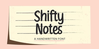 Shifty Notes is a cute and simple lettered handwritten font. Whether you use it for cartoon related designs, children games or just any creation that requires a lovely touch, this font will be an amazing choice.
 - Snowy Owl by Ali Hamidi,
$10.00 Snowy Owl is a cute, joyful and fun display font. Whether you use it for cartoon related designs, children games or just any creation that requires a lovely touch, this font will be an amazing choice.
 - Quiroga Serif Pro by TipoType,
$29.00 Quiroga Serif began in 2007 with the name Quadratta Serif. This typography was designed for continuous text, legible at medium and small sizes, with great saving of space, optimized for 6, 8, 10 and 12 points. The morphology is a mix between tradition and innovation; it has a vertical axis, thick serifs, tall x-height, light modulation and a lot of internal space between letters: key to improve legibility at small sizes. Formally, my idea was to make a serif type that had a unique color, this is visible due to the light modulation. This is also complemented with the incorporation of not common, alternative signs. Some parts of the letters that are usually curb or diagonal where made horizontal (for example: a, q, p, etc.), this makes the eye of each character to be wide and unique. The serifs (wedge type) suffered diverse variations during the process. At the begining they where thicker and ended vertically, but this caused a great deal of printing errors. And so we decided to modify them by giving them an angle to avoid visible errors in medium and small sizes. The ch, and ll ligatures where rescued because they are a part of our current spanish alphabet. The historic ligatures and stylistic alternates give different options to users who want different alternatives within a text. The accentuation signs were composed in a middle line above all signs to avoid visual shock. We also gave plenty of importance to small caps numbers, mathematical signs and currency signs so that the could interact well.
 - CA Capoli by Cape Arcona Type Foundry,
$29.00 CA Capoli is a fine script typeface with a vintage touch. Perfect for illustrative titles or logotypes. It comes in two styles, Regular and Stroke. The inspiration came during our trip to Italy, where we took a short rest in a bar during a hot day. We discovered a simple ceramic ashtray on the table. The word “Nido” was inscribed in a typeface that looked like it dated back to the 1950s. We made some investigations about the word, its meaning and origin but it still remains a big mystery. Was it the name of a hotel or a restaurant or some vintage Italian cigarettes? We don’t know. We were so amazed about the design of the logo that we decided to create a typeface out of it. A sophisticated endeavor because we just had four letters. How could the rest of the letters – if it ever existed – have looked like? Our hypothesis is CA Capoli. A typeface with a full Central European character set and some nice alternative letters to chose from. When we thought about “Nido” and its possible derivation of hotel business, we felt like creating a small side project for this typeface, a brand for a fictional hotel called Hotel Capoli with business cards, letterheads, a reception book, key fobs and embroidered patches for the service dress of the hotel service stuff. The Hotel Capoli is located at the wonderful beach of Cape Arcona on the fictional country of Arcona Islands where our type foundry is located.
 - Anticode by Ronin Design,
$15.00 Anticode is a modern display font. Featuring a solid style and outline style. Anticode font will bring of your creative ideas to the highest level. This font is perfect for game/app designs, logo designs, poster and many more.
 - Rainclouds by Hanoded,
$15.00 I was doodling away with a sharpie pen on a rainy day. Hey… wait a minute. A rainy day, a font called Rainclouds… Yep, that’s right, it is called Rainclouds for that reason! ;-) Rainclouds is a fat marker font with a lot of texture and a lot of mouth.
 - Stitchin Crochet Pro by Adriprints,
$6.00 StitchinCrochet Pro is the third font in the Stitchin Family following StitchinCrochet and StitchinKnit. Unable to find a stylish and easy-to-use crochet symbol font, I decided to make one! StitchinCrochet offers incredibly legible, intuitive symbols that are easily accessible without special numerical codes on the keyboard. StitchinCrochet Pro has updated crochet symbols (compared to StitchinCrochet) and are newly re-drawn, scaled, and have corresponding increase and decrease symbols ranging from single crochet to double treble crochet. StitchinCrochet Pro also includes an updated QWERTY keyboard key, better symbol layout, and symbol guide for both U.S. and U.K. crochet terminology! Choose the “manual install” method to access the .PDF guides and symbol guides.
 - Twentieth Century by Monotype,
$29.99 Twentieth Century was designed and drawn by Sol Hess in the Lanston Monotype drawing office between 1936 and 1947. The first weights were added to the Monotype typeface library in 1959. Twentieth Century is based on geometric shapes which originated in Germany in the early 1920's and became an integral part of the Bauhaus movement of that time. Form and function became the key words, unnecessary decoration was scorned. This clean cut, sans serif with geometric shapes was most appropriate. The lighter weights of the Twentieth Century font family can be used for text setting; the Twentieth Century bold and condensed fonts are suitable for display in headlines and advertising. Commonly spelled 20th Century.
 - Rikkia by Matt Chansky,
$21.00 Rikkia is synonymous with glamour and innovation and has an immediate high-end look that is both timeless and universally appealing. The font family is distinguished by modern ovals and subtle architectural angles. Stylish and versatile, Rikkia comes in wide and standard widths – from hair to bold. The font also has an alt character set for key glyphs like "a" and "R." You'll find a professional set of ligatures, multilingual options, fractions, and a the estimated symbol. Cosmetics, AI, engineering, healthcare, sports, editorial – and all points in between, Rikkia has you covered for a variety of layout needs. Clean, distinctive, memorable, and easily readable — an ideal choice for both print and screens.
 - Mirtha Display by Nois,
$24.00 Mirtha Display is a modern display font with distinct Art Nouveau details. Its lighter weights are condensed and sophisticated, while the heavier weights have a more powerful effect, making it perfect for headlines, posters, branding, logos, packaging and more. With a set of over 450 glyphs, this font supports a wide range of languages. Key OpenType Features include numerators and denominators, Old Style and Lining numbers, standard ligatures and localized characters such as Uppercase and Lowercase Sharp S. Mirtha Display covers 5 weights, 10 styles and 2 Variable cuts (regular and italic) to give you more design flexibility. Any suggestion to continue improving Mirtha Display will be welcome, do not hesitate to contact us!
 - Rather Both by PintassilgoPrints,
$24.00 Rather Jazzy, Rather Loud: a family of two quite distinct fonts that perform together handsomely well. Both fonts include 2 versions for each letter, easily reachable through keyboard upper and lower keys. They also come packed with Contextual Alternates functionality to instantly cycle the alternates, providing a realistic handcrafted feel: just turn on the feature in any OpenType savvy application and let the music sound. Rather Loud brings yet another cool feature: lots of interlocking pairs that will add that nice extra twist your projects sometimes ask for. Trigger the discretionary ligatures feature button (OpenType savvy applications needed!) or pick up your choices through a glyphs palette or character map. Jazzy? Loud? I'd Rather Both, for sure!
 - Lovingly by Happy Letters,
$6.00 Welcome to Happy Letters shop :) Happy St. Valentine's Day! Lovingly includes unique heart flourishes that give a charm and romantic love holiday mood ornaments, Valentine greeting cards, invitations, etc. Thin, elegant calligraphic lines like a light breeze give freshness and dreaminess to your handmade creations. Ornament font Lovingly is mapped to regular keyboard keys, so you don't need any additional programs to use them. Just install font, type and go! Lovingly is perfect for: decorating your albums, for holidays, logos, phrases, gift shops, Valentine's Day card, gift cards, tags, labels, stickers, wedding invitations, header images, Etsy presentations, ideal for handmade, scrap booking, printed paper items, promoting seasonal blog posts, social media posts, Pinterest, Instagram and much more.
 - Rush by Canada Type,
$24.95Follow us to the future. It is in your face. It is fashionable. It is friendly. It is fly, far-out, funkadelic, fun. But first of all, the future is fast and full. Named after the most famous Canadian rock group of all, Rush is a typeface that wants your full attention. It is square like a bodybuilder's jaw, round like a football player's muscles, and tight like an abdomen after a thousand sit-ups. It gives you plenty of attitude. It commands your respect and lets you know that if you've been thinking of giving up on macho in this brave new world, think again. It tells you that everything has an underlying engine, that every engine hums clockwise, that adrenaline is the name of the game, and if you don't like it, get your sensitive self back to your silly scripts. Rush comes in two fully interchangeable variations: Rush One and Rush Two. While Rush Two is the somewhat predictable, determined pedal-to-the-metal contemporary brute, Rush One is sharper, smarter and more sophisticated in the way it affects a design. While Rush Two's message is a straight-forward one of strength and speed belonging in an overall design, Rush One calls attention to itself first then turns on the wonder about everything surrounding it. Expertly mixing shapes from both fonts in the same word or line can achieve just that perfect form a design needs for its message. Such flexibility and distinction in character design and degree of message relay makes Rush the perfect font package for any design that has anything to do with speed, strength, and proud pursuit of adrenaline. - Arcadia by Kraken,
$15.00A typeface inspired by the old computer games of the 1980s. - ITC Angryhog by ITC,
$29.00The name Angryhog came out of nowhere out of free association. "When you're working on a typeface on the Mac it demands a name from you which I find a bit confrontational" says Donaldson. ITC Angryhog brings together Roman and Gothic influences in a quirky and sophisticated display face. Characteristic of this typeface are its sharp, pointed forms, especially noticeable in the serifs, which give ITC Angryhog a restless, almost aggressive feel. It is as though the letters have a mind of their own and ignore all rules and regulations. ITC Angryhog is a perfect typeface for comics or satire, best suited to short to middle length texts and headlines. - Helgis Black by Oleg Stepanov,
$15.00 Helgis Black is a hand crafted font, inspired by album covers of progressive and psychedelic rock bands of 70's. It is perfectly suited for covers (books, albums), posters and games.
 - Hobgoblin by Hanoded,
$15.00 Hobgoblin is a cute and happy little font. It would be ideal for children's books, games and apps. Hobgoblin come with mischievous glyphs and a pot-o-gold worth of diacritics.
 - Lightbringer by Subversive Type,
$13.00 A modern all caps font with alternative characters. Looks best in large display text, but also legible in small sizes. Ideal for rock bands, graphic novels, action films and video games.
 - Artho by Twinletter,
$12.00 Our newest font named Artho has a strong and bold character but is relaxed and fun to look at. so it is appropriate if you use this font for your project that is friendly fun but has a strong impression and attracts attention. This font is also equipped with three choices of thin, regular, and bold. makes it easier and more flexible for you to combine them to suit your needs. This handwritten font is perfect for children’s magazines, drink banners, games, posters, beverage, outdoor events, thumbnails, food banners, cheerful writing, film titles, quotes, titles, logos, and various kinds of projects you need, of course, your various design projects will be perfect and extraordinary if you use this font because this font is equipped with a complimentary font family, both for titles and subtitles and sentence text. start using our fonts for your amazing projects.
 - HD Colton by HyperDeluxe,
$35.00 HD Colton is a 90-style super-sans from London Design Studio HyperDeluxe®. Using a combination of horizontal & vertical terminals along with squarish ovals, it is built with a confident structure that feels so much more than a neutral sans, it feels iconic. Engineered in 5 widths, compressed to extra wide, and in nine weights, HD Colton features a huge 90 styles that will offer your brand ultimate flexibility and variation in one font family. The black weights will help bring prominence to your brand while the light to mid weights will help you tell your story at a smaller size. HD Colton includes 1200+ glyphs per style, providing you with a workhorse sans that supports 200+ languages including extended Latin, extended Cyrillic and basic Greek. Also included are 5 stylistic sets, 2 arrow sets & numerous OpenType features (see last poster for complete list). The HD Colton complete family package comes with a single, 3-axis variable font so you'll have an infinite amount of combinations and uses for you to experiment with and add that touch of finesse to your visuals. Variable fonts are tech friendly providing smaller sizes for developers to work with, while also being responsive and used for motion design on the web. HD Colton key features: 3-Axis Variable Font. 90 Styles. 1200+ Glyphs Per Style. 5 Widths (Compressed, Condensed, Regular, Wide, Extra Wide). 200+ Languages Supported. Extended Latin, Extended Cyrillic, Greek Support. Stylistic Alternates for some key glyphs (J, Q, G, l, &, Arrows). Extensive OpenType features.
 - Reksano by Just Font You,
$19.00 Reksano was inspired by retro vintage arcades, toys, and games back in the 90s era. Embracing the retro-futurism trend with the mindset from the past, predicting how the future will look from the human eye's perspective. The bold, and tall form of construction makes the Reksano a no-doubt game-changer for your graphic design visual journey. Perfectly fit for logo, branding, gaming, esport design, poster, music video, album artwork, cover, book, packaging, merchandise, apparel, fashion, and many more.
 - Okule by Raditya Type,
$17.00 OKULE is a unique futuristic and retro sci-fi typeface design. This font is suitable for modern and retro games, racing, street themes, hypebeast, sci-fi, etc. Use this font for your design projects and cool apps.
 - Shape Bit by ahweproject,
$12.00 This font is inspired by ancient games that still use pixel displays. This font can be used for various designs as needed, especially pixel-themed designs. In addition, the Shape Bit font can also give a retro feel to your designs.
 - Racing Foner by Multype Studio,
$24.00 Racing Foner is a racing sport display font. A strong, bold and unique style instantly gives your design power and uniqueness. This font perfect font for sport or racing themed projects, such as logo, poster, games, product design and much more.
 - Soothsayer by Comicraft,
$39.00 A soft spoken sorceress whispers sweet somethings in your shell-like ear. Her words excite and enthrall, tantalize and tease, they soothe and seduce, stimulate and sustain you, they awaken and arouse you, they entice and engorge you, they -- oh, I'm sorry, what was I supposed to be saying? Oh yeah, from the pages of DC Comics' Vertigo title, THE WITCHING HOUR, and Joe Kelly and Chris Bachalo's STEAMPUNK, Comicraft is happy to make available one of our most requested fonts... Hey, what happened to that cute girl with the white hair? And, Hey, Where's my wallet?!?
 - Monky Business - Unknown license

- Minork Sans by Peninsula Studioz,
$9.00 Minork Sans is a minimal, sleek, and stylish geometric sans typeface meticulously crafted for years. Tailored to elevate all your design projects, from UI design and app design to web design, branding, posters, magazines, infographics, packaging, and beyond. With its clean and solid strokes, Minork Sans effortlessly radiates the minimal aesthetic of contemporary design and modern sophistication. Boasting 12 font weight variations, Minork Sans excels in delivering a multi-level content hierarchy in your design, ensuring your value is communicated clearly and easily. Key features: Extended language support Small capitals Mathematical symbols Currency symbols Alternate stylish letters Directional arrows Fraction support Special ligatures Numerator and Denominator support
 - Soundtrack by PintassilgoPrints,
$24.00 Simple and charming, Soundtrack is a lively all-caps font that brings two versions for each letter. Make your choices by simply typing the upper or lower case keys or switch on the Contextual Alternates feature on any OpenType savvy program to instantly alternate between lettershapes. Versatile, Soundtrack comes in two weights and is suited for a wide range of display applications, doing great also for small chunks of text. Handy dingbats are included in both versions. Pick them using a glyphs palette or character map or just turn on the OpenType ornaments feature for accessing them directly from your keyboard. Let music sound!
 - IMPuzzled by Ingrimayne Type,
$9.00 IMPuzzled uses the OpenType feature of Contextual Alternatives to alternate two sets of characters. The sets are on two puzzle pieces that tessellate, that is, fit together to fill the plane with no gaps or overlaps. Empty pieces are on the brace keys and can be used to fill spaces. The black or solid style is designed to be used in a layer under the regular style, though it can be used alone if adjacent pieces are given different colors. This unusual font has limited uses but may be appropriate when the topic is related to the broad areas of puzzles, puzzled, and fitting pieces together.
 - Fast Hand by Gerald Gallo,
$20.00 The Fast Hand set was inspired by casual, neat hand lettering. They are casual and informal and ideal for use in conveying these qualities. They are excellent for casual text and at large sizes an effective casual display font. Both fonts have the same uppercase alphabet, numbers, punctuation, accented characters, symbols, and miscellaneous characters. As their names imply Fast Hand Lower Case has a lowercase alphabet while Fast Hand Small Caps has small caps in place of the lowercase alphabet. Fast Hand Lower Case and Fast Hand Small Caps are sold as a set priced at $20.
 - Shelf Numbers JNL by Jeff Levine,
$29.00Shelf Numbers JNL recreates the small plastic pricing tags that were used on grocery, drug, variety and liquor stores shelves for many years. The number keys have alternates in the shift position with a cent sign alongside the numbers. Also included are various phrases such as "for", "each", "lb." in the A-L/a-l keystrokes, and there is an additional set of numbers in the M-V/m-v keystrokes with a decimal point to the right of each numeral for dollar amounts. - Erbar by URW Type Foundry,
$49.99Erbar or Erbar Grotesk, designed by Jakob Erbar (Ludwig & Mayer) in the early 1920s, is a truly key design from a historical viewpoint. None other than Paul Renner studied Erbar and used this knowledge in the design of his famous Futura. Erbar is a beautiful constructive Grotesk perfectly mirroring the Zeitgeist of the 1920s. The newly expanded Erbar family of URW++ comes in nine styles, of which seven have been digitally remastered recently in URW's design studio (light, book, medium, bold, italic, bold italic). - Yasmine by Arabetics,
$39.00 The Yasmine type family follows the guidelines of the Mutamathil Taqlidi type style. It has one glyph for every basic Arabic Unicode character or letter and one additional, final-position, glyph for each Arabic letter that is normally connected with other letters from both sides in traditional cursive Arabic strings. Yasmine employs four fixed x-height values, two above and two below the x-axis. Values are high to give a slight vertical overall look. Its design uses full curves with equally distributed weight. Yasmine family includes all required Lam-Alif ligatures and uses ligature substitutions, and marks positioning but it does not use any other glyph substitutions or forming. Text strings composed using types of this family are non-cursive with stand-alone isolated glyphs. It employs our “natural Arabic input” method where first glyph is displayed in its non-isolated form. Tatweel (or Kashida) glyph is a zero width space. Keying it before any glyph will display that glyph isolated form. Keying it before Alif Lam Lam Ha will display the Allah ligature. Yasmine family includes both Arabic and Arabic-Indic numerals, all required diacritic marks, Allah ligature, in addition to all standard English keyboard punctuations and major currency symbols. The fonts in this family support the following scripts: Arabic, Persian, Urdu, Pashtu, Kurdish, Baluchi, Kashmiri, Kazakh, Sindhi, Uyghur, Turkic, and all extended Arabic scripts.
 - Amudi by Arabetics,
$39.00 The Amudi type family follows the guidelines of the Mutamathil Taqlidi type style. It has one glyph for every basic Arabic Unicode character or letter and one additional, final-position, glyph for each Arabic letter that is normally connected with other letters from both sides in traditional cursive Arabic strings. Amudi employs four fixed x-height values, two above and two below the x-axis.. Values are high to give a slight vertical overall look. Amudi family includes all required Lam-Alif ligatures and uses ligature substitutions, and marks positioning but it does not use any other glyph substitutions or forming. Text strings composed using types of this family are non-cursive with stand-alone isolated glyphs. It employs our “natural Arabic input” method where first glyph is displayed in its non-isolated form. Tatweel (or Kashida) glyph is a zero width space. Keying it before any glyph will display that glyph isolated form. Keying it before Alif Lam Lam Ha will display the Allah ligature. it Amudi family includes both Arabic and Arabic-Indic numerals, all required diacritic marks, Allah ligature, in addition to all standard English keyboard punctuations and major currency symbols. The fonts in this family support the following scripts: Arabic, Persian, Urdu, Pashtu, Kurdish, Baluchi, Kashmiri, Kazakh, Sindhi, Uyghur, Turkic, and all extended Arabic scripts.
 - Centabel Book - 100% free

- Houschka Pro by G-Type,
$72.00 Houschka was named after Georg Houschka, a sadly defunct confectioner’s shop in Salzburg, Austria, which had a wonderful 1930’s frontage and distinctively rounded letterforms in the sign above the door. Houschka Pro is the follow up to the original Houschka type family which first appeared back in 1999. Character shapes have been improved, kerning and spacing refined, and OpenType features include CE, Baltic, Turkish & Cyrillic language support plus small caps, 3 stylistic sets, contextual alternates, ligatures and 4 sets of numerals. Houschka is a clean and legible modern sans serif typeface which shares the humanist qualities of Gill Sans and Johnston but retains a uniquely charming character of its own (particularly in signature glyphs A, G, Q, W, u & w). The monolinear structure, rounded corners and rolling curves give Houschka a soft and friendly appearance. Houschka Alt Pro is a carbon copy of the Houschka Pro family with one key difference: the rounded signature glyphs A & W on the default positions swap places with their straight alternates.

