10,000 search results
(0.108 seconds)
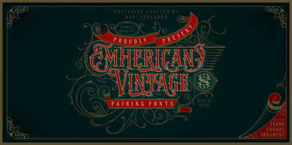
- NS Emhericans Vintage by Novi Souldado,
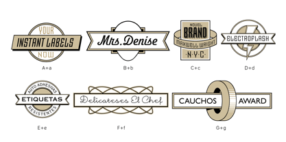
$15.00A design revelation inspirited by perpetual classics—establishing a graceful, aesthetic, and dynamic font. Introducing a vintage galvanized look typeface named Emherican. Comes with three font pairing combinations, extras ornaments, ligatures, and +60 stylistic alternates—makes it ideal and perfect for creating a design piece inspired by letterheads, posters, signage, charters, labels, packaging, logotypes, etc. - Farmer's Market PW by Patty Whack Fonts,
$24.00Farmer's Market PW is suitable for display use for titles, as well as paragraphs of text. This font contains tons of characters. Uppercase, lowercase, numerals, foreign characters, fractions, lots of alternates and ligatures as well as punctuation. Farmer's Market PW is available in OpenType and TrueType format which are both included in the same package. - BIKES by Lauren Ashpole,
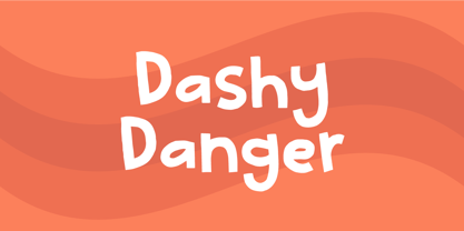
$15.00Do you enjoy bicycles? So much that when you aren't riding them you spend your time on bike related design? Then this font is for you. BIKES is a dingbat font that lives up to its name. The capital letters are detailed silhouettes of cycles while the lowercase are simplified versions for smaller uses. - Dashy Danger by Bogstav,
$17.00There is nothing dangerous about this font, but indeed something dashy! That may not make much sense, and that's the same with the font - unless you want to do something eye-catching and organic looking for kids! Dashy Danger is my laid back, kinda wild, legible but unpredictable kids font - with an organic twist! - Jeu De Mots NF by Nick's Fonts,
$10.00A 1970s Photolettering catalog indentified the pattern for this typeface as "Exotique" ...from France, no less. Named for a French expression meaning “pun,” this face is, indeed, witty and playful, with nary a groan in sight. Both versions of this font include the complete Unicode 1252 Latin and Unicode 1250 Central European character sets. - Astera by ParaType,
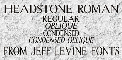
$25.00A set of astronomical signs (symbolic representation of the Sun, the Moon, planets and other celestial bodies as well as zodiacal constellations, phases of the Moon, etc), signs of Chinese Zodiac and several ornamental symbols. Designed by Andrey Belonogov. The typeface (under the name Astra) was awarded a Diploma of TypeArt’05 Design Contest. - Headstone Roman JNL by Jeff Levine,
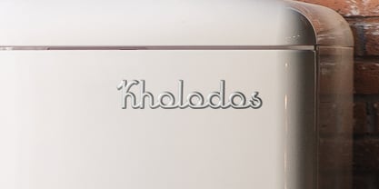
$29.00Despite its macabre-sounding name, Headstone Roman JNL is not a novelty font for Halloween or horror movies. Instead, it's an attractive Roman typeface based on an example provided of a guide for stonecutters to use when cutting epitaphs into tombstones. Headstone Roman JNL is available in regular, oblique, condensed and condensed oblique versions. - Kholodos by Grigorij Gushchin,
$15.00Kholodos - the slang name of the refrigerator in Russia. This font contains 383 characters, supports Latin, Cyrillic, Latin-1 Supplement, and also has the symbols of the Ukrainian and Belorussian alphabets. A font feature is a large number of alternates that define the connection of letters. Kholodos - the perfect solution for vibrant retro lettering. - Rough Cut NF by Nick's Fonts,
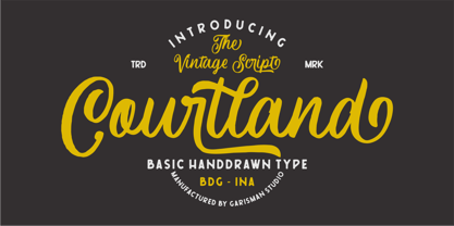
$10.00An old Art Nouveau typeface named "Daphne" provided the inspiration for this decidely different font. This version is upright, but the linocut treatment employed visually suggests the slight rightward slant of the original typeface. Bold, unusual and distinctive. Both versions of the font include 1252 Latin, 1250 CE (with localization for Romanian and Moldovan). - Courtland by Garisman Studio,
$22.00One name originating from Canada greatly inspired the birth of this vintage font. With the opentype feature: standar ligature, stylistic alternate (specifically for lowercase), Stylistic Sets 01 through 06 with different styles in each letter. Courtland is perfect for use in logo types, vintage logos, posters, labels, packaging, headlines, t-shirts and other designs. - Bandoleer by MADType,
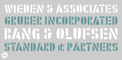
$24.00The inspiration for this versatile typeface came from both Art Deco and Military sources. It comes with both a clean geometric and hand drawn version so you don't have to get carpal tunnel sketching it out yourself. This typeface is equally at home stenciled with paint on a wall or used on a music poster. - Imperial Quortex by PizzaDude.dk,
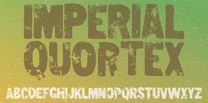
$20.00Imperial Quortex came to life during many processes. Including a bad copymachine, a wet cloth and multiple prints and scans. The result is Imperial Quortex: a unique eroded font! Comes with unique accented letters, alternate upper- and lowercase, smart ligatures and alternate letters. You will need to use OpenType supporting applications to use the ligatures. - Grape Feud by PizzaDude.dk,
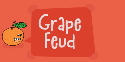
$17.00The name Grape Feud is obviously a wordplay, and is derived of the, sometimes, mistaken of the orange and the (often) purple fruits. But Grape Feud is also a playful and charming no-nonsense comic style font. The x-height is quite unpredictable, and I've added ligature for the most common double letter combinations. - P22 Gothic Gothic by IHOF,
$24.95The name says it all. Gothic from the old literary style and/or current subculture genre. And Gothic meaning a block or sans serif style of lettering. The concept was to take the classic German style lettering and create a contemporary extended block letter typeface. The result is a fusion of old and new. - Ring Quad by Ochakov,
$9.00Ring Quad is brave and confident from thin to black. A cleaner, geometrical and professional aesthetic. Ring Quad is a modern & minimalist font. It’s perfect for branding, logos, quotes, posters, name card, stationary, and every other design that needs a striking typeface. Now, Ring font family prepared for any insane adventure life throws our way! - Packaged Cookies JNL by Jeff Levine,
$29.00An image found online of the first [1923] “Oreo Sandwich” package provided a type inspiration from the pen-lettered block sans with rounded corners used for the product's name. Prior to 1923, the cookies were sold in boxes or tins. The result is Packaged Cookies JNL, which is available in both regular and oblique versions. - InkArt Labels by John Moore Type Foundry,
$24.95Inkart is a font dingbats, shapes for new labels or frames that the user can supplement according to the requirements and purposes. It consists of a set uppercase containing the forms, and a set is lower case which has areas of the same shapes to be colored by layers. Contains retro and modern styles. - P22 Hoy Pro by IHOF,
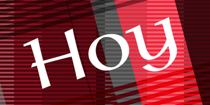
$39.95Hoy is a decorative font whose name derives from one of the Orkney Islands. Inspired by the wonderful encounter between the Celtic and Norse cultures in this specific geographic location, the font has adapted some of the features of the Insular half-uncial. It is playful and relaxed, and easily recognizable by its roundness. - Travel Plans JNL by Jeff Levine,
$29.00A 1930s travel poster from American Airlines had the airline’s name in a classic thick-and-thin Art Deco design of hand lettering. With the addition of angular spurs, some of the characters become semi-serif in nature. This type style is now available as Travel Plans JNL, in both regular and oblique versions. - Walftower by Arendxstudio,
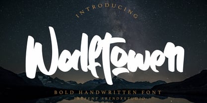
$15.00Walftower - Bold Handwritten Font with its distinctive character that can be easily implemented in your various design projects . Walftowert came with opentype features such stylistic alternates, stylistic sets & ligatures good for logotype, poster, badge, book cover, tshirt design, packaging and any more. Features : • Character Set A-Z • Numerals & Punctuations (OpenType Standard) • Accents (Multilingual characters) • Ligature - Reaver - Personal use only
- Lucida Handwriting by Monotype,
$40.99Lucida Handwriting is a casual, connected script designed for smooth and fun reading on screens and in print. Its relaxed personality and vigorous energy sends a distinctive message. Lucida Handwriting was originally released in one weight. It is now available in five weights, from Thin to Black. Lucida Handwriting was designed by Kris Holmes and Charles Bigelow based on historic blackletter style cursives. As with other joining script typefaces, all capital letters usage is not recommended: it is best to use upper and lowercase for optimal legibility. Lucida Handwriting is part of the Lucida superfamily of fonts from Bigelow & Holmes. Lucida is highly regarded for legibility and its extensive range of type styles. The Lucida Handwriting typeface family has a Standard character set with 255 glyphs supporting the basic range of Latin languages. - Plinc Italiano by House Industries,
$33.00Dave West’s Italiano is a smooth and sensuous typographic dish with a few extra savory dashes. The silky semi-serif combines ingredients from eighteenth-century engraved italics and nineteenth-century Italian Modern, softened by fine stroke endings and plump dolloped terminals. Preserve Italiano’s subtle flavors by maximizing its size in headlines, advertising captions, and identity campaigns, or capitalize on its swash characters to sweeten package and poster designs. However you use it, Plinc Italiano is a tasty typographic treat—non ci piove! Drawn in the late 1960s for Photo-Lettering, Inc., Italiano was digitized by Steve Ross with Ken Barber in 2015. Like all good subversives, House Industries hides in plain sight while amplifying the look, feel and style of the world’s most interesting brands, products and people. Based in Delaware, visually influencing the world. - Augsburg Initials by Kaer,
$18.00Hey! I'm happy to introduce to you my new initial's set. These drop caps I found in the "Introductorium in astronomiam" manuscript. It was printed in Augsburg in 1489 by Erhard Ratdolt. I've added some lost letters and assembled a full alphabet. Augsburg is a medieval gothic style font. Set of dim colored and monochrome grunge style emblems. Engraved initial drop caps. Perfect for vintage premium identity, Middle Ages posters, luxury packaging. If you want dark and strong medieval style concepts, please try it. --- *You can use color fonts in PS since CC 2017, AI since CC 2018, ID since CC 2019, macOS 10.14 Mojave* *Please note that the Canva & Corel doesn't support color fonts!* --- Please feel free to request any help you need: kaer.pro@gmail.com Best, Roman. Thank you! - Halloween Pumpkins by Voysla,
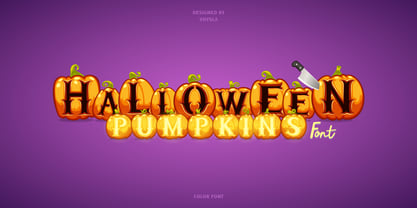
$9.00Hey! Happy Halloween Pumpkins! 🎃🎃🎃 This is a family of colored fonts "Halloween Pumpkins" in four styles (regular, glowing with and without Halloween pumpkins). PLEASE NOTE that in order to work with color fonts, you will need one of the listed applications - Photoshop CC 2017, Illustrator CC 2018, or Procreate 4.3 or later. It is also supported by some web browsers and text editors. You can read more about color fonts at the link - http://www.colorfonts.wtf The font supports Latin letters, all the necessary symbols, numbers and a set of multilingual characters. There are also additional glyphs of various pumpkins, a knife and decorative elements. They are great for Halloween designs. In addition to the color font family, the set includes a monochrome font "Halloween Carved" without Halloween pumpkins in two styles. - Shopping Guide by Jeff Levine,
$29.00While watching the 1947 holiday classic “Miracle on 34th Street”, one scene in particular presented a chance to develop a retro type design. ‘Kris Kringle’ suggests to a mother visiting with her child in the Macy’s toy department to try Gimbel’s for a toy she couldn’t find at the store. The news of this behavior reaches Mr. Macy himself, who embraces the practice as a brilliant marketing strategy. A number of departments are then presented with reference books containing competitor ads, and the visual of the cover stating “R.H. Macy & Co. Shopping Guide for the Convenience of Our Customers” shows on screen. The thin, Art Deco sans serif monoline with a few serif-like hooks added onto some characters became the basis for Shopping Guide JNL, which is available in both regular and oblique versions. - Chisel Mark - 100% free
- Andada - 100% free
- Signika - 100% free
- Squealer - 100% free
- SF Buttacup Lettering - Unknown license
- SF Buttacup Lettering - Unknown license
- SF Buttacup Lettering Shaded - 100% free
- SF Buttacup - Unknown license
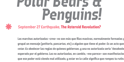
- Fierro by Los Andes,
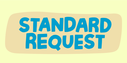
$16.00Fierro is a heavy-geometric-retrofuturistic typographic construction that, without any curve, still retains good legibility. These shapes are based on great bended metal pieces, which represent its name, meaning "hardware store". It has been designed to be used in large sizes and for designs with character that look to create a strong visual block. Designed by Jko Contreras. - Standard Request by Bogstav,
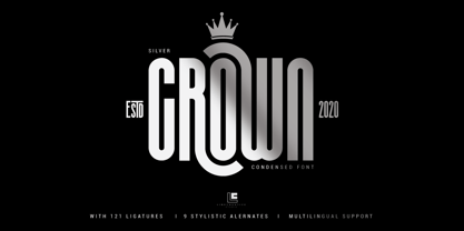
$18.00Standard Request is 100% handmade, and was inspired by both grafitti and comic book lettering. When viewed at large sizes, the handmade look and feel really stands out - at the same time, Standard Request, is super legible even at really small sizes. I've added 5 slightly different versions of each letter, and they automatically cycle as you type! - Silver Crown by Linecreative,
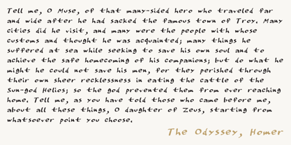
$16.00Silver Crown is an Ultra Condensend display font with minimalist characters. It's perfect for logos, name cards, magazine layouts, headers, or even large scale artwork. Silver Crown, a clean sans serif, offers you: 1. Upper and Lowercase characters (All Caps) 2. Ligatures (121 characters) and Stylistic alternates (9 Characters) 3. Multilingual Support (Latin Western Europe), Numbers and Punctuation - Penzance by TEKNIKE,
$45.00Penzance is a display monospace handwriting font. The typeface is a distinct hand drawn font using a fountain pen quill ink style. The Penzance name means "holy headland" in the Cornish language and is derived from the town on the English coast of Cornwall. Penzance is great for display work, invitations, writing, books, posters, logos and headings. - Petty Despot NF by Nick's Fonts,
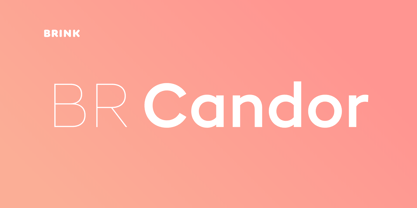
$10.00A typeface named Times Gothic, which made its first appearance in the 1905 ATF specimen book, inspired this headline sans. Use it to add a bit of quirky visual interest to headlines and subheads. Both versions include the complete Latin 1252, Central European 1250 and Turkish 1254 character sets, with localization for Lithuanian, Moldovan and Romanian. - BR Candor by Brink,
$30.00BR Candor is a geometric sans based on the functional characteristics and raw geometry of early European sans serifs. BR Candor however, is a more modernist interpretation of these classic styles, and its distinctly geometric letterforms produce a strikingly clear and contemporary typographic aesthetic. As the name suggests BR Candor is open, honest and straight talking.
