10,000 search results
(0.016 seconds)
- Coral Reef by Vozzy,
$10.00 Introducing a clean script font named Coral Reef. This smooth font is perfect for lettering with alternates for small letters (for the last letter for example) and multilingual support.
 - Potato Sans by 4RM Font,
$9.00 Made with a cute shape, making this font suitable for use in graphic designs related to unique things. This font is available in 2 styles namely bold and black.
 - Rock Wood by Kprojects,
$15.00 Rock Wood is a fresh version of old western wood type. With its strong and sinuous lines it has a taste of vintage and modern at the same time.
 - Ps Javier by Fontopia,
$- The font is named after my son Javier. He studies architecture. Font Javier follows architectural principles. Javier 1, Javier 2 and Javier 3 can be combined with each other.
 - Vullkan NF by Nick's Fonts,
$10.00 Live long and prosper. Barnhart Brothers and Spindler. 1884. Originally named Vulcan. Enough said. Both versions support the Latin 1252, Central European 1250, Turkish 1254 and Baltic 1257 codepages.
 - Cartelle Inline by Stereo Type Haus,
$30.00 Cartelle is a sexy small caps bitmap design characterized by it's whimsical curls and ornate flourishes. It's inspiration came from a French poster design from the early 1900's.
 - Lumberjacky by Tour De Force,
$25.00 In winter when cold time comes, when animals with thin fur play drums, there’s one guy who keeps you warm, his name is Lumberjacky and he’s stronger then storm!
 - Schism One by Alias,
$55.00 Schism is a modulated sans-serif, originally developed from our Alias Didot typeface, as a serif-less version of the same design. It was expanded to three sub-families, with the thin stroke getting progressively heavier from Schism One to Schism Three. The different versions explore how this change in contrast between thick and thin strokes changes the character of the letterforms. The shape is maintained, but the emphasis shifts from rounded to angular, elegant to incised. Schism One has high contrast, and the same weight of thin stroke from Light to Black. Letter endings are at horizontal or vertical, giving a pinched, constricted shape for characters such as a, c, e and s. The h, m, n and u have a sharp connection between curve and vertical, and are high shouldered, giving a slightly square shape. The r and y have a thick stress at their horizontal endings, which makes them impactful and striking at bolder weights. Though derived from an elegant, classic form, Schism feels austere rather than flowery. It doesn’t have the flourishes of other modulated sans typefaces, its aesthetic more a kind of graphic-tinged utility. While in Schism Two and Three the thin stroke gets progressively heavier, the connections between vertical and curves — in a, b, n etc — remain cut to an incised point throughout. The effect is that Schism looks chiselled and textural across all weights. Forms maintain a clear, defined shape even in Bold and Black, and don’t have the bloated, wide and heavy appearance heavy weights can have. The change in the thickness of the thin stroke in different versions of the same weight of a typeface is called grading. This is often used when the types are to used in problematic print surfaces such as newsprint, or at small sizes — where thin strokes might bleed, and counters fill in and lose clarity, or detail might be lost or be too thin to register. The different gradings are incremental and can be quite subtle. In Schism it is extreme, and used as a design device, giving three connected but separate styles, from Sans-Didot to almost-Grotesk. The name Schism suggests the differences in shape and style in Schism One, Two and Three. Three styles with distinct differences, from the same start point.
 - Schism Three by Alias,
$55.00 Schism is a modulated sans-serif, originally developed from our Alias Didot typeface, as a serif-less version of the same design. It was expanded to three sub-families, with the thin stroke getting progressively heavier from Schism One to Schism Three. The different versions explore how this change in contrast between thick and thin strokes changes the character of the letterforms. The shape is maintained, but the emphasis shifts from rounded to angular, elegant to incised. Schism One has high contrast, and the same weight of thin stroke from Light to Black. Letter endings are at horizontal or vertical, giving a pinched, constricted shape for characters such as a, c, e and s. The h, m, n and u have a sharp connection between curve and vertical, and are high shouldered, giving a slightly square shape. The r and y have a thick stress at their horizontal endings, which makes them impactful and striking at bolder weights. Though derived from an elegant, classic form, Schism feels austere rather than flowery. It doesn’t have the flourishes of other modulated sans typefaces, its aesthetic more a kind of graphic-tinged utility. While in Schism Two and Three the thin stroke gets progressively heavier, the connections between vertical and curves — in a, b, n etc — remain cut to an incised point throughout. The effect is that Schism looks chiselled and textural across all weights. Forms maintain a clear, defined shape even in Bold and Black, and don’t have the bloated, wide and heavy appearance heavy weights can have. The change in the thickness of the thin stroke in different versions of the same weight of a typeface is called grading. This is often used when the types are to used in problematic print surfaces such as newsprint, or at small sizes — where thin strokes might bleed, and counters fill in and lose clarity, or detail might be lost or be too thin to register. The different gradings are incremental and can be quite subtle. In Schism it is extreme, and used as a design device, giving three connected but separate styles, from Sans-Didot to almost-Grotesk. The name Schism suggests the differences in shape and style in Schism One, Two and Three. Three styles with distinct differences, from the same start point.
 - Schism Two by Alias,
$55.00 Schism is a modulated sans-serif, originally developed from our Alias Didot typeface, as a serif-less version of the same design. It was expanded to three sub-families, with the thin stroke getting progressively heavier from Schism One to Schism Three. The different versions explore how this change in contrast between thick and thin strokes changes the character of the letterforms. The shape is maintained, but the emphasis shifts from rounded to angular, elegant to incised. Schism One has high contrast, and the same weight of thin stroke from Light to Black. Letter endings are at horizontal or vertical, giving a pinched, constricted shape for characters such as a, c, e and s. The h, m, n and u have a sharp connection between curve and vertical, and are high shouldered, giving a slightly square shape. The r and y have a thick stress at their horizontal endings, which makes them impactful and striking at bolder weights. Though derived from an elegant, classic form, Schism feels austere rather than flowery. It doesn’t have the flourishes of other modulated sans typefaces, its aesthetic more a kind of graphic-tinged utility. While in Schism Two and Three the thin stroke gets progressively heavier, the connections between vertical and curves — in a, b, n etc — remain cut to an incised point throughout. The effect is that Schism looks chiselled and textural across all weights. Forms maintain a clear, defined shape even in Bold and Black, and don’t have the bloated, wide and heavy appearance heavy weights can have. The change in the thickness of the thin stroke in different versions of the same weight of a typeface is called grading. This is often used when the types are to used in problematic print surfaces such as newsprint, or at small sizes — where thin strokes might bleed, and counters fill in and lose clarity, or detail might be lost or be too thin to register. The different gradings are incremental and can be quite subtle. In Schism it is extreme, and used as a design device, giving three connected but separate styles, from Sans-Didot to almost-Grotesk. The name Schism suggests the differences in shape and style in Schism One, Two and Three. Three styles with distinct differences, from the same start point.
 - Tin Doghouse - Unknown license

- Tin Birdhouse - Unknown license

- Raffadyn by Attype Studio,
$16.00 Raffadyn is a wedding font perfect for your wedding dream. Combine Raffadyn with stylistic set to create amazing script font for wedding! Fall in love with its incredibly versatile style and use it to create spectacular designs! Raffadyn is perfect for branding, logo, invitation, quotes, apparel design, product packaging, merchandise, game titles, cute style design, Book/Cover Title and more. What's Included : - Stylistic Set character - Multilingual Support --- Hope you enjoy with our font! Attype Studio
 - Maken by Graphicxell,
$19.00 This typeface encapsulates a rhythm that is symmetrical and balanced due to a unique mix of different sources of inspiration. Proportions are precisely adjusted with subtle contours and subtle contrasts. These shapes give the font an attractive look without compromising on elegance and minimalism, ensuring that any glyph will work well in any graphic design purpose such as brochures, videos, advertising branding, logos, magazines, layout designs, posters, post templates, games and others
 - Luna Love by Attype Studio,
$10.00 Introducing Luna love - Inspired by Star on the space & cute display, Luna love is handwritten font cursive that perfect for children product. come with star layered font, make combination of this font to create amazing design! Two style Font: regular & Display Luna love is perfect for children product, branding, logo, invitation, stationery, wedding, product packaging, merchandise, monogram, blog design, game titles, cute style design, Book/Cover Title and more. Features : - Multilingual Support - stylistic set
 - Lemon Glow by Olivetype,
$18.00 With Lemon Glow, you'll bring the joy back to your design projects with a font that's suitable for anything from creative pieces and children's products to gaming brands and fresh business logos. It's versatile, full of joy, and easy to use! Lemon Glow font includes : Standard Latin Uppercase and Lowercase Numbers, symbols, and punctuations Multilingual Support. PUA Encoded and fully accessible without additional design software Simple Installations Works on PC & Mac Thank You.
 - Birani by Attype Studio,
$16.00 Birani is lovely script font with swash on beginning & ending word. This font perfect for valentine & wedding theme design. Combine it with Birani beginning, ending swash & ligatures to make perfect design for yor projects. Birani perfect for valentine promotion, wedding invitation, branding, logo, invitation, stationery, social media post, product packaging, merchandise, blog design, game titles, cute style design, Book/Cover Title and more. What's Included : - Birani Family Font - Ligature - Multilingual Support - Beginning & Ending Swash
 - FF Market by FontFont,
$76.99 German type designer H. A. Simon created this script FontFont in 1996. The family contains 3 weights: Regular, Condensed, and Bold and is ideally suited for advertising and packaging, festive occasions, editorial and publishing, poster and billboards as well as software and gaming. FF Market provides advanced typographical support with features such as ligatures, alternate characters, case-sensitive forms, fractions, super- and subscript characters, and stylistic alternates. It comes with tabular lining figures.
 - Celdum by The Northern Block,
$39.00 Celdum, a modern geometric type family, constructed from a rectangular grid. Smooth, precise curves meet horizontal and vertical lines to create a monoline design with no apparent contrast. Each letter shape has unique subtleties creating a purposeful type family suited to text and branding scenarios within mobile applications, video games and other interactive software. Details include six weights with italics, 460 characters, five variations of numerals, manually edited kerning and Opentype features.
 - Flower by Graphicxell,
$19.00 This typeface encapsulates a rhythm that is symmetrical and balanced due to a unique mix of different sources of inspiration. Proportions are precisely adjusted with subtle contours and subtle contrasts. These shapes give the font an attractive look without compromising on elegance and minimalism, ensuring that any glyph will work well in any graphic design purpose such as brochures, videos, advertising branding, logos, magazines, layout designs, posters, post templates, games and others
 - Strategy by Graphicxell,
$19.00 This typeface encapsulates a rhythm that is symmetrical and balanced due to a unique mix of different sources of inspiration. Proportions are precisely adjusted with subtle contours and subtle contrasts. These shapes give the font an attractive look without compromising on elegance and minimalism, ensuring that any glyph will work well in any graphic design purpose such as brochures, videos, advertising branding, logos, magazines, layout designs, posters, post templates, games and others
 - Packy Great by Graphicxell,
$19.00 This typeface encapsulates a rhythm that is symmetrical and balanced due to a unique mix of different sources of inspiration. Proportions are precisely adjusted with subtle contours and subtle contrasts. These shapes give the font an attractive look without compromising on elegance and minimalism, ensuring that any glyph will work well in any graphic design purpose such as brochures, videos, advertising branding, logos, magazines, layout designs, posters, post templates, games and others
 - Dark Star by PleasureFonts,
$19.00Dark Star is a modern, futuristic typeface with a sci-fi, high-tech look. The letter design is a geometric sans but also slightly rounded to make a more organic and natural impression. The suggested use for Dark Star is logo design, headlines in editorial design, packaging, web and print titles and game design. This futuristic typeface was designed in 2021, released by pleasurefonts and comes in 6 weights with a glyphs amount of 394. - Olympic by Graphicxell,
$19.00 This typeface encapsulates a rhythm that is symmetrical and balanced due to a unique mix of different sources of inspiration. Proportions are precisely adjusted with subtle contours and subtle contrasts. These shapes give the font an attractive look without compromising on elegance and minimalism, ensuring that any glyph will work well in any graphic design purpose such as brochures, videos, advertising branding, logos, magazines, layout designs, posters, post templates, games and others
 - Nowduke by Just Font You,
$19.00 Nowduke is a bold vintage font. Inspired by the rise of the Retro-Futurism trend in the digital industry nowadays. The undeniable invasion in every industry makes it a big trigger I can say, to bring this pop font to rise in this universe. Perfectly fit for logo, branding, gaming, esport design, poster, music video, album artwork, retro concept, advertising, digital content, stream overlay, cover, book, packaging, merchandise, apparel, fashion, and many more.
 - Weight by Graphicxell,
$19.00 This typeface encapsulates a rhythm that is symmetrical and balanced due to a unique mix of different sources of inspiration. Proportions are precisely adjusted with subtle contours and subtle contrasts. These shapes give the font an attractive look without compromising on elegance and minimalism, ensuring that any glyph will work well in any graphic design purpose such as brochures, videos, advertising branding, logos, magazines, layout designs, posters, post templates, games and others
 - FF Typestar OCR by FontFont,
$62.99 German type designer Steffen Sauerteig created this slab FontFont in 1999. The font is ideally suited for logo, branding and creative industries and software and gaming. FF Typestar OCR provides advanced typographical support with features such as ligatures, alternate characters, case-sensitive forms, super- and subscript characters, and stylistic alternates. It comes with tabular lining figures. This FontFont is a member of the FF Typestar super family, which also includes FF Typestar.
 - Worksy by Graphicxell,
$19.00 This typeface encapsulates a rhythm that is symmetrical and balanced due to a unique mix of different sources of inspiration. Proportions are precisely adjusted with subtle contours and subtle contrasts. These shapes give the font an attractive look without compromising on elegance and minimalism, ensuring that any glyph will work well in any graphic design purpose such as brochures, videos, advertising branding, logos, magazines, layout designs, posters, post templates, games and others
 - Qicka by Attype Studio,
$16.00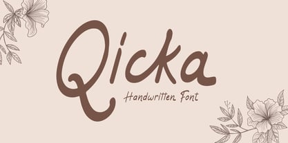 Qicka is a Handwritten Font. Perfect font for business brand. Combine Qicka stylistic set to create amazing script font! Fall in love with its incredibly versatile style and use it to create spectacular designs! Qicka is perfect for branding, logo, invitation, quotes, wedding invitation, cricut font, silhouette font, product packaging, merchandise, game titles, cute style design, Book/Cover Title and more. What's Included : - Ligatures - Multilingual Support --- Hope you enjoy with our font! Attype Studio
 - Yellow Party by Attype Studio,
$8.00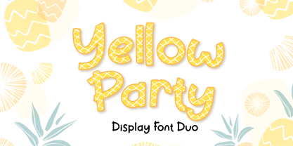 Yellow Party is display font with the texture of pineapple and includes two styles: Regular and Display. Yellow Party is perfect for branding, logos, invitations, stationery, social media posts, product packaging, merchandise, blog designs, game titles, cute style designs, Book/Cover Titles and more. What's Included : - Multilingual Support (Afrikaans, Albanian, Catalan, Danish, Dutch, English, Estonian, Finnish, French, German, Icelandic, Italian, Norwegian, Portugese, Spanisch, Swedish, Zulu) - 6 ligatures --- Hope you enjoy with our font! Attype Studio
 - Airbolt by Zealab Fonts Division,
$9.00 Airbolt is sporty, futuristic, and sharp font. It will make your design looks sporty and also futuristic design. Airbolt is a great fit for retro, futuristic, automotive, and gaming themed designs. Just look how it performs on the preview that I have provided, you will see its capabilities. But it will also work well with other themes. I can’t wait to see what you guys will come up with with using this font!
 - Tuesday Jingle by Attype Studio,
$13.00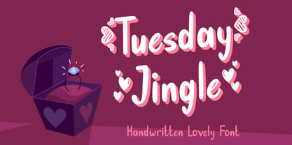 Tuesday Jingle is an exquisite font for Valentine theme design, with dingbats heart on character "{}[]" Fall in love with it and bring your projects to the highest levels! Tuesday Jingle is perfect for branding, logo, invitation, stationery, social media post, product packaging, merchandise, blog design, game titles, cute style design, Book/Cover Title and more. What's Included : - Tuesday Jingle.otf - Heart dingbats on character "{}[]" - Multilingual Support --- Hope you enjoy with our font! Attype Studio
 - Edges by Graphicxell,
$19.00 This typeface encapsulates a rhythm that is symmetrical and balanced due to a unique mix of different sources of inspiration. Proportions are precisely adjusted with subtle contours and subtle contrasts. These shapes give the font an attractive look without compromising on elegance and minimalism, ensuring that any glyph will work well in any graphic design purpose such as brochures, videos, advertising branding, logos, magazines, layout designs, posters, post templates, games and others
 - Makes by Graphicxell,
$19.00 This typeface encapsulates a rhythm that is symmetrical and balanced due to a unique mix of different sources of inspiration. Proportions are precisely adjusted with subtle contours and subtle contrasts. These shapes give the font an attractive look without compromising on elegance and minimalism, ensuring that any glyph will work well in any graphic design purpose such as brochures, videos, advertising branding, logos, magazines, layout designs, posters, post templates, games and others
 - Almost Textual by Graphicxell,
$19.00 This typeface encapsulates a rhythm that is symmetrical and balanced due to a unique mix of different sources of inspiration. Proportions are precisely adjusted with subtle contours and subtle contrasts. These shapes give the font an attractive look without compromising on elegance and minimalism, ensuring that any glyph will work well in any graphic design purpose such as brochures, videos, advertising branding, logos, magazines, layout designs, posters, post templates, games and others
 - Arimalia by Attype Studio,
$19.00 Arimalia is unique script font with lovely ligatures. This font perfect for elegant & logotype design. Combine Alternates Character to make perfect design for yor projects. Arimalia perfect for elegant promotion, wedding invitation, branding, logo, invitation, stationery, social media post, product packaging, merchandise, blog design, game titles, cute style design, Book/Cover Title and more. Features : - Arimalia Font - Ligatures - Multilingual, US Roman, Latin 1 Support --- Hope you enjoy with our font! Attype Studio
 - WBP Sight by Studio Jasper Nijssen,
$15.00 This font is inspired by posters opticians use to test a person’s eyesight. Those letters are always blurred or distorted when they're beheld. That’s awful for any creation. So why not rig the game from the start and blur the whole font?! WBP Sight is most defiantly a display font, so play to it’s strengths. Use it in headings, on banners or on posters. Especially on those to test a person’s eyesight…
 - Speed Rush by Pixesia Studio,
$10.00 Speed Rush - A Race Display Font Speed Rush is an assertive and modern display font that oozes strength and toughness. It suits perfectly any racing theme or online game. Have fun with this beautiful font and explore its endless variations. FEATURES - Uppercase and Lowercase letters - Numbering and Punctuations - Multilingual Support - Works on PC or Mac - Simple Installation - Support Adobe Illustrator, Adobe Photoshop, Adobe InDesign, also works on Microsoft Word Hope you Like it. Thanks.
 - Wilffer by Graphicxell,
$19.00 This typeface encapsulates a rhythm that is symmetrical and balanced due to a unique mix of different sources of inspiration. Proportions are precisely adjusted with subtle contours and subtle contrasts. These shapes give the font an attractive look without compromising on elegance and minimalism, ensuring that any glyph will work well in any graphic design purpose such as brochures, videos, advertising branding, logos, magazines, layout designs, posters, post templates, games and others
 - Jingle by Supfonts,
$15.00 This font was inspired by the game with different signature styles! The result is a light and nice, mono linear font that looks completely handdrawn. Jingle will look beautiful on Christmas and holiday invitations, wedding invites and stationery, logos, and more. I love using it for emphasis words and pairing it with sans serifs Includes: - Ligatures - Uppercase and lowercase - Numbers and punctuation - Foreign language support Check out my blog: - www.instagram.com/dmitriychirkov - pinterest.com/dmitriychirkov7

