10,000 search results
(0.015 seconds)
- Rikkia by Matt Chansky,
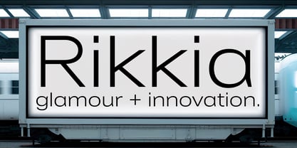
$21.00Rikkia is synonymous with glamour and innovation and has an immediate high-end look that is both timeless and universally appealing. The font family is distinguished by modern ovals and subtle architectural angles. Stylish and versatile, Rikkia comes in wide and standard widths – from hair to bold. The font also has an alt character set for key glyphs like "a" and "R." You'll find a professional set of ligatures, multilingual options, fractions, and a the estimated symbol. Cosmetics, AI, engineering, healthcare, sports, editorial – and all points in between, Rikkia has you covered for a variety of layout needs. Clean, distinctive, memorable, and easily readable — an ideal choice for both print and screens. - LTC Circled Caps by Lanston Type Co.,
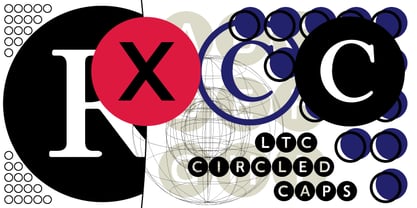
$24.95This handy font allows designers of commercial products to add basic circled letters that are uniform in appearance. For example, on music CDs, the Copyright and Publish (AKA Phonogram) symbols often do not match. While most fonts include a circled 'c' for Copyright, they seldom contain a circle 'p' for Publish (note that all P22 fonts include the circle 'p' and 'c'). The circle 'U' and 'K' for Kosher foods are rarely included in fonts and have to be made as needed. This single font contains both a serif and sans serif style caps A-Z as well as figures assigned to regular keys and also mapped to standard Unicode for "Enclosed Alphanumerics". - Mirtha Display by Nois,
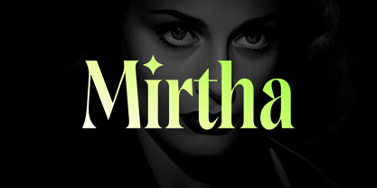
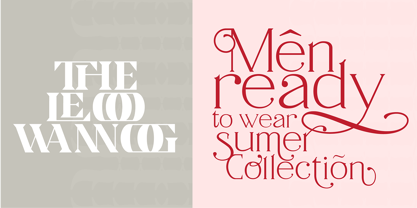
$24.00Mirtha Display is a modern display font with distinct Art Nouveau details. Its lighter weights are condensed and sophisticated, while the heavier weights have a more powerful effect, making it perfect for headlines, posters, branding, logos, packaging and more. With a set of over 450 glyphs, this font supports a wide range of languages. Key OpenType Features include numerators and denominators, Old Style and Lining numbers, standard ligatures and localized characters such as Uppercase and Lowercase Sharp S. Mirtha Display covers 5 weights, 10 styles and 2 Variable cuts (regular and italic) to give you more design flexibility. Any suggestion to continue improving Mirtha Display will be welcome, do not hesitate to contact us! - Rather Both by PintassilgoPrints,
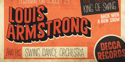
$24.00Rather Jazzy, Rather Loud: a family of two quite distinct fonts that perform together handsomely well. Both fonts include 2 versions for each letter, easily reachable through keyboard upper and lower keys. They also come packed with Contextual Alternates functionality to instantly cycle the alternates, providing a realistic handcrafted feel: just turn on the feature in any OpenType savvy application and let the music sound. Rather Loud brings yet another cool feature: lots of interlocking pairs that will add that nice extra twist your projects sometimes ask for. Trigger the discretionary ligatures feature button (OpenType savvy applications needed!) or pick up your choices through a glyphs palette or character map. Jazzy? Loud? I'd Rather Both, for sure! - Typesetter Ornaments JNL by Jeff Levine,
$29.00The pages of vintage type foundry catalogs yield so much wonderful type design and artwork. Found within their pages are hundreds of classic text and display faces alongside delicately engraved cuts as well as print shop borders, ornaments and embellishments. These books are treasure troves of their respective times, and Typesetter Ornaments JNL preserves some of that art in digital form. Redrawn from this source material are twenty-six basic design elements that include corner pieces, end pieces, pointing hands, spot illustrations and other designs. Also included are old style parentheses, brackets, an Rx (prescription symbol), two cent signs and a few extra elements located on the number keys and their caps shift counterparts. - Horst More by MIX.Jpg,
$10.00Horst More is a retro soft serif typeface comprising 18 fonts. It can handle most typographic applications from branding to body copy with its range of weights and inherent legibility. Whatever you type will have a friendly message, but it really comes into its own when you start applying some of the additional ligatures and alternates that are built into this type family. You’ll soon be creating distinctive typographic compositions that are pleasing to the eye. There are 18 fonts, 9 weights altogether. It has an extensive character set that covers all Latin European languages. Key features: 9 weights in Roman and Italic Alternates Ligatures Thanks for visiting and purchasing my font! Ekayasa Mix.Jpg - Lovingly by Happy Letters,
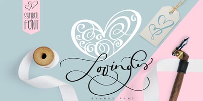
$6.00Welcome to Happy Letters shop :) Happy St. Valentine's Day! Lovingly includes unique heart flourishes that give a charm and romantic love holiday mood ornaments, Valentine greeting cards, invitations, etc. Thin, elegant calligraphic lines like a light breeze give freshness and dreaminess to your handmade creations. Ornament font Lovingly is mapped to regular keyboard keys, so you don't need any additional programs to use them. Just install font, type and go! Lovingly is perfect for: decorating your albums, for holidays, logos, phrases, gift shops, Valentine's Day card, gift cards, tags, labels, stickers, wedding invitations, header images, Etsy presentations, ideal for handmade, scrap booking, printed paper items, promoting seasonal blog posts, social media posts, Pinterest, Instagram and much more. - Linotype Punkt by Linotype,
$29.99Linotype Punkt, from US designer Mischa Leiner, is part of the TakeType Library, chosen from the entries of the Linotype-sponsored International Digital Type Design Contest 1999 for inclusion on the TakeType 3 CD. This font, from US designer Mischa Leiner is available in three weights, light, regular and bold. The basic forms are those of a robust sans serif, however the figures are composed of evenly placed dots, hence the name Punkt, the German word for dot. This distinguishing characteristic lets this font look as though it appears on a background of light. One other unique trait of this font is the nature of the three weights. The figures of each weight have exactly the same measurements, the same width, breadth, etc. The only variable measurements are those of the individual dots making up the forms, making the bold weight much darker than the light while retaining the same outer contours. Linotype Punkt should be used in larger point sizes, as when it is too small the dots blur together and rob the font of its 'light'. The font is therefore best for headlines in large and very large point sizes. - HD Colton by HyperDeluxe,
$35.00HD Colton is a 90-style super-sans from London Design Studio HyperDeluxe®. Using a combination of horizontal & vertical terminals along with squarish ovals, it is built with a confident structure that feels so much more than a neutral sans, it feels iconic. Engineered in 5 widths, compressed to extra wide, and in nine weights, HD Colton features a huge 90 styles that will offer your brand ultimate flexibility and variation in one font family. The black weights will help bring prominence to your brand while the light to mid weights will help you tell your story at a smaller size. HD Colton includes 1200+ glyphs per style, providing you with a workhorse sans that supports 200+ languages including extended Latin, extended Cyrillic and basic Greek. Also included are 5 stylistic sets, 2 arrow sets & numerous OpenType features (see last poster for complete list). The HD Colton complete family package comes with a single, 3-axis variable font so you'll have an infinite amount of combinations and uses for you to experiment with and add that touch of finesse to your visuals. Variable fonts are tech friendly providing smaller sizes for developers to work with, while also being responsive and used for motion design on the web. HD Colton key features: 3-Axis Variable Font. 90 Styles. 1200+ Glyphs Per Style. 5 Widths (Compressed, Condensed, Regular, Wide, Extra Wide). 200+ Languages Supported. Extended Latin, Extended Cyrillic, Greek Support. Stylistic Alternates for some key glyphs (J, Q, G, l, &, Arrows). Extensive OpenType features. - Chess-7 - Personal use only
- Eye Socket - Unknown license
- Apple Butter - Unknown license
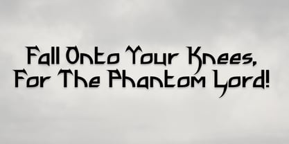
- Phantom Lord by Subversive Type,
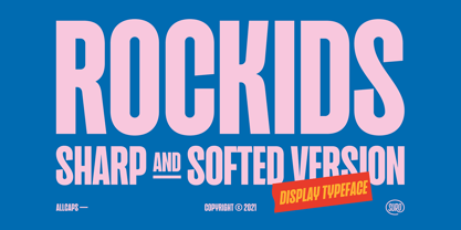
$13.00 - Rockids by Surotype,
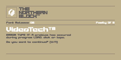
$20.00 - VideoTech by The Northern Block,
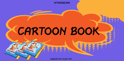
$12.80 - Cartoon Book by PojolType,
$12.00 - Chateau by Wilton Foundry,
$29.00On the one hand Chateau is almost palatial but at the same time it has a quite earthy personality as represented by the stenciled strokes. However, this stencil effect serves to refine the strokes by creating the illusion of a completed thin stroke. Chateau is more of a hybrid roundhand script with its contrasting ornate capitals. Originally a fortified residence in France was called a Chateau. Today there are many estates with true Chateaux on them in Bordeaux, but it is customary for any wine-producing estate, no matter how humble, to prefix its name with "Chateau". This is true whether the building itself is a magnificent palace or a shack. The distinctive chateau architecture was in inspiration for the name of this script. Chateau is ideal for packaging design, invitations, announcements, headlines, brochures, menus, weddings, scrapbooking, etc. Chateau is available in Opentype, Postscript and Truetype for Macs and PCs. - PF Kids Pro by Parachute,
$79.00This is not just a typeface inspired by a kid’s first attempts to write. This is in fact how exactly a kid writes. Alexandros Papalexis was born again kid when he became a father. This series came about while designing his daughter’s birthday invitations. Since its first release, it has been constantly on our most wanted list. You step into a supermarket, a bookstore or a clothing store and you see tens of products using this typeface. Anything from baby products, food, clothing, children’s books and magazines, print and TV campaigns, you name it. But don't just stick to the name. Every single weight serves the right purpose. This is why this typeface has also been used extensively for grown-up market. Recently, it was upgraded to include Latin, Greek and Cyrillic. Furthermore, the accompanied series of pictograms was completed and loaded with 125 western and eastern European pieces. - All Is Quiet by Kitchen Table Type Foundry,
$15.00The year 2022 went and 2023 came. I can honestly say that last year was a horrible year and I am happy it ended a couple of days ago. The first week after New Year’s Eve always fills my head with the U2 song ‘New Year’s Day’ - so I named this font after a line from the lyrics. I also happened to watch a fantastic movie called ‘Im Westen Nights Neues’, directed by Edward Berger, but based on a book by Erich Maria Remarque, which, in English, was published as ‘All Quiet On The Western Front’. So there you have it: naming a font in 2 easy steps! ;-) All Is Quiet is a lovely brush font, which I created using my father in law’s Chinese pencil and ink. I can suggest some uses here, but I am convinced you can come up with that yourself. - Eksperiment by PizzaDude.dk,
$18.00Eksperiment is danish for experiment. Without much guessing or knowledge to danish, you probably already knew that! I like those danish words containing a "k" - is it because my name is spelled with a "k"? I don't know - maybe it's because it kind of represents the danish language, which is full of words with "k"s. Anyway, the reason for the name is that I wanted a font looking like it had gone through tough times, a bad copy machine and perhaps even crumpled paper...but the experiment is that the font is 100% made using digital media. I used my MacBook and my iPad creating this font. I find it quite amusing, that something 100% digital looks like something organic. I've added 5 different versions of each letter, which is really helpful when working with grunge fonts. It looks more natural, when the same letter rarely repeats itself. - RB Naftalin by RockBee,
$-This typeface came out as a side idea while I was working on one logotype. Suddenly I came up with an idea of creating “tuned” version of the typeface, based on that logo. The “tuning” turned me in a completely different direction and in a few hours of haste I was looking at a completely different typeface. A few days later I made this font available for free, since it wasn't meant to be at all :-). A few months later, I saw my typeface used in the menu in one pizzeria. I was amazed and glad and happy and proud, all at the same time. Oh, by the way: the logo I was working on was of different style and even of another stem’s widths. So, this is truly a font of it’s own design. Naftalin has both Latin and Cyrillic sets, since it was used with both. - Slivowitz by Hanoded,
$15.00First off, Slivowitz is written with a v (SlivoVitz), rather than a w, but I liked it better with a w. Slivowitz is a plum brandy from Eastern Europe. My father used to be an international truck driver and he often had to go to Eastern Europe. He took all kinds of ‘western’ goods with him to give away (plastic bags, beer, cigarettes - remember, Eastern Europe at the time was still communist!). He always came back with bottles of Slivowitz. I never tasted it, as I was too young, but I liked the name and I decided to name this font after a fond memory! Slivowitz is an easy-going handwritten script font - it looks good on fashion items, book covers and fancy magazines, but greeting cards will look just as great. Comes with a bunch of ligatures, alternates and a whole lotta diacritics! - Cornelius by Artcity,
$19.00Cornelius is a playful hand-drawn font family designed by Daniel Bak (Artcity). It is available in three handy weights: regular, bold and screaming. It contains international language accent marks and diacriticals, including Greek and Cyrillic in both OTF and TTF formats. Font family name is inspired by the main male ape character from the 1968 science fiction film Planet of the Apes and Pierre Boulle novel of the same name. Boulle published his La Planète des singes in 1963, which was originally translated in 1964 as Monkey Planet by Xan Fielding, and later re-issued as Planet of the Apes . Dr. Cornelius is a chimpanzee archaeologist and historian who appears in the original novel, and also the first three installments of the classic movie series, from the 1960s and 1970s. He was portrayed mainly by actor Roddy McDowall, but also by David Watson. - Sulatko - Unknown license
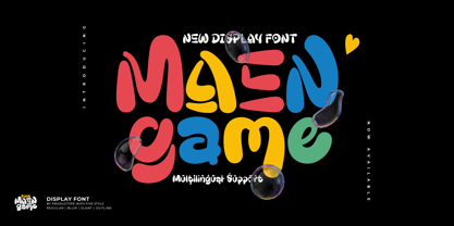
- Maengame by Product Type,
$17.00Meet Maengame Font Display, Bring Fun and Power to Your Designs! Maengame is not just a font; it's a gateway to a world of joy and power in your designs. With eye-catching display themes and a strong game style, Maengame brings a unique touch to your projects. Inject a fun twist into each character with a bubble-filled design, adding a fun element to each letter. Maengame also brings a sense of courage and resilience, making your projects stand out with passion. Maengame is the perfect solution for projects that require a unique touch. Whether you're working on a bold display, a lively game, or an entertaining event, this font ensures that every design carries unforgettable charm. Do not miss this opportunity! Get Maengame Display Font now and turn every design into an unforgettable game! - Amoonk by Product Type,
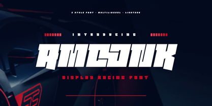
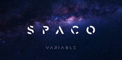
$18.00 - Spaco Stencil SC by Koray Özbey,
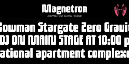
$36.00 - Magnetron by Device,
$39.00 - Quado by Tadiar,
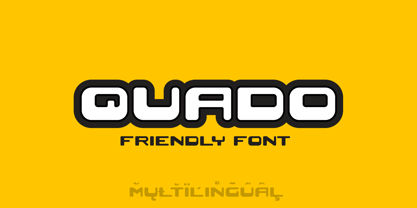
$13.00 - Muisca by JVB Fonts,
$25.00Muisca, that in its early edition was named as «Muisca Sans», was developed in mid-1997 and based on the graphic concept of pre-Columbian characteristics figures within some of the very few visual elements recovered from the Muisca culture. This ancient pre-Columbian tribe disappeared since the arrival of the Spanish 500 years ago, in what is now the center of Colombia. In fact, the name of the capital Bogotá goes back to Bacatá as primary or village downtown of what was once the imperial capital of the Muisca tribe. This typographic project was submitted as my work for the degree in Graphic Design, obtained in September of that year (at the Universidad Nacional de Colombia), under the creative concept of vindicating the ancient culture and identity through a functional typeface, into a fact without precedent in the country. Muisca was recently edited, arranged and completed, including multilingual diacritic glyphs to be versatile in several languages. Related and inspired by Latin America, Ethnic, Native, Tribal, Mysthical, Handmade, Aboriginal, Pre-Hispanic, Pre-Columbian, Textured, Fantasy. Ideal to be used in logos, display text & titles, games and other design applications that reminds of the Pre-Hispanic art. - Ammer Handwriting by Schriftlabor,
$18.99Austrian Cartoonist Wolfgang Ammer lent his handwriting to this font, which was produced by Miriam Surányi. Wolfgang already uses the font in his daily routine: It facilitates corrections and translations of his cartoons for international newspapers. Rich in contextual alternates, Ammer contains about 1800 glyphs. Each character has multiple alternates. And a complex OpenType substitution feature makes sure that the same variant does not appear twice in a line. As a special gimmick, the font contains a Tic Tac Toe game: To activate it, type a # and turn on stylistic set 20. Then use digits 1–9 for setting the naughts and crosses on their places. The enclosed TT variant has a reduced glyph set and therefore a smaller file size, hence it is better suited for use on the web. - Le Havre Width by insigne,
$-Le Havre Width is the loveable putty of fonts. Stretch it. Squish it. Squeeze it. Whichever way you play with it, you’re bound to find hours of fun ahead. This avant-garde typeface family has six distinct weights--each one including a set of four different widths. It’s randomized rhythm also includes selectable glyphs for customization, enabling you to bounce plenty of ideas around for diverse logotypes as well as for specific looks focused on a single width. Looking for even more fun with this geometric sans? Try adding in some of the alternate ligatures, or use the two different art deco styles included with the font. The all-around whimsical nature of Le Havre Width is perfect for toys, posters, T-shirts, cards, and anywhere else where fun is the name of the game. - Gia by XO Type Co,
$40.00Gia is 7 weights, true small caps and unicase options, designed after iconic letterforms of the 1960’s to 1980’s. In the early years of the American tech revolution, when Silicon Valley was more closely identified with Dallas, Texas, a curious type of letterform began to appear—strict in geometry, and curiously minimal in geometry and stroke, making it easier to be read by machine-readers, and people more used to reading machine-generated typography. Coders! As the years went on, this kind of sinewy, curved letterform began popping up in logotypes and music videos and upright video games: NASA, The Buggles, Atari, Pong, Sega, Namco, Stern, Devo, Apple. Gia pays homage to that letterform, and is named after Gia Carangi, the iconic face of early 1980’s pop fashion. - Rufing by Twinletter,
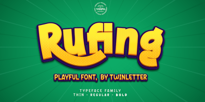
$12.00Introduce our newest font named Rufing. There are three alternatives in this font, thin, regular, and bold. which makes it easier for you to arrange a proportional and captivating design layout because the character of this font is suitable for use as logos and titles and of course it is also flexible in use in text and sentences. This handwritten font is perfect for children’s magazines, drink banners, games, posters, beverage, outdoor events, thumbnails, food banners, cheerful writing, film titles, quotes, titles, logos, and various kinds of projects you need, of course, your various design projects will be perfect and extraordinary if you use this font because this font is equipped with a complimentary font family, both for titles and subtitles and sentence text. start using our fonts for your amazing projects. - Stack Braille by Echopraxium,
$5.00This is a monospace font for the Braille alphabet. The idea came while exploring new ways to display the regular braille glyph ( 3 rows of 2 dots ). The glyph design is inspired by "stackable multiple board" games like the famous Vulcan chess (from Star Trek series) and the Qubic (3D tic-tac-toe). The stack is made from 3 levels, each level is a 3x3 grid with 2 "playable" cells (South-West and North-East). Each cell can be either empty, filled by a white square token or a black square token. The 3D effect is obtained by means of the classic isometric perspective. Lowercase letters use black tokens, while uppercase letters use white tokens. Most special characters (e.g. digits, *$#@, []{}() etc.. ) are also provided for special usages like program source code (see poster 5). - Pixel Engine by Sronstudio,
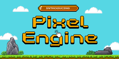
$23.00Unleash a nostalgic vibe with 'Pixel Engine', a font that pays homage to the golden era of gaming. This pixel-inspired typeface effortlessly blends the charm of retro aesthetics with a touch of modern design. Ideal for gaming logos, pixel art, or any project that craves a vintage arcade feel, 'Pixel Enginel' brings a playful nod to the past while staying firmly rooted in the present. Features: - Uppercase & Lowercase - Numeral & Punctuation - PUA Encoded - Multilingual support - Simple Installation - Work both on Mac and Windows Thank you very much :) - Pixel Retro by JK Creative,
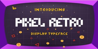
$16.00Introducing Pixel Retro - Display Typeface Font Pixel Retro is a bitmap font base on the from Namco Arcade Games. This Font is Perfect for Movie, Game, Film, Logo Brand and T shirt Design FEATURES - Uppercase and Lowercase letters - Numbering and Punctuations and Multilingual Support - Works on PC or Mac - Simple Installation - Support Adobe Illustrator, Adobe Photoshop, Adobe InDesign, also works on Microsoft Word Hope you Like it. **Note: All images on the demo is just for preview purpose only and not actually included on the files** - Plain Stupid by PizzaDude.dk,
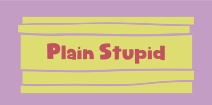
$17.00Really, there is nothing stupid about this font. In some strange and weird way, I just thought that the name sounded like something eye-catching - in the same way that the font is eye-catching! It may look like your average comic font, but it's not! I carefully put a lot of funk, twist, comic and a spoonful of pizzadude into each and every letter. The result is a bouncy crazy looking comic font. Oh, I almost forgot - I topped the letters with a spoonful of grafitti mixed with the sounds of a party...that's the recipe for this lovely multilingual font! :) - Pondicherry by Hanoded,
$15.00Pondicherry is a nice city in the South-East of India. It has changed colonial hands over time, but after the last colonial power (the French) left in 1954, it reunited with India. I have always liked the name Pondicherry. It evokes something happy and exotic and I guess I had the same feeling when I developed this font. Pondicherry font is an outlined affair with an uneven baseline and an overall 'happy' feel. It is an all caps font, but upper and lower case differ and you can use them together. Pondicherry comes with a treasure chest full of diacritics. - Nixin by Kinobrand,
$33.00A nixie tube is a technology from the 50’s used to display numerals that are composed by metal filaments that light up much like a lamp bulb. Due to their beauty these little numerals (0-9) are a love case for any designer, and formally it’s where the inspiration for the Nixin typeface came from. All the other typeface characters and weights are an interpretation from the original 10 numerals, always keeping the same minimalistic spirit and formal elegance. Nixin is a geometric and regular typeface, with a vintage touch and a bit of modernism.
