3,050 search results
(0.007 seconds)
- Bellasia Hawainis by Inermedia Studio,
$15.00 Introducing the beautiful and delicate handmade Bellasia Hawainis Font. Fonts designed for your design and business needs. It has beautiful and charming letters with more than 150 characters. Subtle curves will make your business stand out even more in the market. A few Glyph and Swash will add a punch to your masterpiece.
 - Fostone by GlyphStyle,
$17.00 Fostone is a signature style font with a natural looking ballpoint pen. Luxurious and elegant font. Font family with 4 version: regular, bold, italic, bolditalic. This signature font is perfect for, watermarks, branding, business, business cards, product logos, etc. – Font feature Uppercase, Lowercase, Numerals & Punctuations, Stylistic Alt, swsh (ending swash), Ligature, Multilanguage
 - Carlosea by Portograph Studio,
$20.00 Carlosea is a serif while classic elegance is still maintained. It will boost your design stand out! Carlosea is the perfect typeface for any kind of your project, such as advertisements, branding, graphic design, quotes, wedding design, logo for online or offline business, photography, and others. Make your business more elegant beautiful!
 - Calling Card JNL by Jeff Levine,
$29.00In today's day and age, the term "calling card" refers to a prepaid means of making long distance phone calls. In a more gentler time, the calling card (similar to a business card) was what a gentleman presented to a housekeeper or butler when visiting (calling) on a friend or business contact. - Wondrous by Sinfa,
$14.00 Wondrous with some new ideas with fonts that are perfect for all types of your project with alternative fonts both upper and lowercase and several types of underlines, such as advertising, branding, quotes, wedding designs, graphic designs, logos for online or offline business, photography, and more. . -other. Make your business more memorable!
 - Ergonomique by Monotype,
$31.99 Ergonomique is a humanist sans serif typeface that has been designed to be efficient and comfortable to use across all applications. Ergonomique’s personality is defined by its spurless lowercase glyphs – the stems are truncated and blend into their adjoining arcs, as can be seen in the a/b/d/m/n/p/q/r/u characters. Ergonomique is ideal for branding and display purposes, but also performs well as body copy if you’re seeking a unique style for your text. With its nine weights and complementing italics, Ergonomique is highly versatile, especially when you consider that there are small caps and old style figures included, along with a Latin Extended character set. Key Features: • 18 font family – 9 weights in Roman and Italic • Small Caps, Ligatures, with Proportional, Old Style, and Small Cap figures, plus Fractions, Numerators, Denominators, Superiors, and Inferiors • Full European character set (Latin Extended) • 800+ glyphs per font.
 - Trippy Tarot by Mix Fonts,
$13.00 MIX TRIPPY TAROT is a witchy handwritten serif, sans serif AND a dingbat set. The perfect balance of cute and creep to complete any of your crafty woowoo, astrology, zodiac, mystic, spellbook, or magic projects. This family of fonts come with an abundance of glyphs, alternates and ligatures. The dingbat set is a collection of 36 doodles that perfectly go with the regular or serif Trippy Tarot font (or any other font, for that matter)! WHAT YOU'LL GET: Mix Trippy Tarot Regular Mix Trippy Tarot Little Sans Mix Trippy Tarot Dingbats Mix Trippy Tarot Regular comes with the following glyphs: ABCDEFGHIJKLMNOPQRSTUVWXYZ abcdefghijklmnopqrstuvwxyz 0123456789 !@$#%^&*()`~♥❤•· ÷×+−±≈=≠≥≤[]:;’”,.|/?{}“”‘’-–—_… ©®™‹›«»°¹²³ªº¡¿₱¢€£¥½¼¾¶§№† ÁÀÂÄÃÅĂĀĄÆĆĈČÇÐĐÉÈÊËĖĒĘĜĤIÍÌÎÏĪĮĴŁŃÑŇ ÓÒÔÖÕŌŐØŒŔŘŚŜŠȘŤȚÚÙÛÜŮŰŬŪŲẂẀŴÝŶŸŹẐŽŻÞ áàâäãåăāąæćĉčçðđéèêëėēęĝĥıíìîïīįĵłńñň óòôöõōőøœŕřśŝšșťțúùûüůűŭūųẃẁŵýŷÿźẑžżþß Ligatures: ee ff fl ft ll mm nn ss tt Alternate: Q Mix Trippy Tarot Regular comes with the following glyphs: ABCDEFGHIJKLMNOPQRSTUVWXYZ abcdefghijklmnopqrstuvwxyz 0123456789 !@$#%^&*()`~♥❤•· ×+−=[]<>:;’”,.\|/?{}“”‘’-–—_…©®™‹›«»°¹²³ªº¡¿₱¢€¥Þþß Fellow witches, enjoy!
 - Capraia by CAST,
$45.00 Capraia is a book typeface, with a heavily quirky look when shown at big sizes, and with an irregular but attractive rhythm at text sizes. Capraia Book and Regular are designed specifically for continuous texts: Book meets a current preference of Italian publishers for lighter faces, while the slightly heavier Regular is intended for the wider international market. True to its vocation for publishing, Capraia has a big x-height, medium contrast and wide bracketed serifs. Furthermore, its slightly flattened curves, some unconventional roman letterforms (a, G, Q) and the 'slanted roman' italics, along with design details such as ball terminals, give to the whole family a very contemporary appeal. Originally the design was intended as a tribute to Caslon's Great Primer but at a certain point the designer was enthralled by Baskerville. Capraia is the unpredicted and original result of that intense experience.
 - Acarau Display by Tipogra Fio,
$30.00 Acarau is a 6 fonts display typeface with high reverse contrast—since from Roman capitals and calligraphy, usually Latin alphabet letters have thiner horizontal steams and thicker verticals, these features being optical or visual—quite adequate for logos, headlines and posters. Moreover, the style of the typeface is inspired by Italics form factor: lowercase letters having less strokes to make their shapes; A has one story; E has one stroke shape, such as K, G, Y and Z; F has a descent. To give it more calligraphic feeling, there is contrast for uppercases as well, this is very perceived by the diagonal letters like A, K, M, N, V, W, X, Y and Z. J also has a descent. Q and R have natural swashes, but they have alternates in case the costumer want to go for more usual forms—including accent marked letters. Acarau is a 12 months project, the contrast for uppercases were increasing as the process was made. In the middle it is found suitable blend the letter shapes with the history of Brazilian music from the 70’s and 80’s, since the font has a tropical, warm, spicy and nostalgic feeling. Songs from bands and singers that emerged on Rio de Janeiro like Paralamas do Sucesso, Cazuza, Lulu Santos and Kid Abelha bring the beach accent and rhythm that this font has. OpenType features complement the set, which has Multi-Lingual support for a comprehensive Latin set, including Vietnamese—meaning more than 640 glyphs: Case-Sensitive forms, so symbols can properly align to uppercase letters; Ligatures, to better reading for z_y and L_I, and style for s_s, w_w_w; also for ease arrows and punctuation typing; Stylistic Set 1: two story a—including accent marked letters; Stylistic Set 2: two story g—including accent marked letters; Stylistic Set 3: diagonal (usual) z—including accent marked letters; Stylistic Set 4: flower i and j dots; Contextual alternates; Terminal forms, for R and Q; Ordinals.
 - Pendekar by Goodigital13,
$20.00 This font is perfect for fashion brand, apparel, shoes company, business card, logo brand, clothing, and also business brand name like Coffeshop or Bakery. elegant and classic handwritten font. Whether you’re looking for fonts for Instagram or calligraphy scripts for DIY projects, Deventer will turn any creative idea into a true piece of art!
 - Adisha Script by Nowlystudios,
$12.00 Adisha Script is a sweet calligraphy writing but maintains its elegance. This will make your design stand out! Adisha Script is the perfect typeface for any kind of project you have, such as advertising, branding, graphic design, quotes, wedding designs, logos for online or offline businesses, photography and more. Make your business more beautiful! Thank's !
 - Jasmine Tea by Goodigital13,
$20.00 Characters So beautiful on invitation like greeting cards, branding materials, business cards, quotes, posters, and more!!
 - Mood Boosters by Bluestudio,
$10.00 Mood Boosters Handwritten Font Duo is a perfectly font duo for all your design project needs. Create your perfect design with Mood Boosters Handwritten Font Duo. Try this font for all kinds of your business projects like: logo design, business card, mood board, greeting card, magazine ,headline, social media design, watermark and more, and it will all look perfect.
 - Komet Pro by Jan Fromm,
$65.00 Komet is a sturdy typeface with a calm and upright feel. Although it derives inspiration from classical English sans-serifs, it’s not too closely related to that model. Komet, instead, feels rather more lively and contemporary. Its compact spacing, low stroke contrast and heavy dots and accents give it an almost monolinear quality. The diagonals are slightly curved and the counters of the round letters such as b, o and q are generously wide. The muted, understated middle weights are built for extended body copy, while Komet’s thin and dark weights look brisk and assertive and make for subtly expressive headlines. Komet is an ideal choice for editorial design, branding and corporate design. The Komet Pro family comes in eight weights with matching italics, from Thin to Black. Each font contains around 850 glyphs, including a rich repertoire of OpenType features. Small caps, ligatures, ten different figure sets with matching currency symbols, stylistic alternates and arrows make Komet Pro a comprehensive toolkit for ambitious typography.
 - Komet by Jan Fromm,
$45.00 Komet is a sturdy typeface with a calm and upright feel. Although it derives inspiration from classical English sans-serifs, it’s not too closely related to that model. Komet, instead, feels rather more lively and contemporary. Its compact spacing, low stroke contrast and heavy dots and accents give it an almost monolinear quality. The diagonals are slightly curved and the counters of the round letters such as b, o and q are generously wide. The muted, understated middle weights are built for extended body copy, while Komet’s thin and dark weights look brisk and assertive and make for subtly expressive headlines. Komet is an ideal choice for editorial design, branding and corporate design. The Komet family comes in eight weights with matching italics, from Thin to Black. The glyph set of each font contains around 520 glyphs and provides good everyday support for most Latin-based languages. For a wider range of advanced OpenType features, Komet Pro is also available.
 - Marvin by Canada Type,
$29.95 The objective of this font was to try and find out how far back in the designer's life this obsession with letters began. The challenge was to draw, from memory only, two sets of caps that recall older Looney Tunes and Merrie Melodies lettering. The experiment was a success, which means that the designer's got it bad since he was, like, four! The Marvin set includes three stylistic variations (Regular, Round and Shadow), with extensive multi-script language support covering Western, Central and Eastern European languages, as well as Cyrillic, Greek and Vietnamese. A few extra alternates and interlocking ligatures are also included, all adding up to over 650 characters in each font. And here we are. Marvin is a great cartoon font that can help you build your very own Illudium Q-36 Space Modulator, so you can trigger that earth-shattering kaboom. Then you're on your way to claim this planet in the name of Mars. Isn't it lovely, mm?
 - Pedantic by Larin Type Co,
$15.00 Pedantic it's a classic, delightful and charming, sounds like a perfect melody, flows like water,working with her is a pleasure. This font duo includes a monumental serif and a calligraphy script. The Serif font is contracting and elegant, will emphasize your taste and impress with its sophistication and simplicity. The calligraphic Script is elegant, beautiful and carefully assembled, he includes many alternates for uppercase and lowercase as well as swashes. Script and Serif looks great both separately and together and they will be a wonderful addition to your font library.This font is easy to use has OpenType features and all characters in this font have PUA encoding. Includes: Full alphabet with Uppercase and Lowercase A-z for Script Full Capital alphabet A-Z for Serif Numbers, fractions for Script and Serif Punctuation and symbols for Script and Serif Alternates for Serif "Q, K, R, ampersand" Alternates uppercase for Script Alternates lowercase for Script Ligatures for Script "ff, oh, ol, ok, or, os" Swashes for Script
 - Hadriano by Monotype,
$29.99When traveling in Paris, American designer Frederic W. Goudy did a rubbing of a second century marble inscription he found in the Louvre. After ruminating on these letterforms for several years, he drew a titling typeface in 1918, all around the letters P, R, and E. He called the new face Hadriano" as that name was in the original inscription. Robert Wiebking cut the matrices, and the Continental Typefounders Association released the font. Goudy designed a lowercase at the request of Monotype in 1930, though he didn't really like the idea of adding lowercase to an inscriptional letterform. The lowercase looks much like some of Goudy's other Roman faces. Compugraphic added more weights in the late 1970s, and made the shapes more cohesive. Hadriano has nicely cupped serifs and sturdy, generous body shapes. Distinctive individual letters include the cap A and Q, and the lowercase e, g, and z. Hadriano™ is an excellent choice for impressive headings and vigorous display lines." - Diablo by Monotype,
$29.99Jim Parkinson's Diablo typeface is a single weight display design. The look comes from samples found in early 20th century books on hand-lettering books, as well as general poster lettering styles from that same of the period. Diablo has a touch of the Arts and Crafts" movement in its appearance, and it also looks rather heavy. It is a unicase design, in that there is no real "lowercase." Some glyphs on the uppercase keys are alternates to the capital-style forms found on the lowercase keyboard, like A, E, F, H, J, K, M, N, Q, R, V, W, and Z. In fact, the uppercase itself is a bit more decorated and round than the lowercase. Nevertheless, the upper and lowercase letters may be freely interchanged with each other to create the best possible image for the text. The name of the typeface, Diablo, is another term for the devil, or Satan." - Normatica by CarnokyType,
$42.00 Normatica is a neutral typeface inspired by advertising letters used as letterings on shop windows during period of Normalization (the 60s–90s) in former Czechoslovakia. The complete font family consist of 24 styles in 6 weights (Thin–Black) with matching Italics where every style is followed by his Display counterpart. The difference between default and display styles is tighter spacing in Display fonts and different design of punctuation and diacritics accents. Beside the complete set of Latin, Normatica includes Cyrillic characters as well. Each font contains of alternative variation of some characters (j, t, y, Q) and includes a wide range of the Opentype features (for more details see pdf Specimen in Gallery section). Mixture of Normatica and Normatica Display can be effectively used for both text and display usage. It can be used in advertising, signage, corporate identities and various situations of editorial design. You can try two Demo styles in Medium weight fully for free.
 - Preto Sans OT Std by DizajnDesign,
$50.00 Preto is an extensive type family, which explores the function of serifs on readability and legibility. Preto consist of three subfamilies: Sans, Semi and Serif. Preto is designed for multilingual typesetting. All of the subfamilies have equal gray value but different texture which can be use to differentiate languages. Preto subfamilies have two text weights and two bold styles (Regular --> Bold, Medium --> Black). Every weight has a companion Italic style as well. Preto Sans OT Std The Sans version of Preto forms the basic skeleton of the family, it is decidedly simpler than the other styles (Semi and Serif). Although you can find many distinctive and unique elements in the details. The most visible elements are the tapered upper part of the letters. The capital letters have uniform widths achieving very different texture than traditional roman proportions. There are two different options for ligatures and alternative characters (J, Q, g, &) gives more variability for different languages.
 - Framer Sans by 23-Jun,
$35.00 Framer Sans is sans-serif condensed type-family, created by June 23 Foundry. It is a geometric, lightly robust, simple and clean font, with a low contrast width. Framer Sans perfectly conforms to the ever-increasing demand for a diverse set of weights and additional support for non-Latin languages. The type system consists of 7 weights that for the clarity and users convenience is labelled with numbers from 100 to 700 (100 for “Thin”, 200 - “Ultra-Light”, and so on till 700 for “Bold”). It supports full Latin (European) character set, as well as Turkish, Vietnamese, Greek (basic) and Cyrillic languages. Framer Sans includes alternate characters, ligatures, symbols and 253 country codes that perfectly expand the design’s capabilities. Numerals contain six figure sets and Roman numbers. The variety of choices is expanded with additional stylistic sets for lowercases "a" and "g", as well as 3 stylistic sets for Latin uppercases with crossbars and letter “Q”.
 - Houschka Alt Pro by G-Type,
$72.00 Houschka Alt Pro is a carbon copy of the Houschka Pro family with one key difference: the rounded signature glyphs A & W on the default positions swap places with their straight alternates. Houschka was named after Georg Houschka, a sadly defunct confectioner’s shop in Salzburg, Austria, which had a wonderful 1930s frontage and distinctively rounded letterforms in the sign above the door. Houschka Pro is the follow up to the original Houschka type family which first appeared back in 1999. Character shapes have been improved, kerning and spacing refined, and OpenType features include CE, Baltic, Turkish & Cyrillic language support plus small caps, 3 stylistic sets, contextual alternates, ligatures and 4 sets of numerals. Houschka is a clean and legible modern sans serif typeface which shares the humanist qualities of Gill Sans and Johnston but retains a uniquely charming character of its own (particularly in signature glyphs A, G, Q, W, u & w). The monolinear structure, rounded corners and rolling curves give Houschka a soft and friendly appearance.
 - Big Brush by Canada Type,
$20.00Big Brush is the result of me seeing Brush Script everywhere around me. Toronto signage is full of Brush Script. My last two trips to the West Coast showed me mostly Brush Script. Brush Script must be the most widely overused North American script font of all time. Don't we all know at least one restaurant or bar with its sign made in Brush Script? And aren't you just sick of the weird F, Q and T of Brush Script? Well, out with the old and in with the new. Big Brush was made as a replacement for Brush Script, and then some. While Brush Script has only the single familiar letters we all know, Big Brush comes in two fonts, so you can keep the design fresh the neat and keep them guessing at the same time. The next time you want to design something that calls for strong, fast brush calligraphy, do the world's bored eyes a favor and use Big Brush instead. - Drystick Geo Grotesk by deFharo,
$14.00 Drystick is a Sans Serif typographic family of Geo-Grotesque style with 8 pesos plus the italic versions all include small capital letters the symbol of Bitcoin (b #) and other cryptocurrency symbols. It is a geometric typography, minimalist, with neo-grotesque modulations. The typeface has alternative letters and numbers, small caps and advanced OpenType functions. The Italic versions have some of their own characters (&, @, Q, a, g, y), these versions have many optical corrections to balance the deformations created in many curves by the mere inclination of the letters, which in the case of This typography is 9 °. The drawn of the vectors is careful to obtain smooth curves and elegant appearance, the thicker versions have ink traps in the joints of the joints to use in small sizes. The Metric and the Kerning of all the versions I have reviewed individually to obtain maximum readability in any type of text and size.
 - Monocle by Reserves,
$39.99 Monocle is a clean and contemporary monospaced geometric sans that excels in titling, data and numerical settings due to its clear and systematic design. The capitals-only format increases the harmony between letter pairings, opposing the irregularity of mixed case fixed-width typefaces. Stylistically, Monocle has the feel of a neutral sans, yet its underlying structural finish exudes a strong sense of order and authority. Its geometric foundation is especially pronounced in the constructed round forms. With multiple stylistic sets, individual letters can be exchanged to fine-tune text settings for a unique custom type solution. Features include: -Basic Ligature set including ‘f’ ligatures (ae, oe, fi, fl, ff, fh, fj, ft, tt, th, ct, st) -Alternate characters (O, I, S, G, R, Q, _, $, ©, #, •, %) -Slashed zero -Full set of numerators/denominators -Automatic fraction feature (supports any fraction combination) -Extended language support (Latin-1 and Latin Extended-A) *Requires an application with OpenType and/or Unicode support.
 - Preto Sans by DizajnDesign,
$24.00 Preto is an extensive type family, which explores the function of serifs on readability and legibility. Preto consist of three subfamilies: Sans, Semi and Serif. Preto is designed for multilingual typesetting. All of the subfamilies have equal gray value but different texture which can be use to differentiate languages. Preto subfamilies have two text weights and two bold styles (Regular --> Bold, Medium --> Black). Every weight has a companion Italic style as well. Preto Sans The Sans version of Preto forms the basic skeleton of the family, it is decidedly simpler than the other styles (Semi and Serif). Although you can find many distinctive and unique elements in the details. The most visible elements are the tapered upper part of the letters. The capital letters have uniform widths achieving very different texture than traditional roman proportions. There are two different options for ligatures and alternative characters (J, Q, g, &) gives more variability for different languages.
 - Worthington Arcade by Device,
$39.00 Worthington Arcade is a classically-proportioned capitals-only type incorporating a selection of ligatures and alternates. It loosely resembles the hand-painted architectural lettering of the 30s to the 50s, exemplified by the likes of Percy Smith’s interior signage for the BBC or George Mansell’s lettering for the University of London and the signs found on London’s bridges. However, rather than a slavish copy of any historical model, it is more an examination and evocation of certain idiosyncratic quirks of civic lettering of the period, and an attempt to create a peculiarly English titling typeface. The round letters, for example the O, Q and C, are wider than the perfect circle usually found in such designs, while the straight-sided characters, usually drawn on a square, are narrower. This lends the whole a subtle elegance that is also emphasized by the raised crossbars on the H, E and F and extended lower leg of the E. Includes old-style numerals.
 - Marsden by J Foundry,
$25.00 Marsden is a bold, no-nonsense Grotesque. It was designed for display, branding, advertising, packaging or anywhere a strong voice is needed. Marsden is built on a geometric foundation, with just enough warmth to keep the style confident and lively. The family features 8 widths in 12 weights; from a Slim Hairline to an extremely bold Wide Super. The fonts flow from condensed to wide with design intent. The condensed forms feature flat sides and subtle curves, while the wider forms feature rounded sides and open curves. The character set is robust, covering extended latin. The default forms are contemporary with alternates including: single-story a, two-story g, curved terminal l, raised vertex M, rounded top A, fully rounded G, rounded leg R, straight tail Q and straight descender y, all separated into individual style sets for control and customization. Completing the family are the Text fonts where the weights, widths and spacing are adjusted for smaller use.
 - Runista by Struvictory.art,
$14.00 We would like to introduce our new Thin Line Geometric Font Runista. Runista is a linear font in folk style, lowercase is decorated with geometric elements. The typeface includes a Decorative and a Symbol version. Letters and symbols are perfectly combined with each other. The font is easy to use in various design programs or without any program. Runista Typeface is suitable for lettering posters, music albums, tattoos and photo overlays in hipster style. The font works great for both printing clothes and craft products branding and packaging. Also use individual letters and symbols to create logos and monograms. Runista Decorative contains stylistic alternates for letters O, Q, C, D, G and the most popular ligatures: bb, cc, dd, ee, ff, gg, ll, mm, nn, oo, pp, rr, ss, tt, zz, ty, ly, ct, sp, st, in, ch, ck, sh, ou, qu, th, ph, ge, ng, gn, gh, au QU. The font has extensive language support.
 - Agustrush by eyetype,
$16.00 Agustrush a work that is purely a result of handwriting, has a natural characteristic. this is perfect for invitations, signatures, blogs, social media, business cards, product brands. Agustrush a work that is purely handwritten, has its own characteristics with the style of monoline It is perfect for invitations, signatures, blogs, social media, business cards, product brands, also equipped with 52 ligature.
 - Angle - Unknown license

- Ellington Manor by BA Graphics,
$45.00A great look for formal announcements, book work, business, high-end ads and terrific for text as well as headlines. - Brilliant Starlight by Silverdav,
$14.00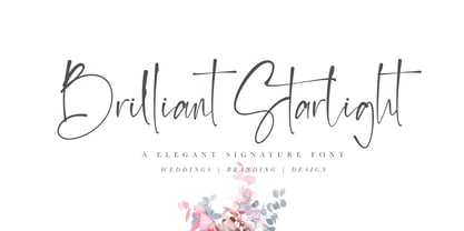 Brilliant Starlight is a very elegant and simple handwritten font, suitable for business cards, signatures, brochures, logos, quotes and more.
 - Joshico by Supfonts,
$15.00 Joshico - a new fresh handmade calligraphy font. Very suitable for greeting cards, branding materials, business cards, quotes, posters, and more!
 - Soothing by Twinletter,
$14.00 Soothing is a signature font created in elegant modern handwriting, with a natural and stylish flow. This font has the perfect shape for your personal branding and business casual designs. This font is perfect for business cards, photography studios, signatures, interior designs, names of models, coffee late, traveling, weddings, cosmetics, jewelry. Start using this font to add an authentic and heartfelt vibe to any design project
 - Insta Story by Bluestudio,
$6.00 Insta Story is a matching font family, consisting of a family of 10 sans serif font styles and paired with 1 script that we made to look like hand writing, so that it looks natural. Insta Story is perfect for all types of your business projects such as: logo design, business cards, greeting cards, magazines, newspapers, social media design, watermarks and more. Happy designing...! Thanks.
 - Imagine if fonts could dance. Well, if any font were to throw on a pair of dancing shoes and hit the dance floor, Unity Dances by S. John Ross would be busting moves that would make even the most res...
- Delores by Larin Type Co,
$16.00 DELORES This is an elegant decorative typeface, it has a wide range of uses, it is perfect for creating template logos, wedding invitations, greeting cards, labels, book and magazine covers, business cards, branding for your business and much more. Delores has only Capital letters and includes many alternatives, with them you can make your project more expressive and elegant. This font is easy to use and has OpenType features.
 - Beatgh by Skiiller Studio,
$20.00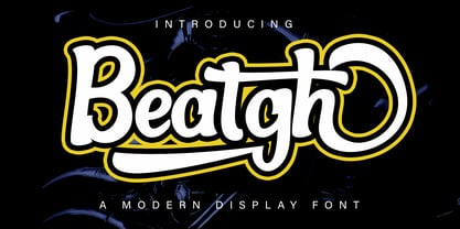 Beatgh is a modern, cool, beautiful, and very suitable display font to support your presentation and support in marketing your products and business
