1,989 search results
(0.009 seconds)
- Helinda Rook by Monotype,
$29.99The Helinda Rook font is a popular choice in advertising, invitations, greeting cards, and wherever a formal hand-lettered or engraved look is desired. Helinda Rook is an elegant connecting alphabet font based on formal handwriting. - Brock Restar by Letterena Studios,
$10.00 Brock Restar is a modern and classic display typeface that has its own unique style and fashionable look. This typeface is perfect for an elegant and luxurious logo, book or movie title design, fashion brand, magazine, clothes, lettering, quotes, and so much more.
 - Rick Griffin by K-Type,
$20.00 The Rick Griffin fonts are based on the 1960s psychedelic poster lettering of the Californian artist. Rick Griffin is the regular font without outlines. The Rick Griffin Contour font has the additional outline characteristic of many Griffin posters, and the matching Rick Griffin Contour Ground font can be overlapped to create bicolor artwork.
 - La Roche by Calamar,
$15.00 Meet the new contemporary calligraphy font duo that have handwritten and organic look - La Roche Font Duo. This beautiful font pair is for those who are needing of elegance and stylish for their designs and particularly well suited for wedding invitations, cards and feminine branding. I have wanted to create such combination a long time and can’t believe that it is here. I’m super excited and hope you’ll estimate it too. Now all you need for perfect wedding invitation design is in one product. I think this decision will help you to save your time. La Roche Font Duo includes two beautiful fonts - elegant Script and Serif font. It’s a beautiful font combo with rough edges to maintain the hand-written look. La Roche Script has a textured look and includes full set of Uppercase and Lowercase Basic Characters, Numerals and Punctuation. Also it contains ligatures and a lot of stylistic alternates to perfectly re-create natural calligraphy. La Roche Serif is a classy high contrast font with a textured look that contains only uppercase characters, numerals and punctuation. All fonts available for Western European, Central European and South Eastern European Languages.
 - Mock Chalk by Throndsen,
$10.00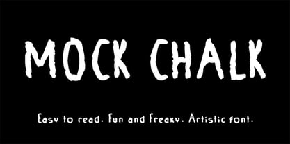
- Kids Yock by PizzaDude.dk,
$20.00 Kids Yock is an updated and cleaner version of my popular comic font Kids Rock. Even though this font is more steady and clean, I did my best to keep the characteristics of the original font, which includes influences from grafitti and comics.
 - Lazy Rock - Personal Use - Personal use only

- punk rock rummage sale - Unknown license

- Rocking the Kasbah NF by Nick's Fonts,
$10.00This lively script is based on a handlettered offering from The Hunt Brothers, which they called simply "Ornamental Italic". Ornamental, yes, but there’s also a lot of action and attitude in this typeface. Please note that, due to the extreme slant of the characters, spacing in the font has been optimized for upper- and lowercase use. Both versions of this font contain complete Unicode 1252 (Latin) and Unicode 1250 (Central European) character sets, with localization for Romanian and Moldovan. - Hand Scribble Sketch Rock by TypoGraphicDesign,
$19.00 U-P-D-A-T-E (more glyphs, bug fixed, MAC (Desktop) + WIN (Office) Version) CHARACTERISTICS An own interpretation of a classic egyptienne/slab serif typeface with modern and fancy handmade haptics/hatching. The 3 styles/weights fits perfectly in each font size. From light till bold. All 3 styles are handemade sketched for diverse display size. APPLICATION AREA This heavy, sketched, scribbled, handmade slab serif font “Hand Scribble Sketch Rock” with many language support would look good in headlines. Magazines or websites, party flyer, movie posters, music Poster, music covers or webbanner. TECHNICAL SPECIFICATIONS ■ Font Name: Hand Scribble Sketch Rock ■ Font Weights: Regular, Bold, Light ■ Fonts Category: Display for Headline Size ■ Font Format: OpenType OTF + Windows TrueType TTF ■ Glyph Set: 361 glyphs ■ Language Support: Basic Latin/English letters, Central Europe, Baltic, Romanian ■ Specials: alternative letters and ligatures (with accents & €) ■ Design Date: 2013 ■ Type Designer: Manuel Viergutz ■ Font License: Desktop license, Web license, App license, eBook license, Server license
 - VU Rock N Roll by VisualizeUnited Fonts,
$65.00 VU Rock nRoll is a block display typeface, that comes in English and Greek characters, numerals and a very basic set of marks. It was inspired by graffiti and custom made wooden type. Having a rough look, it feels appropriate for short messaging and titles since its design is dynamic. Posters, labels and tees would host beautiful designs, that can stand out! Choose your text and rock n roll!
 - Mini Pics Red Rock by NicePrice Font Collection,
$4.99 - Roc Grotesk by Kostic,
$40.00 Roc is a sans serif grotesk inspired by American wood types from the end of the 19th century. With nine weights in five widths, this family contains 45 fonts in total. The character set supports Western and Central European languages, as well as Turkish. Roc Grotesk comes in a range of five widths: Compressed, Condensed, Normal, Wide and ExtraWide, in order to cover a wide scope of applications. Although the styles at both ends of each range are made in their most pronounced form in terms of width and weight, they are not taken to such extremes as to become absurd, and are quite usable in display settings. The Normal width keeps all its nine styles in proportionally similar widths. The Compressed width, however, is deliberately made to be disproportionate, so that every style takes the least possible horizontal space. That is why the contrast between Compressed Thin and Compressed Heavy style is substantial. As the weights progress from Thin to Heavy, the stroke contrast becomes more prominent. It is intentionally exaggerated in heavier weights, which is particularly apparent in the uppercase E and R of the Black and Heavy style. Roc has a large x-height and relatively short descenders and ascenders. No uppercase letter descends below the baseline, so the lines of an all-caps text can be packed tightly on a poster or a headline. The Regular style is somewhat generously spaced, as it is most likely to be used for setting longer passages of text. Its Bold counterpart is spaced in such a way that the width of the text column will be similar to the text set in Regular. Tabular figures in these two styles have exact matching widths, so for example, you could emphasize one row of numbers in a data column without visually disrupting the vertical order of the table. The lowercase g and r have alternatives to accommodate what most designers expect from a typical Grotesk typeface. The single-story g and the cut-off r are accessible via the OpenType feature.
 - Cardholder Dispute SRF by Stella Roberts Fonts,
$25.00 From the remnants of an old freeware font by Ray Larabie comes Cardholder Dispute SRF. Thoroughly rebuilt from the ground up by Jeff Levine, this post-80s techno lettering can also double as a pop culture font evoking 60s or 70s rock concerts and hippie colonies or (as the name implies) credit cards. The net profits from my font sales help defer medical expenses for mysiblings, who both suffer with Cystic Fibrosis and diabetes. Thank you.
 - Dirty Money SRF by Stella Roberts Fonts,
$25.00 Dirty Money SRF is a novelty font with a limited character set emulating the lettering found on U.S. currency. The typeface was designed by Brad O. Nelson of the Brain Eaters Font Company. The net profits from my font sales help defer medical expenses for my siblings, who both suffer with Cystic Fibrosis and diabetes. Thank you.
 - Marginal Notes SRF by Stella Roberts Fonts,
$25.00 Marginal Notes SRF is from the creative pen of Ray Larabie whose Typodermic foundry graces MyFonts.com. Designed to emulate the look of handwritten words using a felt tip pen, this font can be perfectly applied to any project where notations, subtext, memos or other forms of personalization with a human touch is required. The net profits from my font sales help defer medical expenses for my siblings, who both suffer with Cystic Fibrosis and diabetes. Thank you.
 - Dastardly Deeds SRF by Stella Roberts Fonts,
$25.00 This design from Ray Larabie (and adapted by Jeff Levine) is so unusual. The lettering lends itself to messages of sinister intent or horror movie titles. The net profits from my font sales help defer medical expenses for my siblings, who both suffer with Cystic Fibrosis and diabetes. Thank you.
 - Fitz Sans SRF by Stella Roberts Fonts,
$25.00 Fitz Sans SRF was contributed to the Stella Roberts Fonts project by graphic designer Matt Yow after receiving word of the project from Ray Larabie of Typodermic Fonts. A light, attractive text face, Fitz Sans SRF also lends itself well to headlines and titles. The font is available in both regular and oblique versions. The net profits from my font sales help defer medical expenses for my siblings, who both suffer with Cystic Fibrosis and diabetes. Thank you.
 - Surely You Jest NF by Nick's Fonts,
$10.00A late nineteenth-century type specimen catalog from Farmer, Little & Co. yielded this droll little typeface, originally called "Arbor". The distinctive decorations of the face suggested a fool's cap, and thus the font got its current name. And don't call me Surely. - Loading Dock NF by Nick's Fonts,
$10.00This typeface is patterned after the lettering produced by the Marsh Stencil Making Machine, which was an indispensable part of industrial shipping departments in the mid-twentieth century. The font is unicase, but includes a “this side up” pointing hand at the section mark position, and a recycle symbol at the German double-s position. Both versions of the font include 1252 Latin, 1250 CE (with localization for Romanian and Moldovan). - Sports Jock JNL by Jeff Levine,
$29.00 Sports Jock JNL brings you a serif-style sports font built on the classic design of an early-1900s block font with chamfered angles.
 - Boss Jock JNL by Jeff Levine,
$29.00 The title and credits from the 1965 film “Strange Bedfellows” were hand lettered in a style typical of the early-to-mid 1960s – casual and playful. This brought to mind similar type designs used by many radio stations when advertising their disc jockeys as cool, hip and fashionable in the slang term of the day “boss” jocks. Boss Jock JNL is available in both regular and oblique versions.
 - M Rocky PRC by Monotype HK,
$523.99 M Rocky PRC is a graphic style Simplified Chinese typeface. Graphic font designs have strong personalities and visual impact. Graphic style Simplified Chinese fonts feature decorative elements and pronounced graphics characteristics, suitable for catching attention in display applications.
 - Smart Frocks NF by Nick's Fonts,
$10.00 A sign in a London storefront, ca. 1930, pitching—surprise!—Smart Frocks provided the visual cues for designing this typeface. Singularly stylish, hip and haughty and decidedly Deco, this is the smart font to use! This font contains the complete Latin language character set (Unicode 1252) plus support for Central European (Unicode 1250) languages as well.
 - M Rocky HK by Monotype HK,
$523.99 M Rocky HK is a graphic style Traditional Chinese typeface. Graphic font designs have strong personalities and visual impact. Graphic style Traditional Chinese fonts feature decorative elements and pronounced graphics characteristics, suitable for catching attention in display applications.
 - Sock Hop JNL by Jeff Levine,
$29.00Back in the 1950s and 1960s a popular event was the sock hop - when kids would meet in the school gymnasium, kick off their shoes and dance to the popular records of the day. Sock Hop JNL recalls those simpler times. - URW Dock Condensed by URW Type Foundry,
$35.99URW Dock Condensed is the matching complement for the URW Dock. Including 20 additional condensed styles the URW Dock Condensed is the space-saving alternative in the URW Dock family. URW Dock is a contemporary geometric type family rooted in the square sans genre. Inspired by the square sans typefaces of the 60s, it is a reinterpretation and enhancement particularly designed for today’s requirements of a multipurpose font: to work excellent in print and screen environments. Including a wide range of styles, an extended character set and a careful composition, it has the ability to give brands, artworks, and interfaces a modern, professional and unique touch. Its high legibility and clear informative and technological appearance are perfectly suitable for infographics, signage and way-finding systems. And especially when embedded in app, gaming and infotainment software it will display its strength. While the upright styles communicate a clear, instructional and informative message, the italics express an industrial, dynamic and forward-thinking spirit. An extensive language support, several figure sets and a wide range of OpenType Features will make the URW Dock font family a perfectly suitable partner for a wide range of print, web and app projects. - Ranger Rays Rocketeers SRF by Stella Roberts Fonts,
$25.00 Ranger Rays Rocketeers SRF was originally a freeware font on Jeff Levine's old site, but needed a lot of reworking and cleanup to be user-friendly. Jeff did all of the fixes and provided this charming retro-style font of space-age dingbats to the Stella Roberts Fonts project. The net profits from my font sales help defer medical expenses for my siblings, who both suffer with Cystic Fibrosis and diabetes. Thank you.
 - Hem And Haw SRF by Stella Roberts Fonts,
$25.00 Hem and Haw SRF is another Ray Larabie original for Stella Roberts Fonts. Rebuilt from Ray's former freeware design "Stitchen", the lettering looks as if it were stitched into fabric. The font now is more complete with foreign characters and additional accents, punctuation and currency symbols. The net profits from my font sales help defer medical expenses for my siblings, who both suffer with Cystic Fibrosis and diabetes. Thank you.
 - Big Jim Roberts SRF by Stella Roberts Fonts,
$25.00 Big Jim Roberts was my dad. A dedicated family man who taught us about faith, values and love is missed by our family. Jim just about did it all. He was a military man, a police officer, a power company engineer and a photographer. This typeface (which is comprised of a bold lower-case alphabet) has a 70s retro feel. Jim might have like it. The net profits from my font sales help defer medical expenses for my siblings, who both suffer with Cystic Fibrosis and diabetes. Thank you.
 - Rocky Mountain Spotted Fever - Unknown license

- Spinner Rack Pro BB by Blambot,
$10.00 Spinner Rack Pro BB is a new and improved version of the classic Blambot typeface, Spinner Rack BB! New spacing, kerning, manga characters, barred-I correction, additional accented characters, autoligatures, contextual alternates, and a plain bold weight for the first time!
 - JFRockOutcrop - Unknown license

- Squealer - 100% free

- Brothers of Metal - Unknown license

- Peanut Gallery NF by Nick's Fonts,
$10.00Every type library needs a generic, comicbook-style “POW!” font, and this one is ours. Breezy, bouncy and bold, it’s the perfect choice for rock-em, sock-em headlines. Both versions of the font include 1252 Latin, 1250 CE (with localization for Romanian and Moldovan). - VVDS Suffer by Vintage Voyage Design Supply,
$10.00 Do you hear that sound of Dick Dale's guitar? Here it is! Introducing you a new font family with retro surf rock vibes! Straight outta retro vinyl covers and surf gig posters to your font collection! We're all missed the sun, so grab this family and get some of the summer vibes. No matter what your next design project – a tiki t-shirt collection / summer rock festival or gigs / greeting cards / or a header for your new zine, - you'll get your goals with this family. A lot of alternates will give you a hand written's mood and absolutely unique typographic style. Up to 10 styles for some of them. Open Type Features as Stylistic Alternates, Small Caps and Fractions. Three styles: Clear, Roughen and Scratched. Three widths: Light, Regular and Bold.
 - Bornholm Allinge by Trine Rask,
$25.00 Bornholm Allinge is named after a village "Allinge" on the only rocky island in Denmark "Bornholm" It is the third face in a series of rough stone cut typefaces, that shares proportions, but differs in any other aspect like different pieces of rock. It is a powerful face, but still very friendly. Good for very big sizes, but can be used for small texts, movie titles, cartoons …
 - Petroglyph by ParaType,
$25.00PT Petroglyph™ was designed by Ekaterina Kulagina and licensed by ParaType in 2002. The type was created on the basis of petroglyphs (rock-carvings) that are known in 77 countries. They remained in a form of geometrical drawings in the caves of North Spain and France. Scientists claim that the radial spread-out of circles or center-pointed circles that are usually depicted show the development of solar symbolism at that period of time. We know for sure that such mysterious signs as drawings carved on rocks already existed 40 centuries ago. - Bornholm Sandvig by Trine Rask,
$25.00 Bornholm Sandvig is named after the village, "Sandvig", on the only rocky island in Denmark, Bornholm. It is the second face in a series of rough stone cut typefaces, that shares proportions, but differs in any other aspect like different pieces of rock. It is a powerful face, but still very friendly. Good for very big sizes, but can be used for small texts, movie titles, cartoons, etc.


