7,528 search results
(0.015 seconds)
- Linotype Minos by Linotype,
$29.99Linotype Minos is part of the Take Type Library, chosen from contestants of Linotype’s International Digital Type Design Contests of 1994 and 1997. This fun font was designed by Swiss artist Christian Goetz, who named it after King Minos of Crete of the Bronze Age. Typical of scripts of this time were the ornamental borders around the characters, found on palaces of Knossos, Phaistos and Mallia. These borders surround every character of Linotype Minos, making it exclusively for headlines in larger point sizes. Single characters can also be used as initials mixed with other alphabets, especially with constructed sans serif and modern serif fonts. - Kelasik Handmade by FadeLine Studio,
$15.00 Kelasik a new handmade script with a style natural, sweet and simple. Made with great care to provide the natural and modern elements. This font will look beautiful if used single even with other pairing fonts. The great thing about this font is you can find some style when you use it, examples such as natural handwriting style, unique, simple, elegant, and bold. With a style like this, this font will be suitable in use for logo's, branding projects, homeware designs, product packaging, mugs, quotes, posters, shopping bags, logo's, t-shirts, book covers, name card, invitation cards, greeting cards, and all your other lovely projects.
 - Exoner by Twinletter,
$15.00 Exoner is a worthy graffiti font for you to use in your particular project; by using this font, you will attract a lot of attention from the audience since your project’s appearance is neat, charming, unique, and of high quality. All of your projects will be evaluated for their suitability and uniqueness. This graffiti font is great for product logos, poster titles, headlines, packaging, film titles, logotypes, gorgeous writing, and trendy graffiti designs, among other things. Of course, if you utilize this font in your numerous creative projects, they will be perfect and outstanding. Use this typeface right away for your one-of-a-kind and remarkable projects.
 - Flinscher by Greater Albion Typefounders,
$16.00 The Flinscher family contains twenty display typefaces, in weights that vary from light to black, and widths that extend from condensed to expanded. The family’s design inspiration traces its roots to the early portion of the twentieth century. In essence, it is a calligraphic script typeface family with blackletter influences. The letter forms are decorative and distinctive, yet clear and easy to read, and in use set up a regular rhythm that leads the eye from character to character. The Flinscher typefaces are well suited to design work that needs to combine formality with fun. Just the thing for a certificate or a book cover!
 - Thunder Inferno by Mans Greback,
$79.00 Thunder Inferno is a gothic black metal typeface with sharp serifs. Rooted in the aesthetics of heavy metal and the occult, this typeface is a harbinger of darkness and intensity. Evocative of Halloween and gothic grandeur, Thunder Inferno also captures a march toward darkness. It serves as a rebellious voice for skate culture and alternative lifestyles. Crafted exclusively in uppercase, this font is a growl in typographic form, a visual cacophony that grabs your attention and refuses to let go. Capitalize the first and last letters of any word for symmetrical heavy metal style. Example: Heavy metaL Enclose any word in < > ( ) [ ] { } to give it wings. Example: [HawkstylE]
 - Ballon Midair by Nathatype,
$29.00 Wanna make your branding radiate elegance? Something that’s versatile, original, stylish, and eternal? Get ready to explore to a world of magic, laughter, and butterflies. Your branding will make everyone happy! Balloon Midair-A Handwritten Font A beautifully handcrafted font that’ll make your guests sing and elevate your projects! Every stroke and curve was created to spread happiness and elegance. Use it to create standout headings, promote your online sales, Instagram quotes, and even printed materials like business cards, t-shirts, or invitations. Balloon Midair includes Multilingual Options to make your branding globally acceptable. Features: Ligatures Stylistic Set PUA Encoded Numerals and Punctuation Thank you for downloading premium fonts from Nathatype
 - Emmeline by Dear Alison,
$19.00 There's something about the endless variations of handwriting, the tactile process of pen, pencil or brush to paper, and the personal and ephemeral quality as a whole. I recently came across some old handwritten letters from when my younger sister was going to college, and as soon as I saw them, a flood of memories came back to me. All just from seeing her handwriting. That's just one thing handwriting can do. I hope you find enjoyment in my sister's handwriting as much as I still do. This font is complete with alternates that will auto-typeset via the ligature feature to give a more handwritten feel.
 - Origins by Laura Worthington,
$39.00 Origins is based on letters hand-drawn with a crow quill on parchment paper, a testament to calligraphic grace and antique ambiance. Its tight, energetic angularity can be complemented with swooping swash capitals, alternate ascending and descending letterforms, and graceful ending characters. Origins sings in settings related to food and wine, celebrations, travel, and history. Origins features 120 alternates and swashes, 8 ligatures and 20 ornaments. See what’s included! http://bit.ly/2ci2wgE *NOTE* Basic versions DO NOT include swashes, alternates or ornaments This font has been specially coded for access of all the swashes, alternates and ornaments without the need for professional design software! Info and instructions here: http://lauraworthingtontype.com/faqs/
 - ITC Tickle by ITC,
$29.99When Patricia Lillie was growing up, she thought the coolest thing in the world would be finding her own name listed in a library catalog. The fantasy came true in 1986 when her first children's book was published. Five more followed. The thrill of seeing her work on library shelves hasn't abated, but today, Lillie is just as likely to see one of her typefaces on the cover of a book. She has created several display faces and image fonts. My first typeface designs were based on lettering I'd done while working for a library, doing graphics work for the children's section," she explains. "I currently do a lot of web design, but type is my favorite thing." The Tickles (ITC Tickle and ITC Tickle Too) are Lillie's first ITC typeface releases. "I was playing around with a Sharpie marker one day and liked the way the letters looked," she recalls. "I started redoing the letters from scratch in Fontographer to see what developed, and liked those letters too." ITC Tickle is a bi-form font (with both cap and lowercase letters of the same size) that clearly breaks a typographic rule or two. ITC Tickle Too has the same basic lettershapes, but they've grown clusters of stipples that give a three-dimensional quality to the design. The result is a friendly, offbeat display family that's guaranteed to add a giggle to your work." - Kingthings Conundrum Pro by CheapProFonts,
$10.00 This pearl by Kevin King was the best faux chinese font I've ever come over, and now it can be used for setting themed text and menus in many more languages! :) Kevin King says: "I have said before you know - I can if I want to (Stamp! Scowl!). Cod Chinese of the worst kind, I wanted a "Chinese" font for a project and couldn't find what I wanted. I painted this font with a Chinese brush and imported the resultant mess - it's been a while since I did any Chinese calligraphy - add that to the fact that I don't read or speak Chinese..." ALL fonts from CheapProFonts have very extensive language support: They contain some unusual diacritic letters (some of which are contained in the Latin Extended-B Unicode block) supporting: Cornish, Filipino (Tagalog), Guarani, Luxembourgian, Malagasy, Romanian, Ulithian and Welsh. They also contain all glyphs in the Latin Extended-A Unicode block (which among others cover the Central European and Baltic areas) supporting: Afrikaans, Belarusian (Lacinka), Bosnian, Catalan, Chichewa, Croatian, Czech, Dutch, Esperanto, Greenlandic, Hungarian, Kashubian, Kurdish (Kurmanji), Latvian, Lithuanian, Maltese, Maori, Polish, Saami (Inari), Saami (North), Serbian (latin), Slovak(ian), Slovene, Sorbian (Lower), Sorbian (Upper), Turkish and Turkmen. And they of course contain all the usual "western" glyphs supporting: Albanian, Basque, Breton, Chamorro, Danish, Estonian, Faroese, Finnish, French, Frisian, Galican, German, Icelandic, Indonesian, Irish (Gaelic), Italian, Northern Sotho, Norwegian, Occitan, Portuguese, Rhaeto-Romance, Sami (Lule), Sami (South), Scots (Gaelic), Spanish, Swedish, Tswana, Walloon and Yapese.
 - Shadowed Serif - Unknown license

- White Bold - Unknown license

- Monotype Baskerville eText by Monotype,
$103.99The eText fonts from the Monotype Baskerville have been specially tuned by our type design experts for a better on screen readability for instance in PDFs. - Militta Reguler by Four Lines Std,
$12.00 Personalize your designs and make them stand out from the crowd with our collection of handwritten fonts! From quirky to elegant, we’ve got something for everyone!
 - Windlesham Pro by Red Rooster Collection,
$60.00 Windlesham is a more traditional sans serif version of our Guildford typeface. Windlesham contains all the high-end features expected in a quality OpenType Pro font.
 - Browny Joy by Attype Studio,
$16.00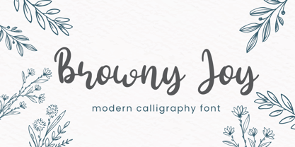 Browny Joy is lovely modern calligraphy font inspired by beauty natural handwriting What's included: - Browny Joy.otf - Multilingual Support --- Hope you enjoy with our font! Attype Studio
 - Merry Bauble Letters by Greater Albion Typefounders,
$6.00 Merry Bauble Letters is designed to complement our 'Merry Baubles' fleuron typeface. Quite simply, it's a set of Christmas Tree ornaments with letters painted on them…
 - Whiplash by 38-lineart,
$16.00 Whiplash is a natural handwritten font with firm strokes as the main character. All-caps and mixed-match are the main concepts of this font, where the uppercase and lowercase can be pair according to your taste. This font has a very strong and very prominent character that will distract the eyes. This is a great choice when used as a title on banners, posters, book titles and even magazine covers. Modern lifestyle brands such as fashion, cosmetics, and outdoor sports are also a trend to use this font style. You who like travelling can also try to write a caption or quote, people are increasingly curious about the mystery of your adventure and short notes. Besides being equipped with multi-language, we also equip ligature such as ee, ll, gg, oo, ss, tt, pp, rr. Enjoy our fonts, and make sure your brand will stand out and invite people to take a closer look.
 - Marlin Soft by FontMesa,
$25.00 Marlin Soft is a rounded corner version of our Marlin Geo font family and like its parent font also includes two sets of italics. The standard italic is set at twelve degrees and the slant version set at six degrees, the slant version is perfect for signage and headlines where you may want the look of an italic but are limited on horizontal space. Marlin Soft includes many alternates which may be accessed using opentype aware applications, with over three hundred alternates to choose from your creative possibilities are great. Whether you're looking for a round dot or a square dot Marlin Soft is one font family that delivers both set up as two separate fonts so you may change a whole page of text at one time. Your projects are sure to look nice and cozy with the warm feeling Marlin Soft will bring to your product label or page design. Three free sample basic fonts are available which are fully functional minus the alternates.
 - Intelo by Kastelov,
$25.00 Intelo was created with the single idea of redefining what makes a functional grotesque typeface nowadays. Its large x-height and letterforms with subtle elliptical finish create a distinctive look that can help brands cater to an increasingly design savvy audience. To top it off, Intelo comes in two versions - an attention-grabbing original cut and an additional version with flat endings for a more streamlined effect. The family weights range from thin to extrabold with matching italics making it a versatile choice and perfectly suited for digital applications including web and interaction design as well as printed media such as editorial and corporate materials. When it comes to Opentype features, Intelo is loaded with stylistic alternates, tabular figures, fractions, ligatures, and more. In addition, the font family has an extended language support featuring Western, Eastern and Central European languages. To sum it up, the friendly and inviting letterforms of Intelo came as a solution to the need for more human fonts in our technology-oriented environment.
 - Searches by Redy Studio,
$17.00Searches – Elegant Ligature Fonts Searches is a font that you should give a chance, if you are looking for a different look, Searches is a good place to start! There is always inspiration in fonts! Searches is an elegant, messy and lovely script. But Searches is not your ordinary script font; it has been developed to perfection by its creator, and it is sure to inspire you as well. You will fall in love with the movement of the letters, and you will find yourself using this font for many design projects to come. It comes with 92 ligatures, numbers, and other necessary glyphs. Searches features: A full set of upper & lowercase characters Numbers & punctuation 92 Gorgeous ligatures accents characters PUA Encoded Characters – Fully accessible without additional design software. Feel free to give me a message if you have a problem or question. Thank you so much for taking the time to look at one of our products. - OKASA by Twinletter,
$15.00 Okasa, our newest typeface, is now available. We present to you a quirky and contemporary typeface, which you can use to produce an optimal visual display in each of your projects and to impress all of your audience with the unique look of your project. Because everyone does not necessarily understand Japanese letters, we supply fonts with letters that can be utilized for your project. We produced this display font with a Japanese theme or an Asian font, which we designed to fulfill the needs of your Japanese-themed project. Of sure, your initiative will be understood by people all around the world. Logotypes, food banners, branding, brochure, posters, movie titles, book titles, quotes, and more may all benefit from this font. Of course, using this font in your various design projects will make them excellent and outstanding; many viewers are drawn to the striking and unusual graphic display. Start utilizing this typeface in your projects to make them stand out. Caps only fonts
 - Save The Date by Latinotype,
$40.00 A wedding begins long before the "I Do's" on the big day—everyone works together throughout the process to make sure that everything happens as planned: details, color combinations, decorations, the way we convey the magic of the visual elements and deliver our message of love. Through this beautiful font, we would like to deliver to you that very message, you make it your own and express yourself in your own way—through the perfect invitation on your wedding day. No matter how sweet or wild your invitation looks, try to be yourself. Save the Date is a font collection consisting of 9 styles and 4 variants: Script, Sans, Serif and Small. The font set is intended to provide users with a wide range of choices for any design project. Save the Date was designed by Paula Nazal and Daniel Hernández. Digital editing by Rodrigo Fuenzalida. Photos by Mónica Muñoz. Mónica specializes in wedding photography. You can find more of her work here: www.thewildbrides.com
 - Orqquidea by PeGGO Fonts,
$29.00 Low contrast and clean Roman Sans with capitals based on the classic Capitalis Monumentalis proportions with uniform and modern SmallCaps, with a subtle script touch on some curved strokes, that give it a less hard feel, more organic and friendly look. The design idea born on 2013 from Roman Schemme studies, where new version of Legan and other roman typeface projects was based on too. Orqquidea was developed in 12 sizes with 659 glyphs each enhanced with professional opentype features (aalt, ccmp, locl, subs, sups, numr, dnom, frac, ordn, lnum, pnum, tnum, onum, c2sc, smcp, case, dlig, liga, zero, salt, calt, ss01, ss02, ss03, ss04), plus a complementary Orqquidea Framed version with 226 glyphs and a Orqquidea Garden version that include floral ornaments and related dingbats with 102 glyphs. It can easily adapt to print and digital environments ideal for fashion branding and corporate purposes, magazine and book headlines and titles, cosmetic label design and even on contents with a modern and artistic air.
 - Primeform Pro by Punchform,
$29.00 The most versatile geometric font ever is here. With 421 alternative characters and 19 stylistic sets, you get unlimited power to take your creativity to the next level. The first typeface of its kind, Primeform Pro is meticulously designed to adapt its personality to any project. Primeform Pro is the smartest choice for any creative project. With a single click, you can change its typographic personality and adapt it to your desired style. Choose between 3 predefined styles or create your own style by combining the hundreds of alternate characters available. OpenType Features Access All Alternates (aalt) Stylistic Alternates (salt) 19 Stylistic Sets (ss01 – ss19) Localized Forms (locl) Case-Sensitive Forms (case) Standard Ligatures (liga) & Discretionary Ligatures (dlig) Slashed Zero (zero) Proportional Figures (pnum) Tabular Figures (tnum) Subscript (subs) & Superscript (sups) Numerators (numr) & Denominators (dnom) Fractions (frac) Ordinals (ordn) Glyph Composition/Decomposition (ccmp) Language Support 317 Latin Languages 2 Greek Languages 15 Cyrillic Languages Tech Specs Glyph Count: 1185 Format: OpenType CFF
 - Fragtude by Letterhend,
$20.00 "Old is Gold".. Perhaps that's the best words to represent this typeface called Fragtude - a pair of vintage display typeface consist of bold script and serif. One of our finest typeface, crafted carefully to make sure its quality. Inspired by 40s 50s lettering and signage, the nostalgic feels will bring you back to the good ol' days. This typeface is perfectly made to be applied especially in logo, and the other various formal forms such as invitations, labels, logos, magazines, books, greeting / wedding cards, packaging, fashion, make up, stationery, novels, labels or any type of advertising purpose. Features : uppercase & lowercase numbers and punctuation multilingual swash and ligatures alternates PUA encoded We highly recommend using a program that supports OpenType features and Glyphs panels like many of Adobe apps and Corel Draw, so you can see and access all Glyph variations. How to access opentype feature : letterhend.com/tutorials/using-opentype-feature-in-any-software/ Email us to letterhend@gmail.com if you need something! Happy Designing!
 - Stormtrooper by Comicraft,
$19.00 We've gathered the old characters together, and added a bunch of young new hotshots, to create the long-anticipated sequel to our STORMTROOPER font! The digitally remastered Special Edition STORMTROOPER is now a trilogy, with two new weights -- outlined ARMOR and inlined BLASTER -- each containing more than 100 autoconnecting letter combos*. Yes, you'd have to be crazy to attempt a font like this; our man JG certainly has courage... * Hutts, dewbacks and point blank misfired laser shots not included
 - Alecto by Scriptorium,
$12.00For our modern/futuristic fonts collection we wanted something truly science fictional, so Dave Nalle designed the Alecto font, an original design with a futuristic look, but some echoes of the type designs and lettering of the Arts & Crafts period. It looks much more modern, but you can see echoes of some of our other fonts like Semiramis in the design. Alecto features multiple versions of many of the characters to make it ideal for designing logos and titles. - 1479 Caxton Initials by GLC,
$20.00 This family was created inspired from the two sets of rough initials fonts used by the famous William Caxton in Westminster (GB) in the late 1400’s. As it was normal for the time, there were not any differences between I and J, U and V. It is not a mistake. We have reconstructed the few other missing characters. This font was conceived as a supplement for our 1479 Caxton but may be used with all our Blackletters fonts.
 - The Story So by Comicraft,
$19.00 Trapped in a world they never made, the characters in our Story So Far have been engaged in final battle with their Arch Enemies... the characters known only as ToBeContinued. One of our characters will win, one will die, at least two of them will be engaged in a Clash of Titans. Face Front, True Believer, This One's Got it All! The Story So Far & Near complete family includes eight weights with support for Western & Central Europe.
 - Warheim by Ironbird Creative,
$15.00 Warheim is a organic display typeface with handdrawn feel. Comes with regular, stamp, spurs and spurs stamp styles. This typefaces is perfect for people looking for vintage aesthetic and organic feel. Suitable for any graphic designs such as branding materials, t-shirt, print, logo, poster, t-shirt, quotes .etc We hope you enjoy the font, please feel free to comment if you have any thoughts or feedback. Thanks for purchasing and have fun! Regards, Ironbird Creative
 - Centima Pro by TipografiaRamis,
$39.00 Centima Pro is an enhance development of Centima – a geometric Sans Serif typeface, released back in 2011. Centima Pro family consists of two sub-families Sans and Serif fonts. Centima Sans – an upgraded version of Centima, with careful refinements to glyph shapes and extension of glyph amounts, which enabled support of Cyrillic languages. A new extended sub-family Centima Serif have been added to the Centima Pro family. This typeface is released in OpenType format with some OpenType features.
 - Nocken by skillyas studio,
$15.00 Nocken is a sleek and modern sans-serif font that exudes elegance and simplicity. With its clean lines and minimalistic design, Its versatility allows it to be used for a wide range of projects, from branding and logo design to web and print materials. Nocken's balanced proportions and subtle details make it highly legible and visually appealing, ensuring that your message will be conveyed with clarity and style. to see more our work visit our website: skillyasstudio.com
 - Benguiat Caslon by House Industries,
$33.00 Designed to be set in big, large and huge sizes in classic TNT (tight-not-touching) style, Benguiat Caslon is dynamite for a wide range of display demands. We also included outline and drop-shadow versions as well as numerous swash caps, ligatures, contextual alternates and automatically-shifting punctuation. Ed Benguiat originally designed this alphabet for the Photo-Lettering library during his tenure as the legendary type house’s art director. When we purchased Photo-Lettering in 2003, one of the first things we did was start picking some of our favorite films to digitize as fonts. Photo-Lettering partner Christian Schwartz chose this expressive serif specimen for its high contrast strokes that stand up to the most vigorous display typography demands without withering against pesky design limitations like screen resolution, ink spread and dot gain. FEATURES: Alternate characters, ligatures and contextual substitutions add an unexpected flair to words and phrases. We also provided a drop shadow to add depth and dimension. Shifting punctuation marks take care of those optical tricks so you don't have to. A delicately expressive outline version adds color even in black and white. BENGUIAT CASLON CREDITS: Typeface Design: Ed Benguiat Typeface Digitization: Christian Schwartz, Bas Smidt Typeface Production: Ben Kiel, Jason Campbell Like all good subversives, House Industries hides in plain sight while amplifying the look, feel and style of the world’s most interesting brands, products and people. Based in Delaware, visually influencing the world.
 - St Croce Pro by Storm Type Foundry,
$29.00 Our eye is able to join missing parts of worn letters back into undisturbed shapes. We tend to see things better than they really are. Thanks to this ability we ignore faults of those close to us as we can’t accept the fact that every once in a while we convene with an impaired entity. Typography is merely a man’s invention, hence imperfection and transience, albeit overlooked, are its key features. This typeface is based on worn-out letterings on tombstones in the St. Croce basilica in Florence. For hundreds of years, microscopic particles of marble are being taken away on the soles of visitors: the embossed figures become fossilised white clouds, fragments of inscriptions are nearing the limits of legibility. First missing are thin joins and serifs, then the main strokes finally slowly diminish into nothingness over time. Unlike an archaeologist, for whom even completely featureless stele is valuable, the typographer must capture the proper moment of wear, when the type is not too “new” but also not too much decimated. Such typeface is usable for catalogue jackets, invitations and posters. Calligraphy is a natural human trait. To write is to create characters of reasonable beauty and content, according to the nature of the writer. A natural characteristic of architecture is to create an aesthetic message very similar to the alphabet. A doric column, the gabled roof, the circle of the well plan: these are the basic shapes from which all text typeface is derived.
 - FM Bolyar TypeCraft by The Fontmaker,
$29.00 A super font family mastered to an unparalleled level of precision, Bolyar TypeCraft is a collection multiple textured styles that represent historical printing techniques. A proud member of our successful Bolyar lineage this unique type family provides unlimited options for your creativity and is quite able to satisfy every typographic taste. If you are addicted to classic vintage style, then you could easily use Bolyar TypeCraft for almost any project of desire - from letterheads, logos and catchy headlines to elegant packaging, book covers and wine labels. Alternates, Swashes and Ligatures will help you customize almost every single letter and fit perfectly to your artwork. Bolyar TypeCraft provides a broad range of advanced typographical features: Multiple subfamilies each packing the two classic Bolyar styles - Regular (N) and Ornate (O). Five weights per style ranging from thin (100) to black (900) with full multilingual support for all Latin based languages as well as Cyrillic. A 1000+ glyphs per weight including three multilingual stylistic sets, swash designs and useful discretionary ligatures. Sub- and superscript basic Latin and Cyrillic glyphs as well as figures. Two positional models for lowercase accessed as OpenType case sensitive forms - baseline (default) or vertical centering. Contextual alternates and special stylistic set with different contour roughness exclusively developed for Bolyar Rough subfamily. A multifunctional Bolyar Shadow family witch can be flawlessly paired with any of the sub-family styles provided. Check out some great examples of Bolyar TypeCraft in use by the Labelmaker
 - Lux by URW Type Foundry,
$35.99 Many times, when a new creative process is starting, it is triggered by an everyday action or item. In this case, the looks of a lady’s watch inspired Michael Herold to create his new typeface LUX. The sight of the chronograph sparked associations of the 1950s in Mr. Herold: While this decade was predominantly dominated by brush and feather scripts, there was also a bloom of strict and modern architecture. This special mix of strength and retro style is exactly what Michael Herold is trying to capture in his LUX. The result is a typeface which is perfectly suitable for use on book covers, posters and claims – thanks to its striking impression. The name LUX, Latin for light, is inspired by the high bright-dark contrast within the individual characters. Oft sind es alltägliche Gegenstände, die das Bestreben eines neuen kreativen Prozesses auslösen. So entspringt auch die Inspiration zur Erschaffung der LUX von Michael Herold dem Anblick einer Damenuhr. Der Chronograph löste bei Herrn Herold Assoziationen zu den 1950er Jahren aus: Während diese Zeit hauptsächlich von Schreibschriften aus Federn und Pinseln beherrscht wurde, nahm auch die streng und modern anmutende Architektur starken Einfluss auf die Epoche. Diese Mischung aus Strenge und 50er Jahre Retro-Stil soll in der LUX zum Ausdruck kommen. Das Ergebnis ist eine Schrift, die sich mit ihrer plakativen Wirkung perfekt für Buchumschläge, Poster und Claims eignet. Namensgebend war der starke hell-dunkel Kontrast innerhalb der Schrift – festgehalten in dem lateinischen Wort für Licht.
 - Aanaar by Letterjuice,
$66.00 This typeface comes from a self initiated project called Sápmi, which aims to contribute to keep a group of minority languages alive through solving issues in the education environment. This re-thought edition takes the name of Aanaar and joins our library with a bigger character set and two new weights which complete the typeface providing a big typographic palette as well as adding stylistic two-story a and g for more advanced readers as well as to enable the typeface to be used in other environments. The typeface was originally designed for children’s text books. Analysing kid’s typeface design, we identified some important problems and solved them within the boundaries we had. The main concern in a typeface which will be used by children is letter recognition, as they have not yet fully develop their reading skills. For example, letters like “a” and “g” share a very similar structure in this particular kind of typefaces, where the only distinctive part is the descender of the “g”. It is known that the lower part of the letter is the less important feature when reading, therefore we decided to make a clear distinction between them by having an “a” with a spur on the top right. This also helped distinguishing “a” and “o”. Children typefaces usually have one story “a”, making “a” usually too close to “o”. Additionally we moved the joint in “a” upwards and narrowed very slightly the “a” to make sure they cannot be mistaken. More generally, the x-height is fairly tall and the typeface has a bit of movement which give it a good rhythm helping moving along nicely when reading. Aanaar consists of 5 weights (Light, Regular, Medium, Bold and Black) plus two Italics (Light Italic and Italic).
 - Varhalla by Just Lett,
$15.00 Varhalla is our new script and handwritten font. We created it with love and care. Varhalla is perfect for signatures, posters, branding, logos, fashion, typography, and more.
 - Roundwood JNL by Jeff Levine,
$29.00 The antique wood type Gothic Tuscan [a spurred design with rounded terminals] was the basis for Roundwood JNL, which is available in both regular and oblique versions.

