1,252 search results
(0.014 seconds)
- Cindy FA by Fontarte,
$39.00 Imelda Marcos, Cinderella - welcome to the club ... A picture font containing over sixty shoes, slippers and boots, fashionable yesterday, today and maybe tomorrow. Hand drawn by a designer Magdalena Frankowska. Not only for fetishists.
 - WC Rhesus A Bta - Unknown license

- WC Mano Negra Bta - Unknown license

- Ego trip Fat Skew - Unknown license

- 7 days fat rotated - Unknown license

- Big Fat Ugly Cow - Unknown license

- WC ADDENDUM Bta Bold - Unknown license

- Digital dream Fat Skew - Unknown license

- 7 days fat oblique - Unknown license

- Digital dream Fat Narrow - Unknown license

- Fat Font Grotesk Streamline by Intellecta Design,
$21.90a stout font with the streamline art deco visual - Funky Fat Jiggly PW by Patty Whack Fonts,
$15.00Funky Fat Jiggly PW is intended and suitable for Display use and Titles. It's not very suitable for long paragraphs of text. This font is meant for fun, fun, fun! It contains the basic characters. Uppercase, lowercase, numerals, and basic punctuation. See the character map for all of the included characters. Funky Fat Jiggly PW is available in OpenType, PostScript and TrueType format. - FHA Modernized Ideal Classic by Fontry West,
$25.00 Frank H. Atkinson's book Atkinson Sign Painting was published in 1909. For decades, this book served as the manual for sign painters - a handbook for hand lettering. Atkinson’s book described techniques, layouts and several sample alphabets. Modernized Ideal Classic was inspired by one of these demonstration alphabets. Although Classic has its beginnings in art deco, it is very comfortable in any period or style of design. It is most appropriate in headline and display text, poster copy and signs. We've included some nice stylistic alternates and an interesting array of ligatures.
 - FTY Varoge Saro Noest by The Fontry,
$25.00 VAROGE SARO NOEST arrives on your computer with OpenType replacement features standard, along with extended language support for Central European, Greek, Cyrillic and Extended Cyrillic. We've even included some nice character options for our German-speaking customers with the uppercase Eszett and a number of alternatives to the standard lowercase eszett. Also included is the new Turkish Lira. VAROGE SARO NOEST is a font with a very funny name. Sometimes it can be a funny font. Or a font that is fun. It looks kinda casual, but also a little bit handwritten--freeform and freehand. Or a form of block lettering with a rough edge. Not too rough. Just enough to break up the visual rigidity. But this is not a face in distress. It's mostly at ease in its surroundings. If it's in text mode, it handles the job comfortably. In headline mode it does well too. It's quite flexible and looking for a home. Give this font a home. See if you can figure out what to use it for. See if you see what we saw when we made it. We saw a font that's cool and elegant with a bit of a tantrum driving the node count. We also found it's impossible to look away from it. Anyone can see that. That's why you're here. That's why you're reading this. And VAROGE will do you a favor if you let it. Revisit your typographic beliefs and head over to the one persistent constant in life: your font list. Is VAROGE SARO NOEST on it? If it were to set up headquarters there, you might discover something ideal. That's the favor I was promising.
 - Fat Face No. 20 by Solotype,
$19.95This is almost a necessity if you are doing reproductions of mid-19th century posters and playbills. - FT Pedant Dilettante - Unknown license

- FT Scandinavian Titan by Fenotype,
$29.95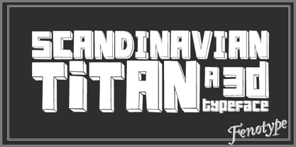
- Ye-As-Ta by Grummedia,
$20.00Ye-As-Ta is a unique interpretation of traditional brush drawn oriental calligraphy. A caps only font, the characters type English style left to right but appear laid on their side. When the text box is rotated 90 degrees clockwise the text reads top right to bottom left, oriental style. A fun typeface, though reading can require a little practice! - TA Modern Times by Tural Alisoy,
$17.00 The Modern Times is the most popular font developed by me. It was sold more than any other of font that I created. The earlier version supported Western Europe, Central/Eastern Europe, Baltic, Turkish, Romanian, Cyrillic, Greek, Georgian languages. Last year, I decided to update it. The new version is called TA Modern Times. Its OpenType features include 1200 glyph, Stylistic Alternates, Stylistic Set 01–12, Standard and Discretionary Ligatures, Numerators, Denominators, Subscript, Superscript, Ordinals, Contextual Alternates and Kerning. Currently, supported languages are as following: Western Europe, Central/Eastern Europe, Baltic, Turkish, Romanian, Cyrillic, Greek, Hebrew. Additionally, the font has multiple styles such as Semi Condensed, Condensed, Extra Condensed, Ultra Condensed, Rounded, Inline, Outline, Semi Expanded, Expanded, Extra Expanded, Ultra Expanded. 6 previous versions of the font are FREE. You may download and enjoy it. Latin Plus languages supported 95% Latin Plus diacritics included 88% TA Modern Times OpenType features list: aalt, calt, case, dlig, dnom, frac, kern, liga, locl, numr, ordn, salt, sinf, ss01, ss02, ss03, ss04, ss05, ss06, ss07, ss08, ss09, ss10, ss11, ss12, subs, sups TA Modern Times graphic presentation at Behance
 - FT Industry Machine by Fenotype,
$9.95
- Churchward Ta Tiki by BluHead Studio,
$20.00Churchward Ta Tiki is a new font release by BluHead Studio, LLC from the exciting and unique typefaces of New Zealand designer Joseph Churchward. We will be releasing fonts from his extensive library in OpenType format on a regular basis. - FT Twisted Ontogenesis by Fenotype,
$29.95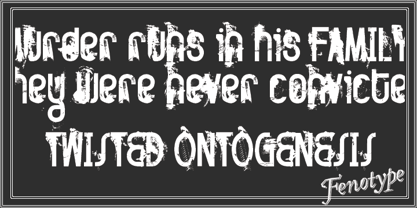
- FT Digital Kauno by Fenotype,
$19.95 Digital Kauno is a soft geometric script type. It is recommended for headlines and display use. Digital Kauno was originally designed in 2002 and it has now been redesigned with full character set and more distinctive letters.
 - TA Father 60 by Tural Alisoy,
$15.00 Since 2017, I have been improving my font creating skills. In the same year, I went through my father's notes and decided to make a font with his handwriting style. I completed the initial version with a lower number of glyphs in 2018. It supported only basic Latin, Turkish, and Azerbaijani alphabets. On the 15th of January 2021, my dad will turn 60. I am planning to finalize the updated version of the Father font by then. 584 glyph, 100+ Languages Set. Multilingual support: Latin basic, Latin Extended, Cyrillic, Central Europe, Turkish, Romanian, Euro, West European diacritics
 - Clave De Fa by DMTR.ORG,
$59.00
- FT Military Dingbats by Fenotype,
$19.00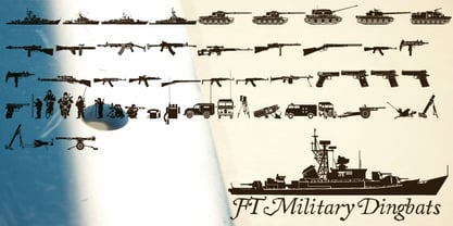 Pictograms of military boats, personnel, firearms and other weapons.
 - TA Regresso PRO by Tural Alisoy,
$39.00 TA Regresso PRO graphic presentation at Behance TA Regresso PRO font is inspired by Didon and Bodoni fonts. A combination of a little Bodoni and a little Didon elements and a unique style and Text, Display, Subhead and about 80 styles, it is a font that gives the user a choice. TA Regresso font supports Greek, Hebrew, Cyrillic and Latin alphabets. After starting work on the font since February of last year, the font is ready today with constant revisions. Being open to learning, I sought help from experienced designers. I must mention that Yulia Gonina, the founder of Schrifteria Foundry, also helped me a lot to make Regresso good. With her knowledge and advice, the flaws in the font were eliminated. By the way, Viktor Baltus also helped me with his valuable advices. I did some research about the alphabets of the supported languages so that Regresso is good. I paid a lot of attention to the correct design of the letters. I will fix the problems I missed in the next updates of the font. I would be happy if you send me your work when you use my font. I'm very interested in where you use my font. TA Regresso PRO contains 200+ Latin and Cyrillic, Greek, Hebrew languages. TAFT produce retail typefaces, create custom fonts and even do Greek, Hebrew and Cyrillization. Our mission is to create and distribute only carefully drawn, thoroughly tested, and perfectly optimized typefaces which are available to a wide range of customers. If you're looking for a type or logo → t@taft.work
 - FT Hidden Forest by Fenotype,
$59.95 Hidden Forest is a collection of 52 hand drawn tree silhouettes. It is a super fast tool for creating wonderful illustrations!
 - Grotesk Polski FA by Fontarte,
$39.00 Grotesk Polski FA developed in 1998-2006, was inspired by the Polish eminent pre-WWII text typeface - Antykwa Półtawskiego. Adam Półtawski designing his antiqua had took into consideration the special qualities of Polish language. He designed unique letters: k, w, y, z and R, K, Y. Another unique element of his typeface was polygonal dot. Grotesk Polski keeps all that shapes and goes further. It is a contemporary sans serif in four cuts: Regular, Italic, Bold and Stencil. The proportions of the typeface were rebalanced to give it a neo-grotesque form with a Polish twist.
 - Saturator Serif FA by Fontarte,
$39.00 Saturator Serif FA is a younger brother of Saturator FA. It comes with upper and lower case letters and with diacritic characters for many Latin languages. Its informal and cheerful character allows for different creative ways of usage. This slab serif typeface is designed to accompany sans serif version. It has three variants: Regular, Italic and Shadow.
 - FT Moonshine Script by Fenotype,
$19.95 An inky script font written by a madman from the cabin deep in the forest. Moonshine Script has a regular set of uppercase and lowercase script letters but also condensed capital letters that you can access by switching SmallCaps on and writing with CAPS.
 - FT Grandpas Script by Fenotype,
$19.95 Grandpas Script is a blotted and hand-drawn joined script font.
 - TA Bankslab Shadow by Tural Alisoy,
$40.00 TA Bankslab Shadow I created the font in 10 styles. 7 weight from Thin to Extra Black, an Outline, Shadow, and Art Nouveau. The Art Nouveau style was inspired by the texture in the background used for the text on the building. The texture I applied to capital letters adds beauty to the font. If you like the font feel free to use it or simply let me know if your current alphabet doesn't support this font.
 - Do not eat this Fat - Unknown license

- Digital dream Fat Skew Narrow - Unknown license

- Do not eat this Fat Italic - Unknown license

- TA Bankslab Art Nouveau by Tural Alisoy,
$40.00 TA Bankslab graphic presentation at Behance The building of the Northern Bank of St. Petersburg's Baku branch was built in 1903-1905. It was the first Art Nouveau-style building in Baku, Azerbaijan. Later the bank was transformed into the Russian-Asian Bank. After the oil boom in Baku in the 19th century, branches of many banks and new banks were opened in the city. The branch of the Northern Bank of St. Petersburg was among the first banks that was opened in Baku. N.Bayev was the architect of the building for the branch of the Northern Bank of St. Petersburg located at Gorchakovskaya 3 in 1903-1905. The building currently houses the Central Branch of the International Bank of Azerbaijan. My purpose in writing this is not to copy and paste the information from Wikipedia. What attracted me to the building was the word "Банкъ" (Bank) written in Cyrillic letters, which was also used in Azerbaijan during the Soviet era. The exact date of the writing is not known. Every time I pass by this building, I always thought of creating a font of this writing someday. I had taken a photo of the building and saved it on my phone. I did a lot of research on the font and asked a lot of people. However, some did not provide information at all and some said they did not have any information. I was interested in the history of this font but I do not know if this font really existed or it was created by the architect out of nowhere. If there was such a history of this font, I wanted to recreate this font and make it available. If not, I had to create it from scratch in the same way, using only existing letters on the building. Finally, I made up my mind and decided to develop the font with all letters I have got. It was difficult to create a font based on the word, Банкъ. Because in the appearance of the letters, the midline of the letters on A, H, K was very distinct, both in the form of inclination and in more precise degrees. The serif part of the letters, the height of the upper and lower sides, differed from each other. I don't know whether it was done this way when the building was constructed or it happened over time. I prepared and kept the initial version of the font. I took a break for a while. I started digging on the story of the font again. Meanwhile, I was researching and got inspired by similar fonts. Unfortunately, my research on the font's history did not yield any results. I decided to continue finishing up the font. After developing the demo, I created the font by keeping certain parts of these differences in the letters. In addition, I had to consider the development of letters in the Cyrillic, as well as the Latin alphabet, over the past period. Thus, I began to look at the appearance of slab-serif or serif fonts of that time. In general, as I gain more experience in developing fonts, I try to focus on the precision of the design for each font. In recent years, I specifically paid attention to this matter. YouTube channel and articles by Alexandra K.'s of ParaType, as well as, information and samples from TypeType and Fontfabric studios on the Cyrillic alphabet were quite useful. I gathered data regarding the Latin alphabet from various credible sources. I do not know if I could accomplish what I aimed at but I know one thing that I could develop the font. Maybe someday I'll have to revise this font. For now, I share it with you. I created the font in 10 styles. 7 weight from Thin to Extra Black, an Outline, Shadow, and Art Nouveau. The Art Nouveau style was inspired by the texture in the background used for the text on the building. The texture I applied to capital letters adds beauty to the font. If you like the font feel free to use it or simply let me know if your current alphabet doesn't support this font.
 - TA Film Fiction Sans by Tural Alisoy,
$25.00 We've already updated and revitalized Film Fiction Sans to ensure it perfectly matches your evolving creative vision. The inclusion of tabular figures, old-style figures and alternative glyphs expands your design palette and allows you to adapt the font to your unique style. TA Film Fiction Sans has been updated experience the appeal – this can be your font of choice to enhance your brand identity, cinematic efforts and editorial design. This brilliant typeface is not just a typographic tool, but a creative catalyst for headlines, logos, web elements, signage, posters and fashion apparel, packaging. TA Film Fiction Sans does not follow trends, it defines them, imbuing each project with a true modern essence. Embrace the possibilities with 9 different styles, each boasting a large set of 758 glyphs. Discover additional features of OpenType features such as aalt, dnom, frac, kern, liga, numr, ordn, salt, sin, ss01, ss02, ss03, ss04, ss05, ss06, ss07, tabular figures, old-style figures and alternative glyphs. Not only does this font speak multiple languages, it also covers a variety of design needs – offering seamless language support for Western European, Central/Eastern European, Baltic, Turkish, and Romanian languages. Test your alphabet, explore the nuances and witness the transformation. And if you're at any creative crossroads, I'm here for you. If you want to customize TA Film Fiction Sans, need font files or have any other questions, please reach out to me at t@taft.work. TA Film Fiction Sans be the cornerstone of your creative journey. Elevate your designs, embrace innovation and redefine possibilities with TA Film Fiction Sans, where each character tells a story.
 - FT Master Of Poster by Fenotype,
$19.95 Master of Poster is an all caps OpenType family. Each style has over 450 ligatures.
 - FT Weapon Of Choice by Fenotype,
$19.00 A dingbat set with close combat weapons, guns, baseball bats, knives and other tools of violence.


