10,000 search results
(0.048 seconds)
- Satron by Aah Yes,
$3.95A reminder of the days of flower power, Satron is quite a bit different, slightly hippy and slightly grungy. Although it is not in any way an attempt to emulate the fonts used in that era, it evokes the mood of the time. There's two different shapes making up each character, with a grungy black one in front of a hippy white one. The combined effect however is quite novel and modern. There's also a jumbled version with the letters rotated and whacked around, in case you want it funky-flavored. There's all the main characters plus lots of extra accented letters as well. The package contains both OTF and TTF versions - install either OTF or TTF, not both versions on the same machine. - Space 101 by Azure Studio,
$11.00 Introducing the first typeface by Azure studio, Space 101! Space 101 is a handcrafted chalkboard reminiscent typeface with irregular slender lines and a quirky personality. This typeface is perfect to add character and charm to bodies of text and heading where the slight imperfections tie your whole design together. The inspiration for Space 101 was found in an old signwriting book. The character shapes were updated and improved while still retaining the same charm. The typeface gave me interstellar space travel vibes reminiscent of early books based around space travel, which is why I decided to call it Space 101. I hope you enjoy this typeface and if you have any questions or comments get in touch. I'd love to hear from you. fonts@azurestudio.co.nz
 - Halewyn by Hanoded,
$15.00 Heer Halewijn (The Song of Lord Halewijn) is a 13th century Dutch folk tale which survives in folk ballad. The story tells of a man called Halewijn, who lives in the woods and who lures pretty women with his songs (whom he then kills). One day a princess visits Halewijn, but when he wants to kill her, she requests he remove his robe, so as not to stain it with her blood. He obliges and when he is undressing, the princess seizes his sword and chops off his head. Halewyn is a handmade font, which was loosely based on my Languedoc font and Garamond. Use it for product packaging, books and posters. Comes in 4 weights (with italics) and a ballad full of diacritics.
 - Zona Pro by Intelligent Design,
$10.00 Zona Pro is a geometric sans-serif type family of 8 styles plus matching italics, designed by Kostas Bartsokas in 2013/14. It draws inspiration from 1920’s geometric style faces, having clean and highly readable shapes, and mixes it up in the heavier weights with a slight variance in the stroke widths, lending it a grotesque-ish unique and distinctive look. Zona Pro is multifunctional and versatile. With its modern yet elegant form it performs amazingly in display sizes and headlines. At the same time its really tall x-height makes Zona Pro equally suited for editorials and shorter lines of text in smaller sizes (magazines, newspapers). Zona Pro supports Greek, Western, Central and Eastern European languages, ligatures and special characters.
 - Brownhill Script by sizimon,
$20.00 Brownhill Script is hand written fonts set . Very cool for logos, name tag, handwritten quotes, product packaging, merchandise, social media & greeting cards. And very easy to make design t-shirts and other products. Very save time in making the design of a product. It contains a full set of lower & uppercase letters, a large range of punctuation, numerals, and multilingual support. What's Include : Brownhill Script Brownhill Script Swash 3 sets of lowercase letter 2 sets of uppercase letter Bonus Swash Multilingual support To access the alternate glyphs, you need a program that supports OpenType features such as Adobe Illustrator CS, Adobe Photoshop CC, Adobe Indesign and Corel Draw. If you have any question please do not hesitate to contact me. Thank You!
 - Isle Headline by Mans Greback,
$19.00 Isle Headline is a high-quality serif typeface family, drawn by Måns Grebäck during 2018 and 2019. It is a sharp font with a clear and attentive look, adapted for headlines, titles and large type settings. It comes in four weights, each one as italic, totaling in eight styles: Light and Light Italic, Medium and Medium Italic, Bold and Bold Italic, Black and Black Italic. The font family can be used in a combination with a font of a different style, or together with its sister font Isle Body, also a serif font, which has the same basic structure but with a softer look and adapted for body text and smaller type. Each style contains ligatures and support for a wide range of languages.
 - Chen Xing by Pelavin Fonts,
$25.00 Chen Xing, literally “morning star”, a font both futuristic yet mystifyingly ancient is cast in contemporary forms on the cutting edge of the present moment, but harkens back centuries to endless cultural heritage.
 - Soho Gothic by Monotype,
$29.99 “There is just something magical about type design,” says Sebastian Lester. “If you draw a successful typeface it can travel the world, taking a part of you with it.” If this is true, his Soho® Gothic family has taken him far and wide. Understated, modern and exceptionally versatile, the family has been put to good use in just about every application imaginable. A good choice for virtually any type of project, The Soho Gothic family performs equally well as the backbone of a global brand as it would in an edgy fashion magazine. Versatile, extensive, customizable, and multilingual – the Soho Gothic typeface family has it all.With the same proportions as Soho, its slab serif cousin, Soho Gothic ranges across seven weights, from a willowy hairline to a brawny ultra – each with a complementary italic.Lester took care to ensure that the Soho and Soho Gothic designs work in perfect harmony. According to him, “The typefaces were developed alongside each other so that I could consider every aspect of each design and be certain that they would be absolutely compatible.”Soho Gothic is a more understated and more subtle design than Soho. Features that give the design its distinctive tone are the flat, crisp apexes of the diagonal characters like the A and V, and the marked horizontal stress in the a, g and s. “I wanted the family as a whole to radiate effortless modernity,” recalls Lester, “to be a master communicator that works in all conditions and at all sizes.” A collection of alternate and “semi-slab” characters were also part of Lester’s plan. “I like to develop alternate characters for all my type designs,” he says. “I believe they give graphic designers greater flexibility and make a typeface more valuable.” Soho Gothic is available as OpenType® Pro fonts that have an extended character set which supports most Central European and many Eastern European languages. If you’re looking to complete your designs, consider pairing it with Bembo® Book,Joanna® Nova,Neue Frutiger®,PMN Caecilia®,or ITC Stone® Serif.
 - Bree by TypeTogether,
$37.50 The Bree font family is a spry sans serif by Veronika Burian and José Scaglione that delivers a spirited look and feel for branding and headline usage. As an upright italic, Bree shows a pleasant mix of rather unobtrusive capitals with more vivid lowercase letters, giving text a lively appearance. Bree is clearly influenced by handwriting. As such, some of its most characteristic features are the single-story ‘a’, the cursive ‘e’, the outstroke curves of ‘v’ and ‘w’, the flourished ‘Q’, and the fluid shapes of ‘g’, ‘y’, and ‘z’. Alternates of these letters are available when a more neutral look is desired. Bree has a touch of cheekiness, a wide stance for each character, and an extra-large x-height. All this adds up to a big personality, so even when set in small text there is no skimming past the words Bree voices. In 2019, the Bree font family got a huge update. A few shapes were updated or added (the ‘k’ and German capital ‘ß’), two entirely new weights were added (Book and Book Italic), and spacing was perfected. More than that, Vietnamese support was added to Bree Latin, and the Bree Greek and Bree Cyrillic scripts were designed from scratch to parallel the Latin’s tone. Additionally, Bree was designed in variable font format for those who want complete control over the font’s appearance while simultaneously saving digital weight in the form of kilobytes and megabytes. Bree is in the perfect position for the next digital revolution. The complete Bree font family, along with our entire catalogue, has been optimised for today’s varied screen uses. Bree has been chosen for such wide-ranging uses as Breast Cancer Awareness Month in the US, the branding for the country of Peru, and numerous layouts including mobile apps, magazines, newspapers, and books. Awards – Tipos Latinos exhibition 2008 – Several best-of-the-year typeface lists of 2008 MyFonts Top 10 Fonts of 2008 Smashing Magazine: 60 Brilliant Typefaces For Corporate Design https://www.smashingmagazine.com/2008/03/60-brilliant-typefaces-for-corporate-design/ Die besten Schriften 2008 http://www.fontwerk.com/619/die-besten-schriften-2008/ – Selected for Typographica’s Best Typefaces of 2008 – Won Bronze for Original Typeface in the 2009 European Design Awards
 - AwanZaman by TypeTogether,
$93.00 AwanZaman has a three-phase story, beginning with Dr Mamoun Sakkal’s two Arabic styles and culminating with Juliet Shen’s Latin extension. AwanZaman started as simply Awan, a commission for a modern, clean, monoline typeface for writing headlines and story titles in a forward-thinking Kuwaiti newspaper. Awan was based on the geometric forms of Kufic script, while in phase two, a second typeface (Zaman) was designed to add enough calligraphic Naskh details to make it easy to read in demanding newspaper settings. Together these two phases give the typeface a warm, familiar, and progressive look, as well as an explanatory two-part name — AwanZaman. Since most editorials use typical Naskh headline fonts with an exaggerated baseline, Awan’s rational forms immediately distinguish it as a modern and progressive voice in the crowded field of Arabic editorial typefaces. As the companion Arabic typeface, Zaman has the same basic proportions and forms as Awan, but with many cursive, energetic, and playful details. And since modern monoline fonts are increasingly being used to set extended texts, more features were borrowed from Naskh calligraphy to expand the typeface’s use from headlines into text setting. When using the AwanZaman Arabic family, Awan (geometric Kufic forms) is the starting point. To add the sweeping, energetic personality of Zaman (calligraphic Naskh forms), simply activate an alternate character through the option of 20 stylistic sets available in any OpenType-savvy software. The two typefaces function as one file — the AwanZaman Arabic family — allowing users to combine features from both designs to transform the appearance of text from geometric and formal to playful and informal. The third phase of AwanZaman’s development introduced a companion Latin typeface designed by Juliet Shen to fulfil the persistent need in the Arabic fonts market for modern and geometric bilingual type families. Due to the Arabic’s monolinear strokes, AwanZaman Latin was destined to be a sans serif with a tall x-height, larger counters, and corresponding stem thickness to harmonise with the Arabic’s overall text colour and page presence. But it needed much more. One of AwanZaman’s chief assets is making the two languages look on a par when typeset side by side. Arabic and English readers will have a different sense of what that entails, but this type family defers to the Arabic — graceful and artistic with a good mix of straight stems and curved forms. Latin in general doesn’t aesthetically flow the way Arabic does, yet the tone of the Latin needed to mirror both the Arabic’s more squarish curves and formal personality of Awan and the undulating and more playful shapes of Zaman without looking outlandish. That need was met by creating some novel Latin characters, which are accessed through four stylistic sets the same way as AwanZaman Arabic. The alternates are not just clever in the way they look and how they echo the Arabic aesthetic, but also in harmonising the disparate languages and serving designers well when needing a balanced, bilingual text face with a warm and lively voice. AwanZaman is a clever, seven-weight powerhouse that makes extensive use of OpenType’s stylistic sets (20 in the Arabic and four in the Latin) so writers and designers can make the most of everything from a single glyph in display sizes down to dense text in paragraphs. As AwanZaman Arabic has no italic, neither does the Latin; contextual distinction normally handled by italics is achieved by exploiting the family’s seven weights. AwanZaman’s intricate OpenType programming supports Persian and Urdu, with features such as the returning tail of Barri Yeh treated properly. From its inception in geometry to its melding of two worlds with novel forms, AwanZaman is a personal labor by designers Dr Mamoun Sakkal and Juliet Shen, and embodies the TypeTogether ideals of serving the global community with innovative and stylish typeface solutions. The complete AwanZaman Arabic and Latin families, along with our entire catalogue, have been optimised for today’s varied screen uses.
 - Imagine a font that decided one morning to leap out of the digital ether, do a few stretches, and embody the audacity of an 80s arcade game crashing a cyberpunk party. That's Bandwidth BRK by AEnigma...
- Letterpress Retro JNL by Jeff Levine,
$29.00 More treasures from the heyday of letterpress printing are found in Letterpress Retro JNL, with plenty of great cartoons, catch words, embellishments and more.
 - Friendlist by Lunas Type,
$19.00 Friendlist is a casual modern handwritten font. Friendlist comes with a lot of ligatures and ending swash that make your text is more charming and more expression. Friendlist brings natural element to your design, it's perfect for wedding, stationery, logos, social media quotes, branding identity, and many more.
 - AT Allowe by Ardyanatypes,
$15.00 AT Allowe comes with a geometric sans serif style and a modern and elegant sans serif tagline. This font comes in eight thickness levels, from thin to black to suit your needs. AT Allowe is also equipped with the latest professional characteristics that can present an elegant and attractive identity for your company or project for business purposes. It goes well with modern serifs and scripts depicted or stands firm as a title and brand representative for an elegant look. AT Allowe also comes with multiple languages, making it easy to use for any country and language use. It also comes with alternative Ligatures and styles to make your designs more attractive. AT Allowe is suitable for branding projects and various design purposes such as business cards, name tags, advertisements, posters, invitations, branding, logos, magazines, merchandise, presentations, etc. Supports languages: Afrikaans, Albanian, Asturian, Asu, Azerbaijani, Basque, Bemba, Bena, Bosnian, Breton, Catalan, Chiga, Colognian, Cornish, Croatian, Czech, Danish, Dutch, Embu, English, Esperanto, Estonian, Faroese, Filipino, Finnish, French, Friulian, Galician, German, Gusii, Hungarian, Icelandic, Igbo, Indonesian, Irish, Italian, Kabuverdianu, Kalaallisut, Kalenjin, Kamba, Kikuyu, Kinyarwanda, Latvian, Lithuanian, Low German, Lower Sorbian, Luo, Luxembourgish, Luyia, Machame, Makhuwa-Meetto, Makonde, Malagasy, Malay, Maltese, Manx, Meru, Morisyen, North Ndebele, Norwegian Bokmål, Norwegian Nynorsk, Nyankole, Oromo, Polish, Portuguese, Quechua, Romanian, Romansh, Rombo, Rundi, Rwa, Samburu, Sango, Sangu, Scottish Gaelic, Sena, Shambala, Shona, Slovak, Slovenian, Soga, Somali, Spanish, Swahili, Swedish, Swiss German, Taita, Teso, Turkish, Turkmen, Upper Sorbian, Vietnamese, Vunjo, Walser, Welsh, Western Frisian, Yoruba, Zulu
 - Nortune by Ardyanatypes,
$10.00 Nortune is inspired by modern style combined with retro style so that it has a dynamic and elegant shape. This will be very suitable for use in any design that has a modern, retro, and classic feel. Nortune also has 10 thicknesses so it will be very easy to use on any design you have in mind. It also comes with multiple languages, making it easy to use for any country and language. Nortune also comes with alternative Ligatures and styles to make your designs more attractive. Alternate fonts will also create lots of options to combine. This modern letter shape will be very suitable to be combined with various types of fonts. Nortune is suitable for branding projects and various design purposes such as business cards, name tags, advertisements, posters, invitations, branding, logos, magazines, merchandise, presentations, etc. Supports languages: Afrikaans, Albanian, Asturian, Asu, Azerbaijani, Basque, Bemba, Bena, Bosnian, Breton, Catalan, Chiga, Colognian, Cornish, Croatian, Czech, Danish, Dutch, Embu, English, Esperanto, Estonian, Faroese, Filipino, Finnish, French, Friulian, Galician, German, Gusii, Hungarian, Icelandic, Igbo, Indonesian, Irish, Italian, Kabuverdianu, Kalaallisut, Kalenjin, Kamba, Kikuyu, Kinyarwanda, Latvian, Lithuanian, Low German, Lower Sorbian, Luo, Luxembourgish, Luyia, Machame, Makhuwa-Meetto, Makonde, Malagasy, Malay, Maltese, Manx, Meru, Morisyen, North Ndebele, Norwegian Bokmål, Norwegian Nynorsk, Nyankole, Oromo, Polish, Portuguese, Quechua, Romanian, Romansh, Rombo, Rundi, Rwa, Samburu, Sango, Sangu, Scottish Gaelic, Sena, Shambala, Shona, Slovak, Slovenian, Soga, Somali, Spanish, Swahili, Swedish, Swiss German, Taita, Teso, Turkish, Turkmen, Upper Sorbian, Vietnamese, Vunjo, Walser, Welsh, Western Frisian, Yoruba, Zulu
 - Ottine Slab by Ardyanatypes,
$15.00 Ottine Slab Comes with a Slab Serif style typical of the 80s typeface, which gives a retro and classic style but has a unique and elegant style that gives an extraordinary impression. It is equipped with features to add a kind that makes the project impressionable. Ottine Slab is also equipped with various languages so that it allows Ottine Slab to be used in all your projects. Ottine Slab is very suitable for use in multiple purposes or projects, including Sport, Poster, Product, Logo, Branding, and many more that you can apply with this Ottine Slab Typeface. Supports languages: Afrikaans, Albanian, Asu, Azerbaijani, Basque, Bemba, Bena, Bosnian, Breton, Catalan, Chiga, Colognian, Cornish, Croatian, Czech, Danish, Dutch, Embu, English, Estonian, Faroese, Filipino, Finnish, French, Friulian, Galician, Ganda, German, Gusii, Hungarian, Icelandic, Igbo, Inari Sami, Indonesian, Irish, Italian, Jola-Fonyi, Kabuverdianu, Kalaallisut, Kalenjin, Kamba, Kikuyu, Kinyarwanda, Latvian, Lithuanian, Low German, Lower Sorbian, Luo, Luxembourgish, Luyia, Machame, Makhuwa-Meetto, Makonde, Malagasy, Malay, Maltese, Manx, Meru, Metaʼ, Morisyen, North Ndebele, Northern Sami, Norwegian Bokmål, Norwegian Nynorsk, Nyankole, Oromo, Polish, Portuguese, Quechua, Romanian, Romansh, Rombo, Rundi, Rwa, Samburu, Sango, Sangu, Scottish Gaelic, Sena, Shambala, Shona, Slovak, Slovenian, Soga, Somali, Spanish, Swahili, Swedish, Swiss German, Taita, Teso, Thai, Turkish, Turkmen, Upper Sorbian, Vietnamese, Vunjo, Walser, Welsh, Western Frisian, Wolof, Yoruba, Zulu A guide to accessing all alternatives can be read at http://adobe.ly/1m1fn4Y. Adobe Photoshop goes to Window - glyphs Adobe Illustrator go to Type - glyphs. Features: A – Z Character Set a – z Characters set Numerals & Punctuations (OpenType Standard) Multilingual Thank you and have a nice day
 - Mountogen by Ardyanatypes,
$17.00 Introducing Mountogen Rounded Typeface Style which has a unique and very strong characteristic that makes all designs look unique and have a modern feel. Mountogen Rounded has its own charm, so it will be very suitable to be combined with any style. Has Lots of Alternatives and ligatures to add a great interactive feel to every design. Mountogen Rounded also comes with multilingual support and is very easy to use. Mountogen Rounded is interesting to use in designs such as books, movie posters, logos, branding, business cards, and more that can be combined with Mountogen Rounded. Supports languages: Afrikaans, Albanian, Asu, Azerbaijani, Basque, Bemba, Bena, Bosnian, Breton, Catalan, Chiga, Colognian, Cornish, Croatian, Czech, Danish, Dutch, Embu, English, Estonian, Faroese, Filipino, Finnish, French, Friulian, Galician, Ganda, German, Gusii, Hungarian, Icelandic, Igbo, Inari Sami, Indonesian, Irish, Italian, Jola-Fonyi, Kabuverdianu, Kalaallisut, Kalenjin, Kamba, Kikuyu, Kinyarwanda, Latvian, Lithuanian, Low German, Lower Sorbian, Luo, Luxembourgish, Luyia, Machame, Makhuwa-Meetto, Makonde, Malagasy, Malay, Maltese, Manx, Meru, Metaʼ, Morisyen, North Ndebele, Northern Sami, Norwegian Bokmål, Norwegian Nynorsk, Nyankole, Oromo, Polish, Portuguese, Quechua, Romanian, Romansh, Rombo, Rundi, Rwa, Samburu, Sango, Sangu, Scottish Gaelic, Sena, Shambala, Shona, Slovak, Slovenian, Soga, Somali, Spanish, Swahili, Swedish, Swiss German, Taita, Teso, Thai, Turkish, Turkmen, Upper Sorbian, Vietnamese, Vunjo, Walser, Welsh, Western Frisian, Wolof, Yoruba, Zulu A guide to accessing all alternatives can be read at http://adobe.ly/1m1fn4Y Adobe Photoshop go to Window – glyphs Adobe Illustrator go to Type – glyphs Features: A – Z Character Set a – z Characters set Numerals & Punctuations (OpenType Standard) Multilingual Thank you and have a nice day
 - Austen Aesthetic by Ardyanatypes,
$15.00 Description Austen Aesthetic comes with an aesthetic style with a modern and elegant serif-type tagline appearance. This font comes with 8 thickness levels, from thin to black to suit your needs. Austen Aesthetic is also equipped with modern professional characteristics that can present an elegant and attractive identity for your company or project for business purposes. It pairs well with modern serifs and scripts pictured or stands firm as a title and brand representative for an elegant look. Austen Aesthetic also comes with multiple languages, making it easy to use for any country and language use. It also comes with alternative Ligatures and stylistics to make your designs more appealing. Austen Aesthetic is suitable for branding projects and various design purposes such as business cards, name tags, uniforms as a brand enhancement. Advertising, posters, invitations, branding, logos, magazines, merchandise, presentations, etc. Supports languages: Afrikaans, Albanian, Asturian, Asu, Azerbaijani, Basque, Bemba, Bena, Bosnian, Breton, Catalan, Chiga, Colognian, Cornish, Croatian, Czech, Danish, Dutch, Embu, English, Esperanto, Estonian, Faroese, Filipino, Finnish, French, Friulian, Galician, German, Gusii, Hungarian, Icelandic, Igbo, Indonesian, Irish, Italian, Kabuverdianu, Kalaallisut, Kalenjin, Kamba, Kikuyu, Kinyarwanda, Latvian, Lithuanian, Low German, Lower Sorbian, Luo, Luxembourgish, Luyia, Machame, Makhuwa-Meetto, Makonde, Malagasy, Malay, Maltese, Manx, Meru, Morisyen, North Ndebele, Norwegian Bokmål, Norwegian Nynorsk, Nyankole, Oromo, Polish, Portuguese, Quechua, Romanian, Romansh, Rombo, Rundi, Rwa, Samburu, Sango, Sangu, Scottish Gaelic, Sena, Shambala, Shona, Slovak, Slovenian, Soga, Somali, Spanish, Swahili, Swedish, Swiss German, Taita, Teso, Turkish, Turkmen, Upper Sorbian, Vietnamese, Vunjo, Walser, Welsh, Western Frisian, Yoruba, Zulu
 - Picture it: a font that stalks the night, looming from the shadowy corners of design like the legendary vampire it's named after. "Nosferatu," conjured into being by the creative blood magicians at K...
- MB TyranT, created by the imaginative minds at ModBlackmoon Design, is a font that unmistakably stands out with its distinctive character and aesthetic appeal. This typeface draws its inspiration fro...
- Ah, Scatterbrained Restrained by StimulEye Fonts — a name that sounds like what happens when a caffeine-addicted squirrel tries its hand at typography. This font is the charming eccentric of the font...
- Ah, LT Anomaly, the typographic equivalent of that one friend who's both effortlessly stylish and a bit eccentric, brought to us by the whimsical digital pen of Nymphont. Picture this: each letter cr...
- Big Fat Ugly Cow is a font that stands out in the crowd with its bold and whimsical charm, instantly injecting personality and a sense of humor into any design. Imagine letters that seem to have been...
- "Destiny's Border Dings" is an intriguing and imaginative font that stands out for its rich storytelling through symbols. Unlike traditional typefaces characterized by letters and numbers, Destiny's ...
- Komikaze - 100% free

- TT Backwards by TypeType,
$29.00 TT Backwards useful links: Specimen | Graphic presentation | Customization options About TT Backwards: TT Backwards is an experimental font project inspired by the USSR typography and fonts of the late 70s and early 80s. Shop signs, posters, and book design—this is where we drew the inspiration for our project. TT Backwards consists of two complementary font subfamilies, a Script and a Grotesque, each of them includes 5 typefaces in 5 different weights (Thin, Light, Regular, Bold, Black). TT Backwards Script is a noncontrast almost monolinear solid script inspired by shop signs, poster and book design of the USSR. TT Backwards Script features a large number of Latin and Cyrillic ligatures (more than 70 items), which allows to make the script versatile and sophisticated to the max. And thanks to the implementation of a huge number of context alternates, all lowercase letters are joined softly and without breaks, and they meet the uppercase letters beautifully and correctly. TT Backwards Script supports the following OpenType features: liga, case, ordn, frac, sups, sinf, numr, dnom, tnum, onum, pnum. TT Backwards Sans is a narrow grotesque, which takes us back to the book design of late 70s and early 80s with its ductile characters. It is created considering its use in the small text size. TT Backwards Sans has a number of pronounced peculiarities: high x-height, exaggerated extenders, and big visual compensators and ink traps. Apart from the basic visual solution, TT Backwards Sans contains two experimental stylistic sets, which markedly change the overall visual perception of the text. SS01 alters high-frequency symbols of the Cyrillic alphabet, and SS02 significantly changes the high-frequency symbols of the Latin alphabet. FOLLOW US: Instagram | Facebook | Website TT Backwards OpenType features: case, ordn, frac, sups, sinf, numr, dnom, tnum, pnum, liga, zero, salt, ss01, ss02. TT Backwards language support: Acehnese, Afar, Albanian, Alsatian, Aragonese, Arumanian, Asu, Aymara, Banjar, Basque, Belarusian (cyr), Bemba, Bena, Betawi, Bislama, Boholano, Bosnian (cyr), Bosnian (lat), Breton, Bulgarian (cyr), Cebuano, Chamorro, Chiga, Colognian, Cornish, Corsican, Cree, Croatian, Czech, Danish, Embu, English, Erzya, Estonian, Faroese, Fijian, Filipino, Finnish, French, Friulian, Gaelic, Gagauz (lat), Galician, German, Gusii, Haitian Creole, Hawaiian, Hiri Motu, Hungarian, Icelandic, Ilocano, Indonesian, Innu-aimun, Interlingua, Irish, Italian, Javanese, Judaeo-Spanish, Judaeo-Spanish, Kalenjin, Karachay-Balkar (lat), Karaim (lat), Karakalpak (lat), Kashubian, Khasi, Khvarshi, Kinyarwanda, Kirundi, Kongo, Kumyk, Kurdish (lat), Ladin, Latvian, Laz, Leonese, Lithuanian, Luganda, Luo, Luxembourgish, Luyia, Macedonian, Machame, Makhuwa-Meetto, Makonde, Malay, Manx, Maori, Mauritian Creole, Minangkabau, Moldavian (lat), Montenegrin (lat), Mordvin-moksha, Morisyen, Nahuatl, Nauruan, Ndebele, Nias, Nogai, Norwegian, Nyankole, Occitan, Oromo, Palauan, Polish, Portuguese, Quechua, Rheto-Romance, Rohingya, Romanian, Romansh, Rombo, Rundi, Russian, Rusyn, Rwa, Salar, Samburu, Samoan, Sango, Sangu, Scots, Sena, Serbian (cyr), Serbian (lat), Seychellois Creole, Shambala, Shona, Slovak, Slovenian, Soga, Somali, Sorbian, Sotho, Spanish, Sundanese, Swahili, Swazi, Swedish, Swiss German, Swiss German, Tagalog, Tahitian, Taita, Tatar, Tetum, Tok Pisin, Tongan, Tsonga, Tswana, Turkish, Turkmen (lat), Ukrainian, Uyghur, Vepsian, Volapük, Võro, Vunjo, Xhosa, Zaza, Zulu.
 - Palmilla 2.0 by RodrigoTypo,
$25.00 Palmilla 2.0 is a continuation of palmilla which added more glyphs such as Alphabets, Cyrillic was added like Greek, in addition to Alternatives such as Ligatures, more Ligatures were also added in Latin to play more with the title, in total there are six special weights for informal and creative titles.
 - Capaldi by Lunas Type,
$19.00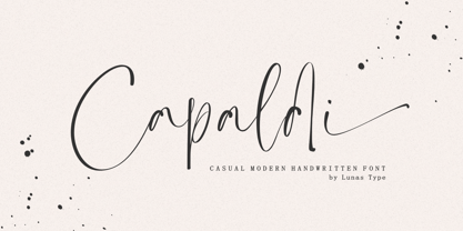 Introducing, Capaldi! Capaldi is a casual modern handwritten font. Capaldi comes with a lot of ligatures and ending swash that make your text is more charming and more expression. Capaldi brings natural element to your design, it's perfect for wedding, stationery, logos, social media quotes, branding identity, and many more.
 - Areplos by Storm Type Foundry,
$53.00To design a text typeface "at the top with, at the bottom without" serifs was an idea which crossed my mind at the end of the sixties. I started from the fact that what one reads in the Latin alphabet is mainly the upper half of the letters, where good distinguishableness of the individual signs, and therefore, also good legibility, is aided by serifs. The first tests of the design, by which I checked up whether the basic principle could be used also for the then current technology of setting - for double-sign matrices -, were carried out in 1970. During the first half of the seventies I created first the basic design, then also the slanted Roman and the medium types. These drawings were not very successful. My greatest concern during this initial phase was the upper case A. I had to design it in such a way that the basic principle should be adhered to and the new alphabet, at the same time, should not look too complicated. The necessary prerequisite for a design of a new alphabet for double-sign matrices, i.e. to draw each letter of all the three fonts to the same width, did not agree with this typeface. What came to the greatest harm were the two styles used for emphasis: the italics even more than the medium type. That is why I fundamentally remodelled the basic design in 1980. In the course of this work I tried to forget about the previous technological limitations and to respect only the requirements then placed on typefaces intended for photosetting. As a matter of fact, this was not very difficult; this typeface was from the very beginning conceived in such a way as to have a large x-height of lower-case letters and upper serifs that could be joined without any problems in condensed setting. I gave much more thought to the proportional relations of the individual letters, the continuity of their outer and inner silhouettes, than to the requirements of their production. The greatest number of problems arose in the colour balancing of the individual signs, as it was necessary to achieve that the upper half of each letter should have a visual counterbalance in its lower, simpler half. Specifically, this meant to find the correct shape and degree of thickening of the lower parts of the letters. These had to counterbalance the upper parts of the letters emphasized by serifs, yet they should not look too romantic or decorative, for otherwise the typeface might lose its sober character. Also the shape, length and thickness of the upper serifs had to be resolved differently than in the previous design. In the seventies and at the beginning of the eighties a typeface conceived in this way, let alone one intended for setting of common texts in magazines and books, was to all intents and purposes an experiment with an uncertain end. At this time, before typographic postmodernism, it was not the custom to abandon in such typefaces the clear-cut formal categories, let alone to attempt to combine the serif and sans serif principles in a single design. I had already designed the basic, starting, alphabets of lower case and upper case letters with the intention to derive further styles from them, differing in colour and proportions. These fonts were not to serve merely for emphasis in the context of the basic design, but were to function, especially the bold versions, also as independent display alphabets. At this stage of my work it was, for a change, the upper case L that presented the greatest problem. Its lower left part had to counterbalance the symmetrical two-sided serif in the upper half of the letter. The ITC Company submitted this design to text tests, which, in their view, were successful. The director of this company Aaron Burns then invited me to add further styles, in order to create an entire, extensive typeface family. At that time, without the possibility to use a computer and given my other considerable workload, this was a task I could not manage. I tried to come back to this, by then already very large project, several times, but every time some other, at the moment very urgent, work diverted me from it. At the beginning of the nineties several alphabets appeared which were based on the same principle. It seemed to me that to continue working on my semi-finished designs was pointless. They were, therefore, abandoned until the spring of 2005, when František Štorm digitalized the basic design. František gave the typeface the working title Areplos and this name stuck. Then he made me add small capitals and the entire bold type, inducing me at the same time to consider what to do with the italics in order that they might be at least a little italic in character, and not merely slanted Roman alphabets, as was my original intention. In the course of the subsequent summer holidays, when the weather was bad, we met in his little cottage in South Bohemia, between two ponds, and resuscitated this more than twenty-five-years-old typeface. It was like this: We were drinking good tea, František worked on the computer, added accents and some remaining signs, inclined and interpolated, while I was looking over his shoulder. There is hardly any typeface that originated in a more harmonious setting. Solpera, summer 2005 I first encountered this typeface at the exhibition of Contemporary Czech Type Design in 1982. It was there, in the Portheim Summer Palace in Prague, that I, at the age of sixteen, decided to become a typographer. Having no knowledge about the technologies, the rules of construction of an alphabet or about cultural connections, I perceived Jan Solpera's typeface as the acme of excellence. Now, many years after, replete with experience of revitalization of typefaces of both living and deceased Czech type designers, I am able to compare their differing approaches. Jan Solpera put up a fight against the digital technology and exerted creative pressure to counteract my rather loose approach. Jan prepared dozens of fresh pencil drawings on thin sketching paper in which he elaborated in detail all the style-creating elements of the alphabet. I can say with full responsibility that I have never worked on anything as meticulous as the design of the Areplos typeface. I did not invent this name; it is the name of Jan Solpera's miniature publishing house, in which he issued for example an enchanting series of memoirs of a certain shopkeeper of Jindrichuv Hradec. The idea that the publishing house and the typeface might have the same name crossed my mind instinctively as a symbol of the original designation of Areplos - to serve for text setting. What you can see here originated in Trebon and in a cottage outside the village of Domanín - I even wanted to rename my firm to The Trebon Type Foundry. When mists enfold the pond and gloom pervades one's soul, the so-called typographic weather sets in - the time to sit, peer at the monitor and click the mouse, as also our students who were present would attest. Areplos is reminiscent of the essential inspirational period of a whole generation of Czech type designers - of the seventies and eighties, which were, however, at the same time the incubation period of my generation. I believe that this typeface will be received favourably, for it represents the better aspect of the eighties. Today, at the time when the infection by ITC typefaces has not been quite cured yet, it does absolutely no harm to remind ourselves of the high quality and timeless typefaces designed then in this country.In technical terms, this family consists of two times four OpenType designs, with five types of figures, ligatures and small capitals as well as an extensive assortment of both eastern and western diacritics. I can see as a basic text typeface of smaller periodicals and informative job-prints, a typeface usable for posters and programmes of various events, but also for corporate identity. Štorm, summer 2005 - Mr Eaves Modern by Emigre,
$59.00 Mr Eaves is the often requested and finally finished sans-serif companion to Mrs Eaves, one of Emigre’s classic typeface designs. Created by Zuzana Licko, this 2009 addition to the Emigre Type Library expands the versatility of the original Mrs Eaves with two complimentary families: Mr Eaves Sans and Mr Eaves Modern. Mr Eaves was based on the proportions of Mrs Eaves, but Licko took some liberty with its design. One of the main concerns was to avoid creating a typeface that looked like it simply had its serifs cut off. And while it matches Mrs Eaves in weight, color, and armature, Mr Eaves stands as its own typeface with many unique characteristics. The Sans version relates most directly to the original serif version, noticeably in the roman lower case letters a, e, and g, as well as in subtle details such as the angled lead in strokes, the counter forms of the b, d, p, and q, and the flared leg of the capital R, the tail of the Q. The distinctly loose-fitting letter spacing of Mrs Eaves was applied also to the Sans version. This, together with generous built-in line spacing due to a small x-height and extended ascenders and descenders, renders the same kind of lightness and airiness when setting text that is so characteristic of Mrs Eaves. Deviations from the original Mrs Eaves are evident in the overall decrease of contrast, as well as in details such as the flag and tail of the f and j, and the finial of the t, which were shortened to maintain a cleaner, sans serif look. And the lower case c had to be balanced out differently after it lost its top ball terminal. And with the loss of serifs, Mr Eaves set width is slightly narrower. Mr Eaves Italic also carries over many forms from its Mrs Eaves model, most notably the v, w, and z, which are unusually flamboyant for a sans italic design. It also utilizes lead in and terminal tails that are reminiscent of the serif italic. The biggest departure here is the width of the characters. The extra narrow gauge and delicate features seemed more appropriate for the Serif than the Sans. To allow for a comfortable fit, Mr Eaves Italic has a more robust design and wider character width. Meanwhile, the Modern family provides an overall less humanistic look, with simpler and more geometric-looking shapes, most noticeably in the squared-off terminals and symmetric lower case counters. This family has moved furthest from its roots, yet still contains some of Mrs Eaves’ DNA. The Modern Italic is free of tails, and overall the Modern exhibits more repetition of forms, projecting a cleaner look. This provides stronger differentiation from the serif version whenever a more contrasting look is desired. Each version (Sans and Modern) contains its own set of alternates providing unique options for applications such as headlines, word logos, letterheads, pull quotes, and other short text settings. Both the Sans and Modern come in six weights. The simpler forms of a sans-serif provide the opportunity of more weights than do serif letter forms, which are more complex in structure, making it difficult to accommodate additional weight without distortions. Regular and Bold match the original Mrs Eaves weights, while the Heavy provides an additional weight for extra emphasis.
 - Mr Eaves Sans by Emigre,
$59.00 Mr Eaves is the sans-serif companion to Mrs Eaves, one of Emigre’s classic typeface designs. Created by Zuzana Licko, this 2009 addition to the Emigre Type Library expands the versatility of the original Mrs Eaves with two complementary families: Mr Eaves Sans and Mr Eaves Modern. Mr Eaves was based on the proportions of Mrs Eaves, but Licko took some liberty with its design. One of the main concerns was to avoid creating a typeface that looked like it simply had its serifs cut off. And while it matches Mrs Eaves in weight, color, and armature, Mr Eaves stands as its own typeface with many unique characteristics. The Sans version relates most directly to the original serif version, noticeably in the roman lower case letters a, e, and g, as well as in subtle details such as the angled lead in strokes, the counter forms of the b, d, p, and q, and the flared leg of the capital R, the tail of the Q. The distinctly loose-fitting letter spacing of Mrs Eaves was applied also to the Sans version. This, together with generous built-in line spacing due to a small x-height and extended ascenders and descenders, renders the same kind of lightness and airiness when setting text that is so characteristic of Mrs Eaves. Deviations from the original Mrs Eaves are evident in the overall decrease of contrast, as well as in details such as the flag and tail of the f and j, and the finial of the t, which were shortened to maintain a cleaner, sans serif look. And the lower case c had to be balanced out differently after it lost its top ball terminal. And with the loss of serifs, Mr Eaves set width is slightly narrower. Mr Eaves Italic also carries over many forms from its Mrs Eaves model, most notably the v, w, and z, which are unusually flamboyant for a sans italic design. It also utilizes lead in and terminal tails that are reminiscent of the serif italic. The biggest departure here is the width of the characters. The extra narrow gauge and delicate features seemed more appropriate for the Serif than the Sans. To allow for a comfortable fit, Mr Eaves Italic has a more robust design and wider character width. Meanwhile, the Modern family provides an overall less humanistic look, with simpler and more geometric-looking shapes, most noticeably in the squared-off terminals and symmetric lower case counters. This family has moved furthest from its roots, yet still contains some of Mrs Eaves' DNA. The Modern Italic is free of tails, and overall the Modern exhibits more repetition of forms, projecting a cleaner look. This provides stronger differentiation from the serif version whenever a more contrasting look is desired. Each version (Sans and Modern) contains its own set of alternates providing unique options for applications such as headlines, word logos, letterheads, pull quotes, and other short text settings. Both the Sans and Modern come in three weights. The simpler forms of a sans-serif provide the opportunity of more weights than do serif letter forms, which are more complex in structure, making it difficult to accommodate additional weight without distortions. Regular and Bold match the original Mrs Eaves weights, while the Heavy provides an additional weight for extra emphasis.
 - Izumi Natsuka by Phonnastudio,
$10.00 Izumi Natsuka is a slim typeface with, gorgeous and flowing handwriting in a personalized way, such as branding, greeting, wedding planner, logo, poster, and so on. It can help kind of more your project in the future what you get: - more Stylistic Alternate - more ligatures - Number and Punctuation - Include Multilingual support Latin simple.
 - Barbarello - Unknown license

- Times New Roman Windows compatible by Monotype,In 1931, The Times of London commissioned a new text type design from Stanley Morison and the Monotype Corporation, after Morison had written an article criticizing The Times for being badly printed and typographically behind the times. The new design was supervised by Stanley Morison and drawn by Victor Lardent, an artist from the advertising department of The Times. Morison used an older typeface, Plantin, as the basis for his design, but made revisions for legibility and economy of space (always important concerns for newspapers). As the old type used by the newspaper had been called Times Old Roman," Morison's revision became "Times New Roman." The Times of London debuted the new typeface in October 1932, and after one year the design was released for commercial sale. The Times New Roman World Version is an extension of the original Times New Roman with several other scripts like with the Helvetica World fonts. It is part of the Windows Vista system. The following code pages are supported:1250 Latin 2: Eastern European 1251 Cyrillic 1253 Greek 1254 Turkish 1255 Hebrew 1256 Arabic Note: The Roman and Bold versions include the arabic scripts but they are not part in the corresponding italic versions. 1257 Windows Baltic 1258 Windows Vietnamese
- Challenger by Linotype,
$29.99German-born, veteran graphic designer and calligrapher Mandred Kloppert, has designed everything from book covers and packaging to logos and fonts. In fact, in 1977, one of his poster designs was voted best poster of the year. Challenger, his first digital typeface draws on his more than 40 years of experience as a freelance graphic designer and calligrapher. Challenger is a versatile font and is particularly effective in contexts in which the purpose is to put across a message very directly and assertively, while retaining a dignified style - in advertisement texts, on packaging, invitations and greetings cards and the like. It is dynamic without being overbearing, individual without being quirky. - Lilette by Elyas Beria,
$5.00 This elegant typeface came out of a quick, back-of-the-napkin, sketch I did for a different typeface. After toiling on that typeface I looked back at the sketch and realized that I had lost some of the elegance and playful character of my original sketch. So, it was back to the drawing board and Lilette was born. Lilette is fun but also serious. Playful but elegant. Personal yet also industrial. That’s the power of a slab serif. Perfect for magazine headlines, wedding invitations, signs, posters, slides, promotions, product design, branding, logos, and so much more. Make this versatile typeface with 10 styles yours.
 - Meethlake by Garisman Studio,
$10.00 Meethlake was born from an inspiring vintage display. This font gives a feel of a vintage, classic, old, handmade looked like. Already PUA Encoded, this font is perfect for people looking for vintage aesthetic or logo-type. It's suitable for any graphic designs such as branding materials, t-shirt, prints, business cards, logos, posters, t-shirts, photography, quotes, and more. - Meethlake Script, Meethlake One, Meethlake Two, Meethlake Three. - Numerals & Punctuations - Meethlake Script support Ligature, Stylistic Sets, Contextual Alternates, and Swashes. - Simple installation and choose the Opentype (especially in Meethlake Script) - PUA encoded open (open with Character Map on Windows and Font book on MAC) - Multilingual characters
 - Nootdorp by Garisman Studio,
$10.00 Welcome to Nootdorp, a Sans Serif! Inspired by modern sans serifs, the powerful typeface Nootdorp is born. The name comes from a place in Germany: Nootdorp. This font is versatile for branding, labels, packaging, logotypes, websites, headers, headlines, magazines, and more. Nootdorp comes with 3 styles: Regular, Italic, and Outline. So, very good for pairing the fonts! Features and advantages: - Simple Installation - Opentype Ligatures - PUA Encoded - Support for MAC and PC. Also for Adobe Illustrator, Corel Draw, Indesign or Photoshop - 23 Language Support: Afrikaans Albanian Catalan Croatian Czech Danish Dutch English Estonian Finnish French German Hungarian Icelandic Italian Norwegian Polish Portuguese Slovak Slovenian Spanisch Swedish Zulu
 - IronOn by Fontasmic,
$16.99 The IronOn fonts are a collection of geometric display faces that were inspired by the iron-on t-shirt lettering of the 70s. The original source came from a submitted sample to the MyFonts "What the Font" forums, and while it had similarities to ITC Machine, it could not be tied to any existing typeface. And so, this new geometric sans family was born, exhibiting a more open letterstyle with several weights and widths, with a complete capital and lowercase set, no allcaps set here. Ideal for packaging, T-shirts, advertising, or for industrial applications like signage and newsletter headlines, this powerhouse font family offers a unique rigid flexibility.
 - Stampoo by Typodermic,
$11.95 Welcome to the world of Stampoo, where creativity meets typography. This isn’t your run-of-the-mill typeface—this is a joyful, wild, and curvaceous font that is guaranteed to make your words pop. When you use Stampoo, your message will be transformed from a mundane statement to a laid-back expression of kindness. It’s like giving your words a warm hug, but without the awkwardness of physical contact. The rubber stamp letterforms are as natural as the grass under your feet, and the bespoke pairs will make your text flow like a mountain stream. But Stampoo isn’t just a pretty face. Oh no! This font is a true workhorse, designed to make your life easier. With OpenType ligatures, those tricky letter combinations are replaced by bespoke pairs, making your text look more natural and realistic. It’s like having a personal typographer at your fingertips, without the exorbitant hourly rate. So why settle for boring, run-of-the-mill typography when you can have the natural, creative, and joyful letterforms of Stampoo? Add a touch of whimsy to your next project, and let Stampoo do the heavy lifting. Your audience will thank you for it. Some Latin-based European writing systems are supported, including the following languages. Afaan Oromo, Afar, Afrikaans, Albanian, Alsatian, Aymara, Basque, Bemba, Bikol, Breton, Cape Verdean, Creole, Catalan, Cebuano, Chamorro, Chavacano, Danish, Dawan, Dholuo, Dutch, English, Estonian, Faroese, Fijian, Filipino, Finnish, French, Frisian, Friulian, Galician, Genoese, German, Guadeloupean Creole, Haitian Creole, Hiligaynon, Icelandic, Ilocano, Indonesian, Irish, Italian, Jamaican, Kaqchikel, Kikongo, Kinyarwanda, Kirundi, Lombard, Low Saxon, Luxembourgish, Makhuwa, Malay, Ndebele, Neapolitan, Norwegian, Novial, Occitan, Papiamento, Piedmontese, Portuguese, Quechua, Rarotongan, Romansh, Sango, Saramaccan, Sardinian, Scottish Gaelic, Shona, Sicilian, Silesian, Slovak, Slovenian, Somali, Sotho, Spanish, Swahili, Swazi, Swedish, Tagalog, Tetum, Tshiluba, Tsonga, Tswana, Tumbuka, Uzbek (Latin), Venetian, Võro, Walloon, Waray-Waray, Wayuu, Xhosa, Yapese, Zapotec Zulu and Zuni.

