10,000 search results
(0.025 seconds)
- Simeon by astype,
$40.00 Simeon is well suited for setting an short and medium amount of text with an historic impression. OpenType features: - over 650 glyphs - Central European faces - stylistic alternates and historical forms - ornaments, signs, zodiac, symbols - proportional & mediaeval numerals - numerators, denominators and fractions - Roman numerals
 - Ribelano by Frantic Disorder,
$12.00 Ribelano is a serif display font that represents clear, contrast, and sharpness. The font comes in 6 different weight styles from Light to Black and it comes with 300+ glyphs. Perfectly suited for display needs such as heading, branding, logos, poster, etc.
 - Seriffity by MotionTail,
$12.00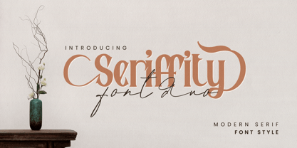 Give your designs an authentic handcrafted feel. "Seriffity" is perfectly suited to signature, stationery, logo, typography quotes, magazine or book cover, website header, clothing, branding, packaging design and more. Files included: - uppercase letters - multilingual symbols - numerals - punctuation Thanks for use this font
 - Sunset Trips by Maulana Creative,
$16.00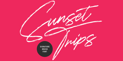 Give your designs an authentic handcrafted feel. Sunset Trips is perfectly suited for signatures, stationery, logos, typography quotes, magazines or book covers, website headers, clothing, branding, packaging design and more. This font includes: - Ligatures - Multilingual Support Thanks for use this font ~ Maulana
 - Astrospy JNL by Jeff Levine,
$29.00Astrospy JNL is a square-shaped, futuristic techno-style font from Jeff Levine. It is very well suited for short phrases, but caution should be used in setting too many words with it because of legibility issues. Best used in larger point sizes. - Bearish by Trim Studio,
$12.00 Bearish is a handwritten modern display font, inspired by kids handwriting. It's perfectly suited for crafters and graphic artists to complete their design such as invitations, advertisements, posters, logos, birthday carts, product signs, and many more. Bearish contains all standard glyphs and punctuations.
 - Marita by profonts,
$51.99 Marita combines sternness with swing and, from this, develops its own, unique elegance. This makes Marita quite versatile, also and especially for headline settings. Apart from numerous ligatures, the font also includes old style figures. Marita is based on brush writing with drop-shaped serifs. The idea was to try to apply a given design criteria (also see Volker Schnebel's Manuel and Martin fonts) to every single character. In other words, start with a character and develop all of the others from it. This is quite easy for some characters but extremely difficult for others. This process generates creativity and the characters move away from the initial constructed sketch. Together in a typeface, the individual characters are now all of a piece and character.
 - Le Griffe by ITC,
$40.99Le Griffe is the work of French designer Andre-Michel Lubac. A superb calligraphic script, Le Griffe includes two fonts of separate alternates and swash characters. In contrast to its more reserved lowercase, Le Griffe's capitals are quite lively- especially those with swashes and flourishes. With Le Griffe, Lubac has imitated the skilled penmanship of free-flowing calligraphy in digital form. Now, instead of writing out beautiful text by hand, you can set it quickly and easily with this masterful type! - Bonedigger by Hanoded,
$15.00 For some reason I had Paul Simon’s song ‘You Can Call Me All’ in my head when I was busy working on this font, so I just had to call it Bonedigger. Bonedigger does not dig bones, but it does have ‘heavy bones’, as it is quite big. Bonedigger is seriously eroded and would look great on book covers and product packaging. It comes in a lovely regular and italic style and a seriously twisted inline style (with, of course, its own italic). As the song goes: With a knick-knack paddywhack, give the dog a bone, this old font came rolling home.
 - Umberland Slab by Sharkshock,
$115.00 Umberland Slab is an attractive family available in 3 different weights with italics. There’s a particular emphasis on simple geometric shapes and the way they interact with tall vertical strokes. Smooth curves and sharp angles blend together in a pleasing symmetry. Stroke widths are given variable degrees of contrast but serifs are consistent and heavy handed. Spacing is on the tight side with some lowercase pairs quite snug against each other. Umberland Slab would work well in small blocks of text, corporate logos, menus, or signage. This family is equipped with European accents/diacritics for international support, fractions, alternates, and ligatures.
 - Magical Brush by Hanoded,
$15.00 Personally I think a brush font should have the word ‘Brush’ in its name. It’s not that easy finding a name - you need some magic to come up with a good one! Magical Brush is a completely handmade font. I used a small brush (a number 3 to be precise) and Chinese Ink. I wanted just a little ‘erosion’, so I used copier paper rather than my expensive French water color paper (which is quite rough). Magical Brush comes in the normal variant and a chickenpox one. Use it for your posters, your book covers and your Christmas invitations!
 - Modernique by Monotype,
$29.99The Modernique font has an Art Deco flair. Contrast between thick and thin strokes is extreme, making this font only suitable for display. The Lowercase f, i and j are unusual. - Art Topic JNL by Jeff Levine,
$29.00 Art Topic JNL is a round-cornered square sans serif in the Art Deco style, and was modeled from a 1930 WPA (Works Progress Administration) poster for the Federal Arts Project.
 - Solid Serif JNL by Jeff Levine,
$29.00 Solid Serif JNL adds tiny serifs to the letter forms of Parkitecture JNL and changes the look and feel into an Art Deco Roman face for display, titling and period pieces.
 - Rocket Man by Comicraft,
$19.00 Don your Flying Suit and tighten up your Atomic Powered Jet Pack buckle! Pencil in your pencil-thin moustache and stick your head into that Rocketeering Helmet! It's Zero Hour, 9am, 1949! Five Days a Week, you ARE the King of the Rocket Men, ready to Burn out your Fuse on a Timeless Flight into Outer Space Alone! Mission Control has advised our Space Race Typeface that Mars is not the kind of place to raise your kids and, furthermore, it's gonna be a long, long time until touchdown brings you round again to find you're not the man they think you are at home. You are in fact a ROCKET MAN; not a postman or a milkman, you're a modern man, a higher-than-a kite flying masked hero on your first manned flight to Infinity and Beyond!
 - Holy Mary by Redy Studio,
$19.00 Take a closer look and see how beautifully soft this calligraphy script is, both elegant and simple. Holy Mary is a lovely calligraphy font that writes beautifully and is easy to read. Holy Mary Font will instantly make your designs stand out from the crowd, adding a unique look and touch to whatever you put it on! Providing the combination of elegance, freedom, and sophistication from its own unique curves and elegant ink flow, along with modern touch makes it perfect for various design needs, for your project needs a feminine or masculine touch, Holy Mary can do it all! Perfectly suited for logo design, wedding invitations, labels, quotes, headings, signage, and more! Feel free to give me a message if you have a problem or question. Thank you so much for taking the time to look at one of our products. ~Redy
 - Kappa by W Type Foundry,
$25.00 Kappa is a modern sans serif with humanistic and geometric features. Its structure is slightly narrow to fit in a greater range of platforms (moreover if you print it, you may save a lot of paper), and its height is higher allowing a great legibility in small sizes. This family is composed with the display version and the text version providing a broad spectrum of solutions, making this family easier and friendlier to use. Designed with powerful OpenType features in mind. Each weight includes alternate characters, ligatures, fractions, special numbers, arrows, extended language support, small caps and many more… Perfectly suited for graphic design and any display / text use. The 36 fonts are part of the larger Kappa super family. Learn about upcoming releases, work in progress and get to know us better! On Instagram W Foundry On facebook W Foundry wtypefoundry.com
 - Magneton by Melvastype,
$32.00 Magneton is a brush script typeface that contains three weights and two slant angles. Three weights simulates the pressure of the brush pen; light is written with a gentle pressure and the bold one with more pressure. Two slant angles gives Magneton two natures; the more casual one and the more dynamic one. So with this script you have lots of options to choose from. You can adjust the look and feel just like when writing with a real brush pen! Magneton has lots of alternates and swash characters. It has two sets (and more) of upper case letters. The more basic one and the more flamboyant one. It also has lots and lots of lower case alternates: two styles of end swashes, underlines, a few different ascender and descer swashes and much more. Please explore the images and glyhp set to get the idea. I hope you like what you see and use Magneton in logos, lettering compositions, t-shirts etc. there are lots of opportunities with this one. Thank you and please enjoy!
 - Cenzo Flare by W Type Foundry,
$20.00 Cenzo Flare is a mixture of modern sans serif base with a touch of flare to it. The inspiration is drawn from all kinds of old Americana advertising, Italian posters, old century logos and signs. All that plus the strong trend on retro fonts now displayed on tv series and current music imagery results on Cenzo Flare. A typeface designed for headlines, posters, advertising and corporate identity. With its appealing curvy smooth edges it is sure to catch the eye. Also enjoy multiple styles that work on their own or as overlapping layers with the InLine & Line variants to create colorful designs. This 40 font family consists of four 5-weight subfamilies: Regular, InLine, Line & Condensed. All of them with matching italics. Designed with powerful opentype features, each weight includes alternate characters to play with, extended language support and many more. We’re proud to introduce: Cenzo Flare. Learn about upcoming releases, work in progress and get to know us better! On Instagram W Foundry On facebook W Foundry wtypefoundry.com
 - Bobber Motorcycles by Vozzy,
$10.00 Introducing a vintage look label font named Bobber Motorcycles. It includes five styles - Base, Rough, Outline, Shadow and Light. This font will good viewed on any retro design like posters, t-shirts, labels, logos and more.
 - PIXymbols Signet Classic by Page Studio Graphics,
$29.00A font package to generate traditional three-letter monogram designs, or a single initial. Includes 29 borders, each accessed by a single keystroke on the computer keyboard. The borders will automatically line up with the initials. - Relaunch by Fype Co,
$16.00 Relaunch delivers a classy, smart and timeless look. To make it look like handwriting, we created 20 ligatures and 15 alternates, so you can mix and match it to make a better style on your design.
 - Fontropolis by Comicraft,
$49.00 When you're ready to leave your cozy picket fence life in Typeville, make the move to the hustle and bustle of Fontropolis! FONTROPOLIS is populated by friendly-faced characters you can always count on to help you through the thick and thin of everyday life in the Capital. Why not take a day to admire the classic arches of the ascenders, descenders and horizontals featured in Fontropolis's architecture? Indulge in a little idle chitchat with your fellow Fontropolitans! Fear not! The People of Fontropolis will stand firm beside you when the unavoidable Supervillains and Crackpots descend on the capitals, spouting Arrogant Expositions of their Nefarious Plans as they seek to usurp our great country’s democracy! FONTROPOLIS will always prevail! The Fontropolis font family includes four weights (Regular, Italic, Bold & Bold Italic) with alternate uppercase characters, Western & Central European & Vietnamese support, Manga characters and Crossbar I Technology™
 - ITC Medea by ITC,
$40.99The designer of ITC Medea , Silvio Napoleone said: “I've always had an interest in early letter shapes, particularly how they influenced modern typographic designs. While I was on vacation in Greece, I had a chance to see, first-hand, examples of early letterforms and typography. They really made an impression on me.” The idea of combining the ancient and the modern to create something new was the primary inspiration behind ITC Medea. ITC Medea is essentially a careful blending of the modern sans serif with the elegant forms of the uncial. At first glance, Medea appears to be constructed of geometric shapes. However, closer inspection reveals many calligraphic subtleties. Stroke terminals are flared slightly in characters like the 'e' and 'c.' The top curve of the 'd' is more pronounced than the bottom, and characters like the 'o' are elliptical rather than round. “I gravitated towards the simplicity and legibility of the uncial and half-uncial,” Napoleone recalls. “I thought it would make a great titling font, and I was surprised at how attractive ITC Medea looked in a body text.” - Goudy Text by Monotype,
$29.99The word Text" in Goudy Text™ is short for Textura, and textura is the style of blackletter or gothic writing developed in Northern Europe in the middle ages. The use of space in blackletter is quite different from what we know about Roman letterforms. Lowercase forms in blackletter writing and typefaces must be evenly textured with black and white elements, like the texture of weaving or fabric. Capital letters can provide either an integration of the even texture (by the use of decoration in their construction) or, if they are wide and open and filled with white, they provide bright spots of visual emphasis. Goudy, despite being an American in the twentieth century, understood well the fundamental texture of medieval blackletter and the importance of both density and light. He designed Goudy Text in 1928 for Lanston Monotype after studying the type in Gutenberg's 42-line bible; still one of the best models for designers of blackletter typefaces. The lowercase of Goudy Text has impact and medieval authenticity. The standard caps have some Victorian eccentricities but are mostly well drawn. The alternate, or "Lombardic" caps are spectacular - they set beautifully with the lowercase letters, providing the proverbial shafts of light through the Gothic cathedral's stained glass windows. Use this potent font in sizes 14 point or larger, for Christmas greetings, certificates, wedding invitations, advertising, or music collateral pieces." - ITC Cali by ITC,
$29.99 There are a few professions in which being left-handed confers an advantage-think of the great southpaw pitchers in major league baseball, like Sandy Koufax. Now, think of all the great left-handed calligraphers. Not so easy, right? Here's a hint: Luis Siquot. Far from being an advantage, Siquot's lefty orientation proved a hurdle to overcome. When I was young, I had serious problems writing," he recalls. "If there was a lot of text, I almost always soiled the paper with wet ink as my hand followed the pen." Then, a friend told Siquot about a special store in London that catered to left-handed people. It was there that he found an Osmiroid pen specially designed for left-handed calligraphers. ITC Cali is based on Siquot's use of this pen. "Electronic scans of my calligraphy were the foundation of the design," he says. "I was careful to leave in some imperfections to avoid an excessively mechanical look, and added the little notches in the strokes to imitate the texture of writing on a rough cotton paper." ITC Cali works equally well in text and display sizes, but it is a calligraphic script, Siquot warns, "and shouldn't be set in all capitals." That said, ITC Cali is a remarkably versatile design, well-suited to a variety of communication projects."
 - Neo Sans Cyrillic by Monotype,
$103.99The branding agency's client wanted an ultra modern"" typeface that was ""futuristic without being gimmicky or ephemeral,"" according to the design brief. Designer Sebastian Lester took on this intriguing custom font assignment, but soon, a bureaucratic decision cancelled the project. ""I was left with a sketchbook full of ideas and thought it would be a shame not to see what came of them,"" says Lester. He decided to finish the design on his own. Lester's research confirmed that the principal ingredient of an ""ultra modern"" typeface was simplicity of character structure: a carefully drawn, monoline form, open letter shapes and smooth, strong curves. To conceive a typeface that crossed the line from modern to futuristic, Lester decided to amplify these qualities. About a year after Lester's initial conceptual work, two highly functional and versatile typefaces emerged. These are Neo Sans and Neo Tech, designs Lester describes as ""legible without being neutral, nuanced without being fussy, and expressive without being distracting."" Both the Neo Sans and the more-minimalist Neo Tech families are available in six weights, ranging from Light to Ultra. Each has a companion italic, and Neo Tech offers a suite of alternate characters. While engineered to look modern as tomorrow, Neo Sans and Neo Tech display the functional and aesthetic excellence that earns them a place in the list of classic designs from the Monotype typeface library. - Neo Sans Paneuropean by Monotype,
$114.99The branding agency's client wanted an ultra modern"" typeface that was ""futuristic without being gimmicky or ephemeral,"" according to the design brief. Designer Sebastian Lester took on this intriguing custom font assignment, but soon, a bureaucratic decision cancelled the project. ""I was left with a sketchbook full of ideas and thought it would be a shame not to see what came of them,"" says Lester. He decided to finish the design on his own. Lester's research confirmed that the principal ingredient of an ""ultra modern"" typeface was simplicity of character structure: a carefully drawn, monoline form, open letter shapes and smooth, strong curves. To conceive a typeface that crossed the line from modern to futuristic, Lester decided to amplify these qualities. About a year after Lester's initial conceptual work, two highly functional and versatile typefaces emerged. These are Neo Sans and Neo Tech, designs Lester describes as ""legible without being neutral, nuanced without being fussy, and expressive without being distracting."" Both the Neo Sans and the more-minimalist Neo Tech families are available in six weights, ranging from Light to Ultra. Each has a companion italic, and Neo Tech offers a suite of alternate characters. While engineered to look modern as tomorrow, Neo Sans and Neo Tech display the functional and aesthetic excellence that earns them a place in the list of classic designs from the Monotype typeface library. - Milk Drops by Duck Soup Design,
$12.00 Milk Drops is a semi-casual-feeling cross between a didone and slab serif display font. Elegant, flourishy, whimsical and bold, as much as one font can be any or all of those things! It has highly contrasting weights, but not so much to take itself too seriously or risk legibility. Playfully, it entertains the teardrop motif wherever it can – in expected areas like the descender of a "y" and the ascender of an "f", but also in some whimsical flourishes. Many of the uses of the teardrop motif are implemented on the terminals and ears where many old prints may have suffered from bleed of ink – answering a "what if" question like "what if those accidental bleeds were designed on purpose?" or "what if a font were designed as though it was already seen through blurry eyes?" Milk Drops also features stencil-like open counters and lots of ligatures (32). Note also, it has some super-nerdy additions like symbols for Bitcoin, Pilcrow, Interrobang and Irony Mark. Language Support Milk Drops is highly versatile – with an impressive count of 470 glyphs, it can accommodate up to 78 latin-based languages.
 - Dream Script by Lián Types,
$49.00 One of my dreams as a type-designer was making a good looking chancery cursive. Full of life, like some of the best calligraphers around the world do on their artworks. With Julian Waters, John Stevens and Denis Brown (just to name a few of them) (1) chancery, or italic script, was transformed into a new, exciting and very fresh style of calligraphy mainly at the end of 20th Century. Dream Script may be that dream named above made true. I have been practicing chancery in the way I learnt from those calligraphers for many years now. Making a font out of my ink-sketches was a tough work, since they were closer of -being art- than of -being type-. However, this font rescues many aspects of handmade calligraphy: You have to look at it really close to notice it is actually a font, and that was one of my goals. The secret of a good looking chancery is on its subtle details: pen angle is constantly changing, even on the strokes which seem straight. Capitals and swashes have to be done a little faster than lowercase letters. The rhythm has to be even, in spite of its playful look. The fact that makes Dream look alive is that it has many alternates per glyph. This makes each word look unique like it happens in calligraphy: you will find alternates for the beginning/ending of a word/phrase, some for the middle of it, some interchangeable. Also, to accompany the script, you will find Dream Caps, which was inspired in the eternally beautiful trajan capitals. Place them like I did on the posters and you will have great results for sure. The font works great in small, middle and big sizes and can be a great selection for magazines, wedding invitations, perfumes, and posters. Close your eyes, and Dream with me... TECHNICAL Dream Script Pro is the most complete style, it contains all the alternates and ligatures (OT programmed, better if you use Adobe applications) If you plan to use the font for text, be sure to activate the less decorative capitals, which are placed in the “salt” group of alternates. Dream Script Standard has less glyphs than the Pro one, it contains just some ligatures for a better legibility. (OT programmed, better if you use Adobe applications) NOTES (1) Not only are they great artists, but also good people, who are always willing to share with their students all what they know. I would also like to thank Ricardo Rousselot, whose work inspired me this time to make “The Dream Script” exlibris; and to Alisara Tareekes, a very talented friend which international calligraphy conferences gave me: She kindly helped me with some tips to make this font better.
 - FS Clerkenwell by Fontsmith,
$80.00 A creative context 2003. Fontsmith was sharing a small, cold, whitewashed studio space in Northburgh Street, Clerkenwell. But things were on the up following prestigious custom type commissions for The Post Office and E4. “Slab serifs were on the brink of another revival, we could feel it,” says Jason Smith. “All we wanted to do was have a play with these slabs, go as far as we could within what was acceptable and readable.” “It wasn’t initially clear what was happening,” recalls Phil Garnham. “We were becoming very influenced by our surroundings, outside the studio space. We absorbed the essence and the designer grime of where we were.” Process Jason began by drawing stems on-screen. “The key aspect of the font is the upward bend of the leading shoulder serif, the way it kind of ramps up and then plummets back down the stem. “The regular and light characters are quite narrow – great for text but the bold is quite wide and chunky – better for headlines. I think ‘y’ is quite different for a slab design. We call it the Fontsmith ‘y’.” Promotion Fontsmith were determined to get FS Clerkenwell noticed. To launch the font, Ian Whalley, a designer friend of Fontsmith, captured words heard on the streets of Clerkenwell, set them in the new font and crafted a small book of typographic conversations. It was a first for Fontsmith. “I think that’s part of why this font has been so successful,” says Phil. “It really does embody the spirit of the area, as a special place for design, arts and crafts. And designers love that.” Contemporary twist FS Clerkenwell, based on influences in and around this part of London with a rich tradition of printing and design, mixes tradition with creation. Old-fashioned values meet new-school trends. Its quirky, contemporary character lends an edge to headlines, logotypes and any large-size text.
 - Egyptian Hieroglyphics – Dendera by Deniart Systems,
$25.00 Cast your stars like the ancient Pharaohs. Commonly known as the Zodiac of Dendera, this series is based on the symbols found on the roof of the temple at Dendera. It is believed that the Egyptians likely borrowed the signs of the zodiac from the Greeks, possibly in the Ptolemaic period. Containing 52 unique characters, the series includes the 12 zodiac signs, the 30 phases of the moon in its equatorial position, the Gods of the four winds, and the Gods of the five planets of Venus, Mercury, Mars, Saturn and Jupiter. NOTE: this font comes with an interpretation guide in pdf format.
 - Tabulamore Script by Tabular Type Foundry,
$25.00 Tabulamore is a monospaced script typeface with two goals: to make a script face that looks as natural as possible within the limitation of monospace, and to offer better all-cap solution where many script typefaces fail to address. The typeface style is generally a loosely spaced casual script, whose spacing allows big letters like M W m to fit comfortably. The automatic small cap part is based on so-called Architect�s Casual style, and shows up automatically depending on the context. As the name suggests, it is perfect for someone who likes to express their love in monospace format.
 - Fer by ParaType,
$30.00 Fer is a sans-serif font for body text, not lacking in its own distinctive voice. The aftertaste of reading the text set in Fer is like reading the letters on old rusty plates somewhere in Southern Europe, hence the name (Fer means iron in French). Being a modern system that includes a variable font with weight and optical size axes, Fer combines the features of geometriс sans serifs and old sans serifs with closed apertures. The typeface contains three sets of styles: for captions, text and headings, — with the weight ranging from regular to black. Fer was created with the idea to unite nations. The Latin character set supports all European languages, most African languages and Vietnamese. Cyrillic has support for all living Cyrillic languages and some obsolete characters too. The font also supports the Greek language. Additionally, the character set includes currency signs of all supported languages’ countries, old style, lining, tabular and proportional figures as well as numbers in squares and circles. Lastly, the font has lots of localized letterforms and stylistic sets. Fer was designed by Dmitry Goloub for Paratype in 2020–2023.
 - Annifont - Unknown license

- Alcohole - Unknown license

- HOZENOZZLE - Unknown license

- Brad - Unknown license

- Love Duets by Ingrimayne Type,
$9.00 LoveDuets is a family of two novelty fonts that have letters on hearts. There are at least five other font families on myfonts that have have letters on hearts but LoveDuets differs from them because it uses the OpenType feature of Contextual Alternatives (calt) to put two letters on each heart, one on the left side and a second on the right side. The two styles in the family can be used in layers to increase color possibilities. The brace characters have empty half hearts that can be used to replace spaces or to complete hearts at ends of lines. LoveDuets can be used when hearts are appropriate such as for Valentines Day, anniversaries, and weddings.
 - Strangelove NextSlab by FaceType,
$12.00 Strangelove NextSlab is a serif version of our bestseller Strangelove Next. It contains 3 styles with two weights each. (Be sure to have ‘Contextual Alternates’ activated in your design app of choice to get a more lively look when it comes to subsequent letters like ee, gg ... etc).


