10,000 search results
(0.5 seconds)
- Classy Wishes by Seemly Fonts,
$14.00 Classy Wishes is a display font. Classy Wishes is perfectly suited for stationery, logos, t-shirt, paper, print design, website headers, photo frames, flyers, music covers, posters, image sliders, and much more.
 - The Monster by Maulana Creative,
$10.00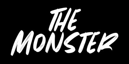 Give your designs an authentic brush handcrafted feel. The Monster is perfectly suited to signature, stationery, logo, typography quotes, magazine or book cover, website header, flyer, clothing, branding, packaging design and more.
 - Dobra by DSType,
$26.00 Dobra is a redesign of the previous released Dione. Dobra is a very geometric and robust sans typeface, specially suited for magazines and newspapers, but it works great as a corporate typeface.
 - Mykonos by Deniart Systems,
$20.00 A geometrical, modern, angular design inspired by the Greek Key. It's complex yet simple, creating smooth, continuously flowing print. This font is well suited for headlines, posters, greeting cards, and much more.
 - Pleasing Moment by Seemly Fonts,
$14.00 Pleasing Moment is a striking display font. It is perfectly suited for stationery, logos, t-shirt, paper, print designs, website headers, photo frames, flyers, music covers, posters, image sliders, and much more.
 - Tatty by Scrowleyfonts,
$- Tatty is a sans serif, monoline font that is distinguished by the gentle, rounded, backward curves on the ascenders. I created it because I had a picture in my mind of a font that I wanted to use when designing images and logos for clients' websites but I could never find one that was just exactly right. Many years ago I worked for a sign-writing company. My job was to copy and enlarge letter sets from printed copy and then cut masks for airbrushing. One morning I arrived at my desk to find that the airbrush artist had written on a rough, rubbed out, scribbled on drawing of the letter ‘a’ - “make a letter happy, make it beautiful”. That was the brief I set myself in the design of Tatty - to make every letter happy and beautiful. The result is a flowing, elegant yet simple type which I believe works particularly well for poetry.
 - Irrlicht by Aarhaus,
$30.00 Irrlicht is based on C. H. Kleukens’ 1923 typeface Judith Type . Whilst Dunkle Irrlicht is a fairly faithful rendition and extension of Kleukens’ typeface, the Licht style was initially added as a stand-alone stencil version; yet, the two styles work perfectly together – for different nuances, for emphasis or simply stacked/layered. Irrlicht is equipped with upper- and lowercase ligatures, contextual and stylistic alternates, fractions, superior and inferior figures, extended language support and a few extra goodies. Additional information – How Irrlicht came to life Christian Heinrich Kleukens cut his Judith Type in 1923, at the peak of German expressionism, exclusively for publications with the Ernst-Ludwig-Press, such as a limited series of biblical prints – the first being the Book of Judith , hence the original’s name. I stumbled upon this typeface a couple of years ago in a nice little 1930 booklet of the Gutenberg-Gesellschaft and was struck by its forceful darkness on paper and its seemingly simple, crude letterforms. The lack of a long-ſ in the final version of Judith Type – quite unusual for a German typeface of that time – adds to this feel of crudeness and spontaneity*. Judith Type seemed to me like a semi-blackletter cousin of Rudolf Koch’s typeface Neuland (cast in the same year). Besides its apparent affinity with expressionism, it reflects a lot of that deeply spiritual craftsmanship of the era – much like Neuland. A few months later, when I was working on a stencil project and looking for a typeface that could be cut into thin wooden plates easily, I remembered those dark, sharp letters that seemed to be lacking any curves at all. After enlarging a few letters and tracing them by hand, the whole set was redrawn digitally, using only straight lines. As for spacing, the goal was to keep the letters tight but to avoid touching characters – without ironing out all the original’s tension and rhythm. Deliberate kerning, subtle contextual alternates and ligatures help to deal with critical glyph combinations. Two additional versions were developed: a stencil version with open counters and, in reference to a popular style of the 1920s and inspired by dry, cracked wood, an inline version. These two additional styles were later merged into one font – Lichte** Irrlicht was born. — AARHAUS * Consequently, the original typeface’s German eszett is simply a ligature of the “round s” and standard z . In some of his publications, Kleukens dispenses with using eszett altogether and sets double s instead. Irrlicht , however, does feature a more common eszett (ß); the original, among other more faithful letter forms, can be accessed via the stylistic sets feature ** licht – literally bright – being the German term for inline typefaces – not to be confused with leicht ( light )
 - Chubs by Type.p,
$24.00 "Chubs," a typeface specifically designed for large display sizes, perfect for making a bold statement. Each letter in Chubs has been meticulously crafted to possess a thick and prominent appearance, ensuring that your designs leave a lasting impact on viewers. Chubs's distinctive weight and blackness make it an ideal choice for a wide range of applications, including posters, packaging, and logos. Whether you want to create eye-catching promotional materials or design a powerful brand identity, Chubs has got you covered. Within the Chubs typeface family, you'll find two distinct styles, each with its own personality and visual appeal. The first style, "Chubs Black," features letters with a captivating slit, reminiscent of a belly that overlaps. This distinctive groove adds an extra layer of visual interest and uniqueness to your designs. On the other hand, "Chubs Filled" offers a solid and plump appearance, without the characteristic slit. This style amplifies the chubby nature of the letters, resulting in a bold and impactful display. To further enhance your creative options, both styles within the Chubs family include an alternate character set featuring a wink shadow in every letter. These additional characters provide a touch of fanciness and playfulness, allowing you to experiment and add unique elements to your designs. Choose "Chubs" for your next big project, and witness the boldness and charm that sets your designs apart from the rest. Let Chubs bring your ideas to life and make a powerful visual statement that captures attention and leaves a lasting impression.
 - Squirty by Typodermic,
$11.95 Picture this: You’re sitting at your desk, staring at the same old boring font on your screen, and you can feel your eyes glaze over as you read yet another tedious document. Enter Squirty, the typeface that injects a much-needed dose of life into your words. Inspired by the vibrant promotional visuals of Japanese nightclubs from back in the day, Squirty is like a breath of fresh air in a stale room. Its hand-painted letterforms are quirky and playful, with a personality all their own. And don’t worry about being too rigid—Squirty’s unconventional style gives you permission to let your hair down and loosen up a bit. But that’s not all. If you’re lucky enough to have access to OpenType ligatures, Squirty takes things to the next level. Letter and numeral variations shuffle around automatically, so your words flow more naturally, like a conversation with an old friend. No more stuffy, robotic language—Squirty lets you be yourself. So why settle for boring when you can have brave? Give your words a personality all their own with Squirty—your new wingman in the design world. Most Latin-based European, Vietnamese, Greek, and most Cyrillic-based writing systems are supported, including the following languages. Afaan Oromo, Afar, Afrikaans, Albanian, Alsatian, Aromanian, Aymara, Azerbaijani, Bashkir, Bashkir (Latin), Basque, Belarusian, Belarusian (Latin), Bemba, Bikol, Bosnian, Breton, Bulgarian, Buryat, Cape Verdean, Creole, Catalan, Cebuano, Chamorro, Chavacano, Chichewa, Crimean Tatar (Latin), Croatian, Czech, Danish, Dawan, Dholuo, Dungan, Dutch, English, Estonian, Faroese, Fijian, Filipino, Finnish, French, Frisian, Friulian, Gagauz (Latin), Galician, Ganda, Genoese, German, Gikuyu, Greenlandic, Guadeloupean Creole, Haitian Creole, Hawaiian, Hiligaynon, Hungarian, Icelandic, Igbo, Ilocano, Indonesian, Irish, Italian, Jamaican, Kaingang, Khalkha, Kalmyk, Kanuri, Kaqchikel, Karakalpak (Latin), Kashubian, Kazakh, Kikongo, Kinyarwanda, Kirundi, Komi-Permyak, Kurdish, Kurdish (Latin), Kyrgyz, Latvian, Lithuanian, Lombard, Low Saxon, Luxembourgish, Maasai, Macedonian, Makhuwa, Malay, Maltese, Māori, Moldovan, Montenegrin, Nahuatl, Ndebele, Neapolitan, Norwegian, Novial, Occitan, Ossetian, Ossetian (Latin), Papiamento, Piedmontese, Polish, Portuguese, Quechua, Rarotongan, Romanian, Romansh, Russian, Rusyn, Sami, Sango, Saramaccan, Sardinian, Scottish Gaelic, Serbian, Serbian (Latin), Shona, Sicilian, Silesian, Slovak, Slovenian, Somali, Sorbian, Sotho, Spanish, Swahili, Swazi, Swedish, Tagalog, Tahitian, Tajik, Tatar, Tetum, Tongan, Tshiluba, Tsonga, Tswana, Tumbuka, Turkish, Turkmen (Latin), Tuvaluan, Ukrainian, Uzbek, Uzbek (Latin), Venda, Venetian, Vepsian, Vietnamese, Võro, Walloon, Waray-Waray, Wayuu, Welsh, Wolof, Xavante, Xhosa, Yapese, Zapotec, Zarma, Zazaki, Zulu and Zuni.
 - Cross Stitch Gothic by Gerald Gallo,
$20.00 Cross Stitch Gothic is not intended for text use. It was designed for use as fancy monograms or initials. Cross Stitch Gothic is based on upper case characters 28 stitches tall and contains the characters A-Z. Most characters extend above the capital line or below the base line.
 - Miometry by HakanPolatovic,
$20.00 GEOMETRICAL PERFECTNESS Every letter of miometry has a ratio to one another SHARPNESS Due it's design,it has a elegant look at first sight RATIONALITY It can even be used in every kind of rational system like patterns etc INSPIRED BY Concepts like futurism,transhumanism,cyberpunk,cyberworld etc
 - Regular Bien by JASCHA&FRANZ,
$15.00 Regular Bien is a display font that is created out of two shapes - a circle and a line. It has a plain and a mutated face, depending on the usage of lowercase or capital letters. Regular Bien can be used in various fun ways and connections between lines.
 - Outer Space by Vozzy,
$10.00 Introducing a vintage look label font named "Outer Space". You can see all available characters on the posters. This font have 4 styles (including layered shadow effect style). Outer Space will do well on any retro design like poster, t-shirt, label, logo etc.
 - FT Graphitum by Foxys Forest Foundry,
$9.00 This is a powerful graphic rough sans-serif typeface with four different styles. Two linear, one with an aged texture and one basic, for your experiments. It makes a bold impression, feels like a strong simple typeface. Looks great in short inscriptions, headlines, posters.
 - Sorvettero by Just in Type,
$30.00 Sorvettero is a sans, layered and unicase typeface inspired by some wood signs at Descansópolis, a neighborhood on Campos do Jordão, a city of Brazil. A fun and cute display project with different use purposes, like packaging, logos, signs, and whatever your creativity brings on. Designed by Diego Maldonado, with contribution of Tony de Marco on the Diamond style.
 - FF Sizmo by FontFont,
$50.99 FF Sizmo™ is available in two flavors. One is an honest, industrial strength, somewhat condensed, sans serif family. The other builds on the first, and is a display design with horizontally connecting baseline strokes. The five weights of basic the FF Sizmo typefaces are ideal for print and digital projects. Character spacing is generous, counters are open and apertures are wide and clear. Banners, navigational links, sub heads, and short blocks of contextual copy are natural on-screen uses for the design. Print projects from branding to way-finding also fall easily into FF Sizmo’s range of applications. The “line” versions of FF Sizmo can be arresting stand-alone typefaces – or distinctive complements to the basic roman and italic designs. In either instance, the line designs make powerful statements in headlines, subheads, posters and cover art. OpenType® fonts automatically insert beginning, middle or ending line element characters into the copy. Drawn by Verena Gerlach, both designs were inspired by the same source, a commercial signage system that enabled quick and easy copy changes. “The idea for the typeface,” explains Gerlach, “is a housing complex index board, on which movable white plastic capital letters were fixed by a thick line to the wooden board. This line is an important part of the font’s appearance.”
 - HT Libreria by Dharma Type,
$19.99 This font consists of thin lines, we get very delicate impression.The straight lines are regularly arranged, at the same time, this font has very beautiful curved lines. So its overall atmosphere is intelligent and sophisticated. Holiday Type Project offers retro hand drawing scripts. Inspired by retro script on shopfront lettering, wall paint advertisements in Italy around 1950s. Check out the script fonts from Holiday Type!
 - Choir by Linecreative,
$16.00 Choir is a modern sans serif font. Each letter consists of three combined lines that connect together like a maze. This font is suitable for logos, business cards, magazines header, Flyer Titles, or large-scale oven artworks.
 - Paradise Lost by Hanoded,
$15.00 Paradise Lost is a 1667 poem by John Milton which mostly concerns the Biblical story of the Fall of Man, Eve's temptation by the devil and the expulsion of Adam and Eve from Eden. It's quite a hefty read, as the poem consists of ten books with over 10.000 lines of verse. Needless to say, I didn't read it all. But, it did give me inspiration for a font, which I called Paradise Lost. It's a good name, even though there is nothing Biblical about this font. Paradise Lost was created (pun intended) using a broken bamboo satay skewer and Chinese ink. It is all caps, but upper and lower case differ and like to mingle. I also included several ligatures for double lower case letters (aa, ee, jj, kk, etc.). Paradise Lost comes with an eternity of diacritics.
 - Saveur Sans by Arkitype,
$10.00 Saveur Sans is inspired by art deco and French cafes. This display family has clean, simple letterforms that feel modern but at the same time have a retro, art-deco styling. This family can add a sophistication to any layout whether it be print or online. Saveur Sans is a great selection for headlines, logotypes and branding. it is an all-caps display family with some neat alternates including an alternate O and E that instantly give your copy that retro-deco look. The promos have been inspired by french food and design. This family is perfect for use in packaging and branding of food products as well as menus and restaurant or cafe branding.
 - Josephine by Scholtz Fonts,
$25.00Josephine, named for Josephine Baker, the legendary dancer of the 1930s, is a twenty first century sans serif typeface that harks back to the earlier part of last century. Although very modern, it has been greatly influenced by the many art deco fonts produced during the twenties and thirties of the twentieth century.In it I have tried to capture the art deco spirit in a modern humanist font. Josephine is exceptionally readable and yet completely characteristic of the Art Deco period. It can be used for text passages as well as display in posters, advertising, labels and packaging. It is professionally finished and contains all upper and lower case characters as well as all special characters, punctuation and symbols. - Gizela by Type Salon,
$11.00 Gizela shows her personality with a feminine, sensual, seductive and art deco vibes. Perfect for late December invitations and New Year's cards.
 - Ming by K-Type,
$20.00 A sans serif with the futuristic retro, Art Deco feel of mid 20th century science fiction, particularly the early Flash Gordon serials.
 - I am not a robot by PizzaDude.dk,
$15.00 The other day I had to login to a page several times, and as security I had to check the "I am not a robot" box. Actually, I think I did a login at that particular page like 30 times that day...and in the end I was thinking "Come on, you should know by now that I am not a robot" And even though I thought it was a repetitious hassle I figured that I needed to name a font "I am not a robot" - and not a robotic-like one, but a sweet and funny cartoonish one! :)
 - Positronic Toaster by Brian Crick,
$25.00 Positronic Toaster is a modern interpretation of the French upright scripts of the nineteenth century. It started off as an attempt to make a stylized script that didn't feel like it belonged on a 1950s chrome appliance. Later on, however, the design grew to embrace the qualities of that style of lettering. The result is something playful and elegant, that is not tied to any particular time period. The distinctive angular loops on the ascenders will join together in words like 'bulb' or 'wallflower' using OpenType contextual alternates. It is suitable for cards, wedding invitations, or any project requiring a fashionable, upscale look.
 - Marseille by Louise Fili Ltd,
$35.00 Marseille is an Art Deco-inspired typeface which is based on Louise Fili’s iconic cover design for the hauntingly beautiful Marguerite Duras novel, The Lover. The font is available in six irresistible weights: thin, light, regular, medium, semibold, and bold. Each weight features both caps and lower case, and supports over 200 languages. Marseille will satisfy all your typographic needs, from book jackets to monograms to packaging, logos, and even wedding invitations—timelessly elegant, with a distinctive flair that exudes La Belle France.
 - Aglaia by Wildstripe,
$19.00 Aglaia is an elegant geometric sans serif typeface that comes in three weights. Designed in part inspired by Art Deco, but with a modern minimalist approach that makes it a versatile and excellent contemporary display font for titles, editorials and short texts. Font features: Uppercase & Lowercase Numerals, Punctuation & Symbols Alternates & Ligatures Multiple Languages Support (Latin characters + Diacritics) How to access Alternate Characters: The alternate characters can be accessed via the glyphs panel in your favorite software. Or with OpenType features turned on.
 - Office Visit JNL by Jeff Levine,
$29.00 Dan Hardie, a Miami-based graphic artist and creative consultant at Mutiny, Inc. shared an image he’d spotted online of some interesting signage formerly on the front of the Miami Medical Building. Comprised of hand-cut metal characters (with a thoroughly avant-garde “Art Deco meets Modernist” approach), this instantly became a font design idea unusual and quirky enough to develop as a digital typeface. The end result is Office Visit JNL, which is available in both regular and oblique versions.
 - Decour Soft by Latinotype,
$26.00 Decour Soft is the rounded-edged version of Decour. It is a slab serif humanist low contrast typeface. The overall design also features strong curves, making it a very friendly face. The font retains the original elegant features of Decour—based on Art Deco design—such as high contrast between upper and lower case characters. Decour Soft is a suitable font for logotypes and packaging. Its design also allows it to be used with certain elegance in book titles and magazines subheadings.
 - UNDERSTOOD by Studio Hello Good,
$12.00 Understood is a cool alternative for you to easily create a logo for your underground metal band. Using alternate front and ending letters brings the font to life, It comes with a basic character set and a small group of symbols and signs often used in the extreme music sector – the classics of Death- and Blackmetal like pentagram drops, roots, spikes and more.
 - Angelynn Monogram by Letterara,
$14.00 Angelynn Monogram is a beautiful Calligraphy script with a Monogram font designed with an incredibly modern feel. This font is PUA encoded which means you can access all of the glyphs and swashes with ease! It features a varying baseline, smooth lines, gorgeous glyphs, and stunning alternates. Use this gorgeous and unique Calligraphy font to bring any DIY project to life!
 - Wonder Dream by Sabrcreative,
$15.00 Welcome to Sabr Creative, where imagination comes to life through fonts like our delightful Wonder Dream. This display font is designed to bring smiles to kids and kids at heart with its cute and happy style. The Wonder Dream font is perfect for adding a touch of whimsy to your creative projects, from children's books to playful invitations and more.
 - Monument by Solotype,
$19.95This font started life in 1893 at the Boston Type Foundry, but was also cast at the Central Type Foundry. Both were members of the ATF combine formed in 1892. Like so many interesting fonts of its day, it was issued without a lowercase, limiting its use to display headlines. Sometime in the early 1990s, we designed a lowercase to go with it. - Boutiera by Melvastype,
$32.00 Boutiera is an upright and soft vintage script with a modern twist. Its main characteristics are bouncy baseline, round forms and bumpy stems. These qualities gives Boutiera its casual, friendly and handmade looks. It has three weights to give contrast and options to your typographic elements and designs. Boutiera has two sets of Upper cases; Slightly swashy and more basic one. The more basic set can be used in all caps. Boutiera has positional alternate characters; Initial forms to letters like r, s, x and z. And final forms to all lower cases. Those final forms have a shortened upstroke to give more balanced and harmonized look. You can use these easily by enabling Contextual Aternates from OpenType menu. It also has alternate versions of letters t and s. You can use Boutiera on logos, packages, on titles or wherever you need a friendly and lively font.
 - Garuda by Campotype,
$49.00 Garuda typeface, featuring the shape and style based on "Garuda Pancasila", the state symbol of the Republic of Indonesia. Garuda is a mythical bird in the Javanese puppet stories, is very similar to the eagle. At the typeface we can find more ligatures beside than the standard. Within Garuda at least encoded 792 glyphs per weight onto major codepage: win 1252, 1250, 1254, 1257 including Mac OS Roman. It is containing more OpenType features such as swash, contextual alternate, stylistic, figures/number, and a few bit ornaments. The typeface has a pretty good readability and legibility even in small sizes. So it is useful for short texts (text length? Whom fear) for print and screen material. Usage on headlines, posters, titles, or something like that, can utilize ornament lines as a sweetener. Please find more information about the OpenType Manual of this typeface on the gallery page (pdf).
 - Debs by Scholtz Fonts,
$9.95 Debs was inspired by a thank you note sent from one of my friends to another. The recipient liked the handwriting so much that he passed the note on to me after having asked permission from Debs, the writer. I enjoyed the vigor and looseness of the handwriting, as well as admiring its legibility and style. Debs has all the characteristics of modern handwriting: It appears loose, unstructured, and free, while maintaining good form and great legibility. Its baseline is varied, creating an impression of notes written by busy people, while its characters remain well formed and readable. Debs comes in five styles, regular, lite, black, wide and wide-black. Use Debs for advertising, for casual greeting cards, for a casual, handwritten look on music or fashion media. Debs has all the features usually included in a fully professional font. Language support includes all European character sets.
 - Gingerline by Hanoded,
$15.00 I love learning new words. I stumbled upon the term Gingerline after I named an older font Gamboge. Like Gamboge, Gingerline is a name for a shade of orange - the color of ripe kumquats to be precise. Didn’t know that! Gingerline font is a handmade calligraphy font; nice and even, thick and thin and quite elegant if I may say so. Comes with an abundance of diacritics as well.
 - Adagio by profonts,
$51.99 Adagio Pro, that sounds like music, elegance and classic quality. That's exactly how Adagio Pro carries the message to the reader. Adagio Pro is a rather formal script with very beautiful, generous and swashy upper case that was redesigned, digitized, completed and expanded as OpenType in the profonts type studio.Adagio Pro comes with more than 1.100 characters covering the complete Latin glyph set for West and East including Baltic and Turkish. Additionally, there is a large selection of ligatures, character combinations and alternates to make this beautiful script design a perfect font for OTF-savvy applications like e.g. InDesign or Quark Xpress 7.Adagio Pro is a very distinguished, elegant and versatile script font well-suited for anything in the area of classical music, art, ballet etc. Also, it is good for certificates, reports, documents and alike.
 - Symphony by profonts,
$51.99 Symphony Pro… sounds like music, elegance and classic quality. That's exactly how Symphony Pro carries the message to the reader. Symphony Pro is a rather formal script with very beautiful, generous and swashy upper case that was redesigned, digitized, completed and expanded as OpenType in the profonts type studio. Symphony Pro comes with more than 800 characters covering the complete Latin glyph set for West and East including Baltic and Turkish. Addionally, there is a large selection of ligatures, character combinations and alternates to make this beautiful script design a perfect font for OTF-savvy applications like e.g. InDesign or Quark Xpress 7. Symphony Pro is a very distinguished, elegant and versatile script font well-suited for anything in the area of classical music, art, ballet etc. Also, it is good for certificates, reports, documents and alike.
 - Rocksane Display by Andrey Sharonov,
$30.00 Rocksane Display is a modern hybrid font with fantastic decorative uppercase and strong serif lowercase for impressive and powerful look. This typeface works fine in big sizes and more suits for example in short tittles, logotypes, names, movie posters, books and music album covers. Rocksane includes 84 beautiful uppercase alternates except of basic set. You can easy get it with special combination like A1, A2, A3 etc. (This hot keys works with activated Standard Ligatures option). In addition, there are 11 End-swashes which harmoniously underline the words. You can quickly get it by the same way with combination like _1, _2, _3 up to _11 (underscore+number). This features works fine in Adobe Photoshop or Illustrator. You can use Rocksane for following languages: Danish, Dutch, English, Estonian, Faroese, Finnish, French, German, Hungarian, Icelandic, Italian, Norwegian, Polish, Portuguese, Slovene, Spanish, Swedish, Turkish.