10,000 search results
(0.031 seconds)
- Black Hat by Trustha,
$17.00 Black Hat is a bold handwritten font. Inspired by a round black hat. Written with a brush pen with fast movements. Comes with two fonts, makes it easy to choose a font that suits the project being worked on. Suitable for branding, advertising, headlines, packaging design, and more.
 - Memphis by Linotype,
$40.99 Because of the geometric basis of its forms, Memphis is often thought of as a font for technical fields, making a rational, purposeful impression. This emphasis on objectivity is well-suited to technical texts, but Memphis is appropriate for any text which should exhibit a clear, neutral character.
 - PopUps - Unknown license

- Rennie Mackintosh Artlover by CRMFontCo,
$29.00Charles Rennie Mackintosh's artwork has an art deco feel that has been reproduced on fabrics, jewellery and all sorts of household items. Now, with this font, you can add Mackintosh icons and letter tiles with just the touch of a key. - Basic Monoline JNL by Jeff Levine,
$29.00 On page 34 of the 1930 Samuel Welo publication “Lettering - Practical and Foreign” is a simple, basic Art Deco monoline design. This hand lettered type style is now digitally available as Basic Monoline JNL in both regular and oblique versions.
 - Lecture Hall JNL by Jeff Levine,
$29.00 Lecture Hall JNL is a reworking of Dance Hall JNL. By removing the Art Deco flairs and realigning the horizontal strokes in order to create a more traditional design, the font now takes on the look of a classic headline face.
 - Inlet JNL by Jeff Levine,
$29.00 An interesting bit of Art Deco influenced serif hand lettering was found on the cover of the sheet music for 1938's "Boatman's Serenade". This became the model for the digital font Inlet JNL; available in both regular and oblique versions.
 - Decima Nova Pro by TipografiaRamis,
$39.00 Decima Nova Pro is a geometric sans serif typeface family, built in eight styles. The typeface is ideal for use in display sizes, but also is quite legible in text and is well suited for editorial and brand design. Features include extended language support, small caps, multiple numeral styles, slashed zero, ligatures... Decima Nova Pro is released as font family in OpenType format with a Latin Western 1252, Eastern European 1250, Baltic 1257, Turkish 1254 and Cyrillic 1251 character set.
 - The Beautyline by Putracetol,
$14.00 The Beautyline is a modern monoline typeface. Like the font name, this font is made of beautiful lines with additional lines in some characters which makes this font more beautiful. It’s perfect for branding, logos, wedding designs, social media posts, advertisements, invitations, stationery and any projects. The Beautyline comes with uppercase, lowercase, numerals, punctuation and many variations on each character, including OpenType alternates and common ligatures to let you customize your designs.
 - Swing Era JNL by Jeff Levine,
$29.00 Hand lettered Art Deco lettering for the title on the cover of the 1930s-era song "And I Still Do" provided the inspiration for Swing Era JNL. A bold, casual and friendly typeface, it features an intersecting inline through some of the characters. One could almost picture the hottest big band of the day promoted on a lobby card with this alphabet, beckoning all to come on in and "cut a rug".
 - Tenby by Paragraph,
$12.00 Tenby is a series of modular geometric display sans serif fonts with a hint of Art Deco combined with a 1980s finish. The fonts' underlying grid is ten squares high. Their widths correspond to condensed (Tenby Four), normal (Tenby Five) semi-extended (Tenby Six), extended (Tenby Seven), and extra-extended (Tenby Eight). Each contains two weights, light and regular. Although smaller text sizes are still quite legible, the fonts work better at large sizes.
 - Bloemgracht by Hanoded,
$15.00 In the old Amsterdam neighborhood of 'De Jordaan', you will find a canal called Bloemgracht (Flower Canal). For many years, a coffee store called Schildmeijer could be found here. Their paper coffee bags and advertisements sported a hand made font which I have tried to recreate and the result is Bloemgracht typeface. It is an all caps art deco font, quite angular, but very legible and distinct. Bloemgracht comes with extensive language support.
 - Groovy by ArtyType,
$29.00 Groovy started out as a prospective variant in the ‘Flashback’ series but very quickly established its own distinct appearance, especially with the lower case letters blending into the format so well. There wasn't any preconceived idea to design a retro looking font in principle, it simply evolved that way, but I do think it has several characteristics reminiscent of style genres from the '70s. It’s probably quite subliminal and like me, you may find yourself thinking, what does that remind me of? The double-entendre'd title is quite apt too, not merely for reasons of its outwardly retro appearance but also because of the considered, rounded elements forming the negative spaces throughout. The font also has something of a chameleon-like personality, being both adaptable and capable of having a trendy / fun appearance, or alternatively something solid and stylish, depending on the use, as demonstrated in the banner examples here.
 - Buntaro by Hanoded,
$15.00 I am reading a great book by David Mitchell, called Number 9 Dream. One of the characters is called Buntaro, so I decided to call my new inky font after him. Like the book, Buntaro is quite unusual: it has no real baseline, comes with some strange characters, feels familiar, but surprises you nonetheless. It was made with a broken bamboo satay-skewer, Chinese ink and a lot of patience. Buntaro comes with a wealth of diacritics.
 - CTM Sans by Gspr one,
$- CTM Sans is a typeface of the grotesk category, it is designed based on a previous Herokid typeface, but with greater freedom to creative tastes and at the same time with more rebellion and errors (quite a few, but well-intentioned) than its predecessor. This makes Bellavista a somewhat messy clone, for the grotesk style. This font does not seek to be a correct typography, but rather fun and useful for the designer. I hope you like it
 - Juggling Squad by Bogstav,
$19.00 The name of the font is from the hilarious movie "21 Jump Street" - and that is where the similarity ends. While the movie is quite funny, it is also super goofy! I can't say the same about the font, because terms like organic and organic comes to my mind. Strange, yes! And I have really no good reason for this naming, other that its an odd way to tribute this one of my all time favourite comic movies! :)
 - Austina Capitton by HansCo,
$15.00 Austina Capitton is our new modern, clean, and stylish monoline signature font and was created to look as a naturally handwritten as possible. Built with unique style in OpenType features, this script comes to life as if you are writing it yourself. This font is very suitable to be used to brand a product because if you write a brand name it will look like your company signature. Austina Capitton is perfect for photographers, bloggers, trademarks, magazines, fashion, logos, business cards and much more. There are two styles in this font package, they are Alt and Regular. You can use Regular style if you like the curve of the font or you can use Alt style if you like simple and minimal ones. It's highly recommended to use it in OpenType capable software - like a Coreldraw, Photoshop, Illustrator and Indesign. This font come with Uppercase, Lowercase, Numbers, Punctuation and swash. It offers Multilingual Support, works on Mac and Windows OS and is easy to install. Enjoy!
 - Ultramodern Classic SG by Spiece Graphics,
$39.00 If you're getting tired of using Broadway, here’s an exciting alternative in regular and bold weights. Douglas C. McMurtrie, Aaron Borad, and Leslie Sprunger began designing this high-contrast novelty face for the Ludlow Foundry in 1928. It retains the classic style of the Jazz Age with a bit more individuality and spirit than Broadway. This extreme thick and thin design also sports normal descenders instead of the clipped ones found on Broadway. Ultramodern Classic is also available in the OpenType Std format. Some new characters have been added to this OpenType version. Advanced features currently work in Adobe Creative Suite InDesign, Creative Suite Illustrator, and Quark XPress 7. Check for OpenType advanced feature support in other applications as it gradually becomes available with upgrades.
 - Supertanker by Bogstav,
$11.00 Here's my tall and thin sans handmade font! It's lively, rough and quite organic looking - and to boost the natural organic look, I have added 6 different versions of each letter!
 - Fine And Dandy JNL by Jeff Levine,
$29.00 Fine and Dandy JNL comes from the hand lettered title of the 1929 movie "Isle of Escape"; found on the sheet music for its theme song "My Kalua Rose". An engraved and fancy Roman, the style combines elements of Western, Art Nouveau and Art Deco into one attractive type design; available in both regular and oblique versions.
 - Schoolyard Blues JNL by Jeff Levine,
$29.00 Schoolyard Blues JNL is based on the hand lettered title found on the sheet music for the 1938 song "I Was Late for School". A condensed sans serif with chamfered corners, it reflects the Art Deco influences of the day in some of the letter forms. This type design is available in both regular and oblique versions.
 - Jungle Drums JNL by Jeff Levine,
$29.00 Jungle Drums JNL is based on the hand-lettered title on the 1929 sheet music of its musical namesake. A bold, free form design with a hint of the Art Deco movement of the coming decades, this casual typeface has the vintage charm to enrich many design projects. Jungle Drums JNL is available in both regular and oblique versions.
 - Visual Arts JNL by Jeff Levine,
$29.00 Visual Arts JNL is a classic Art Deco typeface based on the hand lettering found on a 1930s-era WPA (Works Progress Administration) poster for Women Artists. The exhibit took place in the Federal Art Gallery in Boston, and was part of the arts project underwritten by the WPA to keep many creative people working during the Depression years.
 - Chuck by Parkinson,
$20.00 Chuck. Designed in 2004 by Jim Parkinson. Originally released as a Type 1 font, Chuck was refreshed (version2) and re-released as simple Open Type in 2012. The models for this massive Deco typeface appear on a bronze plaque on the South Tower of the Golden Gate Bridge. The plaque commemorates the builders of the bridge.
 - Matahari Sans by Studio Sun,
$36.00 Matahari (English : Sun) is the power source of life. The symbol of power and energy that synergies with other part of daily lives. It is one of the most fundamental thing us humans need, just like communication. And like Matahari itself, words are powerful enough to make a living. Referring to Grotesque Font and influenced by the works of Eric Gill, Matahari Typeface is available in 3 widths and 7 weights, also in Oblique version in each font. The font uses oldstyle and transitional letters (double-story ‘a’ and ‘g’). It has a humanist gesture, the thickness of the font is semi-monolinear where the horizontal and vertical size is almost equal, making the font reach its maximum optical readability even in small sizes. The font anatomy refers to the basic geometric square-sized of the letter ‘M’, while the letters of S/C/G/c/e have uneven curve shape which give the sense of humanist and flexibility. This typeface is ideal for various design needs, from Printing to On-Screen/Digital Reading, from Brand Identity, Posters, Caption, Headline, to Body Text. With the numbers of widths available, the font can be used for all kinds of purposes (Label, Signage, Packaging, Website, etc). Supported well over 75+ languages, including Greek & Cyrillic, Matahari Typeface will give you an excellent way in aesthetic communication and message-delivering.
 - Ferghaus Sans by Fontdation,
$15.00 Introducing Ferghaus Sans, a modern sans serif font. This all-caps font is crafted with high attention to the details, gives you a clean and sharp feeling using it on your designs. Packed with so many OpenType features (such as alternate chars, swashes, ligatures, etc), lets you play and explore every possibilities with the letters combo. Ferghaus Sans is highly versatile, suits best for almost everything, whether you're working on classic themed design, or the modern ones.
 - Caskey by Twinletter,
$15.00 Caskey is a unique font with a graffiti motif, outdoor activities, and an abstract display with gorgeous graphics. We put all of it into this typeface, which we dubbed Caskey. We also include alternates, ranging from thin to thick, to make it easier for you to use; you are free to choose whichever suits you best. Now is the time to use this typeface to bring your specific project to life. This graffiti font is great for product logos, poster titles, headlines, packaging, film titles, logotypes, gorgeous writing, and trendy graffiti designs, among other things. Of course, if you utilize this font in your numerous creative projects, they will be perfect and outstanding. Use this typeface right away for your one-of-a-kind and remarkable projects.
 - Penny by Wooden Type Fonts,
$20.00 A revival of one of the popular serif wooden type fonts of the 19th century, tall x height, quite short descenders, thin, rounded serifs, thick stems, based on Roman styles, deliberate, accurate rendering of the original.
 - Cienfuegos - Personal use only

- Morganhand by Morganismi,
$9.00 Morganhand is a very individual typeface based on the handwriting of Finnish outsider artist Heikki Morgan Hämäläinen. Its economical lines make it very serviceable for numerous uses like cards, notes, prints, comics and so on. Morganhand Outline is based on Morganhand Regular, a handwritten font imitating the writing of Finnish outsider artist Heikki Morgan Hämäläinen. Every drawn line of each glyph is outlined giving a fun expression. The two fonts can be used separately or mixed together. Mightly usable in cards, notes, prints, comics etc. Morganhand Outline supports many European languages. Morganhand supports many European languages. The font works fine with its sister Morganhand Outline which is kind of a modification of it.
 - Kettering 205 by Talbot Type,
$12.99 Kettering 205 is a geometric slab-serif with Art Deco influences, such as lowered crossbars on many characters, and a crossed W. It includes old style non-aligning (lower case) numbers, both proportional and tabular as well as accented characters for Central European languages. It’s a highly individual looking font, but retains good legibility coupled with striking looks as a display font. The Kettering 205 family comprises of six weights and is closely related to Kettering 105, its less Deco flavoured cousin.
 - Lektorat by TypeTogether,
$35.00 Florian Fecher’s Lektorat font family is one for the books, and for the screens, and for the magazines. While an editorial’s main goals are to entertain, inform, and persuade, more should be considered. For example, clear divisions are necessary, not just from one article to the next, but in how each is positioned as op-ed or fact-based, infographic or table, vilifying or uplifting. From masthead to colophon, Lektorat has six concise text styles and 21 display styles to captivate, educate, and motivate within any editorial purpose. Magazines and related publications are notoriously difficult to brand and then to format accordingly. The research behind Lektorat focused on expression versus communication and what it takes for a great typeface to accomplish both tasks. In the changeover from the 19th to 20th century, German type foundry Schelter & Giesecke published several grotesque families that would become Lektorat’s partial inspiration. Experimentation with concepts from different exemplars gave birth to Lektorat’s manifest character traits: raised shoulders, deep incisions within highly contrasted junctions, and asymmetrical counters in a sans family. After thoroughly analysing magazine publishing and editorial designs, Florian discovered that a concise setup is sufficient for general paragraph text. So Lektorat’s text offering is concentrated into six total styles: regular, semibold, and bold with their obliques. Stylistic sets are equally minimal; an alternate ‘k, K’ and tail-less ‘a’ appear in text only. No fluff, no wasted “good intentions”, just a laser-like suite to focus the reader on the words. The display styles were another matter. They aim to attract attention in banners, as oversized type filling small spaces, photo knockouts, and in subsidiary headings like decks, callouts, sections, and more. For these reasons, three dialed-in widths — Narrow, Condensed, and Compressed — complete the display offerings in seven upright weights each, flaunting 21 headlining fonts in total. If being on font technology’s cutting edge is more your goal, the Lektorat type family is optionally available in three small variable font files for ultimate control and data savings. The Lektorat typeface was forged with a steel spine for pixel and print publishing. It unwaveringly informs, convincingly persuades, and aesthetically entertains when the tone calls for it. Its sans serif forms expand in methodical ways until the heaviest two weights close in, highlighting its irrepressible usefulness to the very end. Lektorat is an example of how much we relish entering into an agreed battle of persuasion — one which both sides actually enjoy.
 - LiebeKlara by LiebeFonts,
$29.90 LiebeKlara is LiebeFonts’ most delicious gourmet creation yet. The mouth-watering look of savory swashes and the fine aroma of masterfully sprinkled contextual alternates will make everyone happy—your spouse, family, and friends. LiebeKlara is festive enough to sit on wedding menus, but still warm enough to give everyday dinner invitations the personal flavor they deserve. LiebeKlara likes company—for example when her girlfriend LiebeErika comes over and they have some LiebeOrnaments with their LiebeMenu. LiebeKlara also likes travelling! She speaks most Western languages fluently and with a cute accent. Try it for yourself—LiebeKlara is calorie-free but (or because) she is very delicate. We hope you like her as much as we do! Bon appétit! LiebeKlara comes with a tasty variety of ligatures and alternative forms available through OpenType features. (Please make sure your software supports OpenType if you wish to use the advanced features.) The font contains over 580 carefully hand-crafted glyphs—so it’s more like two or three fonts in one.
 - Sunday Fish by PizzaDude.dk,
$15.00 I am not sure if there is such a thing as a Sunday Fish. But anyway, now you have a font with that name! My idea of a Sunday Fish is a lazy, goofy and kinda laid back one. One you'd like to play around with, and a friend for life - not that kind of fish that ends up on your plate! :) Sunday Fish has massive language support and 4 different versions of each lowercase letter, and these automatically cycle as you type! It comes in 4 different layered versions, which works well together - just play around with the layers and your favourite colours!
 - Framingham JNL by Jeff Levine,
$29.00Framingham JNL is a widened version of Nostrand JNL that takes on a new look quite different from the original condensed wood type design. - Screwball - Unknown license

- Innovate P Rounded by NicolassFonts,
$29.00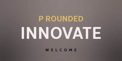 Innovate is a modern versatile sans-serif typeface based on Innovate font family. What differentiates Innovate from the other fonts is an exceptionally distinctive design. It is brilliantly suited for graphic design and display use and perfect for logotypes, t-shirts, packaging, brand identity, books, magazines, newspapers, posters, billboards, and advertising.
 - Chumpsy by PizzaDude.dk,
$17.00 Chumpsy is clumsy - I did my best to make an awkward and bouncy hand-written font that was funky, but still legible. I added 11 slightly different versions of each lowercase letter, which automatically cycle as you type, or you can manually choose the one that suits you the best.
 - Waston by Burnoth Design Co.,
$19.00 Waston is a beautiful and inspiring set of classical typography glyphs based on a minimal and simplistic approach to elegance Waston is a classic serif font made for headlines, titles, and is well-suited for advertising, fashion mood board, branding, logotypes, packaging, titles, editorial design and modern and social media.
 - Docklands by Hemphill Type,
$22.00 An authentic collection of engineered fonts, constructed in East London. Docklands is a handmade font family inspired by the creation of the London docks in the early 18th century. The rough edged sign written style is evocative of the era when iron works and boatbuilding wharfs lined the River Thames.


