10,000 search results
(0.027 seconds)
- Spicy Taste by Vozzy,
$10.00 A new script label typeface named Spicy Taste. This typeface contents caps and small letters, numbers, punctuation signs and some alternates for small letters. This is a handwritten brush font with authentic dry brush strokes like drawn on paper.
 - Miscellany JNL by Jeff Levine,
$29.00 Miscellany JNL collects numerous images of various genres into one dingbat font. There are vintage stencil patterns, old-time ad cuts and decorations, line spacers [number keys 1 through 7], conversation balloons, parking lot symbols and other assorted goodies.
 - Sutiya by Twinletter,
$14.00 Introducing our newest font named Sutiya This font is surnamed calligraphy script with cute and beautiful nuances, designed with beautiful curves for each letter, with opentype support you can change each character easily like magic. It also has a charming modern character, perfect for Halloween and Cristmast nuances. Of course, the beautiful and beautiful letterforms make this font look charming for you to use as a title, logo or anything else in your every design project. This charming font also offers the beauty of abstract typography harmony for a wide variety of design projects, including digital natural handwriting for designs, quote designs, for social media business designs, advertisements, trademarks, food and beverage promotion banners, text, posters, a signature, and all designs require handwriting or whatever design you want. This font is equipped with uppercase, lowercase, numbers, punctuation marks, swhases and several variations on each character including multi-language. ================================================== This font is best suited for open type friendly applications. How to get alternative glyphs from open type fonts: http://adobe.ly/1m1fn4Y PUA Character Code - Fully accessible without additional design software. do not hesitate anymore start using this font. and Feel free to send any message you want to convey.
 - Renouveau by Intellecta Design,
$25.00 Intellecta in partnership with Monocracy Types (Paulo W) presents “Renouveau”. Renouveau : taste the feeling of vintage typography. Inspired by the old letters at classic Victorian Era into the first decades of the XX century. This is a multi use typeface with over 600 glyphs which comes with wide variation of letters, accessible via OpenType features. A display typography in addition to your design arsenal. Suits for any project : labels, t-shirt design, typographic quotes, posters, packaging, wedding invitations, headlines, logo and branding, web, magazine covers, editorial design, print posters, signage, window shop design. It works beautifully for branding and advertising. Using the many ornamental forms and alternates you can create realistic headers. This display font has all standard character letters such as capital letters and lowercase letters, currency figures, numerals, punctuation. As well a complete multi-lingual support, to another languase systems from Europe and Asia countries. Althought a victorian style typeface, we keep simple the shape of the letters, to avoid the extravaganza from that epoch. You will get special capital letters and lowercases when you activate the alternate features or can choose alternatively manually on your software feature, like adobe illustrator, corel and others.
 - VAG Rounded Next by Monotype,
$57.99 VAG Rounded Next brings a classic 1970s typeface up to date, keeping all of its easy going, approachable personality but adding some much-needed versatility and language support. Originally commissioned by Volkswagen, VAG Rounded remained in use by the company until the early 90s and has also been used by Apple, Skype and Myspace. Its enduring appeal lies in its appealingly rounded terminals, and its immediate, informal tone of voice. “When you look at the Volkswagen Beetle it has these curves that are timeless and legendary,” says Steve Matteson, who led the creation of VAG Rounded Next. “I think that's what stands out in this design – that friendly aesthetic, and the simple line and circle.” This new version offers 700 glyphs with pan European language support (including Greek and Cyrllic), as well as 10 weights of upright and italic styles. New display weights Shine and Rough – which create “chocolate popsicle” and “rust” effects – are begging to be used in branding, packaging and editorial projects, while the lighter weights are well suited for text. VAG Rounded Next Variables are font files which are featuring one axis and have a preset instance from Thin to Black.
 - Nomenclatur by Aronetiv,
$9.99 The font was created under the influence of German tabular inscriptions. Especially, DIN font influenced on Nomenclatur graphic. It adds clarity and conciseness in the font. Nomenclatur is intended for use in architectural and design topics. It is also intended for a set of instructions and manuals. The font has the aesthetics of the Bauhaus and other constructivist movements. Characters of font are designed with high intelligibility, which makes it well readable in a small size. The lowercase letter "l" has a tail, so as not to confuse it with the capital letter "I", which has serifs. It avoids confusion in words like "Illinois". The font is well suited for the design of signs and navigation texts. A wide selection of styles allows you to design complex typography. The font family includes 15 styles. The font family has a variable font with two axes of weight and width. The font contains a set of alternative characters that will allow you to create different moods. The font contains Western European Latin and standard Cyrillic. The font has more than 3,600 kerning pairs configured. The font contains beautiful ampersand.
 - Karim by Linotype,
$187.99Karim is a traditional-style Arabic text face, designed in response to a demand for a traditional text face adapted to setting Quranic commentaries. Within the constraints of the standard character set and typesetting program, Karim’s design aims to recall the style and fluency of manuscript Naskh without, however, reproducing the idiosyncrasies of any particular calligrapher. The line weight chosen is heavier than usual for a traditional light face in order to benefit the reproduction of small size Tafsir text. A tall kaf, deep descenders and slightly inclined alifs and lams all help to suggest the cursiveness of manuscript. The type-style that emerges is characterized by restraint and clarity; qualities suited to Karim’s original purpose, and ones that recommend it for wider use. Karim ships includes Latin glyphs from Janson Text Roman, allowing the single font to set text in both most Western European and Arabic languages. Karim’s code pages incorporate Basic Latin and the Arabic character set, which supports Arabic, Persian, and Urdu. The font includes tabular and proportional Arabic, Persian, and Urdu numerals, as well as a set of tabular European (Latin) numerals. - Askan Slim by Hoftype,
$49.00 Askan Slim has the same design features as Askan , cap-height, x-height, descenders and ascenders. It is a moderately condensed version of Askan and works superbly as an addition to Askan or as independently for space saving applications. It is the perfect complement of the Askan family. Like Askan, Askan Slim consists of 18 styles and is well equipped for advanced typography. It comes in OpenType format with extended language support. All weights contain small caps, ligatures, superior characters, proportional lining figures, tabular lining figures, proportional old style figures, lining old style figures, matching currency symbols, fraction- and scientific numerals, matching arrows and alternate characters.
 - Impara by Hoftype,
$39.00 Impara was designed in 2010. It is a slightly contrasted sans serif with a lively stroke ductus and distinct humanistic characteristics. It represents a synthesis of linear coolness and classic elegance. It qualifies for informational text applications and, in display sizes, it reveals elaborate details. Impara comes in 10 styles in OpenType and TrueType format. Each font is equipped with an extended character set containing: standard and discretional ligatures, small caps, proportional lining figures, tabular lining figures, proportional old style figures, lining old style figures, matching currency symbols, fraction- and scientific numerals. Impara supports Western European as well as Central and Eastern European languages.
 - Kress Titling by RMU,
$30.00 In 1923, the Schriftguss AG, Dresden, released this all-caps Art Deco font designed by Otto von Kress. From the existing basics, the now available font was completely redrawn and redesigned for modern use.
 - Otago by Hanoded,
$15.00 Otago is a classic all caps Art Deco font. Clean, crisp and very, very legible. I took my inspiration for this font from a 1920's postcard. Otago comes with a bagful of diacritics.
 - 4 Point Florals by Deniart Systems,
$20.00 A whimsical array of floral pointers (up/down/left/right) - great for adding directions or pointers to documents, maps, posters, greetings, or simply used as decorative elements. See also 4Point Deco and 4Point GreekFret.
 - Movieland JNL by Jeff Levine,
$29.00Movieland JNL is a re-working of Jeff Levine's Art Deco-styled Wingate JNL, with more traditional letter shapes; making it perfect for creating (or recreating) the compact look of movie poster production credits. - Zedou by Kvant,
$59.00 Zedou was inspired by old Art Deco flavoured signage from the former French colony of Madagascar. It has a mechanical yet organic feel to it, and consists of four display weights covering Latin Pro.
 - Potenciarte by Nasir Udin,
$25.00 Potenciarte is an all-caps display typeface inspired by the facade of old buildings from the era of Nederlandsch-Indie (1900’s) in Surabaya, where Art Deco & Art Nouveau typographic styles were widely used.
 - Aparcero JNL by Jeff Levine,
$29.00 Vintage sheet music with the title of "Aparcero" lettered in a bold, Art Deco sans is the basis for Aparcero JNL. The title is a Spanish word that translates to "tenant farmer" or "sharecropper".
 - Dujour by Ascender,
$29.99 Dujour is an art deco revival of the 1930s typeface Independent from the Collette and Dufour typefoundry. Steve Matteson created Dujour to enhance posters, signs or other documents with a touch of historical boldness.
 - Apex Brush by Hanoded,
$15.00 I like playing around with brushes and Chinese ink. I always have some kind of idea of what the final design should look like, but once it’s done, it never ever looks like what I had in mind. Apex Brush is one of those designs: it started off as a few brush strokes, but before I knew it, I had a really nice set of matching brush fonts! Use it for any design that needs a bit of rough, a splash of ink and a pinch of rebel.
 - Saturknight by Echopraxium,
$13.50 Saturnight Regular is a proportional and kerned typeface. The name is a variation of Saturnight, which is itself the anagram of Unstraight. This is because vertical lines are Unstraight sticks. It's a consequence of the Design rule * Glyphs are built from segments on a triangular tessellation (cf. poster 1) Note 1: Unstraight lines depend from the chosen tesselation orientation (here the tesselation has horizontal lines and thus Unstraight verticals). Note 2: The encoding is Windows Latin 'ANSI', which includes Icelandic characters (as illustrated by poster 3).
 - Studio Neon by LLW Studio,
$22.00 Studio Neon is an all-caps display font constructed with three rounded-end strokes; the lowercase set is included as a repeat of the uppercase to make setting type just that little bit easier. It’s a modern rendition of neon sign lettering, with a decidedly art deco pedigree, and is intended for use in larger sizes of type, upwards of 36 pt. It’s perfect for a design that wants to imitate neon — use Photoshop layer effects to light it up! I originally started this font with only a few letters, since I could not find a neon-style font made with 3 strokes that looked modern. (Once I started, I found out why. It's a LOT of work!) Most traditional neon fonts include a “bent tube” element in the design; however, not all modern neon signage is constructed with the tubes bent. I also wanted to design a fun font that would have more life than just as an imitation of signage — something to inspire designers who love the geometry of art-deco type. So I made all the corners consistent, with no references to bent tubes. Use this font for any application that needs a bold and decorative look. Studio Neon should work well for sign production and even vinyl cut applications at larger sizes.
 - Lubaline by Lián Types,
$39.00 Who haven't heard the phrase that ‘any past time was better’?. Although I sometimes find this phrase a little too pessimistic (because I try to think that the best is yet to come), it may be true regarding my passion, typography. I'm too young (29) unfortunately, and this means I did not have the pleasure of being contemporary with maybe the man who has influenced my work the most (1). The man that showed that letters are more than just letters to be read. Herb Lubalin (1918-1981), also called sometimes as ‘the rule basher’ (2), smashed the taboos and sacred rules of type design and gave it personality. He rejected the functionalist philosophy of europeans in favor of an eclectic and exuberant style. To him, letters were not merely vessels of form, they were objects of meaning. (3). Nowadays, when looking at his portfolio, who dares to deny that the term ‘typography’ and ‘beauty’ may go hand-in-hand without any problem? Ed Benguiat, one of Herb’s partners, still likes making jokes with the phrase “screw legibility, type should be beautiful” and what I understand of this is not to forget the rules, but to know and break them carefully. In an era of pure eclecticism, we, the lovers of flourishes and swashes, can't do nothing but admire all the legacy that Lubalin, this wonderful type-guru, left. My font Lubaline read as “the line of Lubalin” is my humble tribute to him. Those who know his work, may see the influences easily like in his ‘Beards’ (1976) and ‘The Sound of Music’ (1965) posters; the art-deco forms in many of his amazing logos and practically in all his creations where letters seem to be alive just like you and me. I really hope that the future finds me still learning more and more about type-design and letterforms, and like him, always willing to make innovations in my field: Because letters are not just letters to be read. NOTES (1) These are some of my fonts in which some of Lubalin’s influences can be seen (in order of creation): Reina, Aire, Erotica, String, Beatle, Heroe, Selfie, Model, Seventies, and many others that are still in progress. (2) (3) Steven Heller. Herb Lubalin: Rule Basher. U&lc (1998) http://www.printmag.com/imprint/my-favorite-lubalin/
 - Coco Gothic Pro by Zetafonts,
$39.00 Inspired by a biography of Coco Chanel and trying to capture the quintessential mood of classical fashion elegance, Cosimo Lorenzo Pancini designed Coco Gothic looking for the effect that the first geometric sans typefaces (like Futura, Kabel or the italian eponyms like Semplicità) had when printed on paper. The crisp modernist shapes acquired in printing charme and warmth through a slight rounding of the corners that is translated digitally in the design of Coco Gothic. This signature touch is enhanced by the inclusion of light humanist touches to the proportions of the letters, resulting in the unique mix that makes Coco Gothic one of our best sellers, with a look that is both contemporary and vintage. After six years from the original project (that has spawned in the meanwhile successful families like Cocogoose and Coco Sharp), we went back to the design to completely redraw and expand the original family, creating with a Pro version that has better on-screen readability, a wider weight range, variable type versions and more language coverage (with Coco Gothic Arabic adding a new script to the latin, greek and Cyrillic of the original). Coco Gothic Pro comes in three subfamilies, each with seven weights with matching italics and featuring an extended character set with open type support for small caps, ligatures, alternates, European languages, Greek and Cyrillic alphabets. The original, body-text optimised Coco Gothic and Coco Gothic Alternate subfamilies have been kept for compatibility with the previous version, while a new Coco Gothic Display subfamily has been developed with a complete redesign aimed at display usage, featuring tighter spacing and optimised letterforms. A distinguishing feature of Coco Gothic Pro is the inclusion of ten alternate historical sets that allow you to use the typeface as a true “typographic time machine”, selecting period letterforms that range from art deco and nouveau, to modernism and to eighties’ minimalism. Equipped with such an array of historical variants, Coco Gothic Pro becomes an encyclopedia of styles from the last century, ready to transform itself and adapt to the mood of your text.
 - Nefertiti by JAB,
$12.00As you can see, Nefertiti is a font based on ancient Egyptian hieroglyphs and could be classified as a fun-font. I've always been really interested in Egyptology and a couple of years ago I thought it would be great to be able to write in hieroglyphs. I started to study them but soon realized it would take me a long time to be able to do this. Still, I was determined to find a way around this problem. At some point I came up with the idea of rearranging and reforming the hieroglyphs so as to resemble the English alphabet. During this process I tried as much as possible to preserve their ethos and appearance. However, since they are designed to write in English with, it's obvious that they are not always going to look like the real thing. Despite this, I'm really happy with the final result and I think many Pharaohphiles who just want to have some fun will be also. The only difference in this font between lower and upper case characters, is that the latter are set between two parallel, horizontal lines. These are for use with brackets (motif ends) to form cartouches - elongated ovals for names and/or titles. Try typing the following using the upper case in the sample text box. e.g. (JOHN} The zigzagged vertical lines at each end, separate the motifs from the hieroglyphs. Note the three types of ends/brackets. These lines are also used to separated words from one another and to give a more authentic appearance. So pressing the space bar gives a zigzagged line - not a space. They can also be used at any point within a cartouche to separate first and last names or titles. e.g. ; (JOHN;BROWN} walked straight home after work. Notice the eye glyph (period/full stop) at the end of the sentence. This is the only punctuation mark which can be used within a cartouche, e.g. after Mr. or to add a more Egyptian appearance to a name or title. e.g. (MR>;JOHN;BROWN} Parallel lines dividing hieroglyphical inscriptions and writing into rows or columns are very common. To incorporate these in a body of text, simple use the underline U. e.g. (OSIRUS) and {ISIS} were important gods of the ancient Egyptians. (HORUS) {HATHOR} and [RA],the sun god, were also highly revered deities. The punctuation marks available are shown below. . , " " ' ! ? "where is the king?" The font also includes the numbers 0-9, the following mathematical symbols and the hash sign(Scarab beetle). Once again, I've tried to make them look as Egyptian as possible; whether I've succeeded or not is open to debate. e.g. + - x / = # This font is named after Akhenaten's beautiful wife, Nefertiti, who's image can be seen in the graphic on this page. - Macaroni Sans by Type Associates,
$30.00 Macaroni Sans evolved from our search for an extended font family consisting of a range of weights in both uprights and obliques, with a contemporary appeal. The desired character was to be sympathetic with a range of high-tech consumer products so a friendly, soft approach was called for. The resulting mix of geometric shape, rounded terminals, subtle italic angle of just six degrees and a few quirky stroke endings met with an enthusiastic response. As its subject product line exhibits brilliant color and imagery, a style was called for that conveyed contemporary appeal and readability but would not compete with the savvy products. We arrived at a clean, modern, sociable look that would suit a broad subject field in either text, semi display or signage. Its simple lines and monoline strokes fit well with logo usage or screaming posters, enhancing letterheads or websites, for foodstuffs to autos, insurance to swimming pools, lawfirms to babyfood. Macaroni Sans is the perfect typeface for branding, logotypes, may even flatter challenging viewing conditions. Rounded types have been around (pardon the pun) for centuries; numerous examples can be seen on old wood type posters, which in a small way prompted the name: in fashion Macaroni was a term used in mid-eighteenth century Europe to describe a dandy, a chap who displayed flamboyance in dress and hairstyle and spoke outlandishly or in an effeminate manner. Hence the term macaronic verse.
 - Lichtspiele by Typocalypse,
$29.00 Cinemas from the early 20th century are called “Lichtspiele” in Germany. “Lichtspiele” transports you back to a time where neon lights and marquee letters decorated cinema façades. Of the five styles, three have two versions of italics — the left-leaning italic evokes looking up from lower-left, the right-leaning italic is as if we are looking from lower-right. Display is the basic style, while Neon is inspired by the old neon letters found outside cinemas. Try placing Neon Outline on top of Display or Neon to add another layer to your artwork. Neon 3D is a extruded version of Neon. The Screen Credits style is based on the notes — producers, cast, crew and so on — on movie posters. Get more out of life, go out to a movie.
 - Bigtyles by Forberas Club,
$16.00 Hi this is Bigstyles our new handwritten font, maybe this playful font theme can suits your upcoming event, party, or your personal project. This font is free for personal use, If you need an extended license or corporate license you can contact me at gasforberas@gmail.com.
 - Loving Days by Seemly Fonts,
$14.00 Loving Days is a brand new handwritten font perfectly suited for stationery, logos, t-shirts, print design, website headers, photo frames, flyers, music album covers, posters, image sliders, and much more. Add this font to your favorite creative ideas, and notice how it makes them come alive!
 - Junlyne by Forberas Club,
$16.00 Hi this is Junlyne our new handwritten font, maybe this playful font theme can suits your upcoming event, party, or your personal project. This font is free for personal use, If you need an extended license or corporate license you can contact me at gasforberas@gmail.com.
 - Salmander Bentols Script by Maulana Creative,
$13.00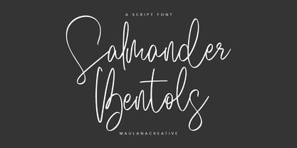 Give your designs an authentic handcrafted feel. "Salmander Bentols Script" is perfectly suited to signature, stationery, logos, typography quotes, magazine or book covers, website headers, clothing, branding, packaging design and more. Salmander Bentols Script contains: - Ligatures - Multilingual Support and is easy to instal Mac and Windows.
 - Quirthy by Brithos Type,
$11.00 Quirthy is a textured brush handwritten font. This fantastic font is best suited for headlines of all sizes, as well as for blocks of text that have both maximum and minimum variations. Whether it’s for web, print, moving images or anything else – Quirthy will look spectacular.
 - Innovate by NicolassFonts,
$29.00 Innovate is a modern versatile sans-serif typeface. What differentiates Innovate from the other fonts is an exceptionally distinctive design. It is brilliantly suited for graphic design and display use and perfect for logotypes, t-shirts, packaging, brand identity, books, magazines, newspapers, posters, billboards, and advertising.
 - Vage by Katatrad,
$25.00 Vage™ is a family of 10 fonts, a contemporary sans-serif typeface. It is rooted in the style of a classic high contrast typeface provides advanced typographical support with features such as ligatures and alternate characters. Especially suited for fashion magazines, logotypes and luxury contexts.
 - Edgewater Serif by cm5dzyne,
$16.00Edgewater Serif, the companion font for cm5dzyne's Edgewater, is suited for various projects requiring anything from refined titling to a futuristic theme. Its rounded corners reduce the rigid visual impact of normal slab-serif fonts and give it a more casual feel than its sans-serif counterpart. - Cult by ITC,
$29.99Cult is the work of designer Timothy Donaldson and its forms alone evoke a sense of mystery. The wide capitals with their unusual forms complement perfectly a condensed, angular lower case alphabet. The unique Cult is especially suited to work dealing with anything mystical or New Age. - Astoylist by Maulana Creative,
$14.00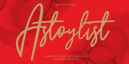 Astoylist Slanted Signature Script Font Give your designs an authentic handcrafted feel. Astoylist Slanted Signature Script Font is perfectly suited to logo, stationery, branding, typography quotes, magazine or book cover, website header, clothing, branding, packaging design, restaurant and more. Thanks for use this font. Maulana Creative
 - Aesthero by Sarid Ezra,
$15.00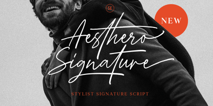 Aesthero Signature is a genuine signature typeface featuring lowercase and uppercase characters, symbols, and with multilingual support. It includes ligatures, contextual alternates, stylistic alternates, as well as swashes. Aesthero Signature is perfectly suited for logo branding, exquisite fashion designs, ideal for wedding invitations, and crafting handwritten quotes.
 - Summer Dreams by Seemly Fonts,
$14.00 Summer Dreams is a brand new handwritten font perfectly suited for stationery, logos, t-shirts, print design, website headers, photo frames, flyers, music album covers, posters, image sliders, and much more. Add this font to your favorite creative ideas, and notice how it makes them come alive!
 - Santa Monica by Larin Type Co,
$10.00 Santa Monica - a modern calligraphy font duo. Inspired by modern calligraphy, this font duo will suit any of your projects, with the help of many alternatives that you can choose, as well font sans serifs, the design of your project will look individual and unique. Enjoy using!
 - Aelia by Scrowleyfonts,
$18.00 Aelia is a creative, decorative font inspired by the simple and overlapping twirls of Victorian ironwork. It is particularly suited for use with floral, organic, natural imagery. While it is undeniably pretty, it is also carefully constructed and robust with several features including kerning and oldstyle figures.
 - Katerina by NicolassFonts,
$25.00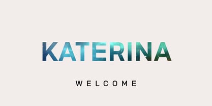 Katerina is a modern versatile sans-serif typeface. What differentiates Katerina from the other fonts is an exceptionally distinctive design. It is brilliantly suited for graphic design and display use and perfect for logotypes, t-shirts, packaging, brand identity, books, magazines, newspapers, posters, billboards, and advertising.