10,000 search results
(0.046 seconds)
- Mogila Display by Letterfreshstudio,
$15.00 Mogila is a display font with a touch of style that's cheerful, elegant and strong. So it is suitable for use in product design and appearance, both in modern or vintage designs. OpenType feature with several alternative characters that allow you to mix and match letter pairs to suit your design. Mogila also includes 4 different styles, namely Regular,Italic, Bold and Outline which are made with different styles but still have the same characters. Mogila is included in a display font so it is very suitable for use in titles, poster products, logos, book menus, websites, books, t-shirts, posters, book covers, labels, business cards, branding, print templates and many other designs according to your needs. Mogila includes a complete set of upper and lowercase letters, as well as multi-language support, punctuation, ligatures and alternatives. Thank you very much for looking and Enjoying it!
 - Wholecar by Mans Greback,
$59.00 Wholecar is a train graffiti typeface. The letters are fun and friendly, with a happy personality and cartoonish quirkiness. A street style, Wholecar is drawn and created by Mans Greback, and is the perfect combination of cool and childish typography. This hip-hop styled comic typeface family comes in eight styles: Black, Inline, Invert, Regular and White. Additionally, the Wholecar Color, consisting of Noir, Pink and Silver, specifically created for Photoshop and Illustrator. Use characters [ ] { } ¤ # _ for train parts fitting the letters. Examples: [¤#¤_¤_¤#¤] [¤Graffiti¤] The font is built with advanced OpenType functionality and has a guaranteed top-notch quality, containing stylistic and contextual alternates, ligatures and more features; all to give you full control and customizability. It has extensive lingual support, covering all Latin-based languages, from North Europe to South Africa, from America to South-East Asia. It contains all characters and symbols you'll ever need, including all punctuation and numbers.
 - Widy by Pasternak,
$12.00 Wide font family is a geometric sans serif font, which features 9 styles. It’s based on the Futura developed by Paul Renner and neo sans-serif fonts. At the same time, it has significant stylistic differences. Massive lengthy letters are among the unique features of this font. They will help you come up with the perfect composition. The letters have optical compensation, while a circle is the main figure of the fonts. Due to wide fonts, your project will have modern and fresh design. The composition will keep its contrast regardless of a background you’ve chosen. The Widy family includes 9 styles: Thin, Extra Light, Light, Semi Light, Regular, Medium, Semi Bold, Bold and Extra Bold. Each of them also has Italic variation. The fonts are perfect for both graphic design projects (posters, brand identities, logotypes) and simple interface design, which needs the necessary style.
 - Anderfont by alphArt,
$15.00 Anderfont is a Signature Font is a handwritten script font with a simple and classy style. This font is great for your next creative projects such as watermark on photography, signature or signature logo design, quotes, album cover, business card, and many other design project. From business cards to photo watermarks, Anderfont is here to elevate your work to the highest level. Anderfont comes with uppercase letters, lowercase letters, lowercase alternative letters, numbers, punctuation, ligature and multi lingual support What's inclued : - Anderfont.otf Please note : To use alternative end text is just block end letters and select alternative letters on glyphs option. It may be used in almost any program by using your Operating System’s utilities (CharacterMap for Windows and Font Book for Mac.), as well as Illustrator, Photoshop CC 2017 and several other applications.
 - Rare Bird Specimen III by Rare Bird Font Foundry,
$100.00 RARE BIRD SPECIMEN III Rare Bird Specimen III is a graceful hand by Karla Lim of Written Word Calligraphy. This all lowercase font feels both modern and feminine. While uppercase letters are still lowercase in shape, they are larger and read as caps. OBSERVATIONS Specimen III has a dancer-like form; supple and lithe. Willowy letters are nimble and lissome, content alone or paired with a stronger, more masculine specimen. DEFINING CHARACTERISTICS Opentype programming, formal title and preposition word art, 7 alternate lowercase t cross-strokes, Roman numerals, old-style numerals, seamlessly semi-connecting calligraphic letters, realistic double-letter ligatures, in and out-stroked letters at the beginning and end of words where appropriate, basic Latin encoding. POTENTIAL SIGHTINGS Bridal + baby shower stationery, logo design, gourmet food packaging, clothing labels.
 - Duos Pro by Underware,
$50.00 Duos Pro, a script for illusionists, comes in 10 styles. Whatever style you pick: apply this speedy monolinear handwriting font in large sizes, because it is made for catching the attention. Take Duos Sharp, which comes with speedy strokes and sharp endings in light, regular and black weights. Or pick Duos Round, and its 3 styles with a softer voice and round endings. Some people call those endings “funky ball noses“, an odd but appropriate description. Round styles look more like round tip speedball lettering, but contrary to most speedball letterings they're written with a very high speed. Especially Duos Round Black is more cuddlesome than its sharper counterpart. For an even more intuitive feel, we added two more sets: Duos Brush & Duos Paint. Duos Brush combines monoline strokes with brush beginnings and endings, for that graphical, freshly lettered touch. A closer look will reveal how its brushed tails vary all the time. Duos Paint is made up out of rough & artistic painted strokes, with all its accompanying shortcomings. In contradiction to the finesses of lighter weights, Duos Paint Black scores in being the most nonchalant and impressionistic. Poésie brutale! As well as having the option to choose between (or mix) these 10 styles, Duos Pro has additional hidden functionalities. For example, every style has many alternate lettershapes and ligatures, offering various different results and lengths to display every single word. Or manually add one of the swashes for more emphasis. A bonus font, Duos Tools, includes tool icons, strokes and banners. If that ain’t enough, throw in some polysemic letters for smart, ambiguous communication if you like. Want to become a signpainter? Then be a signpainter. Always wanted to be an artist? This is your chance! Duos Pro boosts your look. Make your visual vocabulary as grandiose, dramatic, sensitive or picturesque as you want. But whatever you do, don't hesitate to apply Duos Pro “short & big”!
 - Blockrock by Volcano Type,
$9.00 Blockrock is an OpenType typeface that lets you build letters right away. Use the different weights to construct 3-dimensional letter-buildings. It is inspired by the apartment living blocks in the center of East Berlin built in the 60s. The regular font contains more complex letter buildings, while the simple font has simplified and plain letters in two different levels. Blockrock comes with kerning and a full Western and Central European language support, including Baltic and Turkish.
 - Sagittarius by Hoefler & Co.,
$51.99 A typeface with lightly-worn futurism, Sagittarius is equally at home among the beauty and wellness aisles, or the coils of the warp core. The Sagittarius typeface was designed by Jonathan Hoefler in 2021. A decorative adaptation of Hoefler’s Peristyle typeface (2017), Sagittarius’s rounded corners and streamlined shapes recall the digital aesthetic of the first alphabets designed for machine reading, a style that survives as a cheeky Space Age invocation of futurism. Sagittarius was created for The Historical Dictionary of Science Fiction, where it first appeared in 2021. From the desk of the designer: Typeface designers spend a lot of time chasing down strange valences. We try to figure out what’s producing that whiff of Art Deco, or that vaguely militaristic air, or what’s making a once solemn typeface suddenly feel tongue-in-cheek. If we can identify the source of these qualities, we can cultivate them, and change the direction of the design; more often, we just extinguish them without mercy. Sometimes, we get the chance to follow a third path, which is how we arrived at Sagittarius. During the development of Peristyle, our family of compact, high-contrast sans serifs, I often found myself unwittingly humming space-age pop songs. Nothing about Peristyle’s chic and elegant letterforms suggested the deadpan romp of “The Planet Plan” by United Future Organization, let alone “Music To Watch Space Girls By” from the ill-advised (but delicious) Leonard Nimoy Presents Mr. Spock’s Music from Outer Space, but there they were. Something in the fonts was provoking an afterimage of the otherworldly, as if the typeface was sliding in and out of a parallel universe of high-tech spycraft and low-tech brawls with rubber-masked aliens. It might have had something to do with a new eyeglass prescription. But I liked the effect, and started thinking about creating an alternate, space-age version of the typeface, one with a little more funk, and a lot more fun. I wondered if softer edges, a measured dose of seventies retrofuturism, and some proper draftsmanship might produce a typeface not only suitable for sci-fi potboilers, but for more serious projects, too: why not a line of skin care products, a fitness system, a high-end digital camera, or a music festival? I put a pin in the idea, wondering if there’d ever be a project that called for equal parts sobriety and fantasy. And almost immediately, exactly such a project appeared. The Historical Dictionary of Science Fiction Jesse Sheidlower is a lexicographer, a former Editor at Large for the Oxford English Dictionary, and a longtime friend. He’s someone who takes equal pleasure in the words ‘usufructuary’ and ‘megaboss,’ and therefore a welcome collaborator for the typeface designer whose love of the Flemish baroque is matched by a fondness for alphabets made of logs. Jesse was preparing to launch The Historical Dictionary of Science Fiction, a comprehensive online resource dedicated to the terminology of the genre, whose combination of scholarship and joy was a perfect fit for the typeface I imagined. For linguists, there’d be well-researched citations to explain how the hitherto uninvented ‘force field’ and ‘warp speed’ came to enter the lexicon. For science fiction fans, there’d be definitive (and sometimes surprising) histories of the argot of Stars both Trek and Wars. And for everyone, there’d be the pleasure of discovering science fiction’s less enduring contributions, from ‘saucerman’ to ‘braintape,’ each ripe for a comeback. A moderated, crowdsourced project, the dictionary is now online and growing every day. You’ll find it dressed in three font families from H&Co: Whitney ScreenSmart for its text, Decimal for its navigational icons, and Sagittarius for its headlines — with some of the font’s more fantastical alternate characters turned on. The New Typeface Sagittarius is a typeface whose rounded corners and streamlined forms give it a romantically scientific voice. In the interest of versatility, its letterforms make only oblique references to specific technologies, helping the typeface remain open to interpretation. But for projects that need the full-throated voice of science fiction, a few sets of digital accessories are included, which designers can introduce at their own discretion. There are alternate letters with futuristic pedigrees, from the barless A popularized by Danne & Blackburn’s 1975 ‘worm’ logo for NASA, to a disconnected K recalling the 1968 RCA logo by Lippincott & Margulies. A collection of digitally-inspired symbols are included for decorative use, from the evocative MICR symbols of electronic banking, to the obligatory barcodes that forever haunt human–machine interactions. More widely applicable are the font’s arrows and manicules, and the automatic substitutions that resolve thirty-four awkward combinations of letters with streamlined ligatures. About the Name Sagittarius is one of thirteen constellations of the zodiac, and home to some of astronomy’s most inspiring discoveries. In 1977, a powerful radio signal originating in the Sagittarius constellation was considered by many to be the most compelling recorded evidence of extraterrestrial life. Thanks to an astronomer’s enthusiastically penned comment, the 72-second transmission became known as the Wow! signal, and it galvanized support for one of science’s most affecting projects, the Search for Extraterrestrial Intelligence (SETI). More recently, Sagittarius has been identified as the location of a staggering celestial discovery: a supermassive black hole, some 44 million kilometers in diameter, in the Galactic Center of the Milky Way. <
 - Flow Handscript by Taner Ardali,
$26.00 Main idea of this font depends on creating a “well designed handwriting typeface”. With general brush script characteristics, this font is also designed in detail letter by letter to create the best geometric values. It is particularly designed to achieve better connections between letters as well as the best rhythm for words. It is not just a hand brush typeface, Flow handscript is a high quality designed typeface that can be used for graphic design like packaging, branding, poster design and invitations.
 - PF DIN Text by Parachute,
$79.00 The purpose of the original DIN 1451 standard was to lay down a style of lettering which is timeless and easily legible. Unfortunately, these early letters lacked elegance and were not properly designed for typographic applications. Ever since its first publication in the 1930’s, several type foundries adopted the original designs for digital photocomposition. By early 2000, it became apparent that the existing DIN-based fonts did not fulfil the ever-increasing demand for a diverse set of weights and additional support for non-Latin languages. Parachute® was set out to fill this gap by introducing the PF DIN series which has become ever since the most comprehensive and sophisticated set of DIN typefaces. It was based on the original standards but was specifically designed to fit typographic requirements. Its letterforms divert from the stiff geometric structure of the original and introduce instead elements which are familiar, softer and easier to read. The first set of fonts was completed in 2002 as a group of 3 families which included condensed and compressed versions. With its vast array of weights, the extended language support, but most of all its meticulous and elaborate design, it has proved itself valuable to numerous design agencies around the world. Ever since its first release, it has been used in diverse editorials, packaging, branding and advertising campaigns as well as a great number of websites. It was quoted by Publish magazine as being “an overkill series for complex corporate identity projects”. The whole PF DIN Text type system (with normal, condensed and compressed styles) includes 45 weights from Hairline to Extra Black including true-italics. Additionally, every font in the Pro series is powered by 270 very useful symbols for packaging, environmental graphics, signage, transportation, computing, fabric care. There are 2 versions to choose from: The PRO version is the most powerful. All weights support Latin, Cyrillic, Greek, Central/Eastern European, Romanian, Baltic and Turkish, with 20 advanced opentype features including small caps. The standard STD version is more economic. All weights support Latin, Central/Eastern European, Romanian, Baltic and Turkish, with 18 advanced opentype features including small caps. In 2010 Parachute® released 4 new families DIN Monospace, DIN Stencil, DIN Text Arabic and DIN Text Universal. All these are complemented by the popular DIN Display version. Altogether the Parachute DIN series is a set of 8 superfamilies with a total of 96 weights.
 - Untold History by Arterfak Project,
$15.00 Lights up your past memory with Untold History font, a classic typewriting font designed in modern style. Comes in four available styles: regular, bold, underlined, and inky. Each style has its own unique touch, allowing you to create a variety of designs. The inky style adds a subtle ink bleed effect to the letters, giving it a more authentic vintage look. Inspired by classic typing machines, this font gives the taste of the past while still being versatile enough for modern designs. Untold History is suitable for a range of projects, such as editorial designs, vintage posters, books, branding, and quotes. Fonts featured : Uppercase Lowercase Numbers & symbols Punctuation Stylistic alternates Multilingual support Thank you for always supporting our work!
 - Skagwae by Ingrimayne Type,
$7.95 The characters of Skagwae have no curves, just straight line segments. The letter shapes themselves are fairly standard, but the choppy line segments used to construct them give the fonts a crude, unfinished look that is highlighted at large point sizes. At small point sizes the fonts are surprisingly legible. The family has nine styles. The regular, bold, italic, bold italic, shadow, and shadow inside styles are proportionally spaced. Shadowinside is very similar to regular but is spaced to be used in a layer with the shadow style. SkagwaeMono-Regular and SkagwaeMono-Bold are monospaced versions of the family. A third monospaced style, SkagwaeMono-Rippled, is a distorted version with squiggly lines full of curves.
 - Pexico Micro by Setup,
$- Pexico Micro is a pixel typeface that uses 5 by 7 grid (capital letter) in 8 styles: 4 basic styles for text setting — Regular, Bold, Narrow, and Mono and 4 stylistic variations of the Regular style for display setting — Outline, Dots, Round, and Inverse. It fits the display's pixel grid when used at 10pt size or its multiples. Pexico Micro supports Latin, Cyrillic, and Greek Monotonic scripts, all with thoroughly designed diacritics. Moreover, Pexico Micro makes use of advanced OpenType features, just as any other modern text typeface. Each style also has 9 sets of numbers, small capitals and is properly kerned. For more information go to For more information go to Urtd.
 - Rotulo by Huy!Fonts,
$35.00 Rotulo is a contrasted sans family which combines the Thick & Thin signpainter's style and some 70s feeling in a huge font family with 90 styles. A visit to an exhibition of Spanish movie posters by Jano was the beginning of Rótulo (Spanish for Sign) project. Classic thick & thin signpainter style was featured in many letterings of those posters, as it was a very common style in 60s and 70s Spanish design. Unfortunately, today very few Contrasted Sans are seen, something that was quite common years ago has fallen into disuse in favor of Helvetic monotony. Rótulo recapture all that personality, with an extense range of weights and widths to be used in striking headlines and short texts.
 - Ozana Pro by Mostardesign,
$99.00 Ozana Pro is a bracketed serif font family adapted to the professional requirements of graphic designers, web designers and mobile app developers. Comprised of 24 styles including 12 styles designed especially for headlines and 12 styles for text and long paragraph design, Ozana Pro is a very versatile family of fonts that can be used in many projects such as editorial design, branding or corporate identity creation, design of posters or logos, the creation of websites or the development of mobile applications. This serif font family, with a resolutely modern aspect, also hides a unique typographic design since it has 2 distinct styles (Roman and Display) which have 2 different optical sizes in order to graphically differentiate the appearance of titles, subtitles and long paragraphs. With this design of glyphs differentiated by the optical size according to the styles, the titles have a very graphic aspect while the long texts have a more classic design in order to keep an optimal readability in all cases. Ozana Pro is also equipped with powerful OpenType features such as case sensitivity, true small caps, ligatures, tabular figures, old styles figures, numbers circled. Ozana Pro is also available as a variable font family.
 - Camelong Brush by Realtype,
$14.00 Camelong Brush is a handwritten font to get the best texture for each letter. Camelong Brush is designed to perfection, each letter character will make your design strong and charming. Each letter and symbol is painted using the finest brushes and ink. Camelong Brush contains upper and lower case characters, numbers and various punctuation marks that are ready for you to use with unique and charming characters. Camelong Brush Font is suitable for any modern design such as for advertising banners, modern cards, invitations, announcements, seasonal designs, social media promotions, web design, branding and logo styling and more.
 - Ancress by Tour De Force,
$25.00 Ancress is modern geometric sans serif family with display elements. Designed in 14 styles with extended Latin character map, Ancress uses simple geometric shapes for achieving all characteristics of modern sans family: wide versatility, full legibility and design recognition. Letter shapes are visually softened with rounded corners and straight endings. Characteristic letters are visible in every word typed with Ancress, so it is not a typeface that differs from others by single letter only, it is graphically well balanced and thymically smooth typeface that should refine any design project – from editorial design, posters, packages, branding to websites, applications and outdoor graphics.
 - Flawless Flygirl PB by Pink Broccoli,
$16.00 Flawless Flygirl is a quirky sans-serif font inspired by the titling sequence from the 1964 film, "The World of Henry Orient". Fun and full of personality, it is one of those lettering styles that was a joy to flesh out and make into a typeface filled with double letter ligature alternates to keep the typesetting weird and wonderful. With a pseudo unicase character set, and offbeat letter weighting, Flawless Flygirl is fun to typeset, with ligature combinations that are pleasant surprises. You’ll find this Flawless Flygirl is ready to dance to the beat of your designs.
 - Handwritten Note JNL by Jeff Levine,
$29.00 The movie poster promoting the 1962 James Cagney comedy "One, Two Three" had it's text done in free-style hand lettering. Starting with an auto-trace in order to have an isolated version of the black letters separated from the red poster background, the tracing kept the basic forms intact, but with limited accuracy. Cleaning up and digitally reshaping the letters manually to form a more correct version [closer to the original movie poster], additional figures, foreign characters, accents and punctuation were drawn from scratch. This is now available as Handwritten Note JNL in both regular and oblique versions.
 - Psychopath Note by Pitt's Hand,
$7.00 I work as a comic letterer for an Italian publisher. I created this font to write the Italian version of a Batman comic. We needed a style of writing that simulated imprecise handwriting that could change in letters and space. I didn't have one, so I decided to make one by myself. It is the first font created with criteria, and after having adjusted it, I propose it to you here. Valid for lettering comics, or for titles and graphic design when you need a simulated handwritten note, which is credible but still easy to manage.
 - Kallem by Khaiuns,
$16.00 Kallem is a stylish modern Calligraphy font with magical pressure. i hope this font perfect for creating signature logos and watermarks for photography studio or wedding invitation, best for initial or branding logo signature. Kallem includes full set of gorgeous uppercase and lowercase letters, numerals, a large range of punctuation and 61 ligatures. All lowercase letters include ending swashes, giving realistic hand-lettered style In order to use the beautiful swashes, you need a program that supports OpenType features such as Adobe Illustrator CS, Adobe Photoshop CC, Adobe Indesign and Corel Draw. Thanks for use this font ~ Khaiuns
 - Victorian Ornamentals by Celebrity Fontz,
$24.99Victorian Ornamentals is a digital revival of a lovely Victorian letterset containing initials adorned with flourishes from a vintage embroidery typeface. It is a highly ornate and delicate typestyle with an air of elegance, romance, and flair. This font contains uppercase letters, smallcap letters. and numerals in the Victorian Ornamentals typeface and, for convenience, includes punctuation in a standardized font style. Accented characters are also included. This digital format allows colorizing of type and is a perfect font for publications that want to capture the feel of the Victorian era and the delicate nature of embroidered lettering. - Quality Times by Gilar Studio,
$16.00 Quality Times is a stylish modern calligraphy font with casual chic flair. It is perfect for branding, wedding invites and cards, and maybe for red wine label. Quality Times includes full set of gorgeous uppercase and lowercase letters, numerals, a large range of punctuation and ligatures. All lowercase letters include beginning and ending swashes, giving realistic hand-lettered style. What you get, darling? In order to use the beautiful swashes, you need a program that supports OpenType features such as Adobe Illustrator CS, Adobe Photoshop CC, Adobe Indesign and Corel Draw. Check my other Font here : https://gilarstudio.com/
 - Julitho by Asenbayu,
$15.00 Julitho are demi-serif display fonts that have a strong and elegant appearance. Julitho comes from the word "July" to represent beautiful and "litho" which represents strength and integrity. Demi-serif is emphasized for lowercase letters that have one side of the serif. You can use these fonts in high-end, vintage, modern and classic designs. These fonts are perfect for a variety of projects, such as branding, poster displays, logo designs, magazine, headline, sticker and more. Julitho fonts feature opentype, kerning, alternative style and ligature. Julitho include uppercase letters, lowercase letters, numeral, punctuation and multilingual support.
 - Swing Vote JNL by Jeff Levine,
$29.00 A 1964 piece of sheet music entitled “Old Soldiers Never Die (They Just Fade Away)” was based on the farewell speech General Douglas MacArthur gave to Congress on April 19, 1951. This particular edition of the song sheet had part of his speech (as well as its title) hand lettered in a free-form sans serif reminiscent of the lettering done by such noted lettering artists as Paul Coker and Saul Bass. The casual and playful style of this type design became the inspiration for Swing Vote JNL, which is available in both regular and oblique versions.
 - Vidal by Blackmoon Foundry,
$24.00 The Vidal is a display typeface designed in 2016 by Elena Albertoni. It comes in three styles: Regular, Bold and Black. This wide sans-serif with low contrast is inspired by French and British Art Deco lettering and it is suitable for use in medium to large sizes, where it offers good legibility and all its friskiness. The attitude of Vidal when set in all caps derives from the models that inspired the design: mainly capital-only lettering pieces; the essential addition of lowercase letters distinguishes Vidal from similar revivals and makes it a great modern choice.
 - Bailamore by 38-lineart,
$19.00 Bailamore is a retro boldscript font. We're pouring the lettering styles into fonts. As much as possible we make this font well integrated with spacing and balance of space. We made 159 ligatures. Activate the ligature mode and you are like being a lettering artist, plus 85 alternates to enrich the feel of lettering. This font consists of 3 fonts, namely regular, outline and shadow. Regular stands alone, while outline and shadow are complementary if you want a 3D extrude impression. Please see the video torial here: https://youtu.be/H71JEgEOows Please try and enjoy the retro bold Bailamore script
 - Fling by ITC,
$29.00 Michael Gills, formerly a resident designer at Letraset, created the Fling typeface in 1995. Fling's letterforms are based on the Ronde --or round--script style from France. The design includes intricate and generous capital letters, which are contrasted with a more reserved lowercase letters. This allows for a sophisticated and elegant appearance in text. Fling's letterforms are highly legible for those of a script face, and it is a typeface with many uses. Aside from short amounts of running text, Fling's capital letters serve well as initials. In the Opentype font are extra ligatures and alternative letterforms thatoffer expanded typesetting possibilities.
 - Sgt Peppers by K-Type,
$20.00 SGT PEPPERS LONELY HEARTS CLUB is a typeface inspired by the capital letters on the bass drum in the Beatles' Sgt Pepper album cover. The original lettering was hand painted by fairground artist Joe Ephgrave during March 1967 in an art deco style he called 'futuristic'. The font completes the uppercase, adds a lowercase, and includes a full complement of over 400 characters. SGT PEPPERS OUTLINE and SGT PEPPERS OUTLINE FILL are two fonts with matching spacing and kerning that can be overlapped for creating bicolor/multicolor effects and faux drums. The Outline and Outline Fill fonts do not contain lowercase characters, instead they comprise two weights of outline capitals as painted on the Sgt Pepper drum. The uppercase letters are in the wider style from around the outer edge of the drum, and the lowercase keys deliver the more condensed 'Lonely Hearts' inline style from the middle of the drum. The uppercase Y has been flipped to produce a more conventionally acceptable character with the thicker diagonal arm on the left. However, Joe Ephgrave's reverse Y (with inline) is included in the Outline fonts at the Section keystroke § (Alt-0167 on Windows). A simplified vector image (mono) of the bass drum without lettering is also included within the Outline fonts at the PlusMinus keystroke ± (Alt-0177 on Windows).
 - Pleasant Show Card JNL by Jeff Levine,
$29.00 A beautiful and stylish pen lettered alphabet appears within the pages of the 1921 publication “How to Write Show Cards” and its Art Nouveau stylings made it a perfect candidate for a digital revival. Pleasant Show Card JNL is available in both regular and oblique versions.
 - LD Old Country by Illustration Ink,
$3.00This old fashion font looks like it belongs on a saloon sign. If you've got old west style photos, finish up your scrapbook page with title and journaling done in this cool font. It's perfect for lettering on western themed invitations, newsletters, sign, flyers, even menus. - Praitor by Scriptorium,
$18.00Praitor is based on a devotional inscription to the goddess Diana found a short distance from Rome in 1887. It is an early style from before 100 BC and has some characteristics of Etruscan lettering. It's a rough, strong font which works very well for distinctive titles. - Brown Sugar by Muntab Art,
$18.00 Brown Sugar fonts includes uppercase letters, numerals, a large range of punctuation. Serif font with modern stylish style. Created for poster, web design, branding, illustrations, badges and some other works. Please contact us if you have any question, we are happy to help you! Thank you!
 - Solitude JNL by Jeff Levine,
$29.00 A piece of vintage sheet music with the hand lettered title "Solitude" is the namesake and inspiration for Solitude JNL. Purely Art Deco in its typographic curves and angles of the period, this typeface typifies the "Streamline" style that permeated designs of the 30s and 40s.
 - Sweet Nancy by Matteson Typographics,
$9.99 Sweet Nancy is a monoline connected script typeface with a nostalgic, yet modern feel. Elegant cues inspired by Art Deco combine with a modern lettering style for lovely invitations, announcements, logos, book jackets and menus. Enjoy Sweet Nancy’s flowing lines in whimsical, romantic or fantastical designs.
 - Aiglon Drame by ErlosDesign,
$19.00 Aiglon Drame is a ligature serif font with modern style. It includes uppercase letters, numeral, a large range of punctuation, ligatures, alternates and also multilingual support. Perfects for poster, web design, magazine cover, album cover, branding and much more. Features: • Works on PC & Mac • Simple installation Enjoy!
 - Essenco Paradiso by Carpiola Studio,
$12.00 Essenco Paradiso is a beautiful and timeless retro vintage-style display font. It is the best choice for creating eye-catching wall posters, logos, branding and quotes. Each letter has a unique and beautiful look, which will bring your designs to life with a playful touch.
 - Carpellon by Creativemedialab,
$16.00 Carpellon is inspired by tattoo scripts, and features nice curves to represent the combination of art and beauty. It is unique and easy to read, and includes both regular and ornament styles. It is best for use with gothic art themes, tattoo lettering, posters, logos and more.
 - Sweet Titling No. 22 by Sweet,
$39.00 Sweet Titling No. 22 is part of the Sweet Collection of engraved lettering styles from the 20th Century, published by MVB Fonts. This obscure, art deco design would have been used for engraved letterhead, business cards, etc., and likely first appeared in the 1920s or ’30s.
 - Ageoline by Blankids,
$17.00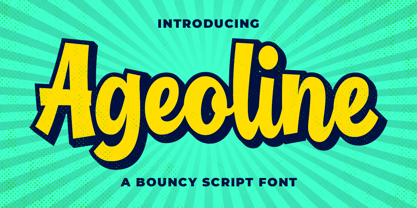 Introducing of our new product the name is Ageoline a Bouncy Script Font. Ageoline inspired by bouncy lettering style this font is a fun theme very good for display, tshirt design, craft, quote sign, logotype and etc FEATURES : Uppercase Lowercase Number Punctuation Multilingual PUA Encode Opentype