10,000 search results
(0.078 seconds)
- LE Buffec by Jolicia Type,
$20.00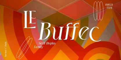 LE Buffec is a modern display serif with 18 font style and complete alternates and ligature for Caps that looks stunning in just about every works. With Full Multilingual support. well-suited for advertising, branding, logotypes, packaging, titles, headlines and editorial design. Enjoy with LE Buffec font. Cheers! LE Buffec Features : · Multilanguange · Alternates · PUA Encoded · Font Family totals 18 fonts Note : this helps you to use all of our font functions · Adobe Photoshop go to Window - glyphs · Adobe Illustrator go to Type - glyphs
 - Andora by Letterara,
$12.00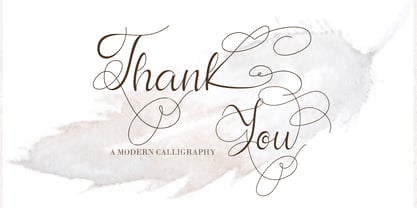 Introducing Andora, a beautiful, full-featured modern calligraphic font with tons of alternate characters and OpenType features. Andora hand-lettered is particularly well-suited for invitations, branding and editorial design. Perhaps the most fun thing about Andora is that it includes multiple versions of all ascending and descending letters, making it lots of fun to play with layouts and compositions. The OpenType features can be very easily accessed by using OpenType-savvy programs such as Adobe Illustrator and Adobe InDesign.
 - Warzone by Arterfak Project,
$23.00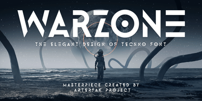 Warzone is a minimalist techno font. Based on sans serif design, developed to techno style with the minimalist stencil concept and sharp edges. Quipped with extra alternate characters that give you more variations on your design. This font has geometric shapes that are perfect for a futuristic theme, techno, digital, sci-fi, and hipster style. Warzone is an all-caps font that has a solid version in the lowercase. A great choice to apply for many purposes. Thank you and happy designing!
 - ITC Coolman by ITC,
$40.99Pelle Piano is the stage name for Per Ellstrom, a musician in Stockholm with an interest in irregular and informal lettering. ITC Coolman was inspired by lettering styles of the 1950s. “I have a passion for old '50s type lettering,” says Piano, “as seen on posters from B-movies and pocketbooks and cartoons.” Although ITC Coolman is not a script face, its caps work best with the lowercase, rather than together. The funky, bouncy look of Coolman cries out for beach movies. - Gigabot by Grontype,
$12.00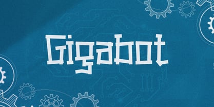 Gigabot is a decorative based font with unique shape inspired from robot-made that will make your design looks hi-tech and modern. You can use this font for any purpose, especially to make logotype and sci-fi movie poster. You can mix and match the uppercase and lowercase to make your logo more stand out. This font also support multi language. Gigabot Features: Uppercase glyphs Lowercase glyphs Numeral and Punctuations Currencies Standard Ligatures Stylistic Alternates Thankyou for choosing this font, Enjoy
 - Clair De Lune by Hanoded,
$20.00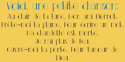 Clair De Lune is part of the famous Suite Bergamasque, written by Claude Debussy in 1890, and published in 1905. It means Moonlight in French, a kind of romantic name. The name is exactly what I had in mind for this übercute font. Clair De Lune can be used to design postcards and posters, liven up websites and give your designs an overall happy feel. Clair De Lune was handmade using a 0.5 pen, eco friendly Italian paper and a wooden kitchen table.
 - FF Folk by FontFont,
$41.99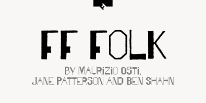 Italian type designer Maurizio Osti and American type designer Jane Patterson created this display FontFont in 2003. The family contains 4 weights and is ideally suited for advertising and packaging, music and nightlife as well as poster and billboards. FF Folk provides advanced typographical support with features such as ligatures, alternate characters, case-sensitive forms, and stylistic alternates.The font was based on the original alphabet created by Ben Shahn in 1940. It comes with proportional lining and tabular lining figures.
 - Happy Fingers by PizzaDude.dk,
$14.00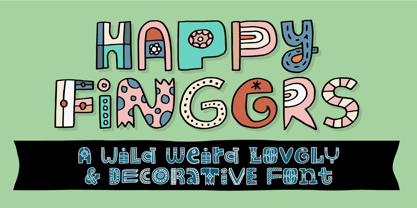 Happy Fingers are a truly mad font! The font contains 10 different versions of each letter - and no two letters are the same - it's a lovely mix of upper- and lowercase, serfifs and sans, grunge, comic, sci-fi, fantasy, computer ... everything you can imagine. And they are all handmade! Of course there is multilingual support and I have even added a black version, for you to use as massive fill, or perhaps a cool shadow! Go crazy, go Happy Fingers!
 - Adieu Mon Ami by Hanoded,
$15.00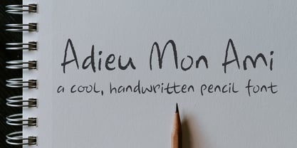 No, I am not leaving and none of my friends or relatives have packed up and left. I needed a more ‘letter-like’ name for this font and I found Adieu Mon Ami (farewell, my friend in French). Adieu Mon Ami is a handmade pencil font that will add that extra ‘je ne sais quoi’ to your designs. It comes with joie de vivre, un petit peu de vilain, but can be doux comme de la soie as well. Bonne chance!
 - Deco Donut by Just My Type,
$20.00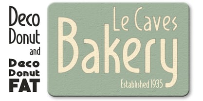 On the very northern edge of South Tucson lies an Old Pueblo institution, Le Caves Bakery, Home of the Vegetable Donut. That’s what they were called when Le Caves opened; now you’d say Vegan Donut, or No Animal Products Used. Radical concept in the Brave New World of 1935. I started with the letters from their sign and extrapolated the rest of the font from those. Deco Donut Fat is extrapolated from Deco Donut. If you want a donut, type a 0 (zero).
 - Abela Sweety by Gatype,
$12.00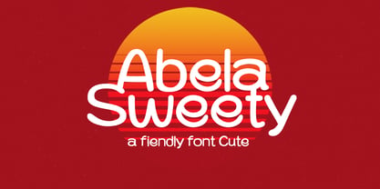 Abela Sweety is a monoline comic display font, a very unique trendy font with a combination of modern character bindings, and in my opinion this product suits the teaser display theme in every headline design, business cards, leaflets, magazines, children's events and brand screen printing. Come on, take a look and be happy to hear the review. If you have suggestions about this product, please let your work environment know whether this product is good for them. Thank you so much for everything!!
 - Crate Pro by Kustomtype,
$25.00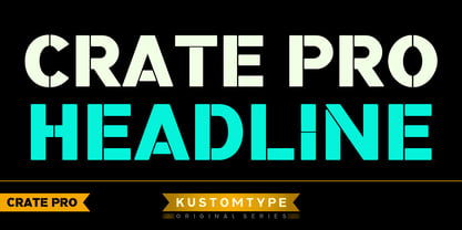 Crate Pro is a brand-new stencil font with rounded edges and thick main strokes, all glyphs have been contemplated very carefully so that all characters match in a well-balanced and streaming way. In both shaped weights, the font suits extraordinary well for headings, slogans etc. The cleanly cut and powerful Crate Pro font can easily be used for logotype, games, prints, magazines, web, apps, packaging, posters, T-shirts, signage & design projects. The font is original and custom made by Kustomtype.
 - Brittania by Atharuah Studios,
$18.00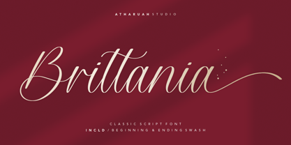 Introducing the Brittania! Classic script font that shows beauty and balance in every letter that is displayed. The font files include uppercase, lowercase, numbers, punctuation, and multilingual support. Brittania also adds a beginning and ending swash to beautify each of your projects. You can access it in every lowercase alternative. That's it! I hope you enjoy it. Feel free to comment if there are issues or queries. You can also say hello to me on Instagram: https://www.instagram.com/atharuah_ Thank You!
 - Cally by Gleb Guralnyk,
$15.00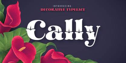 Cally is a classic looking typeface with decorative vintage elements. It is perfectly suited for label design and for various lettering postcards and invitations. Cally includes the English alphabet, punctuation, numbers and Western European multilingual characters (check out the screenshots with all available characters). Also there are few ligatures and swashes. To access swash glyphs, just type underscore character and number 1-5, like this _1. Using "standard ligature" feature this symbols will be automatically replaced with one of the swash symbols.
 - Roundica by Fontease,
$20.00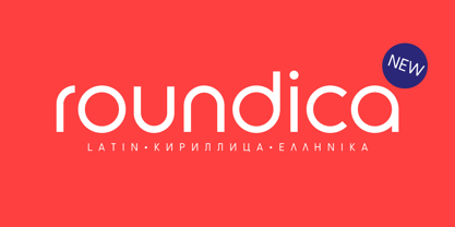 Roundica is a modern geometric typeface inspired by both classic typefaces of the 20th century like Avantgarde, Bauhaus, Futura, Helvetica and some modern fonts such as Abeat By Kai, Comfortaa, Gotham. Started in 2018 Roundica is the main reason for the appearance of Fontease Type Foundry. With its 834 glyphs Roundica includes extended Latin language support, but also Cyrillic and Greek. Designed with OpenType features like ligatures, fractions, small capitals etc., Roundica is perfectly suited for graphic design and any display use.
 - Contempo Gothic by Arkitype,
$20.00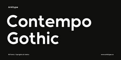 Contempo Gothic is a modern sans serif with a geometric approach. It comes in 18 weights, 9 uprights and its matching italics. Designed with opentype features including stylistic sets and tabular figures. Contempo Gothic includes extensive language support, fractions, arrows, ligatures and more. Perfectly suited for graphic design and any display use at any size. It could easily work for websites, blogs, signage, corporate identities, publishing and editorial design to name a few. Contempo Gothic is super versatile for everyday design use.
 - Snow Blue by Girinesia,
$17.00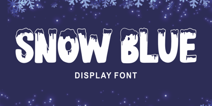 Hello guys... We proudly presenting our new font. It's name SNOW BLUE. SNOW BLUE is modern display font. SNOW BLUE is a bold decorative font perfect for your celebration party like Halloween, Chrismast or New Year. SNOW BLUE would perfect for Titles for kid`s book, scrapbook, logo, icon, phrases or quotes for winter greeting cards ( Halloween, Christmas or New Year holidays), photo overlay, short phrases, children’s book, gift shops tag, presentation in social media Pinterest, Instagram, Facebook or others.
 - FF Dirty Four by FontFont,
$41.99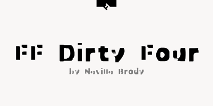 British type designer Neville Brody created this display FontFont in 1994. The font is ideally suited for advertising and packaging, music and nightlife as well as poster and billboards. FF Dirty Four provides advanced typographical support with features such as ligatures, alternate characters, and case-sensitive forms. It comes with proportional lining figures. This FontFont is a member of the FF Dirty super family, which also includes FF Dirty One, FF Dirty Seven, FF Dirty Six, and FF Dirty Three.
 - Ripped Bam Boom by Comicraft,
$19.00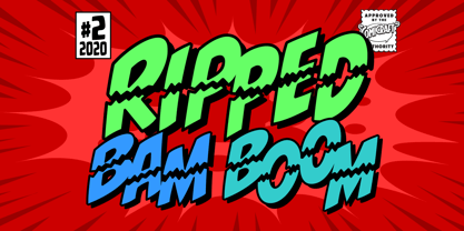 It’s stronger than the Thing AND the Hulk! It can bench press 500 pound gorillas and send them scurrying into the corner. RIPPED BAM BOOM is a font that can tear through the alphabet faster than you can say “A to Z” and will work your chest, shoulders and triceps and help YOUR characters gain upper-body strength and muscle mass! Features alternate uppercase characters, Western & Central Europe, Vietnamese & Cyrillic support, Crossbar I Technology™ and 18 Chinese Sound Effects
 - Tavolga by Ivan Petrov,
$30.00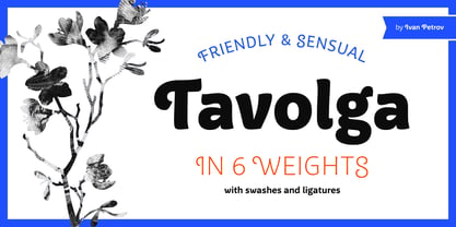 Tavolga have the mood of brushed feeling and come across as friendly and gentle. The harmony of organic and smooth shapes makes Tavolga uniquely appealing for display and titling where special expression is required. It has 6 weights, ranging from Thin to Black is ideally suited for advertising and packaging, festive occasions, editorial and publishing, logo, branding and creative industries, poster and billboards as well as web and screen design. Tavolga includes alternates for every uppercase letter, plus a handful of ligatures.
 - Toggle by Thinkdust,
$10.00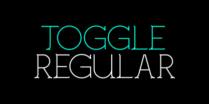 Toggle is a welcoming font with a charming and friendly demeanour. An all-caps display set with built-in layers of customisability in the form of two different cuts, regular and stencil, Toggle is happy to go along with whatever suits you best. The quirky corners and upbeat details flirt with tradition without conforming to what has been before, giving you confidence in Toggle’s quality type credentials while simultaneously freeing you to use it in a huge variety of situations.
 - Kidnap Note - Personal use only

- SHARKBOY & lavagirl - Personal use only

- Comic Relief - Personal use only

- LC Body is a contemporary typeface, meticulously designed to meet the needs of extensive text settings while maintaining an elegant and approachable character. Its design philosophy embodies a balanc...
- Rahere Informal by ULGA Type,
$18.99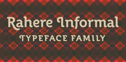 Rahere Informal is a slab semi-serif typeface that has a seriously charming personality and a little spring in its step. Serifs bend and flick, giving the characters a spirited, almost calligraphic feel. It's lively and friendly without being whimsical, great for messages that need a casual but credible tone with a bit of zing in the mix. Rahere Informal is suitable for a wide range of applications such as information signage, packaging, advertising, brochures, catalogues, screen text, visual identities and opera festivals. Want an annual report that pleases the board, shareholders and investors? Set it in Rahere Informal - that’ll put a smile on everyone’s face. The family comes in six weights from light to extra bold with corresponding italics. The lighter weights are more delicate, an evenly-spaced flamboyance of flamingos basking in the sun. As the weights get heavier, characters transform into a tight-knit group of line dancing rhinos. All styles contain a set of swash caps, a few ligatures and alternatives. Nice. The character set covers most European languages plus Vietnamese. Each weight contains lining & non-aligning numerals in both proportional & tabular spacing. The tabular numerals share the same width across all weights and styles (matching Rahere Sans and Rahere Slab). If a companion sans serif is needed, Rahere Sans is the ideal partner. They are both part of the extended Rahere typeface family and have been designed to complement each other. Seriously charming, charmingly serious. Seriously, what more do you want from a typeface? Rahere, founder of St Barts in London The typeface is named after Rahere, a 12th-century Anglo-Norman priest, who founded the Priory of the Hospital of St Bartholomew, London in 1123. In 2007 I was successfully treated at Barts for relapsed testicular cancer so I’m indebted to all the doctors, nurses and support staff who work there. A special shout out to Orchid Cancer – a UK charity that helps men affected by cancer – who funded the research for my treatment.
 - Liszthius-Alkimista - 100% free

- Rippen - Unknown license

- Banks and Miles by K-Type,
$20.00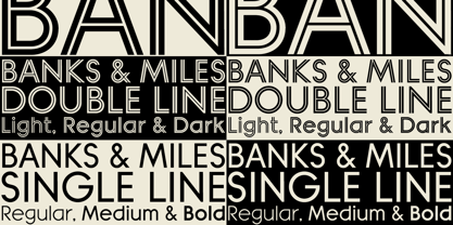 K-Type’s ‘Banks & Miles’ fonts are inspired by the geometric monoline lettering created for the British Post Office in 1970 by London design company Banks & Miles, a project initiated and supervised by partner John Miles, and which included ‘Double Line’ and ‘Single Line’ alphabets. The new digital typeface is a reworking and extension of both alphabets. Banks & Miles Double Line is provided in three weights – Light, Regular and Dark – variations achieved by adjusting the width of the inline. Banks & Miles Single Line develops the less used companion sans into a three weight family – Regular, Medium and Bold – each with an optically corrected oblique. Although the ‘Banks & Miles Double Line’ and ‘Banks & Miles Single Line’ fonts are based on the original Post Office letterforms, glyphs have been drawn from scratch and include numerous adjustments and impertinent alterations, such as narrowing the overly wide Z and shortening the leg of the K. Several disparities exist between the Post Office Double and Single Line styles, and K-Type has attempted to secure greater consistency between the two. For instance, a wide apex on the Double Line’s lowercase w is made pointed to match the uppercase W and the Single Line’s W/w. Also, the gently sloping hook of Single Line’s lowercase j is adopted for both families. The original Single Line’s R and k, which were incongruously simplified, are drawn in their more remarkable Double Line forms, and whilst the new Single Line fonts are modestly condensed where appropriate, rounded letters retain the essentially circular form of the Double Line. Many characters that were not part of the original project, such as @, ß, #, and currency symbols, have been designed afresh, and a full set of Latin Extended-A characters is included. The new fonts are a celebration of distinctive features like the delightful teardrop-shaped bowl of a,b,d,g,p and q, and a general level of elegance not always achieved by inline typefaces. The Post Office Double Line alphabet was used from the early 1970s, in different colours to denote the various parts of the Post Office business which included telecommunications, counter services and the Royal Mail. Even after the Post Office was split into separate businesses in the 1980s, Post Office Counters and Royal Mail continued use of the lettering, and a version can still be seen within the Royal Mail cruciform logo.
 - Zonttife by Twinletter,
$13.00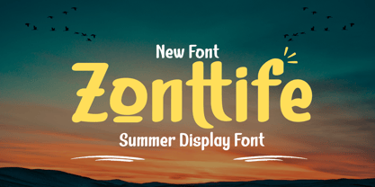 Introducing “Zonttife Font” – Embrace the Summer Vibe! Unlock the essence of summer in your designs with Zonttife Font. This stunning display font is your gateway to infusing every project with the vibrant spirit of the season. Zonttife Font’s unique style instantly transports your text into the heart of summer. Whether you’re working on beach-themed posters, sun-soaked party invitations, or any other creative endeavor, this font will bring your designs to life with a touch of summer magic. Crafted with meticulous attention to detail, Zonttife Font ensures that your text radiates the warmth and playfulness of summer. Its versatility shines through in various design applications, from tropical brochures to poolside banners. But that’s not all – Zonttife Font also supports multiple languages, making it accessible to a global audience. No matter where your creative journey takes you, Zonttife Font will help you express the sun-soaked vibes of summer. Embrace the summer vibes and let your designs bask in the sunny glow of Zonttife Font. Elevate your creativity and infuse the spirit of the season into every project. – PUA Encoded Characters – Fully accessible without additional design software.
 - Travel Kit SG by Spiece Graphics,
$39.00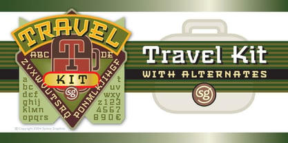 Here’s an intriguing mixture of 1930s deco and modern tech fashion. Travel Kit Medium is a sturdy semi-serif hybrid with one foot in the past and another in the present. It is slightly low-waisted with extended crossbars on the capital A, E, F, H, K, and P. But the capital B, M, R and X are distinctively contemporary with the E and M repeated as unicase letters in the lowercase. Optional retro characters (notably the unicase e and m) have been provided if you prefer a more traditional overall look - and your software allows access to these characters. Simply find and replace the more modern letters with the older ones. In addition, small caps with even more alternate characters have been included for greater flexibility and convenience. Travel Kit Medium with Alternates is now available in the OpenType format. In addition to small caps, lining figures, oldstyle figures, and petite figures, this expanded OpenType version contains additional stylistic alternates and historical forms. These advanced features work in current versions of Adobe Creative Suite InDesign, Creative Suite Illustrator, and Quark XPress. Check for OpenType advanced feature support in other applications as it gradually becomes available with upgrades.
 - Beverly Shores Script SG by Spiece Graphics,
$39.00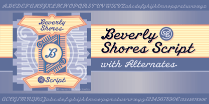 If you take the South Shore Line from Chicago to South Bend, your train will pass though the small community of Beverly Shores, Indiana. The beautifully restored and highly colorful “Beverly Shores” train station sign not far from the Lake Michigan beach is the source of inspiration for this connecting script typeface. The sign’s existing ten letters have now been extended to include the entire alphabet. This old-fashioned depot letterstyle is much in the spirit of such faces as Fulton Sign and Inserat Cursive. Ascenders and descenders have been lengthened and capitals are now much larger. Alternate lowercase swashes, capitals, and small figures have been included for your convenience. And custom uphill words such as “The,” “for,” and “to” have been added for more novelty and spark in headline settings. Beverly Shores Script with Alternates is also available in the OpenType Std format. Some new characters including old style figures have been added to this OpenType version. Advanced features currently work in Adobe Creative Suite InDesign, Creative Suite Illustrator, and Quark XPress 7. Check for OpenType advanced feature support in other applications as it gradually becomes available with upgrades. All aboard for Beverly Shores!
 - Blood Orange by Fenotype,
$25.00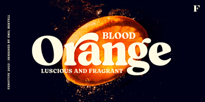 If you need to say something weighty, say it with Blood Orange. Blood Orange is a hearty rounded serif font with an easygoing confidence and a delightful nostalgic feeling, without the dusty burden of actual fonts from the last century. Blood Orange works great as a logotype, in magazines, headlines, posters, advertising and packaging. It’s at its best in short sentences since it’s so bold, but can be used for a bit longer text passages too, with some spacing added. As a product of modern era, Blood Orange is fully equipped with plenty of OpenType goodness: Contextual Alternates and Standard Ligatures do their usual trick in smoothing certain letter combinations, and they’re automatically on. In addition it has a wide range of Discretionary Ligatures, Stylistic, Swash and Titling Alternates that you can trigger on from OpenType controls in any OpenType savvy program, or manually select the suitable variations from the character window. Try these alternates for more eloquent designs, but remember to treat them like you would treat you would treat really strong spices: just a bit at a time. See the full range of the alternative glyphs on the specimen posters.
 - !Sketchy Times - Unknown license

- Hooper dooper - Unknown license

- !Futurelic Sans Souci - Unknown license

- !The Black Bloc - Unknown license

- Hiragino Sans by SCREEN Graphic Solutions,
$210.00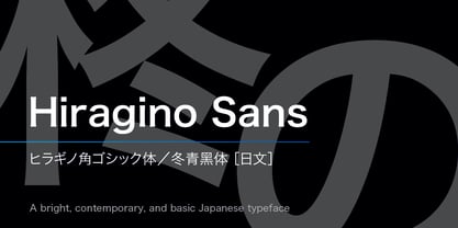 Mindful that Hiragino Sans (Kaku Gothic) would be used in conjunction with Hiragino Serif (Mincho), SCREEN developed a font that anticipated today’s world where most people do their reading on displays and yet still has an orthodox letterform that does not blur when printed on paper. In short, our goal with this font was to create a new concept that responds to the demands of today’s times. This font offers weight variations from W0 to W9 and is extremely versatile. This makes it well-suited to all visual expression media including paper, metallic textures, resins, cloth, television, movies, broadcasting, websites, and electronic displays. One of the design’s strongpoints is that it elides serif on the right side of each stroke, thus delivering more spacious counters and a comfortable appearance. Thanks to this, the typeface not only delivers a contemporary, lively impression same as Latin sans serif typefaces, but also heightens the natural continuity and readability of text whether it is set vertically or horizontally. As a result, it makes it possible to bring a strong appealing power to text. Without a doubt, this is typeface that above else embodies the role of Sans Serif.
 - Linotype Dala by Linotype,
$40.99Created by Swedish designer Bo Berndal in 1999, Linotype Dala Text can best be described as a softer, friendlier blackletter. Blackletter refers to typefaces that evolve out of Northern Europe's medieval manuscript tradition. Often called gothic, or Old English, these letters are identified by the traces of the wide-nibbed pen stroke within their forms. Linotype Dala Text most resembles the fraktur type of blackletter. Fraktur types were popular text faces in Northern Europe until the 20th century. Inspired by Swedish folklore, this fraktur is much softer and rounder than most examples. Its connection to the Scandinavian folkloric tradition makes Linotype Dala perfectly suited for such texts as fairy tales, medieval stories, and other things that might appeal to a child's sense of adventure. To strengthen the medieval fairy tale look, use Linotype Dala Text together with other elements of the Linotype Dala family: Library's Linotype Dala Pict and Linotype Dala Border. The characters in these two supplementary fonts were inspired by medieval and renaissance folk art, and were also drawn by Bo Berndal, making them a perfect match. All three styles of the Linotype Dala Family are part of the Take Type 4 collection from Linotype GmbH." - Sintesi Serif by FSdesign-Salmina,
$-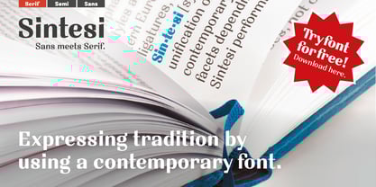 Sans meets serif. Would you like to express tradition by using a contemporary font? Sintesi might be exactly what you are looking for. Sintesi stands for synthesis: the unification of serif and sans-serif into a contemporary font, which surprises with different facets depending on its application. In copy size Sintesi performs like a sans-serif. It is a compact and well readable font that fulfills all requirements of modern digital media. In larger sizes, Sintesi unfolds its traditional character. Now, its strong contrast and the perceptible feather-ductus stand out clearly, as we appreciate it in a historical old style face. Sintesi is completed by a suitable italic. Its cursive character has more to do with writing-speed than to moderate inclination. Therefore Sintesi may be well-suited for many other purposes, not only for emphasis. The whole font family consists of 20 styles and offers a wide range of Western and Eastern European special characters, typographical ligatures, uppercase, oldstyle and fraction figures. Sintesi (Serif) builds together with Sintesi Semi and Sintesi Sans an extended family. Start combining antiquity with modernity! Download a free trial version of Sintesi with a reduced character set. Check it out!


