9,454 search results
(0.026 seconds)
- Ferghaus Sans by Fontdation,
$15.00 Introducing Ferghaus Sans, a modern sans serif font. This all-caps font is crafted with high attention to the details, gives you a clean and sharp feeling using it on your designs. Packed with so many OpenType features (such as alternate chars, swashes, ligatures, etc), lets you play and explore every possibilities with the letters combo. Ferghaus Sans is highly versatile, suits best for almost everything, whether you're working on classic themed design, or the modern ones.
 - Shinokai by Lukas Schiltknecht,
$14.00 The Shinokai is a sans serif of two weights that is both dynamic and consequent. Originally concepted as a font for application letters by Lukas Schiltknecht it quickly became a more sophisticated piece of work. This Typeface is inspired by some of his favorite fonts the FF DIN and the ITC Officina. It is made to suit a variety of uses like advertising and packaging, film and tv, editorial and publishing as well as posters and billboards.
 - Biscuit Pro by Kustomtype,
$30.00 Biscuit is a rounded unique typeface, clearly and easy readable with upper- and lowercase. Perfectly applicable for big or bold tekst pages. This font family has an excellent legibility - both in print and on the web - and an optimized kerning. Biscuit is intentionally designed to be used as a display typeface in publications, packaging and al of your artwork and design. It's warm and cosy character suits extraordinary well for modern or vintage typography and corporate design.
 - Mister Crack by Olivetype,
$18.00 Say goodbye to boring typography and hello to an impactful visual experience! Mister Crack's rough texture adds depth and dimension to your designs, making them stand out from the crowd. Whether you're designing a vintage-inspired poster or crafting a powerful logo, this typeface injects charisma and attitude into every word. Mister Crack features : Standard Latin Numbers, symbols, and punctuations Multilingual Support. Fully accessible without additional design software Simple Installations Works on PC & Mac Thank You.
 - Keista Heather by Matra Creative,
$12.00 Keista Heather brings her own unique style to every design project. This fantastic script font is best suited for headers of all sizes, and for blocks of text that have maximum and minimum variations. Whether it's for the web, printing, motion pictures, or anything else – Keista Heather would look spectacular. This font is PUA coded which means you can access all the cute glyphs and swashes with ease! It also has many special features including alternate glyphs and ornaments.
 - D Blues by W Type Foundry,
$29.00 D Blues its a sans serif typefamily of 9 weights plus matching italics. It is inspired by the neo humanist typefaces with a mix of 20st grotesque sans typeface. D Blues serve very well in web & print design areas, body text, excellent web-font legibility etc… D Blues is equipped with a complete set of opentype features including alternative glyphs, fractions, ligatures and many more. It is perfectly suited for highlighting lettering, magazines, web, interaction design, advertising & logotypes.
 - Schnitz by Linotype,
$29.99Linotype Schnitz is part of the Take Type Library, selected from the contestants of Linotype’s International Digital Type Design Contests of 1994 and 1997. Designed by the Finnish artist Osmo Niemi, the characters seem to contain no round forms at all. Linotype Schnitz looks as though it were chiseled and has an angular, almost brittle feel. The restless and lively appearance makes Linotype Schnitz particular well-suited to headlines and shorter texts with point sizes of 12 and larger. - Evuschka by Petra Sucic Roje,
$33.00 A dramatic contrast between thick and thin strokes, “ball” shapes at stroke terminals, and straight hairline serifs are main Evuschka characteristics. In this font, the x-height is specifically accentuated in relation to body height. In spite of its extreme geometrical shape, Evuschka exudes fairytale romance. Belonging to decorative type fonts, it is best suited for headlines, titles, and small amounts of text in large sizes. Evuschka was selected for TDC Certificate of Typographic Excellence 2017.
 - Lundoon by Mazkicibe,
$11.00 Description Hello gaes! How are you guys ? I'm sure it's very good. Introducing, this is our newest product, we call this produc Lundoon Font.. Lundoon Font is Handwritten and modern font combined with a sweet touch and beautifully curved each letter. using a touch of soft curves so that it is pleasing to the eye Lundoon Font Spirit is great for: Wedding invitations, fashion magazines, logos, signatures, and suitable for watermark photography. Features: -Uppercase, -Lowercase, -Numeral, -Punctuation,
 - Menco by Kvant,
$59.00 Menco was inspired by the lettering of engineering, found on blueprints, mechanical drawings, stencils and templates. The family has 5 weights, ranging from Thin to Black (including italics) and is ideally suited for advertising and packaging, editorial and publishing, logo, branding and creative industries as well as small text. Menco provides advanced typographical support with features such as case-sensitive forms, fractions, super- and subscript characters, and stylistic alternates. It also comes with tabular lining and proportional lining figures.
 - Macis by Stabenfonts,
$30.00 Macis is a real-and-fake-retro-modern font-family containing five weights from thin to black. It is inspired by shop signs, packaging and typography from around the middle of 20th century. Though it is strictly geometrically constructed, it contains some hand-crafted influences as well as some irregularities. Some say, it dances on the baseline, ’cause the bowls and curves reach far out over the stems. Use it in big sizes, especially the extreme weights!
 - Kelpt Sans by Typesketchbook,
$55.00 Kelpt Sans is an altered modified from the form of the original Kelpt typeface. Designed to be more Corporate, the font family has flat terminals that harmonizes with sharp corners. With all of these features, “Kelpt Sans” is a prominent, eye-catching and unique typeface. It comes with 9 weights with 2 Hight options in order to suit for a multifunctional usage, especially for cooperative work, such as website, magazine, editorial, publishing, as well as packaging.
 - Ringlings by Yanky Goldman,
$29.00 Ringlings stems from Yanky Goldman’s quest for a fresh and innovative display font that subtly attracts. Thus, this lively, dancing-in-the-sun typeface was created. Ringlings is ideal for logo design, package design, headlines and more. This single-stroke, semi-serif font family includes over 1,100 glyphs including uppercase, lowercase, stylistic sets, titling, petite caps, deco caps, ligatures, borders & ornaments and more. It supports most Latin and European languages. Ringlings is airy, light and quite versatile.
 - Argonautica by URW Type Foundry,
$39.99 Argonautica is based on a relict of the future that was left on earth by time-travelling extra-terrestrials. In 1947, an UFO crashed in the New Mexico desert. There were unknown glyphs found on the spaceship which couldn�t be deciphered to date. Based on one of the unknown glyphs, Gabriele Lindemann developed a complete alphabet readable for human beings. Argonautica is particularly suited for colored typography and can be read much better with growing distance.
 - Juggling Squad by Bogstav,
$19.00 The name of the font is from the hilarious movie "21 Jump Street" - and that is where the similarity ends. While the movie is quite funny, it is also super goofy! I can't say the same about the font, because terms like organic and organic comes to my mind. Strange, yes! And I have really no good reason for this naming, other that its an odd way to tribute this one of my all time favourite comic movies! :)
 - Gunar by The Northern Block,
$39.00 A geometric sans serif with a square chiseled appearance. Precise curves are met with straight lines and tapered angles to produce a fresh, technical typeface. It’s large x-height and neutral width give it good legibility at small point sizes. These refined rectangular features make it ideally suited to a wide range of modern applications. Details include 550 characters with alternative lowercase a, e, g and y. 5 variations of numerals, manually edited kerning and Opentype features.
 - Brignell Sunday by IB TYPE Inc.,
$40.00 BRIGNELL SUNDAY is an eight font family designed by Ian Brignell. A relaxed, easy-reading companion for any day of the week. A clean, modern, friendly sans serif characterized by an open style with occasionally rounded corners, occasional curved junctures on diagonals and a slightly sloped lower case A. Brignell Sunday was born in 2006 and was inspired by corporate custom font ideas Ian designed for an LG Electronics sub-brand called Best Shop. Extended Latin set.
 - Lalalo by Cuda Wianki,
$25.00 Lalalo is a casual, modern sans-serif font family based on hand-lettering. It's oval letter shapes provide soft and friendly appearance. Lalalo font is very legible with a warm touch perfectly suited for children books. Lalalo family consists of 6 weights ( Extra Light, Light, Regular, Semibold, Bold, ExtraBold). You can use it with normal fill or outlined. You can mix various colors and stroke widths to gain interesting results. There is also a set of nice frames available.
 - MRK Maston Pro by Marka Design,
$10.00 MRK Maston Pro is a vintage look display typeface with 7 versions of styles. This typeface adds a bold and iconic style to your retro and modern graphic designs. It’s perfect for any graphic design or typography project that requires a solid mood. You can also use in your UI designs for a better style and system. A stylish and extraordinary font containing all punctuations, and supports multi-languages. This font is suitable for various purposes such as street style designs, T-shirts, posters, logos, labels, packaging, branding, editorial design, UI designs, and modern purposes.
 - FS Lola by Fontsmith,
$80.00 L-O-L-A Like the subject of the Kinks’ song, FS Lola is a little bit of both – a font with a rare combination of masculine and feminine. The font was inspired by the song, which itself was inspired by the night the Kinks’ manager spent dancing drunkenly in a Soho club with a beautiful woman... Or so he’d thought, until her stubble started to show halfway through the evening. Masculine/feminin Phil Garnham’s experience in designing FS Lola was similar to the one related by Ray Davies. Setting out to create a sans serif font, he realised along the way that he was actually dealing with a semi-serif. He went with it, though, and produced a font with the best masculine and feminine qualities: hard edges and corners tempered by shapes of softness and generosity, the outcome of what Phil calls an “organic” design process. “Initially, my designs were very graphic and hard but not very distinctive. By printing and redrawing the letters in pencil I achieved a softer and friendlier alphabet with a strong personality.” Broad Lola, as you’d expect, is very broad-minded. Available in five weights with italics – and fluent in central European languages – FS Lola offers a confident combination of feminine softness and male steeliness to any kind of design. As the song says, “It’s a mixed-up, muddled-up, shook-up world... except for Lola.
 - Young RIEHUM by Twinletter,
$17.00 Regards! Say hello to Young Riehum, a superhero-style display font that will bring strength and tension to your projects. If you’re looking for a strong, bold, and bold font, Young Riehum is the perfect choice for creating an electrifying look in the worlds of film, gaming, and design. With a striking presence, Young Riehum grabs attention instantly and delivers an unforgettable message to your audience. Each letter exudes electrifying energy, giving your projects a new dimension and creating an extraordinary experience. In addition to extraordinary styles, Young Riehum is also equipped with features that enrich your creativity. With the available ligatures and alternative characters, you can explore a variety of unique and interesting typography combinations. Apart from that, this font also supports multiple languages, allowing you to reach an international audience with a strong and bold message. Join the forces of Young Riehum and let your every project be an epic adventure. With its stunning superhero style and special features, this font will provide unforgettable strength and tension. Don’t miss the opportunity to own Young Riehum and create extraordinary works that inspire and amaze your audience. What’s Included : File font All glyphs Iso Latin 1 Alternate, Ligature Simple installations We highly recommend using a program that supports OpenType features and Glyphs panels like many Adobe apps and Corel Draw so that you can see and access all Glyph variations. PUA Encoded Characters – Fully accessible without additional design software. Fonts include Multilingual support
 - Daito by insigne,
$29.99 It’s alive! Insigne’s new creation, Daito, is now functional, built to process your logos, business cards, magazine layouts, packaging and more without the slightest glitch. But this new slab serif is no heartless churn of the same factory nuts and bolts. Daito is designed to greet your reader with a friendly face. Inspired by types from the era of the Space Race, this new take on some old faces brings a contemporized, unique set of serif forms to the font race. Daito comes complete with a variety of weights to help you find the best settings for your current needs or moods. Need soft and playful? Daito light communicates its message gently with softened serif. Need a different feel with more authority? With the touch of a few buttons, engage the powerful Black or striking Bold. Additional features with Daito include stylistic alternates, ligatures, titling capitals and small caps among other typographic features. Please note: use magical OpenType-savvy applications such as Adobe Creative Suite, QuarkXPress, etc to keep your font from malfunctioning, shorting, attacking people, or attempting a world takeover. Daito also speaks Western, Eastern, and Central European languages. However, Japanese is not available for this edition. It’s not every day you find a top-of-the-line font like Daito. This machine can handle most anything on your list, short of folding your laundry (though it may make your laundry look nicer). Don’t wait. Order yours today while supplies last.
 - Remora Sans by G-Type,
$39.00 Remora is an extensive new humanist sans serif which comes in 2 style variations, the effervescent Remora Sans and its corporate business partner Remora Corp . Both styles include 5 individual width sets ranging from the condensed W1 to the extra-wide W5. Furthermore, with an impressive 7 weights (Thin to Ultra) and true matching italics in each pack Remora is an ultra versatile super family comprising 140 individual fonts, perfect for any typographic assignment or design brief. Remora was designed by G-Type founder Nick Cooke. Both the Sans and Corp families share the same proportions, with the exception of certain key characters that change the overall appearance. Remora Sans is an exuberant and characterful typeface while Remora Corp, as its name suggests, is a businesslike typeface more suited to corporate typography. Quite early on in the design process Nick decided to give Remora Corp equal billing instead of incorporating these glyphs as alternates or a stylistic set that may get overlooked. “I created two separate families after learning a valuable lesson with one of my earlier typefaces, Houschka”, says Nick. “Houschka contained distinctive rounded A’s W’s and w’s, with ‘straight’ styles as character alternates. Even though style sets and alternates are easy to activate they are rarely used, so after many requests for customised versions of the fonts with the straight characters as defaults it was decided to create the separate ‘Alt’ family. So I cut straight to the chase with the two Remora variants and created two complementary families.” Both sets contain many shared letterforms, but it is the alternate characters that significantly alter the appearance of each font. Remora has been carefully designed for optimum legibility at large and very small sizes. Although fairly monolinear in appearance, especially in the lighter weights, particular attention has been paid to optical correction like the overshoots of the curved characters. Open counters and painstaking attention to detail (e.g. weight contrast between horizontal and vertical strokes, junctions of shoulders and stems etc) all boost readability and make Remora a great choice across all media. Remora Sans and Corp are ‘humanist’ rather than ‘geometric’ in style, meaning they’re not strictly based on rectangles and circles, resulting in a warm and friendlier feel. The slightly ’super-elliptical’ rounded forms create generously attractive curves. Remora has very distinctive italics in that they are only inclined by 8 degrees, but are not just based on slanted uprights. The italic styles are very alluring when used for display at large sizes and the good news is they come bundled free with their respective uprights. Each family also contains many OpenType features including proportional and tabular numbers, small caps, discretionary ligatures, plus five stylistic sets for ultra versatile typography.
 - Remora Corp by G-Type,
$39.00 Remora is an extensive new humanist sans serif which comes in 2 style variations, the effervescent Remora Sans and its corporate business partner Remora Corp. Both styles include 5 individual width sets ranging from the condensed W1 to the extra-wide W5. Furthermore, with an impressive 7 weights (Thin to Ultra) and true matching italics in each pack Remora is an ultra versatile super family comprising 140 individual fonts, perfect for any typographic assignment or design brief. Remora was designed by G-Type founder Nick Cooke. Both the Sans and Corp families share the same proportions, with the exception of certain key characters that change the overall appearance. Remora Sans is an exuberant and characterful typeface while Remora Corp, as its name suggests, is a businesslike typeface more suited to corporate typography. Quite early on in the design process Nick decided to give Remora Corp equal billing instead of incorporating these glyphs as alternates or a stylistic set that may get overlooked. “I created two separate families after learning a valuable lesson with one of my earlier typefaces, Houschka”, says Nick. “Houschka contained distinctive rounded A’s W’s and w’s, with ‘straight’ styles as character alternates. Even though style sets and alternates are easy to activate they are rarely used, so after many requests for customised versions of the fonts with the straight characters as defaults it was decided to create the separate ‘Alt’ family. So I cut straight to the chase with the two Remora variants and created two complementary families.” Both sets contain many shared letterforms, but it is the alternate characters that significantly alter the appearance of each font. Remora has been carefully designed for optimum legibility at large and very small sizes. Although fairly monolinear in appearance, especially in the lighter weights, particular attention has been paid to optical correction like the overshoots of the curved characters. Open counters and painstaking attention to detail (e.g. weight contrast between horizontal and vertical strokes, junctions of shoulders and stems etc) all boost readability and make Remora a great choice across all media. Remora Sans and Corp are ‘humanist’ rather than ‘geometric’ in style, meaning they’re not strictly based on rectangles and circles, resulting in a warm and friendlier feel. The slightly ’super-elliptical’ rounded forms create generously attractive curves. Remora has very distinctive italics in that they are only inclined by 8 degrees, but are not just based on slanted uprights. The italic styles are very alluring when used for display at large sizes and the good news is they come bundled free with their respective uprights. Each family also contains many OpenType features including proportional and tabular numbers, small caps, discretionary ligatures, plus five stylistic sets for ultra versatile typography.
 - Gimbal Egyptian by AVP,
$19.00 Gimbal Egyptian is a richly-featured font family providing many style options across a broad range of languages. It is twinned with Gimbal Grotesque, a sans-serif family with an identical range of weights and features. Originally conceived as a small webfont family, the letterforms have been revitalised to put a spring in their step and the family has been extended to create a versatile multi-script text face equally at home on the printed page. Carefully crafted at all weights, Gimbal also lends itself to headlines and display applications such as posters, exhibitions and signage while resolving well on-screen for general document creation and web-based applications. The letters are spaced for best readability on-screen and in the usual printed body text ranges but are tolerant of tracking adjustment to suit other uses. The styles are divided by width into four families (Compressed, Condensed, Normal, Extended), each family possessing six weights plus corresponding italics. Within each family, the 'regular' and 'bold' weights are style-linked, and all upright forms have an italic counterpart. The full opentype character set includes latin, greek and cyrillic scripts with appropriate local variants (also as stylistic sets) for Turkish, Polish and Romanian (latin) and Russian, Bulgarian and Serbian (cyrillic). All fonts contain small capitals for all scripts, superscript for latin and commonly used greek together with the usual numeral style, size and positioning options. The default numerals are 'proportional lining'. Other opentype features include case-sensitive marks, fractions, and some discretionary ligatures. A set of circled numerals and circled latin capitals is included, along with an unusual feature that composes 2-character country codes.
 - Gimbal Grotesque by AVP,
$19.00 Gimbal Grotesque is a richly-featured font family providing many style options across a broad range of languages. It is twinned with Gimbal Egyptian, a slab-serif family with an identical range of weights and features. Originally conceived as a small webfont family, the letterforms have been revitalised to put a spring in their step and the family has been extended to create a versatile multi-script text face equally at home on the printed page. Carefully crafted at all weights, Gimbal also lends itself to headlines and display applications such as posters, exhibitions and signage while resolving well on-screen for general document creation and web-based applications. The letters are spaced for best readability on-screen and in the usual printed body text ranges but are tolerant of tracking adjustment to suit other uses. The styles are divided by width into four families (Compressed, Condensed, Normal, Extended), each family possessing six weights plus corresponding italics. Within each family, the 'regular' and 'bold' weights are style-linked, and all upright forms have an italic counterpart. The full opentype character set includes latin, greek and cyrillic scripts with appropriate local variants (also as stylistic sets) for Turkish, Polish and Romanian (latin) and Russian, Bulgarian and Serbian (cyrillic). All fonts contain small capitals for all scripts, superscript for latin and commonly used greek together with the usual numeral style, size and positioning options. The default numerals are 'proportional lining'. Other opentype features include case-sensitive marks, fractions, and some discretionary ligatures. A set of circled numerals and circled latin capitals is included, along with an unusual feature that composes 2-character country codes.
 - Holofernes NF by Nick's Fonts,
$10.00The raw emotional energy of German Expressionism is evident in this font, based on Judith Type, designed by C. H. Kleukens in 1923. This version takes its name from the Biblical character who lost his head to the original font’s namesake. Both versions of the font include 1252 Latin, 1250 CE (with localization for Romanian and Moldovan). - YT Big Latin by Yangtype,
$9.00 The concept of this letter is a young alligator. Young crocodiles have lean bodies and are agile. It has uncontrollable power, and the angular leather vinyl and teeth feel vivid. This font was created to convey the most compressed energy possible through a collection of compressed squares. Although it doesn't attack, it is quite an aggressive letter.
 - Swordtail by Type Innovations,
$39.00 A friend bought me a Chinese calligraphic brush set in a beautifully decorated box. I started to letter the alphabet on parchment, in my own hand, using quick strokes and found the resulting script had an interesting energy to it. After further refinement in my font application software 'Swordtail' was born. A great free-hand script.
 - Quagey by Craft Supply Co,
$20.00 Quagey - Psychedelic Typeface: Where letters dance with vibrant, kaleidoscopic energy. It's not just a font; it's an electrifying visual experience, making your message unmissable, like a psychedelic journey. This typeface is ideal for greeting card, packaging, brand identity, poster, or any purpose to make your design project look eye catching and trendy. Feel free to play with this typeface!
 - Hai Brush by Sabrcreative,
$30.00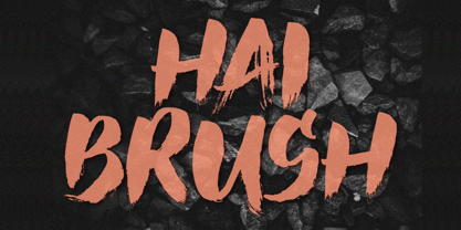 Unleash your creativity with the all-caps captivating Hai Brush Font. This unique typeface effortlessly combines the raw energy of hand brush strokes with a touch of elegance, making it an exceptional choice for a variety of design endeavors. Whether you're crafting logos, posters, or branding materials, Hai Brush Font adds an authentic, artistic flair to your projects.
 - Chunk Plump by Viswell,
$19.00 Introducing "Chunk Plump," a retro display font that combines chunky and rounded shapes. Bold and playful, it captures the nostalgic charm of the past with a contemporary twist. Perfect for headlines and titles, it adds authenticity and character to any design, infusing a sense of warmth and inviting energy. Get ready to make a lasting impression with "Chunk Plump."
 - Cybersport by Anton Kokoshka,
$28.00 Cybersport is a modern geometric grotesque sans with contemporary aesthetics. Ideal for dynamic designs in esports, sports, and active living, it conveys energy and motion. With 9 weights and italics, its letters feature rectangular shapes, giving a futuristic, tech-savvy look that reflects its innovation. Use Cybersport to add modern aesthetics and vibrancy to your work.
 - LT Hakuna Matata by Latam Type Foundry,
$15.00 Introducing "LT Hakuna Matata" font collection, inspired by The Classic Movie Lion King. Styles: Normal, Outline, Shadow, Ink. Captures Timon and Pumbaa's essence. Normal exudes joy, Outline adds an artistic touch. Shadow creates depth, Ink offers handcrafted charm. Experience African savannah's energy in typography.- Where typography meets the magic of The Lion King. Enjoy! Thank's for Support!
 - Olis by Roman Polishchuk,
$34.00 Olis is a stylish, fresh new handwritten script. Olis comes with two weights, numerals, punctuations, and some variations on character including OpenType alternates, and common ligatures. It helps set your designs apart by adding a custom-lettered look. You will also find that its initial and terminal letters can enhance your designs in new and creative ways. Hand-drawn leaves, plants, flowers, as well as large and small snowflakes add original detail while complementing the font perfectly. If you like this font you might also like an aesthetic text generator by the same author.
 - Salinas by TipoType,
$38.90 Salinas imitates a friendly and warm handwritten typeface. Its particular feeling is achieved thanks to several character variations, which can automatically alternate between three different (and complete) sets of characters, giving the font the proper character of hand writing, mixing: height, weight and inclination. Through its opentype programming, Salinas generates multiple character changes in the text, without losing its surprising legibility in various sizes. The added gestural strokes for titles enriches the spectrum of variants and versatility. Itís ideal for countless pieces of design that require warmth and spontaneity.
 - Brannboll Stencil by Mans Greback,
$59.00 Brannboll Stencil is a script sport typeface. The baseball-style lettering was drawn by Mans Greback in 2020. It is a specialist stencil typeface, created primarily for laser cutters: All whitespaces are connected with the background, making it a lettering perfect for signs, jewellery, stencils and general cutting. It also comes with the additional, decorative style Brannboll Stencil Swash, which contains ten cool swashes to give the graphic extra expression. It has a very extensive lingual support, covering all European Latin scripts. The font contains all characters you'll ever need, including all punctuation and numbers.
 - Redig by Great Scott,
$16.00 Redig is a bold condensed display typeface with an assertive and athletic aesthetic. Inspired by newspaper headline typefaces from early 1900s it has chamfered corners with rounded edges that smooths out some harshness and generous x-height to its lower case characters. Redig will shine when used big. And I mean BIG. This is certainly a case when “bigger is better” really is the truth. Redig comes with an oblique style and ligatures and works best in headlines, logos, branding, social media or any display type use. Use it big.
 - Delima by Monotype,
$29.99The Delima font family has something of the Clarendon or Ionic influence but is distinguished by a lighter serif treatment. The contrast between thick and thin strokes is not pronounced, weight stress is vertical. Delima's serifs are short but strong, allowing close letter spacing to give good economy. Lowercase x-height is very generous, internal counters are open. This combines to give Delima excellent legibility in small sizes and an overall even colour when set in text. Delima works well for magazines, periodicals and display work in advertising, flyers and catalogues. - Bale Mono by moretype,
$28.00 Bale Mono is the monospaced companion of Bale. This Mono font brings a technical edge to the cool professionalism of Bale. Originally developed as a part of a corporate identity, Bale is a warm and confident sans-serif font. With its generous counters and angled terminals Bale is a dependable work horse with enough flare to add interest to any typographical landscape. This hardworking font comes equipped with small caps, automatic fractions, proportional/tabular lining and old style figures and alternative glyphs and is the must for any typographic toolkit.