9,454 search results
(0.059 seconds)
- Lacuna by Set Sail Studios,
$14.00 Introducing the Lacuna marker font! Lacuna is a fresh & high energy all-caps font, hand-drawn with a marker pen to maintain realistic textures. It's a great choice for trendy signature-style logos, merchandise, posters, music artwork and more. As well as a full alternate set of upper & lowercase characters, Lacuna also includes a set of 26 swashes, ideal for underlining your Lacuna lettering and adding that extra 'custom' style. The Lacuna fonts contain language support for; English, French, Italian, Spanish, Portuguese, German, Swedish, Norwegian, Danish, Dutch, Finnish, Indonesian, Malay, Hungarian, Polish, Croatian, Turkish, Romanian, Czech, Latvian, Lithuanian, Slovak, Slovenian.
 - M Qing Hua PRC by Monotype HK,
$523.99 Among the world of Chinese commercial fonts, M Qing Hua has a relatively high flexibility to be used in different areas, for instance, media of advertising. Its design concept is to combine the neatness of Hei typeface with the roundedness of Yuen typeface. The typeface tries to revitalize the boring traditional design by adding energy, simplicity and modernness to it, which could be shown in the small features in strokes like delicate and curvy finishings. More is the appropriate mix of masculinity and femininity, so as to enable a more effective communication, stronger visual attractiveness and higher affections.
 - Exelancer by Popskraft,
$19.00 We are proud to present the futuristic Excelancer font. This font was inspired by passion for space stories. The uniqueness of this font lies in the rare combination of a wibrant style of decorative capital letters and perfectly balanced lowercase charachters that read well in any massive text. Thus, you get a universal font kit with which all the tasks of futuristic design are solved. However, this font will become a decoration not only for fantastic stories, but also for everything related to technology, development, progress and even sports. In short, this is the pure energy of the future!
 - Machinoir by Invasi Studio,
$19.00 With its organic glyph strokes, Machinoir captures the spirit of the vintage era of motorcycle clubs. The font draws inspiration from this theme to create an all-caps display font reminiscent of the vintage style. Its unique feature set, including alternates and ligatures, adds a touch of uniqueness and organic charm to your designs. A perfect choice for designing eye-catching headings, trendy t-shirts, dynamic flyers, heartfelt greeting cards, captivating product packaging, timeless book covers, inspirational printed quotes, memorable logotypes, and electrifying album covers, Machinoir is your go-to solution. Embrace Machinoir's raw energy and vintage vibes in your designs!
 - Forenight by Flawlessandco,
$9.00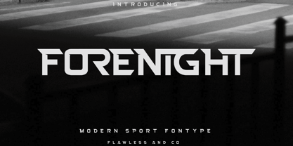 Introducing "Forenight" - a dynamic and modern sport font designed to capture the spirit of athleticism and energy. With its bold and sleek letterforms, Forenight brings a sense of power and movement to your sports-related designs. There's some connected letters and some alternates that suitable for any graphic designs such as branding materials, t-shirt, print, business cards, logo, poster, t-shirt, photography, quotes .etc This font support for some multilingual. Also contains uppercase A-Z and lowercase a-z, alternate character, numbers 0-9, and some punctuation. If you need help, just write me! Thanks so much for checking out my shop!
 - Cosmo Sheep by Sipanji21,
$18.00 "Cosmo Sheep" is a display font with a Racing and futuristic theme, perfect for design projects such as sports jerseys, athletic shoes, helmets, and other sports-related products. With its dynamic appearance, this font brings a sense of energy and movement to your designs. The clean lines and modern feel of "Cosmo Sheep" make it an excellent choice for projects that require a sleek and contemporary look. Whether you're designing for a sports team or creating an athletic product, "Cosmo Sheep" will help you create a strong and memorable brand identity that embodies the spirit of sports and the future.
 - Skaligari by PintassilgoPrints,
$24.00 Skaligari is a sharp and energetic typeface, somewhat expressionist, somewhat eighties, punk, new wave, always edgy. It's an all-caps font with two options for each letter and also for each numeral. Turn on the Contextual Alternates OpenType feature to instantly cycle these glyphs. There are yet stylistic alternatives, as well as graphical elements to add a twist here and there. Wild and full of energy, Skaligari is a winning choice for sports and music-related ideas, skate films and labels, logos, apparel, zines. And, as creativity has no limits, how about some wedding invitations? Just play it loud!
 - Speed Impact by Sipanji21,
$17.00 "Speed Impact " is a display font with a sporty and futuristic theme, perfect for design projects such as sports jerseys, athletic shoes, helmets, and other sports-related products. With its dynamic appearance, this font brings a sense of energy and movement to your designs. The clean lines and modern feel of "Speed Impact " make it an excellent choice for projects that require a sleek and contemporary look. Whether you're designing for a sports team or creating an athletic product, "Speed Impact" will help you create a strong and memorable brand identity that embodies the spirit of sports and the future.
 - Loxer Graffiti by Sipanji21,
$16.00 "Loxer" is a monoline font with a graffiti theme. It is perfect for a wide range of urban or street-themed design projects, such as streetwear design, logo design, car/motosport decals, skateboard decals, and other similar designs. With its edgy and bold appearance, "Loxer" brings a sense of energy and attitude to your designs. The font's monoline style and slight shadow effect create a 3D effect that adds visual interest and makes your designs stand out. Whether you're looking to create a strong and impactful design or add a touch of urban style to your projects, "Loxer" is the font for you.
 - Gioties by IbraCreative,
$11.00 Gioties is an adorable display font that radiates an irresistible charm and playfulness. With its cute and whimsical letterforms, Gioties encapsulates the essence of innocence and joy. The rounded edges and friendly curves of each letter exude a sense of approachability, making it the perfect choice for designs that require a touch of sweetness and lightheartedness. Gioties effortlessly adds a delightful flair to children's books, playful merchandise, and cheerful branding. Its unique character variations and vibrant energy create a captivating visual experience, ensuring that any project adorned with Gioties becomes a canvas of endearing cuteness and boundless creativity.
 - Feast of Flesh BB is a creation of Blambot Fonts, a type foundry that has made a significant mark in the realm of comic book lettering and graphic design. This particular font encapsulates an aura of...
- Accent Watermelon is a font that seamlessly blends playful vivacity with artistic creativity, resulting in a typeface that is as refreshing and delightful as a slice of watermelon on a hot summer day...
- Ladies and gentlemen, gather round, for I have the pleasure of introducing you to one of the most charmingly whimsical typefaces to ever grace the digital page: akaDora, crafted by the one and only J...
- Alrighty, imagine you're diving into a world where comic books aren't just stories; they're experiences that leap off the page. That's where ShockTherapy BB by Blambot Fonts punches its way in, decki...
- Kaushan Script - 100% free

- Squealer Embossed - Unknown license

- Teen - Unknown license

- Sybilla by Karandash,
$19.95 Sybilla is a robust, but friendly, humanist slab serif well suitable for broad range of design projects. A true workhorse and superb text type family, Sybilla was especially designed with legibility in mind. Its soft almost cursive shapes and generous internal spaces define a slab serif that is easier on the reader’s eye and help establish a feeling of warmth and friendliness. The type family consists of eight weights with complimentary italics. While the Light, Book, Regular and Medium weights are great performers for body text, the Thin, Bold and Heavy weights make an excellent choice for headlines. Also there is the specially designed Ultra weight if extra punch is needed. Sybilla has extensive multilingual support and specially designed Cyrillic that works harmoniously with its Latin counterparts - a perfect choice for design projects that need both writing systems running side by side.
 - Primed by Set Sail Studios,
$14.00 It's bold, chunky, and ready to make a big impression - Primed is an authentic, hand-drawn brush font made with real marker pens. Perfect for unmissable display text, logos, handwritten quotes, product packaging and more! As well as a full alternate set of upper & lowercase characters, Primed also includes a set of 18 swashes, ideal for underlining your lettering and adding that extra 'custom' style. The alternates and swashes are included as their own separate fonts. Primed also includes 47 ligatures, these double and triple letter combinations will help letters connect and flow more naturally. The ligatures will automatically generate when using the Primed fonts with most software. The Primed fonts contain language support for; English, French, Italian, Spanish, Portuguese, German, Swedish, Norwegian, Danish, Dutch, Finnish, Indonesian, Malay, Hungarian, Polish, Croatian, Turkish, Romanian, Czech, Latvian, Lithuanian, Slovak, Slovenian.
 - Mobley by Sudtipos,
$29.00Based on ten characters found on the cover of a 1960s Blue Note jazz album. The source characters were originally designed for film-based typesetting by Wayne Stettler as part of a single typeface published by Visual Graphics Corporation (VGC) under the name Neil Bold. Mobley Sans, along with its condensed and serifed counterparts, constitute a brand new typographic whole molded around the original inspirational source. The family embodies the independent creative spirit of that era - yet manages to remain contemporary with several modern design traits - creating its own unique visual theme through the use of odd counters, generous curves and sharp corners. Mobley delivers your message in a bold, yet friendly, and subtly discerning fashion. Perfect for music artwork, packaging and book covers. Available with both sans and serif versions, in regular and condensed widths. - Al Murberry by Aluyeah Studio,
$90.00 Bonjour! Murberry a fashion chic display font. This font was carefully crafted and inspired by one of leading fashion brand in the world. In general, it creates a luxurious and elegant look in design. Coming to you with 50+ luxury ligature and 30+ alternate in 4 weight – light, normal, medium and bold – to create a perfectly beautiful, classy, chic, elegant, and luxurious design. Use this font for your fashion brand, resort, cosmetics, invitations, wedding, branding, packaging, magazines, boutique, social media, restaurant, spa, greeting cards, headers, headline and many more. Features: OpenType support Multilingual support (15 languages) PUA Encoded Super Easy to Use alternates – It’s OpenType support but you can easily call alternates character using special combination like a.2 c.2 e.3 etc so you don't need special software. To get results like the preview just type Mu.2RBe.5RRY
 - Antipol by phospho,
$30.00 Antipol is a Sans Serif design that reverses the conventions of a regular Latin Sans Serif. With a weight emphasis on the horizontals and its vertical terminals Antipol radiates a 1970s charisma known from the like of Antique Olive. Its modern and avantgardistic attributes are most pronounced in the Hairline weight, where ultra thin lines meet distinctive arrowhead-corners. This particular weight is meant for display settings, think full-page magazine titles or posters. Antipol Wide and Antipol Extended are a generous statement for graphic design with enough space to let the type breathe: art catalogs, lead texts, invitations, letterheads or brand identity. Any style comes with a wide range of OpenType features that goes beyond a standard display font: Small Caps, Proportional and Tabular Oldstyle Figures and Lining Figures, Fractions, and much more. Type Specimen: http://bit.ly/2mxRCcA
 - Garamond #3 by Linotype,
$40.99Opinion varies regarding the role of Claude Garamond (ca. 1480–1561) in the development of the Old Face font Garamond. What is accepted is the influence this font had on other typeface developments from the time of its creation to the present. Garamond, or Garamont, is related to the alphabet of Claude Garamond (1480-1561) as well as to the work of Jean Jannon (1580–1635 or 1658), much of which was attributed to Garamond. In comparison to the earlier Italian font forms, Garamond has finer serifs and a generally more elegant image. The Garamond of Jean Jannon was introduced at the Paris World’s Fair in 1900 as Original Garamond, whereafter many font foundries began to cast similar types. Morris F. Benton’s Garamond appeared in 1936 and is based on the forms of Jean Jannon, which already displayed characteristics of the Transitional style. - Oops by Posterizer KG,
$22.00 The initial idea for the Oops font, was to create graphemes, and by using them it could imitate a mark of a spilled liquid-stain. In an attempt to make the most convincing effect, those graphemes were written on glass. The final appearance of the graphemes, mostly remain in their basic form, and have the characteristic of a liquid, like fluidity in motion. This manuscript is expressive, but that does not affect the readability of the letters. The generated font was created by using Photoshop, Illustrator and a little bit of interventions in Font Lab. Font Oops is updated and edited version of an old version of the Art decor font, which had just basic letters. Today, Oops font contains Latin and Cyrillic letters, and it can be ideal for use in subjects like a paintball, art, expression, ink, water...
 - Twogether Sans by Sudtipos,
$39.00 Twogether Sans builds upon the achievements of Twogether Rounded, creating a more comprehensive system and positioning itself as a suitable choice for general text usage. By removing the rounded elements from each character, Twogether Sans gains increased flexibility and a broader range of possibilities for different types of projects. It retains the essential characteristics of its counterpart, such as proportions, x-height, small caps, ligatures, numerals, and the construction of the italic variant. This version also introduces distinctive alternate characters for "T," "Y," "y," and "a." However, in this case, the position of the "a" with an old-style eye has been adjusted to enhance legibility in this context. These details maintain consistency with the Rounded version while reinforcing Twogether Sans' unique personality. It remains an excellent choice for branding, editorial design, promotional materials, packaging, and digital applications.
 - Binnek by Twinletter,
$17.00 Binnek is the perfect font for any sporting event. This font, combined with the immense popularity of outdoor sports, has generated a huge demand for typography solutions suitable for use in outdoor advertising media. Binnek features 6 different styles from sans, and slabs, to sharp edges, as well as beveled variations, the result is a versatile display typeface that can be used in high-speed situations while still taking advantage of a contemporary tone. Using this font also tells everyone that you mean business. What’s Included : - File font - All glyphs Iso Latin 1 - Alternate, Ligature - Simple installations - We highly recommend using a program that supports OpenType features and Glyphs panels like many Adobe apps and Corel Draw, so you can see and access all Glyph variations. - PUA Encoded Characters – Fully accessible without additional design software. - Fonts include Multilingual support
 - ITC Lubalin Graph by ITC,
$40.99 ITC Lubalin Graph® was initially designed by Herb Lubalin and drawn to fit the requirements of typographic reproduction by Tony DiSpigna and Joe Sundwall in 1974. Its underlying forms are those of Lubalin's previously released ITC Avant Garde Gothic, but its shapes were modified to accommodate large slab serifs. Its condensed weights, which include small caps and oldstyle figures, were later additions by Helga Jörgenson and Sigrid Engelmann in 1992. The family, with its generous x-height and overall tight fit has come to represent the typographic style of American graphic design in the 1970s. The typeface is at home when paired with mid-century modern design and spare sanses or more traditional text faces from the period. ITC Lubalin Graph covers four weights in its condensed width from Book to Bold, and five weights in its normal width.
 - Galette by Paragraph,
$- Galette is a contemporary all-purpose sans-serif for printing and online delivery, allowing the use of one layout both as printed material and online without loss of quality or legibility. Not only a high resolution printing font with extensive kerning, it was designed from the ground up for clear and uniform display on the computer screen. It displays more predictably than the traditional fonts: no overhangs are used, the stroke thickness of capitals and lower case letters is identical, making hinting or antialiasing smoother at any point size and zoom combination. The hint of Art Nouveau makes the font more expressive and individualistic. A number of alternative capitals allows the font’s expression to be turned up or down at will. A generous complement of accented characters (Western & Eastern European, Baltic, Turkish) enables multi-lingual use.
 - Altivo by Kostic,
$40.00 Altivo is a proper workhorse sans serif. Sixteen OpenType fonts in eight weights (with true Italics) range from Thin to Ultra. Meticulous care was taken to ensure high legibility in text sizes on the screen. The typeface is designed to have wide proportions, generous x-height, loose spacing, ink traps, large apertures and low stroke contrast. Altivo’s ink traps are not only a functional design feature, they also look interesting and lend character to the typeface in headlines. True Italics, small caps and multiple sets of figures, as well as a complete set of lowercase superscript were all included in the family to accommodate high typographic standards. If you need to pair it with a serif font, you can’t go wrong with Chiavettieri, since both typefaces were made with the same basic proportions, and their tabular figures are the same width.
 - Pragmatica Slab Serif by ParaType,
$30.00 Pragmatica Slabserif was designed as a complement to the popular type family Pragmatica by Vladimir Yefimov and Isabella Chaeva (1989-2004) by addition of square serifs. Inspired by Helserif (Phil Martin, 1978) which was formed in the same way by addition of square serifs to Helvetica (Eduard Hoffman and Max Miedinger, 1957). First sketches of Pragmatica Slabserif were created by Vladimir Yefimov in 1988 during development of Pragmatica. Olga Umpeleva designed the whole slabserif type family of six weights basing on those sketches. All styles of Pragmatica Slabserif coordinate with corresponding Pragmatica styles on metrics, proportions, weights and design. The new family can be used together with Pragmatica and separately. It’s convenient for technical texts, for magazines of general nature, for business applications as well as for advertising and display matter. Pragmatica Slabserif was released by ParaType in 2011.
 - Baskerville Old Face KTKM by KTKM,
$55.00 “So-called Baskerville Old Face of the type foundry Stephenson Blake & Co. of Sheffield. The Script is probably not immediately linked to Baskerville, but it is very much influenced by it. It is one of the most beautiful types of which the mats still exist; it has an incomparably different spirit than the ‘streamlined’ re-cuts of today’s Baskerville. Even keeping the general restraint extremely expressive. According to Berthold Wolpe (‘Signatures’ No. 18), the punches were cut and shown in samples in 1776 by Isaac Moore, who came from Birmingham to Bristol.” – Jan Tschichold, “Meisterbuch der Schrift”, Notes On The Plates, Page 231 Publisher note: I wanted to improve the contrast between thick and thin, reduce some ink-traps and give stems, serifs and links a smoother overall feel. I have also added some alternative letters and old style numerals.
 - Marshmallow by Positype,
$39.00 Marshmallow is a fun, fat, super high-contrast script typeface in two variants. A slick connected (Script) and a mellow unconnected (Fluff) style that provides the versatility you need regardless of the display usage you plan. Marshmallow Script tops out at 820 characters, and both fonts feature a wide array of swash and stylistic alternates that complement the other, with varying options in the three additional stylist sets, titling alternates, ligatures and contextual ligature combinations. The fonts even contain ordinals, superior and inferior numerals, OpenType-generated fractions. All of these extras are produced with a sense of decadence and fun to expand the possible uses of the typeface. It can’t be used everywhere, but when it is used, it should be used with indulgent abandon… which is pretty much what happens any time we take a soft, gooey bite into marshmallow now, right?!
 - Tilden Sans by Delve Fonts,
$29.00 Thoroughly contemporary, clean, and ready for work, Tilden Sans was designed by Delve Withrington to be no-nonsense but still stylish and friendly. Tilden Sans is square-ish with low contrast and a generous x-height. Curvilinear strokes like those in the capitals C or S, and many lowercase letters feature incised terminals offering a measure of distinction from other sans serifs, without sacrificing legibility. All of those features work in unison to make this typeface a pleasure to use and read. The Tilden Sans family has seven useful weights ranging from Light to Black and features a glyph repertoire of over 900 glyphs with language support for 225 languages. This versatile typeface performs brilliantly in a host of sizes. The Regular and Medium weights can be used at text sizes, while the Light and Black weights are great for display size settings.
 - Lontara by Triden Works,
$21.00 PREFACE Lontara typeface shape is originally created by freehand technique, without modify other exist digital typeface. It purely inspired by traditional Lontara manuscript, South Sulawesi. Lontara typeface is dedicated for originality of Indonesian Cultural. ORIGINS The La Galigo that written in traditional Lontara script is widely believed by people Buginese as a bible of sacred and should not be read without a certain ritual preceded.It tells the story of hundreds of descendants of the gods who live at a time for 6 (six), hereditary generation, the various kingdoms in South Sulawesi and the surrounding islands. The Lontara script is an Brahmic script traditionally used for the Bugis language, Makassarese language, and Mandar languages of Sulawesi in modern Indonesia. It is also known as the Buginese script. It was largely replaced by the Latin alphabet during the period of Dutch colonization.
 - Shibui by Artisticandunique,
$38.00 Shibui is a Japanese word that expresses a certain aesthetic of simple, subtle and inconspicuous beauty. Shibui - Sans serif font, character structure is simple alphabet style. It has an elegant appearance with rounded folds. It offers the best solutions in your digital projects with this font which is highly readable in the smallest dimensions. With its modern minimalist stance, this font can meet your needs in all modern or classic creative projects. Absolutely perfect for titles, websites, magazines, books, invitations, logos, packaging design, branding and more! Character Ranges: Basic Latin, Latin-1 Supplement, Latin Extended-A, Latin Extended-B, General Punctuation, Currency Symbols, CJK Symbols And Punctuation, Private Use Area (plane 0), Glyph Count: 463 With this font you can create your unique designs. If you have a question, please contact me. Have a good time.
 - Romana by Bitstream,
$29.99The French interest in the revival of suitably edited Oldstyle romans as an alternative to a world of Modern typefaces started in 1846 when Louis Perrin cut the Lyons capitals. About 1860, as Phemister was cutting the Miller & Richard Old Style in Edinburgh, Theophile Beaudoire turned the idea of the Lyons capitals into a complete Oldstyle typeface, with similar overwhelming success; it was generally known as Elzevir in France and Roemisch, Romanisch, Romaans or Romana in Germany, Holland and Switzerland. In 1892, Gustav Schroeder, at the Central Division of ATF, expanded the series, adding a boldface under the name De Vinne. It was promptly copied, initially in Europe by Ludwig & Mayer, and spread rapidly throughout the US and Europe, becoming the best known member of the series. ATF made popular an ornamental form under the name De Vinne Ornamental. - Calicanto by Sudtipos,
$39.00 Alejandro Freitez’s first commercial typeface is inspired by contemporary serifs and newspaper typography. Calicanto is a compact typeface with strong serifs, symmetrical curves and a vertical axis. It has open counters and a generous x-height with slightly condensed characters and low contrast strokes. The design of its letters are simple (with a precise rationale), and it is ideal for combining different variables and typographic bodies, for digital and printed media. Each of the 12 variables has 750 glyphs (supporting more than 90 languages), with small caps, ligatures, lining figures by default, OldStyle and tabular, mathematical and currency symbols for each set of numerals, intelligent fractions, lower and upper numerals, glyphs sensitive to capital letters and circular numerals, among other OpenType functions that make it ideal for composing demanding texts for books, magazines, newspapers, annual reports, and much more.
 - Mamute by PintassilgoPrints,
$18.00 Mamute is a block rockin' family with a cool letterpress look. Its upper- and lower-case slots hold glyphs with slightly different textures for a natural look. Numbers and punctuation marks also have alternate versions. Just trigger the Contextual Alternates feature to easily cycle the alternate glyphs, preventing double letters from displaying the same texture. Mamute is a highly decorative typeface available in 2 widths, regular and condensed, each also offered as a layered font, a handy and playful way for adding shades to your composition. There’s also a generous ornaments font and a catchwords one to spice up your designs. Mamute is based on Aldine wood type spirit (as there were many incarnations of it!), from circa 1870. Please note that this family has a limited character set and doesn't bring diacritics nor accented characters. But yet it does rock, you bet!
 - Garamond Classico by Linotype,
$29.99Opinion varies regarding the role of Claude Garamond (ca. 1480–1561) in the development of the Old Face font Garamond. What is accepted is the influence this font had on other typeface developments from the time of its creation to the present. Garamond, or Garamont, is related to the alphabet of Claude Garamond (1480–1561) as well as to the work of Jean Jannon (1580–1635 or 1658), much of which was attributed to Garamond. In comparison to the earlier Italian font forms, Garamond has finer serifs and a generally more elegant image. The Garamond of Jean Jannon was introduced at the Paris World’s Fair in 1900 as Original Garamond, whereafter many font foundries began to cast similar types. Garamond Classico is based on the forms of Jean Jannon, which already displayed characteristics of the Transitional style. - The font named Tapeworm presents a distinctive and imaginative approach to typography that is playful, whimsical, yet can evoke a slightly eerie or unsettling aesthetic depending on its application. ...


