7,383 search results
(0.023 seconds)
- Kevong Gabion by Product Type,
$13.00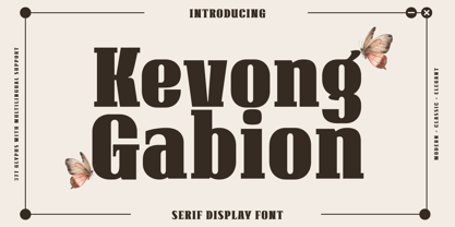 Kevong Gabion Serif font is the epitome of timeless elegance and classic style. The font boasts a sleek and sophisticated design that is perfect for a range of projects, from branding to editorial design. Its classic serif form is perfect for adding a touch of sophistication to your work. In addition to its timeless design, Kevong Gabion Serif font is also incredibly versatile. It comes with a wide range of language support, making it the ideal choice for projects with a global audience. Whether you’re designing a website or creating a marketing campaign, this font is sure to impress. Overall, Kevong Gabion Serif font is a must-have for any designer who values classic design and versatility. Its timeless elegance and wide range of language support make it the perfect choice for a range of projects. So why not add it to your font library today and take your designs to the next level? What’s Included : - File font - All glyphs Iso Latin 1 - We highly recommend using a program that supports OpenType features and Glyphs panels like many Adobe apps and Corel Draw, so you can see and access all Glyph variations. - PUA Encoded Characters – Fully accessible without additional design software. - Fonts include Multilingual support
 - Kometa by Kiril Zlatkov Type Foundry,
$40.00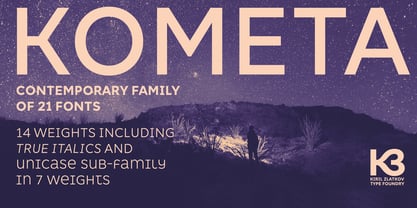 Kometa Sans is a contemporary grotesk with a certain personality. She has a steady geometric skeleton, but its appearance is rather humanistic. The precise details of the artwork, the carefully drawn true italics, the six types of numerals, the variety of alternates, the broad range of open-type features and the extensive glyph set can meet most of the contemporary typographer’s demands for a neutral, but not boring type family for both long text and display use. Among the distinctive qualities of Kometa are also the forms of ligatures (both default and discretionary). They follow the natural constructive transitions between oval parts and stems, which is an advantage to mark, at least for designers who respect the beauty of clean forms. Note the specially designed Kometa Unicase sub-family, substantially enough to exist as a separate typeface. Its elegant and expressive letterforms are boosting further the power to create outstanding design work. Kometa Unicase has original and playful, yet reasonable approach to letterforms variety. Kometa has a very broad usability range – from logotypes and poster designs to corporate identities and complex editorial projects. The contemporary Cyrillics of Kometa allows easily completion of graphically consistent multilingual corporate and artistic design projects. Designed by Kiril Zlatkov and Vassil Kateliev.
 - Broted Young Plant by Alit Design,
$12.00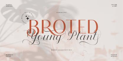 Introducing Broted Young Plant Font Duo. Unique and fantastic duo fonts combined or they stand alone. Broted Young Plant Sans Serif font family consists of 14 families, from Thin to Heavy style. The elegant modern font creates a unique design and is sure to steal the eye of the design target audience. Besides being unique, the Broted Young Plant Sans Serif font also has a luxury simple character that makes the design charming and luxurious. Broted Young Plant Script is a signature script that has cool strokes. The line shape of Broted Young Plant Script is inspired by a unique elegant style. In addition, Broted Young Plant Script has an altenate ligature that looks natural and not stiff. Combining the two Broted Young Plant Script and Sans serif fonts will create a design that is charming, unique, elegant and cool. you can see from the design preview. These two fonts are perfect for designs with the concept of elegant, luxury, romance, fashion and so on. In order to use the beautiful swashes, you need a program that supports OpenType features such as Adobe Illustrator CS, Adobe Photoshop CC, Adobe Indesign and Corel Draw. but if your software doesn't have Glyphs panel, you can install additional swashes font files.
 - FS Koopman Variable by Fontsmith,
$299.99New York to London via Europe The hardworking FS Koopman is a crossbred workhorse which draws inspiration from Swiss and Germanic grotesks, American gothics and early British grotesques, but refuses to fit neatly into any of these categories. Its neither one nor the other, but all of the above. Fontsmith designers Andy Lethbridge and Stuart de Rozario decided to take the characteristics they admired from each category and distill them down into one functional family. Neo meets Neue FS Koopman aims to swim against the tide of Helvetica-ish derivatives by bringing some personality and soul to a genre that all too often ends up feeling bland and sterile. FS Koopman subtly embraces the quirkiness and charm often seen in early twentieth century designs but pairs this with the functionality of later pioneers of the genre. It’s a grotesque isn’t it? The term grotesque surfaced around the early 1800s and refers to the early sans serif designs that many initially believed were strange or ‘grotesque’ due to their lack of elegant serifs. Later variations became known as neo-grotesques and this moniker stuck around even after they gained mass popularity. Some American variants became known as gothics. FS Koopman takes cues from all three categories and blends them into one cohesive design. - Rekusen by Product Type,
$15.00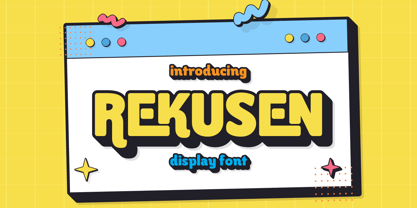 Rekusen is a modern and bold sans-serif display font that stands out with its cleanness. Perfect for branding, headlines, and editorial design, this font is sure to make a statement. The unique combination of thick and thin strokes creates a dynamic and eye-catching appearance that draws attention to your message. In addition to its stylish design, Rekusen also features a wide range of alternate characters and ligatures that allow for creative customization and increased versatility. With alternates and ligatures, this font provides endless possibilities for unique and impactful designs. And with support for multiple languages, it can be used across a variety of projects with ease. Whether you’re designing a logo, creating a poster, or crafting a website, Rekusen is a powerful tool that will help you achieve your design goals with style and sophistication. Its modern, clean, and versatile design makes it a perfect fit for any project that needs a touch of boldness and professionalism. What’s Included : - All glyphs Iso Latin 1 - We highly recommend using a program that supports OpenType features and Glyphs panels like many Adobe apps and Corel Draw, so you can see and access all Glyph variations. - PUA Encoded Characters – Fully accessible without additional design software. - Fonts include Multilingual support
 - Quayside by Eclectotype,
$40.00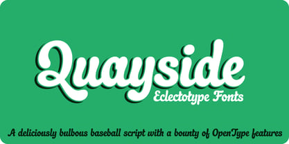 Quayside is a deliciously thick and bulbous baseball script, with a wealth of OpenType features. Features include: Contextual alternates - I would suggest having these on by default; they make letters connect more smoothly (uppercase letters like M and H, which are normally non-connecting for all-caps purposes, connect to lowercase letters. The swash variant of J, and all o and b characters connect to any e character at a lower junction for a smoother join). Contextual alternates also make sure special end-forms of lowercase letters are used at the ends of words. Ligatures - A nice collection of useful ligatures which make the text flow smoother. Swash - Gives you more exuberant capitals. Not recommended for all-caps usage! The swash function also gives a variation of the ampersand and turns # into a nice numero symbol. Oldstyle Figures - lining figures are default but with the flick of a switch in OpenType savvy applications, you get expressive oldstyle figures. Quayside is a versatile typeface. Depending on the mood you're after, it can easily be retro or modern, fun or (fairly) serious. I'm often pleasantly surprised by the wide variety of uses my fonts get put to, and I can't wait to see what you do with this one!
 - Kunhety by Twinletter,
$18.00 Introducing Kunhety, a groovy retro font display perfect for bringing a vintage touch to your designs. This font features bold and quirky letters that will make your projects stand out and evoke a feeling of nostalgia. Whether you’re working on a poster, or an album cover, or want to add some retro vibes to your latest project, Kunhety is the perfect font for you. With a range of alternative characters and multilingual support, this font is versatile and ready to add some groovy flavor to your work. Don’t miss out on the opportunity to elevate your designs with Kunhety. Furthermore, Kunhety is user-friendly and easy to use. Making it compatible with a wide range of software and devices. And with its clear and distinct letterforms, it’s sure to grab the attention of your audience and leave a lasting impression. So, add a touch of retro cool to your next project with Kunhety today! What’s Included : - File font - All glyphs Iso Latin 1 - Alternate, Ligature - Simple installations - We highly recommend using a program that supports OpenType features and Glyphs panels like many Adobe apps and Corel Draw so that you can see and access all Glyph variations. - PUA Encoded Characters – Fully accessible without additional design software. - Fonts include Multilingual support
 - Fazeta Sans by Adtypo,
$32.00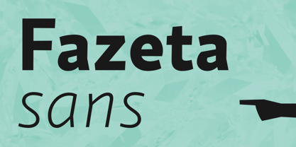 Fazeta Sans is a perfect companion to serif typeface Fazeta. Two light weights were added, so the complete typeface consist of 14 fonts (7 weights + matching italics). The fine gradation lets you choose perfect weight for any type of project. Every font have 1140 glyphs – just like the serif version and contains the same features, so use and combining of whole typeface is very comfortable. Also fixed kerning allows better comfort for eyes by reading and shortens the length of the text. I tried to preserve sharp and cold impression from serif version, but some straight lines had to be curved due to the natural limitation of sans typefaces (for example the upper arch of “f” is shaped more smooth). However it keeps extremely open form. A little playfulness was left at the end of letters “k, K, and R”, but if you want, this can be eliminated by using a rigorous SS01 feature. Serifs were here transformed into a small yaw from main stroke and so enlive the monotony of sans kind of types. Also slight cutting the top of the letters helping to surprisingly vivid final impression. Fazeta Sans is therefore suitable for wide range of type sizes – from small marginalies to huge poster sizes. To see more please check the PDF specimen.
 - Kareth by Product Type,
$17.00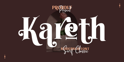 Kareth Classic Serif font is the epitome of timeless elegance. With its classic and refined design, this font is perfect for any project that requires a touch of sophistication. The font features elegant serifs and clean lines that exude an air of classic sophistication. The font is also enriched with stylistic alternates and ligatures that add a touch of artistic flair to your designs. Kareth font is a versatile font that is suitable for a wide range of projects. It is ideal for creating logos, branding materials, and any design project that requires a classic and refined look. With its multilingual support, the font can be used for projects that require text in different languages. Whether you are working on a branding project, a wedding invitation, or any design project that requires a classic touch, Kareth font is a perfect choice. With its timeless design and stylistic alternates and ligatures, this font is sure to elevate any design project and make it stand out. What’s Included : - File font - All glyphs Iso Latin 1 - We highly recommend using a program that supports OpenType features and Glyphs panels like many Adobe apps and Corel Draw, so you can see and access all Glyph variations. - PUA Encoded Characters – Fully accessible without additional design software. - Fonts include Multilingual support
 - Ugroh Black by Saffatin.co,
$12.00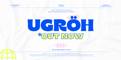 Get ready to jazz up your design game with the brave Ugroh Display Black font include Italic! Armed with a whopping 260 glyphs, it's got all the languages covered and comes with a bonus of ligatures and alternative glyphs. So, whether you want to add a fancy twist or a subtle tweak, it's got you covered and will make your designs shine like a star! With its bold and modern look, Ugroh Display Black font is a perfect choice for any design project that requires a touch of elegance. Its clean lines and sharp edges will give your designs a professional look that will impress any audience. Whether you're creating a logo, a poster, or a website layout, Ugroh display black font will give your project a unique and stylish look. Its versatile character set makes it a great choice for a variety of design styles, from minimalistic to ornate. And with its extensive language support, you can be sure that your message will be heard loud and clear, no matter where your audience is located. So, why settle for a dull and uninspired design when you can jazz it up with Ugroh display black font? Try it out today and see your designs shine like never before!
 - Hangulatin EN by URW Type Foundry,
$99.99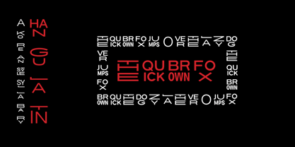 To obtain maximum pleasure in working with Hangulatin, please use the typeface as follows: 1 Open an OpenType-savvy program 2 Select the "Hangulatin“ typeface. 3 Copy the following test text into your document: HEL LO WORLD ! THE QUICK BROWN FOX JUMPS O VER THE LA ZY DOG . If this fails to bring about the desired result, please make sure that you are using an OpenType-savvy program and that usage of the OpenType features is activated in that program. Standard graphic programs are suited to that purpose. The same applies to Microsoft Word starting from the 2010 version upwards.To have fun and success with your new typeface, please write all words in the format shown in the sample text, i.e. all syllables need to be written in capital letters and separated from one another using spacecharacters (for single letters leave 2 spaces). If, however, a desired syllable is not to be substituted, proceed as follows: Please check + to see whether it is a word from the English language; + whether the word has been spelled correctly; + whether the word has been subdivided into syllables correctly; + whether the syllable has been terminated with a space character (allow 2 spaces for single letters).
 - Delightful by Jessie Makes Stuff,
$12.00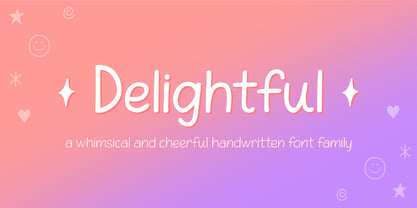 Delightful is a whimsical and cheerful handwritten font family of varying weights and widths. This typeface is like if Comic Sans had a cousin who studied abroad one summer and now wears scarves to look more grown up, even though inside she's still the same, sweet marshmallow she always was. The letters were inspired by my handwriting on a good day - slowed down, legible, and intentionally drawn. I even threw in some of my favorite doodles as alt characters because the set wouldn't be complete without them. And the name was inspired purely by how it feels when I see it - and by my word of the year, delight. Delightful is ideal for anyone who wants to include a bit more warmth and a personal touch with their messaging. It's friendly and non-threatening, and will enhance personal projects or professional ones alike - whether you're a designer, an Instagram influencer, or you need to create some flyers for the local Mom 'n Pop Shop. There are two versions of this font. The original style is slightly more rounded and gets chubbier as you increase its boldness, and the stretched style is like a condensed version, except it's been stretched taller rather than squished narrower. I hope you delight in it as much as I do!
 - Rufina by TipoType,
$16.00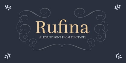 Rufina was as tall and thin as a reed. Elegant but with that distance that well-defined forms seem to impose. Her voice, however, was sweeter, closer, and when she spoke her name, like a slow whisper, one felt like what she had come to say could be read in her image. Rufina’s story can only be told through a detour because her origin does not coincide with her birth. Rufina was born on a Sunday afternoon while her father was drawing black letters on a white background, and her mother was trying to join those same letters to form words that could tell a story. But her origin goes much further back, and that is why she is pierced by a story that precedes her, even though it is not her own. Maybe her origin can be traced back to that autumn night in which that tall man with that distant demeanor ran into that woman with that sweet smile and elegant aspect. He looked at her in such a way that he was trapped by that gaze, even though they found no words to say to each other, and they stayed in silence. Somehow, some words leaked into that gaze because since that moment they were never apart again. Later, after they started talking, projects started coming up and then coexistence and arguments, routines and mismatches. But in that chaos of crossed words in their life together, something was stable through the silence of the gazes. In those gazes, the silent words sustained that indescribable love that they didn’t even try to understand. And in one of those silences, Rufina appeared, when that man told that woman that he needed a text to try out his new font, and she saw him look at her with that same fascination of the first time, and she started to write something with those forms that he was giving her as a gift. Rufina was as tall and thin as a reed, wrote her mother when Rufina was born. Photo (Fragilité): Karin Topolanski / Post: Raw (www.raw.com.uy) - María Pérez Gutiérrez
 - Zeitung Pro by Underware,
$50.00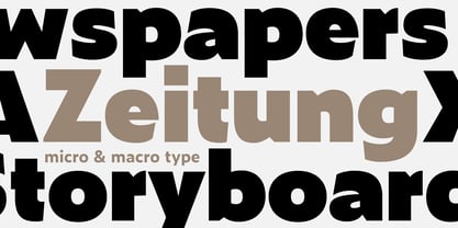 Zeitung is a sans serif family which works equally well on print and web. First of all: Zeitung is a sans serif made according to contemporary standards: 8 weights, romans and italics, all equipped with small caps. Lots of OpenType features, like uppercase punctuation or 5 figure styles to make sure any of your mathematical or financial charts, tables and diagrams look cool. Zeitung’s typographic palette focuses on utility and legibility, but in the farthest corners you’ll discover a rich array of flavours: punchy black weights, fashionable thin styles, carefully hand crafted true italics, distinct small caps. But Zeitung has more to offer. Its optical sizes offer the best style for each size of your text. Zeitung fonts are devided to two optical families: Zeitung Standard and Zeitung Micro. Zeitung Standard works great in most sizes, while Zeitung Micro fonts are specially made for very small sizes in print and web. Zeitung Micro fonts are perfectly legible in web, where the same technical font styles have to survive in many environments, from older browsers to most up to date mobile screens. Next to that: the lightest weights also function as grades, because they share the same metrics. This can be very handy for selecting the optimal weight for your specific situation, especially on screens or when type is printed by a newspaper press. Letters are rendered in many various ways on different screens. Maybe the interface of your next app requires a different grade than your latest website? Zeitung allows you to change the weight of your text without any further consequence for the design. That is a welcome relief during the design process. Zeitung will help to bring your message across in many different circumstances, from large text in print to small type on screens.
 - Aanaar by Letterjuice,
$66.00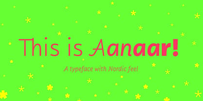 This typeface comes from a self initiated project called Sápmi, which aims to contribute to keep a group of minority languages alive through solving issues in the education environment. This re-thought edition takes the name of Aanaar and joins our library with a bigger character set and two new weights which complete the typeface providing a big typographic palette as well as adding stylistic two-story a and g for more advanced readers as well as to enable the typeface to be used in other environments. The typeface was originally designed for children’s text books. Analysing kid’s typeface design, we identified some important problems and solved them within the boundaries we had. The main concern in a typeface which will be used by children is letter recognition, as they have not yet fully develop their reading skills. For example, letters like “a” and “g” share a very similar structure in this particular kind of typefaces, where the only distinctive part is the descender of the “g”. It is known that the lower part of the letter is the less important feature when reading, therefore we decided to make a clear distinction between them by having an “a” with a spur on the top right. This also helped distinguishing “a” and “o”. Children typefaces usually have one story “a”, making “a” usually too close to “o”. Additionally we moved the joint in “a” upwards and narrowed very slightly the “a” to make sure they cannot be mistaken. More generally, the x-height is fairly tall and the typeface has a bit of movement which give it a good rhythm helping moving along nicely when reading. Aanaar consists of 5 weights (Light, Regular, Medium, Bold and Black) plus two Italics (Light Italic and Italic).
 - Fazeta by Adtypo,
$38.00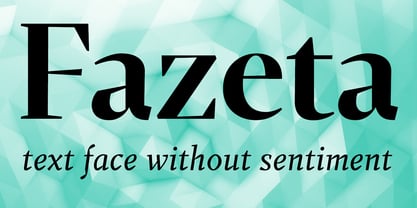 Fazeta is a type family that uses the optical sections. It is a modern static antiqua (it has not obliqued axis, serifs without slopes) but distant from ceremonious and rigid look of this type category. Inspiration was typeproduction from Czechoslovakia 60’s - J. Týfa, V. Preissig, J. Linzboth or A. Krátky. Common factor of this typefaces is vivid and sharp design with stable serifs, tend to rational construction rather than calligraphy and some sophisticated small details vitalized general impression. In this case are facetted asymmetrical arches (some abbreviation). Specific of this typeface is a short arch of glyph “f” that allows comfortable typesetting without ligatures obligation. In character set are besides classical ligatures discretionary ligatures for special occasions. Another surprising element is that all vertical strokes are slightly expanded upwards. These details become invisible in small text but in larger sizes impressed the eye and fix attention to headline. For traditional text feeling are here alternative glyphs “a, c, f, j, k, r, y, K, R” terminated with typical serif. Typeface is graded by optical size into 3 variants - caption (robust structure with low contrast, suitable for size 6 - 9 pt), text (medium contrast, suitable for ordinary text about 10 pt) and display (high contrast and subtle details for 20 pt and higher). Every variant has 5 weights (light, regular, medium, bold and black) with italics. Typeface is with their naked cold expression suitable for neutral text without emotional feelings. In contrast with most antique typefaces this is intended for modern glossy white paper where crisp details can excelled. Every font contains 1140 glyphs, between them original small capitals, various digits, fractions, indexes, matematical symbols, arrows, borders and many alternative glyphs. To see more please check the PDF specimen.
 - FM Bolyar Sans Pro by The Fontmaker,
$29.00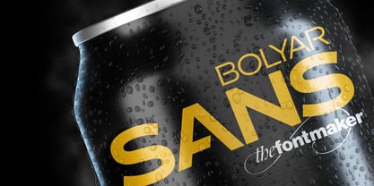 This is Bolyar Sans font family. For us it is a dream-come-true. It took more than 1 year hard work to transform the existing Bolyar Pro from Serif to Sans Serif version. The result really surprised even us from The Fontmaker and we decided to develop it in 9 instead of 7 weights. So at the end we created 7 different styles of Bolyar sans each consisting from 9 precise weights. Bolyar Sans is not just another font family in our portfolio - it is the essence from all our efforts thru the past 5 years to create a powerful type tool that could easily meet very diverse and complex demands of modern design. Furthermore, like all its predecessors, Bolyar Sans is a type concept created by Designers for Designers. If you are in wine and spirits industry, packaging design, or you just love to work with strong headlines that effortlessly could turn into brand logos, then you should definitely try our Bolyar Sans. It is designed for this. Of course there are plenty of different features like multilingual support, ligatures, alternates, we even added adaptive over- and underlining to make it even more complex in its use. Bolyar Sans pairs perfectly with other members of Bolyar Family - Pro , Ornate and Typecraft . So as you see Bolyar is developed as a type platform with own character and style. By using it you could be vintage, classic, modern, soft, even bold, rough and ornate. It is a visual bridge between different typographic periods united under Bolyar name. With our Sans version we aim to be contemporary and to provide powerful type tool to those designers who often love to swim between past and modernity.
 - Betthofen Script by Ferry Ardana Putra,
$12.00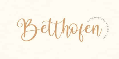 Betthofen |Handwriting Bouncy Script font manufactured by Ferry Ardana Putra, this typeface support OpenType features and includes numeral, punctuation, ligatures and it also supports multi-languages. Combine this bouncy font with its ligature and ton of ornaments that you can freely choose for your precious project! This font is perfect for branding projects, wedding designs, advertisements, product packaging, product designs, label, photography, invitation, quotes and any project spiced up! Betthofen features: A full set of upper & lowercase characters Numbers & punctuation Multilingual language support PUA Encoded Characters +350 Glyph Ligatures Swashes Ornaments OpenType Features ——— ⚠️To enable the OpenType Stylistic alternates, you need a program that supports OpenType features such as Adobe Illustrator CS, Adobe InDesign & CorelDraw X6-X7, Microsoft Word 2010 or later versions. There are additional ways to access alternates/swashes, using Character Map (Windows), Nexus Font (Windows), Font Book (Mac) or a software program such as Pop Char (for Windows and Mac). ⚠️For more information about accessing alternative, you can see this link: http://adobe.ly/1m1fn4Y ——— 🔑Important tutorial from the author: Tutorial for Mollusca font trio: https://lnkd.in/d984CQD6 How to use Midway | Retro Script Font on illustrator: https://lnkd.in/eusbZd7s How to use Midway | Retro Script Font on Photoshop: https://lnkd.in/evsYrwgs ——— ❤️Get in touch with the author: Instagram: https://www.instagram.com/ardana619 Behance: https://www.behance.net/ardana619 ——— 📢Shout out to: https://unsplash.com (for awesome photos) https://graphicburger.com (for outstanding mockups) ——— 🔥Thankyou for purchasing our product, hope you like and have fun with our product. If you have any queries, questions or issues, please don't hesitate to contact us directly. If you satisfied with our product, please give 5 stars rating. ——— Happy Designing...😊
 - BPpong - Unknown license

- Osmane by Skiiller Studio,
$20.00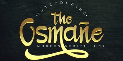 Osmane is a beautiful script type script designed with a neat concept, , even businesses, companies, clothing, and much more What's include: Stylistic alternate for lowercase PUA Encoded Characters - Fully accessible without additional design software. Basic Latin Language Support How to access alternate glyphs? you can see it on this link ( http://goo.gl/1vy2fv )
 - Augenblick by Etewut,
$20.00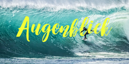 I'm glad to introduce Augenblick! My new font fits to your design be it wedding invitation, corporative Identity or bottle of wine. Send flowers to your lover with a card signed with Augenblick, and see what happens! It has multi language support, so, please use your mother tongue. Good luck & be happy!
 - Beat Boy by PizzaDude.dk,
$18.00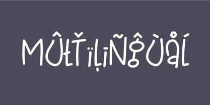 Searching for some company? Beat Boy is ready to take action - He wants to put that beat to your designs. I am not sure which category Beat Boy fits in...is it graffiti? Comicbook text? Something for candy labels? Cute posters or hardcore skater flyers? ... the purposes of use could be many!
 - Ostbahnhof by Sylvain Mazas,
$14.99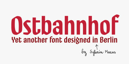 Ostbahnhof is a headline font inspired by both german blackletter and hand-painted signs. The 4 weights can be combined together to achieve a fancy letterpress effect, where slightly rounded corners are not proportional to the font size. Not sure what I'm talking about? Have a look at the examples. youtube video
 - Wu by Gajana Aslanjan,
$34.99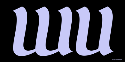 Wu is a font that flows through the page like waves in the sea. The font is based on the shape of an Ancistrus fish swimming through water. The shapes of the letters flow into each other and move out again in perfect harmony. Purchase this font and come see it swim.
 - Zepto by d[esign],
$-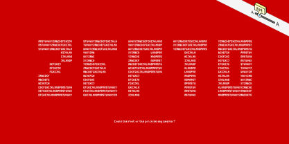 Zepto is about as small as you can get with pixel fonts without sub-pixel rendering. Featured on Make: A tiny screen font you can actually download and use, free. For optimal use, please turn font anti-aliasing off and set at a size of 8px with image resolution set to 72ppi.
 - Amellia by Haksen,
$12.00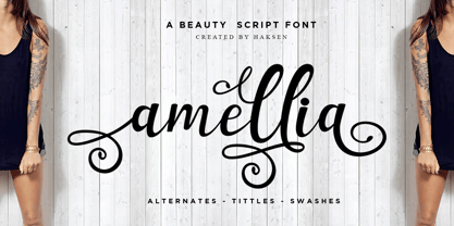 Hello Font lovers, I just released my new font with the name "Amellia" "Amellia" is one of beauty script font with many alternate fonts. WHAT YOU GET? - Amellia otf with many alternates. As You can see in the preview. You will make many of version in every letters. Thanks for visited. Happy Designs
 - Karepe FX by Differentialtype,
$10.00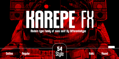 Karepe FX is a modern sans family, which comes in a variety of styles. Includes 54 styles with regular, rounded, and outline options. They all work perfectly with each other. It can easily fit into any project, so add it to your creative ideas and see how it can make it stand out!
 - Fun Baking by Vozzy,
$10.00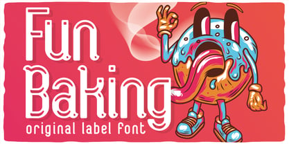 Introducing a vintage look label font named Fun Baking. All available characters you can see at the screenshot. This font have 7 styles - Regular, Outline, Texture, Shine, Shine FX, Outline FX and Texture FX. This funny style font will good viewed on any retro design like poster, t-shirt, label, logo etc.
 - Rondabo by Yoga Letter,
$14.00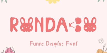 "Rondabo" is a cute display font with cute doll headdresses, cherries, a smiling sun, tulips, carrots, and cute bunny ears. This font can be used for spring, Easter, book titles, movie titles, cartoons, magazines, logos, and more. This font is equipped with upper- and lower-case letters, numerals, punctuation, and multilingual support.
 - ITC Resavska by ITC,
$29.99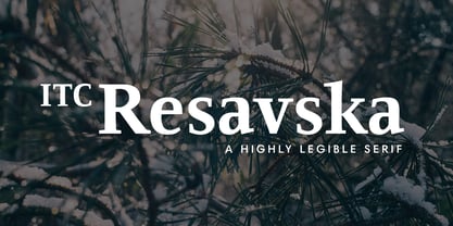 Olivera Stojadinovic made her first sketches of the ITC Resavska family with the goal of creating a typeface that would be readable at small sizes. Stojadinovic added geometric serifs to the original design to create four weights in serif and sans serif sub-families. Each weight (except the black) has an italic counterpart.
 - Seaman by Vozzy,
$10.00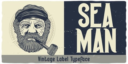 Introducing a vintage label font named Seaman. All available characters you can see at the screenshots. This font has two variations, Clean and Grunge, and for each included three styles - Clean, Shadow and Shadow Wave. This font will look good on any retro design like a poster, T-shirt, label, logo, etc.
 - Jemina by Creativemedialab,
$20.00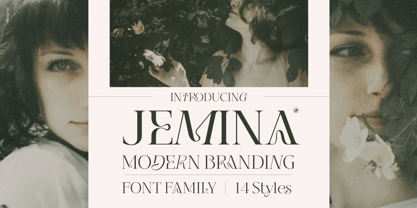 Jemina is a modern, unique serif font. The dynamic curve of each letter looks elegant and charismatic and will be the center of attention for the eye which sees it. The abstract feel of its characters strikes a balance between modern and classic typography. Perfect for branding, logo, and fashion-related concepts.
 - Ornaments of Paris by Outside the Line,
$19.00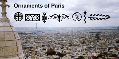 The Ornaments of Paris were inspired by a recent trip to Paris. Each tiny Paris icon is distilled from a church, a fence, a doorway, a railing, the Louvre, graphics in a store window, a feeling, a rainy day, a glass of wine... For more of the similar see Fleurons of Paris.
 - Kryptonite by Elemeno,
$10.00Designed to be the ultimate grunge font, Kryptonite and Kryptonite Bizarro are nearly illegible at small sizes, but can't be touched at large sizes. The Kryptonite family has a limited character set and is named for the element capable of killing Superman (with all due respect). Not for the faint of heart. - Delight Script by Sudtipos,
$59.00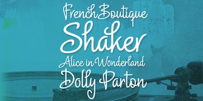 Delight Script is a fresh and original Angel Koziupa design that takes its cue from post-WWII advertising scripts. Casual, bouncy and playful, this upright script is built and engineered by Alejandro Paul with tons of alternates that can make every word look like real hand lettering. It covers all Latin-based languages.
 - Barbary Pirates by OzType.,
$16.00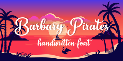 Imagine a hot summer day with a cool breeze, watching the sun set over the beach, ice cold lemonade in your hand and some of your favorite music playing in the background. A perfect postcard moment! Use Barbary Pirates to make awesome type designs for logos, posters, album covers, packaging, Instagram posts...
 - Dainty Lady by Solotype,
$19.95You will see this in the old type catalogs as Dainty. Late in the nineteenth century, type founders developed a number of fonts with a "pen-drawn" look. They wanted to complete with the work of the hand lettering artists who were coming into their own, thanks to the new art of photoengraving - Circus Sideshow by Vozzy,
$15.00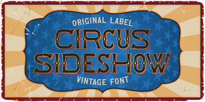 Introducing vintage label font named Circus Sideshow. All available characters you can see at the screenshots. This font has six styles: Regular, Shadow, Rough, Rough Texture and two effect styles Texture FX and Shadow FX. This font will look good on any vintage styled designs like a poster, T-shirt, label, logo, etc.
 - Doohickey by Comicraft,
$19.00So your widget’s stuck between the framistat and the whatchamacallit, there’s a spanner in the works and your avengers just won't assemble. Hey, if you want to get any more work done, you know you're gonna have to hook the hoojamajigger up to the doohickey! See the families related to Doohickey: Doohickey Lower. - ITC Resavska Sans by ITC,
$40.99Olivera Stojadinovic made her first sketches of the ITC Resavska family with the goal of creating a typeface that would be readable at small sizes. Stojadinovic added geometric serifs to the original design to create four weights in serif and sans serif sub-families. Each weight (except the black) has an italic counterpart.
