10,000 search results
(0.034 seconds)
- Groomed by Create Big Supply,
$15.00 Introducing Yellow Duck, a delightful bouncy handwritten script font that adds a playful touch to your creative projects. With its lively and energetic style, this font is a perfect choice for various craft projects and beyond. Yellow Duck's charming bouncy script style brings a sense of joy and character to your designs. Whether you're working on craft projects, farmhouse decor, shirt designs, websites, SVG creations, home decor, branding materials, blogs, logos, or invitations, this font will infuse your work with a vibrant and dynamic personality. Featuring both uppercase and lowercase letters, Yellow Duck offers versatility and allows for captivating compositions. The font also includes numbers and punctuations, ensuring seamless integration within your text. Its multilingual support enables effective communication across different languages, making it suitable for global audiences. Yellow Duck provides ligatures that enhance the fluidity and aesthetics of your typography, creating a harmonious and visually appealing result. With PUA Encoding, accessing special characters and glyphs is effortless, empowering you to unlock limitless creative possibilities.
 - Rainbow by Nk Studio,
$20.00 Rainbow is a soft and sweet script typeface, with the characters dancing along its baseline. It has a casual and elegant touch. Can be used for various purposes such as logos, wedding invitations, headers, t-shirts, letterheads, signboards, labels, news, posters, badges etc. OpenType features with alternate styles, ligatures and multi-language support. To activate the OpenType Stylistic alternative, you need a program that supports OpenType features such as Adobe Illustrator CS, Adobe Indesign & CorelDraw X6-X7, Microsoft Word 2010 or a later version. How to access all alternative characters, using the Windows Character Map with Photoshop: https://www.youtube.com/watch?v=Go9vacoYmBw How to access all alternative characters using Adobe Illustrator: http://youtu.be/iptSFA7feQ0 There are additional ways to swap / swap, using Character Map (Windows), Nexus Fonts (Windows), Font Book (Mac) or a software program such as PopChar (for Windows and Mac). Need help? If you need help or advice, please contact me via email. Thank you!
 - Starlit Neon by Ditatype,
$29.00 Starlit Neon is a delightful display font that combines the elegance of rounded letterforms with the captivating allure of neon lights. With its bold uppercase characters and unique design, this typeface adds a touch of playfulness and charm to your projects. The defining feature of Starlit Neon lies in its rounded letterforms, which exude a sense of softness and approachability. Each letter is meticulously crafted with smooth curves, creating a harmonious and pleasing aesthetic. The rounded shapes give the font a friendly and welcoming appearance, while the neon style adds a touch of excitement and vibrancy. Inspired by the mesmerizing glow of neon signs, Starlit Neon infuses a sense of enchantment and allure into each character. The font captures the captivating charm of neon lights, casting a radiant glow that evokes a magical atmosphere. In some letters, you'll find additional subtle accent lines, which enhance the overall composition with a touch of sophistication. The uppercase letterforms of Starlit Neon are bold and assertive, commanding attention with their rounded shapes. Each letter of Starlit Neon is thoughtfully crafted to strike a balance between rounded shapes and legibility. The uppercase characters are distinct and easily recognizable, ensuring your message remains clear and impactful. The additional subtle accent lines in select letters add an extra touch of visual interest, elevating the font's overall composition. Find out more ways to use this font by taking a look at the font preview. Features: Alternates Multilingual Supports PUA Encoded Numerals and Punctuations Starlit Neon perfect for designs like headlines, logos, and eye-catching titles that seek to make a bold statement with a touch of whimsy. Whether you're creating posters, branding materials, digital artwork, or anything in between, this font will infuse your projects with a sense of joy and uniqueness. It particularly shines in applications related to entertainment, children's products, beauty, and lifestyle themes. Find out more ways to use this font by taking a look at the font preview. Thanks for purchasing our fonts. Hopefully, you have a great time using our font. Feel free to contact us anytime for further information or when you have trouble with the font. Thanks a lot and happy designing.
 - PF Champion Script Pro by Parachute,
$125.00 PF Champion Script Pro is perhaps the most advanced and powerful calligraphic family ever made. It received an award for Excellence in Type Design from the International Type Design Competition ‘Modern Cyrillic 2009’ which was held in Moscow. Most recently, it received another award from the 3rd International Eastern Type Design Competition - Granshan Awards 2010. This typeface was first presented in June 2007 at the 3rd International Conference on Typography and Visual Communication (ICTVC) and was met with rave reviews. It is based mainly on the manuscripts of the 18th century English calligrapher Joseph Champion. Developed over a period of two and a half years, each one of the 2 weights is loaded with 4300 glyphs(!), offering simultaneous support for all European languages based on the Latin, Greek and Cyrillic scripts. Furthermore, a wide selection of alternate forms and ligatures is included for all languages, in order to accommodate diverse design aesthetics. These alternates are either applied automatically through an advanced programming scheme, or manually through several OpenType features. An attempt was made to design a contemporary script typeface with classic roots, by following certain guidelines, i.e. lowercase characters were designed so they are less inclined, have a higher x-height and are less condensed than the original. Several characters were stripped-off their connecting lines in order to enhance legibility. Four sets of alternate swashed capitals as well as a plethora of ornaments and frames (117) was included. Small caps and their alternate forms were designed to replace the capitals which disrupt the flow of text within a sentence with their extravagant swashes. All characters were carefully designed with the proper weight in order to sustain harsh printing conditions (on special papers), a situation which affects mainly the light connecting parts of calligraphic typefaces. Finally, it was programmed in such a way as to preserve handwriting qualities, by designing an extensive array of ligatures and alternate glyphs in all languages, never before released or incorporated within the same font.
 - Referenz Grotesk by Sudtipos,
$49.00 Made in Germany, Referenz Grotesk is a typeface full of references referring to the type design history of Stuttgart State Academy of Art and Design. Its typographic history holds a broad spectrum of shapes and characters, including F.H. Ernst Schneidler (1882–1956), Imre Reiner (1900–1987), Walter Brudi (1907–1987), Kurt Weidemann (1922–2011) and Frank Heine (1964–2003). During extensive research phases for Referenz Grotesk included collection and analysis. This led to further research in the Academy’s collection and archive where the majority of Weidemann’s estate is housed next to works of other designers and professors like F.H. Ernst Schneidler and Walter Brudi. Another place of research was the typesetting workshop where Schneidler had previously taught and worked. Some of his freshly cast fonts were tested and used there for the first time and are still stored in several of the type cases. Regarding the more recent history, for instance about the Emigre designer Frank Heine, former colleagues and professors have been consulted. These studies resulted in the new font Referenz Grotesk that includes traces of Kurt Weidemann’s Corporate as well as calligraphic hints that link to Schneidler’s Stuttgarter Schule (Stuttgart School) where writing played an important role during the form finding process. For the regular text fonts these features are integrated in a subtle manner whereas several alternative glyphs pick up more expressive forms. The final sans serif type family has a clarity and contemporary straightness that becomes more characteristic in its heavier weights. Additionally more than 60 alternative glyphs per weight allow for individual combinations that can be tailored specifically for each application and context. They open up a broad range of visual expressions, from subtle to playful and eccentric characteristics. Referenz Grotesk is available in six weights: Light, Regular, Medium, Bold, Extra Bold and Black, plus italics. In addition, the family includes multiple OpenType functions such as Stylistic Sets, Tabular Figures and Case Sensitive forms. Variable version of the font is included when you license the full pack.
 - Hamptons BF by Bomparte's Fonts,
$40.00 Hamptons BF is a beautiful, elegant sans serif with dramatic individuality. A font that steps out in Art Deco style. As a design movement Art Deco came into prominence during the 1920s and 30s when forms were typically sleek, symmetrical, geometric or highly stylized. Today the influence of this enduring style can be clearly seen in architecture, industrial design, fashion, art, graphic design, and yes, even type design. Art Deco style exemplifies luxury, glamour and modernity. I believe Hamptons BF captures something of that retro look in a nod to the past without ever looking dated, all the while retaining a contemporary flair. Named after the well-known New York resorts synonymous with style and elegance, this gothic or sans serif type is based upon University Roman, an early 1970s serif design which in turn was influenced by yet another serif design called Forum Flair (late 1960s); and that in turn owes its pedigree to the late 1930s’ Stunt Roman, which is the original source of inspiration for all of these. Quite a family tree! There’s dynamic interplay between certain wide, full-round letters such as C, D, G, O, P, Q, R, S and narrow ones like A, E, F, H, K, L, M, N, U, etc. This contrast repeats throughout certain lower case letters and serves to create a unique look of distinction. Light and Regular weights communicate a romantic, feminine appeal while the Bold offers a complementary emphasis. The font is somewhat versatile as in addition to its primary purpose for display, Hamptons BF also succeeds in settings containing short blocks of large text. It’s right at home in a variety of typographic environments: branding, packaging, signage logos, magazine headlines, invitations, menus, trendy cafes and more. Among the included OpenType features are Stylistic Alternates, Automatic Ligatures and Fractions. There is extended language support for Western, Central and Eastern Europe and Turkish.
 - Metromedium #2 by Linotype,
$29.00American graphic designer William Addison Dwiggins' (W.A.D. for short) first typefaces were the Metro family, designed from 1927 onward. The project grew out of Dwiggins' dissatisfaction with the new European sans serif typefaces of the day, such as Futura, Erbar, and Kabel, a feeling he expressed in his seminal book Layout in Advertising. Urged by Mergenthaler Linotype to create a solution for the problem, Dwiggins began a professional relationship that would span over the next few decades. The first Metro family typeface to be released was Metroblack, brought to market by Linotype in 1929 (Metroblack #2™ the only one of the two versions that Mergenthaler Linotype eventually put into production which is available in digital form). With more of a humanist quality than the geometric styles popular in Europe at the time, Dwiggins drew what he believed to be the ideal sans serif for headlines and advertising copy. Metroblack has a warmer character than the Modernists' achievements, and the type is full of mannered curves and angled terminals (Metroblack also has an astoundingly beautiful Q). The other weights of the Metro family, Metromedium #2™ and Metrolite #2™, were designed by Mergenthaler Linotype's design office under Dwiggins' supervision. Despite having been created more than three-quarters of a century ago, the Metro family types have aged well, and remain a popular sans serif family. Although spec'd less often than other bestsellers, like Futura, Metro continues to find many diverse uses. The typeface has appeared throughout Europe and the North America for decades in newspapers and magazines, and can even help create a great brand image when used in logos and corporate identity. Dwiggins ranks among the most influential graphic designers and typeface designers of the 20th Century. He has several other quality fonts in the Linotype Originals, including the serif text faces Electra™ and New Caledonia™, as well as Caravan™, a font of typographic ornaments." - Rufina STD by TipoType,
$13.00 Rufina was as tall and thin as a reed. Elegant but with that distance that well-defined forms seem to impose. Her voice, however, was sweeter, closer, and when she spoke her name, like a slow whisper, one felt like what she had come to say could be read in her image. Rufina's story can only be told through a detour because her origin does not coincide with her birth. Rufina was born on a Sunday afternoon while her father was drawing black letters on a white background, and her mother was trying to join those same letters to form words that could tell a story. But her origin goes much further back, and that is why she is pierced by a story that precedes her, even though it is not her own. Maybe her origin can be traced back to that autumn night in which that tall man with that distant demeanor ran into that woman with that sweet smile and elegant aspect. He looked at her in such a way that he was trapped by that gaze, even though they found no words to say to each other, and they stayed in silence. Somehow, some words leaked into that gaze because since that moment they were never apart again. Later, after they started talking, projects started coming up and then coexistence and arguments, routines and mismatches. But in that chaos of crossed words in their life together, something was stable through the silence of the gazes. In those gazes, the silent words sustained that indescribable love that they didn't even try to understand. And in one of those silences, Rufina appeared, when that man told that woman that he needed a text to try out his new font, and she saw him look at her with that same fascination of the first time, and she started to write something with those forms that he was giving her as a gift. Rufina was as tall and thin as a reed, wrote her mother when Rufina was born.
 - FF Good by FontFont,
$72.99 FF Good is a straight-sided sans serif in the American Gothic tradition, designed by Warsaw-based Łukasz Dziedzic. Despite having something of an “old-fashioned” heritage, FF Good feels new. Many customers agree: the sturdy, legible forms of FF Good have been put to good use in the Polish-language magazine ‘Komputer Swiat,’ the German and Russian edition of the celebrity tabloid OK!, and the new corporate design for the Associated Press. Although initially released as a family of modest size, the typeface was fully overhauled in 2010, increasing it from nine styles to 30 styles, with an additional 30-style sibling for larger sizes, FF Good Headline. In 2014, the type system underwent additional expansion to become FontFont’s largest family ever with an incredible 196 total styles. This includes seven weights ranging from Light to Ultra, and an astonishing seven widths from Compressed to Extended for both FF Good and FF Good Headline, all with companion italics and small caps in both roman and italic. With its subtle weight and width graduation, it is the perfect companion for interface, editorial, and web designers. This allows the typographer to pick the style best suited to their layout. As a contemporary competitor to classic American Gothic style typefaces—like Franklin Gothic, News Gothic, or Trade Gothic—it was necessary that an expanded FF Good also offers customers both Text and Display versions. The base FF Good fonts are mastered for text use, while FF Good Headline aims for maximum compactness. Its low cap height together with trimmed ascenders and descenders give punch to headlines and larger-sized copy in publications such as newspapers, magazines, and blogs. There is even more good news about FF Good: it has something of a serif companion. Łukasz Dziedzic built FF Good to work together with FF More, creating in a powerhouse superfamily that is versatile in both its function and aesthetic.
 - Banks and Miles by K-Type,
$20.00 K-Type’s ‘Banks & Miles’ fonts are inspired by the geometric monoline lettering created for the British Post Office in 1970 by London design company Banks & Miles, a project initiated and supervised by partner John Miles, and which included ‘Double Line’ and ‘Single Line’ alphabets. The new digital typeface is a reworking and extension of both alphabets. Banks & Miles Double Line is provided in three weights – Light, Regular and Dark – variations achieved by adjusting the width of the inline. Banks & Miles Single Line develops the less used companion sans into a three weight family – Regular, Medium and Bold – each with an optically corrected oblique. Although the ‘Banks & Miles Double Line’ and ‘Banks & Miles Single Line’ fonts are based on the original Post Office letterforms, glyphs have been drawn from scratch and include numerous adjustments and impertinent alterations, such as narrowing the overly wide Z and shortening the leg of the K. Several disparities exist between the Post Office Double and Single Line styles, and K-Type has attempted to secure greater consistency between the two. For instance, a wide apex on the Double Line’s lowercase w is made pointed to match the uppercase W and the Single Line’s W/w. Also, the gently sloping hook of Single Line’s lowercase j is adopted for both families. The original Single Line’s R and k, which were incongruously simplified, are drawn in their more remarkable Double Line forms, and whilst the new Single Line fonts are modestly condensed where appropriate, rounded letters retain the essentially circular form of the Double Line. Many characters that were not part of the original project, such as @, ß, #, and currency symbols, have been designed afresh, and a full set of Latin Extended-A characters is included. The new fonts are a celebration of distinctive features like the delightful teardrop-shaped bowl of a,b,d,g,p and q, and a general level of elegance not always achieved by inline typefaces. The Post Office Double Line alphabet was used from the early 1970s, in different colours to denote the various parts of the Post Office business which included telecommunications, counter services and the Royal Mail. Even after the Post Office was split into separate businesses in the 1980s, Post Office Counters and Royal Mail continued use of the lettering, and a version can still be seen within the Royal Mail cruciform logo.
 - Madgue by Sarid Ezra,
$15.00 Madgue is unique monoline font. You can use it many cases, such as awesome logo and more. This font contains ligatures, many stylistic alternates and a separate swash weight. This font is also supports multiple languages.
 - The Anthelope by Stringlabs Creative Studio,
$25.00 The Anthelope is a retro bold script with groovy style. The Anthelope is perfect for retro lovers and it is perfect for branding and logos such as, barbershop, motorcycle club, clothing, coffee shops and much more!
 - Hookline by WAP Type,
$15.00 HOOKLINE Font will be perfect for a variety of projects such as logo & branding, headlines, invitations, posters, flyers, wedding designs, social media posts, advertisements, product packaging, product designs, labels, photography, watermarks, special events or poster titles.
 - HV Cedarwood by Harmonais Visual,
$18.00 Cedarwood is a classic serif with a regal, elegant touch. Inspired by the work of the old masters, Cedarwood is perfectly suitable for creating classy yet still elegant designs such as logos, packaging, editorial, and more.
 - Marborn by OCSstudio,
$14.00 Marborn Bold Script Typeface modern suitable for your design needs. This font is suitable for designs such as logo designs, t-shirts, branding, social media posts, thumbnails, mugs, tupperware, tote bags, and various other design purposes.
 - Caleuche by RodrigoTypo,
$25.00 Caleuche is a typeface family of 18 styles, from its standard version Light to UltraBold such as Rough and Inline, it is a display typeface that plays with the style of action, mythology, terror and suspense.
 - Control spirit by Sulthan Studio,
$12.00 Introducing Control spirit - Bold typeface handwritten font It is suitable for all types of work that you do with various purposes such as logos, wedding invitations, titles, t-shirts, letterheads , signboards, labels, news, posters, badges, etc.
 - Normies by Gassstype,
$25.00 Introducing NORMIES It's Sans Display Typeface is a Textured Natural Style and Authentic Classy Style, this font is great for your creative projects such as watermark on photography, You can activate 9 Alternate glyphs OpenType panel.
 - Bestigna by Tony Type Studio,
$12.00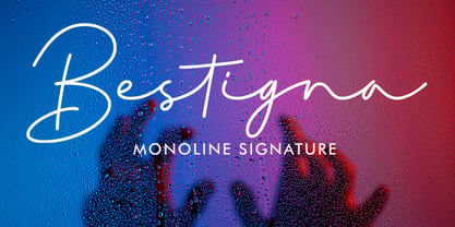 Bestigna is a signature style script font with stunning characters. It can be used for various purposes, such as logos, product packaging, wedding invitations, branding, headlines, signage, labels, signatures, book covers, posters, quotes and much more.
 - Mephist Garilos by Lemonthe,
$14.00 Mephist Garilos is a muscular script font. Use it to add that special retro touch to any design idea! It is perfect for many different projects such as logos & branding, product designs, labels, and much more!
 - Makel by La Boîte Graphique,
$13.00 Makel is a fanciful typography. Ideal for areas such as food, catering, packaging, youth publishing ... Thanks to its curves and the movement of letters, Makel wishes to bring good humor and dynamism to your communication media.
 - Tioxo Sans by Fo Da,
$2.00 Tioxo Sans is a display font of a single weight, ideally suited for advertising and packaging, festive occasions, editorial and publishing, creative industries and posters . Tioxo Sans provides advanced typographical support with features such as ligatures.
 - Agression by Gassstype,
$27.00 Agression-Handwritten Brush font with a Rough style and dramatic movement. This font is great for your next creative project such as logos, printed quotes, invitations, cards, product packaging, headers, Logotype, Letterhead, Poster, Label, and etc.
 - Rolantha by Just Lett,
$13.00 Rolantha is script and handwritten font. This font is perfect for your all design project such as typography design, lettering design, logo type, book cover, poster, flyer, calligraphy, etc. Features: ~UPPERCASE ~lowercase ~Numeral & Puncuation ~Multilingual Accent
 - Heavy Pitch by PizzaDude.dk,
$19.00 Fun packed comic style font. Especially made for commercial products such as all kinds of packaging, cereals, video games, candy, kids toys and alike. I added ligatures for double letters to avoid a repeating look. Enjoy!
 - Youra Script by Nandatype Studio,
$15.00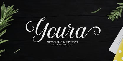 Youra is a simply beautiful, classy and elegant calligraphy font. Can be used for various purposes. such as logos, wedding invitation, t-shirt, letterhead, signage, posters etc. Features OpenType including alternates, ligatures and multiple language support.
 - Bakeryhouse by Fractal Font Factory,
$8.00 We present you a vintage type of layered font called "bakeryhouse". This font includes four styles (including effect styles). This font will be clearly visible on any retro design such as poster, packaging label, logo, etc.
 - Janger by Creativemedialab,
$18.00 Introducing Janger, a bold and fun display font. Janger features a reverse contrast style with a retro and psychedelic look that’s simply ideal for design such as posters, t-shirts, branding, heading, titles and many more
 - Tulip merah by Nahda Creative,
$11.00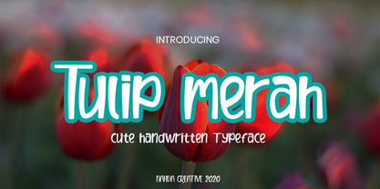 Tulip merah is a simple and natural handwritten font. This font Is perfect for any of your projects such as product packaging, product designs, label, Cartoon, books, watermark, special events or anything you can think of
 - Cork Screw by ErlosDesign,
$17.00 CorkScrew - Quirky Handwritten Font by erlosDESIGN CorkScrew is quirky calligraphy script, with swash and extra doodle. It can be used for various purposes such as headings, logos, birthday invitation, t-shirt, letterhead, posters and much more.
 - Aure Brash by Aure Font Design,
$23.00 Aure Brash speaks with the cheeky inuendo of a sassy parrot. The quirky forms of this unique outline font engage the reader with a subtext of whimsy. Designed for its visual impact, Brash stands out as a title font and offers delightful possibilities for graphic imagery. Brash is an original design developed by Aurora Isaac. After more than a decade in development, 2018 marks the first release of the CJ and KB glyphsets. The CJ glyphset is a full text font with an extended set of lowercase and uppercase glyphs supporting a variety of European languages. Additional glyphs include standard ligatures, four variations of the ampersand, and check-mark and happy-face with their companions x-mark and grumpy-face. Numbers are available in lining and oldstyle versions, with numerators and denominators for forming fractions. Companion glyphs include Roman numerals, specialized glyphs for indicating ordinals, and a variety of mathematical symbols and operators. The CJ glyphset also includes an extended set of glyphs for typesetting Western Astrology. These glyphs are also available separately in the KB glyphset: a symbol font re-coded to allow easy keyboard access for the most commonly used glyphs. Brash is not designed for use in extended text. It shows its strength paired with strong text fonts such as Aure Jane or Aure Teddy. Used sparingly, Brash will add witty highlights to catch the reader's eye. Give Aure Brash a trial run! You may discover a permanent place for this font family in your typographic palette. AureFontDesign.com
 - Resist Sans by Groteskly Yours,
$25.00 Resist Sans is a free-spirited neo-grotesque that embodies both the innate desire for revolt and a tendency towards uniformity. While Resist Sans preserves the neat, minimalist look which is associated with neo-grotesques, it also accentuates the tentativeness of each letter form. The name, too, hints at the rebellious character of the typeface. Resist Sans comes in 28 styles (14 uprights and matching obliques). Text vs Display Resist Sans comes in two versions: Display and Text, which serve different purposes but remain interchangeable and even complementary in some cases. Resist Text is equipped with deep ink traps and optical compensators, which really come into play at smaller sizes. The Display version is smoother and more consistent, so better for use in larger sizes and headlines. Styles/Weights Each of the two versions of Resist Sans comes in 7 weights (Thin to Black) and is equipped with matching Obliques, which brings the total number of styles to 28. Two trial styles (Text Light and Display Medium Oblique) can be downloaded free of charge. Each style contains 900+ glyphs, awesome OpenType features, and around 1500 kerning pairs. Language Support Resist Sans is truly multilingual. It supports most European and Latin-languages and features Extended Cyrillic, which gives access to such languages as Ukrainian, Bulgarian, Serbian, Russian, Macedonian and many more. Free Styles Two styles of Resist Sans can be downloaded for free on MyFonts. Type Specimen Resist Sans PDF Type Specimen can be downloaded here: Resist Sans PDF Type Specimen
 - Dolsáb by Kent Barns,
$20.00 Dolsáb was designed from scratch with uniqueness in mind. The subtle movement from thick to thin and the variants of sharp to rounded make this cutting edge san serif a must have. The inspiration for Dolsab was a simple pairing of a rhombus and calligraphy. While neither of those two elements can be seen in their entirety in any instance, the influence of both is strong. The rhombus can be notice on most ascenders like on the lowercase t & l, for example. And the calligraphy inspiration is most easily captured on the descenders such as the lowercase y & g. The most beautiful characteristics of Dolsab is definitely the calligraphy-influenced movement. These features really stand out on the lowercase a & e. It's almost amusing to let your eye follow the contours of those two letter forms as they travel from thick to thin, sharp to rounded and back again. Users are welcomed to try all font styles of Dolsab in any applique of their choosing. However, it will be quickly noticeable that only Dolsab Air & Demi (the thiner of the styles) will be best suited for body copy. Personally I like to see these letterforms as large as they can be to really showcase the subtle movement, especially in Dolsab Heavy where these movements become much more dramatic. You'll never know what really works best unless you experiment. Dolsab surely isn't the answer to all projects, but it's certainly worth trying. No other typeface moves quite like Dolsáb.
 - Fontleroy NF Pro by CheapProFonts,
$10.00 I have completely redone the spacing in this font, making the sidebearings more conventional. And after replacing the kerning with fresh pairs working together with the new spacing the font looks like a real gem. I love it! The inline version has a wider spacing after the letters CEK = no connecting words. Otherwise just as lovely and retro! Nick Curtis says: "Here’s a strange hybrid: I took the lower case from the formal script font Stuyvesant, straightened out its rather extreme 22° slant, and combined them with caps from the font Bellevue, again making them upright, and adding an inline effect. The result is a font that flows very nicely, with a nice balance between clean lowercase characters and swashy caps. Thanks to Deb Dunbar for naming this font. Fontleroy Brown is the solid version, produced at the request of the King of Ding, Jeff Levine." ALL fonts from CheapProFonts have very extensive language support: They contain some unusual diacritic letters (some of which are contained in the Latin Extended-B Unicode block) supporting: Cornish, Filipino (Tagalog), Guarani, Luxembourgian, Malagasy, Romanian, Ulithian and Welsh. They also contain all glyphs in the Latin Extended-A Unicode block (which among others cover the Central European and Baltic areas) supporting: Afrikaans, Belarusian (Lacinka), Bosnian, Catalan, Chichewa, Croatian, Czech, Dutch, Esperanto, Greenlandic, Hungarian, Kashubian, Kurdish (Kurmanji), Latvian, Lithuanian, Maltese, Maori, Polish, Saami (Inari), Saami (North), Serbian (latin), Slovak(ian), Slovene, Sorbian (Lower), Sorbian (Upper), Turkish and Turkmen. And they of course contain all the usual “western” glyphs supporting: Albanian, Basque, Breton, Chamorro, Danish, Estonian, Faroese, Finnish, French, Frisian, Galican, German, Icelandic, Indonesian, Irish (Gaelic), Italian, Northern Sotho, Norwegian, Occitan, Portuguese, Rhaeto-Romance, Sami (Lule), Sami (South), Scots (Gaelic), Spanish, Swedish, Tswana, Walloon and Yapese.
 - Zosma by Typodermic,
$11.95 When it comes to effective communication in the world of high-technology, every detail matters. Your message needs to be clear, concise, and precise. That’s why you need Zosma, the purpose-driven typeface designed to mirror the sleek lines of today’s hi-tech hardware. With Zosma, your designs will have the perfect balance of form and function. The stark precision of this typeface will convey your message with clarity and power, whether it’s on a product label or in a user manual. Zosma comes in three weights and italics, giving you the flexibility to create a variety of designs that perfectly match your brand’s aesthetic. Plus, with its techno letterforms and industrial style, Zosma is the perfect choice for any company looking to showcase its cutting-edge design prowess. So if you’re ready to take your designs to the next level, get Zosma today and start creating with confidence. Most Latin-based European writing systems are supported, including the following languages. Afaan Oromo, Afar, Afrikaans, Albanian, Alsatian, Aromanian, Aymara, Bashkir (Latin), Basque, Belarusian (Latin), Bemba, Bikol, Bosnian, Breton, Cape Verdean, Creole, Catalan, Cebuano, Chamorro, Chavacano, Chichewa, Crimean Tatar (Latin), Croatian, Czech, Danish, Dawan, Dholuo, Dutch, English, Estonian, Faroese, Fijian, Filipino, Finnish, French, Frisian, Friulian, Gagauz (Latin), Galician, Ganda, Genoese, German, Greenlandic, Guadeloupean Creole, Haitian Creole, Hawaiian, Hiligaynon, Hungarian, Icelandic, Ilocano, Indonesian, Irish, Italian, Jamaican, Kaqchikel, Karakalpak (Latin), Kashubian, Kikongo, Kinyarwanda, Kirundi, Kurdish (Latin), Latvian, Lithuanian, Lombard, Low Saxon, Luxembourgish, Maasai, Makhuwa, Malay, Maltese, Māori, Moldovan, Montenegrin, Ndebele, Neapolitan, Norwegian, Novial, Occitan, Ossetian (Latin), Papiamento, Piedmontese, Polish, Portuguese, Quechua, Rarotongan, Romanian, Romansh, Sami, Sango, Saramaccan, Sardinian, Scottish Gaelic, Serbian (Latin), Shona, Sicilian, Silesian, Slovak, Slovenian, Somali, Sorbian, Sotho, Spanish, Swahili, Swazi, Swedish, Tagalog, Tahitian, Tetum, Tongan, Tshiluba, Tsonga, Tswana, Tumbuka, Turkish, Turkmen (Latin), Tuvaluan, Uzbek (Latin), Venetian, Vepsian, Võro, Walloon, Waray-Waray, Wayuu, Welsh, Wolof, Xhosa, Yapese, Zapotec Zulu and Zuni.
 - Riseria by Alit Design,
$24.00 Introducing "Riseria" – a bold and avant-garde typeface that seamlessly blends the raw power of brutalism metal with the intricate elegance of blackletter, enhanced by haunting thorn decorations. This font is a striking testament to the fusion of divergent design elements, resulting in a visually arresting and unique typographic experience. With 839 meticulously crafted characters, Riseria stands as a versatile typeface that transcends conventional boundaries. Its design exudes an industrial and unapologetically bold aesthetic, drawing inspiration from the robustness of brutalist architecture and the mystique of blackletter scripts. The fusion of these elements creates a harmonious balance between strength and intricacy, making Riseria an ideal choice for projects that demand a powerful and visually captivating presence. The font boasts a comprehensive set of ligatures, allowing characters to seamlessly merge and create a fluid and organic appearance. Alternatives provide additional flexibility, enabling users to experiment with different stylistic variations for a truly customized look. Riseria's multilingual support ensures its adaptability across a wide range of languages, making it a globally accessible and inclusive typographic tool. One of the most distinctive features of Riseria is its spine-chilling thorn decorations. These frightening adornments add an element of darkness and mystique to the font, elevating it beyond mere letters and transforming it into a visceral and evocative design element. The thorns, intricately intertwined with the characters, create an otherworldly aura that is both mesmerizing and unsettling. In essence, Riseria is not just a font – it's an artistic statement that pushes the boundaries of conventional typography. Whether used in branding, album covers, posters, or other design projects, Riseria is sure to leave an indelible mark with its brutalist metal aesthetics, blackletter charm, and spine-tingling thorn decorations.
 - Sancoale Slab Soft by insigne,
$24.75 Ready for the designs of today, the Sancoale superfamily takes a softer turn with a rounded slab serif. Crafted from Sancoale’s simple geometry, new softened slab serifs provide a lively typeface that conveniently enhances its cousins: Sancoale Softened--a sans with blunted terminals; Sancoale Slab; and, certainly, the first Sancoale. The weights of each and every member are balanced diligently to be compatible with one another. When used alongside one another, the combination makes for robust and tight design. With weights starting with the slender thin ranging to the juicy black, Slab Soft opens the doorway to the vary of uses. Its design is legible and neutral enough for bodies of copy--both in print and on your website. The web font also stands out perfectly as a headline or a display face. Slab Soft carefully places a foot ahead, and doesn't overpower like many slabs. This font’s the choice to seize the day and get the job done. All insigne™ fonts are absolutely loaded with OpenType options. Sancoale Slab is geared up for pro typography, together with alternates with stems, compact caps and lots of alts, together with “normalized” capitals and lowercase letters. The font features many numeral sets, with fractions, old-style and lining figures with superiors and inferiors. OpenType-capable programs like Quark or the Adobe suite allow you to quickly change ligatures and alternates. You can see these options shown in the .pdf brochure. Bundled are compact caps, fractions, old-style and lining quantities, scientific superior/inferior figures, entire ordinal and inferior alphabet. The Sancoale superfamily also features the glyphs to aid a variety of languages, together with Central, Eastern and Western European languages. In all, Sancoale Slab supports around forty languages that utilize the Latin script, earning Sancoale the pick for for multi-lingual publications and packaging.
 - AB One by AB Studio,
$23.99 AB One is a captivating sans-serif font family that effortlessly blends modern aesthetics with a dynamic, fluid formality inspired by the world of architecture. This versatile typeface offers three distinct weights, each carefully crafted to cater to a range of design needs. Key Features: Dynamic Fluidity: AB One embodies the dynamic essence of architectural forms, showcasing a graceful flow and a sense of movement. The font's letterforms possess an inherent flexibility that adds a touch of vibrancy to your designs, making it an excellent choice for contemporary projects that demand energy and liveliness. Sleek and Modern: The light weight of AB One radiates a modern, minimalist charm, perfect for creating a sleek and refined impression in your design projects. Its clean lines and well-balanced proportions ensure readability while evoking a sense of cutting-edge sophistication. Three Distinct Weights: The AB One font family offers three carefully crafted weights to provide versatility in your design work. Sans-Serif Elegance: As a sans-serif typeface, AB One represents a harmonious marriage of legibility and style. Its straightforward, elegant letterforms make it suitable for a wide range of applications, including branding, advertising, editorial design, and web interfaces. Inspired by Architecture: Drawing inspiration from the world of architecture, AB One captures the essence of structural elegance and sophistication. This font is an ideal choice for projects that require a touch of architectural finesse. Versatile Application: AB One's adaptability allows it to excel in a variety of design contexts. It seamlessly integrates with other design elements, providing a harmonious and engaging visual experience. AB One is a typeface that thrives on the principles of sleek modernity and architectural inspiration, making it a go-to choice for designers who seek to infuse their projects with a touch of dynamic fluid formality.
 - Sangli by insigne,
$- It started in 2007 with Chennai, the first of a three-part series of sans that I envisioned with slab serif counterparts. Each font would differ from the others in how the stem terminals were expressed. The initial font was extremely well received, and a revitalized and remastered Chennai made its appearance two years later, complete with new weights and new, novel OpenType features. Then came Madurai, a variation of Chennai based on the same core, only without the rounded stems. Chennai’s rounded stems made it distinctive and great for headlines but left it lacking appeal as copy--a problem that Madurai easily solved. And now comes Sangli, the final iteration of my original 2007 vision. Sangli is a happy medium. Like Chennai, it’s great for headlines--but not too distinct for copy. Sangli keeps the same core structure as the other two, but new less sharp forms give this latest font a friendlier look that’s more versatile than the original Chennai and less formal than Madurai. The font includes a whole range of six weights from light to black, along with condensed and extended options as well for a total of 54 fonts. There are plenty of OpenType features, including small caps. Alternates include normalized capitals and lowercase letters that include stems for when you want a more traditional look or when you’re writing copy. Sangli also supports over 70 languages that use the extended Latin script. Use Chennai, Madurai, and their slab serif variants interchangeably with Sangli, too, for even more options in your work. All three complement one another well. So when you need a balanced font that stands boldly on the page and commands your reader’s attention, look within and find your Sangli.
 - Planet Adventure by Putracetol,
$28.00 Introducing PLANET ADVENTURE - SCIFI FONT. This font is inspired by techno circuit boards, combined with the scifi font type. PLANET ADVENTURE is great for any kind of display purpose from logos, Tshirt, apparel, product packaging, tittle header, poster, merchandise, social media, labels, branding. The alternative characters were divided into several Open Type features such as Swash, Stylistic Sets, Stylistic Alternates, Contextual Alternates, and Ligature. The Open Type features can be accessed by using Open Type savvy programs such as Adobe Illustrator, Adobe InDesign, Adobe Photoshop Corel Draw X version, And Microsoft Word. This font is also support multi language.