10,000 search results
(0.034 seconds)
- Ashery by Viswell,
$16.00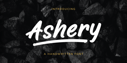 Ashery is a handwritten font, made with a natural marker brush. This font will be suit for your design project such as branding, logo design, packaging, quotes, and many more.
 - Hello Velantinos by IM Studio,
$12.00 Hello Velantinos is modern calligraphy. a bold, elegant & fun vintage script font. It can be used for various purposes such as logos, wedding invitations, t-shirts, letterheads, signage, news, posters, badges etc. Hello Velantinos features 453 glyphs and 222 alternate characters, ligatures, washes and multiple language support. To enable the OpenType Stylistic alternative, you need a program that supports OpenType features such as Adobe Illustrator CS, Adobe Indesign & CorelDraw X6-X7. How to get alternative glyph access from open type fonts: http://youtu.be/iptSFA7feQ0 There are additional ways to access alternatives/swashes, using Character Map (Windows), Nexus Font (Windows), Font Book (Mac) or a software program such as PopChar (for Windows and Mac). How to access all alternative characters, using Windows Character Map with Photoshop: https://www.youtube.com/watch?v=Go9vacoYmBw Need help? If you need help or advice, please contact me.
 - The Harley Queen by Natural Ink,
$10.00 Harley Queen is a fun, vintage script font. It can be used for various purposes such as logos, wedding invitations, t-shirts, letterheads, signage, news, posters, badges, and more. Harley Queen Script features 300+ glyphs and extruded font, alternate characters, ligatures, and swash support. To enable the OpenType Stylistic alternates, you need a program that supports OpenType features such as Adobe Illustrator CS, Adobe Indesign & CorelDraw X6-X7. How to get access alternate glyphs from open type fonts: http://youtu.be/iptSFA7feQ0 There are additional ways to access alternates/swashes, using Character Map (Windows), Nexus Font (Windows), Font Book (Mac) or a software program such as PopChar (for Windows and Mac). How to access all alternative characters, using Windows Character Map with Photoshop: https://www.youtube.com/watch?v=Go9vacoYmBw Need help? If you need help or advice, please contact me by e-mail. Thank you!
 - Historia Script by Fargun Studio,
$19.00 Historia script is the stylish vintage look font. Come with ligatures, stylistic alternate, stylistic set and end swash to make your own design look perfect. Can be used for various purposes. such as headings, signature, logos, retro wedding invitation, t-shirt, letterhead, signage, label, news, posters, badges etc. Features : Unique ligatures Stylistic Alternates Stylistic sets Basic Latin A-Z and a-z Numbers International Symbols included Punctuations To enable the OpenType Stylistic alternates, you need a program that supports OpenType features such as Adobe Illustrator CS, Adobe Indesign, Adobe Photoshop & CorelDraw X6-X7. There are additional ways to access alternates/swashes, using Character Map (Windows), Nexus Font (Windows), Font Book (Mac) or a software program such as PopChar (for Windows and Mac). Need help? If you need help or advice, please contact me by e-mail fargunstudio@gmail.com Thank you for your purchase!
 - Fragilita by SilverStag,
$24.00 Introducing Fragilità, a captivating serif font that embodies the delicate balance of classic elegance and modern innovation. With its exquisitely crafted characters, high contrast, and subtle ligatures, Fragilità seamlessly blends the charm of yesterday with the spirit of today. Fragilità's unique design harmoniously blends elements of both retro and modern aesthetics. Its condensed letterforms evoke a touch of nostalgia, reminiscent of classic serif fonts from the past. Yet, the font's modern sensibilities shine through in its circular O, Q, and C characters, which retain their full circularity, adding a touch of contemporary sophistication. Fragilità's high contrast between the thick and thin strokes of its characters ensures exceptional readability across various mediums. Whether gracing the pages of a book, adorning a website, or captivating viewers on a digital screen, Fragilità remains effortlessly legible. Fragilità's extensive library of ligatures adds a touch of refinement and sophistication to your text. These intricate pairings of letters flow seamlessly together, creating a sense of continuity and elegance that elevates your written expression. Fragilità's comprehensive support for over 92 languages makes it an invaluable tool for anyone seeking a versatile font that can transcend cultural boundaries. With its adaptability to a wide range of languages, Fragilità ensures that your message resonates with audiences worldwide. We understand that quality fonts shouldn't be a luxury reserved for a select few. That's why Fragilità is available for an incredibly affordable price of just $24, making it accessible to designers and creative professionals of all levels. With its exquisite design, exceptional readability, and ligature-rich character, Fragilità is a font that will elevate your creative projects to new heights. Whether you're crafting elegant body text, designing eye-catching headlines, or creating captivating marketing materials, Fragilità will add a touch of timeless elegance and modern sophistication to your work. Embrace the delicate balance of classic charm and modern innovation with Fragilità, your new go-to serif font for all your creative endeavors. Would you like to get 5 completely free fonts worth over $75? No tricks, no hidden words, terms or anything. Just subscribe to my newsletter, make sure to check your email to approve the subscription, add me to your contacts so that the emails don't end up in spam folder and you will get 5 fonts for free. The fonts are packed with alternates, ligatures and some even come with extra goodies. https://view.flodesk.com/pages/63594052b967a943dd6cc528 Happy creating everyone!
 - Bradley Gratis - Unknown license

- Vernacular Sans by jpFonts,
$19.95 The Vernacular trilogy was designed by Swiss designer Hans-Jürg Hunziker, who had worked for Adrian Frutiger in Paris for many years. Based on the concept of a transitional Linear Antiqua, he has developed a colorful bouquet of typefaces that contain the entire spectrum of typefaces for book design and corporate identity. Thanks to his "Swiss school" and his outstanding skills, he has succeeded in giving the typefaces a particularly noble and sympathetic expression. In addition to the Sans family, there is a Serif family and a Clarendon family, each of which, including the separately drawn italics, is equipped with 12 font weights that are finely tuned to one another. Each of the 3 font styles develops its own character, but thanks to a concept that brings the different font styles closer together, they also work well together and complement each other perfectly. Sans and Clarendon have a vertical axis and similar endings in contrast to the Serif, which has a traditional diagonal axis and horizontal endings. The straight stems and the proportions are used as an element to stress the closeness of the typeface-trilogy. They thus share a comon feature. All fonts contain tabular and proportional figures as well as old style figures. Small caps and small cap figures are also available in all fonts. In addition, some fonts have alternative characters available via style set, such as «g», which can be used to further vary the typeface. Vernacular offers all the options for well-kept typesetting for print and web - for small and large orders.
 - Royalis by Julien Fincker,
$34.95 About Royalis: Royalis is an expressive and extravagant serif typeface family. It is characterized by a high contrast and dynamic features in the details, such as long terminals or deep inktraps. Royalis is available in three versions: a display version in six weights, a corresponding condensed version also for display applications, and a text version for body text in four weights. It also comes with all the corresponding italics. This makes Royalis versatile, especially for editorial, packaging, branding and advertising. The wide range of weights and possibilities allows Royalis to be used variably. The thinner weights are characterized by their elegance, while the thicker weights captivate with their powerful contrast. They complement each other like the three musketeers once did. Be it the charmingly elegant Aramis, the sober strategist Athos, the powerful ruffian Porthos or the charismatic d'Artagnan, who led the group. Features: The Royalis family has a total of 32 weights, from extralight to black with matching italics, as Display, Display Condensed and Text versions. With over 1027 characters, it covers more than 200 Latin-based languages, with a whole range of Open Type features. There are alternative characters as stylistic sets, small caps, automatic fractions - just to name a few. Arrows and numbers: In particular, the extensive selection of arrows and numbers should be mentioned here. Thanks to Open Type features and a simple system, the various designs of arrows and numbers can also be easily "written" without first having to select them in a glyph palette.
 - Almoneda by Sudtipos,
$49.00 Almoneda: Sale at public auction of movable goods, generally used. And also: private and voluntary sale of jewelry and junk that is made without the intervention of justice. Formerly, it was nothing more than the market or sale of things and spoils won from the enemy in war. Nowadays, the almoneda is practically associated with spaces where the sale of "old things" takes place and, in Madrid, they are usually concentrated in the area of El Rastro, an open-air market that is set up on Sundays and some holidays in the center of Madrid. There, you can find everything and, if you walk around a lot and look hard enough, great typographic finds. It is there where I find a large number of elements (usually from the late nineteenth and early twentieth century) such as boxes, posters, books, etc.. in which appear uppercase letters with a variety of shapes, letters embedded, rare ligatures ... In addition, many elements extracted from street signs, tiles from bars and commemorative elements of Madrid have been used to complete this font design made with care and patience. Thus was born Almoneda, a modern typeface with a marked axis and great contrast, and an uppercase with several sets of characters to play with and enjoy. It also includes a large number of ligatures and discretionary ligatures. A Variable font is included with the full package license. Almoneda, a typeface that will not leave you indifferent. They take it out of my hands, hey!
 - Guillermo by Homelessfonts,
$49.00 Homelessfonts is an initiative by the Arrels foundation to support, raise awareness and bring some dignity to the life of homeless people in Barcelona Spain. Each of the fonts was carefully digitized from the handwriting of different homeless people who agreed to participate in this initiative. Please Note: these fonts include only the latin alphabet; no accented characters, no numbers or punctuation. MyFonts is pleased to donate all revenue from the sales of Homelessfonts to the Arrels foundation in support of their mission to provide the homeless people in Barcelona with a path to independence with accommodations, food, social and health care. Guillermo was born in Argentina. And after crossing four continents and travelling in more than twenty countries, he still has his accent. His luck ran out on the streets of Barcelona. But despite his circumstances, he hasn’t lost a bit of his wit or articulacy. “The worst thing about the street is something that touches your heart, your brain. Not being able to have sex, not having any privacy until it leaves you empty.” On the street he follows his passion for art and writing as best he can, using old cardboard when he can’t find paper and listening to the music that comes to him. His way of thinking and expressing himself leaves people wide-eyed and open-mouthed, but even so he admits he’s a solitary man. “Solitude is an individual word. A solitary type like me can’t bring the word solitude to the whole world.”
 - Vernacular Serif by jpFonts,
$19.95 The Vernacular trilogy was designed by Swiss designer Hans-Jürg Hunziker, who had worked for Adrian Frutiger in Paris for many years. Based on the concept of a transitional Linear Antiqua, he has developed a colorful bouquet of typefaces that contain the entire spectrum of typefaces for book design and corporate identity. Thanks to his "Swiss school" and his outstanding skills, he has succeeded in giving the typefaces a particularly noble and sympathetic expression. In addition to the Sans family, there is a Serif family and a Clarendon family, each of which, including the separately drawn italics, is equipped with 12 font weights that are finely tuned to one another. Each of the 3 font styles develops its own character, but thanks to a concept that brings the different font styles closer together, they also work well together and complement each other perfectly. Sans and Clarendon have a vertical axis and similar endings in contrast to the Serif, which has a traditional diagonal axis and horizontal endings. The straight stems and the proportions are used as an element to stress the closeness of the typeface-trilogy. They thus share a comon feature. All fonts contain tabular and proportional figures as well as old style figures. Small caps and small cap figures are also available in all fonts. In addition, some fonts have alternative characters available via style set, such as «g», which can be used to further vary the typeface. Vernacular offers all the options for well-kept typesetting for print and web - for small and large orders.
 - Vernacular Clarendon by jpFonts,
$19.95 The Vernacular trilogy was designed by Swiss designer Hans-Jürg Hunziker, who had worked for Adrian Frutiger in Paris for many years. Based on the concept of a transitional Linear Antiqua, he has developed a colorful bouquet of typefaces that contain the entire spectrum of typefaces for book design and corporate identity. Thanks to his "Swiss school" and his outstanding skills, he has succeeded in giving the typefaces a particularly noble and sympathetic expression. In addition to the Sans family, there is a Serif family and a Clarendon family, each of which, including the separately drawn italics, is equipped with 12 font weights that are finely tuned to one another. Each of the 3 font styles develops its own character, but thanks to a concept that brings the different font styles closer together, they also work well together and complement each other perfectly. Sans and Clarendon have a vertical axis and similar endings in contrast to the Serif, which has a traditional diagonal axis and horizontal endings. The straight stems and the proportions are used as an element to stress the closeness of the typeface-trilogy. They thus share a comon feature. All fonts contain tabular and proportional figures as well as old style figures. Small caps and small cap figures are also available in all fonts. In addition, some fonts have alternative characters available via style set, such as «g», which can be used to further vary the typeface. Vernacular offers all the options for well-kept typesetting for print and web - for small and large orders.
 - Hamburger by FontMesa,
$29.00 Our new Hamburger font is based on the old classic Brush Script design with many new additions. We've added many alternates to the design including lowercase swash tail letters, swash underscores and a few alternate uppercase letters. Upright scripts are popular these day so new to this old type design is a near upright script version, a lot of hand work went into producing it. One of the biggest problems with the old Brush Script font is that people use it as all caps, which doesn't look good because of the extended swash on the top left side of the caps letters. We've fixed that problem by making an all caps version where the caps in the lowercase position have the top left swash tucked in to help the letters display better as an all caps font. We've also created a small caps version, again the small caps lowercase have all the top left swashes tucked in to bring the letters closer together for a better display. Also new to this font are two higher x-height versions that are ideal for signage. The first is Hamburger X which stands for extra x-height and the second is Hamburger SPX which stands for super x-height. Both of these higher x-height fonts are suitable for signage on a building, billboard and vehicle lettering where you're looking for faster readability from moving traffic. We've designed a new lowercase b and moved the original to an alternate position. We've also redesigned the uppercase C bringing the bottom up to the baseline and moved the original C to an alternate position. The original lowercase g was open at the top, we've closed it and we're not offering the original g as an alternate.
 - Estro Venora by Ilhamtaro,
$32.00 ESTRO VENORA is a serif font with a vintage style of Victorian influence. A classic font that matches the vintage layout design combined with abstract leaf or floral ornaments. This font is an all caps font, with a letter height difference between the uppercase and lowercase. It is suitable for vintage logo designs such as liquor logos and label designs. To enable the OpenType Stylistic alternates, you need a program that supports OpenType features such as Adobe Illustrator CS, Adobe Indesign & CorelDraw X6-X7. Cheers!
 - Babylone Script by Almeera Studio,
$15.00 Babylone is a modern calligraphy with many alternative styles, this font looks natural, elegant and perfect for any extraordinary project. Babylone is suitable for various products such as invitations, product packaging, quotes, product design, crafter, labels, photography, watermarks, logos & branding and very suitable for design Valentine day, mother day, wedding, spring, christmas, etc.Everything Stylistic Altternate can be accessed using software that supports Opentype, such as Adobe Indesign, Adobe CS Illustrator, Adobe Photoshop CC, and Corel Draw or It has swash and stylistic alternates. Thank you & Happy design.
 - Fallons by Gassstype,
$25.00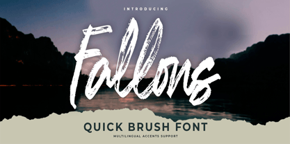 Hello Everyone, introduce our new product Font Fallons it is Quick Brush Font.This is a Textured Natural Style and classy style with a clear style and dramatic movement. This font Fallons is great for your next creative project such as logos, printed quotes, invitations, cards, product packaging, headers, Logotype, Letterhead, Poster, Design this font is great for your creative projects such as watermark on photography, and perfect for logos & branding, invitation,advertisements,product designs, stationery, wedding designs,and label. You can activate 32 Ligatures glyphs OpenType panel.
 - Mellody Script by Josstype,
$13.00 Millady features 410+ glyphs and 50 alternate characters. including initial and terminal letters, alternates, swashes, ligatures and multiple language support. Files included: Millady.(Otf, ttf) Millady Swash To enable the OpenType Stylistic alternates, you need a program that supports OpenType features such as Adobe Illustrator CS, Adobe Indesign & CorelDraw X6-X7, Microsoft Word 2010 or later versions. There are additional ways to access alternates/swashes, using Character Map (Windows), Nexus Font (Windows), Font Book (Mac) or a software program such as PopChar (for Windows and Mac).
 - Undisclose by Gassstype,
$27.00 Hello Everyone, introduce our new product Font UNDISCLOSE it is Horror Display Font.This is a Textured Natural Style and Strong style with a Cool style and dramatic movement. This font UNDISCLOSE is great for your next creative project such as logos, printed quotes, invitations, cards, product packaging, headers, Logotype, Letterhead, Poster, Design this font is great for your creative projects such as watermark on photography, and perfect for logos & branding, invitation,advertisements,product designs, stationery. You can activate Ligatures and 5 Alternate glyphs OpenType panel.
 - Auttera Signature by MJB Letters,
$17.00 Auttera Signature is a bold script font with a casual style and modern concept, this font has an attractive ligature and beginning and ending swash that can make the design more attractive. To enable the OpenType Stylistic alternates, you need a program that supports OpenType features such as Adobe Illustrator CS, Adobe Indesign & CorelDraw X6-X7. There are additional ways to access alternates, using Character Map (Windows), Nexus Font (Windows), Font Book (Mac) or a software program such as PopChar (for Windows and Mac).
 - Realitta Sinta by Zamjump,
$10.00 "Realitta Sinta" is a handwritten font that was created using the Infinite Painter application for sketches. This font is inspired by simplicity which is then attached to each stroke. Realitta sinta is a simple font that includes various features such as ligatures and alternates. Realitta Sinta suitable for various needs such as writing invitations, signatures, promo needs, business card design, Photography logos, casual wear, profession or work and others. Ligature and lowercase alternate swash are differentiators for various purposes or adjust the desired style,
 - Shrieky by Gassstype,
$27.00 Hello Everyone, introduce our new product font SHRIEKY is a Bad Brush Font.This is a Textured Natural Style and classy style with a clear style and dramatic movement. This font SHRIEKY is great for your next creative project such as logos, printed quotes, invitations, cards, product packaging, headers, Logotype, Letterhead, Poster, Design this font is great for your creative projects such as watermark on photography, and perfect for logos & branding, This font is PUA encoded which means you can access all of 16 Ligatures glyphs.
 - Golga by Gassstype,
$23.00 Here comes a New font, Golga is Unique Bold Display Font this is strong Font, that is written casually and quickly amazing. Then crafted carefully drawn into vector format. This font is great for your next creative project such as logos, printed quotes, invitations, cards, product packaging, headers, Logotype, Letterhead, Poster, Label, and etc.It is perfect for any design project as Invitation,logo, book cover, craft or any design purposes.this font is great for your creative projects such as watermark on photography, and perfect for logos & branding.
 - Formasi by Michael Browers,
$25.00Formasi, Azeri for "Form of," resulted from the concept of a civil war between serif and sanserif. What would the aftermath of such a war be? The answer is simple: Formasi! - Bridgeriden by VzType,
$15.00 Thanks for checking out Bridgeriden is perfect for all your needs, such as a logo, printed quotes, badge, insignia, packaging, headline, poster, t-shirt/apparel, greeting card, and wedding invitation, & etc.
 - Jully Julia by Romie Creative,
$12.00 Jully Julia ! Fresh modern handwritten font with decorative characters and dancing baseline. So beautiful on invitations such as crafts, greeting cards, branding materials, business cards, quotes, posters and other design concepts.
 - Bastian by Akifatype,
$14.00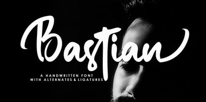 Bastian is a modern handwritten font, organic, dynamic and energetic sytle.Can used for various purposes. such as the title, signature, logo, correspondence, wedding invitations, letterhead, signage, labels, newsletters, posters, badges, etc.
 - Nugelo by Viswell,
$15.00 Nugelo is a retro modern serif font, comes with stylishtic alternates and ligatures Nugelo will be suitable for your various design needs such as branding, logo, poster, headlines and many others.
 - Jusline by Letterafandi Studio,
$12.00 Jusline is a modern handwritten font. It can be used for various purposes such as logos, wedding invitations, headings, t-shirts, letterhead, signage, labels, news, posters, badges and so much more.
 - Nagarawa by Beewest Studio,
$50.00 Nagarawa is an Asian style font, very suitable for various logotypes for Asian nuanced products, such as Asian food, martial arts clubs, music, novel and comic titles, apharel clothing and others.
 - Algorisma Heart Font by IbeyDesign,
$17.00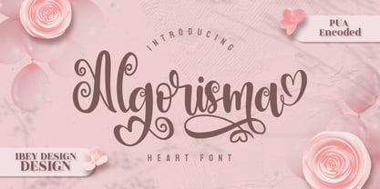 Algorisma Heart Font inspires friendliness and elegance. It is perfect to use for any of your wonderful creations such as branding projects, logos, brochures, business cards, wedding invitations, and many others.
 - Alandria by Goodigital13,
$50.00 This font is perfect for many different projects such as logos & branding, invitation, stationery, wedding designs, social media posts, advertisements, product packaging, product designs, label, photography, watermark, special events or anything.
 - Guffie by Dealita Studio,
$9.00 Guffie - a chic & elegant display modern serif with beautiful contrast. Specially designed for fashion-themed projects, perfectly suitable for creating elegant, chic, lifestyle designs such as logos, titles, magazines, and more.
 - Kallisha by Nirmana Visual,
$17.00 Kallisa is such a artistic font, Script with a touch of hand-written, It's best used for logos, wedding stationery, social media, and quotes. Kallisha features: Multilanguange PUA Encoded Thank you!
 - Trinidad Neue by Sudaca Type Design Studio,
$40.00 Trinidad Neue™️ is a geohumanistic typeface developed by the Chilean Type Design Studio Sudaca. The origin of this work lies in an exercise of comparing classic Roman proportions (Trajan Columns) with the capital letter set of Futura by Paul Renner. I wanted to create my own Sans Serif interpretation of classic proportions. I started working with letters A, H, N, O, R and S. When I finished the uppercase set, this exercise transformed itself into a project. I started to develop a set of lowercase letters choosing as direct references Futura and Kabel by Rudolph Koch; always having in mind that the objective was to find a balance between the humanist and the rational or geometric. Here is when this group is formed, giving its name and identity to this family: Paul, Rudolph & Alexis. The result is a typeface with an elegant, modern and versatile aspect. Its seven stylistic sets make Trinidad Neue™️ into a Swiss army knife to compose short and medium texts for editorial design, branding, exhibitions, motion graphics, etc. The family consists of nine weight variants and its corresponding oblique versions. It counts with many OpenType characteristics in each variant, including small caps, seven stylistic sets that can be combined, standard ligatures and discretionals ligatures, proportional numerals, tabular numbers, fractions, superscript, subscript, normal punctuation and also aligned to small caps and capital letters, arrows, emojis and more. With more than 1000 glyphs, this typeface has a wide idiomatic range that includes more than 190 Latin languages. Trinidad Neue™ is the new and alternative version of LC Trinidad™.
 - Ghost Town by Comicraft,
$19.00 The Gold Rush is over, the prospectors have made their fortune and the mine has been worked out! The inhabitants of Boomtown USA have moved on -- the saloon is dry, the sheriff has hung his hat and the only visitors to the local whorehouse are tumbleweeds. Yeah, the buildings remain -- hollowed out husks carrying memories of bar room brawls, high noon shootouts and high stake poker games between outlaws -- but if you take a walk down the street be careful not to kick up too much dust... Turn the corner and you might see Ol' Toothless Joe standing on the corner sucking on a bottle of whiskey... And don't walk too slowly past the storefront of the undertaker -- that guy made his living putting strangers like you in a wooden overcoat from sunrise to sundown. Spooks and Spectres linger everywhere... there's a sign just down the road -- didn't you see it? "Ghost Town! Abandon Hope all who Enter Here!"
 - Gauche Display - Personal use only

- Gearing by Heyfonts,
$15.00 Gearing is a typeface that is widely associated with the extreme music genre of death metal. It is characterized by its dark and aggressive appearance, evoking a sense of brutality and chaos. The font is typically designed with sharp edges, bold and angular letterforms, and intricate or distorted shapes. The death metal font typically features strong upper and lowercase letter variations, often with sharp, exaggerated serifs or thorn-like spikes. These embellishments contribute to its menacing and threatening aesthetic. The letters may also have broken or damaged elements, giving them a weathered or decayed look. Though death metal fonts come in various styles and variations, they often prioritize legibility and impact over ease of reading. This means that certain parts of the letters may be missing or disconnected, making them appear jagged or incomplete. Ligatures, which are unique letter combinations, are sometimes included in the font to add a sense of continuity or artwork to the overall design. In terms of color, death metal fonts are commonly depicted in monochromatic shades such as black, grey, or dark red to maintain their sinister appearance. The color contrast often enhances the sharpness and intensity of the font, making it more visually striking. Due to its association with the underground music scene, the death metal font has become an essential element in album covers, band logos, posters, and merchandise. It effectively conveys the aggressive and rebellious spirit of the genre, becoming instantly recognizable to fans and enthusiasts.
 - Able by T-26,
$39.00The history of Able’s connection with the Harry Potter phenomenon is really up in the air. It’s a catch-22 in this business - you either promote your own work and negotiate expensive exclusive licenses, or you work with a promoter and sell your designs to anyone and everyone. It could have been an in-house designer at Rowling’s publisher, Scholastic, or a freelancer who proposed Able for the headings and such. The responsible party licensed it from T26, and JK Rowling’s storytelling made it a star. (I suppose it’s ironic that there’s a whole lot of unwritten history in the typography business.) Able’s rise to fame really is a classic love story between reading and type design. If the books weren’t so popular, Able might still be waiting for some Mexican fast food chain to pick it up for packaging design. The movie deal certainly made the font all the more recognizable, what with its merchandising campaign. Popularity can also cripple a great decorative face. It’s always being recognized as “The Harry Potter Font.” It might just have to wait a few decades for the Potter phenomenon to subside to be freed from the “Chamber of Pigeonholed Fonts.” In the meantime, I’m sure that a lot of fledgling graphic design apprentices are reading their new Potter books, being charmed by the idea of type design when they’re not turning the pages too fast to notice. - Quercus 10 by Storm Type Foundry,
$69.00 Quercus is characterised by open, yet a little bit condensed drawing with sufficient spacing so that the neighbouring letters never touch. It has eight interpolated weights with respective italics. Their fine gradation allows to find an exact valeur for any kind of design, especially on the web. Quercus serif styles took inspiration from classicistic typefaces with vertical shadows, ball terminals and thin serifs. The italics have the same width proportion as upright styles. This “modern” attitude is applied to both families and calls for use on the same page, e g in dictionaries and cultural programmes. Serif styles marked by “10” are dedicated to textual point sizes and long reading. The sans-serif principle is rather minimalistic, with subtle shadows and thinned joints between curved shapes and stems. Quercus family comprises of the usual functionality such as Small Caps, Cyrillics, diacritics, ligatures, scientific and aesthetic variants, swashes, and other bells & whistles. It excels in informational and magazine design, corporate identity and branding, but it’s very well suited for book covers, catalogues and posters as well. When choosing a name for this typeface I've been staring out from my studio window, thinking helplessly without any idea in sight. Suddenly I realised that all I can see is a spectacular alley of oaks (Quercus in Latin) surrounding my house. These oaks were planted by the builders of local ponds under the leadership of Jakub Krčín in the fifteenth century.
 - Quercus Whiteline by Storm Type Foundry,
$69.00 Quercus is characterised by open, yet a little bit condensed drawing with sufficient spacing so that the neighbouring letters never touch. It has eight interpolated weights with respective italics. Their fine gradation allows to find an exact valeur for any kind of design, especially on the web. Quercus serif styles took inspiration from classicistic typefaces with vertical shadows, ball terminals and thin serifs. The italics have the same width proportion as upright styles. This “modern” attitude is applied to both families and calls for use on the same page, e g in dictionaries and cultural programmes. Serif styles marked by “10” are dedicated to textual point sizes and long reading. The sans-serif principle is rather minimalistic, with subtle shadows and thinned joints between curved shapes and stems. Quercus family comprises of the usual functionality such as Small Caps, Cyrillics, diacritics, ligatures, scientific and aesthetic variants, swashes, and other bells & whistles. It excels in informational and magazine design, corporate identity and branding, but it’s very well suited for book covers, catalogues and posters as well. When choosing a name for this typeface I've been staring out from my studio window, thinking helplessly without any idea in sight. Suddenly I realised that all I can see is a spectacular alley of oaks (Quercus in Latin) surrounding my house. These oaks were planted by the builders of local ponds under the leadership of Jakub Krčín in the fifteenth century.

