10,000 search results
(0.021 seconds)
- Arethusa by AVP,
$14.99 Arethusa is a versatile font after the 'transitional' style – a style that has been evolving for 250 years. The balanced design of familiar letter forms blends form with function to create highly readable text. Twelve fonts organised in three sub-families provide a range of weights and styles. The standard character set covers many roman-based languages. For extended language support, see Arethusa Pro.
 - Caleb Grotesk by Brenners Template,
$19.00 It seeks a stable balance through the pairing of plain contrasts and ink trap interfaces. The ordinary yet sophisticated ink trap digging is designed to minimize the discomfort caused by the change in weight. This stability is consistent no matter what weight or style you choose. So it has a wide coverage area ranging from logo design, editorial design, web UI, and app design.
 - Boop Boop NF by Nick's Fonts,
$10.00Here’s another wild and wacky typeface based on handlettering found on Hallmark Studio Cards of the 1950s. All possible letter combinations have been kerned, so you can mix and match upper and lowercase letters to create just the balance you’re looking for. All versions of this font include the Unicode 1250 Central European character set in addition to the standard Unicode 1252 Latin set. - 1540 Mercator Script by GLC,
$38.00 This font was inspired by the so-called Litterarum latinarum, quas italicas, cursoriasque vocant, scribendum Ratio (Louvain 1540), a manual intended for calligraphers by the well known scientist Gerhard Mercator. It was a magnificent “Cancellaresca corsiva” design, enriched with many alternates, final loops and ligatures. We have added a lot of accented and other characters required for modern use that did not exist in the original.
 - Vemony by Absonstype,
$20.00 Vemony is the Groovy Retro display typeface with All Caps style looks and feel nice balanced. Provide with alternates and ligatures font in variant style make the design letter looks nice. Honestly it works perfectly for headlines, logos, posters, packaging, T-shirts and much more. If you have questions, just send me a message and I’m glad to help. Have a great day, Absonstype
 - Apres by Font Bureau,
$40.00 David Berlow and staff drew Apres as part of a series designed originally for the Palm Pre smart phone, for use both on the device and in print marketing. Simple, open letterforms and generous proportions provide a clear, comfortable, and inviting experience for navigation and readability. The plain-spoken geometry is regular and balanced, without being static or mechanical, for a friendly and forthright familiarity; FB 2008
 - Bolt Display by SilverStag,
$19.00 Introducing Bolt Display – picture this: uppercase letters with rounded corners, inviting you in with a warm, approachable embrace. Or, if you're feeling adventurous, the outlined uppercase stylistic set that adds that contemporary edge to your work. On the flip side, lowercase letters with sharp corners confidently declare their presence, while the lowercase outlined stylistic set strikes the perfect balance between structure and artistic freedom.
 - Gaude by Trustha,
$19.00 Gaude is a sans-serif typeface. Crafted with care, maximizing neatness in shape. With thickness balancing with negative space. Making it fitting when strung together into words, or sentences. Added with alternative glyphs, to make it more alive. Gaude comes with 3 widths, namely: normal, wide, and expanded. And also a soft version, making it 6 styles. Gaude is perfect for branding, titling, headline, and more.
 - Auxiliary by Wildan Type,
$10.00 Auxiliary is a humanist sans serif font. Make it more interesting and dynamic. Auxiliary is designed for content display and text. Maximizes thickness while maintaining balance in each shape. This is perfect for any type of creative project. Auxiliary come with 4 styles plus Multilingual support.. That is Regular, Italic, Hollow, and Hollow Italic. Makes every project you work on easier, and will certainly be awesome!
 - Galerie by ArtyType,
$29.00 Incorporating a certain Gallic ‘je ne sais quoi’ Galerie is a chic & stylish sans serif, though you'll notice some short tails with angled terminals acting rather like serifs, lending a sophisticated characteristic to its balanced proportions. Galerie’s large x-height makes it a very legible font family, available in 4 weights: Thin, Light, Medium and Bold. See also the condensed sister family Galerie 2.
 - Moku Brush by Deltatype,
$49.00 Moku Brush is a structural brush script inspired from handwriting with brush, with straight letterform you will get less formal but more sweet! Moku Brush come with nine weights, so you can use as body text or even better with headline. With nine variations, you can use this font in different sizes with different weights, you will get better balance when do type setup.
 - ZT Mostion by Zelow Type,
$14.00 Introducing "ZT Monstion," a fusion of sans and grotesque styles, both in bold weight, radiating an essence of simplicity and modernism. Crafted meticulously, this typeface embodies the purity of sans-serif aesthetics while embracing the boldness of grotesque forms. Its carefully refined x-height and expertly smoothed angles create a mesmerizing balance, where minimalistic design meets commanding boldness. With each character empowered by the weighty black typography.
 - PF DIN Serif by Parachute,
$36.00 DIN Serif: Specimen Manual PDF The DIN Type System: A Comparison Table This is the first ever release of a true serif companion for the popular DIN typeface. DIN Serif originated in a custom project for a watchmaking journal which required a modern serif to work in unison and match the inherent simplicity of DIN. As a result, a solid, confident and well-balanced typeface was developed which is simple and neutral enough when set at small sizes, but sturdy and powerful when set at heavier weights and bigger sizes. It utilizes the skeleton of the original DIN and retains its basic proportions such as x-height, caps height and descenders, whereas ascenders were slightly increased. DIN Serif makes no attempt to impress with ephemeral nifty details on individual letters, but instead it concentrates on a few modern, functional and everlasting novelties which express an overall distinct quality on the page and set it apart from most classic romans. This is a low contrast typeface with vertical axis and squarish form which brings out a balance between simplicity and legibility. Its narrow proportions offer economy of space which is critical for newspaper body text and headlines. At small sizes the text has an even texture, it is comfortable and highly readable. The serifs are narrow at heavy weights and when tight typesetting is applied at large sizes, the heavier weights become ideal for headlines. DIN Serif was inspired by late 19th century Egyptian and earlier transitional roman faces. Bracketed serifs were placed on the upper part of the letterforms (this is where we mostly concentrate our attention when we read) whereas small clean square serifs were placed on and under the baseline to simplify the letterforms. In order to reduce visual tension at the joins and make reading smooth and comfortable, a slight hint of bracketed serif was added at the joins in the form of a subtle angular tapered serif, which softens the harsh angularity. These angular tapered serifs tend to disappear at smaller sizes (or smooth out the joins) but stand out at bigger sizes exuding a strong, modern and energetic personality. What started out as a custom 2 weight family, it has developed into a full scale superfamily with 10 styles from Regular to ExtraBlack along with their italics. Additional features were added such as small caps, alternate letters and numbers as well as numerous symbols for branding, signage and publishing. All weights were meticulously hinted for excellent display performance on the web. Finally, DIN Serif supports more that 100 languages such as those based on the Latin, Greek and Cyrillic alphabet.
 - Epoca Classic by Hoftype,
$39.00 Epoca-Classic, designed in 2012, is the contrasted sister of Epoca, also suited for text and display. As is the case with Epoca, Epoca-classic has economical proportions, a neutral appearance and a discreet elegance. It is fresh, crisp and distinguished. Its well-balanced proportions result in an even text flow which allows for pleasant reading even with large amounts of text. Epoca-Classic comes in twelve weights, in OpenType format and with extended language support for more than 40 languages. All weights contain small caps, standard ligatures, proportional lining figures, tabular lining figures, proportional old style figures, lining old style figures, matching currency symbols, fraction- and scientific numerals.
 - Quimbly by Magpie Paper Works,
$18.00 Quimbly was designed to shine! This hand-drawn font family comes in three weights (light, regular and bold) and was carefully created with coordination in mind. Warm, balanced letters pair very well with just about every modern calligraphy typeface. And unlike many other hand drawn fonts, Quimbly's thoughtful kerning means your text is easy to read at all point sizes! You'll find this versatile family is equally at home in everything from large-scale signage to wedding invitations. Rich Opentype features include decorative swashed capital letters, stylish proper titles, old-style numerals and a full set (uppercase & lowercase) of small caps. Multi-language support is also included in the font.
 - Riposte by Scholtz Fonts,
$15.00 Riposte is a powerful and carefully-integrated handwriting font. You should use it where you want to create a strong impact but want to avoid heavy, boxy, formal fonts. The characters were designed for excellent letter-spacing without kerning, but you can switch kerning on to add some subtle enhancements to the letter-spacing. Riposte is readable, even at quite small sizes. It was designed to be used as a mix of upper and lower-case letters. Do not make text using only uppercase letters since the spacing of the uppercase letters was optimized for use together with lowercase letters. So remember, when you want your text to have the powerful impact of the master swordsman with his balanced stance and vigorous movement -- try Riposte. The font is fully professional: carefully letterspaced and kerned. It contains over 235 characters - (upper and lower case characters, punctuation, numerals, symbols and accented characters are present). It has all the accented characters used in the major European languages. Riposte works well in professional layout application packages as well as in word-processing packages such as Microsoft Word® that do not support professional kerning.
 - Tailpen by Yumna Type,
$25.00 It is a tough task to create a visual identity without using a characteristic, multipurpose font to represent your brand in order to look different, yet unexaggerating. For that reason, let us welcome Tailpen, the perfect balance of simplicity, charm, and boldness to live up your brand identity. Tailpen is a display font in simple, inclined square letter shapes to show charming, real, attractive nuances. It is greatly legible due to the simple shapes in high contrasts with which you can apply this font for various text sizes. It also gives you a clipart as a bonus and you can make use of the available features here as well. Features: Multilingual Supports PUA Encoded Numerals and Punctuations Tailpen fits best for various design projects, such as brandings, posters, banners, headings, magazine covers, quotes, printed products, merchandise, social media, etc. Find out more ways to use this font by taking a look at the font preview. Thanks for purchasing our fonts. Hopefully, you have a great time using our font. Feel free to contact us anytime for further information or when you have trouble with the font. Thanks a lot and happy designing.
 - Merina by ActiveSphere,
$30.00 Merina is a fat slab typeface, and works best in text and display applications, such as headline, posters, signage, magazine, product branding, corporate branding, logos and titles. Several alternate characters are included in this typeface.
 - Subzoete by Subtitude,
$25.00 Subzoete is a gathering of icons used in a cultural agenda for the city of Montreal in Quebec. They are unique and original. Great for simple indications such as tickets, free admission, outdoor events, etc.
 - Mossimo by ActiveSphere,
$30.00 Mossimo is a fat slab typeface, and works best in text and display applications, such as headline, posters, signage, magazine, product branding, corporate branding, logos and titles. Several alternate characters are included in this typeface.
 - Sailfin by ActiveSphere,
$30.00 Sailfin is a condensed geometric typeface, and works best in text and display applications, such as headline, posters, signage, magazine, product branding, corporate branding, logos and titles. Several alternate characters are included in this typeface.
 - Katniss by Epiclinez,
$19.00 Katniss is a stylish and modern calligraphy font. It is a nice choice for creating eye-catching logos, branding, and quotes. It has beautiful and well-balanced characters and as a result, it matches a wide pool of designs. Add it to your most creative ideas and notice how it makes them come alive! The font Katniss contains 204 glyphs. Supporting more than 66 languages, from English to Zulu. It is also PUA encoded and has open-type features such as ligatures. So what's included: Basic Latin A-Z, a-z, numbers, symbols, punctuations, and ligatures. Accented Characters : ÀÁÂÃÄÅÆÇÈÉÊËÌÍÎÏÑÒÓÔÕÖØŒŠÙÚÛÜŸÝŽàáâãäåæçèéêëìíîïñòóôõöøœšùúûüýÿžß
 - Chanley by Flawlessandco,
$9.00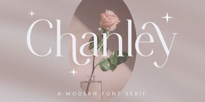 Chanley, a sleek and sophisticated modern serif font that is sure to make a statement. With its clean lines and contemporary design, Chanley strikes the perfect balance between elegance and versatility. An Original typeface that suitable for any graphic designs such as branding materials, t-shirt, print, business cards, logo, poster, t-shirt, photography, quotes .etc This font support for some multilingual. Modern Sweet Retro that contains uppercase A-Z and lowercase a-z, alternate character, numbers 0-9, and some punctuation. If you need help, just write me! Thanks so much for checking out my shop!
 - Coda Loop by Slex Studio,
$25.00 Coda Loop is a Sans Serif font created with balanced line sizes, this font is inspired by Logo which uses block letters. Coda Loop comes with uppercase, lowercase, numbers, punctuation and so many variations on each character including common ligatures as well as additional strokes to allow you to customize your designs. This font is perfect for Logotypes, Letterheads, Formal Letters, Newspapers, Posters, Clothing Designs, Labels, and more. Also supported is PUA encoded. Simply copy and paste alternative characters using the Character Map (Windows), Font Book (Mac) or a software program such as PopChar (for Windows and Mac).
 - MY WAY by Posterizer KG,
$18.00 MY WAY belongs to a genre of fonts which contain the “aesthetic of ugly”. This is a font with a good balance of rhythm and contrast. Its aim is casual, wild and anarchic. Because of the spontaneity this font contains, there are plenty of Standard and Discretionary Ligatures to avoid frequent repetition of letters. If you find single repeating glyphs, you can change that by toggling between Stylistic Alternates. There are ligatures created for Cyrillic too. MY WAY is the perfect choice for all dirty, natural and wild, yet authentically beautiful things such as Blues, Jazz, Punk...
 - IL Palamede by Notope,
$25.00 IL Palamede is a typeface with just one style, referring by its name to the French chess magazine Le Palamède. Connects with chess here not only the name. Each symbol is built on a 5x5 grid with 3x3 priority. At the same time, the logic here is higher than optical compensation, so you can observe here quite dense, for example "b". Thanks to this solution, the typed text is balanced in width, and it also creates the feeling of a chess cell, where black and white cells alternate. Connects with chess here not only the name. Each symbol is built on a 5x5 grid with 3x3 priority. At the same time, the logic here is higher than optical compensation, so you can observe here quite dense, for example, "s". Thanks to this solution, the typed text is balanced in width, and it also creates the feeling of a chess cell, where black and white cells alternate. Use this font for any purpose that includes winning or enjoying.
 - Cumbre by Antipixel,
$22.00 Cumbre is a slanted display type with unorthodox anatomy, a dynamic rhythmic structure, movement expression, and intense visual language. An eccentric rebel with ribbon-like moves, a balanced extrovert that makes meticulous use of ink traps. Both the name and design got inspiration from mountain peaks. "Cumbre" in Spanish means summit, and that's the motive for the spiked design and the angular serrated structure. Cumbre is built by balancing sharp angles and venturous curves. The stems are spiky, and they vary in width. Cumbre is slanted and unicase. It has condensed proportions, moderate weight contrast, spacious counters, pointy terminals, and square ink traps. Cumbre is meant for large display settings to make the most out of the precise outlines and the clean intersections. The font styles: 'Sharp' has straight paths and precise intersections. 'Round' has the same outlines but with round corners. 'Stamp' has irregular wavy contours and heavy swelling at intersections.
 - Iranica by Naghi Naghachian,
$64.00 Iranica is a new creation of Naghi Naghashian. It is extremely legible even in very small size. "Iranica" is reminiscence to my birthplace and my cultural root. Iranica is a modern Sans Serif font family. This innovation is a contribution to modernisation of Arabic typography, gives the font design of Arabic letters real typographic arrangement und provides more typographic flexibility. Iranica supports Arabic, Persian and Urdu. The highest degree of calligraphic grace and the clarity of geometric typography. This typeface offers a fine balance between calligraphic tradition and the Roman aesthetic common in Latin typography. It also includes proportional and tabular numerals for the supported languages. Iranica design fulfills the following needs: A. Explicitly crafted for use in electronic media fulfills the demands of electronic communication. B. Suitability for multiple applications. Gives the widest potential acceptability. C. Extreme legibility not only in small sizes, but also when the type is filtered or skewed, e.g., in Photoshop or Illustrator. Iranica's simplified forms may be artificial obliqued in InDesign or Illustrator, without any loss in quality for the effected text. D. An attractive typographic image. Iranica was developed for multiple languages and writing conventions. Iranica supports Arabic, Persian and Urdu. It also includes proportional and tabular numerals for the supported languages. E. The highest degree of calligraphic grace and the clarity of geometric typography. This typeface offers a fine balance between calligraphic tradition and the Roman aesthetic common in Latin typography.
 - PF Adamant Pro by Parachute,
$59.00 The Adamant family is a serif typeface that comes in six weights, from Light to ExtraBold, each with italic and small caps versions. It has received an original typeface award from Granshan Awards 2010. Every font in this family includes ligatures, lining and oldstyle figures in proportional and tabular widths, fractions, alternate characters, and other typographic features. The weights are finely balanced so that they can be easily combined, depending on type of paper and print conditions. Its proportions, sturdy serifs, high x-height and wide apertures make it very readable at small sizes. It is suitable for setting books, magazines and newspapers, but is also appropriate for use in large sizes like in poster design.
 - DangeR NighT by Absonstype,
$19.00 DANGER NIGH is the horror display typeface with high contrast all caps style looks and feel nice balanced. Honestly it works perfectly for headlines, logos, posters, packaging, T-shirts and much more. Recommended to use in Adobe Illustrator or Adobe Photoshop with opentype feature. Ligatures feature is default setting in Adobe Illustrator or Adobe Photoshop in Uppercase character. So when you want not to use the ligatures. Open glyphs panel : In Adobe Photoshop choose tool Window Character and then please click fi symbol In Adobe Illustrator choose tool Window Type Open Type and then please click fi symbol If you have questions, just send me a message and I’m glad to help. Have a great day, Absonstype
 - Astra Goldie by Putracetol,
$28.00 Astra Goldie font makes for more elegant, trendy and more lively. This font is inspired by the bold font style and well balanced lines.This font has a surprise from alternate that will make your work even more beautiful. This font is perfect for a professional touch which makes it even more unique and classic. But this font is also suitable for logos, branding, greeting cards, invitation cards, advertisements, titles, healines, book titles, stickers, packaging, quotes, posters, t-shirts/apparel, billboards and others. The alternative characters were divided into several Open Type features such as Swash, Stylistic Sets, Stylistic Alternates, Contextual Alternates, and Ligature. The Open Type features can be accessed by using Open Type savvy programs such as Adobe Illustrator, Adobe InDesign, Adobe Photoshop Corel Draw X version, And Microsoft Word. This font is also support multi language.
 - The Romantic Absolute Duo by Lettersams,
$12.00 The Romantic Absolute Script and Sans are a beautiful and romantic combination of two fonts that have a lot of lovely characters that are very interesting. This font has a beautiful and balanced character, making it suitable for a variety of purposes. such as posters, wedding invitations, logos, product packaging, branding, titles, signs, labels, mugs, book covers, quotes, and others. The Romantic Absolute Script Script features 700+ glyphs covering characters, alternatives and ligatures, including start and end letters, alternates, binders and multiple language support. The Romantic Absolute Sans features 190+ glyphs including binding characters and multiple language support. To access all OpenType Stylistic alternates, you need a program that supports OpenType features such as Adobe Illustrator, Adobe Photoshop, CorelDraw and Microsoft word. This font is PUA encoded which means you can access all glyphs and swashes with ease! Happy designing!
 - Alternoon by Putracetol,
$22.00 Alternoon - Ligature Display Font. Alternoon inspired by the ligature style and well balanced curves. Alternoon font makes for more fun, trendy and more lively. Alternoon has a surprise from alternate that will make your work display even more beautiful. Alternoon perfect for a professional touch which makes it even more unique ligature and classic display font. But Alternoon is also suitable for logos, branding, greeting cards, invitation cards, advertisements, titles, headlines, book titles, stickers, packaging, quotes, posters, t-shirts/apparel, billboards and others. The alternative characters were divided into several Open Type features such as Swash, Stylistic Sets, Stylistic Alternates, Contextual Alternates, and Ligature. The Open Type features can be accessed by using Open Type savvy programs such as Adobe Illustrator, Adobe InDesign, Adobe Photoshop Corel Draw X version, And Microsoft Word. This font is also support multi language.
 - Ragwort by Putracetol,
$28.00 Ragwort - Display Sans Serif Font. Ragwort font makes for more fun, trendy and more lively. This font is inspired by the extra bold font style and well balanced curves.This font has a surprise from alternate that will make your work even more beautiful. This font is perfect for a professional touch which makes it even more unique and classic. But this font is also suitable for logos, branding, greeting cards, invitation cards, advertisements, titles, healines, book titles, stickers, packaging, quotes, posters, t-shirts/apparel, billboards and others. The alternative characters were divided into several Open Type features such as Swash, Stylistic Sets, Stylistic Alternates, Contextual Alternates, and Ligature. The Open Type features can be accessed by using Open Type savvy programs such as Adobe Illustrator, Adobe InDesign, Adobe Photoshop Corel Draw X version, And Microsoft Word. This font is also support multi language.
 - Dining Room JNL by Jeff Levine,
$29.00 Inspired by the basic letter concept of Walter Huxley's 1935 gem Huxley Vertical, Dining Room JNL is a completely re-drawn typeface, adding even more of an Art Deco feel to an already classic Deco-era letter form consisting of condensed, rounded letters. Thick vertical lines balance against lighter weight ones, giving a dramatic contrast so typical of the Streamline Era of design concepts. This font marks another milestone in the Jeff Levine library of retro-inspired type faces. Beginning in 2006 with only ten designs, the collection has grown steadily with Dining Room JNL being the 750th font in the library.
 - Arian by Linotype,
$187.99 For decades, the Persian-born Naghi Naghashian has been working as a graphic designer and illustrator in Germany. Arian™ is his first commercial Arabic typeface. Named after his mother, Naghi created the Arian typeface family after years of systematically analyzing the Arabic script. The Arian design is sought to fulfill the many needs and was developed for multiple languages and writing conventions. It's extremely legibilitable not only in small sizes, but also when the type is filtered or skewed. This typeface offers a fine balance between calligraphic tradition and the contemporary sans serif aesthetic now common in Latin typography.
 - Genia by Product Type,
$15.00 In every glyph, Genia is lovely and charming. It has a strong, uncompromising style with regulated letterforms and a contemporary edge. Each typeface in the family can stand alone, be lively, and forceful in its own right, and there’s a balance between harsh lines and gentle curves. This typeface also comes with 16 different families to help you create outstanding projects. of course, your various design projects will be perfect and extraordinary if you use this font because this font is equipped with a font family, both for titles and subtitles and sentence text, start using our fonts for your extraordinary projects.
 - Exelancer by Popskraft,
$19.00 We are proud to present the futuristic Excelancer font. This font was inspired by passion for space stories. The uniqueness of this font lies in the rare combination of a wibrant style of decorative capital letters and perfectly balanced lowercase charachters that read well in any massive text. Thus, you get a universal font kit with which all the tasks of futuristic design are solved. However, this font will become a decoration not only for fantastic stories, but also for everything related to technology, development, progress and even sports. In short, this is the pure energy of the future!
 - Couturier by Latinotype,
$29.00 Couturier font is all about haute couture: classy ready-to-use characters for each project, perfectly drawn curved shapes and well-balanced counterforms. Elegantly embroidered ligatures, alternative glyphs and beautiful swashes give the font an extremely elegant look. Couturier comes in 4 weights, ranging from Regular to Black, with matching italics, resulting in a total of 8 fonts that help you achieve a strong composition in your publishing projects. Its true italics with a humanist feel give each design a chic personality. The font contains a set of more than 1,200 characters that support over 200 languages.
 - Androneida by Absonstype,
$19.00 ANDRONEIDA is the display serif style with combine uppercase and lowercase looks and feel nice balanced. Provide with alternates and ligatures font in variant style make the design letter looks nice. Honestly it works perfectly for headlines, logos, posters, packaging, T-shirts and much more. Recommended to use in Adobe Illustrator or Adobe Photoshop with opentype feature. Ligatures feature is default setting in Adobe Illustrator or Adobe Photoshop in Uppercase character. So when you want not to use the ligatures. Open glyphs panel : In Adobe Photoshop choose tool Window Character and then please click fi symbol In Adobe Illustrator choose tool Window Type Open Type and then please click fi symbol How to access Alternates Character? Open glyphs panel : In Adobe Photoshop choose tool Window glyphs In Adobe Illustrator choose tool Type glyphs