6,550 search results
(0.024 seconds)
- Kidnapped At Old Times by Intellecta Design,
$11.90 Kidnapped at Old Times, by Intellecta Design, is a collection of 35 fonts (and growing) of some of the most decorative caps we have ever carried. Decorative caps can capture the attention of anyone when used well. These caps are remarkably interesting and very detailed. So many to choose from - the entire family has over 2000 exotic, intrincate and historical letters. Easier to just order the whole family!
 - Fifty Famous Fairy Tales by Funk King,
$20.00 Fifty Famous Fairy Tales was inspired by lettering on the cover of a children’s book of the same name published by Whitman Publishers back in the 50s or 60s.
 - Times New Roman WGL by Monotype,
$67.99 In 1931, The Times of London commissioned a new text type design from Stanley Morison and the Monotype Corporation, after Morison had written an article criticizing The Times for being badly printed and typographically behind the times. The new design was supervised by Stanley Morison and drawn by Victor Lardent, an artist from the advertising department of The Times. Morison used an older typeface, Plantin, as the basis for his design, but made revisions for legibility and economy of space (always important concerns for newspapers). As the old type used by the newspaper had been called Times Old Roman," Morison's revision became "Times New Roman." The Times of London debuted the new typeface in October 1932, and after one year the design was released for commercial sale. The Linotype version, called simply "Times," was optimized for line-casting technology, though the differences in the basic design are subtle. The typeface was very successful for the Times of London, which used a higher grade of newsprint than most newspapers. The better, whiter paper enhanced the new typeface's high degree of contrast and sharp serifs, and created a sparkling, modern look. In 1972, Walter Tracy designed Times Europa for The Times of London. This was a sturdier version, and it was needed to hold up to the newest demands of newspaper printing: faster presses and cheaper paper. In the United States, the Times font family has enjoyed popularity as a magazine and book type since the 1940s. Times continues to be very popular around the world because of its versatility and readability. And because it is a standard font on most computers and digital printers, it has become universally familiar as the office workhorse. Times?, Times? Europa, and Times New Roman? are sure bets for proposals, annual reports, office correspondence, magazines, and newspapers. Linotype offers many versions of this font: Times? is the universal version of Times, used formerly as the matrices for the Linotype hot metal line-casting machines. The basic four weights of roman, italic, bold and bold italic are standard fonts on most printers. There are also small caps, Old style Figures, phonetic characters, and Central European characters. Times? Ten is the version specially designed for smaller text (12 point and below); its characters are wider and the hairlines are a little stronger. Times Ten has many weights for Latin typography, as well as several weights for Central European, Cyrillic, and Greek typesetting. Times? Eighteen is the headline version, ideal for point sizes of 18 and larger. The characters are subtly condensed and the hairlines are finer."
 - Greatest All of Time by Struggle Studio,
$16.00 Greatest All the Time - is a Duo Handwritten with Extras and petite (handwritten and modern look) Font Duo, featuring a sweet and gentle look. This original look will appeal to a variety of crafty ideas, from letterhead and titles to writing implements.
 - Hand Retro Sketch Times by TypoGraphicDesign,
$19.00 CONCEPT/ CHARACTERISTICS A serif typeface with modern and fancy handmade haptics. Take the 3 layers for unique designs and create many different variations. From light and warm outline (take the regular style), about heavy and pithy filling (take the bold style) till fancy and modern 3d shadows (take the 3d style). The combination of all 3 font styles = bulky design freedom. Game with it! Handemade sketched for display size. APPLICATION AREA The vintage but modern, the raw but friendly serif font »Hand Retro Sketch Times« with many language support (for a display font) would look good at headlines. Editorial Design (Magazine or Fanzine) or Webdesign (Headline Webfont for your website), party flyer, movie poster, music poster, music covers or webbanner. And and and… TECHNICAL SPECIFICATIONS Headline Font | Display Font | Serif Layer Font »Hand Retro Sketch Times« OpenType Font with 341 glyphs, alternative letters and ligatures (with accents & €) & 3 styles & 3 layers (regular, bold, 3d)
 - Times New Roman PS by Monotype,
$67.99In 1931, The Times of London commissioned a new text type design from Stanley Morison and the Monotype Corporation, after Morison had written an article criticizing The Times for being badly printed and typographically behind the times. The new design was supervised by Stanley Morison and drawn by Victor Lardent, an artist from the advertising department of The Times. Morison used an older typeface, Plantin, as the basis for his design, but made revisions for legibility and economy of space (always important concerns for newspapers). As the old type used by the newspaper had been called Times Old Roman," Morison's revision became "Times New Roman." The Times of London debuted the new typeface in October 1932, and after one year the design was released for commercial sale. The Linotype version, called simply "Times," was optimized for line-casting technology, though the differences in the basic design are subtle. The typeface was very successful for the Times of London, which used a higher grade of newsprint than most newspapers. The better, whiter paper enhanced the new typeface's high degree of contrast and sharp serifs, and created a sparkling, modern look. In 1972, Walter Tracy designed Times Europa for The Times of London. This was a sturdier version, and it was needed to hold up to the newest demands of newspaper printing: faster presses and cheaper paper. In the United States, the Times font family has enjoyed popularity as a magazine and book type since the 1940s. Times continues to be very popular around the world because of its versatility and readability. And because it is a standard font on most computers and digital printers, it has become universally familiar as the office workhorse. Times?, Times? Europa, and Times New Roman? are sure bets for proposals, annual reports, office correspondence, magazines, and newspapers. Linotype offers many versions of this font: Times? is the universal version of Times, used formerly as the matrices for the Linotype hot metal line-casting machines. The basic four weights of roman, italic, bold and bold italic are standard fonts on most printers. There are also small caps, Old style Figures, phonetic characters, and Central European characters. Times? Ten is the version specially designed for smaller text (12 point and below); its characters are wider and the hairlines are a little stronger. Times Ten has many weights for Latin typography, as well as several weights for Central European, Cyrillic, and Greek typesetting. Times? Eighteen is the headline version, ideal for point sizes of 18 and larger. The characters are subtly condensed and the hairlines are finer." - KG How Many Times by Kimberly Geswein,
$5.00 A cute, markered skinny font that is tall and neat with plenty personality to spare.
 - VVDS The Dickens Tale by Vintage Voyage Design Supply,
$10.00 The Dickens's Fairytale – it's a new chapter of VVDS products - The collections of fancy display fonts which will include many typefaces that will be perfectly combined not only with each other, but also with other collections of this series. As a result, you will get a large collection of beautiful fonts and graphics that will help you create beautiful designs without having to look for anything else. All these collections are inspired by classic books design of XIX and XX centuries like Franklin's Library Classic Collection and modern publishing houses like Barnes & Nobel Collectible Editions. This collection is the first one and including 12 font files. The Serif presented in two styles - cutted and normal. The cutted style has two weights - Regular and Bold. Also, there are two types of shadows - block and offset. Plus decor for cutted serif. The cherry on top - curly calligraphic Script with Swirl calligraphy elements for decoration. The both of types has many Open Type Features as Oldstyle Figures, Fractions, Stylistic Alternates and ending lowercase letters for script. • OTF & WEB • Multilingual
 - White Tie Affair NF by Nick's Fonts,
$10.00Round, firm and fully packed, this unusual yet elegant headline font with its multiline treatment is best used in large sizes. Both versions of this font contain the Unicode 1252 Latin and Unicode 1250 Central European character sets, with localization for Romanian and Moldovan. - KG The Last Time Bubble - Personal use only

- KG Always A Good Time - Personal use only

- KR A Time For Peace - Unknown license

- For The One Hundreth Time - Unknown license

- KG First Time In Forever by Kimberly Geswein,
$5.00 This handwritten font was designed with Ashley Sanderson at Flying High In First Grade.
 - KG Always A Good Time by Kimberly Geswein,
$5.00 Happily-lettered handwriting full of optimism. This handwriting was drawn with a chunky round marker and is bold enough for drawing attention yet still completely legible.
 - Times New Roman PS Cyrillic by Monotype,
$67.99In 1931, The Times of London commissioned a new text type design from Stanley Morison and the Monotype Corporation, after Morison had written an article criticizing The Times for being badly printed and typographically behind the times. The new design was supervised by Stanley Morison and drawn by Victor Lardent, an artist from the advertising department of The Times. Morison used an older typeface, Plantin, as the basis for his design, but made revisions for legibility and economy of space (always important concerns for newspapers). As the old type used by the newspaper had been called Times Old Roman," Morison's revision became "Times New Roman." The Times of London debuted the new typeface in October 1932, and after one year the design was released for commercial sale. The Linotype version, called simply "Times," was optimized for line-casting technology, though the differences in the basic design are subtle. The typeface was very successful for the Times of London, which used a higher grade of newsprint than most newspapers. The better, whiter paper enhanced the new typeface's high degree of contrast and sharp serifs, and created a sparkling, modern look. In 1972, Walter Tracy designed Times Europa for The Times of London. This was a sturdier version, and it was needed to hold up to the newest demands of newspaper printing: faster presses and cheaper paper. In the United States, the Times font family has enjoyed popularity as a magazine and book type since the 1940s. Times continues to be very popular around the world because of its versatility and readability. And because it is a standard font on most computers and digital printers, it has become universally familiar as the office workhorse. Times?, Times? Europa, and Times New Roman? are sure bets for proposals, annual reports, office correspondence, magazines, and newspapers. Linotype offers many versions of this font: Times? is the universal version of Times, used formerly as the matrices for the Linotype hot metal line-casting machines. The basic four weights of roman, italic, bold and bold italic are standard fonts on most printers. There are also small caps, Old style Figures, phonetic characters, and Central European characters. Times? Ten is the version specially designed for smaller text (12 point and below); its characters are wider and the hairlines are a little stronger. Times Ten has many weights for Latin typography, as well as several weights for Central European, Cyrillic, and Greek typesetting. Times? Eighteen is the headline version, ideal for point sizes of 18 and larger. The characters are subtly condensed and the hairlines are finer." - DB Once Upon A Time by Illustration Ink,
$3.00The classic story of princes and princesses is represented here in DoodleBat Once Upon A Time. - Times New Roman Small Text by Monotype,
$67.99In 1931, The Times of London commissioned a new text type design from Stanley Morison and the Monotype Corporation, after Morison had written an article criticizing The Times for being badly printed and typographically behind the times. The new design was supervised by Stanley Morison and drawn by Victor Lardent, an artist from the advertising department of The Times. Morison used an older typeface, Plantin, as the basis for his design, but made revisions for legibility and economy of space (always important concerns for newspapers). As the old type used by the newspaper had been called Times Old Roman," Morison's revision became "Times New Roman." The Times of London debuted the new typeface in October 1932, and after one year the design was released for commercial sale. The Linotype version, called simply "Times," was optimized for line-casting technology, though the differences in the basic design are subtle. The typeface was very successful for the Times of London, which used a higher grade of newsprint than most newspapers. The better, whiter paper enhanced the new typeface's high degree of contrast and sharp serifs, and created a sparkling, modern look. In 1972, Walter Tracy designed Times Europa for The Times of London. This was a sturdier version, and it was needed to hold up to the newest demands of newspaper printing: faster presses and cheaper paper. In the United States, the Times font family has enjoyed popularity as a magazine and book type since the 1940s. Times continues to be very popular around the world because of its versatility and readability. And because it is a standard font on most computers and digital printers, it has become universally familiar as the office workhorse. Times?, Times? Europa, and Times New Roman? are sure bets for proposals, annual reports, office correspondence, magazines, and newspapers. Linotype offers many versions of this font: Times? is the universal version of Times, used formerly as the matrices for the Linotype hot metal line-casting machines. The basic four weights of roman, italic, bold and bold italic are standard fonts on most printers. There are also small caps, Old style Figures, phonetic characters, and Central European characters. Times? Ten is the version specially designed for smaller text (12 point and below); its characters are wider and the hairlines are a little stronger. Times Ten has many weights for Latin typography, as well as several weights for Central European, Cyrillic, and Greek typesetting. Times? Eighteen is the headline version, ideal for point sizes of 18 and larger. The characters are subtly condensed and the hairlines are finer." - Times New Roman Windows compatible by Monotype,In 1931, The Times of London commissioned a new text type design from Stanley Morison and the Monotype Corporation, after Morison had written an article criticizing The Times for being badly printed and typographically behind the times. The new design was supervised by Stanley Morison and drawn by Victor Lardent, an artist from the advertising department of The Times. Morison used an older typeface, Plantin, as the basis for his design, but made revisions for legibility and economy of space (always important concerns for newspapers). As the old type used by the newspaper had been called Times Old Roman," Morison's revision became "Times New Roman." The Times of London debuted the new typeface in October 1932, and after one year the design was released for commercial sale. The Times New Roman World Version is an extension of the original Times New Roman with several other scripts like with the Helvetica World fonts. It is part of the Windows Vista system. The following code pages are supported:1250 Latin 2: Eastern European 1251 Cyrillic 1253 Greek 1254 Turkish 1255 Hebrew 1256 Arabic Note: The Roman and Bold versions include the arabic scripts but they are not part in the corresponding italic versions. 1257 Windows Baltic 1258 Windows Vietnamese
- Times New Roman PS Greek by Monotype,
$67.99In 1931, The Times of London commissioned a new text type design from Stanley Morison and the Monotype Corporation, after Morison had written an article criticizing The Times for being badly printed and typographically behind the times. The new design was supervised by Stanley Morison and drawn by Victor Lardent, an artist from the advertising department of The Times. Morison used an older typeface, Plantin, as the basis for his design, but made revisions for legibility and economy of space (always important concerns for newspapers). As the old type used by the newspaper had been called Times Old Roman," Morison's revision became "Times New Roman." The Times of London debuted the new typeface in October 1932, and after one year the design was released for commercial sale. The Linotype version, called simply "Times," was optimized for line-casting technology, though the differences in the basic design are subtle. The typeface was very successful for the Times of London, which used a higher grade of newsprint than most newspapers. The better, whiter paper enhanced the new typeface's high degree of contrast and sharp serifs, and created a sparkling, modern look. In 1972, Walter Tracy designed Times Europa for The Times of London. This was a sturdier version, and it was needed to hold up to the newest demands of newspaper printing: faster presses and cheaper paper. In the United States, the Times font family has enjoyed popularity as a magazine and book type since the 1940s. Times continues to be very popular around the world because of its versatility and readability. And because it is a standard font on most computers and digital printers, it has become universally familiar as the office workhorse. Times?, Times? Europa, and Times New Roman? are sure bets for proposals, annual reports, office correspondence, magazines, and newspapers. Linotype offers many versions of this font: Times? is the universal version of Times, used formerly as the matrices for the Linotype hot metal line-casting machines. The basic four weights of roman, italic, bold and bold italic are standard fonts on most printers. There are also small caps, Old style Figures, phonetic characters, and Central European characters. Times? Ten is the version specially designed for smaller text (12 point and below); its characters are wider and the hairlines are a little stronger. Times Ten has many weights for Latin typography, as well as several weights for Central European, Cyrillic, and Greek typesetting. Times? Eighteen is the headline version, ideal for point sizes of 18 and larger. The characters are subtly condensed and the hairlines are finer." - Borough Hall JNL by Jeff Levine,
$29.00Picture yourself on a New York subway station platform with the location name set into the tiles on the wall. Borough Hall JNL evokes the feeling of urban industrialism at its best. - Midtown Tessie NF by Nick's Fonts,
$10.00A sign at the 81st Street (Museum of Natural History) New York subway stop provided the pattern for this mosaic tile face. The font features a full-tile background at the bar position (shift-backslash) and left-and-right pointing fists at the brace positions as well as complete Latin 1252 and Central European 1250 character sets. - SubwayTicker by K-Type,
$20.00Subway Ticker is based on a 5x7 grid, electronic display observed on a New York subway train in February 2005 en route to Coney Island. - Metrica by Ixipcalli,
$20.00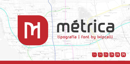 Métrica Font, Inspired for Modern Subway
 - Downtown Tessie NF by Nick's Fonts,
$10.00Here's another mosaic marvel from the New York subway system, to complement Midtown Tessie. This style is based on signage at the 34th Street station, with connections to Brooklyn. A full tile background is available at the bar position, and a marvelous meander can be found at the German double-s spot. Both versions of the font include 1252 Latin, 1250 CE (with localization for Romanian and Moldovan). - Washington Heights JNL by Jeff Levine,
$29.00 Washington Heights JNL is a sans serif type design based on a vintage hand-made directional sign for the New York subway system.
 - Storybook - Unknown license

- Line44 by URW Type Foundry,
$39.99 Remembering us of the early graffiti on the New York subways. And similar to creating and producing a graffiti, a "Piece", also the styles of Line44 are superposed in layers.
 - Walt Disney Script - Personal use only

- Pinocchio - Unknown license

- MetroDF - Unknown license

- LaFarge by Typetanic Fonts,
$39.00 LaFarge is a typeface primarily inspired by the historic mosaic titling capitals found in the New York City Subway, designed by architect Squire J. Vickers and his staff between 1915-1927. These elegant but industrial signs are characteristic of early-20th century American architectural lettering, and show an evolution of the classical Roman capitals to lower contrast, bolder serifs, and more regular character widths. The majority of this lettering still remains in subway stations today, and though elements of the style vary from sign to sign, many carry the unique features that are reflected in LaFarge: high-waisted crossbars with angled serifs, elegantly curved “R” leg, and distinctive trapezoidal serifs. LaFarge expands this style into a lower case, taking cues from contemporary typefaces like Bookman, Cheltenham, and Della Robbia. A number of typographic features are included, such as small caps, ordinal indicators / superscript letters, arrows, and a set of borders inspired by early subway tile. The result is a fashionable, architecturally-minded typeface that is just as at home on the façade of a grand public building as it is on packaging, magazines, or the web. LaFarge works well in both text and display settings, remaining readable at small sizes but showing off its elegant details in larger uses. LaFarge has received the Communication Arts Typography Award, the ADC Annual Merit Award, is included in the 2020 STA 100, and was part of designer Greg Shutters’ winning portfolio in the 2019 Type Directors Club Ascender Awards. You can download a PDF specimen of LaFarge, and also view a video of LaFarge in action.
 - Waite Park JNL by Jeff Levine,
$29.00Waite Park JNL is based on the smallest of the die-cut letters and numbers contained in the Webway Sign Cabinet - once manufactured by the Holes-Webway Company of Minneapolis, Minnesota. The largest of the set's sizes (2 inch) was the model for Sign Kit JNL, the medium size (1-1/8 inch) was used to make Sign Production JNL and this font is a version from the 3/4 inch size. Each size of alphabet and numerals have their own unique characteristics, although they all follow the same basic font style, which is reminiscent of classic Art Deco-era sanserif typefaces. The name Waite Park JNL was derived from a division of Holes-Webway that (for some reason lost to time) distributed their sign kits under the name Waite Park Sign Company, located in the Minnesota city of the same name. - Uptown Line JNL by Jeff Levine,
$29.00 Ask any typical New Yorker about subway directions and they'll tell you to take the "uptown line", "downtown line" or "cross-town line". Uptown Line JNL is yet another variation of the Art Deco monoline style of lettering prevalent during the 1930s and 1940s, and is based on titling from vintage sheet music for a Johann Strauss classical piece.
 - Altemus Rays by Altemus Creative,
$11.00 A collection of 174 ray sunray and corner ray designs.
 - Backstage by AVP,
$19.00Backstage is a bold sans serif stencil with subtly rounded corners. - Fontazia Papilio by Deniart Systems,
$24.00 Create your fontisimo butterfly garden with this original fontazia typeface featuring 52 unique hand-drawn butterfly inspired flowers! Whether you're looking for a modern papillion fluttering about or a metamorphosis experience, bring all your butterfly garden fantasies to life with these subtly bold, subtly complex inspirations.
 - ZionTrain Cyrillic by AndrijType,
$27.00 Originally ZionTrain was built as a (probably first in Cyrillic!) navigation typeface for the Kharkiv identity project and Kharkiv subway and airport navigation systems. We wanted comprehensible, distinctive letterforms, that can help everybody on the way from Babylon to Zion. The project was used in Kharkiv promotion at homeland and abroad, but was rejected by the new government. As a corporate typeface it was used for a few cultural projects.
 - Metroland by takoliko,
$15.00 Metroland inspired by urban and modern life on a metropolis city. Metroland have a Subway vibe and a transportation theme that relate to our routine. Metroland is simple and modern sans serif display family font. it has a monoline geometric, and simple atmosphere. Metroland came with 9 weight and 9 italic fonts. It can easily be matched to an incredibly large set of projects, and good for communicating your brands.
 - Clique by Device,
$29.00 A clean elegant subtly flared serif in three weights suitable for high-fashion and luxury brand use.


