10,000 search results
(0.033 seconds)
- Westman by Almarkha Type,
$29.00 Westman is a inspired by classic fonts with retro style combined with decorative Slab style nuances of western back to the era of the 60’s – 70’s, a style that is timeless. Westman is perfect for vintage,social media posts, Craft , Product packaging, product designs, label, branding projects, logo, advertisements, watermark, invitation, stationery and any projects
 - Redoneta Display by Rafael Jordan,
$20.00 Redoneta Display is a bonus subfamily of the geometric Redoneta Trilogy (Sans, Sans Rounded, and Slab) with extra bold trendy forms. It contains a display style for each style. Expressivity and efficiency: Redoneta Display has the same OpenType features as the rest of the Redoneta family, 100 icons & emojis plus, and a unique personality for each style.
 - Not Your Droids by Thomas Käding,
$5.00 A clean and easy to read Aurebesh font, in the style used at the Droid Depot at Disney's Hollywood Studios. This style is also called Droidebesh. Have fun with it.
 - Waterlord by Raditya Type,
$14.00 Waterlord is made to support the work of designers who are used to making work with contemporary styles. This font is great for various design styles, modern or old school.
 - Norca by Holis.Mjd,
$10.00 Norca is a typeface available in 4 types of styles, regular/clean, round, rough and textured. Available in all caps mode, suitable for designs with classic, vintage, and retro styles.
 - Lisbeth by TypeTogether,
$39.00 Louisa Fröhlich’s Lisbeth is the charming all-italic trailblazer that handles branding and text with internal vividness. With no roman style, it’s an italic-only family whose creation was guided by imagination instead of restrictive writing tools. Some type families aren’t sure what they want. Lisbeth proceeds with the utmost confidence on its own terms — it’s a feisty three-dimensional thespian amidst the cast of strait-laced characters you’re used to. With branding and magazine usage in mind, Lisbeth addresses the distinct challenges of text and display in a characterful way. The curves of the text weights show a soft angularity, emphasising the handwritten quality and the subtle twist inside the letters. The stroke’s carefully balanced contrast is more pronounced in the vibrant heavier weights but almost absent in the graceful structure of the thin weight. The angle of the letters is almost upright and the x-height is relatively large, so longer texts can be read comfortably and without effort. Lisbeth is slightly condensed and so uses a smaller area to efficiently impart much information. So if a type design can be thought of as the clothing letters wear, then Lisbeth is an energetic, freely flowing stroke wrapped around practical and efficient letter proportions. Another highlight of the family is the quirky high-contrast display style, easily catching every eye. The design concept of the twisted stroke shows at the extreme here and makes the letters dance a little on the page. Even though the shapes behave wildly, every letter is carefully balanced in itself so that the rhythmic repetition of the lettershapes results in an even and harmonic total picture. Lisbeth’s five text weights (from thin to bold) perform excellently in text settings, and its funky display style amps up the internal shimmer within each glyph. It supports numerous languages (Latin-A extended) and comes with ligatures and contextual alternates to produce beautiful typography. The character set contains proportional lining and oldstyle figures, tabular figures, subscripts, superscripts, and fractions. The complete Lisbeth family, along with our entire catalogue, has been optimised for today’s varied screen uses.
 - Laima by TypeTogether,
$39.00 Laima is the brush-formed stencil from Bogidar Mascareñas that will create an ovation for branding, album art, upscale venues, and packaging. If wide appeal, attention to detail, or international reach is necessary for your brand, consider Laima’s high-calibre design as your personal ambassador. The general font user is accustomed to stencil typefaces that have a brute look to them — industrial, mechanical, restrictive, or even militarised. Stencils are commonly used because they serve a function, like spray-painting over template letters, giving the reader a warning that must be heeded for safety, or a command to follow immediately. Wooden crates and grunge art are the medium and black or red paint are the norm. Laima, instead, creates a stencil from the world of calligraphy to turn all this on its head. Laima’s 12 stencil styles (six roman and six italic) use the junctures of calligraphic strokes as an opportunity to achieve an uncommon stencil effect, shifting to create unexpected shapes and the illusion of twisted, disconnected overlaps. Inspired by “Arte Nueva de Escribir”, an engravings book published by Francisco Palomares in 1776, Laima progressed well beyond its beginning as a Type and Media Master’s project at KABK, The Hague (NL). It sometimes required completely new character shapes to accommodate the space needed for clear diacritic marks, and was further enhanced with flourishes and alternates for liveliness and variety in individual or branded work. Laima’s italic begins with swashes and uses OpenType features to automatically turn them off with more than two successive capital letters. Use one swashed character for a drop cap, two for ligatured fun, turn them on or off at your discretion, or change the ascender length and swash shape to suit your creative need. With two styles of numerals and stylistic sets for final forms, Laima’s 12 styles and hundreds of Latin-based languages can turn simple words into an occasion that would immediately benefit high-class brands and special uses. Set that article title, release that new product, code your best-looking UI yet, letterpress that business card, and print that gourmet label. Whatever is next, Laima is the unexpected stencil partner to introduce it to an expectant world.
 - Madurai Slab by insigne,
$24.00 Chennai’s market-tested type styles have taken new form once again. The geometric forms of Chennai and its derivant Madurai, both successful in web-based applications and logotypes, have now been adapted for the superfamily Madurai Slab, a potent, square slab serif ideal for headlines and posters. Under the surface of Madurai Slab’s straightforward geometric structure, the font’s exaggerated vertical serifs provide the face with an extra chunk that commands the reader’s attention and gives the font more impact in its heavier styles. The extra-fortified forms are anything but monotonous, though. The bolder structure of the slab is instead rational, diligently thought-out, with minimally contrasting strokes, making the sturdier look particularly legible in shorter textual content blocks. This child of Madurai contains a comprehensive range of nine weights--slender to black--and features condensed and extender selections for a complete set of fifty-four fonts. All users of the Madurai Slab collection can access numerous OpenType alternates. Madurai Slab is furnished for experienced typographers, together with alternates, compact caps and many alts like “normalized” capitals and lowercase letters that come with stems. The typeface also contains a range of numeral sets, together with fractions, old-style and lining figures with superiors and inferiors. OpenType-capable programs including Quark or the Adobe suite allow quick changes to ligatures and alternates. Previews of these options can be found in the .pdf brochure. Madurai Slab also features the glyphs to enable all Central, Eastern and Western European languages. In all, Madurai Slab supports around forty languages that utilize the prolonged Latin script, making it an excellent option for multi-lingual publications and packaging. This richness of options makes this the best slab serif family for websites as well as for print, motion graphics, logos, t-shirts and the like. Madurai Slab is a great choice when looking for a Neo-Grotesque slab serif font. In the hands of a learned designer, this new slab offers the potential for beautiful and well-blended layouts. With its widths adjusting to compact and extended content blocks, this typeface is perfect for the headings, captions and other brief, immediate messages that you need to drive your message home.
 - Zt Sigata by Khaiuns,
$15.00 Zt. Sigata is an experiment where combining the two font styles into one, namely sans serif and serif, maybe this sounds very strange, don't worry this has been designed with very deep consideration with the serif style superti water droplets in the foliage that present coolness in every word and simple style sans serif with softness on each side, So when combined the two will be an extraordinarily beautiful design invention. Zt. Sigata comes with 6 styles (Regular/ italic, Kozi / italic, Rame / italic) that from each style have their own uniqueness, so it further expands your design experiment, and is great for poster design, packaging, logos, films and thanks to the uniqueness of each style may look good either in magazines or kompanye branding effectively. I hope you have a blast using zt.Sigata Thanks for use this font ~ Khaiuns X zelowtype
 - Zt Shago by Khaiuns,
$26.00 Zt Shago is a font family of 3 eye-catching display forms, each style has its own character, from very strong and soft angles. When you're looking for a font with a fun message, you can find it in the zt Shago family. Zt Shago is the most extensive font family I've ever created, with 33 styles and 16 free font styles. The default and round styles come in regular & Italic. But for the free one I only have one on myfont, for other styles you can download at Gumroad. While extra rounded only has one weight, namely extra bold. Zt Shago also has several unique alternatives to the letters a, h, k, m, n, v, w, & z, thus enhancing your design style. I hope you have fun using zt shago Thanks for using this font ~ Khaiuns X zelowtype
 - Sicero by Konstantine Studio,
$12.00 Back in 1800 - 1900, the Serif fonts or known as Roman styles were very popular. Used in so many media, came from calligraphic technique and refined till it became a solid style even so many sign painters use this letter style back in that era. And today, these kinda style still got their fans who love the elegant yet clean solid style. That's what this came for. Please welcome, Sicero Duo Fonts. Its a dynamic duo fonts that came in Serif and Sans-Serif style which is perfectly fit to each other. Bring the old vibes instantly to your project with them :) Sicero Roman A Serif style font with implementations of old-era style, clean and done in click-by-click to fulfil your perfectionist personal. And it comes in Old Style Numbering too, to make the vibes stronger in the whole vintage design when using it. Sicero Sans A Sans-Serif font to make a good pair with Sicero Roman still holding those old vibes but a little bit modern touch in here to reach wider range of trends. Use it all alone is still good to go if you want something different with not pairing it with Sicero Roman as well. Available in OTF, TTF, and Webfonts. Enjoy it more. Have some fun with it, Oldsport :) Cheers, Konstantine Studio
 - Sina Nova by Hoftype,
$- Sina Nova is the slimmer sister of Sina. It has a slightly vertical tendency, a higher x-height which makes it more open in small text sizes. Its economical proportions allow an even more universal application. Sina comes in 12 styles and in OpenType format. All styles contain standard and discretional ligatures, small caps, proportional lining figures, tabular lining figures, proportional old style figures, lining old style figures, matching currency symbols, fraction- and scientific numerals. Sina supports Western European, Central and Eastern European languages.
 - Hecate by Océane Moutot,
$32.90 Hécate is a contemporary serif typeface designed with sharp serifs, smooth and dynamic lines and high contrast. Inspired by the Garalde style with its tilted axis, Hécate brings uniqueness and modernity to this more traditional style. Its large variety of glyphs, including accents, old-style numbers and ligatures will give you freedom for all of your projects. It offers a large choice of uses such as magazine, branding, edition and so on. Hécate is available in 16 styles from thin to black, in roman and italic.
 - Agasthiya Rococo by Bykineks,
$15.00 agasthiya rococo is a script type font with 552 glyphs, supports western & eastern europe, turkish, cyrillic languages. equipped with alternates lowercase, ligatures, and swash. inspired by the art of rococo architecture, which is an ornamental architectural style that emerged in the 18th with its characteristic intricate and layered details. The rococo style is a further development of Baroque, where the forms used have not changed. The Rococo style first appeared in the 18th century in Paris. makes this font has a distinctive character style similar to victorian
 - Local Brewery by Cultivated Mind,
$29.00 Local Brewery is a vintage inspired font collection that includes six script styles and two sans serif styles. Script styles include a ripple edged, smooth or rough version. The sans serif styles include a ripple edged or rough version. Local Brewery Script comes with lower case y, g and tail alternates. These alternates will give your designs an extra flair and uniqueness. The script and sans serif fonts work exceptionally well together. Use Local Brewery for packaging, magazines, marketing, weddings, beer labels, film and clothing.
 - Orange Baroon by Attype Studio,
$14.00 Orange Baroon - Inspired by typeface on 70s era, Orange Baroon has the vintage font & retro with stencil look. with 2 font style, It's super easy to use stencil effect with Orange Baroon family font. Two style Font: Regular & Display Orange Baroon is perfect for vintage & retro style product, branding, logo, invitation, stationery, product packaging, merchandise, monogram, blog design, game titles, cute style design, Book/Cover Title and more. Features : - Orange Baroon Family Font - Ligatures - Multilingual Support --- Hope you enjoy with our font! Attype Studio
 - Apagah Reverse by Differentialtype,
$10.00 Apagah Reverse is a reverse contrast serif font with a contemporary concept and modern style. Equipped with an alternative with a reverse style too, you can use the uppercase with the lowercase style, and vice versa. This font also has four styles that you can mix and match, to complete the design you create. Crafted with high attention to detail, giving you the best designing experience. Most suitable for poster design, headlines, quote writing, pamphlets, greeting cards, product packaging, book covers, logo types, album covers, etc.
 - Black Thone by Attype Studio,
$12.00 Introducing Black Thone - Inspired by typeface on 70s era, Black Thone has the vintage font & retro font style. with 3 font style, It's super easy to use 3D effect wint Black Thone family font. Three style Font: Regular, Display & Extruded Black Thone is perfect for children product, branding, logo, invitation, stationery, product packaging, merchandise, monogram, blog design, game titles, cute style design, Book/Cover Title and more. Features : - Black Thone.otf - Black Thone Extruded.otf - Black Thone Display.otf - Multilingual Support --- Hope you enjoy with our font! Attype Studio
 - BB Strata (Pro) by Bold Studio,
$49.00 BB Strata™ (Pro) is the first font with only octagon angles (±45°), polyspacing (same width in every weight), optical shape and monoline variants for any type of use. The ideographic system was created for an exhibition in 2015 to visualize the process and results of scientific investigations in a historical and contemporary context. ● 9 Variants (incl. SS19, SS20) ● 37 Opentype-Features/Style ● 60 Stylistic Sets (20/Variant) ● 90 Styles (incl. SS19, SS20) ● 40 OT-Features/Style ● 97 Languages Support ● 31,920 Glyphs (1064/Style)
 - TT Ricordi Greto by TypeType,
$29.00TT Ricordi Greto useful links: Specimen | Graphic presentation | Customization options TT Ricordi Greto is the 5th project from the TT Ricordi collection of fonts, the main task of which is to find gems in old tablets and on stones and bring these inscriptions back to life in the form of contemporary fonts under the general name TT Ricordi. TT Ricordi Greto is Kseniya Karataeva’s original experimental project, inspired by a floor plaque dating from 1423 found in the Basilica di Santa Croce, Florence. When working on the typeface, we wanted to do something new and modern, but at the same time find details or artifacts in the source that could be exaggerated to the maximum. TT Ricordi Greto is a non-contrasting Florentine sans-serif with dynamic proportions and a hint on what would be serifs. The main features of the typeface are the closed aperture, dynamic proportions, and the combination of historical forms with modern visual solutions, flowing terminals with curling dash ends and flared ends, and subtle serifs that hint at the historical material. Another feature of the typeface is a large set of graphic icons (characters and objects), margin markers (flowers, stars and drops) and thirteen catchwords. All icons and spacing have been carefully selected and rendered in order to best match the visual plasticity of the font and interact well with it. The TT Ricordi Greto font family consists of 4 styles: Regular, Medium, Demibold + the Variable font. Each style includes 678 glyphs and 14 OpenType features. In addition to wide language support (extended Latin and basic Cyrillic), each style has two sets of figures and currencies (proportional and tabular), a set of arrows alternative versions of the letter M (flared and straight versions) and the letter Ф (round and oval) and the same a set of icons, margin markers and catchwords. TT Ricordi Greto OpenType features list: aalt, ccmp, locl, numr, ordn, tnum, pnum, case, ss01, ss02, ss03, ss04, ss05, calt. TT Ricordi Greto language support: Acehnese, Afar, Albanian+, Aleut (lat), Alsatian, Aragonese, Arumanian+, Asu, Aymara, Azerbaijani +, Banjar, Basque +, Belarusian (lat), Bemba, Bena, Betawi, Bislama+, Boholano+, Bosnian (lat), Breton +, Catalan+, Cebuano+, Chamorro+, Chichewa, Chiga, Colognian+, Cornish, Corsican +, Cree, Croatian, Czech+, Danish, Dutch+, Embu, English+, Esperanto, Estonian+, Faroese+, Fijian, Filipino+, Finnish, French, Frisian, Friulian+, Gaelic, Gagauz (lat), Galician+, Ganda, German+, Gikuyu, Guarani, Gusii, Haitian Creole, Hawaiian, Hiri Motu, Hungarian+, Icelandic+, Ilocano, Indonesian+, Innu-aimun, Interlingua, Irish, Italian+, Javanese, Jola-Fonyi, Judaeo-Spanish, Kabuverdianu, Kalenjin, Kamba, Karachay-Balkar (lat), Karaim (lat), Karakalpak (lat), Karelian, Kashubian, Kazakh (lat), Khasi, Kikuyu, Kinyarwanda, Kirundi, Kongo, Kurdish (lat), Ladin, Latvian, Leonese, Lithuanian+, Livvi-Karelian, Luba-Kasai, Ludic, Luganda+, Luo, Luxembourgish+, Luyia, Machame, Makhuwa-Meetto, Makonde, Malagasy, Malay+, Maltese, Manx, Maori, Marshallese, Mauritian Creole, Meru, Minangkabau+, Moldavian (lat), Montenegrin (lat), Morisyen, Nahuatl, Nauruan, Ndebele, Nias, Norwegian, Nyankole, Occitan, Oromo, Palauan, Polish+, Portuguese+, Quechua+, Rheto-Romance, Rohingya, Romanian +, Romansh+, Rombo, Rundi, Rwa, Salar, Samburu, Samoan, Sango, Sangu, Sasak, Scots, Sena, Serbian (lat)+, Seychellois Creole, Shambala, Shona, Silesian, Slovak+, Slovenian+, Soga, Somali, Sorbian, Sotho+, Spanish+, Sundanese, Swahili, Swazi, Swedish+, Swiss, German +, Tagalog+, Tahitian, Taita, Talysh (lat), Tatar+, Teso, Tetum, Tok Pisin, Tongan+, Tsakhur (Azerbaijan), Tsonga, Tswana +, Turkish+, Turkmen (lat), Uyghur, Valencian+, Vastese, Vepsian, Volapük, Võro, Vunjo, Walloon, Walser+, Welsh+, Wolof, Xhosa, Zaza, Zulu+, Belarusian (cyr), Bosnian (cyr), Bulgarian (cyr), Erzya, Karachay-Balkar (cyr), Khvarshi, Kumyk, Macedonian+, Montenegrin (cyr), Mordvin-moksha, Nogai, Russian+, Rusyn, Serbian (cyr)+, Ukrainian. - Core Dodam by S-Core,
$59.00 CoreDodam is a geometric shaped title font with unique structure. The shape of each character is very simple and modern. Depending on shape, some characters have different heights. It makes the line of text rhythmically. Supported codepages are MS Windows 1252 Latin1 and MS Windows 949 Korean consisting of 11,172 Korean letters and Symbols except Chinese. We recommend to use for the title or short sentence on posters and especially useful for design works.
 - Core Bori by S-Core,
$59.00 CoreBori is a soft Serif font. The Korean alphabet is designed into ovals, and it is also reflected in English alphabets. With oval shape and condensed width of initial and final consonants are distinguishing factors in hangul. Supported codepages are MS Windows 1252 Latin1 and MS Windows 949 Korean consisting of 11,172 Korean letters and Symbols except Chinese. We Suggest to use this font to fairy tale books, t-shirts, posters, logos and other items.
 - Graviola by Harbor Type,
$30.00🏆 Selected for Tipos Latinos 7 with a Certificate of Excellence. With semi-rounded terminals, Graviola is soft and friendly. The family consists of 16 fonts, from Thin to Black and matching italics. While the intermediate ones are suited for body text, the extreme weights look specially beautiful at display sizes. Each font contains 530+ glyphs, supporting more than 90 languages. Stylistic sets provide alternates in two groupings (a, v, w, y and G, g, &). - Core Label by S-Core,
$59.00 Core Label is a condensed sans serif font. You will be able to manage a lot of information into limited spaces with Core Label. Its highly legible even in condensed forms and also clear at small sizes. Supported codepages are MS Windows 1252 Latin1 and MS Windows 949 Korean consisting of 11,172 Korean letters and Symbols, except Chinese. This Type-face is good for narrow spaces such as Labels, Books and so on.
 - Hand Stamp Play Rough Serif by TypoGraphicDesign,
$25.00 “Hand Stamp Play Rough Serif” is a rough and dirty serif Font with authentic & real stamp look. Original Hand Stamped. A–Z, a–z, and 0–9 are each 3× different forms (every letter/glyph has two additional alternate characters) and is intended to show the hand-made nature and the vibrancy of the display font. The different pressure (velocity) of the stamp on paper creates a liveliness in the typeface. Ligatures like ae, oe, AE, OE, ff, fl, fi, fj, ffl, ffj, ffi, and additional logotypes like and, the, by, tel fax, web, www … and a Versal Eszett (Capital Letter Double S) give the Font more life and shows that despite their retro-looks works with modern OpenType technology (from ❤ love is, from luck will ✤ … ). Replacing the glyphs “E” instead of “3” to convey that typeface invites you to play. It is the desire to experiment and promote uninhibited experimentation. A variety of alternative letters and a few glyphs follow her own head @, &, ₤, £, “,”, * … The typeface has its quirks and downright human characteristics to “just love.” Have fun with this font – Just Stamp It. Application Area The serif font works best for headline size. Logo, Poster, Editorial Design (Magazine or Fanzine) or Webdesign (Headline Webfont for your website), Webbanner, party flyer, movie poster, music poster, music covers … How To Use – awesome magic OpenType-Features in your layout application ■ In Adobe Photoshop and Adobe InDesign, font feature controls are within the Character panel sub-menu → OpenType → Discretionary Ligatures … Checked features are applied/on. Unchecked features are off. ■ In Adobe Illustrator, font feature controls are within the OpenType panel. Icons at the bottom of the panel are button controls. Darker ‘pressed’ buttons are applied/on. ■ Additionally in Adobe InDesign and Adobe Illustrator, alternate glyphs can manually be inserted into a text frame by using the glyphs panel. The panel can be opened by selecting Window from the menu bar → Type → Glyphs. Or use sign-overview of your operating system. ■ For a overview of OpenType-Feature compatibility for common applications, follow the myfonts-help http://www.myfonts.com/help/#looks-different ■ It may process a little bit slowly in some applications, because the font has a lot of lovely rough details (anchor points). Technical Specifications ■ Font Name: Hand Stamp Play Rough Serif ■ Font Weights: Regular, Bold ■ Fonts Category: Display for Headline Size ■ Desktop-Font: OTF (OpenType Font for Mac + Win) + TTF (TrueType Font) ■ Web-Font: SVG + EOT + TTF + WOF ■ Font License: Desktop license, Web license, App license, eBook license, Server license ■ Glyph coverage: 617 ■ Language Support: Albanian, Alsatian, Aragonese, Arapaho, Aromanian, Arrernte, Asturian, Aymara, Basque, Bislama, Bosnian, Breton, Cebuano, Chamorro, Cheyenne, Chichewa (Nyanja), Cimbrian, Corsican, Croatian, Czech, Danish, Dutch, English, Estonian, Faroese, Fijian, Finnish, French, French Creole (Saint Lucia), Frisian, Friulian, Galician, Genoese, German, Gilbertese (Kiribati), Greenlandic, Guarani, Haitian Creole, Hawaiian, Hiligaynon, Hmong, Hopi, Hungarian, Ibanag, Iloko (Ilokano), Indonesian, Interglossa (Glosa), Interlingua, Irish (Gaelic), Islandic, Istro-Romanian, Italian, Jèrriais, Kashubian, Kurdish (Kurmanji), Ladin, Latvian, Lithuanian, Lojban, Lombard, Low Saxon, Luxembourgian, Malagasy, Maltese, Manx, Maori, Megleno-Romanian, Mohawk, Nahuatl, Norfolk/Pitcairnese, Northern Sotho (Pedi), Norwegian, Occitan, Oromo, Pangasinan, Papiamento, Piedmontese, Polish, Portuguese, Potawatomi, Rhaeto-Romance, Romanian, Romansh (Rumantsch), Rotokas, Sami (Inari), Sami (Lule), Samoan, Sardinian (Sardu), Scots (Gaelic), Seychellois Creole (Seselwa), Shona, Sicilian, Slovak, Slovenian (Slovene), Somali, Southern Ndebele, Southern Sotho (Sesotho), Spanish, Swahili, Swati/Swazi, Swedish, Tagalog (Filipino/Pilipino), Tahitian, Tausug, Tetum (Tetun), Tok Pisin, Tongan (Faka-Tonga), Tswana, Turkish, Turkmen, Turkmen (Latinized), Tuvaluan, Uyghur (Latinized), Veps, Volapük, Votic (Latinized), Walloon, Warlpiri, Welsh, Xhosa, Yapese, Zulu ■ Specials: Alternative letters, Versal Eszett (German Capital Sharp S), symbols, dingbats, digits, accents & €, incl. OpenType-Features like Access All Alternates (aalt), Contextual Alternates (calt), Glyph Composition/Decomposition (ccmp), Discretionary Ligatures (dlig) Denominators (dnom), Fractions (frac), Kerning (kern), Standard Ligatures (liga), Numerators (numr), Ordinals (ordn), Stylistic Alternates (salt), Stylistic Set 01 (ss01), Stylistic Set 02 (ss02), Stylistic Set 03 (ss03), Superscript (sups), Slashed Zero (zero) ■ Design Date: 2014 ■ Type Designer: Manuel Viergutz
 - Geodec Fog by Intellecta Design,
$18.95mixed fancy style font - Streamline Deco Square by Intellecta Design,
$18.90a fifities style font - Tribaltypo by Otto Maurer,
$22.00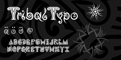 Tribal-styled Tattoo Font.
 - KG Primary Italics by Kimberly Geswein,
$5.00 Primary-style italicized handwriting.
 - MooLahLah by TypeSETit,
$14.95 A cow-print style.
 - Martyric by Mans Greback,
$59.00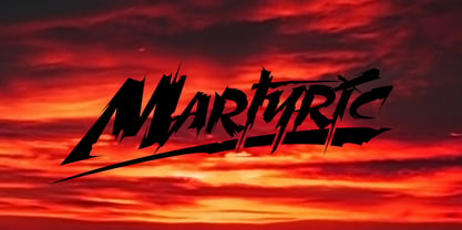 Wild trash style typeface.
 - H74 San Loscisco by Hydro74,
$9.99 Street style, uppercase only.
 - Vallerine by Heyfonts,
$15.00 Vallerine - Display Font is a versatile, bold and unique serif font. Combination between high contrast and Brutalism style, Vallerine has a unique style with stylistic, alternates, ligatures and supports multilingual languages.
 - Graffiti Youth by Nirmana Visual,
$22.00 Inspired by Graffiti style Design, with 2 Style : Regular & Shadow Graffiti Youth offers beautiful typographic harmony for a diversity of design projects, including logos & branding, social media posts, advertisements & product designs.
 - Graffiti Boldy by Nirmana Visual,
$19.00 Inspired by Graffiti style Design, with 2 Style : Regular & Shadow Graffiti Boldy offers beautiful typographic harmony for a diversity of design projects, including logos & branding, social media posts, advertisements & product designs.
 - Zura by Caoni Studio,
$19.00 Zura’s font family design draws its inspiration from nature and a tribal style. The use of geometrical expression emotes a technological undertone. Opentype features include: Old style numerals Case sensitive forms
 - Arsis by URW Type Foundry,
$35.99 Arsis Regular Font was designed by Gerry Powell in 1937. It is a Serif (Antiqua) Modern Style font. Arsis Regular font attributes include roman serif, Didone, elegant, formal, modern style, feminine.
 - Graffiti Urban by Nirmana Visual,
$17.00 Inspired by Graffiti style Design, with 2 Style : Regular & Shadow Graffiti Urban offers beautiful typographic harmony for a diversity of design projects, including logos & branding, social media posts, advertisements & product designs.
 - Sportune by Raditya Type,
$11.00 Sportune is made to support the work of designers who are used to making works with a sporty style. This font is great for various design styles, modern or old school.
 - Rundigsburg by Ingrimayne Type,
$9.95 Is Rundigsburg a calligraphic face morphing into sans serif or sans serif reverting back to a medieval, calligraphic face? The letters are angular and some retain traces of older letter forms, but the ornamentation is gone. Rundigsburg is decorative but also very legible, suitable for both display and some text purposes. The family has four weights, each with an italics style. There are two shadowed versions and each has an "inside" style designed for uses in layers with its shadowed style to add color. These "inside" style are similar to the light style but the spacing matches its shadowed complement. Among Rundigburgs OpenType features are a few basic fractions and some alternative letter forms.