This hand-crafted font was designed for architect, blueprint and drawing use. Small font sizes have good contrast and are very easy to read. Larger font sizes create distinguished-looking headings. This font is also a good choice for adding a personal hand lettered touch, as opposed to fonts with perfectly formed lines and curves or other script fonts that are less formal and often difficult to read. The font resembles a cross between comic and VAG fonts. Architect Small Block started its life as small block letters on vellum ... hence its name.
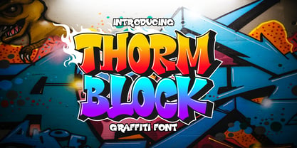
Thorm Black is a spectacular Display font with a Fatty and Cools graffiti style for your design look awesome. It will elevate a wide range of design projects to the highest level, be it branding, headings, designs, invitations, signatures, logotype, Streetwear, wall art illustration, apparel, labels, and much more!
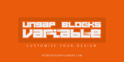
This font was designed by blocks, square glyphs. Terminals/crossbars of some glyphs can be extended in a way that you can customize the text of your design by using the selection bars in "variable font" button. That button will appear in the text editor of your program, if such option is available, like in recente illustrator and photoshop.
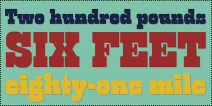
Designed by Dave West and released in 1960, the name Barnum associates this face with the famous nineteenth-century traveling American circus and showman P.T. Barnum. The wood-cut influence of the letter makes the PL Barnum Block font ideal for posters, signage and creative titling and packaging.
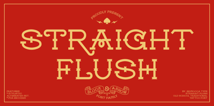
Straight Flush font family inspiration from Old school traditional tattoo font, simple and Strong Charachters. come with some simple Alternates for covering your Project, like Branding, Movie Title, Headline Letter, Bookcover or Book Content, Magazine cover, Poster, Quotes Lettering, Logos, and more your project design. - Unique glyphs - Multilingual Characters - UPPERCASE - Lowercase - Numeric - Symbol - Punctuation Character - Alternates inumocca type Studio
This bold, bodacious blackletter typeface is based on an offering from the 1832 Boston Type Foundry catalog. Although it generally appears to be a sober Old English font, there are a few quirky turns here and there, which make it a lot of fun. The Postscript and Truetype versions contain a complete Latin language character set (Unicode 1252); in addition, the Opentype version supports Unicode 1250 (Central European) languages as well.
Linotype Creative Arrows was designed by Robert Bucan in 1998 and consists mainly of directional symbols. Arrows and symbols in many different variations can also be built together, creating unique combinations for a variety of applications.
The concept for Cell Block 6 is based on the rigid structure and design of modern architecture. It is a structural display font created by Enrich Design. Four of six versions of Cell Block 6 are designed to be used as display fonts in order to uphold their detail. The Solid and Solid Outline versions offer additional versatility and can be used at smaller sizes in a wide range of applications.
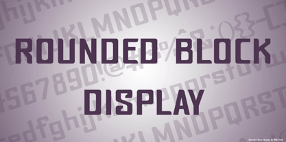
Rounded Block Display is a blocky san serif font perfect for headlines. Its clean facade and easy readability make this a great font to get your message across.
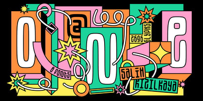
SK One Block was designed by Salih Kızılkaya in 2020. Inspired by Kufic typeface, this font includes many typographic material you will need. SK One consists of 8 different fonts and 2696 glyphs.
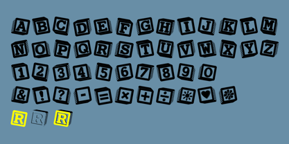
The PIXymbols™Baby Blocks font is designed to create both single color, and two-color titles or initials. Each package includes a document showing the full character set with key codes. The font package includes both TrueType and PostScript versions, and is available in either PC/Win or Macintosh format. In order to avoid serious problems, be sure not to install the same fonts in both TrueType and PostScript on the same computer. The font offers opportunities for various color treatments, with either single or double characters.
The M XiangHe Hei Simplified Chinese typeface merges traditional brush strokes with modern letterforms to carefully balance traditional calligraphy with humanist design. Named for the smooth movements of a flying crane, the M XiangHe Hei typeface is designed to glide across the page, and features strokes that are partly derived from the Kaishu calligraphic style – an everyday script which dates back hundreds of years. Seol Sans features Neue Frutiger for its Latin glyphs, and works harmoniously with Neue Frutiger World and Monotype’s CJK typefaces Tazugane Info (Japanese) and Seol Sans (Korean). M XiangHe Hei is a great choice for global brands using sans serif Latin typefaces looking to maintain their visual identity, and communicate with a consistent tone of voice with Simplified Chinese.
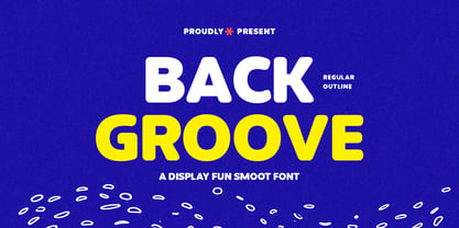
The Back Groove font is smooth in totality and elegance. One of the best releases earlier this year, drawn with pinpoint accuracy. Back Groove has the perfect simplicity and refinement for your next project. Back Groove It perfectly represents a precise and vintage aesthetic. Because it's guided by Outlen's Back Groove I recommend this font for your next celebrations, logos, invitations, and home decor projects that need a touch of compact alternative combinations! Check it out and enjoy!
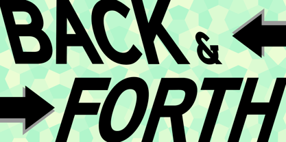
This all cap, bold, sans serif font features one face that slants backward ("Back") and one that slants forward ("Forth"). Use in combination to create headlines and designs that call for a sense of speed, motion and power. Uppercase and lowercase letters are the same.
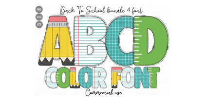
The Back to School Doodle font is a delightful and imaginative typeface that captures the essence of the back-to-school season with its playful doodles and vibrant charm. Each letter is adorned with whimsical illustrations, reminiscent of a child's doodles on a classroom desk. This font features hand-drawn characters filled with fun and colorful details. From doodled stars, pencils, and books to playful arrows, apples, and globes, every letter is an artwork in itself. The doodles add a sense of excitement and creativity to the font, making it perfect for capturing the spirit of going back to school.
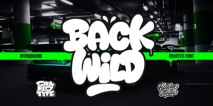
"Back Wild" is a bold and chubby graffiti font that includes swash characters. Fonts with these attributes generally feature bold and wide letterforms, often with playful and rounded elements. Swash characters add decorative and stylish touches to the font, If you have any specific questions or if there's anything specific you'd like to know or discuss about graffiti fonts or design, feel free to ask!
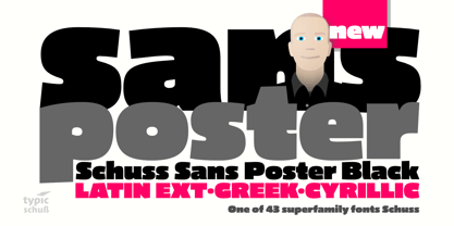
Schuss Sans CG Poster 1 upright OTF Font Latin extended, Cyrillic and Greek. Specially developed for headline poster display sizes. A Sans Black Headline-Font in addition to the Schuss superfamily. The heights are optimized for big sizes, different to the text fonts of the Superfamily Schuss. The character set is slightly different to the non poster styles too. No italic, no additional figures, no tabular figures, no small Caps. But with maximum manual kerning. Ligatures: fi, fl, ff, ffi, ffl. No special OpenType features.
Reverse Calendar Blocks JNL is the third typeface from Jeff Levine that allows the user to create a vintage-style calendar. Other versions available are Calendar Blocks JNL and Monthly Calendar JNL. The layout for the font is as follows: Numerals for displaying a year are on the 0-9 keys The 1-31 dates are located on the A-Z and a-e keys The combination dates of 23/30 and 24/31 are located on the f and g keys Days of the week (Sunday through Saturday) are on the keys h though n Months are found on the o through z keys A blank box (for balancing out layouts) is on the period key
Lewis F. Day, in his book Alphabets Old and New, offered this typeface as an example from sixteenth-century England of lettering incised in wood. The font is essentially monocase, but there several lowercase letters are alternate letterforms. Please note that, due to the ornate nature of the letterforms, this font does not contain math operators, fractions or superior numbers. Both versions of the font include 1252 Latin and 1250 CE (with localization for Romanian and Moldovan) character sets.
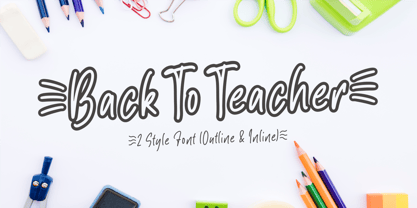
Hi...Thank for your visit :) Back to school (Outline & Inline) a simple handwritten font. It features fun characters that will take your projects to the next level! This font is PUA code which means you can easily access all the glyphs that are full of simple! It also features many special features including glyphs. font designs that are made for various vector designs, printing such as digital wedding blogs, online shops, social media, while printing can be used in the field of product clothing, accessories, bags, pins, logos, business cards, watermarks and many others ... so it can make your product look simple and attractive, and also Multilingual support!!! Happy design ...
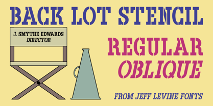
Back Lot Stencil JNL is a hand lettered slab serif stencil design based on the titles and credits from the 1954 film “Human Desire” and is available in both regular and oblique versions. Caps only Font.