10,000 search results
(0.03 seconds)
- ReRun Stencil by Wing's Art Studio,
$10.00 A hand-drawn stencil font for video games and film titles with a grungy urban design. This all-caps display font offers a simple way to replicate the look of hand-drawn or sprayed on stencil lettering. An industrial style that's used for it's quick real-world applications found on everything from roadworks, storage containers and military vehicles; with an urban visual language uniquely suited to video games, film titles and album covers. See above for more usage ideas. This font family includes uppercase-only characters, plus all punctuation, numerals and language support. Contents: ReRun includes 4 styles: - Rough - Clean - Outline - Light Recreate the textured look in these visuals using our infinite textures for Adobe Illustrator. Available to download from our website.
 - Zoelander by Locomotype,
$15.00 Zoelander is an experimental geometric font. The distinctive feature of this font is having an irregular x-height. This will look unusual, but if you are looking for something unique and looks different, Zoelander can be an alternative to making an attractive typography. Zoelander comes in two versions, Zoelander Regular and Zoelander TF. Each has a bold and rounded style. Zoelander Regular is a sans serif font with irregular x-height but if you want the same x-height size, the stylistic alternates feature allows you to do it. While Zoelander TF is the development of a regular version where each letter is connected in a line at the baseline. Some of the other opentype features make it easier for you to explore more interesting typographic designs.
 - Geogrotesque Stencil by Emtype Foundry,
$69.00 Geogrotesque Stencil is a member of the popular Geogrotesque family, and despite being thought as a display typeface, it goes one step further and tries to solve some of the typical problems with stencils fonts. Geogrotesque Stencil comes with 3 widths of cut (A, B and C). These cuts not only allow a better performance when printing at different sizes, you can also move across versions A, B or C in accordance to the rigidity of the material used. The family consists of 42 styles, 7 weights with 3 versions each plus italics, all of them in Open Type format including ligatures, tabular figures, fractions, numerators, denominators, superiors and inferiors with support for Central and Eastern European languages. For more details see the PDF.
 - Astaire Pro by Hackberry Font Foundry,
$24.95 This is a deco-style text OpenType Pro font loosely based on Koch's Locarno as seen in KochAltschrift a recent free German tribute to Koch's work. I was familiar with Meek's Letraset presstype version called Locarno, but I never liked the proportions used by either Meeks or Koch. So I radically revised ascender, descender, and x-height to make them more usable and brought the shapes within my sense of design. Mine is probably closer to Meeks than Koch, but hopefully it is a tribute to both. Astaire looks much more modern and it is much more usable. I added oldstyle figures, small cap figures, small caps, several ligatures, and more. There are an italic, bold, and bold italic also in this family
 - Agatha Bergman by PeachCreme,
$22.00 Introducing our new modern signature font "Agatha Bergman". We would say that "Agatha Bergman" is a result of our latest experiment since a few new things have been done: "Agatha Bergman" is a voguish sophisticated signature-style script with three different uppercase alternatives for each letter and a unique short swash for each lowercase letter. We usually used to make long and wavy swashes, however, that's not the case this time. Also, the stylistic alternates were coded as both ligatures and swashes so that turning on the “Standard ligatures” was enough to access them. The font includes 152 fancy standard ligatures and 6 discretionary ligatures, and while working on them we tried to consider those letter combinations that are often met in surnames, e.g. -ovsky.
 - Sapore by Fonderia Serena,
$23.90 Sapore is a script font family, mostly monoline, inspired by the elegant handmade signs in the beautiful city of Venice, Italy, where I work and live. Many of these signs were made at the beginning of the 20th century by skillful craftsmen and artists, carrying that distinct vintage Italian flavour, and this is why I named the font Sapore, which means precisely flavour (also, one of the signs is from a pastry shop that makes the most delicious things). The design takes this retro vibe into the 21st century, making it up-to-date and fresh, while keeping it authentic. It is a script font, but I added some stand alone capitals that you can use in all caps words and texts effortlessly, as the open type code is taking care of using the right set of letters at the right time, I could have made two separate fonts, but I wanted to give you the best value I could and ease of use. Make sure contextual alternates are always on! There are also swashes, alternate styles, stylistic sets, small caps, 2 figure sets and decorative elements, all accessible through open type. I think the font is particularly suited for display use, as in logos, packaging design, branding, but it is readable enough for small text blocks. You can access the non-linking caps by clicking on the discretionary ligatures button. You can access the loopy caps by clicking on the titling alternates button. The main version has straight terminals but I included a round version and a calligraphic one, called “classico”. Hope you like it!
 - DT Lythmore by Dragon Tongue Foundry,
$9.00 Lythmore This font is called Lythmore and is inspired by Lithos. Lithos was originally designed for Adobe by Carol Twombly in 1990, based it on the lettering from ancient Greek inscriptions. The Capitals are similar in feel and design, but is totally original and built from scratch. It is designed to be similar intentionally, but it is not a clone or rip off. Lithos is an example of a simple blocky san serif font style, with subtly concave sides, angled ends, and off centred curves. Lythmore is also an example of that same style. But is also different in places where I felt it could be improved. And it has a complete lower case set, which Lithos doesn't. I built Lythmore with 8 different weights. Lythmore can be very effective when used in advertising and general display work, but it can also be used for much more. Although it was never designed to be body copy, when used as such, it is still perfectly readable and adds its own version of sans serif style and flavour. I have included two versions of the Lythmore family. Lythmore A and Lythmore B. In the Lythmore A family, the lighter 4 weights all vary in weight in both the horizontal and vertical axis. The heavier 4 weights all vary in the horizontal axis only. In the Lythmore B family, the transition is even in both directions across the entire family. The result of this difference is that the A and B versions difference is most noticeable between the Regular and Medium weights. While the extreme ends of each family version are virtually identical.
 - Miedinger by Canada Type,
$24.95 Helvetica’s 50-year anniversary celebrations in 2007 were overwhelming and contagious. We saw the movie. Twice. We bought the shirts and the buttons. We dug out the homage books and re-read the hate articles. We mourned the fading non-color of an old black shirt proudly exclaiming that “HELVETICA IS NOT AN ADOBE FONT”. We took part in long conversations discussing the merits of the Swiss classic, that most sacred of typographic dreamboats, outlasting its builder and tenants to go on alone and saturate the world with the fundamental truth of its perfect logarithm. We swooned again over its subtleties (“Ah, that mermaid of an R!”). We rehashed decades-old debates about “Hakzidenz,” “improvement in mind” and “less is more.” We dutifully cursed every single one of Helvetica’s knockoffs. We breathed deeply and closed our eyes on perfect Shakti Gawain-style visualizations of David Carson hack'n'slashing Arial — using a Swiss Army knife, no less — with all the infernal post-brutality of his creative disturbance and disturbed creativity. We then sailed without hesitation into the absurdities of analyzing Helvetica’s role in globalization and upcoming world blandness (China beware! Helvetica will invade you as silently and transparently as a sheet of rice paper!). And at the end of a perfect celebratory day, we positively affirmed à la Shakti, and solemnly whispered the energy of our affirmation unto the universal mind: “We appreciate Helvetica for getting us this far. We are now ready for release and await the arrival of the next head snatcher.” The great hype of Swisspalooza '07 prompted a look at Max Miedinger, the designer of Neue Haas Grotesk (later renamed to Helvetica). Surprisingly, what little biographical information available about Miedinger indicates that he was a typography consultant and type sales rep for the Haas foundry until 1956, after which time he was a freelance graphic designer — rather than the full-time type designer most Helvetica enthusiasts presume him to have been. It was under that freelance capacity that he was commissioned to design the regular and bold weights of Neue Haas Grotesk typeface. His role in designing Helvetica was never really trumpeted until long after the typeface attained global popularity. And, again surprisingly, Miedinger designed two more typefaces that seem to have been lost to the dust of film type history. One is called Pro Arte (1954), a very condensed Playbill-like slab serif that is similar to many of its genre. The other, made in 1964, is much more interesting. Its original name was Horizontal. Here it is, lest it becomes a Haas-been, presented to you in digital form by Canada Type under the name of its original designer, Miedinger, the Helvetica King. The original film face was a simple set of bold, panoramically wide caps and figures that give off a first impression of being an ultra wide Gothic incarnation of Microgramma. Upon a second look, they are clearly more than that. This face is a quirky, very non-Akzidental take on the vernacular, mostly an exercise in geometric modularity, but also includes some unconventional solutions to typical problems (like thinning the midline strokes across the board to minimize clogging in three-storey forms). This digital version introduces four new weights, ranging from Thin to Medium, alongside the bold original. The Miedinger package comes in all popular font formats, and supports Western, Central and Eastern European languages, as well as Esperanto, Maltese, Turkish and Celtic/Welsh. A few counter-less alternates are included in the fonts.
 - Anisette Std Petite by Typofonderie,
$59.00 Geometric font inspired by shop signs in 4 styles Anisette has sprouted as a way to test some ideas of designs. It has started with a simple line construction (not outlines as usual) that can be easily expanded and condensed in its width in Illustrator. Subsequently, this principle of multiple widths and extreme weights permitted to Jean François Porchez to have a better understanding with the limitations associated with the use of MultipleMaster to create intermediate font weights. Anisette built around the idea of two widths capitals can be described as a geometric sanserif typeface influenced by the 30s and the Art Deco movement. Its design relies on multiple sources, from Banjo through Cassandre posters, but especially lettering of Paul Iribe. In France, at that time, the Art Deco spirit is mainly capitals. Gérard Blanchard has pointed to Jean Francois that Art Nouveau typefaces designed by Bellery-Desfontaines was featured before the Banjo with this principle of two widths capitals. The complementarity between the two typefaces are these wide capitals mixed with narrow capitals for the Anisette while the Anisette Petite – in its latest version proposes capitals on a square proportions, intermediate between the two others sets. Of course, the Anisette Petite fonts also includes lowercases too. Anisette Petite, a geometric font inspired by shop signs in 4 styles So, when Jean François Porchez has decided to create lowercases the story became more complicated. His stylistic references couldn’t be restricted anymore to the French Art-déco period but to the shop signs present in our cities throughout the twentieth century. These signs, lettering pieces aren’t the typical foundry typefaces. Simply because the influences of these painted letters are different, not directly connected to foundry roots which generally follow typography history. The outcome is a palette of slightly strange shapes, without strictly not following geometrical, mechanical and historical principles such as those that typically appear in typefaces marketed by foundries. As an example, the Anisette Petite r starts with a small and visible sort of apex that no other similar glyphs such as n or m feature, but present at the end of the l and y. The famous g loop is actually inspired by Chancery scripts, which has nothing to do with the lettering. The goal is of course to mix forms without direct reports, in order to properly celebrate this lettering spirit. This is why the e almost finishes horizontally as the Rotis – and the top a which must logically follow this principle and is drawn more round-curly. This weird choice seemed so odd to its designer that he shared his doubts and asked for advise to Jeremy Tankard who immediately was reassuring: “Oddly, your new top a is fine, it brings roundness to the typeface, when the previous pushes towards Anisette Petite to unwanted austerity.” The Anisette Petite, since its early days, is a mixture of non-consistent but charming shapes. Anisette, an Art Déco typeface Anisette Petite Club des directeurs artistiques, 46e palmarès Bukva:raz 2001
 - Ah, Scatterbrained Restrained by StimulEye Fonts — a name that sounds like what happens when a caffeine-addicted squirrel tries its hand at typography. This font is the charming eccentric of the font...
- Text Tile by Tetradtype,
$25.00 TextTile is a system of heavy sans titling faces which can be utilized to carry a repeating chromatic pattern across words and letters. It stands apart from other chromatic faces, where layered effects typically interact only within each letter and do not carry through from one letter to another. The pattern repetition across letters of varying widths is achieved through OpenType substitution, using conditional alternates for each successive letter to allow for a seamless appearance across words, regardless of letter combinations. Though the pattern exists on a strict grid and the letters' widths and spacing must be highly regular in order to preserve the pattern repeat, the letterforms themselves are not rigid; rather, they appear organic, lively. The initial release includes patterns inspired by a classic buffalo plaid, separated into its horizontal and vertical components to maximize the creative possibilities for layering one-, two-, three-, and even four-color plaid patterns. Kits are available to produce the plaid pattern in detail—with overlapping diagonal hatching fully visible—or as a simplified version in which transparency can be used to simulate plaid or to create a checkered or striped effect. The TextTile family of fonts is a flexible canvas for mixing and matching a broad array of patterns to create a unique look. Check back for more pattern releases and take a look at the online specimen to see what is possible with the current offerings. Usage Notes For best results use an OpenType aware program. Enabling Contextual Alternates will ensure pattern alignment. For patterns that are made up of vertical stripes or columns using the Stylistic Alternate/Stylistic Set 1 will shift the columns. Stylistic Set 2 will change 1-0 into blocks of patterns.
 - CoffeeBreak by Andinistas,
$36.00 The coffee made typography. CoffeeBreak is a typefamily designed by Carlos Fabian Camargo G. Its purpose is to communicate similar feelings to the ones you get when you first try the best roasted Colombian coffee early in the morning. That is the reason of the waiting, accompanied, or when you only want to be, nuances your design with its fonts full of flavor, texture and passion. For each time, every time, it gives you hints of flavor to design your day. It unleashes your artistic streak mixing possibilities as you wish, to your taste or the taste of your friends or that special someone. From handwriting to every warm drop of your first mug of the morning, we've always got something for you. Eye catching, modern, beautiful, cool and adventurous styles in the CoffeeBrwak shop ready for you to purchase. - CoffeeBreak A & B: 2 typographic tools with countless swashes and ligatures ideal for use at the beginning, in the middle or end of words that need italics, flavored dancers and rhythm masterfully expressed in gestural strokes for his calligraphic experimental logic. - Coffee Break Script 1 & 2: write them you can easily with decorative letters advocating a return to the artisan product ingenuity of the primacy of man over machine so your upper and lower case letters travel in a single line. - CoffeeBreak Words & WordsBold: It contains words specially designed to attract attention. - CoffeeBreak Dingbats: They are figurative silhouettes with textures that add warmth and a highly communicative environment. All are easily activated glyphs using the Glyphs panel in Illustrator, InDesign and Photoshop. Special thanks: Ilustrations: Eduardo Gomes. Photos: Karen Salvatierra. Texts: Javier Lineares- Description: Ernesto Googolplex. French translation: Marta Cano
 - Ah, Liturgisch! This font is to typography what a grand, echoing chorus is to a silent chapel: absolutely transformative. Crafted by the talented Dieter Steffmann, a wizard in the world of fonts, Lit...
- Funky Muskrat - Unknown license

- Proteron - Unknown license

- Tuesday - Unknown license

- PythonianDeluxe - Unknown license

- Babylon Industrial - Unknown license

- Cosmic Pattern by Okaycat,
$29.95 Cosmic Pattern is clean, cool & charming. Designed with constellation in mind with bright and dim stars connected together in alphabetical pattern. Cosmic Pattern features extended characters, and contains West European diacritics & ligatures. Highly suitable for international environments & publications. For more universe inspired fonts please check our Star Cursive and Arco Star.
 - Oktagona by Sensatype Studio,
$15.00 Oktagona Modern Technology Futuristic Font is A Modern Technology Futuristic Font that we created special for Futuristic Technology needs. What's Included: Character set A-Z All Uppercase / Stylistic alternates Numerals & Punctuation Accented Characters (West Europe) Works on PC & Mac Recommended using Adobe Illustrator or Adobe Photoshop. Wish you enjoy our font. :)
 - Mang by MADType,
$21.00 Mang is an 11 point (or 22 pt or 44 pt etc.) bitmap font that was originally designed for a poetry piece in Born Magazine. It is slightly quirky but works well as a text face. You can use it for screen resolution or print designs as it includes outlines.
 - Creamy Orange by Asd Studio,
$10.00 Introducing Creamy Orange, created by Asd Studio is a quirky and relaxed handwritten font. Whatever the topic, this font will be a wonderful asset to your font library, as it has the potential to enhance any creation. What's Included? :: Uppercase & Lowercase :: Numbers & Punctuation :: Multilingual Support Enjoy our font, thank you.
 - DigiBo by Volcano Type,
$29.00 Inspired by a scoreboard of the public transport in London our best selling font family is the basic font for the german magazine Starshot and even earned feedback from Sports Illustrated. The technical look of the entire DigiBo family is making the font a worthy member of the Eurostile / DIN -league.
 - AndrijScript Cyrillic by AndrijType,
$36.00 The glyphs of AndrijScript typeface are based on usual calligrapher's handwriting, my own native Cyrillic. This strange mix of freedom and professionalism looks vivid but a bit elegant. In three very different weights it has some ligatures and contextual alternatives for more natural look. All you need is love, you know ;)
 - Angela Cute by Sipanji21,
$16.00 Angela is a Cute and charm script font with a relaxed theme, featuring a lovely style. No matter the topic, but this font is awesome for every kids or child project, this font will be an incredibly asset to your fonts’ library, as it has the potential to elevate any creation.
 - Capcay Spicy by Asd Studio,
$10.00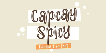 ntroducing Capcay Spicy, created by Asd Studio is a quirky and relaxed handwritten font. Whatever the topic, this font will be a wonderful asset to your font library, as it has the potential to enhance any creation. What's Included? :: Uppercase & Lowercase :: Numbers & Punctuation :: Multilingual Support Enjoy our font, thank you.
 - Melted Cheese by Asd Studio,
$10.00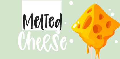 Introducing Melted Cheese, created by Asd Studio is a quirky and relaxed handwritten font. Whatever the topic, this font will be a wonderful asset to your font library, as it has the potential to enhance any creation. What's Included? :: Uppercase & Lowercase :: Numbers & Punctuation :: Multilingual Support Enjoy our font, thank you.
 - Insecticide by Arkalandara,
$110.00 Insecticide Infused with a laid-back charm, our casual handwriting captures the essence of relaxed authenticity. Effortlessly stylish, each stroke exudes approachable warmth, making it the perfect choice to connect with your audience on a personal level. Embrace a brand identity that feels as comfortable as your favorite pair of jeans
 - Picaro NF by Nick's Fonts,
$10.00A rather quaint but charming typeface, originally named Harlequin, provide the inspiration for this typeface. Its mild eccentricities will add an inviting warmth to your next project. Both versions of this font contain the Unicode 1252 (Latin) and Unicode 1250 (Central European) character sets, with localization for Romanian and Moldovan. - See You Later JNL by Jeff Levine,
$29.00 The sheet music cover of Lew Brown and Albert Von Tilzer's 1917 wartime song "Au Revoir, But Not Goodbye (Soldier Boy)" had its title hand-lettered in a condensed sans serif design with the influence of Art Nouveau styling. This has now been re-drawn digitally as See You Later JNL.
 - Misdirection JNL by Jeff Levine,
$29.00Fonts can be both functional and attractive, but there's no rule against them being fun. Misdirection JNL is an assortment of 52 outrageous road signs - perfect for protests against government inefficiency or used on novelty note pads... as attention-getting spot art for ads or for whatever your imagination can deliver... - Summer Children by Asd Studio,
$12.00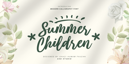 Introducing Summer Children by Asd Studio Summer Children is a modern calligraphy font. Whatever the topic, this font will be a wonderful asset to your font library, as it has the potential to enhance any creation. What's Included? :: Uppercase & Lowercase :: Numbers & Punctuation :: Swashes Ligature :: Multilingual Support Enjoy our font, thank you.
 - Poly by Schriftlabor,
$34.00 Poly is a serif typeface inspired by vintage travel guides keeping the naïf style typical of those publications. It has spiky serifs and a retro style. It will shine in headlines and packaging, for example, but it’s versatile. It can bring a lot of personality to brands and warmth to communication.
 - MPI Deco by mpressInteractive,
$5.00 Deco is a minimal, easy-to-read gothic without fuss. Geometry is sharp, strokes are uniform throughout, and characters are slightly condensed. This version is based on wood type of unknown origin, but the design was likely based on lettering from the Art Deco period of the 1920s and '30s.
 - Sakaboom by Creative17studio,
$11.00 Sakaboom is a high contrast font with strong and clean shapes. designed to support those of you who have an interest in the design of posters, magazines, invitations and various other designs. also supported for multilingual languages. If you have a problem with our product, just take a DM free updates
 - Recobant sans by Sulthan Studio,
$12.00 Recobant is a very charming and stylish font, and is designed to resemble engraving. It also features ligatures and multi-language support. I have made this font as smooth as possible, reducing the number of nodes in each glyph to ensure optimal cutting with Circut, Silhouette or other craft machines.
 - Oksana by AndrijType,
$40.00 Oksana is a Ukrainian female name. As a true native Ukrainian, this semi-serif type family has a strong structure, but soft and friendly nature. In six weights from thin to heavy it is perfect for titles and short texts lines. Look how people use it: http://use.type.org.ua/tagged/oksana
 - Bloomilife by Timurtype,
$14.00 Introducing by Timur type Proudly Present, Bloomilife Bloomilife A Handwritten Script Font Bloomilife is perfect for product packaging, branding project, megazine, social media, wedding, or just used to express words above the background. Bloomilife also multilingual support. Embelish your designs with our original fonts. Enjoy the font 😉 Thank you!
 - Geeeki Soft by Drawwwn,
$15.00 Geeeki Soft is a playful semi serif font, it's cute yet nerdy, stylish but dorky. Bold and chunky, it's a unique headline grabber, so it's the perfect match for style magazines, fashion brands and whimsical websites. Find your inner super-geek! Now softer, rounded and bouncier geeeki is available too!
 - Gorus by Smartfont,
$19.00 Gorus is a variable width sans serif type family that's been created to give a powerful but flexible tool to create strong headlines, posters, logos, and display text with tight spacing and maximum space coverage. A contemporary geometric family in 15 styles brings a modern and strong impression to your design.


