6,705 search results
(0.02 seconds)
- Jaguarundi by Dharma Type,
$9.99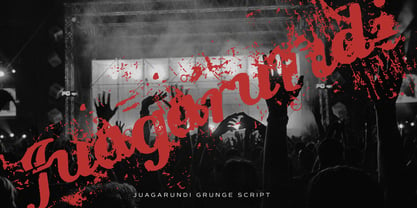 This extremely scratched and decadent font is suitable for posters of rock or grunge.
 - F2F OCRAlexczyk by Linotype,
$29.99The Face2Face (F2F) series was inspired by the sound of 1990s music, personal computers, and new font creation software. For years, Alexander Branczyk and his friends formed a unique type design collective, which churned out a substantial amount of fresh, new fonts, none of which complied with the traditional rules of typography. Many of these typefaces were used to create layouts for the leading German techno magazine of the 1990s, Frontpage. The typeface F2F OCRAlexczyk is one of the Face2Face fonts in Linotype's Take Type Library. It is based on the popular computer font OCR A, which was developed by the American National Standards Institute in 1966 as a system of letters that both humans and machines could easily read. Alexander Branczyk made a more 1990s/techno version, which later became this font. - Breathy Signature by Nathatype,
$29.00 Reveal your very best design result that makes everyone brainstorming easily with Breathy Signature. It's a versatile monoline signature font. The brushstrokes and curves style applied to the characters that resemblance to actual handwriting gives this font natural yet elegant feels. This font also easy to read and will look great in a variety of sizes. Features: Stylistic Sets Ligatures Swashes Numerals and Punctuations PUA Encoded It can be used for many design projects, such as poster, logo, book cover, branding, heading, printed product, merchandise, quotes, social media campaign, etc. Get more inspiration about how to use it by seeing the font preview. Thank you for purchasing our fonts. Please don’t hesitate to contact us, if you have any further question or issues. We’re happy to help. Happy Designing.
 - F2F Frontpage Four by Linotype,
$29.99The Face2Face (F2F) series was inspired by the techno sound of the mid-1990s, personal computers and new font creation software. For years, Alexander Branczyk and his friends formed a unique type design collective, which churned out a substantial amount of fresh, new fonts, none of which complied with the traditional rules of typography. Many of these typefaces were used to create layouts for the leading German techno magazine of the 1990s, Frontpage. Branczyk and his fellows would even set in type at 6 points, in order to make it nearly unreadable. It was a pleasure for the kids to read and decrypt these messages! F2F Frontpage Four is one of 41 Face2Face fonts included in the Take Type 5 collection from Linotype GmbH. Branczyk designed 16 of these himself." - The Sculptor by Comicraft,
$39.00 In much the same way that the leading character in Scott McCloud's first full-length graphic novel has given his life to art, Comicraft's John 'JG' Roshell has given HIS life to sculpt a unique font to suit it. Well, not his LIFE, but at least a couple of days. However, unlike the eponymous hero of THE SCULPTOR, you don't have to make a deal with Death to get your own copy of The Sculptor font! You too can letter anything with your bare hands! And a keyboard. And a computer. And some operating programs and software, obvs. Because creating anything is always going to be harder than you think, especially when you have only 200 days to live. Not you, The Sculptor. In all good bookstores now!
 - Conso Serif by Larin Type Co,
$16.00 CONSO SERIF is an elegant, modern and contrast font family. It includes upright and Italic style, each of them has seven weights from thin to bold. This is a multi-purpose font that is perfect for any project, it is contrasted, modern and easy to read. With it, you can create logos, use in advertising, packaging, book covers and magazines, headings, descriptions and much more. CONSO includes stylistic alternates with a teardrop-shaped tail for uppercase and lowercase, with them, you can change the style of your project and add personality to it and make it more stylized. This font is easy to use has OpenType features and all characters in this font have PUA encoding. Full alphabet with Uppercase and Lowercase A-z Numbers, fractions Punctuation and symbols Alternates for uppercase Alternates for lowercase
 - F2F Burnout Chaos by Linotype,
$29.99The Face2Face (F2F) series was inspired by the techno sound of the mid-1990s, personal computers and new font creation software. For years, Alexander Branczyk and his friends formed a unique type design collective, which churned out a substantial amount of fresh, new fonts, none of which complied with the traditional rules of typography. Many of these typefaces were used to create layouts for the leading German techno magazine of the 1990s, Frontpage. Branczyk and his fellows would even set in type at 6 points, in order to make it nearly unreadable. It was a pleasure for the kids to read and decrypt these messages! F2F Burnout Chaos is one of 41 Face2Face fonts included in the Take Type 5 collection from Linotype GmbH. Branczyk designed 16 of these himself." - F2F Haakonsen by Linotype,
$29.99The Face2Face (F2F) series was inspired by the techno sound of the mid-1990s, personal computers and new font creation software. For years, Stefan Hauser and his friends formed a unique type design collective, which churned out a substantial amount of fresh, new fonts, none of which complied with the traditional rules of typography. Many of these typefaces were used to create layouts for the leading German techno magazine of the 1990s, Frontpage. Hauser and his fellows would even set in type at 6 points, in order to make it nearly unreadable. It was a pleasure for the kids to read and decrypt these messages! F2F Haakonsen is one of 41 Face2Face fonts included in the Take Type 5 collection from Linotype GmbH. Hauser designed two of these himself." - F2F El Dee Cons by Linotype,
$29.99The Face2Face (F2F) series was inspired by the techno sound of the mid-1990s, personal computers and new font creation software. For years, Thomas Nagel and his friends formed a unique type design collective, which churned out a substantial amount of fresh, new fonts, none of which complied with the traditional rules of typography. Many of these typefaces were used to create layouts for the leading German techno magazine of the 1990s, Frontpage. Nagel and his fellows would even set in type at 6 points, in order to make it nearly unreadable. It was a pleasure for the kids to read and decrypt these messages! F2F EI Dee Cons one of 41 Face2Face fonts included in the Take Type 5 collection from Linotype. Nagel designed nine of these himself." - Nature Keystone by Wildan Type,
$15.00 Nature Keystone is a modern sans serif font with a unique ligature and aletrnate style. A simple sans serif with special impression. Combaine with high contrast and slat style perfect for classy logo signs, fashion heads & editorial designs, branding projects, Clothing Branding, packaging, magazine headings, advertising, T-shirts, postcards and much more.
 - Kari Display by Positype,
$49.00 Kari Display is the product of a long standing idea I had to give the well-received Positype typeface, Kari, plastic surgery. Just referring to giving a typeface plastic surgery, or letter lipo, stuck in the back of my head until I was able to pick the project up. The ultimate objective was to refine Kari Display to a point where each glyph was expressed as simple as possible... and in that simplicity a sexiness would appear. Kari is a beautiful script, but it is very 'controlled' and orderly and I wanted Kari Display to break that mold with much more movement, curviness, greater modulation and a more elegant feel on the page. I did not want to take it too far, limiting the use of the typeface, but rather opted for a delicate balance of thick and thin against the added movement of the glyphs. The wealth of sketches and proposed variants during the concepting phase was encouraging and I really pushed to add as many alternate characters, ligatures, swashes (and more) as I possibly could. Just about every character has at least one or more alternates AND the complete offering of alternates completely covers a wide range of Latin-based language groups including Central European diacritics. If you are using any type of OpenType enabled application, then the Kari Display Pro typefaces are the way to go. They include everything found in the 3 separate variants for each style as well as entirely expanding offering of additional swash and ligature sets.
 - Wascally Wabbit by Comicraft,
$49.00 This cunning, conniving, chattering font is devious, devilish and dashing! It's a toon town tattler that will lend a flippant insouciant personality to your comic books and animated features. These handsome letterforms will nab you, jab you, grab you and may even stab you with their sly wily guile. Our advice: Be Very Very Qwiet when tracking down this Wascally Wabbit. Features: Automatic alternate uppercase alphabets Western & Central European language support Manga characters & Crossbar I Technology™
 - Inverted Squircle by Aurora Borealiz Design,
$- What is an inverted squircle? To answer that we must first identify a squircle, which is a square with rounded edges. An inverted squircle isn't just a regular old square. It is a square with inverted rounded edges. This font is a modular font designed to create inverted rounded square edges. This font was created with using just a few shapes stacked and rotated to make a unique, digital font with a little bit of quirky personality.
 - Cindie 2 by Lewis McGuffie Type,
$49.00 Cindie 2 is an update of the optical type Cindie Mono. It retains the monospace-stacking system of the original, but some letters have been redrawn. It also now includes a lowercase and Cindie 2 has a script accompaniment (which isn’t mono and should be used with Contextual Alternates turned on!). Good for posters, branding and headlines, Cindie 2 has 26 monospaced widths which will fit any job. Cindie 2 also comes as a Variable Font.
 - Bitblox by PSY/OPS,
$10.00 Bitblox fonts are based on the lettering created for Glyfyx’ eponymous wooden alphabet blocks. The characters are inspired by the low-res bitmap lettering seen on early generation computer devices. The Bitblox family consists of eight pixelated fonts, including a trio of styles that stack up to create a colorful, dimensional effect. An extensive multi-styled dingbat collection is also included. The Bitblox lettering was designed by James Beall with PSY/OPS Type Foundry, for Glyfyx Inc.
 - Aquaduct - Personal use only

- Ardour GM - Personal use only

- Yellow Swamp - Unknown license

- Ardour 3D GM - Personal use only

- MHF Headbanger by MetalHead,
$14.95 A balance of ballad-meets-distortion that will make you want to Bang Your Head!
 - CamingoSlab by Jan Fromm,
$45.00 A sturdy and solid presence, CamingoSlab is defined by its heavy serifs, low stroke contrast and elliptic curves. Yet it retains a light touch, and feels vivid and friendly, thanks to the humanistic tone that derives more from handwriting than from strict construction. Special attention has been paid to compatibility with the other members of the Camingo series — With their consistent line heights, an equal grey value and the same formal language it can be seamlessly combined with CamingoDos and CamingoMono. CamingoSlab comes with a Pro version that contains small caps, ligatures, 10 different figure sets, stylistic alternates and two sets of arrows.
 - Promenadenmischung - Personal use only

- Futurex Bitmax - Unknown license

- Futurex Voyager - Unknown license

- Caracas by John Moore Type Foundry,
$20.00 Caracas is a new family of sans serif fonts, looking friendly, sweet and comfortable to read. Where text flow between straight lines and round by becoming transparent in the interest of readability. Caracas is ideal for working in small letters and texts of a technical nature. Caracas is a humanistic approach to reading sans forms.
 - Malabar eText by Linotype,
$103.99 A clear and enjoyable reading experience hinges on the legibility of text copy, especially when reading on screen. This is why Monotype has developed the eText collection of fonts specifically tailored for the text-heavy display environments of e-readers, tablets, mobile devices, and the Web. The original Malabar was designed by Dan Reynolds.
 - Northstream Wind by Monotype,
$-Northstream is a Neo-Grotesque in motion. The typeface was inspired by an attempted photograph of an interesting shop sign that was interrupted by a passing truck. The resulting effect was a blur of movement and designer, Hendrik Weber, wanted to capture that feeling within the typeface. The result is a whirlwind of a design and the shadow behind the letterforms creates a very interesting effect. This typeface is meant for graphic designers to enjoy and play around with, and it is best suited for display text and large sizes such in posters and billboards. Northstream was designed as part of the Font Marathon that was run at the Monotype London office in November 2016. This version is available for free and because of the short time frame is supporting a Basic Latin character set and a few alternates. - Peanut Donuts by IKIIKOWRK,
$17.00 Proudly Present Peanut Donuts - Retro Bubble Type, created by ikiiko. Peanut Donuts is a font that perfectly encapsulates nostalgia, you can travel back in time to a time of delectable delicacies and mouthwatering delights. This retro bubble font, which was meticulously crafted, is the ideal option for your vintage products. The Peanut Donut blends your packaging, labeling, and advertising with delectably nostalgic appeal to bring the happiness and enjoyment of the past to the present. It instantly conjures up images of vintage cafes, soda fountains, and recognizable food trucks with its rounded corners and bubbly shapes. This typeface is perfect for an vintage stuff, retro poster layout, children book, comic, packaging, food & beverages and also good for quotes, or simply as a stylish text overlay to any background image. What's included? Uppercase & Lowercase Number & Punctuation Multilingual Support Works on PC & Mac
 - Geomatrix by Type Innovations,
$39.00 The font Geomatrix is an original design by Alex Kaczun. It is a dynamic stencil interpretation based on his extremely successful Contax Pro family of geometric sans typefaces. Geomatrix is a contemporary stencil typeface based on generous proportions and clean, crisp lines.The stencil treatment is balanced visually with the stem weight of the font which creates a uniformity and harmony within the design. Geomatrix makes for easy reading and is ideal for long lines of copy. It exudes a strong sense of sophistication for a true stencil design. However, this is no ordinary stencil typeface. That's putting it mildly. Geomatrix is a font on STEROIDS! This unique OpenType font incorporates hundreds of CAPITAL alternate letter forms and glyph substitutions, automatically and on the fly, within InDesign and other Open Type applications. To turn this feature on, just typeset ALL CAPS and go into InDesign's OpenType>Stylistic Sets and select Set 1 from the menu. Turn character kerning from Metrics to Optical, adjust tracking to minus 20-30, and start typing to create some visually interesting letter substitutions and unique word combinations. Geomatrix was specifically designed to take advantage of the OpenType format, allowing the Graphic Designer a unique tool to achieve the desired degree of possible visual typographic effects. And finally, the character sets in Geomatrix have been expanded to include old-style figures and all Eastern European accented glyphs. Strap in and hold on to your seats. A revolution in new font technologies has begun! GEOMATRIX IMPORTANT PLEASE READ HOW TO ACCESS "ALTERNATE" STYLISTIC "SET 1" LETTER FORMS: Geomatrix is a unique OpenType font which incorporates hundreds of CAPITAL alternate letter forms and glyph substitutions, automatically and on the fly, within InDesign and other OpenType applications. To turn this feature on, just typeset ALL CAPS and go into InDesign\'d5s OpenType>Stylistic Sets and select "Set 1" from the menu. Turn character kerning from Metrics to Optical, adjust tracking to minus 20-30, and start typing to create some visually interesting letter substitutions and unique word combinations. This feature "stylistic set 1" can be toggled "on" or "off" anytime, allowing you to go back and forth, or select only the letters that you want to change. Geomatrix was specifically designed to take advantage of the OpenType format, allowing the Graphic Designer a unique tool to achieve the desired degree of possible visual typographic effects. And finally, the character sets in Geomatrix have been expanded to include old-style figures and all Eastern European accented glyphs. Strap in and hold on to your seats. A revolution in new font technologies has begun!
 - Brassiere Line - Unknown license

- OCR-A by Bitstream,
$29.99A set of capitals adequate for machine reading only; this barely legible pioneer sees declining use. - Zaftig Pro by Typeco,
$49.00Many current poster artists like to reference the graphic type styles that were popular in the ’60s and ’70s. Zaftig is a contemporary font that takes the geometric and blocky inspiration from that era but then steps off in a modern direction. At first glance, it may appear that the capitals of Zaftig all take up the same amount of space, but certain letters have been designed proportionally for a better flow. However, if the designer would prefer to stack the capital letters in even columns, like blocks, then one can use the Titling Alternates feature. In this feature the metrics of all the capital letters are the same, and certain letters have been designed narrower, allowing for seamless stacking. The space, bullet, asterisk have also been given the same monospaced metrics in this feature to make stacking easy. The Small Caps feature in Zaftig is designed so that the small cap glyphs are the same height as the lowercase. This allows the graphic designer not only the option of small caps, but also the ability to mix and match both kinds of letters to create a distinctive style. There are also alternate numerals in the Small Caps feature that match the height of the small caps. In Stylistic Alternates 1 you will find alternate designs for the Q, A, I, J, L, n, and u glyphs. Or you can find alternates in the Glyph Pallet of your favorite OpenType savvy application. Zaftig is more than it appears on the surface. This OpenType font contains over 1200 glyphs and language support. That makes it an international font which contains letters for most languages that use Latin, Central European, Cyrillic, and Greek scripts. - You Suckin' Thief - Unknown license

- Mollie Glaston by Great Studio,
$18.00 Mollie Glaston is a modern serif font with a unique ligature style, a high contrast and light font perfect for feminine logo signs, fashion heads & editorial designs, branding projects, Clothing Branding, packaging, magazine headings, advertising, T-shirts, postcards and much more. Mollie Glaston is also included full set of: Uppercase and lowercase letters Automatic ligatures Multilingual characters Numerals Punctuation
 - ITC Galliard eText by ITC,
$29.00A clear and enjoyable reading experience hinges on the legibility of text copy, especially when reading on screen. This is why Monotype has developed the eText collection of fonts specifically tailored for the text-heavy display environments of e-readers, tablets, mobile devices, and the Web. Matthew Carter designed the original ITC Galliard. Carl Crossgrove created this eText version. - Caracas Stencil Pro by John Moore Type Foundry,
$25.00 Caracas Stencil Pro is a new family of stencil sans serif fonts, looking friendly, sweet and comfortable to read. Where text flow between straight lines and round by becoming transparent in the interest of readability. Caracas Stencil is ideal for working in small letters and texts of a technical nature. Caracas is a humanistic approach to reading sans forms.
 - FS Lucas by Fontsmith,
$80.00 Pure and not-so-simple Maybe it’s the air of purity, openness and transparency that they transmit, but geometric typefaces are more popular than ever among leading brands. Based on near-perfect circles, triangles and squares, geometric letterforms look uncomplicated, even though making them readable is anything but – something the designers of the first wave of geometric fonts discovered nearly a century ago. Many of the world’s most recognisable brands in technology, retail, travel, food, manufacturing and other industries continue to be drawn to the straightforward, honest character that geometric fonts convey. Fontsmith set out in 2015 to develop a typeface in the same tradition, but optimised for the demands of modern brands – online and offline usage, readability and accessibility. And, of course, with the all-important Fontsmith x-factor built in. FS Lucas is the bold and deceptively simple result. Handle with care The letterforms of FS Lucas are round and generous, along the lines of Trajan Column lettering stripped of its serifs. But beware their thorns. Their designer, Stuart de Rozario, who also crafted the award-winning FS Millbank, wanted a contrast between spiky and soft, giving sharp apexes to the more angular letterforms, such as A, M, N, v, w and z. Among his inspirations were the colourful, geometric compositions of Frank Stella, the 1920s art deco poster designs of AM Cassandre, and the triangular cosmic element symbol, which led him to tackle the capital A first, instead of the usual H. The proportions and angles of the triangular form would set the template for many of the other characters. It was this form, and the light-scattering effects of triangular prisms, that lit the path to a name for the typeface: Lucas is derived from lux, the Latin word for light. Recommended reading Early geometric typefaces were accused of putting mathematical integrity before readability. FS Lucas achieves the trick of appearing geometric, while taking the edge off elements that make reading difficult. Perfectly circlular shapes don’t read well. The way around that is to slightly thicken the vertical strokes, and pull out the curves at the corners to compensate; the O and o of FS Lucas are optical illusions. Pointed apexes aren’t as sharp as they look; the flattened tips are an essential design feature. And distinctive details such as the open terminals of the c, e, f, g, j, r and s, and the x-height bar on the i and j, aid legibility, especially on-screen. These and many other features, the product of sketching the letterforms in the first instance by hand rather than mapping them out mechanically by computer, give FS Lucas the built-in humanity and character that make it a better, easier read all-round. Marks of distinction Unlike some of its more buttoned-up geometric bedfellows, FS Lucas can’t contain its natural personality and quirks: the flick of the foot of the l, for example, and the flattish tail on the g and j. The unusual bar on the J improves character recognition, and the G is circular, without a straight stem. There’s a touch of Fontsmith about the t, too, with the curve across the left cross section in the lighter weights, and the ampersand is one of a kind. There’s a lot to like about Lucas. With its 9 weights, perfect proportions and soft but spiky take on the classic geometric font, it’s a typeface that could light up any brand.
 - FS Lucas Paneureopean by Fontsmith,
$90.00Pure and not-so-simple Maybe it’s the air of purity, openness and transparency that they transmit, but geometric typefaces are more popular than ever among leading brands. Based on near-perfect circles, triangles and squares, geometric letterforms look uncomplicated, even though making them readable is anything but – something the designers of the first wave of geometric fonts discovered nearly a century ago. Many of the world’s most recognisable brands in technology, retail, travel, food, manufacturing and other industries continue to be drawn to the straightforward, honest character that geometric fonts convey. Fontsmith set out in 2015 to develop a typeface in the same tradition, but optimised for the demands of modern brands – online and offline usage, readability and accessibility. And, of course, with the all-important Fontsmith x-factor built in. FS Lucas is the bold and deceptively simple result. Handle with care The letterforms of FS Lucas are round and generous, along the lines of Trajan Column lettering stripped of its serifs. But beware their thorns. Their designer, Stuart de Rozario, who also crafted the award-winning FS Millbank, wanted a contrast between spiky and soft, giving sharp apexes to the more angular letterforms, such as A, M, N, v, w and z. Among his inspirations were the colourful, geometric compositions of Frank Stella, the 1920s art deco poster designs of AM Cassandre, and the triangular cosmic element symbol, which led him to tackle the capital A first, instead of the usual H. The proportions and angles of the triangular form would set the template for many of the other characters. It was this form, and the light-scattering effects of triangular prisms, that lit the path to a name for the typeface: Lucas is derived from lux, the Latin word for light. Recommended reading Early geometric typefaces were accused of putting mathematical integrity before readability. FS Lucas achieves the trick of appearing geometric, while taking the edge off elements that make reading difficult. Perfectly circlular shapes don’t read well. The way around that is to slightly thicken the vertical strokes, and pull out the curves at the corners to compensate; the O and o of FS Lucas are optical illusions. Pointed apexes aren’t as sharp as they look; the flattened tips are an essential design feature. And distinctive details such as the open terminals of the c, e, f, g, j, r and s, and the x-height bar on the i and j, aid legibility, especially on-screen. These and many other features, the product of sketching the letterforms in the first instance by hand rather than mapping them out mechanically by computer, give FS Lucas the built-in humanity and character that make it a better, easier read all-round. Marks of distinction Unlike some of its more buttoned-up geometric bedfellows, FS Lucas can’t contain its natural personality and quirks: the flick of the foot of the l, for example, and the flattish tail on the g and j. The unusual bar on the J improves character recognition, and the G is circular, without a straight stem. There’s a touch of Fontsmith about the t, too, with the curve across the left cross section in the lighter weights, and the ampersand is one of a kind. There’s a lot to like about Lucas. With its 9 weights, perfect proportions and soft but spiky take on the classic geometric font, it’s a typeface that could light up any brand. - Citrine by XO Type Co,
$40.00 Citrine is a study in curves, based upon word-processing and in-game text. A tall lowercase makes for easy reading, curved joints give it friendliness, and broad spacing delivers distinctive all-caps treatments. Here’s a downloadable PDF specimen. Citrine’s basic idea began as “a Havelock for reading.” Essential geometry delivers a sense of harmony, and forms sit broadly next to each other to be easily read, even onscreen and very small. Citrine includes case-sensitive alternate shapes for smooth all-caps typesetting, small caps, and a wide range of diacritics to cover a multitude of latin-based languages.
 - Processual by letra Um,
$2.00After readings and reflections about the process-poem,“anti-literary” movement, contemporary of concretism, a font of simple form that could provide directions and sense of reading demanded its creation. So we have done the labor of the processual, modulate by consequence and not by option, born with autonomy and authority. The process demanded soon two things: first, to not be one more “hard to read pixelfont” used only by its creators; second, to attend to the requirements of the poem-process, not like a good daughter but like a modern and comprehensive grandchild (the generations understand themselves to the jumps).


