3,832 search results
(0.03 seconds)
- Progeny by Type Associates,
$35.00 Progeny is a single-stroke freehand informal script that began life as a logo for a fast food company. That logo was rejected but when I added a suite of swash caps and a few extra ligatures and my trademark underlines it all started to come together as a font. Then I used it successfully for another logo and I proceeded to complete the weight variations that emerged during the first logo design, rounding the lighter weights to give a more friendly, softer look. That treatment didn't suit the bold weight but sharp corners did not detract from the robust, legible headliner that emerged. All weights work in all-lowercase, all-capitals, lowers with swash or regular initial caps and surprisingly – in all-caps with swash initials.
 - Minimalist Vonesa by Mordex Studio,
$18.00 Introducing Minimalist VONESA – a new nostalgic serif revival that will blow your mind. I've started looking at classic serifs with a narrow 80's & 90's range, and wanted to make the perfect one for you too! VONESA Minimalist is a beautiful nostalgic upper and lower case typography that looks amazing in upper and lower case settings as Display, Logo and body text. One thing to note about VONESA Minimalist is that the letter spacing is intentionally set for clean readability if you want to use it for body types, so I recommend setting the spacing a bit tighter for display use (around -20 to -40 should be!). Thanks for watching, and come and say hello on Instagram! https://www.instagram.com/mordex.studio/ ~Mordex.Studio
 - Doctrine by Barnbrook Fonts,
$75.00 A contemporary sans-serif typeface with an agreeable character, Doctrine Sans is the moderate comrade of the display typeface Doctrine Stencil. From the obscure starting point of the North Korean national airline livery, Doctrine was developed to encompass a series of more mature typographic influences. Doctrine draws influence from the classic mid-century neo-grotesques and, while it retains a sense of crisp modernity, it exudes a more contemporary and human character. The rounded, lighter weights speak with graceful composure while the large x-height, low contrast and squarer, heavier, weights give Doctrine an affable charm and a persuasive voice. The alternate characters borrow elements from humanist and geometric styles and provide an idiosyncratic, experimental counterpart to the primary character set.
 - DEATHE MAACH by The Fontry,
$15.00 There's a war starting; you just didn't notice because you were too busy fighting to realize what was happening. Take your sides. Pick your battles. Choose a face that stands ready to defend, enforce and police. All who are ready to serve, please step forward. Deathe Maach is a six-font family of descending weights with the strength and stamina to face all comers in the approaching conflict. Armor on. Pistols out. Barrels forward. Enforce and serve.
 - Churchward Montezuma by BluHead Studio,
$25.00 Churchward Montezuma is the latest OpenType font family released by BluHead Studio, LLC. from the exciting and unique typeface library of Joseph Churchward. The cut-in motif gives this four weight serif family a unique look suitable for display work, and the lighter weights hold up well in text.
 - ITC Giovanni by ITC,
$29.99ITC Giovanni is the work of the californian type designer Robert Slimbach, whose goal was to create a face of classic old style proportions that was nevertheless thoroughly contemporary. ITC Giovanni was given a modern feel with slightly shortened ascenders and descenders, a slightly larger x-height and optically lighter capitals. - Churchward Alien by BluHead Studio,
$25.00 Churchward Alien is the latest OpenType font family released by BluHead Studio, LLC. from the exciting and unique typeface library of Joseph Churchward. The quirky chopped-top motif gives this four weight family a unique presence suitable for display work, but the lighter weights work equally well for short text runs.
 - Bradbury Five by Device,
$39.00 A stylish cartoon sans reminiscent of lettering by Harvey Kurtzman on early issues of Mad, or other casual mid-century types. The three widths give full versatility for expressive, customised headlines and layouts, while the lighter weights can be used for text. Conveys an approachable, light touch with style and finesse.
 - Vatican by Alan Meeks,
$45.00 Vatican is a calligraphic face. The lower case is influenced by the lettering of Arthur Baker but the caps are more formal, the shape of the Cap V reminded me of a Bishops Mitre which led eventually to the name. The lighter weight works particually well in small text pieces
 - Hardcore - Unknown license

- WALLRIDER - Personal use only

- H74 San Loscisco by Hydro74,
$9.99 Street style, uppercase only.
 - LD Funky Scribble by Illustration Ink,
$3.00Use LD Funky Scribble wherever you'd like to lighten the mood. It's handwritten look is so great for journaling, newsletters, etc. Have fun with Funky Scribble! - Mexican Knappett - Personal use only

- Shake Your Head by PizzaDude.dk,
$20.00Shake Your Head is a grafitti font which involves both smooth curves and ragged edges. Somewhat a mixture between the grungy lines of TagBoyHardcore and the more elegant swings of TagStarHardcore. Furthermore Shake Your Head is spaced very tight and kerned even tighter in order to keep my way of writing tagfonts! - Witchcraft by Alan Meeks,
$45.00 Witchcraft is a classic Roman font in three weights and corresponding italics. The ‘v’,’w’,and ‘y’, use the old style join at the top reminiscent of Georg Belwe’s Roman design “Belwe”. The large x-height makes for a powerful headline font but excellent for text setting especially in the lighter weights.
 - Harlow by ITC,
$40.99Harlow is a decorative font designed by Colin Brignall which appeared with Elsner + Flake in 1979. The outline alphabet complements the standard characters and its shadows make its forms seem lighter. Most distinctive in harlow font is the contrast between the relatively regular forms of the lower case letters and the extravagent capitals. - Rosalita by Forberas Club,
$16.00 The Rosalita font is a cute and playful font. This font was born for crafter, you can use it as T-Shirt Design, merchandise, greeting card, invitation card, cricut design, decorative, or making some artwork. Lighter weights are well-suited for body text while heavier ones are ideal for high impact headlines.
 - Treves Sans by AdultHumanMale,
$15.00 Treves Sans is a scratchy, messy, hand written display font. It has the look of charcoal or a brass rubbing, reversed in lighter tones it looks like chalk. It reminds me of Edward Gorey's or Eddie Campbell's styles of sketching. It has about 200 glyphs including all those extra pesky foreign features.
 - Classic Cool by Celebrity Fontz,
$19.99An original calligraphic typeface blending the penmanship of French royalty with smooth, modern strokes. The result is a classical flowing design. Includes many accented characters from the Latin-1 Supplement set and others as well as kerning pairs for a tighter look in applications such as Word for Windows that support font kerning. - Sliced Open by ArtyType,
$29.00 This type family is the lighter, more open companion to the eye-catching Sliced volume, a masculine display face with boldly sliced terminals and angles, available in 3 widths. The complete Sliced volume numbers 14 styles, a versatile modern suite of fonts with extended European language coverage, available in OpenType, TrueType & web formats.
 - Houndstooth by Elemeno,
$25.00Part of the Zoot Suite of offbeat handwriting fonts, Herringbone is based on a fast and sloppy formal script the designer has been using since he was a child. For use when handwriting fonts are too informal and script fonts too formal. Herringbone is a happy medium. For a lighter look, try Herringbone. - Hazelton by Type Royal,
$61.00 Hazelton is a neo-humanist typeface inspired by the explorations and development of early British sans-serif typography. Six weight have been developed for Hazelton. The lighter weights are loosely inspired by Edward Johnston’s Underground typeface. The heavier weights glean inspiration from Stephenson Blake’s Granby. Sharp, pointed terminals that are indicative of British typography have been omitted in favour of a more modern sensibility. Subtle humanist characteristics become more exaggerated as the typeface increases in weight, making the lighter weights practical for text purposes and the heavier weights ideal for display use. A unique set of numerals have been developed to infuse them with a humanist quality that is often lacking when typesetting technical data. The result is a diverse typeface that is as powerful as it is beautiful.
 - Perfectly Nineties by Jen Wagner Co.,
$17.00 Introducing Perfectly Nineties – a brand new serif with all the nostalgic vibes! I've started seeing classic, tightly spaced serifs of the 80s & 90s making a comeback, and wanted to create the perfect one for you too! Perfectly Nineties is a beautifully nostalgic upper and lowercase typeface that looks incredible in both large and small settings as a display and body text. It's gorgeous used on its own, or paired as you see above with Aguafina Script (free from Google Fonts: https://fonts.google.com/specimen/Aguafina+Script ) One thing to note about Perfectly Nineties is the letter spacing. It was intentionally spaced for clean reading if you wanted to use it for body type, so I recommend setting the spacing a little tighter for display use (around -20 should do!).
 - TV Western JNL by Jeff Levine,
$29.00 In the 1889 Franklin Type Foundry specimen book is a type face called “Armenian”. With lighter weight horizontal slab serifs than more traditional Western fonts, it could be pictured as being used as copy on wanted posters or town notices. This is now available as TV Western JNL in both regular and oblique versions.
 - Arcle by The Northern Block,
$12.80 A modern geometric typeface with precise radius detailing. Each character has it’s own unique subtleties and style variations, with careful adjustment you can create dynamic page layouts. The elegant curves are best demonstrated using the lighter weight at large scale. Details include 5 weights, a complete character set, manually edited kerning and Euro symbol.
 - PR Swirlies 03 by PR Fonts,
$10.30 This set of swirlies oraments is drawn with a pointed brush, for a higher contrast appearance than Swirlies 1 & 2.
 - Ducatus by Scriptorium,
$12.00We wanted to make an ultra-thin, tall font with a rough, hand-drawn look and ended up with more than we bargained for. To get the font we wanted we started by developing a source font for the basic letter shapes and we ended up with a whole bunch of variations of the basic style. Thus was born the new Ducatus family of fonts, starting with Ducatus Light which developed into the Medium and Heavy versions, and the Medium weight was ultimately used as the basis for the Ducatus Rough font, which was the goal of the project in the first place. Ducatus Rough was created by modifying Ducatus Medium in Photoshop using Gallery Effects and several other filter packages, and then redoing the outlines from scratch in Fontographer. A lot of work, but the result is just what we wanted. - Ermou by TEKNIKE,
$199.00 Ermou is a display monospace font. The typeface has a distinct geometry using sharp angled corners as a tribute to writing and carvings of Ancient Greece. The name is derived from Ermou Street (Οδός Ερμού) or “Street of Hermes” named after the Ancient Greek messenger God and "the bringer of good luck" Hermes (Ἑρμῆς). The famous street was one of the first roads designed in modern Athens, Greece. Today Ermou is Athens’ commercial heart and top ten most expensive retail streets in the world. Ermou is great for team sports, display work, invitations, writing, architecture, fashion, posters, titles and headings.
 - Brothest by Maulana Creative,
$12.00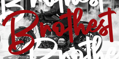 Brothest Street Swag Font Give your designs an authentic handcrafted feel. Brothest Street Swag Font is perfectly suited to logo, stationery, branding, typography quotes, magazine or book cover, website header, clothing, branding, packaging design, restaurant and more.
 - Basquiat Irregular by Cuda Wianki,
$29.00 Basquiat Irregular is a font inspired by graffitti and children's writing. Contains 3 alternative characters for each letter, multilanguage support including cyryllic. It's perfect for creating artistic publications, writing quotes and many other designs. The family also has two fonts with frames, lines and ornaments. Its apperance is rough, hand painted and casual. Perfect for music and street art designs. Frames and lines are created by typing uppercase letters for starting or ending frame or creating an arrow and lowercase letters for typing lines.
 - P22 Sweepy Pro by IHOF,
$39.95 Sweepy is based on his popular Pooper Black but it is lighter and has connecting letters. Sweepy is a brush script that is casual and fluid. In the expanded OpenType version Sweepy is loaded with over 50 alternate characters and ligatures that offer more flexible lettering options. (Sweepy Basic includes 230 glyphs, Sweepy Pro includes 462 glyphs.)
 - Alumina by Rafaeiro Typeiro,
$27.00 Discover Alumina, a typeface that exudes elegance and authority. Its robust weights demand attention, while lighter variants display grace. From bold statements to subtle emotions, Alumina empowers your creativity effortlessly. Suitable for diverse mediums, Alumina remains legible and versatile. Unleash customization with OpenType features like ligatures and fractions. Embrace Alumina as your creative companion, sparking change and expression.
 - Arequipa by Alan Meeks,
$45.00 Arequipa is a Latin font with serifs generally top left. The style is influenced by Aztec and Inca designs the Bold weight is excellant for Headline and the lighter weights work well in limited text. The geometric shape of the serifs, ij dots, full point, comma and cap Q give the font an unusual and distinctive look.
 - Slogan by Linotype,
$29.99Helmut Matheis originally designed Slogan for the Ludwig and Mayer type foundry in Frankfurt, Germany. Slogan is an informal script of medium weight, with some variation in color. Its caps are flowing and the lowercase letters are close fitting. A lighter, more upright companion was designed by Helmut Matheis as well; its design is named Charme. - Silica by Stone Type Foundry,
$49.00 This slab serif is a general purpose type in six weights. The lighter weights are useful for short passages of text. The heavier weights are a versatile tool for setting headlines. Available weights are Extra Light, Light, Regular, Semibold, Bold, Black. Silica was designed to withstand condensation using horizontal scaling without compromising the weighting scheme of the design.
 - Madison Ave. by Funk King,
$10.00 The Madison Ave. family started from Madison Ave. at Fontstruct.com. As my most downloaded font, this was an easy, although not necessarily logical choice to make – regarding taking an existing free font and attempting to offer it for purchase. The font is very basic and simple in its layout, but has achieved popularity over at Dafont with almost 80,000 downloads with its cool, understated nature and inherent sophistication. The original Madison Ave. is now 95 Madison Ave. A couple of glyphs have changed from the original, but mostly the set is the same. The big news here is the availability of multiple variations on the original. Ninety-five refers to the filter settings used to achieve the faint cross lines in the font. The sequence 95-100 provides a gradual fade to solid effect when used together. The other versions use variations on the filter settings that allow each its own distinctive flavor, while at the same time maintaining inherent characteristics of the original. Ninety-five is now joined by 55, 75, 97, 99, 100, 102, 105, 155, 175, 201, 202, and 275. 100 is the solid version which doesn’t contain the trademark lines found in 95. In 95-99, the line width varies to achieve subtle effects. 50 and 85 are distorted by reducing the filter settings in a somewhat minimizing fashion. In 102-205, these are distorted by increasing the filter settings above the normal which is what 100 represents. While some of the effects are extreme and challenge the legibility of text, these can be fun or edgy. They offer a cohesion that can be used to advantage for different projects that require the use of a modern font family.
 - Supa Mega Fantastic by Nicky Laatz,
$28.00 Say hello to Supa Mega Fantastic! A casual font duo consisting of a hand-lettered inky script and a casual inked all caps font. The Script comes with a multitude of additional characters as Opentype Alternates, to add a fancy flair to your words as you require. All uppercase characters have a fancy alternate, and all lowercase letters have a selection of alternates for you to select from to suit your wording best. You can have it plain, or fancy shmancy :) The Script comes in two variants - Regular and slightly thinner. The slightly thinner version is best suited to lighter type on darker backgrounds, and the slightly thicker version is better suited to darker type on lighter backgrounds. Perfect for typography based branding, quotes, packaging design, greeting cards, recipe books, cosmetic brands, retro vintage badge design, creative headers and so much more.
 - Iowan Old Style BT by Bitstream,
$40.99Iowan Old Style was designed for Bitstream in 1990 by noted sign painter John Downer. Iowan Old Style is a hardy contemporary text design modeled after earlier revivals of Jenson and Griffo typefaces but with a larger x-height, tighter letterfit, and reproportioned capitals. Iowan Old Style Titling was designed by John Downer and added to the Iowan Old Style family in 2002. The cap-only character set includes several ornaments and fleurons, broadening the appeal and functionality of the typeface family. Iowan Old Style was originally designed for Bitstream in 1990 by Downer, a noted sign painter. Iowan Old Style is a hardy contemporary text design modeled after earlier revivals of Jenson and Griffo typefaces but with a larger x-height, tighter letterfit, and reproportioned capitals. Expert and old style figure font sets were added in 2000. - Goth Stencil Premium - Personal use only


