3,852 search results
(0.025 seconds)
- North Bergen by Design is Culture,
$39.00 North Bergen is a dirty sans serif based on letterforms seen painted on a wall of a magazine store in North Bergen, New Jersey. Its unrefined, quirky forms reflect a typographic naivete and are meant to evoke a sense of hand painted signage.
 - Sophia Reign by Angele Kamp,
$26.00 Meet Sophia Reign, the perfect font duo! She's got a handwritten signature font and an all-caps font that pairs perfectly with it. Use it for logos, magazines, Instagram quotes, branding, advertisement, and more. Buy this awesome font duo now and start creating!
 - Melisa Script by Lucky Type,
$18.00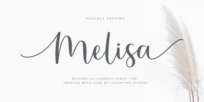 Introduce the latest modern calligraphy font Melisa Script which features a starting and ending swashes. Melisa Script has some beautiful ligatures for your pretty designs. Melisa Script is perfect for wedding stationery, feminime logos, branding and more! Thank you so much for watching.
 - Somatype Skwosh by ArtyType,
$10.00 Somatype Skwosh was born out of a desire to ignore traditional rules for condensed character forms in favour of contrasting vertical and horizontal thicknesses and the interesting shapes produced by re-scaling along only one axis. Somatype Bold was the starting point.
 - Hayden Creek by Letters by Wordsworth,
$34.00 Hayden Creek started as a few letters chosen from vibrant brush lettering. It evolved into a unique font that has an underlying movement with a wonderful energy. The jaunty kick-outs on some of the lower case letters are both fun and elegant.
 - Remedia by Kent Barns,
$5.00 Remedia is a simple linear typeface with a wide range of font weights, from a hairline Ultra Light to Extra Black. Legible in body copy and a great starting point for a unique logo, Remedia is a creative typeface for everyday uses.
 - Sunkiss by Garisman Studio,
$20.00 Sunkiss font starts from a brush stroke with a script style and also follows the times. Sunkiss is very suitable for use in various media such as: packaging, logo, label, poster, shirt design, quotes of wisdom, hand-lettering, typography and many other media.
 - Carlgine by Muksal Creatives,
$10.00 Carlgine is a unique and modern family of serif fonts. Carlgine has 18 families Regular and italic font, starting from the small thin to the largest black. This typeface is versatile and can be used successfully in magazines, posters, branding, websites, etc.*
 - Carltine by Muksal Creatives,
$10.00 Carltine is a unique and modern family of Sans serif fonts. Simply Conception has 18 families Regular and italic font, starting from the small thin to the largest black. This typeface is versatile and can be used successfully in magazines, posters, branding, websites.
 - dearJoe 7 by JOEBOB graphics,
$39.00 The dearJoe series of fonts came to life around the year 1999, when I created dearJoe 1, which was a first (and half-assed) attempt to convert my own handwriting into a working font. Being able to type in my own hand had always been a childhood fantasy, and even though I only partly understood the software, a working font was generated and I decided to put it on the internet for people to use in their own personal projects. Which they did: at this moment the dearJoe 1 font has been downloaded millions of times and can be found on Vietnamese riksjas, Tasmanian gyms and chocolate stores on 5th Avenue for instance. The font is not something I am particularly proud of, but it started me of in building what's now the JOEBOB graphics foundry. Inbetween creating other fonts, the dearJoe series has become a theme I revisit every once in a while, trying to create an update on how my handwriting has evolved, along with my abilities in creating fonts that mimic actual handwriting. In the last decade or so I started implementing ligatures and alternate characters, which helped a lot in coming to a result that can almost pass for actual handwriting. The 2019 dearJoe 7 font is the latest addition to this font family. All characters were scanned from handwritten notes, cherrypicking the characters and letter-combinations I liked best. They were written with a Lamy M66 B pen and only minor adjustments were made to the original scans, leaving most little flaws and rough edges as they were for a convincing ball-point on paper result. The font comes with over 150 ligatures, making sure the font has a variated and credible overall look and feel.
 - Sassoon Handwriting Starter by Sassoon-Williams,
$45.99 Sassoon fonts package for handwriting starters The three upright "infant" fonts developed to meet the demand for letters to produce pupil material for handwriting as well as for reading. Letters have extended ascenders and descenders ideal on screen and print. They facilitate word recognition. The exit strokes link words together visually, also crucially, they space the letters for improved legibility. The "joined" font puts the skills gained into practice producing joined-up handwriting. Together these typefaces provide a valuable resource for Teachers to create consistent material across the curriculum. Sassoon Infant Tracker B font: This font with its direction arrows helps pupils to start in the correct place. Motor movements can be refined by keeping inside the line. When starting and direction is no problem, the arrow font can be dropped and the Dotted font used. Sassoon Infant Dotted B font: Writing over the dots of this font refines motor skills. The aim here is to give confidence by reinforcing starting points, exits and to now encourage fluidity. Sassoon Infant font: With some words in this font and a baseline beneath to copy onto, pupils can use their learned starting points and exit strokes to write freely along the baseline - still unjoined. Once learned, this leads to spontaneous joins along the baseline leading logically to a joined-up hand. Sassoon Joined font: Having learned to write letters with correct starts and exits, this is when the joined font for teaching handwriting can be used. With some words in this font and a baseline beneath to copy onto, pupils can use their learned starting points and simply extend their exit strokes to make joined-up writing. The default joins the font provides are recommended, however there are alternative letterforms that are so important for some Teachers which can be accessed. Create ‘pen lifts’ anytime too! NOTE: Fonts display unjoined by default on this website and are delivered that way - joining is controlled by your text editing application such as Word or TextEdit, read more for instructions… Free to download PDF resources: Stylistic Sets and how to access the alternative letters feature in these OpenType fonts. Using the separate letter fonts Using the joined font Teachers copybooks using these fonts: How to teach pre-cursive Copybook How to teach cursive handwriting Copybook
 - Tubby by Suomi,
$19.00 Tubby came about when I made a book with Cooper Black as a headline font. I started playing with heavy forms, and as a result was Tubby. It has a fat and friendly feel, and with swash italics it is fairly versatile in use.
 - Ronsect by Fontron,
$35.00The idea for this came from a logo I saw which was adapted and simplified to make this font. Almost italic in appearance, it can be used as an alternative sans stencil although that wasn't envisaged at the start. An Italic is also available. - Kensington by AVP,
$29.00 Kensington started life as a sans serif based loosely on the strokes and weights of Garamond but, inevitably, influences of Gill Sans crept in, creating an interesting mix. The single weight is excellent for titling and works as a body font in reasonably small quantities.
 - Gordito by AdultHumanMale,
$10.00 Gordito is a graffiti style bubble font. A little chubby and hopefully a little cute. I wanted this to look fun and maybe like a vandal Smurf has started to ‘Tag’ the Smurf village. The font contains various Glyphs including the Euro symbol. Have Fun.
 - Simply Conception by Muksal Creatives,
$10.00 Simply Conception is a unique and modern family of serif fonts. Simply Conception has 18 families Regular and italic font, starting from the small thin to the largest black. This typeface is versatile and can be used successfully in magazines, posters, branding, websites, etc.*
 - Privé by TEKNIKE,
$39.00 Privé is a display handwriting font. The typeface is a distinct uppercased style hand drawn font and designed to be easy to read. Privé name is Old French for “private” or “participating in secret”. Privé is great for display work, invitations, writing, architecture, posters and headings. Privé is designed by Thoma Kikis and is currently available with Latin, Cyrillic and Greek character sets.
 - Practish by Gleb Guralnyk,
$10.00 Hello! Introducing a Slab Serif font family named Practish. It's a typefaces set that includes 7 weight variations from Bold to Thin. This font has a strict classic shape and diverce characters thickness makes it useful in lots of cases at any sizes, from visit card to billboard. Practish font family has also a multilingual support of west european languages and 13 ligatures.
 - Bs Landscope by Feliciano,
$37.92That’s what people call ‘an experimental typeface’. Yes it is! It consists in letterforms designed in very strict geometrical parameters. I was not thinking about ‘reading’ when I’ve drawn this typeface — rather on different way of projecting our mental image of the words. Do not try to set a book with this type, please! One single version, one single font designed in 2000. - SK Akademkniga by Shriftovik,
$32.00 SK Akademkniga is a monumental classic sans serif with medium contrast. Its strict form emphasizes the uniqueness of each symbol. The typeface supports many languages, including Cyrillic and extended Latin. SK Akademkniga is great for poster design, titles and texts. It also has a versatile geometry, which makes it a great help in work, whether it is graphic design or web design.
 - Unjustified NF by Nick's Fonts,
$10.00 No secret here: this typeface was inspired by the opening credits for the television series "Justified." Alternate upper and lowercase letter to achieve the effect, or—in OpenType-savvy programs—activate the Contextual Alternates (calt) feature. Thin numbers can be found in these positions: ~^{}[]|\<>. Both versions of this font support the Latin 1262, Central European 1250, Turkish 1254 and Baltic 1257 codepages.
 - Palm Court by Scholtz Fonts,
$19.00Palm Court is an elegant, art deco inspired font, reminiscent of glamorous hotels and Hollywood starlets. Its open, clean lines make it a must for magazines, ads and general text. Fully professional, Palm Court contains a complete character set - Upper and Lower case, all numerals, punctuation, symbols and accented characters. It is suitable for use in all major European languages. - II Balfron by Increments,
$19.00 Inspired by Ernö Goldfinger's east London tower block of the same name, II Balfron is an imposing, all caps, one-weight typeface. Brutalist in form, the characters embody the principles of the distinctive 27-storey concrete profile with unexpected angles set within a rigid, structural grid. Much like Goldfinger's humanist, utopian housing ideals, the font is best viewed at large scale.
 - Ciabatta by Sudtipos,
$39.00 Ciabatta is a luscious font made especially for packaging. Thanks to 5 weights, it can be used for all eventualities; powerful in headlines or as lettering, yet very legible in small texts. Its shapes are slightly narrow and based on classical italics but Ciabatta includes alternates with a double-storey ‘a’ and ‘g’ which offer a more formal appearance upright.
 - Soft Block by fontgeneration,
$19.00 The letters possess some of the most characteristic features of this type of font, used for communication and advertising in various mechanized and motor sports, as well as in the gaming industry. The technological-engineering constructiveness is achieved through the strict geometry of the forms, and the sporty competitive look is stylistically expressed through the slopes and contrasts of the beams.
 - CalliSans Variable by 38-lineart,
$140.00 Hello. this is the variable version of CalliSans : a revolution in typography. 14 fonts, 7 regular and 7 italic, seamlessly blend calligraphy's grace with sans-serif simplicity. Perfect for projects demanding elegance, from books to digital screens. Make a bold statement with its distinctive style. Timeless yet contemporary, it transcends trends. Your creative secret weapon. CalliSans Pro: where art meets design.
 - Holigan Style by Sensatype Studio,
$15.00 Holigan is a Modern Sport font that created special for Branding, Title and more stand out typography needs, with extra alternative styles that make your design more memorable. It's so perfect to add your style and headline overview for sport, technology, actions, and fighting theme. And specially for this font, we crafted for bold action style and modern feels so enjoy to create any project that will show your main idea out. Holigan Modern Sport font ready with: 4 Font variation characters prepared to get creative alternatives Preview as a inspirations that you can do with Holigan font Ready with All Uppercase characters Wish you enjoy our font. :)
 - Avega SS by Sensatype Studio,
$15.00 AVEGA is a Modern Sport font that created special for Branding, Title and more stand out typography needs, with extra alternative styles that make your design more memorable. It's so perfect to add your style and headline overview for sport, technology, actions, and fighting theme. And specially for this font, we crafted for bold action style and modern feels so enjoy to create any project that will show your main idea out. AVEGA Modern Sport font ready with: 4 Font variation characters prepared to get creative alternatives Preview as a inspirations that you can do with AVEGA font Ready with All Uppercase characters Wish you enjoy our font. :)
 - Layer by Sensatype Studio,
$15.00 Layer is a Layered Logo Modern Font that created special for Branding, Title and more stand out typography needs, with extra alternative styles that make your design more memorable. It's so perfect to add your style and headline overview for sport, technology, actions, and fighting theme. And specially for this font, we crafted for bold action style and modern feels so enjoy to create any project that will show your main idea out. Layer - Layered Logo Modern Font ready with: Font variation characters prepared to get creative alternatives Preview as a inspirations that you can do with Layer font Ready with All Uppercase characters Wish you enjoy our font. :)
 - Bandera Cyrillic by AndrijType,
$21.00 This square serif typeface is a real workhorse. It is a modern tool for text design: extremely legible and well shaped. Bandera Cyrillic has six weights with original italics. It catches attention in headlines of posters and magazines or makes reading comfortable in plain texts. Bandera Cyrillic shares main proportions with sans serif Osnova Pro typefamily so ideally can pair it. It has Bandera Cyrillic Text and Bandera Cyrillic Display sister families as well. Please check also Pro verion for pan-european support (full Latin-Greek-Cyrillic). Bandera is Spanish for 'flag'. And Bandera is a symbol of Ukrainian fighting for freedom for many years.
 - Metuo by Twinletter,
$12.00 For the younger generation, San Serif has been modernized. Metuo is a modern font available in four weights. Easy to read with eye-catching graphics. It goes well with tech and futuristic themes and may be used for a variety of things, including business logos, packaging, and posters, as well as smaller items like banners, advertisements, apparel design, and letterheads. If you choose this typeface, your project will instantly be engaging and enjoyable, so get started right now! of course, your various design projects will be perfect and extraordinary if you use this font because this font is equipped with a font family, both for titles and subtitles and sentence text, start using our fonts for your extraordinary projects.
 - Edito by Wiescher Design,
$39.50 Edito is a completely new bodycopy font. The special thing about this font is, that all serifs have the same height. So no matter if you take the thinnest cut (A) or the fattest (F), you will always have aligning serifs. I started Edito as an experiment. I tried to enhance the classic and sturdy Times font. But I soon dicovered, that it would be more efficient to take only the basic idea behind Times (the robust design) and start from scratch. It turned out a real solid and useful typeface for everyday use. In due time I will add a couple of extra cuts. Yours in a journalistic mood Gert Wiescher
 - Dusk Til Dawn by Scholtz Fonts,
$19.95 As with Nocturne, Dusk til Dawn recalls the romantic, sophisticated Zeitgeist of the early 20th century, that nostalgic time "between the wars". It as a number of attractive ligatures and upper-case alternates. I have used Nocturne as a basis for Dusk til Dawn, given the font really bold down-strokes, reduced the width of some upper case characters and changed the shape of many lower case characters. Dusk til Dawn comes in two styles: Dusk til Dawn Regular, which uses the Art Deco convention of small x height, and long ascenders. This Display style is perfect for headers, posters, labels etc. Dusk til Dawn Book, which, with its higher x-height and slightly wider characters, is extremely legible and suitable for longer passages of smaller size text.
 - Sinder by The Fontry,
$5.00 It's extended. Somewhat. It's got all the characters. There's a plus. It's fully kerned. That's awesome! And it is rubbed down to the nub. Whuh??? That means it's highly distressed, manually eroded on my work bench. Tortured further to open the wounds using my bitmap editor. Tweaked lovingly and built up to even higher standards of distortion in my vector program. The end result is a font called Sinder. I've even included an "ash" effect. Using the bracket or brace left gives you ashes from left to right as you type your text. Finish your text with ash terminals by typing the bracket or brace right. But be careful. This font is a heavy duty downloader. Make sure all your programs are up to the task, especially before you go converting to vectors.
 - Fellowship by Canada Type,
$24.95 Named in tribute to the members of the American Typecasting Fellowship, this font is an original expression of Jim Rimmer's left-handed calligraphy. It was designed and cut in 24 p in the early 1980s, then cast as foundry type on Jim's own Thompson typecasting machine. This alphabet exhibits classic semi-italic text tension, with sqaurish minuscules and hybrid renaissance majuscules. Jim's unique sense of restrained but attractive typo-calligraphic creativity puts on quite a show here. Fellowship was updated and remastered for the latest technologies in 2013. It comes with plenty of built-in alternates and ligatures. Its glyphset contains over 420 characters, and supports the majority of Latin-based languges. 20% of this font's revenues will be donated to the GDC Scholarship Fund, supporting higher typography education in Canada.
 - ALS Meringue by Art. Lebedev Studio,
$63.00 Meringue, a transitional serif face, is designed specially for modern glossy magazines. It is ideal for fashion photography, fashion publications and mag covers, and can be used for headings and captions, as well as for body copy. The italic version, with its wave-like vertical strokes, creates yet more stylishly expressive feel. Text set in Meringue has an elegant weightless look, and the strongest effect can be achieved with high-quality printing. The typeface includes old style figures, ligatures, and alternative characters that allow creating truly versatile design by means of typography. Designers may also find Meringue perfect for beautiful presentations, invitations and other special occasion papers. Meringue was designed during the Type and Typography course at the British Higher School of Art and Design, supervised by Ilya Ruderman.
 - Hamburger by FontMesa,
$29.00 Our new Hamburger font is based on the old classic Brush Script design with many new additions. We've added many alternates to the design including lowercase swash tail letters, swash underscores and a few alternate uppercase letters. Upright scripts are popular these day so new to this old type design is a near upright script version, a lot of hand work went into producing it. One of the biggest problems with the old Brush Script font is that people use it as all caps, which doesn't look good because of the extended swash on the top left side of the caps letters. We've fixed that problem by making an all caps version where the caps in the lowercase position have the top left swash tucked in to help the letters display better as an all caps font. We've also created a small caps version, again the small caps lowercase have all the top left swashes tucked in to bring the letters closer together for a better display. Also new to this font are two higher x-height versions that are ideal for signage. The first is Hamburger X which stands for extra x-height and the second is Hamburger SPX which stands for super x-height. Both of these higher x-height fonts are suitable for signage on a building, billboard and vehicle lettering where you're looking for faster readability from moving traffic. We've designed a new lowercase b and moved the original to an alternate position. We've also redesigned the uppercase C bringing the bottom up to the baseline and moved the original C to an alternate position. The original lowercase g was open at the top, we've closed it and we're not offering the original g as an alternate.
 - Prismatic Interlaces by MMC-TypEngine,
$93.00 PRISMATIC INTERLACES TYPEFACE! Prismatic Interlaces is a decorative system and ‘Assembling Game’, itself. Settled in squared pieces modules or tiles, embedded by unprecedented Intertwined Prismatic Structures Design, or intricate interlaced bars that may seem quite “impossible” to shape. Although it originated from the ‘Penrose Square’, it may not look totally as an Impossible Figures Type of Optical Illusions. More an “improbable” Effect in its intertwined Design, that even static can seem like a source of Kinetical Sculptures, or drive eyes into a kind of hypnosis. Prismatic Interlaces has two related families, both as a kind of lighter weight versions Prismatic Spirals Default & Pro. While Default is simpler or easier to use, same way as Prismatic Interlaces, Pro provides a more complex intricate Design that requires typing alternating caps. Instructions: Use the Map Font Reference PDF as a guide to learn the 'tiles' position on the keyboard, then easily type and compose puzzle designs with this font! All alphanumeric keys are intuitive or easy to induce, you may easily memorize it all! Plus, often also need to consult it! *Find the Prismatic Interlaces Font Map Reference Interactive PDF Here! (!) Is recommended to Print it to have the Reference in handy or just open the PDF while composing a design with this typeface to also copy and paste, when consulting is required or when it may be difficult to access, depending on the keyboard script or language. As a Tiles Type-System, the line gap space value is 0, this means that tiles line gaps are invisibly grouted, so the user can compose designs, row by row, descending to each following row by clicking Enter, same as line break, while advances on assembling characters. Background History: The first sketches of my Prismatic Knots or Spirals Designs dates back then from 2010, while started developing hand-drawn Celtic Knots and Geometric Drawings in grid paper, while engage to Typography, Sacred Geometry and the “Impossible Figures” genre… I started doing modulation tests from 2013, until around 2018, I got to unravel it in square modules or tiles from the grid, then idealized it as fonts, along with other Type projects. This took 13 years to come out since the first sketches and 6 months in edition. During the production process some additional tiles or missing pieces were thought of and added to the basic set, which firstly had only the borders, corners, crossings, nets, Trivets connectors or T parts and ends, then added with nets and borders integrations. Usage Suggestions: This type-system enables the user to ornate and generate endless decorative patterns, borders, labyrinthine designs, Mosaics, motifs, etc. It can seem just like a puzzle, but a much greater tool instead for higher purposes as to compose Enigmas and use seriously. As like also to write Real Text by assembling the key characters or pieces, this way you can literarily reproduce any Pixel Design or font to its Prismatic Spirals correspondent form, as Kufic Arabic script and further languages and compose messages easily… This Typeface was made to be contemplated, applied, and manufactured on Infinite Decorative Designs as Pavements, Tapestry, Frames, Prints, Fabrics, Bookplates, Coloring Books, Cards, covers or architectonic frontispieces, storefronts, and Jewelry, for example. Usage Tips: Notice that the line-height must be fixed to 100% or 1,0. In some cases, as on Microsoft Word for example, the line-height default is set to 1,15. So you’ll need to change to 1,0 plus remove space after paragraph, in the same dropdown menu on Paragraph section. Considering Word files too, since the text used for mapping the Designs, won't make any literal orthographical sense, the user must select to ignore the Spellcheck underlined in red, by clicking over each misspelled error or in revision, so it can be better appreciated. Also unfolding environments as Adobe Software’s, the Designer will use the character menu to set body size and line gap to same value, as a calculator to fit a layout for example of 1,000 pts high with 9 tiles high, both body size and line gap will be 111.1111 pts. Further Tips: Whenever an architect picks this decorative system to design pavements floor or walls, a printed instruction version of the layout using the ‘map’ font may be helpful and required to the masons that will lay the tiles, to place the pieces and its directions in the right way. Regarding to export PNGs images in Software’s for layered Typesetting as Adobe Illustrator a final procedure may be required, once the designs are done and can be backup it, expanding and applying merge filter, will remove a few possible line glitches and be perfected. Technical Specifications: With 8 styles and 4 subfamilies with 2 complementary weights each (Regular and Bold) therefore, Original Contour, Filled, Decor, with reticle’s decorations and 2 Map fonts with key captions. *All fonts match perfectly when central pasted for layered typesetting. All fonts have 106 glyphs, in which 49 are different keys repeated twice in both caps and shift, plus few more that were repeated for facilitating. It was settled this way in order for exchanging with Prismatic Spirals Pro font which has 96 different keys or 2 versions of each. Concerning tiles manufacturing and Printed Products as stickers or Stencils, any of its repeated pieces was measured and just rotated in different directions in each key, so when sided by other pieces in any direction will fit perfectly without mispatching errors. Copyright Disclaimer: The Font Software’s are protected by Copyright and its licenses grant the user the right to design, apply contours, plus print and manufacture in flat 2D planes only. In case of the advent of the same structures and set of pieces built in 3D Solid form, Font licenses will not be valid or authorized for casting it. © 2023 André T. A. Corrêa “Dr. Andréground” & MMC-TypEngine.
 - Milligan by Greater Albion Typefounders,
$14.50 Milligan is named in honor of the late Spike Milligan, a wonderful comedian who (amongst many other things) wrote and start in the Goon Show. It's a jolly, boisterous display Roman which can bring a sense of liveliness and fun to any project where it's used.
 - Bulgari by Slex Studio,
$15.00 Bulgari is an organic handwritten font suitable for branding, wedding invitations, promotions, product packaging and other necessities. This font is modern, simple, but still authentic. You'll get a full set of lowercase and uppercase letters, numbers and punctuation, multilingual symbols, lowercase start and end swashes, and ligatures.