3,852 search results
(0.024 seconds)
- Strawn by PizzaDude.dk,
$20.00 Strawn is my Wobbly and curvy funk font with bouncy serifs. Watch it bounce its way down the street, or into your next project - you know, that one that needs a fresh breath of fun! Comes with both fi and fl ligatures! You will need to use OpenType supporting applications to use the autoligatures.
 - Nutty Noisses by Gassstype,
$25.00 Here comes our new font Nutty Noisess Inspired from old skool graffiti tagging, street art, we created this Typeface, drawn in Procreate app, then vectorized and crafted carefully. Nutty Noisess Suitable for many design project, branding, packaging, logo, wall art, headline, template, banner, poster, and many more projects. These include all caps, punctuation, and numerals.
 - ViabellaT H Pro by Elsner+Flake,
$40.00 The script version of the typeface Viabella introduces us to the calligraphic side of the Berlin type designer and typographer Karl-Heinz Lange. The sketches for this script typeface, which resulted from the close cooperation with Veronika Elsner and Günther Flake, found their roots in sketch drawings which Karl-Heinz Lange had already drawn in the 1980’s. For the Viabella design, Karl-Heinz Lange drew the basic letterforms of the Black and Regular cuts with a brush. He then re-worked the drawings and transferred them on to tracing paper. The design studio Elsner+Flake in Hamburg cut these typeface extensions and later digitized them manually with the help of the IKARUS Sustem. With the Regular cut as a basis, Elsner+Flake extended the family with the Light version and interpolated and re-worked the Medium weight. The completion of the family was taken over by the type designer Björn Gogalla who had done the same kind of work on Rotola, a design which Karl-Heinz Lange had also created for Elsner+Flake. While Viabella was originally conceived as a headline typeface, its lighter weights can certainly be used for shorter text applications. The Black version creates powerful headlines with highly effective accents. With the help of swashes, which are available for all weights, the user can lighten up longer texts and add special character to titles. In contrast to pure headline fonts, Viabella has been enriched by an extensive complement of special characters. In addition to the Europa-Plus character set which allows setting type in over 70 latin-based languages, the user will find multiple versions of numerals as well as oldstyle figures, tabular and proportional lining figures, diagonal fractions, and a complete set of superior and inferior figures and fractions (60%). With such a rich character set, Viabella is not only ideal for many different uses in the areas of newspaper, magazine and advertising but it will surely be chosen for the design of greeting cards, invitations and other design projects within the privat sphere.
 - Narrow Path by Ingrimayne Type,
$9.00 NarrowPath is a family of 18 condensed and ultra-condensed sans-serif typefaces. The family was derived from the font family NarrowWay by adding true lower-case letters. Some alternative letters forms can be reached with the OpenType feature of stylistic sets. The character spacing in most of the styles is quite loose and it can be tightened with an application's character spacing if needed. These typefaces are display faces that can be useful for squeezing tall lettering into tight spaces. Uses may include packaging, signage, and titles.
 - Dimitrina by Evolutionfonts,
$- Dimitrina was created with a simple premise: Can there exist a typeface which features a minimum of sharp angles? And a readable typeface, as well? With these strict rules in mind, the development started. At first the typeface looked more like a script, and some characters ( M G or R, to name a few) still hold traces of a handwritten style which spices the overall taste of Dimitrina. Since the first draft every character was redrawn, and edited several times, for the purpose of making the typeface readable, and distinct at the same time. Estimate for yourself if our goals are achieved, while you observe the three weights which are available exclusively in MyFonts. All of them feature a full set of characters plus cyrillic support. You can also try the regular weight which is offered free.
 - Malino by Lafontype,
$25.00 Malino is a humanist sans serif that gives a slightly stiff and strong feel but still presents a harmonious blend. The main characteristic of Malino is the flat shape at the end of the letter (specific : inner side of the letter C, G, J, S, a, c, e, g and s) and still maintain the curvature of the outside (Overshoot) so that empty space ( Open Counter) looks wider and the level of readability produced is much higher.
 - Aragon Sans by Canada Type,
$24.95 Designed as a companion to its roman namesake, Aragon Sans is a novel approach to the humanist sans serif. Using the underlying blueprint of true and trusted 16th century forms, its humanism is deeply rooted in fine typographic tradition. By also using the same idea as its roman counterpart, where the stems gradually thicken as they go higher, it becomes a unique breed of sans serif, conservative, and legible in small text, and attractively modern in titling setting.
 - Paradiso by 4RM Font,
$40.00 Inspired by the beauty of the sunset, the paradiso font is made with attention to the beauty of the harmonious letterforms and the height of the ascender is made higher and the width of each letter is made in a extra condensed style making this font look authentic and has the characteristics of deep beauty, this font is a Display category font which is suitable for use in designs such as billboards, logos, posters, and others.
 - Cervo Neue by Typoforge Studio,
$29.00 Cervo Neue is the new perfected and extended version of Cervo, containing 18 variants. It differs from the previous version with the higher accents over glyphs, enlarged punctuation, old-style numerals and the newly added varieties Semi Bold, Bold, Extra Bold and Black. Additionally, there is the variety of grotesque. Font Cervo is inspired by a “You And Me Monthly” published by National Magazines Publisher RSW „Prasa” that appeared from Mai 1960 till December 1973 in Poland.
 - Sarabande by Three Islands Press,
$24.00Sarabande is a painstaking reproduction of Jean Jannon's famous "Garamond" of 1621 -- also known as "Caracteres de l'universite." Whereas the original was intended for setting French and Latin text only, Sarabande has all standard international characters and diacritics, along with a Euro symbol. (There are however no characters for higher mathematics or logic, and the number of other unhistorical characters has also been kept to a practical minimum.) Sarabande comes with two styles: a roman and a true italic. - Kamerik 205 by Talbot Type,
$19.50 Kamerik 205 is inspired by the classic, geometric sans-serifs such as Futura and Avant Garde, but has shallower ascenders and descenders for a more compact look, and features a traditional double-storey lower case a and g. It's a versatile, modern sans, highly legible as a text font and with a clean, elegant look as a display font at larger sizes. It includes old style non-aligning (lower case) numbers, both proportional and tabular as well as accented characters for Central European languages. The Kamerik 205 family comprises of six weights, and is closely related to Kamerik 105. The most notable differences between the two variations, are the two-storey lower case a and g in Kamerik 205, where they are single-storey in Kamerik 105.
 - CA Saygon Text by Cape Arcona Type Foundry,
$40.00 CA Saygon Text is the logic consequence of CA Saygon. It is much calmer and therefore also suitable for reading texts and everyday’s editorial tasks. Basic shapes and proportions were adopted from Saygon and continued in such a way that a font family from Thin to Extrabold resulted. A fundamental inspiration were early static grotesque typefaces such as Akzidenz Grotesk. Nevertheless, the typeface was by no means intended to have a historical look. Thus, a relatively high x-height was chosen, which makes the typeface quite economical in type-setting, since the letters appear visually larger. A relatively small line spacing with good legibility can be achieved due to the small ascenders and the low cap height. Letters like f and t, which otherwise tend to end in curves, were given right angles, which on the one hand meets certain design elements of the original Saygon, but on the other hand also refers to contemporary trends in typeface design. A special feature are the five styles in which CA Saygon Text can be used. The default setting is the Helvetica style, with two-storey a and g. The Futura style has a single-storey a and a two-storey g accordingly. The third style with two-storey a and three-storey g is called the Franklin style. But the real highlight is the Cape style with single-storey a and three-storey g – a real rarity up to now. Let yourself be inspired by this unusual typeface. If you like it even more progressive, you should try the flat style, which continues the right angles in a, g, and y as well. Thanks to the Cyrillic and Latin Extended character sets, a huge linguistic area is covered that even extends to Vietnam! Even the exotic German capital-double-s is available and appears automatically when typed between other capital letters. Numerous OpenType features make life easier for the professional typographer: there are fractions, superscript and subscript numbers, as well as proportional and tabular capitals.
 - The City Burn by Alien,
$40.00 The City Burn, formerly called "The city burn night after night and we spray-paint the walls", was especially designed for Mad Skills Mag issue#3 Urban Flavour. It needed to be street, and urban, so I made a stencil font. It’s used by Fox5 tv for the rant TV show, the website infected.com, Fried chillies TV, and others!
 - Wild Grook by Attype Studio,
$18.00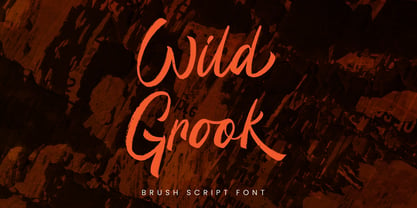 Introducing Wild Grook - Inspired by urban typeface with texture style, Wild Grook has strong character perfect for urban street design. Wild Grook is perfect for branding, logo, invitation, stationery, product packaging, merchandise, monogram, blog design, game titles, cute style design, Book/Cover Title and more. Features : - Ending swash - Ligatures - Multilingual Support Hope you enjoy with our font! Attype Studio
 - Hypothesis by Arendxstudio,
$25.00 Hypothesis is a typeface inspired in tattoo letters, chicano culture and calligraffiti. It works well with normal size text, but it works even better for large displays, short words, or even just to incorporate a few or single characters in a design. Suitable for many creative products & tattoo designs, like posters, t-shirt, street wear, logo, signage, headlines, etc.
 - Wahwoh by 38-lineart,
$14.00 WAHWOH is a heavy allcaps font which is perfect for heavy titles and headlines. The uppercase looks rough while the lowercase looks sharp. This typeface gives the impression of street style, bold, retro, urban and modern style. Clear and bold, easy to combine with other artwork and typefaces, this is the reason why you should have this font.
 - Urban Vibe by DainType,
$15.00 We tried to implement graffiti that is common in our city. Everyone wants to express themselves. Whether in writing, painting on canvas or on the street, everything must be respected as art. It can be useful when you want to express graffiti art, but also consider readability. You can also work easily with three color fonts.
 - Euripedes JNL by Jeff Levine,
$29.00 The Greek-influenced hand lettering on a 1930s WPA (Works Progress Administration) poster for the Federal Theater presentation of "Trojan Incident" inspired Euripedes JNL. The play was based on Homer and Euripedes, and was presented at the off-Broadway St. James Theatre (which opened in 1927 at 246 W. 44th Street on the site of the original Sardi's restaurant).
 - Theater Lights JNL by Jeff Levine,
$29.00 Vintage sheet music for the title song from the film "Forty Second Street" was the inspiration for Theater Lights JNL. While the idea of letters comprised of circles (to simulate bulbs) can be both vintage [as in marquee lights] or modern [simulating dot matrix printers], it is always a fun approach to a tried-and-true style.
 - Midnight Rookie by Hatftype,
$15.00 Midnight Rookie - A Graffiti Display Font is a free style font that has the characteristics of street art that shows freedom and is filled with unique characters. Features : • Character Set A-Z • Numerals & Punctuations (OpenType Standard) • Accents (Multilingual characters) • Ligature • Alternate. There it is. I really hope you enjoy it. Comments & likes are always welcome and accepted.
 - AT Move Holborn by André Toet Design,
$39.95 HOLBORN Aptly named after ‘High Holborn’, a high-street in London where the Central School of Art & Design was based. A font, just in capitals, based on the original design and the earlier sketches (1976) by André Toet. The strong optical illusion in this alphabet makes it an outstanding typeface. Concept/Art Direction/Design: André Toet © 2017
 - Juneway JNL by Jeff Levine,
$29.00 Jeff Levine acquired a set of original water-applied decals made by the Duro Decal Company of Chicago (now Duro Art Industries) and painstakingly recreated one of the classic hand-drawn typefaces from the Duro line. Named after the street where the company is located, Juneway JNL is an authentic reproduction for the computer-based designer.
 - Midtown Tessie NF by Nick's Fonts,
$10.00A sign at the 81st Street (Museum of Natural History) New York subway stop provided the pattern for this mosaic tile face. The font features a full-tile background at the bar position (shift-backslash) and left-and-right pointing fists at the brace positions as well as complete Latin 1252 and Central European 1250 character sets. - Arts Glory by Hatftype,
$15.00 Arts Glory - Graffiti Font is a free style font that has the characteristics of street art that shows freedom and is filled with unique characters. Product Include : Arts Glory (OTF,TTF Format) Arts Gloryt Webfont (WOFFFormat) Features : • Character Set A-Z • Numerals & Punctuations (OpenType Standard) • Accents (Multilingual characters) • Ligature • Alternate There it is. I really hope you enjoy it.
 - Brush King by Subectype,
$17.00 Brush King is a supercharged, street-wise brush font bursting with energy, with extra attention to quick strokes and sharp details. This font is perfect for challenging jobs, titles, t-shirts, websites, hoodies, and various print and digital media with energy. Brush King is ideal for logos, apparel, quotes, product packaging, or anything which needs a typographic turbo-boost.
 - Dark Blades by Tadiar,
$19.00 Dark Blades is an authentic gothic vintage font family of 4 fonts created for headers and text. Multilingual support (Latin Extended). Designed for: - Vintage branding (Clothes, Alcohol, Bikes, Games) - Horror - Music branding - Myth: Vampires, Zombie, Halloween, Werevolves, Magic, Fantasy - Medieval style Well use in vintage labels, headers & titles, Posters, Street Signs and other Outdoor, Package Design.
 - Agneya by Seventh Imperium,
$37.00 Agneya is calligraphy script font, inspired by urban street art. Equipped with opentype features. Stylistic alternates, swash and more 600 glyph. It is make easily to create such as Signpainter logo and various purposes. Just open the Opentype Alternates and choose The alternates that fit best, and you can play with your creation to make your unique designs.
 - Fatigue by Typesthetic Studio,
$13.00 Heroic is a bold and playfull handwritten brush font. This font is very unique because sometimes it can look fierce like in modern street art graffiti if with capital letters, but sometimes it can look cute if it is included with the lowercase letters. As a result, this font can matches a wide pool of designs.
 - Bomber Urban by Nirmana Visual,
$22.00 Bomber Urban Inspired by Graffiti Street Art, Bomber Urban is a fun, urban-style display font. This font is suitable for designs like logos, advertising, apparel, jerseys, sportswear, skateboard designs, and more. Take your concepts to the next level with this stunning font! Make your designs stand out with the urban and edgy look of our Graffiti font.
 - Just Pixo by Latinotype,
$29.00 Inspired by the streets of Brazil, Just Pixo is a display typeface that mimics pixação, Brazilian graffiti. In his book Pixação: São Paulo Signature, François Chastanet says, “This alphabet, with its vertical inscriptions axis, is to be directly classified in the king-size, monumental category; the systematic use of capitals, meticulously aligned and justified, their extreme verticality, are symptomatic of this architectural dimension”. As such, we designed Just Pixo for monumental type sizes and vertical alignments—a family with seven weights, alternate glyphs, multiple ligatures and is provided as a Variable Font too. Unique decorative serif capitals and lowercase sans serif versions make Just Pixo the perfect option for large displays, strong headlines, urban logos, and contemporary concepts. Despite its controversial use on the streets, this often politically charged style will typeface will take your next project to the next level.
 - SirClive - Unknown license

- Quiroh by Hashtag Type,
$32.00 Quiroh is a functional typeface that expresses both artistic life and emotion. Taking its inspiration from the industrial revolution of the 19th Century where romance and science coincided. With a cushioned finish and designed according to traditional conventions, the sentiment is equally as important as the reason, resulting in a very pleasurable read. Quiroh includes both heavy display weights and lighter weights for small copy, it's a perfect tool for communicating to the masses. Tall ascenders and descenders give the typeface a distinctive look with an elegant feel, and while these expressive forms invite the reader to observe its visible shape and appearance, its rhythm and function invites the reader to peruse at their leisure. Full details include 7 weights from thin to heavy with over 470 characters, manually edited kerning and OpenType features.
 - Bommer Sans by dooType,
$30.00Bommer Sans is a warm and friendly type with a distinguishable look. It has been designed to add our twist to the flavour of English humanistic sans serif typefaces. Bommer Sans works like a charm for editorial, headlining, exhibition, signage and wayfinding projects. The big x-height and ascenders close to cap height favor tighter interlinear spacing. The ‘Q’ tail, resting on the baseline, is an invitation to play vertical, stacking lines of caps. Curved strokes on the ‘i’, ‘k’, ‘l’, ‘K’ and ‘R’ bring a friendly touch without compromising the sturdy structure, a marked characteristic of the design of the figure set. With seven weights in the upright and its matching italics, Bommer Sans has 14 styles and is part of the Bommer family. Check Bommer Slab for a great companion! - Darlene by Dominik Krotscheck,
$12.00 Darlene is a sans with contrast and round corners. The absence of serifs results in a clean look, the contrast adds a touch of elegance and the soft edges help to keep it all friendly looking. So whenever you need to convey any of these traits, Darlene is perfect for you. Mainly intended for headlines, logos, invitations or other display uses, this font family provides enough readability to be used for short texts, especially the lighter weights. This means that Darlene is great if you want to use it as a counterpart to a script or handlettering, or simply to juxtapose a more playful or kitschy font. Darlene is available in three weights with italics and equipped with lots of accented characters to cover heaps of languages using the latin alphabet.
 - Lagos by Scholtz Fonts,
$19.00 Lagos was created because of the lack of African-inspired fonts that are truly modern without being partly art-deco in origin. I wanted to make a vigorous, sharp-edged font that reflects the energy and dynamism of modern Africa. The lines of the font combine the sharp angularity of African rocks and mountains with the smooth fluidity of Africa's snake-black rivers. The font is supplied in two styles, Lagos Regular and Lagos Light. Lagos Light is not a simple, mechanical modification of Lagos Regular. The outlines and proportions have been subtly modified to accommodate the lighter weight. Lagos contains a full 256 character set (upper and lower case, punctuation, diacritical characters, special symbols and numerals), in which all characters have been fully kerned and letter-spaced.
 - Grange Text by Device,
$39.00 Grange Text is optimised for smaller text sizes, having more open character shapes and spacing. Use the non-text version of Grange for larger sizes and headlines, which has tighter spacing and detailing. Grange is the Device interpretation of the classic “Grot” thick/thin sans style. Unlike the traditional models on which it is based, Grange takes a rational, consistent approach across wide range of weights and widths for contemporary use. The font includes alternative curved and straighter versions of key characters, most obviously the lower-case ‘g' and capital ‘R', allowing the font to take on either a sharper or warmer, more playful appearance. These can be toggled on or off using the ‘Alts' feature in Illustrator, or ‘Stylistc Sets’ in Indesign. Contains proportional, lining and tabular numerals.
 - Neon Rounded by Joe Hewitt Design,
$12.99 Neon Rounded is a rounded monoline typeface inspired by retro neon light bulbs often used in signage. Neon bulbs were first seen back in 1910 in Paris. They later became popular in 1930s New York, especially on Broadway and the Las Vegas strip. Although Neon Rounded was designed with eye-catching signs in mind, its possible usage is vast. Clothing brands, road signs, logos and advertising. The heavier weights lend themselves to children's books and toys, while the lighter weights provide a more modern, futuristic feel. The typeface contains lower and uppercases in five weights: Light, Regular, Medium, Semi-bold and Bold. There are also alternatives for most letters and all numbers. The glyph set includes all languages covered in Basic Latin, Latin-1 Supplement and Latin Extended-A scripts.
 - Midmoon Gothik by Andy Peat,
$10.00 About this font family Midmoon Gothik was designed for typesetting magazines and information-heavy publications; using simple, clean letterforms for clear communication but with enough character to make it enjoyful. The new lighter weights are a nice addition to the set allowing for finer control over the texture of the page. Features 4 weights; Hairline, Thin, Light and Regular. Multi language Ligatures: fi fl ij ffi ffl fb fj ff fk fh Numerals: tabbed lining, proportional lining, proportional oldstyle Fractions: ½, ¼, ¾, ⅛, ⅜, ⅝, ⅞ Symbols: ¶ § © ® ℗ ™ ° † ‡ ℮ ¢ ¤ $ € ₣ ₤ ₧ £ ₽ ¥ Maths: ⁼+−×÷=≠> Arrows: ↑↗→↘↓↙←↖↔↕ Capital spacing To be able to access alternative fonts, make sure the software you use can support opentype features such as Microsoft Word, Paint, Adobe, Corel draw, Cricut and other applications. Designed and published by Andy Peat. www.andypeat.com Released October 2022
 - Rhodes by Eurotypo,
$19.00 Rhodes is a modern geometric sans serif consisting of 5 weights ranging from Extra Light to Bold with matching true italics. Its variety of weights provide a range of choices that will help you find the best typographic color for your project. Lighter weights are well-suited for body text while heavier ones are ideal for high impact headlines. Rhodes has been designed purposely to enable brands to appeal more emotionally to modern consumers. The balanced characteristic of Rhodes with unique details, such as the geometric form and the prominent x-height makes it perfect for strong headlines and outstanding logos, but also suitable for long text. Rhodes includes a set of ornaments in regular and italic to be able to combine it with the glyphs and thus, to give your designs more exclusivity.
 - Hostil by Intellecta Design,
$34.95Hostil is a modern typeface ready to fight for you. In any territory. Hostil has complete sets in Latin, Hebrew, Cyrillic, and Greek chracters. Plus Central European, Vietnamese, Baltic, Turkish complete sets with all diacritic signs and punctuation marks and extra characters belonging this ranges. Hostil has a wide variety of presentations, like Regular, Bold, Italic, Outline Wide, ExtraWide, Shadow and Compressed.
