7,845 search results
(0.021 seconds)
- Cresta by James Todd,
$40.00 Loaded with personality and functionality, Cresta is built to look good while surviving the worst conditions. It is at home on screen and in a magazine. Its six weights are intended to be used everywhere. Unlike most typefaces, Cresta was built without a reference. For this project, everything design choice was based on what worked best for a workhorse sans serif family. Cresta was originally created as the primary typeface for this website. This meant it needed to work in copy, headlines, and navigation across all devices, browsers and operating systems. This meant it needed to be sturdy and have enough character to make it stand out from other UI typefaces. With its large x-height, ample counters, and giant apertures, Cresta is meant for easy utility in rough conditions. Even with all of this, that doesnít mean that its dull; as the weights increase, the style of Cresta becomes more appearant. This style is defined most apparently by the terminals on the lowercase r and the angle of the joins between the curved and straight strokes (such as in the connection on the n).
 - Helios Antique by W Type Foundry,
$25.00 Helios Antique & Helios Stencil Check our PDF specimen for more details Helios type family is the result of a mixture between the early sans serif and the modern trends of our era. Its rational structure is subtly wider than the majority of the first sans, generating a higher impact in its uses. All the typeface terminals are more open in order to balance better the whites and blacks of Helios, and where the strokes meet it has a deeper contrast giving more legibility to the reader. Furthermore, in some letters it is possible to see some prominent features such as the leg of the "R" and the tail of the "Q", which are particular gestures that identify this type family. Helios Stencil is the tough version of this type family. All the stencil gaps were measured rigorously, thus in small sizes it conveys a neutral aesthetic whereas in big sizes a display logic appears. Helios Antique is composed by 36 styles, 782 glyphs and small caps. Besides, it has powerful OpenType features for each style, including alternates characters, ligatures, fractions, special numbers, arrows, extended language support and many more.
 - Classic Trash BRK Pro by CheapProFonts,
$10.00 A typical Art Deco font with high contrast. I have mirrored the uppercase A and M to give the strokes a correct direction, and shortened/widened a few lowercase letters to give the text a more even color. A stylistic 30s-looking font is ready for international text-setting! ALL fonts from CheapProFonts have very extensive language support: They contain some unusual diacritic letters (some of which are contained in the Latin Extended-B Unicode block) supporting: Cornish, Filipino (Tagalog), Guarani, Luxembourgian, Malagasy, Romanian, Ulithian and Welsh. They also contain all glyphs in the Latin Extended-A Unicode block (which among others cover the Central European and Baltic areas) supporting: Afrikaans, Belarusian (Lacinka), Bosnian, Catalan, Chichewa, Croatian, Czech, Dutch, Esperanto, Greenlandic, Hungarian, Kashubian, Kurdish (Kurmanji), Latvian, Lithuanian, Maltese, Maori, Polish, Saami (Inari), Saami (North), Serbian (latin), Slovak(ian), Slovene, Sorbian (Lower), Sorbian (Upper), Turkish and Turkmen. And they of course contain all the usual "western" glyphs supporting: Albanian, Basque, Breton, Chamorro, Danish, Estonian, Faroese, Finnish, French, Frisian, Galican, German, Icelandic, Indonesian, Irish (Gaelic), Italian, Northern Sotho, Norwegian, Occitan, Portuguese, Rhaeto-Romance, Sami (Lule), Sami (South), Scots (Gaelic), Spanish, Swedish, Tswana, Walloon and Yapese.
 - FF Nort by FontFont,
$72.99 FF Nort™ has all the design attributes that make for an exceptionally versatile print and web typeface – and it benefits from a distinct personality. Equally at home in long-form text copy or billboard size headlines, the family knows few boundaries. There is also a handcrafted neo-grotesque quality to the design, giving FF Nort a friendly mien and separating it from other industrial strength sans serif typefaces. Terminals are clipped at 90° angles to the stroke and counters are slightly condensed, saving space with no loss of legibility. The light weights have a subtle elegance, while the bold are commanding. All eight weights, and their italic companions, enjoy a large character set, with support for most Central and several Eastern European languages – including Cyrillic and Greek. Drawn by Jörg Hemker, the inspiration for FF Nort came from Transport, the typeface designed for Britain’s highway signage. Transport is formal, intellectual, and a model for modern street signage, but it was not intended for small sizes or continuous reading. Hemker took the basic structure of Transport and rebuilt it into a design that’s perfect for a wide range of contemporary hardcopy and digital imaging projects.
 - Casandra Lie by IbraCreative,
$17.00 Casandra Lie – A Chic Monoline Script Font Casandra Lie, a name like a whispered secret, perfectly embodies the essence of this chic monoline script font. Imagine the delicate stroke of a fine penmanship teacher gliding across paper, leaving behind an effortless trail of ink that dances and twirls with understated elegance. Every letter whispers tales of romance and intrigue, their slender forms adorned with graceful swashes and subtle flourishes that hint at a hidden passion. Think vintage Parisian boudoirs illuminated by candlelight, secret love letters penned under twilight skies, and the airy charm of handwritten invitations to soirees under the stars. Casandra Lie is not merely a font; it’s an invitation to a world of whispered dreams and unspoken promises, etched in ink as delicate as a spider’s web, yet strong enough to capture the beating heart of a story waiting to be told. Casandra Lie is perfect for branding projects, logo, wedding designs, social media posts, advertisements, product packaging, product designs, label, photography, watermark, invitation, stationery, game, fashion and any projects. Fonts include multilingual support for; Afrikaans, Albanian, Czech, Danish, Dutch, English, Estonian, Finnish, French, German, Hungarian, Italian, Latvian, Lithuanian, Norwegian, Polish, Portuguese, Slovak, Slovenian, Spanish, Swedish.
 - Blue Signature by Mans Greback,
$69.00 Blue Signature is a playful and expressive handwriting font that exudes a wild and untamed feel. Its looping, flowing strokes and elegant curves give it a unique and authentic look that is perfect for adding a personal touch to your designs. Designed with a focus on creating a signature-like quality, Blue Signature is perfect for anything from logos and branding to social media posts and invitations. Its cute and expressive style is sure to make a lasting impression on your audience. Blue Signature comes in four styles: Regular, Italic, Bold, and Bold Italic, allowing for versatility and creativity in your designs. Use underscore _ anywhere in a word to make a swash. Example: White_sign Use multiple underscores to make different swashes. Example: Love____letters Use * to make flowers! Pink*Roses Spring***Party The font is built with advanced OpenType functionality and has a guaranteed top-notch quality, containing stylistic and contextual alternates, ligatures and more features; all to give you full control and customizability. It has extensive lingual support, covering all Latin-based languages, from Northern Europe to South Africa, from America to South-East Asia. It contains all characters and symbols you'll ever need, including all punctuation and numbers.
 - Sakura by MKGD,
$13.00 Early in my career as a graphic designer I purchased a book on Japanese packaging. With it, I came to notice that Japanese characters used mostly a modicum of strokes. This font was my attempt at trying to balance the familiarity of a Latin alphabet with the unfamiliarity of Kanji and Kana. It was more of a typographical challenge than usual; since going too much in either direction would defeat the purpose. I would like to think that, for the most part, I got the balance right. Sakura has a glyph count of 389 and supports the following languages Afrikaans, Albanian, Asu, Basque, Bemba, Bena, Bosnian, Catalan, Chiga, Colognian, Cornish, Croatian, Czech, Danish, Embu, English, Esperanto, Estonian, Faroese, Filipino, Finnish, French, Friulian, Galician, German, Gusii, Hungarian, Icelandic, Indonesian, Irish, Italian, Kabuverdianu, Kalaallisut, Kalenjin, Kamba, Kikuyu, Kinyarwanda, Latvian, Lithuanian, Low German, Lower Sorbian, Luo, Luxembourgish, Luyia, Machame, Makhuwa-Meetto, Makonde, Malagasy, Malay, Maltese, Manx, Meru, Morisyen, North Ndebele, Norwegian Bokmål, Norwegian Nynorsk, Nyankole, Oromo, Polish, Portuguese, Romanian, Romansh, Rombo, Rundi, Rwa, Samburu, Sango, Sangu, Scottish Gaelic, Sena, Shambala, Shona, Slovak, Slovenian, Soga, Somali, Spanish, Swahili, Swedish, Swiss German, Taita, Teso, Turkmen, Upper Sorbian, Vunjo, Walser, Zulu
 - Bembo MT by Monotype,
$45.99 The origins of Bembo go back to one of the most famous printers of the Italian Renaissance, Aldus Manutius. In 1496, he used a new roman typeface to print the book de Aetna, a travelogue by the popular writer Pietro Bembo. This type was designed by Francesco Griffo, a prolific punchcutter who was one of the first to depart from the heavier pen-drawn look of humanist calligraphy to develop the more stylized look we associate with roman types today. In 1929, Stanley Morison and the design staff at the Monotype Corporation used Griffo's roman as the model for a revival type design named Bembo. They made a number of changes to the fifteenth-century letters to make the font more adaptable to machine composition. The italic is based on letters cut by the Renaissance scribe Giovanni Tagliente. Because of their quiet presence and graceful stability, the lighter weights of Bembo are popular for book typography. The heavier weights impart a look of conservative dependability to advertising and packaging projects. With 31 weights, including small caps, Old style figures, expert characters, and an alternate cap R, Bembo makes an excellent all-purpose font family.
 - Kemanala by IbraCreative,
$17.00 Kemanala – An Enchanting Script Typeface Kemanala, an enchanting script typeface, dances gracefully across the page, intertwining elegance with whimsy. Its flowing and organic strokes exude a wonderful sense of fluidity, capturing the essence of handwritten beauty. Each letter in Kemanala is meticulously crafted, featuring delicate curves and stylish flourishes that add a touch of sophistication to any design. Whether adorning invitations, branding materials, or artistic projects, Kemanala effortlessly bridges the gap between timeless charm and contemporary style. With its versatility and charm, this script typeface invites users to weave a narrative of their own, making every written expression a journey into the realms of enchantment and creativity. Kemanala stands as a testament to the artistry of script typography, offering a harmonious balance between classic appeal and a touch of delightful modernity. Kemanala is perfect for branding projects, logo, wedding designs, social media posts, advertisements, product packaging, product designs, label, photography, watermark, invitation, stationery, game, fashion and any projects. Fonts include multilingual support for; Afrikaans, Albanian, Czech, Danish, Dutch, English, Estonian, Finnish, French, German, Hungarian, Italian, Latvian, Lithuanian, Norwegian, Polish, Portuguese, Slovak, Slovenian, Spanish, Swedish.
 - Bosphorus by Bülent Yüksel,
$19.00 Ideally suited for advertising and packaging, editorial and publishing, logo, branding and creative industries, poster and billboards, small text, wayfinding and signage as well as web and screen design. Optimized for web, tablet and smartphone applications. Also “Bosphorus” is a perfect screen display font. Technical information: “Bosphorus” provides advanced typographical support for Latin-based languages. An extended character set, supporting Central, Western and Eastern European languages, rounds up the family. The designation “Bosphorus 50 Normal 53 Regular” forms the central point. The first figure of the number describes the stroke thickness: 51 Thin to 56 Black. 5 Width / 6 Weights and italics also “Bosphorus” total 60 types. The family contains a set of 530 characters. Case-Sensitive Forms, Classes and Features, Fractions, Superior, Inferior, Denominator, Numerator, Old Style Figures just one touch easy In all graphic programs. You can contact me at buyuksel@hotmail.com, pre-purchase and post-purchase with questions and for technical support. UPDATE: 1- Some glyph unicode error correction / 04-06-2018 - Euro Unicode - Idottacent Unicode - Oganec Unicode - Middot Unicode 2- New Version 2.0 / 25-06-2021 You can enjoy using it.
 - Antonietta by Latinotype,
$59.00 Antonietta is Mauricio Astete Brito's first typeface, which is inspired by the eccentricity of the rococo style and Queen Marie Antoinette's wild personality. This project, supervised by Latinotype Team, was born from the idea of turning lettering into a digital typeface. Antonietta is based on the Copperplate style and inspired by the works of, among others, Hermann Zapf, Ricardo Rousselot and Herb Lubalin. The font comes in the following variants: Antonietta Script, Antonietta Caps, Antonietta Caps Illuminated, Antonietta Caps Shadow, Antonietta Caps Inline and Antonietta Ornaments. Antonietta Script is characterised by a big x-height, condensed proportions, and short ascenders and descenders, which can be modified by using the contextual alternates included in the set. Antonietta Caps, a companion font to the Script, is an all-caps typeface with rational structure and high contrast between thin and thick strokes. Antonietta is a 7-weight typeface well-suited for logotypes, labelling, headlines and short text. The Script variant contains a set of 878 characters that provide a wide range of contextual alternates to fit any project. The typeface also comes with an 'Ornaments' variant, which includes dingbats, borders and catchwords that complement the rest of the fonts.
 - Palm Club by Set Sail Studios,
$17.00 Leisure awaits you at the Palm Club 🏖. The weather is warm, the drinks are cold, and the font choices are excellent. This high energy, retro-fuelled script font is ideal for signature style logos, product packaging, display text and 80s/90s inspired graphics. Palm Club includes 2 font files with added features; 1. Palm Club Script • A handwritten script font containing upper & lowercase characters, numerals and a large range of punctuation. 2. Palm Club Swash • Type any a-z character in this font to generate one of 21 swashes. These fast strokes are great for underlining your Beach Club Script text and adding some extra finesse to your lettering. Alts & End Characters • End characters are available for 24 lowercase letters when using the Palm Club Script font. Use these characters at the end of your word to add a stylistic ‘end-swash’. Alternate characters are also available for 11 uppercase letters. These are accessible via software with opentype capability, by turning on ‘Stylistic Alternates’, or via a Glyphs panel. Language Support • English, French, Italian, Spanish, Portuguese, German, Swedish, Norwegian, Danish, Dutch, Finnish, Indonesian, Malay, Hungarian, Polish, Croatian, Turkish, Romanian, Czech, Latvian, Lithuanian, Slovak, Slovenian.
 - Kang Meatball by Midvel,
$15.00 Kang meatball inspired by brush pen calligraphy. Characters shape based on brush pen stroke. Start by making words with brush pen on paper. Some words that have suitable shape are selected to be the initial inspiration for the font design. We draw calligraphy for uppercase, lowercase and number character. After drew Calligraphy character, next process is design digital lettering. We design Uppercase, lowercase, and number character in digital. Add puctuation and ligature characte. There are some style set, endswash and underline swash character that make lettering design more unique. We encoded unique character in Private Use Area (PUA). Kang meatball has 305 characters including uppercase, lowercase, numbers, punctuation, set style, and underscore swash. Kang meatball is suitable for many design. This brush font is suitable for logos, posters, advertising, gift cards, name cards, and T-shirt design. The font is suitable for logos, name cards, and gift cards. Fonts can be combined with visual elements to create posters, advertising, t-shirt designs or book cover designs. Feature : · Uppercase · Lowercase · Number · Punctuation · Multilingual (Accented Letters) · Ligature · Swash · Style set (01-04) · PUA Encoded Characters If you have question or request for any languange glyph, please contact us.
 - Type Tiles JNL by Jeff Levine,
$29.00 Type Tiles JNL is based on a ‘completed’ version of ‘Alpha-Blox’ by American Type Founders, circa 1944. The capitals, lower case and numerals shown in the sample sheet put out by ATF depicted type made with five-high blocks comprised of modular units spaced two points apart. These units could be combined in varying ways to create custom type of varying heights and widths and was available for purchase in both linear (multi-line) and reverse (white on black) formats. Using the 'reverse' model shown on the sample sheet, all of the characters were re-created digitally, and missing punctuation, foreign characters and other glyphs found in a basic computer font were drawn and added. The 'J' and 'T' in the type sample had truncations, so a more complete character was created for each of those letters. For those wanting an unbroken string of words or blank end caps, there is a double column space on the vertical bar key. A single column space is located on the broken bar key for shorter end caps. Type Tiles JNL is available in both regular and oblique versions
 - Bottuckey by Alit Design,
$20.00 Presenting the Bottucke Signature Script font by alitdesign. The Bottucke Signature Script font is inspired by spontaneous and dynamic signature strokes with an ink texture that makes the Bottucke Signature Script look real. The Bottucke Signature Script font looks unique and charming which makes designs using the Bottucke Signature Script look more prominent and cool. The Bottucke Signature Script font is perfect for a collection of new fonts on your computer, tablet and smartphone for making unique designs or lettering. The Bottucke Signature Script font is perfect for magazine cover designs, brochures, flyers. Instagram ads, Canva Design and so on with unique and modern concepts. besides that this font is very easy to use both in design and non-design programs because everything changes and glyphs are supported by Unicode (PUA). The Bottucke Signature Script contains 648 glyphs with many unique and interesting alternative options. Language Support : Latin, Basic, Western European, Central European, South European,Vietnamese. In order to use the beautiful swashes, you need a program that supports OpenType features such as Adobe Illustrator CS, Adobe Photoshop CC, Adobe Indesign and Corel Draw. but if your software doesn't have Glyphs panel, you can install additional swashes font files.
 - PT Root by ParaType,
$40.00 PT Root is a contemporary sans serif with strict, laconic forms. It’s a versatile typeface that provides a wide range of possibilities. Regular style works great in long texts (both on screen and in print), as well as in the interfaces. Medium and Demibold are good for signage, while the lightest and boldest styles look great in large sizes and are suitable for the brand identity. PT Root is a sans serif with 10 weights and a variable version. Its character set includes extended Latin and extended Cyrillic, three arrow variants, fractions, index numbers and letters. PT Root automatically lifts dashes and brackets with the case change. Its characters have stylistic variants, including the single-storey a, a strikethrough zero and some local alternates for Bulgarian and Serbian Cyrillic. PT Root can work in a project both independently and in pairs. Contemporary serif typefaces are the best text companions for it — try for example PT Serif, Yefimov Serif or Scientia. In case PT Root is the only text typeface in the project, then combine it with serious typefaces, such us technical (Din Condensed as an example) or pronouncedly contemporary typefaces, including postmodern ones, from Stapel or Spile to Helsa.
 - Sunetta by Linotype,
$29.99An inkstone, a brush, ink, and paper. In China, one speaks of “wenfang sibao” — the four treasures of the scholar’s study. With these centuries-old hand tools, Werner Schneider created a calligraphic type trilogy of the highest aesthetic order; he named this typeface family after Buddha’s stepbrother, Sunetta. Sunetta is an outstanding choice for contemporary display type purposes. Its combination of lively forms overcome sterile text passages, lending them a more personal note and feeling. But Sunetta is not only recommended for documents bestowing distinction and accolades; the fonts are superb for shorter text passages as well. Sunetta’s spirited flow raises it above the fray that so many generic letterforms find themselves mired in, creating an unforgettable impression. Sunetta’s three complementary styles, Sunetta Flair, Sunetta Charme, and Sunetta Magic, offer three varying degrees of calligraphic verve. The family’s base font, Sunetta Flair, harkens back to the showcard lettering styles of the 1950s, while remaining distinctly European in taste. Sunetta Charme has a more swash-type appearance, while Sunetta Magic is joyfully decorative — its brush-written strokes dance across the line. Together, they may help you reach typographic nirvana. - The Wickyfest by Colllab Studio,
$14.00 "Hi there, thank you for passing by. Colllab Studio is here. We crafted best collection of typefaces in a variety of styles to keep you covered for any project that comes your way! You want a playful serif font. Something elegant and charming, but still lighthearted , fun and cheerful with a dash of mischief? Introducing The Wickyfest, a playful serif font with a classic tone. If your next project requires a playful touch, you'll love this collection of special characters and features. The Wickyfest style is incredibly well-crafted, resulting in versatile characters that can present a dashing display for your branding designs and ads. For more extravagant projects, try The Wickyfest for children-related graphics, like book covers, movie titles, or posters. Download The Wickyfest Now and make your designs more memorable. String together words that spell out who you are - not just what you do. Sharpen the image of your company or give your online presence a touch of class and charm. Don’t be afraid to let your clients see there’s more to business than just that bottom line. A Million Thanks www.colllabstudio.com
 - Mrattoos by Alit Design,
$22.00 Presenting the Mrattoos Signature Script font by alitdesign. The Mrattoos Signature Script font is inspired by spontaneous and dynamic signature strokes with an ink texture that makes the Mrattoos Signature Script look real. The Mrattoos Signature Script font looks unique and charming which makes designs using the Mrattoos Signature Script look more prominent and cool. The Mrattoos Signature Script font is perfect for a collection of new fonts on your computer, tablet and smartphone for making unique designs or lettering. The Mrattoos Signature Script font is perfect for magazine cover designs, brochures, flyers. Instagram ads, Canva Design and so on with unique and modern concepts. besides that this font is very easy to use both in design and non-design programs because everything changes and glyphs are supported by Unicode (PUA). The Mrattoos Signature Script contains 700 glyphs with many unique and interesting alternative options. Language Support : Latin, Basic, Western European, Central European, South European,Vietnamese. In order to use the beautiful swashes, you need a program that supports OpenType features such as Adobe Illustrator CS, Adobe Photoshop CC, Adobe Indesign and Corel Draw. but if your software doesn't have Glyphs panel, you can install additional swashes font files.
 - Guillotine by Canada Type,
$24.95 Guillotine is inspired by an uncredited early 1970s film face called Rhythm Bold. While the original film type had plenty of round forms that were uneven and somewhat badly drawn to fit within the overwhelming pop wave of the time, this digital incarnation disposes of all curves, relies on a much sharper grid, and adheres to specific parameters of stroke widths and angles. Guillotine is a thick poster classic, mechanically constructed yet clearly exhibiting the idiosyncratic traits of hand drawing. Its forms embody the amalgamation of a multitude of influences, such as woodcut letters, punch card forms, and the unique art nouveau concepts that were popular in the 1960s and 1970s. The totality of the font is a strong display aesthetic that plays very well anywhere the eye is meant to see a strong but casual, sharp but hand crafted message. This font comes in all popular formats for all common platforms, and includes expanded language support to cover Western, Eastern and Central European Latin languages, as well as Baltic, Celtic/Welsh, Esperanto, Maltese, and Turkish. A few alternate characters are sprinkled throughout the character map.
 - Watermint Script by Mans Greback,
$79.00 Watermint Script is a formal typeface that epitomizes the essence of elegance and sophistication. Envisioned for formal settings, its calligraphic strokes evoke a sense of classic beauty, making it an ideal choice for invitations or logotypes that demand a touch of class. Watermint Script is a harmonious blend of cute and lovely, wrapped in a feminine and romantic design. Its light and fresh appearance breathes life into each word, offering a clean and flawless presentation. The font's perfection lies in its attention to detail, with each character exuding a classy aura that enhances the overall visual experience. The font is built with advanced OpenType functionality and guaranteed top-notch quality, containing stylistic and contextual alternates, ligatures and more automatic and manual features; all to give you full control and customizability. It has extensive lingual support, covering all Latin-based languages, from North Europa to South Africa, from America to South-East Asia. It contains all characters and symbols you'll ever need, including all punctuation and numbers. Designed by Mans Greback, Watermint Script is a testament to his commitment to creating fonts that are not just tools of communication, but artworks that enrich the visual landscape.
 - Bartosh by jpFonts,
$19.90 Bartosh is the American short form for Bartholomew. Although I chose this font name because of its sound and its short conciseness, I also liked the fact that Bartholomew had been one of the 12 apostles who had worked in India and Iran and the idea that his spirit could be the inspiration for my work.Bartosh was designed for display on the screen: the large x-height and the clear, open shapes facilitate readability. As a result, it develops a strong expression of character and makes it ideal for headings or highlighting individual text passages – it is ideal for captions of any kind. In each of the six weights, it unfolds its own and special charm. The extra-bold version is particularly noteworthy because fonts in this stroke width are rare and it is precisely these extreme bolds that give them a special graphic appeal.For all fonts there are matching italics in a well-developed set of 677 characters. In addition, it is possible to change the digits and currency characters from proportional to tabular or OldStyle via the OpenType feature, and small caps are also available in all fonts.
 - Aeris by Linotype,
$29.99 Aeris™ typeface is a contemporary book face created by the American designer Tom Grace. It combines the proportions and rhythm of a sans serif font with the high contrasts and flexed strokes of script faces, while the open counters also ensure optimal legibility. Tom Grace focuses on providing subtle differentiations in his cuts and, as a consequence, this font family has its own individual structure: there are A and B variants of the basic forms regular, italic, bold and bold italic, and a display version for use in titles that also comes in A and B variants. It is advisable to use the A variant for larger font sizes, while the slightly more emphasized B variant can be recommended for smaller font sizes. Where the basic forms are to be mixed together in a work, it is important to use the corresponding A/B variants throughout as their designs have been carefully coordinated. Aeris is available in the OpenType Pro format and thus includes a wide range of different glyphs. The font family can be used in various environments, such as books, magazines, advertisements and promotional materials, but it is also the perfect choice for printed corporate documentation.
 - Lomesty by Sabrcreative,
$25.00 Introducing Lomesty, a captivating signature monoline font that exudes elegance and style. Designed with precision and attention to detail, Lomesty is the perfect choice for adding a touch of sophistication to your projects. Whether you're creating wedding invitations, branding materials, or personal stationery, this font will leave a lasting impression. With its seamless integration of uppercase and lowercase letters, Lomesty offers versatility and flexibility in your designs. Its extensive range of numbers and punctuations ensures consistency and harmony throughout your typography. Lomesty goes beyond language barriers with its multilingual support, allowing you to express yourself in various languages and cater to a diverse audience. From English to Spanish, French to German, Lomesty has got you covered. Unlock the full potential of Lomesty with its PUA encoding, which provides easy access to alternate glyphs and ligatures. This feature enhances the flow and uniqueness of your designs, making them truly stand out. Experience the beauty and finesse of Lomesty, where every stroke embodies elegance. Let this signature monoline font elevate your projects and bring them to life. Whether it's a logo, a website, or an art print, Lomesty will leave a lasting impression.
 - Fakir Pro by Underware,
$50.00 Fakir | A Hindu ascetic or religious mendicant, especially one who performs feats of magic or endurance. The well known feats performed by them include sitting steadily on a bed of nails and walking on burning coals. Blackletter | A script used throughout Western Europe from approximately 1150 to 1500. It continued to be used for the German language until the 20th century. Fakir, a blackletter with a holy kiss is a contemporary interpretation of gone letterforms with origin in blackletters. More precisely, we based the construction on broadnip textura, with lots of broken, edgy, interrupted strokes – try to sit on a nail bed and you’ll know why fakirs like to read just these kind of fonts! After being abandoned for some time (not accepted, nearly forbidden), we would like to give our generation a blackletter from here and now. So Fakir is not a revival, but an all new 21st-century blackletter. Fakir is a set of edgy text and display fonts, ranging from tight and heavy to light and wide. It has 11 fonts, all supporting Underware Latin Plus character set, that covers 219 languages.
 - Bembo Infant by Monotype,
$45.99The origins of Bembo go back to one of the most famous printers of the Italian Renaissance, Aldus Manutius. In 1496, he used a new roman typeface to print the book de Aetna, a travelogue by the popular writer Pietro Bembo. This type was designed by Francesco Griffo, a prolific punchcutter who was one of the first to depart from the heavier pen-drawn look of humanist calligraphy to develop the more stylized look we associate with roman types today. In 1929, Stanley Morison and the design staff at the Monotype Corporation used Griffo's roman as the model for a revival type design named Bembo. They made a number of changes to the fifteenth-century letters to make the font more adaptable to machine composition. The italic is based on letters cut by the Renaissance scribe Giovanni Tagliente. Because of their quiet presence and graceful stability, the lighter weights of Bembo are popular for book typography. The heavier weights impart a look of conservative dependability to advertising and packaging projects. With 31 weights, including small caps, Old style figures, expert characters, and an alternate cap R, Bembo makes an excellent all-purpose font family. - Manfollo by Alit Design,
$19.00 Presenting the Manfollo Script font from alitdesign. The Manfollo Script font is inspired by spontaneous and dynamic signature strokes with an ink texture that makes the Manfollo font look real. The Manfollo font looks unique and charming which makes designs using the Manfollo font look more prominent and cool. The Manfollo font is perfect for a collection of new fonts on your computer, tablet and smartphone for making unique designs or lettering. The Manfollo Signature Script font is perfect for magazine cover designs, brochures, flyers. Instagram ads, Canva Design and so on with unique and modern concepts. besides that this font is very easy to use both in design and non-design programs because everything changes and glyphs are supported by Unicode (PUA). The Notholl Script contains 670 glyphs with many unique and interesting alternative options. Language Support : Latin, Basic, Western European, Central European, South European,Vietnamese. In order to use the beautiful swashes, you need a program that supports OpenType features such as Adobe Illustrator CS, Adobe Photoshop CC, Adobe Indesign and Corel Draw. but if your software doesn't have Glyphs panel, you can install additional swashes font files.
 - Cíclope by Andinistas,
$19.95 Cíclope is a typeface family designed by Carlos Fabián Camargo in 2012 and used to write the headlines. Its idea is based on an army of stone soldiers that with their size and strength cause earthquakes. Under this concept he obtained stencil and sans serif letters with monstrous shapes and torn counterforms. Its usefulness as well as readability consists in imitate rocks with scars and cracks. For that reason, Cíclope family has three sizes, each with their respective italics distributed at different levels of corrosion. In addition, each file contains 260 glyphs useful for designing words and phrases with systematically eroded treatments for advertisement material. Thus Cíclope works as a raw material in the exploration of new graphic design. Finally, Cíclope concept has grotesque, geometric and humanistics letters roots that seem disastrous but each and every detail has been planned with high definition drawing. Most importantly, it expresses a big amount of grunge style with cracked edges and medium contrast between thin and thick strokes. In that sense, the writing seems impaired and special for design of logos, posters, flyers, brochures and worn, crusty or demolished graphic design.
 - Urbani by W Type Foundry,
$25.00 URBANI is the result of a mix between Neohumanist and Neogrotesque types. The subtle narrowness of its proportions makes it ideal for composing extensive blocks of text. The slightly superior height of its ascenders, the wider proportions of its counter-forms, the addition of ink traps at certain stroke intersections; every aspect of URBANI’s design was conceived with reading in mind. The Opentype tool Alternative Glyphs is especially important, since its use is fundamental in achieving a universal and geometrical visual language through the rationalization of the font family. URBANI is inspired upon the works of Adrian Frutiger and Paul Renner, a constant source of admiration and inspiration to W. This type family comes fully equipped with Opentype tools, a huge range of alternate glyphs, fractions, modern and old style numbers, superiors and inferiors, ligatures and smallcaps. Universality is a major goal when it comes to creating our fonts. URBANI is ideally suited for general graphic design, print and digital publications, motion graphics, web design, branding and interaction design. Learn about upcoming releases, work in progress and get to know us better! On Instagram W Foundry On facebook W Foundry wtypefoundry.com
 - Ramadan Greeting by Nathatype,
$29.00 Ramadan Greeting is a captivating display font that pays homage to the graceful aesthetics of Arabic calligraphy. Ramadan Greeting is more than just a font; it's a bridge between heritage and modern design. It's a versatile tool that allows you to infuse your projects with the timeless beauty and cultural richness of Arabic calligraphy. The characters in Ramadan Greeting are thoughtfully designed with rounded, soft shapes that exude a sense of warmth and approachability. The high contrast between the strokes adds a traditional and authentic flair while maintaining legibility and clarity, even at display sizes. In addition, you can also enjoy the features here. Features: Stylistic Sets Alternates -Multilingual Supports PUA Encoded Numerals and Punctuations Ramadan Greeting fits in headlines, logos, posters, flyers, branding materials, greeting cards, print media, editorial layouts, and many more designs. Find out more ways to use this font by taking a look at the font preview. Thanks for purchasing our fonts. Hopefully, you have a great time using our font. Feel free to contact us anytime for further information or when you have trouble with the font. Thanks a lot and happy designing.
 - Galactic Adventure by Mans Greback,
$69.00 Galactic Adventure is a calligraphic brush font with a retro twist, inspired by the expressive movement and boldness of vintage advertisements. This font effortlessly combines the heavy, dynamic strokes of brush calligraphy with the cool, adventurous spirit of the past, making it an ideal choice for merchandise, branding, and creative projects that demand a touch of retro charm. Use underscore _ to make a underline. Example: Co_ol Use multiple underscores for longer swashes. Example: Super____human The Galactic Adventure font family features three distinct styles to suit your design needs: Regular, Bold, and their respective Italics. These versatile options allow you to capture the essence of the past while adapting to modern aesthetics, providing endless possibilities for your creations. The font is built with advanced OpenType functionality and has a guaranteed top-notch quality, containing stylistic and contextual alternates, ligatures and more features; all to give you full control and customizability. It has extensive lingual support, covering all Latin-based languages, from Northern Europe to South Africa, from America to South-East Asia. It contains all characters and symbols you'll ever need, including all punctuation and numbers.
 - Jack Knife by Mike Zuidgeest,
$14.00 The "Jack Knife" font is a unique, handcrafted font that perfectly captures the spirit of the medieval time period. With its spiky, pointy design, this font exudes strength, courage, and boldness – making it the perfect choice for anyone looking to add a touch of daring to their brand. The sharp, jagged edges of the "Jack Knife" font give it a rugged, rustic feel that is both timeless and modern. Its bold, thick strokes make it easy to read even from a distance, while the intricate details and delicate curves add a touch of elegance and sophistication. Whether you're looking to create a bold, daring logo for a whisky brand or add a touch of adventure to your design, the "Jack Knife" font is the perfect choice. Its unique design and versatile style make it suitable for a wide range of projects, from branding and packaging to advertising and social media. So if you're looking for a font that embodies the spirit of the medieval period and exudes strength, courage, and boldness, look no further than the "Jack Knife" font – the perfect choice for anyone who wants to make a bold statement with their design.
 - Albertya by Gatype,
$12.00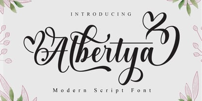 Albertya is a modern calligraphy font. This font is casual and pretty with a stroke. Can be used for various purposes. such as logos, product packaging, wedding invitations, branding, headlines, signage, labels, signatures, book covers, posters, quotes and others. Albertya Script featuring OpenType style alternatives, ligatures, and International support for most Western Languages is included. To enable the OpenType Stylistic alternative, you need a program that supports OpenType features such as Adobe Illustrator CS, Adobe Indesign & CorelDraw X6-X7, Microsoft Word 2010 or a later version. How to access all alternative characters using Adobe Illustrator: https://www.youtube.com/watch?v=XzwjMkbB-wQ Albertya Script is encoded with PUA Unicode, which allows full access to all additional characters without having to design special software. Mac users can use Font Book , and Windows users can use Character Map to view and copy any additional characters to paste into your favorite text editor/application. How to access all alternative characters, using the Windows Character Map with Photoshop: https://www.youtube.com/watch?v=Go9vacoYmBw If you need help or have any questions, let me know. I'm happy to help. Thank you
 - The Daylight by Krafted,
$10.00 Get ready to transcend to a world of magic, laughter, and butterflies. Your branding will spark delight and engage everyone who sees it! Introducing The Daylight - A Calligraphy Font. A beautifully handcrafted calligraphy font that’ll make your guests sing and elevate your projects! Every swash, stroke, and curve was created to entice happiness and elegance. The ideal font for social media banners; posts, and ads, printed quotes, t-shirt designs, packaging, or even as a modern text overlay to any background image. The Daylight includes gorgeous swashes and ligatures that give the font even more flair! What you’ll get: Multilingual & Ligature Support Full sets of Punctuation and Numerals Compatible with: Adobe Suite Microsoft Office KeyNote Pages Software Requirements: The fonts that you’ll receive in the pack are widely supported by most software. In order to get the full functionality of the selection of standard ligatures (custom created letters) in the script font, any software that can read OpenType fonts will work. We hope you enjoy this font and that it makes your branding sparkle! Feel free to reach out to us if you’d like more information or if you have any concerns.
 - Jumping Jess by The Mafia Rabbit Foundry,
$9.99 Jumping Jess is a high quality decorative typeface making use of Stick Figures in various playful jumping poses to depict the letters A-Z. Numbers, symbols and punctuation are composed of elements from the Stick Figure design to visually complement the letters of the alphabet. With a comprehensive set of Ligatures and hundreds of Hand-kerned pairs, Jumping Jess was developed to look great with any string of letters. This font is suitable for greeting cards, sports posters, logos, signage, menus, wedding invitations, product packaging, craft, children's writing, t-shirts, quotes, social media page covers, large format event banners, book covers, magazine title pages and so much more. We highly recommend using an application that supports Open Type features. Ligatures will better display double consonants like "TT" and "LL" and other character combinations like "SH" and "ZY". Ligatures are enabled by default on some applications like Notepad and Photoshop but disabled by default on others like Word and Paintshop. FEATURES Uppercase alphabet 50+ Ligatures, 400+ Kerning Pairs Full range of numbers, symbols & punctuation Comprehensive language support* * ISO-8859-1, ISO/IEC 8859-15, Windows-1252 (e.g. French, German, Polish, Spanish, Italian, Portuguese, Finnish, Norwegian, Swedish, ...)
 - ITC Schuss Hand by ITC,
$29.99Designed by German graphic designer Jochen Schuss. ITC Schuss Hand and ITC Schuss Hand Bold can probably best be described as excellent all around scripts useful for a broad spectrum of advertising purposes as well as for those applications that benefit from a refined handwritten appearance. The characters themselves have a soft, almost “liquid” appearance which is enhanced by the subtle swelling at most of the stroke terminals. The slightly condensed nature of the characters plus a relatively large x-height ensures that both weights are ideal for the advertising arena. An additional feature on ITC Schuss Hand and ITC Schuss Hand Bold are the capital letters which can actually be used on their own in word settings whereas most script capitals are designed just for initialing purposes. The designer has also invested a good deal of careful thought to the way in which a high percentage of the lowercase letter combinations overlap to create an authentic hand-scripted appearance. This, together with the italicized letter forms, will make Schuss Hand and Schuss Hand Bold ideal candidates for those occasions when paper correspondence requires an informal style. So, as is claimed, an excellent all around script style. - ITC Oldrichium by ITC,
$29.99Spirited, unaffected and buoyant, the ITC Oldrichium type family pays homage to the calligraphy and typeface designs of Czech designer Oldrich Menhart. “I came upon one of Menhart's typefaces over a decade ago,” says George Thompson, designer of ITC Oldrichium. “I've been collecting examples of his work ever since.” Thompson was born in Chicago and grew up in north-west Indiana. “While I've been an educator and general graphic designer for over 30 years, lettering and type design have always been an important part of my work,” he says. Thompson now spends much of his free time designing typefaces. ITC Oldrichium is a subtle melding of the shapes and proportions of Menhart's Manuscript typeface, the energetic strokes of his calligraphy, and Thompson's own design skills. The result is a distinctive, powerful, and exceptionally versatile typeface family. Available in light, regular, demi bold and bold weights, with corresponding italics for all but the bold, ITC Oldrichium is comfortable setting both text and display copy. In addition to the basic weights, Thompson has created an Engraved version for those times when an especially powerful statement is called for. - FS Sammy by Fontsmith,
$80.00 Chalky Spritely and full of personality, FS Sammy is a hand-drawn font with a chalky texture, available in one weight only. Give Sammy a run in branding, packaging or billboard advertising for a fresh, informal, honest personality. Calligraphic Too many script fonts have a rushed and thrown-together feel about them. It’s a deceptively complex feat to achieve forms that hold together neatly in text yet still have the breezy, natural air of real handwriting. That’s FS Sammy: considered and crafted. Pencil FS Sammy was originally drawn for a drinks manufacturer by Fontsmith’s calligrapher, Sehmi Satwinder, who made handwritten impressions with a large soft pencil on textured watercolour paper. The digital interpretation of Sehmi’s letters was pushed to its limits and, after a lot of experimentation, a balanced alphabet was achieved. Texture and spirit FS Sammy’s success and uniqueness within the script font category is down to its versatility. In the large text of billboard advertising or headlines, all of its texture comes to life, and small, on menus or booklets, it conveys all of the spirit and personality of a considered piece of handwriting.
 - Praxis by Linotype,
$29.99 Praxis™ was designed in 1976 by Gerard Unger for the German technology corporation Dr.-Ing Rudolf Hell. Praxis is the sans serif counterpart to Demos, another early digital type designed by Unger, who is an accomplished Dutch typographer and teacher. Praxis and Demos share important characteristics, such as open counters, a tall x-height, and blunt stroke terminations. Both faces have very little thick/thin variation, which facilitates smooth linear enlargement and reduction. And like Demos, Praxis is a flexible and legible typeface that works well in small point sizes and on low-quality paper (office documents, newsletters, newspapers, etc.). The word "Praxis" comes from Greek, and means "a practical application." In the late 1990s, Demos and Praxis, along with Univers 57, were selected as the official typefaces of the German Government. More info. In 1990, Linotype AG merged with Dr.-Ing Rudolf Hell GmbH, forming the Linotype-Hell AG (today Linotype GmbH). Since then, Linotype has been the official source of all fonts that were originally designed for the Hell Corporation. Linotype has also improved the typefaces using new technologies, including OpenType."
 - Salome by Canada Type,
$24.95 Salome is a revival, normalization and elaborate expansion of a 1972 film face called Cantini. The original film type, released by a tiny independent outfit called Letter Graphics, looked like it was hand drawn with little consideration for consistency in essential lettering flow measurements, like angles, stroke widths, and vertical metrics. All these issues have been resolved in this digital version, and the original character set, including the whole lot of alternates, was entirely redrawn and expanded to include even more alternates and many useful ligatures, as well as extended support for Latin-based languages. Combining elements of early 20th century art nouveau with common 1960s and 1970s signage and poster lettering flair, Salome uses curls and curves to wave its fantastic shapes in a most hypnotic dance. Salome simply cannot be unseen. Just like its namesake, the female seduction icon, it does not hesitate to put all of its natural beauty and energy on display in order to get what it wants. Salome comes in all popular font formats. The OpenType version, Salome Pro, combines the main font with the alternates one, and contains convenient features for push-button alternation and ligature substitution in supporting software programs.