10,000 search results
(0.078 seconds)
- Bulbis by Azzam Ridhamalik,
$10.00 Introducing Bulbis, the latest addition to our font collection. This unique bubble font is inspired by graffiti and street art, infused with a modern layout that is sure to stand out. The font also incorporates a mix of y2k culture and streetwear visuals, which are currently trending in design identities. With its eye-catching appearance, Bulbis captures attention right from the start, drawing the viewer in to explore its fun and dynamic features. The font is versatile and can be used for a variety of design projects, from logos and branding to social media graphics and more. Give your designs a fresh and modern edge with Bulbis font today!
 - Freehouse by Device,
$39.00 Freehouse is a reinterpretation of the well-remembered Watney’s logo, a brewery and pub chain infamous for its poor quality beer and brutalist decor. In Design Research Unit’s corporate guidelines from 1966 the font is described as Clarendon Bold Expanded — however, this is not the case. Clarendon has square serifs, whereas the Watney’s font is rounder and friendlier. A fixture of the British high street landscape for decades, this digitisation adds a full international character set, numbers, punctuation and many other characters that did not exist in the original. A distressed version that evokes rough print on a wet beermat has also been developed.
 - Flash Script by FadeLine Studio,
$19.00 Flash Script is a modern script font. This is a beautiful font with slanted handmade style. Made by soft and slowly aims to give the character of modern writing that is smooth, cute, simple, stylish, sweet and dancing. This font can be used anywhere as the main font or as a pairing font. With a style like this, this font will be suitable in use for lettering logo's, branding projects, homeware designs, product packaging, mugs, quotes, posters, shopping bags, t-shirts, book covers, name card, invitation cards, greeting cards, and all your other lovely projects. Available 611 glyphs in it! So you can freely and comfortably use it when you make your best design work. This Font support with Opentype Feature! Thank you
 - The Sky by Alandya TypeFoundry,
$7.00 Sky High script is a beautiful classic calligraphic font to add your design to be sweet, elegant, and perfect. Sky High script comes with more than 380+ glyphs per font file, to get richer in beautifying your design. This font will be appropriate for logo project, wedding invitation card, branding, home design, product packaging, quotation, logo, shirt, book cover, business card, greeting card and all other. It comes with a handy set of Opentype Stylistic Alternates, Ligatures and multiple language support. To enable the OpenType Stylistic alternates, you need a program that supports OpenType features such as Adobe Illustrator CS, Adobe Indesign & CorelDraw X6-X7, Microsoft Word 2010 or later versions. Don't hesitate to drop me a message @alandyatype@gmail.com if you have any issues or queries
 - Malabar eText by Linotype,
$103.99 A clear and enjoyable reading experience hinges on the legibility of text copy, especially when reading on screen. This is why Monotype has developed the eText collection of fonts specifically tailored for the text-heavy display environments of e-readers, tablets, mobile devices, and the Web. The original Malabar was designed by Dan Reynolds.
 - Generis Slab by Linotype,
$29.00The idea for the Generis type system came to Erik Faulhaber while he was traveling in the USA. Seeing typefaces mixed together in a business district motivated him to create a new type system with interrelated forms. The first design scheme came about in 1997, following the space saving model of these American Gothics. Faulhaber then examined the demands of legibility and various communications media before finally developing the plan behind this type system. Generis’s design includes two individually designed styles; each of with is available with and without serifs, giving the type system four separate families. Each includes at least four basic weights: Light, Regular, Medium, and Bold. Further weights, small caps, old style figures, and true italics were added to each family where needed. The Generis type system is designed to meet both optical criteria and the highest possible measure of technical precision. Harmony, rhythm, legibility, and formal restraint make up the foreground. Generis combines aesthetic, technical, and economic advantages, which purposefully and efficiently cover the whole range of corporate communication needs. The unified basic form and the individual peculiarity of the styles lead to Generis’ systematic, total-package concept. The clear formal language of the Generis type system resides beneath the information, bringing appropriate typographic expression to high-level corporate identity systems, both in print and on screen. The condensed and aspiring nature of the letterforms allows for the efficient setting of body copy, and the economic use of the page. A range of accented characters allows text to be set in 48 Latin-based languages, offering maximal typographic free range. This previously unknown level of technical and design execution helps create higher quality typography in all areas of corporate communication. Optimal combinations within the type system: Generis Serif or Generis Slab with Generis Sans or Generis Simple. - Generis Serif by Linotype,
$29.00The idea for the Generis type system came to Erik Faulhaber while he was traveling in the USA. Seeing typefaces mixed together in a business district motivated him to create a new type system with interrelated forms. The first design scheme came about in 1997, following the space saving model of these American Gothics. Faulhaber then examined the demands of legibility and various communications media before finally developing the plan behind this type system. Generis’s design includes two individually designed styles; each of with is available with and without serifs, giving the type system four separate families. Each includes at least four basic weights: Light, Regular, Medium, and Bold. Further weights, small caps, old style figures, and true italics were added to each family where needed. The Generis type system is designed to meet both optical criteria and the highest possible measure of technical precision. Harmony, rhythm, legibility, and formal restraint make up the foreground. Generis combines aesthetic, technical, and economic advantages, which purposefully and efficiently cover the whole range of corporate communication needs. The unified basic form and the individual peculiarity of the styles lead to Generis’ systematic, total-package concept. The clear formal language of the Generis type system resides beneath the information, bringing appropriate typographic expression to high-level corporate identity systems, both in print and on screen. The condensed and aspiring nature of the letterforms allows for the efficient setting of body copy, and the economic use of the page. A range of accented characters allows text to be set in 48 Latin-based languages, offering maximal typographic free range. This previously unknown level of technical and design execution helps create higher quality typography in all areas of corporate communication. Optimal combinations within the type system: Generis Serif or Generis Slab with Generis Sans or Generis Simple. - Generis Simple by Linotype,
$39.00The idea for the Generis type system came to Erik Faulhaber while he was traveling in the USA. Seeing typefaces mixed together in a business district motivated him to create a new type system with interrelated forms. The first design scheme came about in 1997, following the space saving model of these American Gothics. Faulhaber then examined the demands of legibility and various communications media before finally developing the plan behind this type system. Generis’s design includes two individually designed styles; each of with is available with and without serifs, giving the type system four separate families. Each includes at least four basic weights: Light, Regular, Medium, and Bold. Further weights, small caps, old style figures, and true italics were added to each family where needed. The Generis type system is designed to meet both optical criteria and the highest possible measure of technical precision. Harmony, rhythm, legibility, and formal restraint make up the foreground. Generis combines aesthetic, technical, and economic advantages, which purposefully and efficiently cover the whole range of corporate communication needs. The unified basic form and the individual peculiarity of the styles lead to Generis’ systematic, total-package concept. The clear formal language of the Generis type system resides beneath the information, bringing appropriate typographic expression to high-level corporate identity systems, both in print and on screen. The condensed and aspiring nature of the letterforms allows for the efficient setting of body copy, and the economic use of the page. A range of accented characters allows text to be set in 48 Latin-based languages, offering maximal typographic free range. This previously unknown level of technical and design execution helps create higher quality typography in all areas of corporate communication. Optimal combinations within the type system: Generis Serif or Generis Slab with Generis Sans or Generis Simple. - Generis Sans by Linotype,
$29.00The idea for the Generis type system came to Erik Faulhaber while he was traveling in the USA. Seeing typefaces mixed together in a business district motivated him to create a new type system with interrelated forms. The first design scheme came about in 1997, following the space saving model of these American Gothics. Faulhaber then examined the demands of legibility and various communications media before finally developing the plan behind this type system. Generis’s design includes two individually designed styles; each of with is available with and without serifs, giving the type system four separate families. Each includes at least four basic weights: Light, Regular, Medium, and Bold. Further weights, small caps, old style figures, and true italics were added to each family where needed. The Generis type system is designed to meet both optical criteria and the highest possible measure of technical precision. Harmony, rhythm, legibility, and formal restraint make up the foreground. Generis combines aesthetic, technical, and economic advantages, which purposefully and efficiently cover the whole range of corporate communication needs. The unified basic form and the individual peculiarity of the styles lead to Generis’ systematic, total-package concept. The clear formal language of the Generis type system resides beneath the information, bringing appropriate typographic expression to high-level corporate identity systems, both in print and on screen. The condensed and aspiring nature of the letterforms allows for the efficient setting of body copy, and the economic use of the page. A range of accented characters allows text to be set in 48 Latin-based languages, offering maximal typographic free range. This previously unknown level of technical and design execution helps create higher quality typography in all areas of corporate communication. Optimal combinations within the type system: Generis Serif or Generis Slab with Generis Sans or Generis Simple. - Afrika Borders by CastleType,
$49.00 A collection of over 50 border patterns based on geometric motifs from various African tribes, including the Ashanti, Bushongo, and Zulu. Use for stationery, greeting cards, etc.
 - Chicory by Ascender,
$29.99 Chicory is a beautiful new calligraphic typeface with a touch of elegance. The narrow chancery style is perfect for formal invitations, newsletter mastheads, menus and greeting cards.
 - Novela by Jonahfonts,
$42.00 Novela is a chisel flat pen style written with overtones of Uncial, from century old scribes. Very suitable for greeting cards, headlines, packaging and many other applications.
 - Gauntly by Ali Hamidi,
$12.00 Gauntly is a stunningly sweet and delicious single line handwritten font with a cool vibe. It will turn any design idea into a true piece of art.
 - Terrace JNL by Jeff Levine,
$29.00 Terrace JNL is a bold, sturdy Art Deco titling face based on hand lettering found on the cover of some 1940s-vintage sheet music for the organ.
 - Stratus by Marc Foley,
$15.00 Stratus is a neutral sans-serif family, consisting of six weights. The design is heavily influenced by '90s screen fonts. It has been tested and developed using a range of different operating systems and web browsers. You'll find it works incredibly well at small sizes and user interfaces.
 - Gardnest by Liartgraphic,
$30.00 Meet our newest product, we call this product Gardnest font. Gardnest font are cute typeface font with a uniqe touch and assertive. Gardnest font is very nice to use on: fashion magazine, logos, ,and photography, landing page, flyer, What’s includes - multilingual support - alternate - ligature Thank you, salutations Ali Sifak Muftari
 - Regratte by Liartgraphic,
$30.00 Meet our newest product, we call this product Regratte font. Regratte font are cute typeface font Whit a uniqe touch and assertive,Regratte font is very nice to use on fashion magazine, logos, ,and photography, landing page, fliyer, What’s includes - mutilngual support - alternate - ligature Thank you, salutations Ali Sifak Muftari
 - Yourz Truly by Outside the Line,
$19.00Yourz Truly is a happy little serif font that doesn't take itself too seriously. It is a headline font with a full character set. Yourz Truly is second in the Love Letters Series following Dearest John . It was in the 2011 Typodarium Page-A-Day Calendar on 10-16-2011. - Vlavour by Liartgraphic,
$30.00 Meet our newest product, we call this product Vlavour font. Vlavour font are cute typeface font Whit a uniqe touch and assertive Vlavour font is very nice to use on: fashion magazine, logos, ,and photography, landing page, fliyer, What’s includes - multilingual support - alternate - ligature Thank you, salutations Ali Sifak Muftari
 - Guildhall by Device,
$39.00 Class, with a punch. It's rare to find fonts that are refined without being too delicate, stylish while still being bold and impactful. Guildhall is a heavy rectangular flared serif in face widths with matching italics. Suitable for film posters, rock concerts and band logos, beer labels, packaging and magazine headlines.
 - Black Sigra by Sign Studio,
$12.00 Black Sigra comes in 3 styles (regular, blur, and shadow) so it can be more versatile. Adapting to a simpler fracture calligraphy style. Has sufficient thickness to dominate a design page. Supports multiple languages and each character has a PUA code which means everything can be accessed on most common software.
 - Shentholla by Liartgraphic,
$23.00 Meet our newest product, we call this product Shentholla font. Shentholla font are sans serif typeface font Whit a uniqe touch and assertive. Shentholla font is very nice to use on: fashion magazine, logos, ,and photography, landing page, fliyer, What’s includes - mutilngual support - alternate - ligature Thank you, salutations Ali Sifak Muftari
 - Delysian NF by Nick's Fonts,
$10.00If you wanted to send out a party invitation in 1923, Barnhart Brothers & Spindler recommended this typeface, which was originally called, simply, "Greeting Card". It also appears to be suitable for greetings from Mars. Available in two weights, regular and bold. Both versions of the font include the 1252 Latin and 1250 CE character sets (with localization for Romanian and Moldovan). - Ghufy Style by Sensatype Studio,
$15.00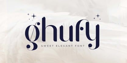 Ghufy is A Sweet Elegant Serif font perfect for unique beauty project and Another Design needs A New font that we created special for Unique branding needs, with unique style that ready to add value of your brand. It's so nice to leverage designer or product owner that need solutions to make their design look more unique, sweet and elegant. Ghufy Sweet Elegant Display font ready with: Lowercase and Uppercase characters Numbers and Punctuations Preview as a inspirations that you can do with Ghufy font Available for PC and Mac Wish you enjoy our font.
 - The City Burn by Alien,
$40.00 The City Burn, formerly called "The city burn night after night and we spray-paint the walls", was especially designed for Mad Skills Mag issue#3 Urban Flavour. It needed to be street, and urban, so I made a stencil font. It’s used by Fox5 tv for the rant TV show, the website infected.com, Fried chillies TV, and others!
 - Wild Grook by Attype Studio,
$18.00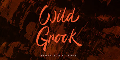 Introducing Wild Grook - Inspired by urban typeface with texture style, Wild Grook has strong character perfect for urban street design. Wild Grook is perfect for branding, logo, invitation, stationery, product packaging, merchandise, monogram, blog design, game titles, cute style design, Book/Cover Title and more. Features : - Ending swash - Ligatures - Multilingual Support Hope you enjoy with our font! Attype Studio
 - Hypothesis by Arendxstudio,
$25.00 Hypothesis is a typeface inspired in tattoo letters, chicano culture and calligraffiti. It works well with normal size text, but it works even better for large displays, short words, or even just to incorporate a few or single characters in a design. Suitable for many creative products & tattoo designs, like posters, t-shirt, street wear, logo, signage, headlines, etc.
 - Urban Vibe by DainType,
$15.00 We tried to implement graffiti that is common in our city. Everyone wants to express themselves. Whether in writing, painting on canvas or on the street, everything must be respected as art. It can be useful when you want to express graffiti art, but also consider readability. You can also work easily with three color fonts.
 - Brush King by Subectype,
$17.00 Brush King is a supercharged, street-wise brush font bursting with energy, with extra attention to quick strokes and sharp details. This font is perfect for challenging jobs, titles, t-shirts, websites, hoodies, and various print and digital media with energy. Brush King is ideal for logos, apparel, quotes, product packaging, or anything which needs a typographic turbo-boost.
 - Agneya by Seventh Imperium,
$37.00 Agneya is calligraphy script font, inspired by urban street art. Equipped with opentype features. Stylistic alternates, swash and more 600 glyph. It is make easily to create such as Signpainter logo and various purposes. Just open the Opentype Alternates and choose The alternates that fit best, and you can play with your creation to make your unique designs.
 - McCadden JNL by Jeff Levine,
$29.00 McCadden JNL was inspired by the hand-lettered credits for the George Burns and Gracie Allen Show [1950-1958]. Its casual theme offers a lighthearted approach to titling and display work. The font gets its name from McCadden Productions (the company started by George Burns), which itself was named after a street Burns' brother William once lived on.
 - Varvid by Cercurius,
$19.95 The characters in this font are composed of rounded lines with even thickness, giving an impression of neon tubes. Although the design is completely new, it has its stylistic roots in the modernistic 20th century world of steel-tube chairs and fluorescent lamps.
 - Liebestraum JNL by Jeff Levine,
$29.00 A Liebestraum, in German is a "dream of love" or "love dream". Based on the ornate sheet music title from a 1920s edition of Franz Liszt's composition, Liebestraum JNL captures and preserves the unique look and feel of this pen-on-paper lettering.
 - Spencerian Palmer Penmanship Pro by Intellecta Design,
$38.90 The concepts of Spencerian Palmer Penmanship PRO come from the Palmer’s Penmanship guides and calligraphy manuals from XIX century. This enhanced OpenType version has complete set in Latin alphabet with Central European, Vietnamese, Baltic and Turkish complete resources with all diacritic signs and punctuation marks plus extra characters belonging this ranges. Spencerian Palmer Penmanship PRO presents you with extra sets of stylistic alternates, swashes, ornaments, tails (to artistic increase any letter of this font) and plus over of 120 contextual alternates solutions - ligatures providing a lot of letterform variations that make this type family looks like a real handwriting on a page or the exact fancy text you wish. Over 500 glyphs which you have total access using software such as InDesign, Illustrator, QuarkXpress and others.
 - Isla by Sudtipos,
$39.00 Eugene Grasset, the popular 19th-century Swiss graphic designer, dabbled in a multitude of disciplines such as ceramics, furniture, tapestry, jewelry and stamp design. Known mostly for his commercial posters and illustrations, he left a legacy of design that still fascinates scholars and professionals alike. One of the rarely mentioned Grasset treasures is the italic he designed in 1898 for use in two of his posters. Grasset's italic has an irregular quality that makes it seem much older than it is. It can be a very meaningful face in many contexts, such as map-related design or historical publications. Isla was digitized by Alfredo Graziani and completed by Alejandro Paul, maintaining the utmost respect for its historical flavor. The typeface includes a wealth of ligatures and alternates.
 - HWT Star Ornaments by Hamilton Wood Type Collection,
$24.95 Star Ornaments are seen as a long standing companion to many wood type poster layouts. Various manufacturers managed to derive many variations of the five pointed star motif and offered them as a ubiquitous ornament option in almost all of their catalogs. Manufacturers such as Wm. H Page, Morgans & Wilcox, Tubbs Mfg. Co. and of course, Hamilton Wood Type each had their own slight variations. This digital font features almost 100 glyphs of mostly stars, but it also features a unique star border that can create boxes just like the modular offerings of the 19th century. The twist on this digital version is the inclusion of additional connection options that become a unique lettering 'kit' that can create typography or maze-like connections using a limited set of component parts.
 - HS Alnasma by Hiba Studio,
$69.00 Hs Alnasma is an Arabic display typeface, under “titles” category. It is useful for book titles, creative designs and modern logos. Also, it is used when a contemporary and simple look is desired that can fit with the characteristics of Latin fonts where horizontal parts are thinner than vertical ones for use in technical and engineering company. The font is based on some modern lines of Kufi calligraphy along with some derived ideas of Latin fonts, maintaining the beauty of the Arabic font and its fixed rates. This font supports Arabic, Persian, Urdu, Kurdish and Pashto and also includes Basic Latin and consisting of two weights (regular and bold) which can add to the library of Arabic and Latin fonts contemporary models that meet with the purposes of various designs for all tastes.
 - AW Conqueror Std Carved by Typofonderie,
$59.00 Engraving inspired typeface The AW Conqueror Carved encapsulates perfectly the lettering styles in fashion during the 19th century quite often in the frontispieces of books. It wasn’t rare to see these kinds of typefaces, with their variations in depth and relief effects, adorning boxes and other forms of packaging of the time. AW Conqueror superfamily AW Conqueror Didot is part of a larger family, who include 4 others subfamilies with great potential: They’re but based on same structure, with some connection between them (width for example), to offer a great & easy titling toolbox to any designers, from skilful to beginner. Each of the members try their best to be different from the others because of their features. They should work harmoniously in contrast. Club des directeurs artistiques Prix 2010 European Design Awards 2011
 - Bay Area Nouveau JNL by Jeff Levine,
$29.00 Bay Area Nouveau JNL is an ultra bold, Art Nouveau headline font inspired by hand lettering on the cover of a piece of 1911 sheet music entitled "The Only Pal I Ever Had Came from 'Frisco Town'".
 - Quarion by René Bieder,
$39.00 Quarion is a clean, neo-humanist sans with a contemporary geometric approach. Its design started as an exploration of geometric fonts from the early 20th century, like Futura, Neuzeit Grotesk or Recta which allows the typeface to generate an inviting but sophisticated feel on the page. Although, less contrasting, geometric designs have been quite popular around type designers until today, Quarion finds its niche by combining circular elements with a medium stroke contrast, resulting in a versatile and robust workhorse for any analog or digital application.