10,000 search results
(0.031 seconds)
- Sunday Gang by Arendxstudio,
$16.00 Sunday Gang is a handwritten font which is very elegant and modern for you to use and your design interests be it for logos, branding names, posters, podcasts and so on. This is perfect for you all. Features: 1.Uppercase & Lowercase 2.Numbers & Punctuation 3.Multilingual Support 4.Ligatures I really hope you enjoy it - comments & likes are always welcome and accepted. More importantly, don't hesitate to send a message if you have a problem or question. Now just read this, go there and make it happen :)
 - Quarter Braille by Echopraxium,
$20.00 Presentation QuarterBraille (Abbreviated as "QB" thereafter) is a decorative, steganographic and lattice font. Its core design concept is that Braille dots are represented as "quarters of a square"[1]. This is illustrated by posters 1 and 2 (NB: these glyph parts will be called "QB dots" thereafter). The other glyph parts (see poster 3) are purely decorative and meaningless in terms of Braille dots encoding[2]. All glyph parts are meant to generate a wide variety of patterns from horizontal and vertical combinations of glyphs. There is also a graphic convention to differentiate uppercase from lowercase letters with the presence or absence of shape subparts (in the "endings", "quarter of a circle with a ring" and "quarter of a diamond with a small square in the middle") like shown by poster 4. This font is suitable for very short texts (e.g. logos, acronyms, quotes, ambigrams, pangrams, palindromes, etc...) but on the other hand it may be used for steganographic purpose like geocaching as well as fictive alphabets (e.g. Alien/SciFi/Fantasy/Antique civilizations). Posters 1. Font Logo: the displayed text is " Quarter " followed by " Braille". There's a rainbow layer above the text to highlight the "QB dots", this is achieved by A..Z glyphs with "only QB dots" (codes 230..255) 2. Anatomy of a Glyph (L) and "QB Dots" (quarters of a square) 3. Glyphs Parts: Square and Cross (Inverted square), Circle and Inverted Circle (with or without the small circle in the middle), Diamond (with or without the small square in the middle), Inverted Square and Circle, Shape combos, Ending 4. Uppercase vs Lowercase (tiny shape subparts are shown in red) 5. Sample 1: Bathroom sink with QB tiles on the credence 6. Sample 2: Hands knuckle tatoos: "LOVE/HATE"[4] 7. Sample 3: Poker Hand: pocket Aces. It's an Ace of Hearts (Ah) on the left and an Ace of Spades (As) on the right. Like in regular cards, the card value (e.g. Ah) is displayed twice: at the top and rotated by 180 degrees at the bottom. This poster also illustrates that QB could be used to print embossed playing cards with tactile and visual display of card values. 8. Sample 4: Pangram: "Adept quick jog over frozen blue whisky mix" 9. Sample 5: Latin Magic Square: "SATOR AREPO TENET OPERA ROTAS" (NB: for compensation of the 2/3 glyph ratio, letters on each line are separated by a space: "S A T O R", ...). 10. Sample 6: Quote of Mahatma Gandhi: "Learn as if you will live forever, live like you will die tomorrow.". This is also a demonstration of border glyphs combinations. 11. Sample 7: Steganography use case: the text is a sequence of 64 aminoacids (1 Letter notation), this protein was described in a research paper "The complete Aminoacid sequence of an amyloid fibril protein AA of unusual size (64 residues) 1975". 12. Sample 8: Border Glyphs with the provided styles and mixed styles. The words are the same than in poster 9 ("SATOR AREPO TENET OPERA ROTAS"). Despite the 2/3 glyph ratio, the "TENET cross" was achieved by both inserting spaces in horizontally ("T ENE T") and by using the "thin borders glyphs". Notes a. Border glyphs[3] are meant to enhance the esthetics of text samples displayed with QB b. Special characters (e.g. *$()[].,;:&@# ...) are provided and follow the NABCC (North American Braille Computer Code) convention. c. A..Z Glyphs with only the "QB dots" are provided as demonstrated by posters 1 and 2 (A/N: this was very useful to create them). d. Glyph Map: 32..64: Special characters - 161..187: "Thin variant" of Border glyphs, 192..229: Border glyphs, 230..255: A..Z with only the "QB dots" - Codes 176 an 181 are "regular SPACE" (empty glyph). Footnotes 1. There is indeed two shapes which represent the braille dot: the "quarter of a square" and the "quarter of a cross". It's because a cross may be considered as an "inverted square" because the square corners are merged in the center. 2. That's why the SPACE glyph is only made of decorative/meaningless glyph parts (i.e. no "QB dots"). 3. For other fonts with border glyphs, please take a look at my other "decorative Braille fonts" (GoBraille, HexBraille, KernigBraille, StackBraille, MaBraille, DiamondBraille, LorraineBraille). 4. LOVE/HATE knuckle tatoos are inspired by the anthology scene from "The Night of the Hunter" movie (Charles Laughton 1955), it also appearead in "Do The Right Thing" movie (Spike Lee 1989). Disclaimer This font is not appropriate and not meant to print text documents in Braille for the blind readers audience.
 - Afical by Formatype Foundry,
$30.00 Afical update 2.0 version Afical Composed of 3 set families, consists of 35 fonts matching italic: Afical Std, Afical Neue, Afical Stencil. families all with distinctive qualities and features but share the same basic construction and proportions. Afical has been carefully crafted to focus on Text sizes and legibility with a high x-height, we developed it with Manual TrueType Hinting. Afical It's a perfect choice for publication, Packaging, logo, branding, Signage, wayfinding design systems, as well as web and screen design OpenType features: Alternate Characters SS.01, SS.02, SS.03, SS.04, SS.05, Denominators Case-Sensitive Forms, Tabular Lining, Fractions, Ordinal, Ligatures, Discretionary Ligatures, Subscript, Superscript, Language Support: 63+ (Latin based) languages Afrikaans, Albanian, Asu, Basque, Bemba-language, Bena, Danish, Dutch, English, Estonian, Faroese, Filipino, Finnish, French, Friulian, Gaelic (Irish, Scots), German, Gusii-language, Hungarian, Icelandic, Indonesian, Irish, Italian, Kabuverdianu, Kalenjin, Cornish, Luhya, Luo-Language, Machame, Madagascan, Makhuwa-Meetto, Makonde, Malayan, Manx, Morisyen, North-Ndebele-Language, Norwegian, Bokmål, Nynorsk, Nyankore, Oromo, Pare, Portuguese, Rombo, Rwandan, Rukiga, Rundi, Rwa, Samburu, Sango, Sangu, Swedish, Swiss German, Sena, Shambala, Shona, Soga, Somali, Spanish, Swahili, Taita, Teso, Vunjo, Zulu Behance Looking for custom Afical? Please send us an email at hello@formatypefoundry.com Designed 2017 Published 2021 2021 Copyright © Formatype Foundry All rights reserved
 - Astorica Display by Zane Studio,
$18.00 Elegant, graceful and timeless. Astorica is a versatile font family with timeless classic appeal, has alternatives & ligatures, multilingual support, (And we think this is our best work so far!) Each letter has been hand-drawn and made with great care. Weight variations provide a variety of options that will help you find the best typographic character for your project. All 6 weights are perfect for big screen use and high impact headlines. The binding and style alternatives available offer a number of different options that give your logo or business card a unique look. FEATURE 6 loads of Astorica High contrast 41 ligatures per capital letter weight and 30 Ligatures per lower case weight 10 alternate glyphs per weight Comprehensive language support Stay sweet, Sweetest Thing
 - Starboard by Hanoded,
$15.00 The term starboard derives from the Old English steorbord, meaning the side on which the ship is steered. Before the steering wheel, boats were steered by an oar at the stern of the ship. Since most sailors were right handed, this is where you would find your steering oar! Starboard font is a rough, handmade, brushy kinda font. It was, of coarse, made with my favourite cheep brush and Chinese ink - resulting in a slightly eroded looking font. Starboard comes with all the trimmings, including double letter ligatures for the lower case.
 - Handmade Dropshadow JNL by Jeff Levine,
$29.00 Handmade Dropshadow JNL was modeled from lettering found on a vintage silk screened metal sign used for point-of-sale marketing. Before the advent of computers and modern techniques, silk screens were hand cut using material called frisket and knife tools, and the lettering reflected the human inconsistencies of cutting these lettering into the template surface for transfer.
 - Eco Coding by S-Core,
$20.00 Eco Coding is a sans-serif monospaced font, especially designed for programmers. This font is optimized for programming (coding) environment. Eco Coding's neutral and open shapes will make your eyes comfortable to read any source codes and text on screen. The appearance of Eco Coding is neutral, but it has distinctive shapes enhance legibility and readability on screen.
 - Criss Cross by Hanoded,
$15.00 Criss Cross is a scratchy, scribbly, rough-n-tough kinda font. The idea comes from the many notes I wrote in my horrible handwriting. When I want to stress things, it sort of looks like Criss Cross. So... Now you can write notes and stress things too! And guess what? It comes with a bunch of alternates, so enjoy!
 - Friendly by Positype,
$29.00 Friendly is an homage to Morris Fuller Benton's adorable Announcement typeface. It is not a strict interpretation, digital revival or reverent reproduction of the original letterforms… but I would be remiss and shady to not acknowledge the letterforms that inspired this typeface. If you are looking for a more accurate 'scanned revival' I would recommend searching "Announcement" on MyFonts. As stated earlier, it is an homage to the original letterforms of the typeface but takes a great bit of freedom tightening the construction up in order to loosen up the movement of the variant letterforms to allow a great deal of usable personality. I enjoy stating this dichotomy… "loosen up to tighten up the forms" and vice versa. It seems counterintuitive or silly but by allowing the letterforms to normalize, I felt more comfortable going back and adding rather indulgent personality. Infused with stylistic alternates, swashes, titling, many many contextual alternates, 9 stylistic sets and 2 stylistic sets with wordmarks, the typeface became far more 'friendly' for me… how could it not? With so many loops, swashes and typographic indulgences, it was bound to be fun. The more elaborate and 'overdone' Friendly got, the more I wanted to slant it. Here's where my thinking differs from MFB's original. I like slanted romans… especially ones with long ascenders, but I do not like much of a slant. It has to be the lettering person in me. It's hard for me to do a completely upright serif and not pair it with an angle, but I did not feel Announcement's 'Italic' offered much and the actual slant needed to be far less. If it's not an italic, I prefer the letters to slant with an angle equivalent to the thickness of the vertical stroke. The Slanted version of Friendly is set at 3.6 degrees, is quite subtle, and very fitting for me. You will find that most characters have a contextual, stylistic, swash and titling alternate assigned to them and some have an echoed alternate to the swash and titling options if the stylistic alt has been selected in tandem. Additionally, all of these are accessible in the glyph palette directly from the base glyph typed or through selecting options through the Stylistic Sets 1–9. Stylistic Sets 10 & 11 are a little different. They are actually configured as complex majuscule ligatures… a result of me getting carried away. Other features like a default old style numeral set and coordinating glyphs have been produced along with case support, ordinals, and more have been added to make it more relevant for contemporary use.
 - Ruggles by Matteson Typographics,
$19.99 Ruggles is a rounded sans serif inspired by the unbridled enthusiasm of a dog greeting its family. Useful for any occasion where a warm and friendly voice is needed – branding, greetings, special promotions.
 - Riga by Ludwig Type,
$45.00 Riga is a space-saving and legible typeface designed to work equally well on paper and on the computer screen. Its personality is clear and practical, yet warm and polite. Riga is suitable for a wide range of typography such as editorial, websites, packaging and corporate design. Economical proportions, high x-height and open letter forms guarantee good performance in narrow columns and tight headlines. Riga is exceptionally readable at small point sizes and elegant at larger ones. Riga comes in 18 styles and weights and contains a large number of OpenType features. For small sizes on screen Riga Screen is also available.
 - Phitaya by Peterdraw,
$18.00 Let’s have fun with the sweet and fun handwritten font Phitaya that will brighten all your handy works. It is a suitable choice for children-themed work, book, logo, quote, greeting cards, quaint branding, and many more. It is also perfect for a stylish text overlay to any background image or semi-formal text. This font package consists of a full set of the alphabet from A to Z, uppercase and lowercase letters, numbering, and punctuation that available in OTF format only. For international use, Phitaya, a sweet handwritten font is supported for multilingual language so it will be a perfect match for fun and cheerful occasion. Phitaya is easy to download and uses a font that will complement your scribble works. Give a fresh and unique statement in every letter you make by using our brand-new font. Please contact our support team if you find any difficulties in purchasing, downloading, or using the font. You may also send us messages or questions regarding this or any other product of ours.
 - FS Clerkenwell by Fontsmith,
$80.00 A creative context 2003. Fontsmith was sharing a small, cold, whitewashed studio space in Northburgh Street, Clerkenwell. But things were on the up following prestigious custom type commissions for The Post Office and E4. “Slab serifs were on the brink of another revival, we could feel it,” says Jason Smith. “All we wanted to do was have a play with these slabs, go as far as we could within what was acceptable and readable.” “It wasn’t initially clear what was happening,” recalls Phil Garnham. “We were becoming very influenced by our surroundings, outside the studio space. We absorbed the essence and the designer grime of where we were.” Process Jason began by drawing stems on-screen. “The key aspect of the font is the upward bend of the leading shoulder serif, the way it kind of ramps up and then plummets back down the stem. “The regular and light characters are quite narrow – great for text but the bold is quite wide and chunky – better for headlines. I think ‘y’ is quite different for a slab design. We call it the Fontsmith ‘y’.” Promotion Fontsmith were determined to get FS Clerkenwell noticed. To launch the font, Ian Whalley, a designer friend of Fontsmith, captured words heard on the streets of Clerkenwell, set them in the new font and crafted a small book of typographic conversations. It was a first for Fontsmith. “I think that’s part of why this font has been so successful,” says Phil. “It really does embody the spirit of the area, as a special place for design, arts and crafts. And designers love that.” Contemporary twist FS Clerkenwell, based on influences in and around this part of London with a rich tradition of printing and design, mixes tradition with creation. Old-fashioned values meet new-school trends. Its quirky, contemporary character lends an edge to headlines, logotypes and any large-size text.
 - Krank by Matt Grey Design,
$12.00 A minimalist, stackable and dynamic squared off typeface, perfect for posters and large print and screen material.
 - Just For You by Typefactory,
$14.00 Just For You is a sweet and dreamy handwritten font. Flowing easily and with a sweet and elegant touch, this font is ideal for each of your personal, bakery, apparel, romantic designs or ideas.
 - Gietta by AEN Creative Studio,
$14.00 Gietta is a sweet, soft hand-lettered font. Fall in love with its authentic feel and use it to create gorgeous wedding invitations, beautiful stationary art, eye-catching social media posts, and sweet logos.
 - Bergsland Round by Hackberry Font Foundry,
$24.95 This is a version of the Bergsland Fashion stylized sans serif font family that is very high-waisted and sleek with rounded terminals called Bergsland Round. Round is my favorite out of the group as it is looser and friendlier. This four-font set has a Regular and a Black plus the italics. The stroke is only slightly modulated. The letterforms are higher, with a more open aperture, and sprinkled with breaks to add light and sparkle. This an attempt at a readable sans serif for text. It has many OpenType features and 465 characters per font: Caps, lower case, small caps, old style figures, numerators, denominators, accents characters and so on.
 - Poster Paint by Canada Type,
$24.95 Poster Paint is a fun shocard alphabet which came about from Jim Rimmer’s admiration of Goudy Stout, a design he liked in spite of the fact that Goudy himself claimed to detest it. Extremely eye-catching and humourous to a fault, Poster Paint is an ideal fit for fun environments like theme parks, concession stands, cofee and juice bars, and in print design for children books and fun food packaging. Poster Paint was updated and remastered for the latest technologies in 2012. It comes with a glyphset of over 375 characters, and supports the majority of Latin-based languges. 20% of this font’s revenues will be donated to a GDC scholarship fund, supporting higher typography education in Canada.
 - Dillan by TypeUnion,
$35.00 Dillan is an 18 style sans family with an edge. It’s angled ascenders add movement and a unique appearance, whilst its flatter terminal angles gives a more fluid connection to partnering letters. The angles give the font a contemporary feel and the higher x-height give it great readability at smaller sizes. The font is made up of 9 weights and it’s matching italics and includes some nice features such as stylistic alternates, extensive European language support, case sensitive characters, ligatures and much more. Dillan is perfect for many applications including digital treatments such as apps, websites and motion design, as well as branding, logos, advertising and editorial, and much much more.
 - Parfumerie Script by Typesenses,
$64.00 Parfumerie Script is a sophisticated calligraphic font defined by its smooth curves, clean lines and the finest of fine strokes. Graceful and refined in its most basic script form, a range of Swash and Decorative alternates (including a unique local style called Filete Porteño, an ornamental form native to Buenos Aires) allows users to elevate their designs to higher levels of aesthetic beauty and elegance. Parfumerie Script Pro contains over 2500 glyphs, among which are swashes, ornaments and decorative alternates. Some alternatives are offered separately too. Use professional software that widely support Open Type features. Otherwise, you may not have access to some glyphs. For further information about features and alternates, see the User Guide
 - Twelkmeyer by Popkern,
$18.00 The multilingual accidental typeface was inspired by the pathos of the late revolutionary asceticism and architectural projects of V.F. Twelkmeyer. All story on twelkmeyer.com This typeface is a spring swallow. This typeface is a dawn and optimism of alumnus of Higher Art and Technical Institute in Leningrad. This typeface is a mirror of the Soviet architecture 30’s. It reflects the impressions from Vesnin brothers and Ginzburg’s works, a curiosity to Bauhaus, and the first test of the waters of socialist reconstructions. This wide, dynamic, angular, drawing typeface will be perfect for serious branding and architectural projects. So, give it a try! From innovative ideas of the 30s to innovative projects of the XXI century.
 - ALS Gross Kunst by Art. Lebedev Studio,
$63.00 Gross Kunst is a humanist sans-serif with an open aperture, sharp outlines, and eye-catching details that make this full of character typeface very recognizable. The type family has three fonts based on wide pen strokes. Depending on its purpose the styles differ in expressiveness and the level of ornamentation. Regular style—low-contrast and neutral—is the most natural choice for body-text. The display face is more dynamic and gets higher contrast. It's very legible from a distance and would do its best on navigational and warning signage, plates, and such. Eloquent straight italics will adorn titles, announcements, and pages with ads. This typeface was acknowledged at the international type design competition Modern Cyrillic '99.
 - ITC Orbon by ITC,
$29.99ITC Orbon font is the work of New York designer James Montalbano, inspired in part by a demo of black letter calligraphy in which letters were created out of only four or five basic strokes. I combined that idea with the notion of taking historical forms like German gothic blackletter and progressively paring them down to achieve a futuristic version, as if this old form naturally evolved over several hundred years to arrive at its post-modern incarnation." Text should be set in point sizes of 20 and higher for optimal legibility. ITC Orbon is a highly condensed font with unique, oblong shapes which are ideal for a number of display applications." - Jaleh by Naghi Naghachian,
$102.00 Jaleh is a sans-serif font family designed by Naghi Naghashian in tree weights, Jaleh Light, Jaleh Regular and Jaleh Bold. Width of this font family is Extra-expanded; a unique typeface. It is extremely legible even in very small size. This font family is a contribution to modernisation of Arabic typography, gives the font design of Arabic letters real typographic arrangement und provides more typographic flexibility. Jaleh supports Arabic, Persian ( Farsi ) and Urdu. It also includes proportional and tabular numerals for the supported languages. Jaleh design fulfills the following needs: A Explicitly crafted for use in electronic media fulfills the demands of electronic communication. B Suitability for multiple applications. Gives the widest potential acceptability. C Extreme legibility not only in small sizes, but also when the type is filtered or skewed, e.g., in Photoshop or Illustrator. Jaleh’s simplified forms may be artificial obliqued in InDesign or Illustrator, without any loss in quality for the effected text. D An attractive typographic image. Jaleh was developed for multiple languages and writing conventions. Jaleh supports Arabic, Persian and Urdu. It also includes proportional and tabular numerals for the supported languages. E The highest degree of calligraphic grace and the clarity of geometric typography.
 - Larchmont by Greater Albion Typefounders,
$8.95 Larchmont is a piece of pure fun, inspired by inter-war enamel advertising hoardings (often known as 'street jewelry') and by traditional sign writing. It's ideal for poster design, book covers and any sort of signage, or just about anywhere you need more than a hint of flair. Larchmont combines a sense of fun with a traditional ethos. The family is offered in three widths, each in upright and oblique forms. Revive the golden age today!
 - Graffiti Line by Putracetol,
$20.00 Introducing Graffiti Line A Display Graffiti Style Font. Inspired by the graffiti art on the city streets, so I made it into a font. So that it will make it easier for you to make graffiti writing or designs. There are much ligatures that will make this font even cooler. So enjoy it! Suitable for many design project, branding, packaging, logo, wall art, headline, template, banner, poster, and so much more! This font is also support multi language.
 - Aeroblock Layered Graffiti by Sipanji21,
$13.00 Aeroblock is an urban graffiti font characterized by Rounded edges and a bold look. Ideal for music posters, apparel designs, shirts, and streetwear, this font brings a touch of edginess to your projects. The unique style of "Aeroblock" makes it the perfect choice for street style or urban graffiti themes. Whether you want to create a strong and powerful statement or simply add a touch of attitude to your designs, "Aeroblock" is the font for you.
 - Cafe Francoise by Sharkshock,
$125.00 This charming, all caps display font was inspired by outdoor chalk board signage in front of outdoor cafes. These are common on the streets of places like London, Paris, Montreal, and Belgium. The letters are casual by design with just enough texture for convincing chalk marks. Use Cafe Francoise for a bakery logo, cafe menu, or poster. Basic Latin, extended Latin, diacritics, punctuation, kerning, and graphics are included. Please check the glyph map for all supported characters and images.
 - Intouch by Fontysia,
$19.00 Intouch is a cool, and display font that has a cool and funny, street art vibe. A playful all-caps Display font that includes four versions font of each letter which can be used separately or on top of each other to achieve a different look. This font is PUA encoded which means you can access all of the glyphs and alternates with ease! (please type the preview to see if I have what you need!)
 - Bade Hoper 3d Graffiti by Sipanji21,
$15.00 Bade Hoper is an urban graffiti font characterized by sharp edges and a bold look. Ideal for music posters, apparel designs, shirts, and streetwear, this font brings a touch of edginess to your projects. The unique style of "Bade Hoper" makes it the perfect choice for street style or urban graffiti themes. Whether you want to create a strong and powerful statement or simply add a touch of attitude to your designs, "Bade Hoper" is the font for you.
 - Slightly Marker by Sarid Ezra,
$15.00 Introducing, Slightly Marker! Slightly Marker is a caps font with street style brush. It's contain uppercase and lowercase in different style, number, symbol, and also with multilingual support! This font also contain opentype feature for adding line under a word, You can access it from ligature, simply type underscore + number (1-5) in the middle of the text. For example: Mar_3ker. You can use this font for any project such as a branding, poster, or quotes!
 - Wild Rebel Layered by Sipanji21,
$15.00 Wild Rebel is an urban graffiti font characterized by sharp edges and a bold look. Ideal for music posters, apparel designs, shirts, and streetwear, this font brings a touch of edginess to your projects. The unique style of "Wild Rebel" makes it the perfect choice for street style or urban graffiti themes. Whether you want to create a strong and powerful statement or simply add a touch of attitude to your designs, "Wild Rebel" is the font for you.
 - Roket Monster Graffiti by Sipanji21,
$10.00 Roket Monster is an urban graffiti font characterized by sharp edges and a bold look. Ideal for music posters, apparel designs, shirts, and streetwear, this font brings a touch of edginess to your projects. The unique style of "Roket Monster" makes it the perfect choice for street style or urban graffiti themes. Whether you want to create a strong and powerful statement or simply add a touch of attitude to your designs, "Roket Monster" is the font for you.
 - PAG Demokratie by Prop-a-ganda,
$19.99Prop-a-ganda offers retro-flavored fonts inspired by lettering on retro propaganda posters, retro advertising posters, retro packages all the world over. This is perfect font for your retrospective project. When you type in this font, the typography looks like that small guards are marching in the street. This retro font is pretty, but it also has a punctual impression. PAG Demokratie is a perfect font for posters, magazines, product packages and all of your creations. - Break Enemy Graffiti by Sipanji21,
$15.00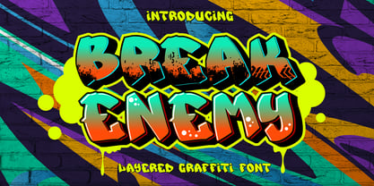 Break Enemy is an urban graffiti font characterized by sharp edges and a bold look. Ideal for music posters, apparel designs, shirts, and streetwear, this font brings a touch of edginess to your projects. The unique style of "Break Enemy" makes it the perfect choice for street style or urban graffiti themes. Whether you want to create a strong and powerful statement or simply add a touch of attitude to your designs, "Break Enemy" is the font for you.
 - Shutterbug JNL by Jeff Levine,
$29.00 On April 20, 1950, film comedian Jerry Lewis indulged his love of cameras by opening up Jerry Lewis’ Camera Exchange on Vine Street in Hollywood. It closed in 1951. Thanks to an image preserved within newsreel footage of the shop’s grand opening night, a glimpse of the post-Art Deco signage with its unusual, block style lettering inspired a digital version. Highly unusual and best for novelty projects, Shutterbug JNL is available in both regular and oblique versions.
 - Spooky Town by Epiclinez,
$18.00 Spooky Town is an awesome, graffiti-style display font that has a street art vibe. This font is suitable for designs such as t-shirts, sportswear, logos, advertisements, clothing, and more. This Font is supporting more than 66 languages, which include: Afrikaans Albanian Catalan Danish Dutch English Estonian Finnish French German Italian Norwegian Portuguese Spanish Swedish Zulu, and more. So what's included : Basic Latin A-Z & a-z. Numbers, symbols, and punctuations Multilingual Support. Accented Characters : ÀÁÂÃÄÅÆÇÈÉÊËÌÍÎÏÑÒÓÔÕÖØŒŠÙÚÛÜŸÝŽàáâãäåæçèéêëìíîïñòóôõöøœšùúûüýÿžß Thank you
 - Southern Clan by IKIIKOWRK,
$17.00 Proudly present Southern Clan - Retrotype, created by ikiiko. A expressive handwriting type with a 80's street graffiti shape. This type is very suitable for making a poster, t-shirt design, magazine header, brand logo, sleeve cover, party flyer, quotes, or simply as a stylish text overlay to any background image. What's Included? Uppercase & Lowercase Numbers & Punctuation Alternates & Stylistic Multilingual Support Enjoy our font and if you have any questions, you can contact us by email : ikiikowrk@gmail.com
 - Aloha Brush by Nirmana Visual,
$22.00 Aloha Brush This font is a supercharged, street-wise brush font bursting with energy. With extra feel as a real brush would! Letters are made with brushes on paper. Then scanned and carefully drawn into vector format. Thas 2 styles of regular and italic variations with a more natural look to your text. Aloha Brush is very suitable for use in various media such as; packaging, logos, labels, posters, shirt designs, bulletins, typography, and many other media.
 - Juggling Squad by Bogstav,
$19.00 The name of the font is from the hilarious movie "21 Jump Street" - and that is where the similarity ends. While the movie is quite funny, it is also super goofy! I can't say the same about the font, because terms like organic and organic comes to my mind. Strange, yes! And I have really no good reason for this naming, other that its an odd way to tribute this one of my all time favourite comic movies! :)