10,000 search results
(0.044 seconds)
- BASEHEAD - Unknown license

- Square Text Tryout - Unknown license

- Groovy Fast - Personal use only

- Diego - Unknown license

- Baby Doodles by Outside the Line,
$19.00 Fun, little illustrations of baby toys, baby clothes and baby stuff. 27 darling doodle-like baby illustrations and 3 script and printed baby titles. This font is another of the many picture and doodles fonts from this foundry.
 - Robeaugo by Stephan Kamperman,
$18.00 Robeaugo is pronounced as “ro-bo-go”. The name is originated out of the 3 words: robo, beau (French) and go. It’s a mix of Art Deco with round shapes and is best used in headings and logos.
 - Doctorline by Typeskets,
$15.00 Doctorline simplifies elegance into one truly outstanding handwritten font. Whether you’re looking for fonts for Instagram or calligraphy scripts for DIY projects, this font will turn any creative idea into a true piece of art! - 3 Font (Weights)
 - Pepperminta by PizzaDude.dk,
$16.00 A curly and playful sans serif font with blurry lines. Fits nice to anything that has to do with products for kids! Comes with 3 different versions of each lowercase letter, and they automatically cycle as you type
 - Zigfrid by Borutta Group,
$20.00 The Zigfrid family was made after my visit to Deutschland and impression of old typography on the streets of Berlin. Zigfrid contains 5 different styles with a geometric, “trendlist” feel.
 - Luxus Brut Sparkling by phospho,
$25.00 Luxus Brut Sparkling developed from sketches for a bolder version of Luxus Brut that I made for a poster design. Interventions like slightly tightening the (still generous) spacing and amplifying the contrast between thick and thin strokes ended in a complete rework of the original font. All the shapes have been redrawn in respect of their distinctive origin in mid 1900’s signage lettering. It has now even more timeless elegance!
 - Munchkin Land NF by Nick's Fonts,
$10.00This typeface bears a superficial resemblance to Belwe Extrabold, but is based on a work called Thor, issued by Frederic Wesselhoeft Ltd of London in the 1930s. The characters in this font are loosely spaced for use in attention-getting subheads, but you can tighten the tracking to get spectacular headlines, should you wish. Both versions of the font include 1252 Latin, 1250 CE (with localization for Romanian and Moldovan). - Shearshank by Arendxstudio,
$16.00 Shearshank is a gothic font that is very elegant and has unique characteristics for each character so it is suitable for your design needs and will add an elegant and frightening atmospheres. Shearshank comes with OpenType features such stylistic alternates, stylistic sets, and ligatures, which makes this great for logotype, posters, badges, book covers, t-shirt designs, packaging and any more. Features: -Uppercase & Lowercase -Multilingual support -Numbers -Symbols -Punctuation
 - Matteo scary by Scratch Design,
$14.00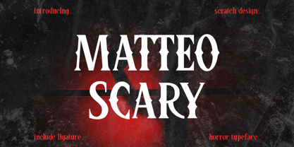 Please Welcome Matteo Scary. Matteo Scary is a horror and creepy font inspired by classic horror movie posters. It gives us the spirit of horror, spooky, frightening and suitable for poster movies, especially Halloween-themed, horror or thriller. This font is perfect also for branding, book cover, magazine header, and others which has horror or spooky vibes. What’s included? Uppercase & lowercase Number & Punctuation Ligatures Multilingual support Enjoy this font!
 - Cupid Gummies by Balpirick,
$15.00 Cupid Gummies is a Sweet and Cute Handbrushed Font. Whether you’re using it for crafts, digital design, presentations, or making greeting cards, this font has the potential to become your favorite go-to font, no matter the occasion! This font only has allcaps letters. - also multilingual support Enjoy the font! Feel free to comment or feedback! Thank you!
 - Original Quotes by Balpirick,
$15.00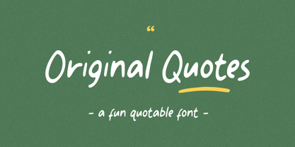 Original Quotes is a Fun Quotable Font. The font looks casual and playful. It's perfect for handwritten notes, sweet greeting cards, beautiful quotes, and stand-out branding as well. The set contains additional items for your design also multilingual support Enjoy the font, feel free to comment or feedback, send me PM or email. Thank you!
 - Rosetica by FadeLine Studio,
$18.00 Introducing Rosetica, a smooth, soft script font in handwriting style which gives the characters of this font a very simple, natural and sweet touch. Rosetica is perfect for logo's, branding projects, homeware designs, product packaging, mugs, quotes, posters, shopping bags, logo's, t-shirts, book covers, name card, invitation cards, greeting cards, and all your other lovely projects.
 - Veotec by Hashtag Type,
$29.00 Veotec is a classic humanist sans that skilfully works for both screen and print due to its steep and precise angles enabling more negative space. Not only does this methodical approach improve legibility and readability at small sizes, it allows the bolder weights to feel harmonised and consistent without the compromise of this legibility. Angles are refined and considered with a balance between sharp and round curves adding a unique feature to this font. This also gives a modern and appealing feel at large sizes. Details include 6 well constructed weights, manually edited kerning, which is more open for on-screen devices, ligatures and alternatives.
 - Reserve by Positype,
$29.00 First and foremost, Reserve is a companion typeface developed to complement the Scotch Suite of typefaces. With a focus on producing simpler forms with less contrast, Reserve evolved into a fantastic serif typeface for long-form text settings, exceptional clarity at low resolutions—for print and screen. Friendly and functional, Reserve is replete with features intended to make you feel comfortable going back to again and again, and with a complete set of condensed fonts, this typeface becomes more of a surprise. Small Caps, 4 sets of numerals, Case-Sensitive forms, Stylistic, Swash and Titling Alternates, Fractions, language support, and more… it’s all there, ready for you to use. The term ‘Reserve’ as it applies to the words of wine and spirits is typically used to alert a consumer of a higher quality, exceptional vintage, or special production of wine or whisky… it’s no different for this typeface’s name. Cheers.
 - Core Sans C by S-Core,
$20.00 Core Sans C family is a part of the Core Sans Series, such as N, M, E, A, D, G, R and B. Core Sans C is inspired by classic geometric sans (Futura, Avenir, Avant Garde etc.). It is based on geometric shapes, like near-perfect circle and square. It has a much higher x-height (height of lowercase letters), an effect which promotes readability especially at small print sizes. The Core Sans C Family consists of 9 weights (Thin, Extra Light, Light, Regular, Medium, Bold, Extra Bold, Heavy, Black) and Italics for each format. Core Sans C supports complete Basic Latin, Cyrillic, Greek, Central European, Turkish, Baltic character sets. Each font includes proportional figures, tabular figures, oldstyle figures, numerators, denominators, superscript, scientific inferiors, subscript, fractions and case features. Core Sans C is an ideal font family for use in magazines, web pages, screens, displays, and so on.
 - Step Better by Ronny Studio,
$19.00 Step better font Inspired by street graffiti markings, Urban Tag comes with the iconic round tip markers, this style is often used by several graffiti artists around the world because of its very unique style, very fun to write on markers. Perfect if you want a realistic street art or hip hop style for your designs, posters, props, etc. Features : All Caps numbers and punctuation multilingual Swash / Ornament PUA encoded Please contact us if you have any questions. Enjoy Crafting and thanks for supporting us! :) Thank you
 - FF Infra by FontFont,
$50.99 FF Infra™ is a fresh take on the robust sans serif typefaces of the early 20th century. Drawn by Gabriel Richter, it’s a friendly, inviting – and multi-talented family. Whether long blocks of editorial text, or snackable copy in web pages and blog posts, FF Infra’s 20 typefaces are easy on the eyes in both print and digital environments. The design also performs as well at petite sizes, as it does at supersized display settings. Pair FF Infra with an old style or Didone serif design and you’ll have powerful and distinctive typographic pages! FF Infra is available in 10 weights, ranging from a delicate light to a commanding black, each with an italic companion. OpenType® Pro fonts of FF infra have an extended character set supporting most Central European and many Eastern European languages, in addition to providing for the automatic insertion of ligatures and fractions. Each font also contains four sets of figures and a bevy of arrows that are ideal for wayfinding and similar info-graphic projects. A generous lowercase x-height, open counters and subtle graduations between family weights, make for a family that is at home in a wide range of sizes, and comfortable in everything from large signage, content for mobile apps, product manuals and full-scale branding projects. In addition, to provide design diversity, Richter drew alternate designs for the a, G and ß. Richter first became interested in fonts and the art of creating typefaces while studying communication design at Düsseldorf University of Applied Sciences. His first designs were experimental, but these lead a position at FontShop International in 2013, where he developed his typeface design skills. A strong background in font production, hinting and font marketing were also part of his FontShop experience. Richter worked as freelance graphic and type designer until he founded übertype in 2017. He also invests back into the type community through the type design courses he teaches at his alma mater. FF Infra is Richter’s first commercial design for Monotype. We’re sure that you’ll find it as versatile and powerful as we do.
 - Trollslayer by Hanoded,
$20.00 Picture this: you are in the woods, hunting for Elk, when all of a sudden you hear the sound of battle horns coming from the village. Troll attack! Thank Wodan you are armed with this brand new font: Trollslayer. Let the fight begin!!
 - The Stack Stone by Putracetol,
$18.00 The Stack Stone - Display Font a bold, quirky display font with a fun, trendy street style vibe. The Stack Stone is a versatile, stacking typeface perfect for retro or modern design aesthetic. The Stack Stone was hand-drawn, making its outlines somewhat irregular and quirky. It has an almost hand-lettered look; the characters jump around the baseline giving it a charming but urban look and feel. The Stack Stone suitables from posters designs to t-shirts and packaging, Stacked Letter will give your designs that alternative look and make your creative work look amazing. With a The Stack Stone , it will be very suitable for your project, which is related to fun, trendy street style vibe. Such as story books, illustrations, comic books, t-shirts, posters, greeting cards, logos, branding, stickers, svg, crafting. The alternative characters were divided into several Open Type features such as Swash, Stylistic Sets, Stylistic Alternates, Contextual Alternates, and Ligature. The Open Type features can be accessed by using Open Type savvy programs such as Adobe Illustrator, Adobe InDesign, Adobe Photoshop Corel Draw X version, And Microsoft Word. The Stack Stone is also support multi language.
 - Batman Beat the hell Outta Me - Unknown license

- Ranegund™ - Unknown license

- Antidote by Hanoded,
$15.00 Antidote is a grungy 3-D font. It is hand drawn and has been given a 'cracked' look. Looks great in headlines, titles and on packaging, but I wouldn't set a text in it as it is quite heavy.
 - Gomuno by Essentials Studio,
$10.00 Introducing by Essentials Studio Proudly Present, GOMUNO GOMUNO Is a A Cute Handwritten Font With 3 Style Font GOMUNO is perfect for product packaging, branding project, megazine, social media, wedding, or just used to express words above the background.
 - Yodo by The Northern Block,
$12.80 A geometric typeface that combines elegant curves with precise angles. The contemporary nature of this font will compliment a wide variety of graphic design applications. Details include 3 weights, a full character set, manually edited kerning and Euro symbol.
 - Reclaim - Personal use only

- Camden Queen by Asterisk,
$33.00 The font design is inspired by the long autumn evenings in London. Those "fast brown foxes" ran along the streets. Camden smelled delicious. And she was as beautiful as a queen.
 - Sherbrooke by Eyad Al-Samman,
$- Sherbrooke is a simple and sans serif font. I have chosen the name of this typeface after the "Sherbrooke" Street in Montreal, Canada, that I daily walked in for several months in the late 2005 while I was studying in Montreal, Quebec, Canada. I do adore this street and also I adore the whole city of Montreal. This font comes in two different weights. "Sherbrooke" can be used in wide fields of publications such as the titles of novels, literary texts, short stories, dictionaries, books, newspapers, websites, and magazines. It is suitable for T-shirts, mugs, advertisement light boards in malls, subtitles of movies, logos, cans of foods, and medicines' names. The font is more attractive when it is printed in calendars and for displaying the contents and paragraphs of electronic encyclopedias and different online websites. "Sherbrooke" is specifically designed for educational, journalistic, literary, and social purposes. The main characteristics of "Sherbrooke" Typeface are in its sans serif new designed letters and also in its lowercase special numerals. I think that these characteristics have made "Sherbrooke" exceptionally unique with its alphanumeric combinations. You can enjoy this typeface and use it anywhere at any product or service. It is simply gratuitous for all. The word "Sherbrooke" is a person's name. Sherbrooke Street - officially Rue Sherbrooke - is a major east-west artery at 31.3 kilometers in length and it is the second longest street on the Island of Montreal in Canada. The street is named for John Coape Sherbrooke, the Governor General of British North America from 1816 to 1818.
 - Alto Adige by Fenotype,
$25.00 Named after Italy’s northernmost region, Alto Adige is a high-contrast display serif typeface. With its condensed width and bold contrast it is excellent for headlines, packaging, magazines, posters and advertising, among any other display use. Alto Adige has large x-height making it a steady choice for sturdy text blocks with tight leading. In large sizes, you can also try tighter tracking for maximum impact. Alto Adige comes with a set of OpenType features: Contextual Alternates and Standard Ligatures are automatically on for certain character pairs. In addition it has over 50 alternates for display capital initials, set in Swash, Stylistic and Titling Alternates.
 - Salvation by Device,
$39.00 Rough and ready, bold and urgent. Or playful and fun in bright colours. The original letters were cut from actual potatoes, then scanned in and converted to vector outlines. Lighter and more heavily inked versions were used for the three variants. Using Opentype character-substitution technology, Salvation rotates through three versions of each letter to create a naturally uneven printed effect. Unlike hot metal type, the potatoes were cut the right way around. This produced reversed prints, which were then flipped back in Photoshop. Originally produced for Hughes' Get Lettering activity book, the font was then extended to cover numbers, punctuation and full European language support.
 - Mailbox Letters JNL by Jeff Levine,
$29.00Many items we use in our day-to-day lives offer wonderful source material for font designs. Mailbox Letters JNL was inspired by a set of self-stick adhesive letters used on mailboxes, doors and other areas of identification at home or in business. Each letter, number and punctuation mark is centered on a black rectangle - just as the actual model for this font. Use it as spaced, or hand set it tighter to form a ribbon with white-on-black text. To provide continuity for the ribbon effect, a blank rectangle is provided on the vertical bar key (the shift position of the backslash key). Limited character set. - Agatha by Underground,
$25.00 2015 First Prize TipoType award. Agatha is a new typeface for titles and short texts in big sizes. It can be use both in editorial publishing and brand design. From gothic geometric bases, the letters resemble the Nordic style in order to be more feminine, rhythmical and vertical. The two versions, Regular & Outline, let the designer choose between two contrasts: one heavy version that emphasize the rhythm and a lighter one that intensifies the subtlety. The third version, Blossom, combines light and color with ornaments that highlight the style. The three fonts have in addition a ligature set and some decorative glyphs that increase the possibilities of use.
 - Mazaeni by Kereatype,
$14.00 Mazaeni is a bold serif font family that includes 5 Weight regular to Extra Black which is inspired by something simple, elegant, usable, and versatile. Mazaeni is a daring and playful display typeface perfect for logotypes, posters, and editorial use. Includes wide language support, optional ligatures, OpenType alternates, and more. One thing to note about Mazaeni is the letter spacing. It was intentionally for clean reading if you wanted to use it for the body type, so I recommended setting the spacing a little tighter for display use (around -5 to -25 should do!). All typefaces from Kereatype include free updates, new features, and free technical support.
 - Kaligane by ArimaType,
$18.00 Kaligane is a type family designed with passion. A geometric typeface, first designed in a muscular black weight with a high-powered dynamic typographic aesthetic used in various communications, and later developed in a lighter weight where the shape exhibits some vintage-inspired proportions. With these diverse influences, typefaces allow for the use of impressive displays and effective logo designs as well as the use of more subtle editorials in body text - with a natural inclination for effective and powerful advertising. Sports typography typically uses italics for added dynamism and impact, and Kaligane complies by offering a choice of three alternative italic shapes with different slants.
 - Ethos by Fonts With Love,
$- Ethos is a contemporary serif fontfamily by Fonts With Love. It comes in 36 fontstyles with true italics and a huge bunch of opentype features like small caps, ligatures, nominators and denomiators, fractions and many more. Its x-height is pretty high, which makes it legible even on small fontsizes. Above that, the lighter weights have a rather low-contrast linestyle, which improves the legibility on display application especially on smaller sizes. On larger fontsizes, the typeface stands out with a distinctive character of geometrically shaped letters with soft rounded corners. Each fontface contains 500+ glyphs, supporting a huge amount of languages, mathematical operators, symbols and punctuations.
 - Agatha by TipoType,
$25.00 2015 First Prize TipoType award. Agatha is a new typeface for titles and short texts in big sizes. It can be use both in editorial publishing and brand design. From gothic geometric bases, the letters resemble the Nordic style in order to be more feminine, rhythmical and vertical. The two versions, Regular & Outline, let the designer choose between two contrasts: one heavy version that emphasize the rhythm and a lighter one that intensifies the subtlety. The third version, Blossom, combines light and color with ornaments that highlight the style. The three fonts have in addition a ligature set and some decorative glyphs that increase the possibilities of use.
 - Chopsee by TypeUnion,
$35.00 Chopsee is a fun, fluid, versatile font family of 8 weights and matching italics designed by Dan Jones for TypeUnion. The font aims to encompass movement and fluidity with its accentuated curves and terminals. The raised x-height creates more synergy between the lowercase and uppercase characters thus enhancing the visual appearance. The family of 8 weights & italics means you have plenty of usage options whether digital, branding or print - Chopsee black is perfect for that new brand idea you have, while the lighter weights provide a subtle support to clean layouts whether it’s call out text on a website or in print applications such as posters or magazine layouts.


