10,000 search results
(0.031 seconds)
- Olympukes 2012 by Barnbrook Fonts,
$30.00 Released on the occasion of the 2012 London Olympics, Olympukes 2012 was a new set of pictograms telling the ‘real’ story of the Olympics and extending the unofficial project that began in 2004. The occasion of the London games provided an opportunity to revisit the complex contradictions of the modern Olympics and to acknowledge the geopolitical shifts of the intervening eight years. The 2012 games arrived at a time of great economic and political uncertainty for the nation and Europe. Greece – the host of the 2004 games – was now located at Ground Zero of a disintegrating Eurozone and the United Kingdom was two years into a programme of austerity enacted by the coalition government of Conservatives and Liberal Democrats. Given that the previous London Olympics had been held in 1948, in a climate of recovery and austerity after a devastating World War (1948’s Olympiad was dubbed the ‘Austerity Games’) there was a sick irony to the 2012 games' arrival. The suppression of human rights in order to deliver the perfect games for PRoC’s Beijing games shocked no-one and yet, in London, the security measures seemed grossly excessive. Then again, in a country with an estimated 1.8 million cctv cameras, perhaps we shouldn’t have been so surprised. Another aspect of the Olympics that returned for 2012 was the unfettered commercialism – if you think the Games are about pure sport, about noble human endeavour, think again. Please note that Barnbrook Fonts is in no way affiliated with, or has received any endorsement from, the International Olympic Committee, the organising committees of the Olympic Games, or any national Olympic committee.
 - Luruh Light by Sebeningjingga,
$5.00 Overview: Pixel perfect design. 1 style included. Works on PC & Mac Perfect for both printing and screen display. Usage: Luruh light font family is perfect for both printing and screen display, and is most suitable for modern design, technology, sci-fi, futuristic style, flat design and web design.
 - Deadfall by Mofr24,
$11.00 Discover Deadfall, the ultimate horror display font that will send shivers down your spine! What sets Deadfall apart is its unique blend of fear-inducing aesthetics and multilingual capabilities. This Monospace typeface exudes a captivating dripped and splash style, adding an extra layer of terror to your designs. Notably, Deadfall supports the Cyrillic alphabet, making it an ideal choice for a global audience. Deadfall offers both regular and italic variations, granting you even more creative possibilities. Whether you're designing posters, crafting marketing materials, conjuring chilling movie titles, creating Death metal logotypes, or working on Halloween-themed crafts, Deadfall will infuse your projects with a bone-chilling atmosphere. To ensure versatility, consider pairing Deadfall with related font families or other typefaces that complement its macabre charm. Its functional aspects include an extensive character set and special features, making it suitable for a wide range of applications. The design concept behind Deadfall revolves around the idea of capturing the essence of horror. The font's distinctive dripped and splash style adds a sense of chaos and unease to any composition, immersing the viewer in a world of terror. The inclusion of the Cyrillic alphabet reflects our commitment to providing a font that caters to diverse audiences, bringing fear to every corner of the globe. We created Deadfall to meet the demand for a truly spine-tingling font that conveys a sense of horror and foreboding. Whether you're a graphic designer looking to evoke fear or a Halloween enthusiast seeking to amplify the spooky atmosphere, Deadfall is here to unleash terror in your designs. Get ready to embrace the darkness with Deadfall - the ultimate font for all things haunting and macabre!
 - Jubileum by Hanoded,
$15.00 Some time ago, I found myself in a clinic with my wife: at the time she was 20 weeks pregnant and had to do an ultrasound. To pass the time, I leafed through some (ladies') magazines which were lying around. Most of them tackled big issues like which shoes to wear and what type of foundation to plaster on, but one glossy featured a photo shoot. The photographer had found an old building with a beautiful art deco tile mural and had placed his skinny model in front of it. Fortunately for me, the mural featured a lot of text in a beautiful frilly style. I re-created the font I saw and it became "Jubileum" - which just means Jubilee in Dutch.
 - The Bolder Shadow by Sipanji21,
$15.00 The Bolder Shadows is an urban graffiti font characterized by sharp edges and a bold look. Ideal for music posters, apparel designs, shirts, and streetwear, this font brings a touch of edginess to your projects. The unique style of "The Bolder Shadows" makes it the perfect choice for street style or urban graffiti themes. Whether you want to create a strong and powerful statement or simply add a touch of attitude to your designs, "The Bolder Shadows" is the font for you.
 - Belmanthor by Scratch Design,
$14.00 Belmanthor is an urban street marker and brush display font, with a bold style. This was made by real marker and you will get the sense of adventure, manly, and strong. This font is perfect for logos, advertising, branding, urban-style posters, social media graphics, invitations, header text, album covers, packaging, product designs, merchandise, etc. This font is full of sets such as uppercase, lowercase, alternates, ligatures, and support for multi-language. So, download this Belmanthor and make your perfect design!
 - Valhala by Mevstory Studio,
$20.00 Valhala is an urban street marker and brush display font, with a bold style. This was made by real marker and you will get the sense of adventure, manly, and strong. This font is perfect for logos, advertising, branding, urban-style posters, social media graphics, invitations, header text, album covers, packaging, product designs, merchandise, etc. This font is full of sets such as uppercase, lowercase, alternates, ligatures, and support for multi-language. So, download this Valhala and make your perfect design!
 - Anno by Linotype,
$29.99The impulse behind André Maaßen’s design of the Anno typeface was the design of a New Year’s card for the year 2000 (Anno 2000). His desire to create the perfect printed image developed into a family with four styles: Anno 1, Anno 1 Italic, Anno 2, and Anno 2 Italic. Anno 1 and its Italic are semi-classicist typefaces, with a high degree of stroke contrast, while Anno 2 and its Italic are semi-grotesks, with less stroke contrast. Both Anno 1 and Anno 2 are sans serifs typefaces, but they each offer a new interpretation of the genre. The Anno typeface may be used in a number of applications and sizes. And it is naturally suitable for New Year’s greetings and other cards, of course! - Jugo Script by Sudtipos,
$39.00 Jugo Script is a Koziupa/Paul near-parody of the soft and speedy late-1980s, early-1990s display scripts. Though it essentially is one of the usual exhibits of Koziupa's calligraphic skill, its individual shapes and overall construct show a mischievous wink at Oz Cooper and the hundreds of lens-blurred film types he inspired in the 1970s and 80s. Koziupa's unique sense of letterform and proportion is on full display in the uppercase and the figures, while the lowercase is an eccentric exercise in single stroke lettering, complete with quick and subtle wrist bends, minimal pausing, and hurried exits. Jugo Script's softness and internal call-and-answer structure make it a natural for comfort food packaging, especially the sweet stuff.
 - Garnet Euro Typewriter by Coniglio Type,
$19.95Garnet is a rare TT typewriter face, made digital from analog samples gathered with great care by Coniglio Type. A time and place; type and life. Garnet Euro Typewriter is the first new release by designer Joseph V Coniglio in over 5 years. It is contemporary designer type, made from the struck steel hammers of an art deco san serif face transferred from a mechanical 1926 Royal Portable typewriter. It has an obsessively complete commercial roman character set ––for the pre-opentype environment of the late 1990's. Yes, it has that great “Monopoly Game” question mark -- and all on a period-piece typewriter! You should have no trouble grafting that sorely needed Euro symbol.” –And he very well did! - Cordel Interior by Ana Cordel Interior Font,
$15.00 Cordel Interior family draws inspiration from covers of 'cordel literature’, - small booklets of popular story-poems that played an essential role on the folk-popular cultural life of Brazil. Printed in coarse paper, usually with an woodcut illustration and lettering in the front, these booklets were sold on the streets, in marketplaces and town squares, hung in a cord - therefore the name ‘cordel’.
 - Yapari by Power Type,
$15.00 YAPARI is a font inspired by a street typography located in a Makassar city 2005, this writing is poured into a font and then made several variations of width which are Wide, Extended, and Expanded kind of stretched font then have thickness ranging from Thin, Extra Light, Light, Regular, Medium, Semi Bold, Bold, Extra Bold, Ultra. This font is suitable for use for design projects that have a bold impression and can also be used for all lines of media as well as formal and informal
 - Biwa by Wordshape,
$20.00 Biwa is a new straight-sided family of formally nuanced grotesk typefaces. Biwa’s lighter weights feel subdued, cool in tone, and neutral, while the heavier weights are more robust and full of personality. Developed over the past few years by Ian Lynam and James Todd, the 14-member Biwa family and the accompanying 14-member Biwa Display family are paeans to the immediate moment when phototype arrived on the global scene — partially smooth and partially machined. Biwa and Biwa Display are neutral in tone, have enlarged x-heights, and look amazing on-screen and in print. Each weight is designed to be highly readable in print and on-screen. The italic variations are true italics, having a single-storied italic a and have been designed for smooth, fluid reading and text-setting. Lovingly spaced and kerned, the Biwa family works equally well for text typesetting and for display design work. Languages supported include Western European, Central, and South European as well as Vietnamese. The entire family is comprised of a range of weights and a matching display family that features rounded terminals for large-scale display work. An agate version of Biwa Black is provided for free.
 - Colore by FSdesign-Salmina,
$39.00 Colore. Colourful and Modular. A happy and colourful New Year from the FSdesign team. In order not to lose the joy of playing, we provide the "Colore" font family: a modular font kit, that encourages to play. By superimposing the different font styles you can create a colourful typographical staging. This New Year's card was realized with the help of "Colore". Too wild? auto-referential? Try Colore and form your own opinion.
 - Yuge by Hanoded,
$15.00 Yuge, apparently, is how New Yorkers pronounce huge. I have never been to New York, so I can’t tell if this is a fact. But I often hear a certain New Yorker pronounce it that way, so I guess it’s sort of true. Yuge is a handwritten font - made with a Sharpie pen. Believe me, it is a good font. It is fantastic. It is the best font ever. It is YUGE! ;-)
 - Arethusa Pro by AVP,
$35.99 Arethusa Pro is a versatile font after the 'transitional' style – a style that has been evolving for 250 years. The balanced design of familiar letter forms blends form with function to create highly readable text. Twelve fonts organised in three sub-families provide a range of weights and styles. Language support includes Greek and Cyrillic and each font contains small capitals, superscript, fractions, ligatures, old-style numerals, case-sensitive forms and other opentype alternatives.
 - Bottle Fork by PizzaDude.dk,
$15.00 Here is my font with carved out letters, like a really bad stamp. Each lowercase letter has 3 different versions, and that makes your text more natural, organic and handmade. Normally I kern my fonts throughout, but this time there is no kerning at all...and that's odd, when we're not talking about monospaced fonts. Anyway, Bottle Fork has its flaws and jumpy x-height...but that's exactly the charm of it all! :)
 - JollyGood Sans by Letradora,
$18.00 Finally, a serious alternative to that other comic font. After years of mocking the font that shall not be named, I decided to create an alternative. I wanted to keep the fun feel and the comic book roots, but have a more polished look. The result? JollyGood, a complete font family, with great language support, a big range of weights and styles, and a friendly look. Check out the other members of the JollyGood family
 - Restaurant And Lounge JNL by Jeff Levine,
$29.00 Restaurant and Lounge is a casual, brush-style type face based on hand lettering found on a 1940s matchbook for the Park Avenue Restaurant (a popular dining spot during the golden years of Miami Beach).
 - Phaserwave by Mysterylab,
$22.00 Part of the wave of modern explorations expanding on the 50+ year-old traditions of groovy psychedelic typography, Mysterylab brings you Phaserwave. With an intriguing fusion of pillowy shapes and sharp stroke ends, this font cooks up a heady mélange of whimsical flow and high precision. We've applied our usual meticulous attention to great kerning, extensive character set, and seamless functionality, so this font's ready to rock your designs any way you might want to do it.
 - Radiant Kingdom by Timurtype,
$14.00 Introduced by Timurtype Studio! Radiant Kingdom is a Quotable Handwritten Font This font enhances your words with a font that is not just handwritten but also a charming masterpiece. Each stroke weaves a story of intrigue, making each quote a journey through the art of expression. Quotable and irresistible – let your writing leave an indelible mark. Radiant Kingdom Font also supports multilingualism. Enhance your designs with our original fonts, feel free to comment or provide feedback, Enjoy the fonts 😊 Thank You
 - Dry Cowboy by Chank,
$99.00 Yee haw! Send me a shot of sarsparilla and let's celebrate a new cowboy font! This time we're pleased to introduce a new, more legible counterpart to Chank's Drunk Cowboy font. The resultant new font has a bit less of a drawl to it and is known as Dry Cowboy. Now you have a choice for smaller text setting when using Drunk Cowboy as the headline font. Wrangle the two together and put a little giddyup in your designs.
 - Siarog by Linecreative,
$16.00 Looks simple and powerful. This is the reason why we want to offer you the Siarog font. This font gives off a clean, powerful and very elegant feel. This font is perfect for use in headlines, posters, branding, titles, and other graphic designs. What you get dear, you will get : Siarog- A clean San serif font including Upper & Lowercase characters(ALL CAPS), Stylistic alternates Character (11 Character) Supports Multi linguage (Latin Western Europe), Numbers and Punctuation
 - Absolute Adventure by Seemly Fonts,
$14.00 Absolute Adventure is a unique handwritten font. This font is a great choice for a wide variety of contexts! It looks amazing on greeting cards, business cards, logos, thank-you cards, quotes, greeting cards, and any other design that needs a creative spark.
 - Aloha Brush by Nirmana Visual,
$22.00 Aloha Brush This font is a supercharged, street-wise brush font bursting with energy. With extra feel as a real brush would! Letters are made with brushes on paper. Then scanned and carefully drawn into vector format. Thas 2 styles of regular and italic variations with a more natural look to your text. Aloha Brush is very suitable for use in various media such as; packaging, logos, labels, posters, shirt designs, bulletins, typography, and many other media.
 - Juggling Squad by Bogstav,
$19.00 The name of the font is from the hilarious movie "21 Jump Street" - and that is where the similarity ends. While the movie is quite funny, it is also super goofy! I can't say the same about the font, because terms like organic and organic comes to my mind. Strange, yes! And I have really no good reason for this naming, other that its an odd way to tribute this one of my all time favourite comic movies! :)
 - Wonders Graf 3d Graffiti by Sipanji21,
$15.00 "Wonder Graff" is a graffiti font that features 3 different layers and multiple font styles. With these layers and font style variations, you can create intriguing effects in your design. The use of layers and font styles allows you to achieve more complex and creative looks. Fonts like "Wonder Graff" are often used in street art, posters, or designs that want to emphasize bold and energetic typography. With different layer and style options, you have greater control over the appearance of your text and can customize it to fit your design concept.
 - Stronger by MlkWsn,
$25.00 Stronger is a supercharged, street-wise brush font bursting with energy. With extra attention to quick strokes and sharp details, Stronger is ideal for logos, apparel, quotes, product packaging, or anything which needs a typographic turbo-boost. What's Included: Stronger Regular - The standard version of the font. Perfect for titles and logos. Stronger Swash - Need a cool underline under your text or a splash of paint? This font set has you covered. Type any letter a-z using this font, and you'll get a unique swash to accompany the font
 - Crooked Hooks by Sarid Ezra,
$15.00 Crooked Hooks is all caps font with street style brush. It's contain uppercase and lowercase in different style, number, symbol, and also with multilingual support! Caps Only Fonts. There is a lot of stylistic ligatures in this font. This font also contain opentype feature for adding line under a word, You can access it from ligature, simply type underscore + number (1-3) in the middle of the text. For example: Mar_3ker. You can use this font for any project such as a branding, poster, or quotes! Happy Creating!
 - Munchkin Land NF by Nick's Fonts,
$10.00This typeface bears a superficial resemblance to Belwe Extrabold, but is based on a work called Thor, issued by Frederic Wesselhoeft Ltd of London in the 1930s. The characters in this font are loosely spaced for use in attention-getting subheads, but you can tighten the tracking to get spectacular headlines, should you wish. Both versions of the font include 1252 Latin, 1250 CE (with localization for Romanian and Moldovan). - Rotorua by Hanoded,
$15.00 Rotorua is a nice city in the Bay of Plent area of New Zealand. The area is famous for geothermal activity and every year thousands of tourists flock there to see the bubbling hot mud pools and the Pohutu Geyser. Rotorua font is a beautiful art deco typeface - with a twist. The font is all caps, but the lower case o, q and y differ. Rotorua comes with volcanic language support.
 - Black Home by Linecreative,
$14.00 Black Home Inspiring from vintage playful style typography. This font is perfect for a design that makes it more attractive and playful. made with a very good level of aesthetics making this font suitable for book cover, poster, packging, merchandise, logotype and much more. What you get dear, you will get : Black Home- including Upper & Lowercase characters(ALL CAPS), Numbers and Punctuation Supports Multi linguage (Latin Western Europe)
 - Tough Dude by Celebrity Fontz,
$24.99The Tough Dude font is a confident, devil-may-care, tough-guy font with attitude that screams "I don't need no stinkin' penmanship." It conveys a self-assuredness that does not preoccupy itself with trying to be necessarily legible or easy on the eyes but rather pragmatic, fast-flowing, and interested in scribbling the message out fast and moving on to the next task. We're confident you will enjoy it. - Garcog by Patria Ari,
$24.00 Garcog : The Ultimate Typeface for Mechanical Aesthetics. Inspired by the intricate design of gears and cogs, Garcog features upper shapes cut like precision engineering. This unique font adds a touch of industrial sophistication to your projects, making it the perfect choice for conveying precision, innovation, and mechanical excellence. Ideal for engineering, manufacturing, and tech-related designs, Garcog is the font that propels your message into a new dimension of creativity.
 - Rowboat by Atlantic Fonts,
$26.00 Rowboat is delightful and dependable. Turn on discretionary ligatures and you will find a salty set of interlocking and double letter combinations. Access interlocking ligatures using all caps. Rowboat Pictures contains 26 original Amy Dietrich seaside illustrations from charming ocean animals to nifty nautical gear.... Go ahead and make a splash! Posters feature images from Atlantic Fonts picture fonts including Eeeek Images , Trailmap Pictures, and of course Rowboat Pictures!
 - Core Sans CR by S-Core,
$20.00 Core Sans CR family is a rounded version of Core Sans C; a part of the Core Sans Series, such as Core Sans N, Core Sans M, Core Sans E, Core Sans A, Core Sans D, Core Sans G, Core Sans R and Core Sans B. Core Sans CR is inspired by classic geometric sans (Futura, Avenir, Avant Garde etc.). It is based on geometric shapes, like near-perfect circle and square. It has a much higher x-height (height of lowercase letters), an effect which promotes readability especially at small print sizes. The Core Sans C Family consists of 9 weights (Thin, Extra Light, Light, Regular, Medium, Bold, Extra Bold, Heavy, Black) and Italics for each format. Core Sans C supports complete Basic Latin, Cyrillic, Central European, Turkish, Baltic character sets. Each font includes proportional figures, tabular figures, oldstyle figures, numerators, denominators, superscript, scientific inferiors, subscript, fractions and case features. Core Sans C is an ideal font family for use in magazines, web pages, screens, displays, and so on.
 - Mercedes1937 by scarab13,
$9.00 There is an interesting story about this vintage professional Mercedes typewriter I’ve used to make this font. My grandfather, who was a Yugoslavian partisan during the WWII captured it from a Wehrmacht command building during an attack, and he kept it in a perfect shape for so many years. After I inherited it, I wanted to share it’s uniqueness (as well as it’s story). I’ve intentionally kept it in it’s original condition - I haven’t replaced the ribbon that was some 34 years old (or more) before sampling the font, and it turned out really nice. One more important thing - I have used ONLY it’s original set of characters (Latin with some Balkan-based letters). With it’s untouched originality and uniqueness it fits to our modern culture perfectly. There are no compromises here - there are no popular @,#,$ and other characters you would expect in a font. You will get EXACTLY what’s on this genuine “Mercedes” typewriter with so much soul.
 - PMN Caecilia eText by Monotype,
$29.99PMN Caecilia™ is the premiere work of the Dutch designer Peter Matthias Noordzij. He made the first sketches for this slab serif design in 1983 during his third year of study in The Hague, and the full font family was released by Linotype in 1990. The PMN prefix represents the designer's initials, and Caecilia is his wife's name. This font has subtle variations of stroke thickness, a tall x-height, open counters, and vivacious true italics. Noordzij combined classical ductus with his own contemporary expression to create a friendly and versatile slab serif family. With numerous weights from light to heavy, and styles including small caps, Old style figures, and Central European characters, PMN Caecilia has all the elements necessary for rich typographic expression. eText fonts - the optimum of on-screen text quality With our new eText fonts that have been optimised for on-screen use, you can ensure that your texts remain readily legible when displayed on smartphones, tablets or e-readers. The poor resolution of many digital display systems represents a major challenge when it comes to presenting text. It is necessary to make considerable compromises, particularly in the case of text in smaller point sizes, in order to adapt characters designed in detail using vector graphics to the relatively crude pixel grid. So-called 'font hinting' can help with this process. This, for example, provides the system with information on which lines are to be displayed in a particular thickness, i.e. using a specific number of pixels. As font hinting is a largely manual and thus very complex technique, many typefaces come with only the most necessary information. What is unimportant for a text printed in high resolution can result in a poor quality image when the same text is displayed on a screen, so that reading it rapidly becomes a demanding activity. Specially optimised eText fonts can help overcome this problem. An extremely refined and elaborate font hinting system makes sure that these fonts are optimally displayed on screens. Monotype has not only adopted font hinting for this purpose but has also thoroughly reworked the fonts to hone them for display in low resolution environments. For example, the open counters present in the letters C, c, e, S, s, g etc. have been slightly expanded so that these retain their character even in small point sizes. Also with a view to enhancing appearance in smaller point sizes, line thickness has been discreetly increased and x-height carefully adjusted. Kerning has also been modified. Don't leave the on-screen appearance of your creations to chance. Play it safe and use eText fonts to achieve perfect results on modern display devices. Many typefaces, including many popular classics, are already available as eText fonts and new ones are continually being published. The eText font you can purchase here are available for use as Desktop Fonts or Web Fonts. Should they be used in Mobile Devices such as smartphones, tablets or eReaders, please contact our OEM specialists at sales-eu@monotype.com. - ITC Grimshaw Hand by ITC,
$29.99 ITC Grimshaw Hand is based on the handwriting of its British designer, Phill Grimshaw. Warm and lively, this typeface has the look of spontaneous handwriting with a little extra panache. Note the jaunty k, the swooping f, the simply stylish s, and the absolutely zingy cap Q and R. Grimshaw designed this face in 1995, at a time when he was also playing the guitar and mandolin. Handwriting fonts give an air of intimacy to the graphic design of advertising pieces, packaging, invitations, greeting cards - and ITC Grimshaw Hand has the touch of sweet music in its enthusiastic strokes.
 - Whisk by Jonahfonts,
$39.00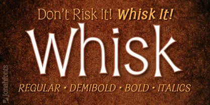 A whimsical font for packaging, logos, captions and greeting cards.