10,000 search results
(0.05 seconds)
- Augsburger by HiH,
$12.00 The Augsburger Family is a product of the Art Nouveau period in Germany and Austria, reflecting the darker, heavier Jugendstil approach typical of the Secession movement in these two countries. Originally released by H. Berthold AG of Berlin and Bauer & Co. of Stuttgart in 1902, Augsburger has been attributed to the designer Peter Schnorr. This current version represents a year-long revision of the Augsburger Family. All three fonts have been updated to eliminate duel encoding, harmonize metrics, and review all glyphs. In addition, the following features have been included in the individual fonts: Augsburger Schrift: a total of 249 glyphs have been added, for a total of 467 and an increase of 114%. New are Tabular Numbers, Small Caps, a variety of Ligatures and the refinement of all accents. Augsburger Initials: complete redesign of upper case, inclusion of upper case from Schrift instead of lower case, plus inclusion of small caps and a selection of appropriate ligature. Augsburger Ornamente: includes some additional glyphs. Augsburger may be purchased as a complete family or as individual fonts. Each font package includes both TTF and OTF versions to allow you to select what is most useful to you.
 - Basic Commercial Soft Rounded by Linotype,
$29.99 Basic Commercial is a font based on historical designs from the hot metal typeface era. It first appeared around 1900, and was created by type designers whose names have not been recorded but whose skills cannot be overlooked. This typeface's design has been popular among groups and movements as diverse as the Bauhaus, Dadaism, and the masters of Swiss/International-Style typography. It influenced for a variety of later grotesque fonts, such as Helvetica and Univers. Basic Commercial was distributed for many years in the United States under the name Standard Series. The typeface worked its way into many aspects of daily life and culture; for instance, it became the face chosen for use in the New York City subway system's signage. The Basic Commercial's font family members have a clear and objective design. Their forms exhibit almost nothing unusual, but remain both lively and legible nonetheless. Perhaps for this reason, Basic Commercial's design has been popular with graphic designers for decades. To read more about the history of typefaces like Basic Commercial, visit our font feature, The Sans Serif Typefaces. In addition several weights of this typefamily are available as soft rounded versions."
 - P22 Klauss Kursiv by IHOF,
$29.95 P22 Klauss Kursiv is the first ever digital revival and expansion of the last face Karl Klauß designed for the Genzsch & Heyse foundry in Stuttgart before he died in 1956. Karl Klauß’s classical training in the graphic arts gave him solid chops to use as a springboard for design ideas that remained relevant among the countless trends fleeting around the turmoil of two world wars. By the mid-1950s, a kind of ornamental deco aesthetic was well on its way into mainstream design in post-war Europe, and demand was high for unique, lively and non-minimal ad faces. Klauß, a reliable designer with a proven track record of calligraphic faces, pushed the envelope on his own calligraphy and designed something that packages elegance in a boldness seldom seen before in luxury scripts. Quite a bit of talent is on display in Klauss Kursiv. In spite of the restraint this kind of design imposes on itself almost by default, the interplay between thick and thin never seems forced or challenging. Clear, natural strokes build a compact alphabet that demonstrates the wrist control of a veteran calligrapher. Creative nib angling segues into very clever start-and-stop constructs to make attractive forms that work quite well together, yet stand well to individual scrutiny. P22 Klauss Kursiv comes with a load of built-in alternates and ligatures in a font of over 470 glyphs, providing extended support for Latin languages.
 - Qewek by Amir Asgari,
$50.00 The Qewek Font Face Family created according to the 20th Century's famous fonts structure adopted and recreated to use for today's platforms. The Font Family Supporting European Languages such as Spanish, French, German, Swedish, and Turkish. The Qewek family could be using postmodern, modern, surreal, and many design styles. Also, Qewek has a so unique and sweet look with a functional shape that is completely awesome for use in print base media and also digital base magazines and newspapers. Just imagine you reading a magazine with a font that is at the same time completely new and also has a classic shape.
 - Beijin by Abbasy Studio,
$10.00 Introducing Beijin Layered Font Beijin is a serif font and comes with 7 layer style, that allows you to stack however you want. There are more than 407 glyphs in this font including Stylistic sets, Contextual Alternates etc. OpenType features with Stylistic Alternates, Contextual Alternate in some characters that allows you to mix and match pairs of letters to fit your design. Beijin Layered Font is suitable for Logo, greeting cards, quotes, posters, branding, stationary, design title, blog header, art quote, typography art, modern envelope lettering or any purpose to make our art/design project look pretty and trendy.
 - Margarita by Ivan Rosenberg,
$16.00 Margarita Script Font is formal script font with multilingual support. It is ideal for wedding invitations, magazines, social media, restaurant menus, greeting cards, birthday invitations, headers and many more. This brush font comes with a complete set of lowercase and uppercase characters, a large range of punctuation ligatures, numerals and and multilingual support. Margarita Script Font is a set of 666 glyphs, Upper and Lowercase characters with ligatures, numerals, lot of punctuation glyphs and up to 20 alternates. For access to Stylistic Alternates and Ligatures is required software with glyphs panel like Photoshop, llustrator, Inkscape etc.
 - Le Jardin by Anmark,
$13.00 Le Jardin comes in two styles: Floral and Regular. This font includes ligatures and a full set of lowercase alternates to make your text as close to a natural handwritten script as possible. Le Jardin Floral is an elegant, decorative, feminine font. Floral uppercase letters are ideal for your wedding monograms and logos. Use this font for wedding invitations, branding, packaging, magazines, florist shops, social media, restaurant menus, greeting cards, headers and many more. Le Jardin Regular is a modern calligraphy font. It's perfect for wedding design projects, instagram, invitations, signatures, watermarks, logos, letterpress address, titles, birthday invitations, handwriting and more.
 - The Fox Tail by Din Studio,
$22.00 Hi Font Lovers! Let me introduce you to The Fox Tail – Font Duo&Extras The Fox Tail – Font Duo&Extras is a font inspired by the retro style and fox’s tail. It has a unique and attractive design so it is suitable for logos, branding projects, product packaging, quotes, greeting cards and many more. Includes: Features: A Full Set of Lowercase and Uppercase Stylistic Alternates Character Set (A-Z) Numerals and Punctuation (OpenType Standard) Accents (Multilingual Characters) PUA Encoded Make your design look unique with retro vibes. I hope The Fox Tail could fit your project’s standard.
 - Creamy Bubble by Balpirick,
$15.00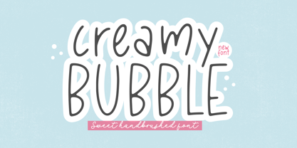 Creamy Bubble - a Sweet Handbrushed Font that's clean, elegant and perfect for a range of design projects! With its smooth, effortless lines and understated sophistication, this font is the perfect choice for those who want a modern look that's still timeless in its appeal. Crafted with precision and care, this font is incredibly versatile and can be used for a range of design projects, including logos, branding, invitations, packaging, and more. With its simple yet refined aesthetic, it's sure to make a lasting impression on anyone who sees it. - also multilingual support Enjoy the font! Feel free to comment or feedback! Thank you!
 - Lion Parade by Letterhend,
$19.00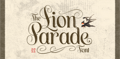 The Lion Parade Font is a unique and classic display font. It's a serif font with swashes! This font perfectly made to be applied especially in logo, and the other various formal forms such as invitations, labels, logos, magazines, books, greeting / wedding cards, packaging, fashion, make up, stationery, novels, labels or any type of advertising purpose. Features : uppercase & lowercase numbers and punctuation multilingual ligatures alternates PUA encoded We highly recommend using a program that supports OpenType features and Glyphs panels like many of Adobe apps and Corel Draw, so you can see and access all Glyph variations.
 - Handikraf by Keristyper Studio,
$9.00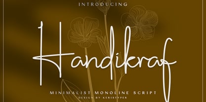 Handikraf Signature Script Font is charming and elegant Typeface. Created with an authentic, handwritten feel. It looks stunning on wedding invitations, thank you cards, quotes, greeting cards, logos, business cards, and every other design which needs a handwritten touch. Handikraf Signature Script Font multilingual support: Afrikaans, Albanian, Catalan, Danish, Dutch, English, Estonian, French, Finnish, German, Icelandic, Indonesian, Italian, Malay, Norwegian, Portuguese, Spanish, Swedish, Zulu, and many more. What’s Included : Web Fonts Standard & Multilingual glyphs Ligature Works on PC & Mac Simple installations Accessible in Adobe Illustrator, Adobe Photoshop, Adobe InDesign, and even work on Microsoft Word. Hope you enjoy our font!
 - Summer Monogram by Yoga Letter,
$16.00 "Summer Monogram" is a combination of script and monogram fonts with coconut tree and beach decorations in the monogram letters. This font is very unique and beautiful, so it is perfect for summer moments. This font is equipped with monograms, basic characters, swash, titling, alternates, multilingual support, numerals and punctuations. Very suitable for summer, spring, autumn, mother's day, christmas, holiday, winter, wedding and other moments.
 - Love Song JNL by Jeff Levine,
$29.00 Love songs are the perennials of music, outlasting all other popular fads and styles that come and go. The 1920s through the 1940s is considered by some to be the Golden Age of the American love song. Thousands upon thousands of copies of popular sheet music sold, and the cover lettering and art on many titles were from some of the finest illustrators of their time. Love Song JNL recreates the Art Deco-flavored design found on one such piece of sheet music from the 1930s.
 - Kia Ora by Something and Nothing,
$15.00 Kia ora is a M?ori-language greeting which is used as an informal greeting, equivalent to "hi" or "hello", or an expression of thanks. The koru (M?ori for loop or coil) is a spiral shape based on the appearance of a new unfurling frond. It is an integral symbol in M?ori art, carving and tattooing, where it symbolises new life, growth, strength and peace. Its shape conveys the idea of perpetual movement, while the inner coil suggests returning to the point of origin.
 - Ah, Verdana! Picture this: you're browsing through your computer, searching for that perfect, clear, and friendly font that just screams "readability." Boom, there you land on Verdana, and it's like ...
- As of my last update in early 2023, Gear by BRIDGEco represents a distinctive font carefully designed to encapsulate a blend of mechanical robustness and sleek, modern aesthetics. Gear stands out for...
- Sensa by Fontfabric,
$47.00 Sensa is a handmade font family consisting of 21 fonts. It is divided into 6 subfamilies, each contributing to its wide range of visual power – Sensa Brush, Sensa Pen, Sensa Wild, Sensa Sans, Sensa Serif and Sensa Goodies. Only your imagination is the limit. Pick any of the font as a leading one and the rest of the fonts can accompany it with ease. To work together in all possible combinations, all fonts in this package were created with that simple idea in mind. Sensa is applicable for almost every design project - from advertising, packaging, editorial and branding, to web and screen projects. For a beauty and tender sensation or for more male and strong communication – you have a wide selection.
 - Lucifer Sans by Daniel Brokstad,
$29.00 Lucifer Sans is a modern sans serif font rooted in Scandinavian geometry and minimalism, mixed with a healthy dose of black metal and irreverent attitude. Harsh vertical cuts and angles throughout the font creates a very strict and hard look, that can either be amplified or loosened up through its stylistic sets. Lucifer Sans family contains 162 font, 9 different weights and width, plus italics. In addition there are 3 different stylistic sets. This creates substantially diverse set of characters for contrasting against another and makes it a versatile font for different formats. Style 01 takes on an almost hand drawn style, while Style 02 enhances the geometric aspects of the font further. Style 03 uses only the rounded letter 01 without the hand drawn variations.
 - Rahere Esoteric by ULGA Type,
$25.00 Rahere Esoteric is a gothic-flavoured, quasi-Roman display font with an eccentric persona and more quirks than a Tim Burton film. A member of the extended Rahere typeface family, it’s the enigmatic cousin of Rahere Roman Display & Rahere Sans. This is a niche display font that doesn’t try to please everyone. Rahere Esoteric revels in its mystical aura, using a bewildering array of ligatures to magically transmute itself as characters loop, curl, jerk and strut, randomly connecting and disconnecting into words like a retro-futuristic steam train clattering along a disused railway track, challenging and delighting the reader at the same time. To add more sparkle, there are alternatives, inferior and superior caps plus a [Wicca] basketful of symbols, ornaments, weird faces and even a snake-infused ampersand. Whilst Rahere Esoteric has been designed primarily as an all-caps font, the lowercase slots contain small caps with corresponding numerals. However, because this is an arcane, unpredictable font, order and regularity are frowned upon, which means there are no tabular numerals – so company reports or accounts are a solid no! Unless they’re for the Golden Circle of Alchemists PLC or Gothic Blackstar Corporation. It is ideal for all things pagan, esoteric, alchemy, other-worldly or magic-related projects and particularly useful for music genres across the Gothic / Darkwave / Ethereal spectrum. What about legibility? Hey, look into my eyes: Esoteric is all about the mystique. If a secondary font is needed for the important stuff, I recommend its cousin, Rahere Sans, which pairs beautifully with this display font and is perfect for long passages or small text. The initial idea for Rahere Esoteric came about during a visit to Whitby, a small coastal town in Yorkshire, UK and famous for its inclusion in Bram Stoker’s novel, Dracula. A Steampunk festival was in full swing and the narrow streets of the town centre were teeming with people adorned in a glorious fusion of clothing and accessories influenced by a love of 19th-century life, science fiction, horror, fashion and art. I was fascinated by the juxtapositions of colour, patterns, material and style – archaic mechanical Sci-fi, gothic, the American Wild West and romantic Victorian. But what intrigued me the most, somehow, all the disparate elements worked as a whole. Thus, like Frankenstein, this font jolted into existence. Supported languages include Western Europe, Vietnamese, Central/Eastern Europe, Baltic, Turkish and Romanian.
 - Plumage by Wilton Foundry,
$29.00Plumage is somewhat unusual in that it has elements of calligraphy as well as script in a semi-loose form that gives it a pleasing appearance for both large and small sizes, and interesting flare finish strokes add to its unique character. As I read a dictionary description of "plumage", I realized that in many ways there is a parallel between a bird's plumage and how it is utilized in the context of writing: Plumage varies in pattern and arrangement for different purposes; what it expresses can of course be even more interesting. Plumage is disposable after a season, as new ones become available... imagine, a self-sustaining quill! - I guess that's equivalent to a refill or disposable pen. Historically, quill pens were made from feathers of a variety of birds, each chosen for its special characteristics. The sturdiest and most reliable feathers, however, come from turkeys, swans and geese. Feathers used to make pens are the stiff-spined flight feathers on the leading edge of the bird's wing. Pens for right-handed writers come from the left wing, and pens for left-handers, from the right! Each bird yields 10-12 good quills, and sometimes only 2 or 3 - so small a yield that the geese reared in England could not furnish nearly enough for local demand, and quills were imported from the Continent in large quantities. At one point St Petersburg in Russia was sending 27 million quills a year to the UK. It is said that geese were specially bred by US President Thomas Jefferson (1743-1826) to supply his own vast need for quills - in his lifetime he wrote almost 20,000 letters. The name "Plumage" was selected to pay homage to the noble birds that supplied countless quills for centuries of literary works. Plumage is recommended for any formal or informal invitation, decorations, awards, poetry, plaques, etc. We hope you will have the pleasure of using Plumage. - Nova Quinta by Mans Greback,
$69.00 Nova Quinta is a breathtaking, enchanting formal script font that weaves an air of magic and sophistication into your designs. With its delightful swirls and exquisite swashes, this font radiates a lovely charm, perfect for adorning wine labels, farm produce packaging, and luxury branding. Imagine your design coming to life with the genuine elegance of Nova Quinta, transforming your work into an enchanting piece of art. The font's irresistible beauty and decorative allure make it a dreamy choice for projects that require a touch of refinement and grace. The Nova Quinta font family includes four mesmerizing styles to suit various design needs: Regular: A gracefully balanced, enchanting style Bold: A more assertive and captivating presence Italic: A whimsical dance of flourishes and movement Bold Italic: The perfect blend of boldness and flair Unleash your creativity with the advanced OpenType functionality of Nova Quinta. This font family ensures top-notch quality and provides you with full control and customizability. It includes stylistic and contextual alternates, ligatures, and other features to make your designs a vibrant, one-of-a-kind masterpiece. Nova Quinta embraces an extensive lingual support, covering all Latin-based languages, from Northern Europe to South Africa, from America to South-East Asia. It contains all the characters and symbols you'll ever need, including all punctuation and numbers.
 - Sariah by melifonts,
$5.00 Sariah is a beautifully simple handwritten typeface, composed of clean lines and exaggerated ascenders. It is perfect for a sweet note, a photo caption, an address label, or a graphic print.
 - Harleyquin by Letterara,
$12.00 Sweet, charming and full of authenticity: Harleyquin is a one-of-a-kind typeface with a personal feel. Use titling to give different letter effects, making your project even more elegant!
 - Bridgeriden by VzType,
$15.00 Thanks for checking out Bridgeriden is perfect for all your needs, such as a logo, printed quotes, badge, insignia, packaging, headline, poster, t-shirt/apparel, greeting card, and wedding invitation, & etc.
 - Hey Sweety by Stringlabs Creative Studio,
$29.00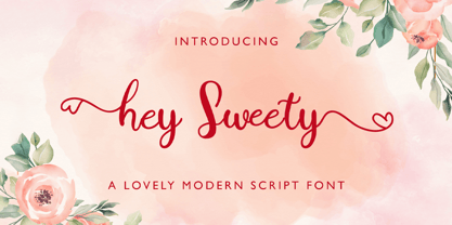 Hey Sweety feels equally charming and elegant. It looks stunning on wedding invitations, thank you cards, quotes, greeting cards, logos, business cards and every other design which needs a handwritten touch.
 - Masherbrum Slab by Juraj Chrastina,
$29.00 Subtle slab serifs and distinctive hooks of this square ultra light type face will add a bit of elegant feeling to your sweet designs. Masherbrum Slab looks better in larger sizes.
 - LD Genevieve by Illustration Ink,
$3.00Both edgy and elegant, LD Genevieve—with its decorative plumes—adds unique flair to your scrapbook layouts, handmade greeting cards and other creative projects. Pair Lowercase and Uppercase to mix cases. - Finery JNL by Jeff Levine,
$29.00 A 1949 piece of piano solo sheet music entitled "Playing Jacks" contained the title beautifully hand-lettered in a stencil-like alphabet. Finery JNL is the digital version of this design.
 - Cinthya Einzberg by Stringlabs Creative Studio,
$29.00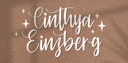 Cinthya Einzberg feels equally charming and elegant. It looks stunning on wedding invitations, thank you cards, quotes, greeting cards, logos, business cards and every other design which needs a handwritten touch.
 - Sellviny Queen by Stringlabs Creative Studio,
$29.00 Sellviny Queen feels equally charming and elegant. It looks stunning on wedding invitations, thank you cards, quotes, greeting cards, logos, business cards and every other design which needs a handwritten touch.
 - Patricia Rustine by Letterena Studios,
$9.00 Patricia Rustine is a romantic and sweet calligraphy typeface with characters that dance along the baseline. It will add a luxury spark to any design project that you wish to create!
 - Melatti by Awanstudio,
$15.00 Melatti allows you to create stunning and easy hand-lettering in an instant. Ideal for the logo, quotes, wedding, product label/packaging, fashion, letter, advertising, invitation, poster, merchandise, greeting cards, etc.
 - Words And Music JNL by Jeff Levine,
$29.00 The 1934 sheet music for "I'll String Along with You" from the Dick Powell-Ginger Rogers musical "20 Million Sweethearts" yielded the charming Deco monoline design for Words and Music JNL.
 - Gambling Resort JNL by Jeff Levine,
$29.00 Sheet music for the song "Beyond the Blue Horizon" from the motion picture "Monte Carlo" had the movie title in hand-lettering reminiscent of the Futura Black style, but with an inline stripe through each character. These few letter examples were the basis for Gambling Resort JNL and conjure up the Nouveau Riche spending their nights in Monte Carlo packing the roulette wheels, blackjack tables and slot machines.
 - Picture this: If fonts were a party, Crushed Out Girl would be the one that arrived on a vintage Vespa, wearing a polka-dot dress and oversized sunglasses, effortlessly becoming the life of the party...
- Frescito by Mans Greback,
$49.00 Frescito is a modern sans-serif typeface that embodies a fresh, cool, and street-smart aesthetic. Designed to be both balanced and versatile, its clear and legible monoline style is designed for branding and advertising in editorial and digital design. The Frescito font family comes in the five classic weights: Thin, Light, Medium, Bold, and Black, along with a Variable font for ultimate flexibility and customization, as well as Italics. Inspired by the energetic spirit of the city and its vibration, Mans Greback set out to create a typeface that would stand out against vivid moment; a type that would work in a traditional café just as well as for contemporary merchandise. The result is a font that combines the best of both worlds: an air of freshness and modernity with an unpretentious, timeless and classy appeal. The font is built with advanced OpenType functionality and has a guaranteed top-notch quality, containing stylistic and contextual alternates, ligatures, and more features; all to give you full control and customizability. It has extensive lingual support, covering all Latin-based languages, from Northern Europe to South Africa, from America to South-East Asia. It contains all characters and symbols you'll ever need, including all punctuation and numbers.
 - Ah, B de Bonita by deFharo - the font that dances on the line between elegance and fun, dipping its typographical feet into pools of style and whimsy! Picture this: you're walking through a garden of...
- Turquoise by Resistenza,
$59.00 Many calligraphers agree that Roman Capitals is one of the most beautiful yet difficult hands to master. Its beauty lies in its simplicity of form and structure, yet understanding and applying these skillfully can take years of mindful practice. My goal was to design Roman Capitals that were smoothly designed with a brush, not carved. The main concept was based on the fundamental strokes that are commonly studied when you practice Roman letters. That’s why many Serifs have these unfinished terminal serifs. I created the Turquoise typeface based on my Capitalis Romana practice with a flexible broad edged brush and gouache. During the lowercase process I was still following Foundational calligraphy with a flat brush. My Turquoise Capitals were then adjusted and redesigned at the Tipobrda calligraphy workshop in Slovenia. Turquoise contains small caps, many discretionary ligatures, ornaments, swashes as well as several brushy nature-inspired ornaments, accessible via OpenType. Ideally suited for headlines or body text in advertising, packaging and visual identities, its delicate shapes, curves and endings give projects a harmonious elegance and stylistic feel in unique Turquoise style. My inspiration for this font showcase is one of the richest islands in the Mediterranean, the place where my parents are from, Sicily. This southern Italian region has so many unique spots: Stromboli, part of the Aeolian Islands, and the Pelagie Islands is one of my favorite places in Sicily. The pictures I used were taken there this year. So enjoy the sun, the serifs, the water and its Turquoise colors. The brush is mightier than the sword. Opentype Features: https://www.rsztype.com/article/how-to-use-opentype-features-adobe-microsoft-pages Turquoise works very well with Nautica Check also Turquoise Inline
 - The Mix Office by LucasFonts,
$59.00"TheMix" is a semi-serif typeface with low-contrast – i.e., the differences between thin and thick strokes are not very pronounced. Yet the reference to writing with the broad-nibbed pen is still present, giving the letters a diagonal stress and a forward flow that facilitates reading. - Sign Project JNL by Jeff Levine,
$29.00 Sign Project JNL is based on vintage water-applied decals once made by the Meyercord Decal Company of Chicago (and later Carol Stream), Illinois. These decals were popular during the 1950s and 1960s for window signage, boat identification, mailbox names and numbers and hundreds of other projects.