10,000 search results
(0.056 seconds)
- Khinta by FadeLine Studio,
$10.00 Khinta comes in a bold and clean style, this font is firm, luxurious and simple. With a style like this, this font will be very suitable to use for logo's, branding projects, homeware designs, product packaging, mugs, quotes, posters, shopping bags, logo's, t-shirts, book covers, name cards, invitation cards, greeting cards, and all your other lovely projects.
 - Always Believe by Olivetype,
$18.00 Always Believe is a simple, fun, and relaxed handwritten font. Whether you’re using it for crafting, digital designing, presentations, or greeting card making, it’s perfect! This font is supporting Multi-Languages, which includes: Afrikaans Albanian Catalan Danish Dutch English Estonian Finnish French German Italian Norwegian Portuguese Spanish Swedish Zulu. You will get : Always Believe OTF Thank You
 - Sayonachi by ActiveSphere,
$30.00 Sayonachi is a fun, curly font to use in a wide range of documents, and works best in display applications, such as posters, greeting cards, awards, invitations, logos and titles. Sayonachi font has a full upper and lower-case, accents, punctuation and a selection of monetary symbols. Currently Available for Mac and PC, in Open Type, PostScript or TrueType.
 - Marthiline by Motokiwo,
$15.00 Introducing Marthiline: a sweet beauty handwritten font that is perfect for beauty branding, book covers, posters, magazines, or quotes. Marthiline is packed with uppercase, lowercase, numeral & punctuation, multilingual and ligature that already PUA encoded. With its real brush texture and natural stroke gesture you can use this font stand alone or combine it with a thin sans serif.
 - Rainboface by Forberas Club,
$16.00 This cute font create with love and inspired below the rainbow. When the rain is coming, the rainbow definitely will blooming. So what make you think twice? just grab it fast, crafter should do crafting. The magical weapon is here, do your thing as invitation card, greeting card, gift card, or wedding decoration this font sure ready for you.
 - Romantic Garden by ErlosDesign,
$19.00 Romantic Garden - Handwritting Font by erlosDESIGN Romantic Garden is a romantic and sweet calligraphy typeface with characters that dance along the baseline. It will add a luxury spark to any design project that you wish to create! This font is PUA encoded which means you can access all of the amazing glyphs and ligatures with ease!
 - Andra Cookie by Allouse Studio,
$16.00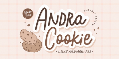 Proudly Presenting, Andra Cookie A Sweet Handwritten Font Andra Cookie is perfect for any titles, logo, product packaging, branding project, megazine, social media, wedding, or just used to express words above the background. Andra Cookie also come with Multi-Lingual Support. Enjoy the font, feel free to comment or feedback, send me PM or email. Thank You!
 - Dhaelzot by Aisyah,
$12.00 Dhaelzot is a stylish, modern handwriting font with a relaxed, informal feel. With its unique, flowing letters, Dhaelzot adds a personal touch to any design project, making it perfect for use in greeting cards, invitations, and social media posts. The font is highly legible and easy to read, making it ideal for body text as well.
 - Kybul by Invasi Studio,
$19.00 A bubbly, sweet font with a cutoff letterform on detail. Kabul takes another step and brings the bubbly into a casual style. Perfect for use in big sizes on posters or flyers. It's a good combination with sans font. Its imperfections keep it casual while still providing legibility. This is a great combination of casual and retro eras.
 - On The Ground by Fascination Workshop,
$10.00 On the Ground is a picture font made from drawings of found objects. These object were found on the ground while walking around different cities in the United States. The font uses varying drawing styles (from detailed to pictographic) but they all have a similar irregularity, unifying the characters. Perfect for animations, signs, greeting cards, posters, etc.
 - Gamos by Letterara,
$12.00 Gamos comes from Greek which means marriage. Add some love in an instant. The font comes decorated with small embellishments, such as hearts. Making it the perfect font for Valentines Day designs, but also Christmas, Weddings, Anniversaries, Birthday cards, table numbers, header menus, display’s, logos, slider blogs, custom addresses, stamps, packaging, greeting cards, and much more!
 - Stay Gladin by IM Studio,
$19.00 Stay Gladin Script Font Trio is a new modern script font with an irregular baseline. Stylish and feminine. Stay Gladin Script looks beautiful in wedding invitations, thank you cards, quotes, greeting cards, logos, business cards and more. Perfect for use in ink or watercolor. Includes start and end letters, alternatives and support for many languages. Thanks You.
 - Dahlia Regictik by Letterena Studios,
$10.00 Dahlia Regictik – Luxury Serif Font, from Letterena, is a Luxury serif font, suitable for any projects such as: logos, branding projects, homeware designs, product packaging, mugs, quotes, posters, shopping bags, t-shirts, book covers, name card, invitation cards, greeting cards, label, photography, watermark, special events, and all your other luxury and beautiful projects that need a Luxury serif taste.
 - Blunder by 3Wprotype,
$10.00 Introducing, Blunder Display Font. Concise typeface is fun, and relaxed with natural handwriting. This type of font is very suitable to be applied especially for the needs of letters and logos, and various other formal forms such as invitations, labels, magazines, books, greeting/wedding cards, packaging, fashion, make up, stationery, novels, labels or any type of advertising purpose.
 - Miracle World by Nathatype,
$29.00 Do you want to get something miracle? Miracle World is an elegant serif font to level up your design into something miracle. It can never go wrong to be applied in any purposes. The weight of the font was designed to bring strength to any title/header. On the other hand, the curves of the characters convey a sense of elegance. It is also has fascinating features that helps you maximize your design. Features: Stylistic Sets Ligatures Multilingual Supports Numerals and Punctuations PUA Encoded It can be used for many design projects, such as poster, logo, book cover, branding, heading, printed product, merchandise, quotes, social media campaign, etc. Learn more about how to use it by seeing the font preview. Thank you for purchasing our fonts. Please don’t hesitate to contact us, if you have any further question or issues. We’re happy to help. Happy Designing.
 - Space Colony by Dharma Type,
$19.99 Before the original sketches, I had imagined and dreamed this font was used for side characters of retro robot animations such as Gundam and Ideon. But the sketches were put in a PENDING folder. It was a few years ago. In the begining of 2011, I restarted working with the sketches to complete as a font file. Detail and some shape were improved retaining the original concept and they were completed, then named ‘Space Colony’. Just as the name implies, this wide and geometric font family consisting of six weights was designed targeting at use for futuristic product of game, movie, logo and so on. Not only that but the rounded shape makes a lovely, cute and soft impressions so this font is also suited for cartoons, animations and character merchandise too. We released 4 big Sci-Fi families in 2013. Check it out! Clonoid Controller Geom Graphic Space Colony
 - Buffet Script by Sudtipos,
$99.00 Buffet Script is based on fantastic calligraphy by Alf Becker, arguably the greatest American sign lettering artist of all time. The Alf Becker series of nameless alphabets published by Sign of the Times magazine in 1941 has attracted letter digitizers for a few years now, so it’s really a wonder that a few of those alphabets are still in the non-digital realm. It is understandable, though, that the basis for Buffet Script was not digitally attempted until now. The page presenting this alphabet shows a jungle of letters running into each others and swashes intertwining. The massive amount of work involved in digitizing such lettering, where scanning is nowhere near being an option, is quite obvious at a mere glance. If anyone was going to commit this particular alphabet to a digital form, it would have to be redrawn stroke by stroke and curve by curve on the computer. And don't we love a challenge! But seriously, the challenge was not the main attraction. In a way, the Becker approach to lettering is so far from digital that the imagination is almost forced to work out possibilities and letter combinations to solve problems presented by the scant showings in that magazine. After a few imaginative visualizations, the digital potential becomes clear in the mind, and the eye and hand follow. The result with Whomp (another Alf Becker-inspired work) was an enormous font with a lot of alternates and ligatures. With Buffet Script the imaginative process was no different, but the result particularly shines here, because this is some of the most fascinating flowing calligraphy ever seen. Calligraphy is where the accountability of all the little extra touches, such as alternates and swashes and ligatures, is raised to a higher level than in most other type categories. Buffet Script’s OpenType programming contains discretionary ligatures, stylistic and contextual alternates, interacting with each other to allow the composition of just the right word or sentence. This font is best used where lush elegance is one of the design’s requirements.
 - Jack History by Ditatype,
$29.00 Jack History is a unique, amazing font inspired by creative, experimental handwritings of which letters are always connected to each other to create surprising, dynamic flows, and adopt unconventional proportions and variations. Some of the letters may actually seem bigger or smaller than the others in free moving and curvy lines to express bravery and freedom nuances of the font. Differences in proportions and letter style changes of the font have become the design’s integral parts. Despite the absence of strict rules, creativity and courage to combine the connected letters in a unique way is all that matters because this script font offers extraordinary attractiveness and uniqueness in all designs. Furthermore, the connected letter flows in various proportions reflect some explorations and innovations in the handwritings. You may then apply this font for big text sizes for a legibility reason and enjoy the available features here. Features: Alternates Ligatures Multilingual Supports PUA Encoded Numerals and Punctuations Jack History fits best for any design projects requiring artistic, elegant displays such as wedding invitations, greeting cards, merchandise designs, and more. For such artistic and elegant displays, this script font is also applicable for logo designs, posters, and packaging. Find out more ways to use this font by taking a look at the font preview. Thanks for purchasing our fonts. Hopefully, you have a great time using our font. Feel free to contact us anytime for further information or when you have trouble with the font. Thanks a lot and happy designing.
 - ALS Pobeda by Art. Lebedev Studio,
$20.00 Pobeda is a bright jobbing typeface inspired by the Moscow Victory Day Parade commemorating the 70th anniversary of the end of the Second World War. At the heart of the typeface is the recognizable rapid silhouette of the famous MiG-29. This cool typeface looks great on souvenir objects, in print and on the web, adding some technical flair to any material.
 - Alma Sans by Great Scott,
$22.00 Alma Sans is a low contrast sans-serif based on simple geographic shapes. It has friendly demeanor with rounded edges and curved ears & spurs. Alma Sans is available in 5 weights. Supports 28 languages: Afrikaans, Albanian, Catalan, Croatian, Czech, Danish, Dutch, English, Estonian, Finnish, French, German, Hungarian, Icelandic, Italian, Latvian, Lithuanian, Maltese, Norwegian, Polish, Portugese, Romanian, Slovak, Slovenian, Spanish, Swedish, Turkish, Zulu.
 - Avalon by Lipton Letter Design,
$25.00 Friedrich Neugebauer is known for the cutting power of his calligraphic invention. As a prisoner of war in Egypt, he wrote with toothpaste when all else failed. The irrepressible style of this Austrian artist inspired Richard Lipton to capture his calligraphy as a typeface. Avalon plays sweeping freedom in the capitals against the vital discipline of a lowercase relieved by alternative ascending characters.
 - Bell Centennial by Bitstream,
$29.99 Designed specifically for AT&T by Matthew Carter at Mergenthaler to replace Bell Gothic with a typeface that made effective use of digital typesetting technology, Bell Centennial gets several more lines per page than Bell Gothic, reduces calls to information because of its significantly higher legibility under adverse printing conditions, saving AT&T many millions of dollars per year. Although intended for use at small sizes, Mazda UK used Bell Centennial at huge sizes to striking effect in a mid-1990s ad campaign.
 - Chalfont Roman by Alan Meeks,
$45.00 Some years ago I designed Chalfont as a sans face. All the characters have a top heavy look when viewed straight on, however, as most type is read at an angle with the top further away than the bottom, this top heavy look is diminished. Chalfont Roman, although re-drawn with some alterations, is still basically the same face but with a top left serif giving more emphasis to the top heavy characteristics. I have also added a set of non ranging numerals.
 - Pax by Linotype,
$29.99Pax is clearly a didone, using Vox classification. The contrast between the thin lines and the thicker ones is noticeable, as you would expect from a didone. The basic form is relatively narrow, therefore I designed another Pax, slightly wider and darker, and called it Pax #2. Otherwise they are more or less identical. Pax is Latin for peace, on everyone's want list in 1995 - as well as every single year before and after that. Pax was released in 1995. - Piedra Pro by Sudtipos,
$29.00 The world may seem cartoonish to you, pilgrim, but the funnies ain't really that funny. The Flintstones are so last century. The Hulks are in, and they're here to stay. Piedra is the rocky, fear-inducing face of galvanized triceps and überchiseled jawlines. Be intimidated, be very intimidated. You don't believe it? Just push the stylistic alternates button and see it disregard the laws and spit pebbles on the sidewalk. Then run to the hills if you want to live.
 - Two Cents Plain JNL by Jeff Levine,
$29.00 Two Cents Plain JNL is a simple sans design for titling, sign work, display ads and so forth. The name is derived from the way folks in the Northeast used to ask for a glass of seltzer water at restaurants and soda fountains decades ago: "Give me a two cents plain." It was always cheaper to order plain seltzer than to have flavored syrup added, and this was especially true in the years during the Great Depression when every penny made a difference.
 - Tudor Perpendicular by Greater Albion Typefounders,
$12.00 Tudor Perpendicular is Greater Albion's seasonal Black letter release (not that we rule out the possibility of non-seasonal ones...) for 2012. As the name suggests, it is a design which emphasises, and yes, exaggerates for effect, the perpendicular up and down nature of Black Letter typefaces. There's no particular historical basis for this one - straight out of our own minds, just as a lot of Black letter 'revivals' have been over the years. Come and visit 'Ye Olde' world today...
 - Pax 2 by Linotype,
$29.99Pax is clearly a didone, using Vox classification. The contrast between the thin lines and the thicker ones is noticeable, as you would expect from a didone. The basic form is relatively narrow, therefore I designed another Pax, slightly wider and darker, and called it Pax #2. Otherwise they are more or less identical. Pax is Latin for peace, on everyone's want list in 1995 - as well as every single year before and after that. Pax was released in 1995. - Innerspring JNL by Jeff Levine,
$29.00 A silk screened sign promoting a mattress sale that was spotted on Flickr features Art Deco-influenced sans serif lettering that is the basis for Innerspring JNL.
 - Bulldog Hunter Std by Club Type,
$36.99 Slab Serif version of the Bulldog family. Hunter family lends itself to on-screen use for web design - the letterforms being legible and robust at small sizes.
 - ITC Johnston by ITC,
$29.00ITC Johnston is the result of the combined talents of Dave Farey and Richard Dawson, based on the work of Edward Johnston. In developing ITC Johnston, says London type designer Dave Farey, he did “lots of research on not only the face but the man.” Edward Johnston was something of an eccentric, “famous for sitting in a deck chair and carrying toast in his pockets.” (The deck chair was his preferred furniture in his own living room; the toast was so that he’d always have sustenance near at hand.) Johnston was also almost single-handedly responsible, early in this century, for the revival in Britain of the Renaissance calligraphic tradition of the chancery italic. His book Writing & Illuminating, & Lettering (with its peculiar extraneous comma in the title) is a classic on its subject, and his influence on his contemporaries was tremendous. He is perhaps best remembered, however, for the alphabet that he designed in 1916 for the London Underground Railway (now London Transport), which was based on his original “block letter” model. Johnston’s letters were constructed very carefully, based on his study of historical writing techniques at the British Museum. His capital letters took their form from the best classical Roman inscriptions. “He had serious rules for his sans serif style,” says Farey, “particularly the height-to-weight ratio of 1:7 for the construction of line weight, and therefore horizontals and verticals were to be the same thickness. Johnston’s O’s and C’s and G’s and even his S’s were constructions of perfect circles. This was a bit of a problem as far as text sizes were concerned, or in reality sizes smaller than half an inch. It also precluded any other weight but medium ‘ any weight lighter or heavier than his 1:7 relationship.” Johnston was famously slow at any project he undertook, says Farey. “He did eventually, under protest, create a bolder weight, in capitals only ‘ which took twenty years to complete.” Farey and his colleague Richard Dawson have based ITC Johnston on Edward Johnston’s original block letters, expanding them into a three-weight type family. Johnston himself never called his Underground lettering a typeface, according to Farey. It was an alphabet meant for signage and other display purposes, designed to be legible at a glance rather than readable in passages of text. Farey and Dawson’s adaptation retains the sparkling starkness of Johnston’s letters while combining comfortably into text. Johnston’s block letter bears an obvious resemblance to Gill Sans, the highly successful type family developed by Monotype in the 1920s. The young Eric Gill had studied under Johnston at the London College of Printing, worked on the Underground project with him, and followed many of the same principles in developing his own sans serif typeface. The Johnston letters gave a characteristic look to London’s transport system after the First World War, but it was Gill Sans that became the emblematic letter form of British graphic design for decades. (Johnston’s sans serif continued in use in the Underground until the early ‘80s, when a revised and modernized version, with a tighter fit and a larger x-height, was designed by the London design firm Banks and Miles.) Farey and Dawson, working from their studio in London’s Clerkenwell, wanted to create a type family that was neither a museum piece nor a bastardization, and that would “provide an alternative of the same school” to the omnipresent Gill Sans. “These alphabets,” says Farey, referring to the Johnston letters, “have never been developed as contemporary styles.” He and Dawson not only devised three weights of ITC Johnston but gave it a full set of small capitals in each weight ‘ something that neither the original Johnston face nor the Gill faces have ‘ as well as old-style figures and several alternate characters. - Albert Einstein by Harald Geisler,
$29.00 Harald Geisler wants to make you as brilliant as Albert Einstein. Or at least let you write like him. Or at least write in his handwriting. — The Wall Street Journal Imagine you could write like Albert Einstein. The Albert Einstein font enables you to do exactly that. In an joined effort, creators Harald Geisler and Elizabeth Waterhouse, spend over 7 years on finalising the project. It was made possible with the help of the Albert Einstein Archive, the Albert Einstein Estate, and funding by a successful Kickstarter Campaign of 2, 334 backers. The outcome was worth the effort: a font unprecedented in aesthetic technique and a benchmark for handwriting fonts. To create a result that is true to the original, Harald Geisler developed a method to analyse the movement of the famous writer. Letter by letter, every glyph was digitally re-written to create a seamlessly working font. It is the only font that holds 5 variations for each lowercase and uppercase-letter, number, and punctuation sign. Each based on meticulous detail to the original samples of Albert Einstein’s handwriting. The OpenType contextual alternates feature dynamically arranges the letters automatically as you type to ensure that no repeated letter forms are placed next to each other. Stylistic variants can also be accessed through stylistic sets. The font has 10 fine-tuned weights ranging from extra-light to fine and extra bold to heavy. The result is a vivid handwritten text true to the original. A PDF documentation, showing step by step how the font was made and comparing numerous original samples, is included with the font and can be downloaded here. The work has been recognised internationally, by press, Einstein fans, and designers. Some quotes used in images: “The font is beautiful“ — Washington Post “If you could write like Einstein, would it help you to think like Einstein?” — The Times (London) “Finally, if your colleagues aren’t taking you seriously, then perhaps you could start sending e-mails in a new font that mimics the handwriting of Albert Einstein.” — Physics World “Geisler and Waterhouse are really asking deeper questions about the diminishing (or evolving) role of our flawed, variable penmanship as a conduit of thought in today’s pixel-perfect landscape.” — QUARTZ “Your writing will look imaginative — which is exactly what Einstein would've wanted." — Huffington Post Arts & Culture "Forget Myriad Pro, Helvetica or Futura. The only font you’ll ever need" — Gizmodo “Capture a piece of Einstein's genius in your own writing." — Mashable
 - Black wagon by LetterStock,
$22.00 Black Wagon This pair was inspired by poster design that i saw on street, It was crafted by hand specially to add natural handmade feeling in its brand identity than i make it clean with pentool. If you need a decorative serif font style, Black Wagon font is great choice for you to make your design looks better and unique. Opentype features Black Wagon font has 204 character set included Black Wagon Font is very good looking in logo, movie poster design, youtube thumbnail, labels, product packaging, invitations, advertising and others. This decorative serif fonts works with folowing languages: Afrikaans, Albanian, Asu, Basque, Bemba, Bena, Chiga, Cornish, Danish, English, Estonian, Filipino, Finnish, French, Friulian, Galician, German, Gusii, Indonesian, Irish, Italian, Kabuverdianu, Kalenjin, Kinyarwanda, Low German, Luo, Luxembourgish, Luyia, Machame, Makhuwa-Meetto, Makonde, Malagasy, Malay, Manx, Morisyen, North Ndebele, Norwegian Bokmål, Norwegian Nynorsk, Nyankole, Oromo, Portuguese, Romansh, Rombo, Rundi, Rwa, Samburu, Sango, Sangu, Scottish Gaelic, Sena, Shambala, Shona, Soga, Somali, Spanish, Swahili, Swedish, Swiss German, Taita, Teso, Vunjo, Zulu Thank you for using this font. LS
 - Project D by DM Founts,
$22.00 Project D is the fourth typeface released by DM Founts. It was inspired by the infamous graffiti atop the former Heygate Estate in South London, which I had passed by numerous times on the overground train years ago. Heygate Estate has since been replaced by soulless luxury flats, as per the gentrification agenda. The letters don't entirely match the graffiti as they were created from memory, but I thought such a profound statement should be honoured. Project D is best used for impact at large sizes, although it should scale well. Use it for computer interfaces, retro headings and anything involving defiance, espionage, infiltration and spy games.
 - Bad Marker by Haiku Monkey,
$10.00 The marker has been sitting in your pen drawer for years. You can't bring yourself to throw it out, because it's the best marker in the world; but it has become worn and frayed, and you can't bring yourself to use it, either. But today you have just the project for the best bad marker in the world, and you take it from the drawer, remove the cap, and notice with glee that time has accumulated a perfect supply of ink in the frayed tip. You bring it down on the pristine white paper in front of you, and magic begins to trace itself on the page...
 - Muisca by JVB Fonts,
$25.00 Muisca, that in its early edition was named as «Muisca Sans», was developed in mid-1997 and based on the graphic concept of pre-Columbian characteristics figures within some of the very few visual elements recovered from the Muisca culture. This ancient pre-Columbian tribe disappeared since the arrival of the Spanish 500 years ago, in what is now the center of Colombia. In fact, the name of the capital Bogotá goes back to Bacatá as primary or village downtown of what was once the imperial capital of the Muisca tribe. This typographic project was submitted as my work for the degree in Graphic Design, obtained in September of that year (at the Universidad Nacional de Colombia), under the creative concept of vindicating the ancient culture and identity through a functional typeface, into a fact without precedent in the country. Muisca was recently edited, arranged and completed, including multilingual diacritic glyphs to be versatile in several languages. Related and inspired by Latin America, Ethnic, Native, Tribal, Mysthical, Handmade, Aboriginal, Pre-Hispanic, Pre-Columbian, Textured, Fantasy. Ideal to be used in logos, display text & titles, games and other design applications that reminds of the Pre-Hispanic art.
 - Crescendo by Canada Type,
$29.95 A year after the tremendous success of Memoriam in the "Lives They Lived" issue of the New York Times magazine at the end of 2008, Patrick Griffin and Nancy Harris Rouemy teamed up once more to tackle the same project for the 2009 issue. This time the magazine's design concept revolved around a typeface they created specifically for custom vertical malleability, and that can play just as well in single- or multi-color environments. The result was another iconic commemorative issue that shows exotic tri-line letters merging, swashing, extending and flourishing in stunning gold, silver and blue on black on the cover, and in black on white on the inside pages. Just like in the previous year, the issue won multiple publication design and typography awards. Crescendo is that typeface, finally issued for retail by public demand. Just turn your setting into outlines in your favorite vector program, grab single strands and extend away, and do your best alternating colours between strands. Crescendo comes with a limited punctuation set, but accented characters for Western Latin languages are included, and there many, many alternates and ligatures in there as well. This typeface is best used in large display sizes.
 - Droog by Device,
$39.00 Droog is an unusual rounded font pierced with circular holes, some of which are used in lieu of counters. Used to best effect in shorter settings and at larger sizes. Suitable for science fiction posters, sweet wrappers, hipster bars, noodle joints, pet shops and native Nadsat speakers.
 - Estencil by RG Hunt Type Design,
$15.00 Estencil was inspired by the use of stencil fonts used as text knocked out of steel plates. Not suitable for long text, it works well for display, signage, and wayfinding applications., maintaining legibility from a distance. It includes the Western European character set, with 251 glyphs.
 - Eccentric by Solotype,
$19.95Here's another old-timer that needed a lowercase, so we drew one. Originally issued as a caps-only type by The American Type Founders Company about 1898, this font found its way into Craftsman period design. It was the inspiration for Galadriel, a dry transfer sheet alphabet.