8,527 search results
(0.026 seconds)
- Railway Gank by IKIIKOWRK,
$17.00 Proudly Present Railway Gank - Street Marker Type, created by ikiiko The free-spirited brush strokes of hand lettering and the strong, urban attitude of street markings combine electrifyingly to create Railway Gank. This font effortlessly jumps out and attracts attention because it embodies the fervor of the streets and the unvarnished reality of graffiti. Railway Gank's brush-style aesthetics give it a handcrafted, real charm. Its flaws and differences give it a unique personality and capture the actual spirit of street art, where each stroke is distinctive. Railway Gank uppercase letters exude confidence and flare, while the lowercase letters give off a more laid-back and welcoming vibe. It is a versatile option for numerous design concepts because of the contrast's ability to create a pleasing equilibrium. This typeface is perfect for an poster event, book cover, movie title, streetwear stuff, magazine layout, quotes, or simply as a stylish text overlay to any background image. What's Included? Uppercase & Lowercase Numbers & Punctuation Alternates Multilingual Support Works on PC & Mac Get also a good offer & FREEBIE at our site : www.ikiiko.com Enjoy our font and if you have any questions, you can contact us by email : ikiikowrk@gmail.com
 - Bordeaux by Solotype,
$19.95This font was inspired by the lettering on a shop sign along a very classy shopping street in Bordeaux, France. There were similar styles among mid-nineteenth century types. - Newshawk JNL by Jeff Levine,
$29.00Jeff Levine's Newshawk JNL emulates the tall, condensed headline fonts often used years ago when an urgent story broke and a newspaper rushed an "Extra" edition to the streets. - Droid Sans Mono by Ascender,
$92.99 Droid Sans Pro Mono is a humanist sans serif typeface designed by Steve Matteson, Type Director of Ascender Corp. Droid Sans Mono features a fixed width (non-proportional) which is useful for developers to see code in a tabular setting and for viewing emails and other screens. Droid Sans is an approachable, friendly set of typefaces optimized for display on screen. Droid Sans Mono was designed to provide optimal quality and legibility. It features upright stress, open forms and a neutral appearance. Droid Sans Mono was optimized for user interfaces and to be comfortable for reading on a mobile handset in menus, web browser and other screen text. The Droid Sans Pro Mono Regular font contains Old Style Figures (requires an application that support advanced OpenType typographic features) and extensive character set coverage including Western Europe, Eastern/Central Europe, Baltic, Cyrillic, Greek and Turkish support.
 - Built by Typodermic,
$11.95 In the world of journalism, headlines are the lifeblood of a publication. They need to be compact, sturdy, and project a voice that exudes trust and neutrality. Enter Built, the font family designed specifically for creating striking headlines that grab the reader’s attention. With its wraparound curves and subtle curls, Built evokes a feel of a bygone newspaper era without being too old-fashioned. The font family is available in five weights, ranging from Extra-Light to Bold, each with its own unique character and style. But what sets Built apart from other fonts is its ability to scale up without sacrificing readability. Lighter typefaces may look great on paper, but on-screen, they can quickly become unreadable if not properly designed. With Built, however, the font becomes narrower as it becomes lighter, allowing designers to set oversized page titles without worrying about copyfitting. In addition to its unique scaling capabilities, Built also offers a simple solution to the problem of aligning numbers in headlines. By disabling kerning, Built ensures that all numerals, monetary symbols, and most math symbols will line up perfectly, saving designers time and frustration. Built also includes a range of other typographical features, such as fractions, primes, ordinals, and vertically compact accents. And as the font becomes lighter, the asterisk grows more legs, allowing it to appear tonally even in Extra-Light. So whether you’re designing a front page for a major newspaper or simply need to create eye-catching headlines for your blog, Built is the font family that can deliver the perfect balance of style and readability. With its range of weights and styles, it’s the perfect choice for any journalist or designer looking to make a bold statement on-screen. Most Latin-based European writing systems are supported, including the following languages. Afaan Oromo, Afar, Afrikaans, Albanian, Alsatian, Aromanian, Aymara, Bashkir (Latin), Basque, Belarusian (Latin), Bemba, Bikol, Bosnian, Breton, Cape Verdean, Creole, Catalan, Cebuano, Chamorro, Chavacano, Chichewa, Crimean Tatar (Latin), Croatian, Czech, Danish, Dawan, Dholuo, Dutch, English, Estonian, Faroese, Fijian, Filipino, Finnish, French, Frisian, Friulian, Gagauz (Latin), Galician, Ganda, Genoese, German, Greenlandic, Guadeloupean Creole, Haitian Creole, Hawaiian, Hiligaynon, Hungarian, Icelandic, Ilocano, Indonesian, Irish, Italian, Jamaican, Kaqchikel, Karakalpak (Latin), Kashubian, Kikongo, Kinyarwanda, Kirundi, Kurdish (Latin), Latvian, Lithuanian, Lombard, Low Saxon, Luxembourgish, Maasai, Makhuwa, Malay, Maltese, Māori, Moldovan, Montenegrin, Ndebele, Neapolitan, Norwegian, Novial, Occitan, Ossetian (Latin), Papiamento, Piedmontese, Polish, Portuguese, Quechua, Rarotongan, Romanian, Romansh, Sami, Sango, Saramaccan, Sardinian, Scottish Gaelic, Serbian (Latin), Shona, Sicilian, Silesian, Slovak, Slovenian, Somali, Sorbian, Sotho, Spanish, Swahili, Swazi, Swedish, Tagalog, Tahitian, Tetum, Tongan, Tshiluba, Tsonga, Tswana, Tumbuka, Turkish, Turkmen (Latin), Tuvaluan, Uzbek (Latin), Venetian, Vepsian, Võro, Walloon, Waray-Waray, Wayuu, Welsh, Wolof, Xhosa, Yapese, Zapotec Zulu and Zuni.
 - Romeo Juliet by Letterara,
$12.00 Romeo Juliet is a beautiful and romantic handwritten font. It features amazing sweet heart-shaped titling. These sweet handwritten fonts with connecting hearts are great for creating personalized items. This font is PUA encoded which means you can access all of the cute glyphs and swashes with ease! It also features a wealth of special features including alternate glyphs and ligatures. Fall in love with its authentic feel and use it to create gorgeous wedding invitations, beautiful stationary art, eye-catching social media posts, and cute greeting cards, and many more.
 - Zigfrid by Borutta Group,
$20.00 The Zigfrid family was made after my visit to Deutschland and impression of old typography on the streets of Berlin. Zigfrid contains 5 different styles with a geometric, “trendlist” feel.
 - Cupid Gummies by Balpirick,
$15.00 Cupid Gummies is a Sweet and Cute Handbrushed Font. Whether you’re using it for crafts, digital design, presentations, or making greeting cards, this font has the potential to become your favorite go-to font, no matter the occasion! This font only has allcaps letters. - also multilingual support Enjoy the font! Feel free to comment or feedback! Thank you!
 - Original Quotes by Balpirick,
$15.00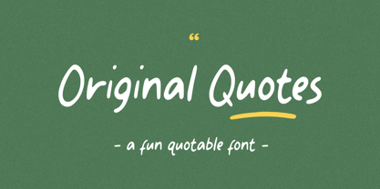 Original Quotes is a Fun Quotable Font. The font looks casual and playful. It's perfect for handwritten notes, sweet greeting cards, beautiful quotes, and stand-out branding as well. The set contains additional items for your design also multilingual support Enjoy the font, feel free to comment or feedback, send me PM or email. Thank you!
 - Rosetica by FadeLine Studio,
$18.00 Introducing Rosetica, a smooth, soft script font in handwriting style which gives the characters of this font a very simple, natural and sweet touch. Rosetica is perfect for logo's, branding projects, homeware designs, product packaging, mugs, quotes, posters, shopping bags, logo's, t-shirts, book covers, name card, invitation cards, greeting cards, and all your other lovely projects.
 - P22 Cigno by IHOF,
$24.95 P22 Cigno is a new digitization of the 1950s Italian typeface by Aldo Novarese for the Nebiolo foundry. This semi-formal script has a definite mid-century European flavor suitable for menus, invitations and poster work. Along with the accurate rendition of the regular weight, designer Colin Kahn has added a lighter companion font for another variation on Cigno. Both fonts feature a full Western European character set.
 - STROKIN by AdultHumanMale,
$15.00 STROKIN is an inky, messy, Omnicase display font. It’s part charcoal part paint strokes, reversed in lighter tones it looks like chalk, add a splash a red and it starts to look like blood. It has over 250 glyphs including all those extra pesky foreign features. OpenType coded, It has various letter pairings that interlock automatically to create a more randomized, bespoke feel to your copy. Hope you like it.
 - Skarpa Condensed by Aga Silva,
$23.99 This is condensed and more visually compact version of Skarpa font. All kerning has been thoroughly revised and manually adjusted. The font is based on geometric forms devoid of excessive flourishing. Would suit modern designs either in fashion, technology or laboratory setting. Would look good on door plaques in pharmacy or simple drawer plaques - especially Medium or Bold specimen. Lighter specimens would look good in leaflet & magazine print (see presented posters).
 - Digot 02 by Fontsphere,
$16.00 Digot 02 is a pixel-style, grid-based, display typeface. This is another version of Digot typeface. Compared to Digot, it is characterized by a more slender form, the letters are taller and narrower, which makes the font lighter. The font is characterized by its simplicity, attention to detail, and original form. You can use it in a wide variety of projects. It gives many possibilities for creating graphics.
 - Klassisk by David Engelby Foundry,
$25.00 Klassisk is the Danish name for “classic” [’klasisg]. Taking its inspiration from a wide range of classic serif traditions, Klassisk can be your partner in crime for almost every kind of design job! It has the four classic weights PLUS two lighter display weights for headers and big letter sizes in general. Klassisk also comes with … a large variety in numerals (three styles) swashes and special ligatures a vibrant italic style.
 - Acosta by Zane Studio,
$18.00 Acosta is a serif typeface with high contrast and a refreshing look. From sheer to black with italics, Acosta offers many possibilities for application in many graphic or editorial projects. The lighter weight is suitable for short paragraphs, and the heavier weight is suitable for headlines, perfect for display purposes such as branding, book covers, and web titles. Acosta is also available latin character set which supports latin based languages.
 - Irritation by Ingrimayne Type,
$12.95 Have you ever had to read text from a cheap dot-matrix printer which is not aligned quite right, so that the tops of the letters are either darker or lighter than the bottoms? Now with IrritationOne and IrritationTwo you can relive that experience even though you no longer use a dot-matrix printer. IrritationOne has dark tops and fading bottoms, while IrritationTwo has the opposite. Naturally both are monospaced.
 - WL Lunatrix by Writ Large,
$12.00 Lunatrix is a conceptual type face for futuristic or fantastic treatments. Ideal for suggesting strange new worlds of science-fiction, it can also evoke a land of fantasy or even hint at the occult. In its lighter weights, Lunatrix is well suited for applications such as posters, album covers, video games, and graphic novels, while in its heavier weights, it’s appropriate for titling and more complex type treatments.
 - Veotec by Hashtag Type,
$29.00 Veotec is a classic humanist sans that skilfully works for both screen and print due to its steep and precise angles enabling more negative space. Not only does this methodical approach improve legibility and readability at small sizes, it allows the bolder weights to feel harmonised and consistent without the compromise of this legibility. Angles are refined and considered with a balance between sharp and round curves adding a unique feature to this font. This also gives a modern and appealing feel at large sizes. Details include 6 well constructed weights, manually edited kerning, which is more open for on-screen devices, ligatures and alternatives.
 - Step Better by Ronny Studio,
$19.00 Step better font Inspired by street graffiti markings, Urban Tag comes with the iconic round tip markers, this style is often used by several graffiti artists around the world because of its very unique style, very fun to write on markers. Perfect if you want a realistic street art or hip hop style for your designs, posters, props, etc. Features : All Caps numbers and punctuation multilingual Swash / Ornament PUA encoded Please contact us if you have any questions. Enjoy Crafting and thanks for supporting us! :) Thank you
 - Reclaim - Personal use only

- The Stack Stone by Putracetol,
$18.00 The Stack Stone - Display Font a bold, quirky display font with a fun, trendy street style vibe. The Stack Stone is a versatile, stacking typeface perfect for retro or modern design aesthetic. The Stack Stone was hand-drawn, making its outlines somewhat irregular and quirky. It has an almost hand-lettered look; the characters jump around the baseline giving it a charming but urban look and feel. The Stack Stone suitables from posters designs to t-shirts and packaging, Stacked Letter will give your designs that alternative look and make your creative work look amazing. With a The Stack Stone , it will be very suitable for your project, which is related to fun, trendy street style vibe. Such as story books, illustrations, comic books, t-shirts, posters, greeting cards, logos, branding, stickers, svg, crafting. The alternative characters were divided into several Open Type features such as Swash, Stylistic Sets, Stylistic Alternates, Contextual Alternates, and Ligature. The Open Type features can be accessed by using Open Type savvy programs such as Adobe Illustrator, Adobe InDesign, Adobe Photoshop Corel Draw X version, And Microsoft Word. The Stack Stone is also support multi language.
 - Camden Queen by Asterisk,
$33.00 The font design is inspired by the long autumn evenings in London. Those "fast brown foxes" ran along the streets. Camden smelled delicious. And she was as beautiful as a queen.
 - Sherbrooke by Eyad Al-Samman,
$- Sherbrooke is a simple and sans serif font. I have chosen the name of this typeface after the "Sherbrooke" Street in Montreal, Canada, that I daily walked in for several months in the late 2005 while I was studying in Montreal, Quebec, Canada. I do adore this street and also I adore the whole city of Montreal. This font comes in two different weights. "Sherbrooke" can be used in wide fields of publications such as the titles of novels, literary texts, short stories, dictionaries, books, newspapers, websites, and magazines. It is suitable for T-shirts, mugs, advertisement light boards in malls, subtitles of movies, logos, cans of foods, and medicines' names. The font is more attractive when it is printed in calendars and for displaying the contents and paragraphs of electronic encyclopedias and different online websites. "Sherbrooke" is specifically designed for educational, journalistic, literary, and social purposes. The main characteristics of "Sherbrooke" Typeface are in its sans serif new designed letters and also in its lowercase special numerals. I think that these characteristics have made "Sherbrooke" exceptionally unique with its alphanumeric combinations. You can enjoy this typeface and use it anywhere at any product or service. It is simply gratuitous for all. The word "Sherbrooke" is a person's name. Sherbrooke Street - officially Rue Sherbrooke - is a major east-west artery at 31.3 kilometers in length and it is the second longest street on the Island of Montreal in Canada. The street is named for John Coape Sherbrooke, the Governor General of British North America from 1816 to 1818.
 - Hyperdrive by Comicraft,
$19.00 If you're about to make the jump into hyperspace, buckle up and engage your R2 unit with our new font release, HYPERDRIVE! Ten years in the making, we've spent almost as much time developing these characters as George Lucas spent developing his! Co-created by Starkings & Roshell (HYPERDRIVE, not George), this font is guaranteed to keep TIE fighters off your tail and will always come in useful if you get menaced by phantoms or attacked by clones. So sit back, relax and enjoy the flight -- but don't forget; let the Wookiee win! Remastered Hyperdrive includes new letter shapes, 200+ connecting letter combos, improved spacing & kerning and support for Western & Central Europe.
 - Throws by Tomatstudio,
$10.00 This is not an ordinary fonts, this is how the real throw up graffiti come into fontype! if you want real throw ups style graffiti fonts, this is the answer! because this is pure from my real graffiti eperiences around the streets. Kerning, spacing i adjust more tight, similar with the real throw up in the streets. The intersection between letter also you can erase it or leave it collide, depends of whats your styles, see our tutorial in the picture slides. I hope you guys like it, cheers!
 - Madness Attitude by IKIIKOWRK,
$19.00 Proudly present Madness Attitude - Street Brush Type, created by ikiiko. Inspired by the brush strokes on the street, where the raw, rough lines show a strong character of freedom expression. The font has a sloppy & dirty stroked texture, so it fits perfectly for making a poster, magazine layout, youth stuff, sleeve cover, party flyer, quotes, or simply as a stylish text overlay to any background image. What's Included? Uppercase & Lowercase Numbers & Punctuation Multilingual Support Works on PC & Mac Enjoy our font and if you have any questions, you can contact us by email : ikiikowrk@gmail.com
 - Boom Shakalaka by IKIIKOWRK,
$17.00 Proudly present Boom Shakalaka - Brush Type, created by ikiiko. Boom Shakalaka - Brush Type is a expressive brush font with touch of street culture. This type has a bold chatacter type, with shape of street culture. This type is very suitable for making a poster, magazine layout, brand logo, sleeve cover, party flyer, quotes, or simply as a stylish text overlay to any background image. What's Included? Uppercase & Lowercase Numbers & Punctuation Multilingual Support Works on PC & Mac Enjoy our font and if you have any questions, you can contact us by email : ikiikowrk@gmail.com
 - Hesorder by Ronny Studio,
$15.00 Hesorder font Inspired by street graffiti markings style in many big cities. This style is bolder and easier to read, perfect for your "street art" design style. I incorporate real graffiti experience into computer fonts, I think it will be different to other fonts if you can feel it, because I draw graffiti, mark and throw up since I was in high school. Features : - All Caps - numbers and punctuation - Alternate - multilingual - Swash / Ornament - PUA encoded Please contact us if you have any questions. Enjoy Crafting and thanks for supporting us! :) Thank you
 - Chesterville by Andrew Tomson,
$10.00 Hello, friends! Just this year I went to the United States for the first time. To my surprise, the neighborhoods, streets, and parks that I had only seen in the movies turned out to be true. There is a soul in them. I really enjoyed wandering these endless streets, soaking up this spirit. They feel childishly carefree, as if you were in a movie.Just try this font and understand my feelings. The font will work for almost anything: social media, cards, invitations, announcements. Good luck and love to you!
 - Brooklyn Pirates by IKIIKOWRK,
$17.00 Proudly present Brooklyn Pirates - Street Type, created by ikiiko. A hipster typeface using handwriting in street and urban style, with a large selection of swashes that you can wear however you like. This type is very suitable for making a brand logo, poster design, magazine header, sleeve cover, flyer, quotes, or simply as a stylish text overlay to any background image. What's Included? Uppercase & Lowercase Numbers & Punctuation Alternates & Stylistic Multilingual Support Enjoy our font and if you have any questions, you can contact us by email : ikiikowrk@gmail.com
 - Uptown Review JNL by Jeff Levine,
$29.00 Cover art for the 1933 sheet music of Harold Arlen and Ted Koehler's "Stormy Weather" (from the musical production "Cotton Club Parade") listed the cast of the show in a condensed hand lettered sans that typified the 1930s and the Art Deco era. This served as the inspiration for Uptown Review JNL; available in both regular and oblique versions. The Cotton Club was a whites-only night club which showcased black acts, and was originally located on 145th Street in Harlem from 1923 to 1935, then existed for a short time in the New York theater district from 1936 to 1940. After the Broadway incarnation of the club closed, its space was taken over by the Latin Quarter.
 - Microphone Check by IKIIKOWRK,
$19.00 Proudly present Microphone Check - Marker Type, created by ikiiko Microphone Check is inspired by the bold and expressive signature strokes of the 90s street hip hop movement. In that era, freestyle marking was a method of self-expression that was closely associated with the underground graffiti scene. This typeface perfectly encapsulates the vitality, attitude and resilience of life on the streets. Sharp lines with bold, bold bodies characterize this type of marker, allowing for substantial fills and bright colors to stand out on any surface. It gave them the opportunity to express their originality and creativity while leaving their mark on the urban environment. This type is very suitable for making a street wear brand, book cover, movie title, magazine layout, poster, quotes, or simply as a stylish text overlay to any background image. What's Included? Uppercase & Lowercase Numbers & Punctuation Alternates & Ligature Multilingual Support Works on PC & Mac
 - Stolzl by Inhouse Type,
$33.78 Stolzl is the text companion of the display family, Stolzl Display, which was optically tailored to perform as a functional addition to this concept steered font collection. Stolzl Text is a modernist interpretation of the first release, stripped of the primary stylised attributes, it is highly readable in print and on screen. Designed to perform at various sizes, Stolzl Text is a great addition to the type collection.
 - Droid Sans by Ascender,
$92.99 Droid Sans Pro Font Family (2 fonts) are a humanist sans serif typeface designed by Steve Matteson, Type Director of Ascender Corp. The Font Family is an approachable, friendly set of typefaces optimized for display on screen. It was designed to provide optimal quality and legibility. It features upright stress, open forms and a neutral appearance. The font was optimized for user interfaces and to be comfortable for reading on a mobile handset in menus, web browser and other screen text. The font family contains Old Style Figures (requires an application that support advanced OpenType typographic features) and extensive character set coverage including Western Europe, Eastern/Central Europe, Baltic, Cyrillic, Greek and Turkish support. Contains: Droid Sans Pro Regular & Droid Sans Pro Bold
 - West West by Fenotype,
$25.00 West West is a high-contrast condensed display serif. West West has extra large x-height making it suitable for efficient choice for distinguishable display use such as headlines, packaging, magazines, posters and advertising, among any other. In large sizes, you can also try tighter tracking for maximum impact. With certain of Art Nouveau shapes and massive contrast West West is a great choice anywhere you need a stylish and fashionable touch.
 - Bitumen by Hanoded,
$12.00 Bitumen is a sticky, black, and highly viscous liquid form of petroleum. When I created this font, it reminded me a bit of asphalt, hence the name. Bitumen is a handmade font based on Schmallfette Grotesk by Walter Haettenschweiler and Haettenschweiler font. The font was made with a Japanese brush pen, hence the bold lines. Bitumen comes in two styles: the regular, fat display font and a lighter version - both with italics.
 - Rasbern by Nasir Udin,
$29.00 Rasbern is a display serif typeface with high contrast and refreshing looks. Ranging from thin to black with italics, Rasbern offers many possibilities to be applied in many graphic or editorial projects. The lighter weights are suitable for short paragraph, and the heavier weights are perfect for headlines, perfectly suitable for display purpose such as branding, book covers, and web heading. Rasbern has extended latin character set that supports 200+ latin-based languages.
 - Secretary Typewriter by Ana's Fonts,
$16.00 Secretary Typewriter is a typewriter font in a lighter, softer weight that makes it perfect for more delicate designs. Use it in long or short texts, in digital collages, branding and packaging, social media posts, logotypes, etc. Secretary Typewriter includes: Contextual alternates. Each letter and number has 3 slight variations that appear "randomly" for extra realism. Underline version of the font. For a grungier look. New! Jumpy version of the font, based on contextual alternates.
 - MPI Republic Gothic by mpressInteractive,
$5.00 Norwich Aldine Reverse is a font of "streamer type" (reversed out type used for banners or streamers) originally designed around 1872. Norwich Aldine is slightly lighter and more open than Aldine. It features medium stroke contrast, heavy serifs, and large rounded bracketing (where the stems meet the serifs). Our version is based on wood type of unknown origin. We created dozens of special ligatures to reduce problematic kerning encountered with a monospaced reversed type.
