8,909 search results
(0.068 seconds)
- Baka Expert by Positype,
$25.00 Why Baka Expert? There’s actually a simple answer. The original Baka was done as an experiment of sorts. I wanted to quickly capture a rough, frenetic handwriting style that broke normal conventions. Commercially, it was successful, received some accolades ... but I wasn’t completely satisfied, so I went back to the master art and the lettering explorations and produced Baka Too. This addressed some of the line items I wanted to refine in Baka. I liked it. Each font has been out for a few years now, and I have seen them in use. I’m very critical of my work, and I could still see things—modulations of strokes, angle of the nib, ink swell, and so on—that I wanted to change, refine, and reorder. For me, it is typographic indulgence, but I wanted to take this handwriting ‘font’ and turn it into a robust ‘typeface.’ So I did just that and a bit more by adding back more of my initial flourish concepts; attaining tighter, consistent control of the modulation; optimizing points; adding titling options; and expanding the character language set. Baka and Baka Too had to exist to produce this entirely new re-envisioning of an old friend ... and they all play well together :)
 - Promenade by Jen Wagner Co.,
$17.00 Introducing Promenade – a calligraphic serif that started on paper with a flat nib pen (see the 6th image), and blossomed into a full serif with italics. At its core, this font is just... beautiful. It's elegant, it's crisp, it's delicate, but can still hold its own. As I was creating the graphics, I just couldn't get over the flow of the letters – especially the italic. It's got class, but also isn't afraid to rock a pair of Doc Marten's. Funny enough, Jen from Tonic (they make beautiful websites) saw a preview of this font and said, "I'd take that font to prom." Which of course spurred a conversation about how this font would take a Mercedes G-Series instead of a limo, and wear Doc Marten's instead of heels, but still wear the most gorgeous dress, and that is 100% Promenade (and inspo for the name – thanks, Jen!). I've also been loving combining the regular and italic, especially for logos (see the "Friendfolk" logo) One thing to note about Promenade is the letter spacing. It was spaced for clean reading and intentional balance, so I recommend setting the spacing a little tighter if you want to create the display look found in many of the logo mockups(around -20 to -40 should do!).
 - Berryfield by Missy Meyer,
$12.00 Berryfield started as an experiment: making a font entirely out of geometric shapes. It started with a couple of circles and a couple of rectangles, and was constructed entirely from those parts, and parts made from those parts! For the uppercase, I took style inspiration from the heavy serif classics. But when it came time to create the lowercase set, I took a sharp turn and looked to fun unicase fonts, creating uppercase-height lowercase letters, in addition to uppercase alternates. When I finished Berryfield Regular, I liked it so much I made a lighter version (almost like a typewriter font), and a heavier version, to give you even more variety! Each font in the family contains over 520 characters, including over 300 extended Latin characters for language support. There are also a number of alternate letters to choose from, as well as superscript ordinals (ST, ND, RD, and TH), all of which are PUA-encoded for easy access no matter what design program you're using. Berryfield was a ton of fun to make, and I hope you have a ton of fun using it! It's smooth and easy for both print and crafting; the uppercase alone is straightforward enough for a magazine headline, but combining in the lowercase makes it quirky and fun.
 - Redshift by Rocket Type,
$25.00 Redshift is sans with 12 upright weights and 12 oblique weights. Its a soft edged, spaced out offering from Rocket Type. It supports most extended Latin languages including English, Spanish, French, Italian, German, Polish and Portuguese. The name redshift means the displacement of spectral lines toward longer wavelengths (the red end of the spectrum) in radiation from distant galaxies and celestial objects. The original concept behind the font was that I wanted to create a massive heavy sans which would give the sense of tranquility within the user not unlike watching an object float through space. Redshift was designed by Dathan Boardman during 2016. Strongly rooted in the tradition of other notable geometric sans faces however much attention was paid to create a soothing experience for reading both large and small bodies of text. Each letter was painstakingly modified for optimal readability and warmth. Redshift was designed with the intent to create the ultimate bold header font. From there I wanted create the lighter weights to be readable when set within large bodies of text. Redshift works great for body headers & text as well as for logo design. It looks great juxtaposed with any number of other Rocket Type Fonts.
 - Kingthings Petrock Pro by CheapProFonts,
$10.00 For these fonts I have reworked the spacing a bit, and completely redesigned the "N" as they were calligraphically very wrong. Kevin King says: "Petrock is based on letterforms found in a small city Church in Exeter - from a display case about bell ringing. A lovely simple labeling hand, I think I've done it justice... Petrock Light is a lighter form of Petrock - makes both of them more usable." ALL fonts from CheapProFonts have very extensive language support: They contain some unusual diacritic letters (some of which are contained in the Latin Extended-B Unicode block) supporting: Cornish, Filipino (Tagalog), Guarani, Luxembourgian, Malagasy, Romanian, Ulithian and Welsh. They also contain all glyphs in the Latin Extended-A Unicode block (which among others cover the Central European and Baltic areas) supporting: Afrikaans, Belarusian (Lacinka), Bosnian, Catalan, Chichewa, Croatian, Czech, Dutch, Esperanto, Greenlandic, Hungarian, Kashubian, Kurdish (Kurmanji), Latvian, Lithuanian, Maltese, Maori, Polish, Saami (Inari), Saami (North), Serbian (latin), Slovak(ian), Slovene, Sorbian (Lower), Sorbian (Upper), Turkish and Turkmen. And they of course contain all the usual "western" glyphs supporting: Albanian, Basque, Breton, Chamorro, Danish, Estonian, Faroese, Finnish, French, Frisian, Galican, German, Icelandic, Indonesian, Irish (Gaelic), Italian, Northern Sotho, Norwegian, Occitan, Portuguese, Rhaeto-Romance, Sami (Lule), Sami (South), Scots (Gaelic), Spanish, Swedish, Tswana, Walloon and Yapese.
 - Sonata by Adobe,
$29.00The Sonata font contains 170 music notation symbols and is used for setting high quality sheet music. - Elegance Monoline by Corradine Fonts,
$29.00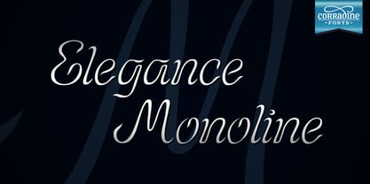 Elegance Monoline is ideal for invitations, greeting cards, logotypes, or anywhere a touch of elegance is desired.
 - Delancey JNL by Jeff Levine,
$29.00 Inline lettering from a vintage piece of sheet music inspired Delancey JNL, an Art Deco-flavored design.
 - Amariya by Monotype,
$40.99 Designed by Nadine Chahine, the Amariya™ typeface family is intended for long form, on-screen textual content. It supports the Arabic, Persian and Urdu languages. The design is consistent with traditional text typeface models popular in the Middle East, but has a lower level of stroke contrast optimized for on-screen reading. The family is available in nine weights ranging from a light hairline to a very bold black. The middle weights are intended for setting text copy while the extreme hairline and black designs are best suited for headlines, sub heads and similar applications. The Amariya family can be used for numerous projects from branding to blogs, in a variety of interactive design environments on both large and small screens. The fonts include the ITC Charter design by Matthew Carter as a Latin companion.
 - Pentathlon Pro by DBSV,
$80.00 Strait passages second part… I tried in this fifth (that's why she took the name "Pentathlon Pro”) consecutive font family to give her a character style with again a strait way of writing. Walking on the same considerations as the previous series (Khamai, Aeolus, Corset & Artios) I tried to give some sense of diversity for the strait passages of character: those fourteen style are the result. And in this family, the “Bold” with "Inlier" and “Bold Italic” with "Inlier Italic” engage in the same way as did the “Layered font families” in the previous series. Also I added a design statement for the twelve zodiac signs, only presented in the Bold, Inlier, Bold Italic and Inlier Italic style. This series is composed of fourteen styles with 628 glyphs each, with true italics and supports Latin, Greek and Cyrillic.
 - Bauhaus Arabic by Naghi Naghachian,
$112.00 Bauhaus is celebrating its centenary in this year. For the Bauhaus's 100th anniversary year, art and design museums and galleries around the world are hosting exhibitions and events. The publication of „Bauhaus Arabic“ font family is my contribution to celebrate this event. Bauhaus Arabic is a sans-serif font family designed by Naghi Naghashian in tree weights. Bauhaus Arabic Light, Bauhaus Arabic Medium and Bauhaus Arabic Bold. It is extremely legible even in very small size. This font family is a contribution to modernisation of Arabic typography, gives the font design of Arabic letters real typographic arrangement und provides more typographic flexibility. Bauhaus Arabic supports Arabic, Persian ( Farsi ) and Urdu. It also includes proportional and tabular numerals for the supported languages. Bauhaus Arabic design fulfills the following needs: A Explicitly crafted for use in electronic media fulfills the demands of electronic communication. B Suitability for multiple applications. Gives the widest potential acceptability. C Extreme legibility not only in small sizes, but also when the type is filtered or skewed, e.g., in Photoshop or Illustrator. Bauhaus Arabic’s simplified forms may be artificial obliqued in InDesign or Illustrator, without any loss in quality for the effected text. D An attractive typographic image. Bauhaus Arabic was developed for multiple languages and writing conventions. Bauhaus Arabic supports Arabic, Persian and Urdu. It also includes proportional and tabular numerals for the supported languages. E The highest degree of calligraphic grace and the clarity of geometric typography.
 - Elementis by Linotype,
$29.99German designer Hans-Jürgen Ellenberger originally developed the concept behind Elementis in 1975. Wanting to create an alternative typewriter script that was more round and natural, Elementis' design was born. True to its typewriter roots, Linotype's Elementis exhibits more character than one expects from that genre. The letters display a delightfully quirky nature, which is sure to lighten up any document. Elementis may be used in a number of point sizes: although the letters function best in large display settings, short passages of text in sizes of 12 point or less may also be created. This family has received a number of awards in various contests: Elementis was awarded an Honorable Mention in the 2003 International Type Design Contest, sponsored by Linotype GmbH. Additionally, Ellenberger received a Certificate of Typographic Excellence from the Type Directors Club in 2005; during their annual TDC2 type design competition, Elementis was selected as a "judge's choice." - Quador Display by Fontador,
$24.99 Quador Display is a serif, especially designed for contemporary typography on print and screen. The superellipse-based forms and high x-height allow large and open letterforms, perfectly adapted to the pixel grid on screen. The font contains 6 weights from light to ultrabold plus true italics. 1.049 glyphs include 282 ligatures, tabular, old style, fractions …, and a wide range of flexibility for latin language support for every typographical needs. Quador Display is a contemporary serif typeface, special for logotypes, brands, magazines and editorial.
 - Inversi by Hanken Design Co.,
$30.00 Inversi is a reverse-stress typeface that may be used as a display or text-face font for a wide range of subjects. Compared to other reverse-stress/reverse-contrast typefaces, Inversi's linear contrast is much lower which, at lower sizes, makes it a good options for text or captions. It has good language support, unique design, fractions, and three different widths. Inversi pairs well with HK Requisite. Use the narrow or condensed style when mixing with HK Requisite to give more contrast to the composition.
 - Queulat by Latinotype,
$- Queulat is a hybrid typeface that combines two different styles, reflecting charm, freshness and, especially, a strong personality. The font is inspired by Modern and Grotesk styles. The former is shown in some characteristic features such as teardrop terminals, which give the typeface an attractive unique look, making it an ideal choice for logotypes and labelling. The latter, with its rationality, makes Queulat a stable and strong face for headings and subheadings. The combination of styles can be clearly seen by comparing the regular with the alt version. The regular version is more simple than the alt one. Differently, the alternative version possesses more features of the Modern style, like teardrop terminals in ‘k’ and ‘v’. Queulat also comes with a Unicase version, in which a higher number of shapes can be found, resulting in a unique colourful display.
 - Ducatus by Scriptorium,
$12.00We wanted to make an ultra-thin, tall font with a rough, hand-drawn look and ended up with more than we bargained for. To get the font we wanted we started by developing a source font for the basic letter shapes and we ended up with a whole bunch of variations of the basic style. Thus was born the new Ducatus family of fonts, starting with Ducatus Light which developed into the Medium and Heavy versions, and the Medium weight was ultimately used as the basis for the Ducatus Rough font, which was the goal of the project in the first place. Ducatus Rough was created by modifying Ducatus Medium in Photoshop using Gallery Effects and several other filter packages, and then redoing the outlines from scratch in Fontographer. A lot of work, but the result is just what we wanted. - Exhibitionist by 38-lineart,
$16.00 Related to typography and art, we define exhibitionist as an innovative work that is able to invite attention. An Exhibitionist must have a strong character, dare to appear as it is, natural, simple and modern-minded. That is what is represented in this font, a handwriting with a natural rhythm and reflects the lifestyle of urban society. We want to give a definition of exhibitionist in a positive typography frame. This font is very simple, too much glyph will make you confused, we make a lot of glyphs but we've filtered out only selected glyphs, so all you do is activate the ligature on your software and feel the interesting handwriting rhythm. We are sure with this font, you will look more stunning and attract the interest of visitors to look more closely at your brand
 - Nocturne by Scholtz Fonts,
$19.95 The font is based on an alphabet from a mid1920s art deco book. The original seemed to have tapering strokes but it was too small to be sure; I made all strokes parallel & orthogonal and slightly modified the original in a number of other ways to bring it into the 21st Century. The designers of the original were Paul Carlyle and Guy Oring. Nocturne has all the elegance of the Deco fonts of the 1930s. It recalls the romantic, sophisticated Zeitgeist of the early 20th century, that nostalgic time "between the wars". Nocturne comes in two styles: Nocturne Regular, which uses the Art Deco convention of small x height, and long ascenders. This style is perfect for headers, posters, labels etc. Nocturne Book, which, with its higher x height and slightly wider characters, is extremely legible and suitable for small size text.
 - Kappa by W Type Foundry,
$25.00 Kappa is a modern sans serif with humanistic and geometric features. Its structure is slightly narrow to fit in a greater range of platforms (moreover if you print it, you may save a lot of paper), and its height is higher allowing a great legibility in small sizes. This family is composed with the display version and the text version providing a broad spectrum of solutions, making this family easier and friendlier to use. Designed with powerful OpenType features in mind. Each weight includes alternate characters, ligatures, fractions, special numbers, arrows, extended language support, small caps and many more… Perfectly suited for graphic design and any display / text use. The 36 fonts are part of the larger Kappa super family. Learn about upcoming releases, work in progress and get to know us better! On Instagram W Foundry On facebook W Foundry wtypefoundry.com
 - Maassslicer3D - 100% free

- Alte DIN 1451 Mittelschrift gepraegt - 100% free

- Elbaris - 100% free

- Nomitais - 100% free

- Quirkus Out - 100% free

- Mister Dangerous by Arterfak Project,
$16.00 Introducing Mister Dangerous, inspired by the graffiti tags found in urban street art. Designed with dynamic freestyle flair, it brings the spirit of graffiti to your creative ideas. This font is the perfect choice to add an urban touch to your designs, including films, posters, stickers, labels, flyers, apparel, packaging, and more. Mister Dangerous features All-Capitals with numerous special characters for endless combinations, along with additional swashes to make your work stand out. Embrace the artistic power of Mister Dangerous for unforgettable and edgy designs. What you'll get : All-capitals characters Numbers & punctuation Stylistic alternates
 - Goberz Tigre by Sipanji21,
$16.00 "Goberz Tigre" is a monoline font with a graffiti theme. It is perfect for a wide range of urban or street-themed design projects, such as streetwear design, logo design, car/motosport decals, skateboard decals, and other similar designs. With its edgy appearance, "Goberz Tigre" brings a sense of energy and attitude to your designs. The font's monoline style that adds visual interest and makes your designs stand out. Whether you're looking to create a strong and impactful design or add a touch of urban style to your projects, "Goberz Tigre" is the font for you.
 - Bouncy Color by Mans Greback,
$59.00 Bouncy Color is a funny cartoon font with pre-set coloring, outline and shine effects! Drawn and created by Mans Greback in 2021, this comic-style lettering has a happy, quirky personality and optimistic humour. It has a colorful graffiti and street art look, while being a childish and cute sans-serif – a typeface for boys and girls alike. Bouncy Color is provided in five styles: White, Blue, Pink, Highlight and Outlined. Use it in Photoshop, Illustrator, InDesign or any other modern software that supports color fonts, and you'll give any project a fun and happy appearance.
 - Taberna by Latinotype,
$49.00 Taberna is a type system that provides a wide range of choices for any design project. The typeface comes in Sans and Serif layered versions plus a monolinear Script font. Taberna is the result of having explored design trends in bar signage, liquor packaging and street wear. Taberna is a funny display font with a Sans version—that provides a more clean and simple design—and a Serif one, which gives text a more distinctive and sombre personality. The Script version matches perfectly with the heavy Caps of the typeface. Taberna is a very versatile font well-suited for headlines, posters, logotypes, etc.
 - More Than Life by Ronny Studio,
$19.00 The More Than Life Bubble graffiti tag font is a typography style commonly used in street art and graffiti culture. It features rounded and inflated letters that create a three-dimensional, bubble-like effect. This style is often used for tagging, a form of graffiti in which an artist writes their name or a stylized chosen word to mark their territory or establish their presence. This font is perfect for your design needs with a graffiti theme. Features : - All Caps - numbers and punctuation - multilingual - PUA encoded Please contact us if you have any questions. Enjoy Crafting and thanks for supporting us! :) Thank you
 - Novusa by Taznix Creative,
$18.00 Novusa is a bold and dramatic display font. This original look will appeal to a wide range of crafty ideas, from letterheads and titles, to stationery. Novusa Perfect for for many creative products such as logos, tattoo design, t-shirt prints, street wear, headlines, tattoo lettering, calligraphy, clothing brands, music, sports, labels and much more. What's Included : Web Fonts Standard glyphs Ligature Works on PC & Mac Simple installations Accessible in the Adobe Illustrator, Adobe Photoshop, Adobe InDesign, even work on Microsoft Word. PUA Encoded Characters - Fully accessible without additional design software. Fonts include multilingual support for; ä ö ü Ä Ö Ü ß ¿ ¡
 - SK Klyaksa by Shriftovik,
$32.00 SK Klyaksa is an experimental font inspired by the most striking and unusual artistic techniques of graffiti art. Its non-standard shapes, rounded points and hypnotic curved lines immerse you in the world of bright colors and unlimited creative freedom on the streets of the city. The SK Klyaksa font plays on the contrast between lightness and heaviness, creating an effect of brightness and dynamism, creating bright and emotional compositions that perfectly emphasize youth and individuality. Like graffiti art, the font speaks its own language and provokes bold decisions in graphic design, bringing originality and character to any project.
 - Badge Robo 3d Display Graffiti by Sipanji21,
$15.00 "Badge Robo" is a 3D display graffiti font with very bold and impactful characters. Fonts like this are often used in designs where you want to create a bold, attention-grabbing, and three-dimensional text effect. This style can be seen in various design applications, including street art, posters, or any project where you want your text to stand out prominently. With "Badge Robo," you can create designs that feature powerful and visually striking typography. The bold and 3D nature of this font can make your text appear dynamic and attention-grabbing, helping your design make a strong impact.
 - StreetArtist by Graffiti Fonts,
$19.99 This tag font includes full alphabets of uppercase & lowercase letters giving 2 distinct looks as well as interesting substitutions. Street Artist is clean and consistent without sacrificing style. With the StreetArtist font family anyone can easily create their own custom graffiti lettering. This tag style typeface includes 4 styles that can be used alone or in groups to create complex effects that are difficult to render manually. The style is inspired by modern handstyles as written with a chisel-tip marker. The rendering of each glyph is clean and smooth. Well over 200 letters, numbers and symbols are included in each style.
 - Stannard by Greater Albion Typefounders,
$12.95 Stannard speaks to us of the happy days of the inter-war period, of enamel advertising 'street-jewelry' as seen on the railways and in all the best shops, of youngsters' train set boxes and toy catalogues, of traditional magazine mastheads, of a simpler, happier and just maybe better era, when summers lasted for ever and all was well with the world. It's a great family of faces for use in nostalic poster design, for nostalgic packaging design or signage or book covers, or even just for making a bold statement anywhere. Four decorative faces are offered.
 - Rainness by pentagonistudio,
$19.00 Rainness Is An Urban Street Font Inspired By Rough and Groovy Style. Font Features : Rainness OTF ( Open Type ) Rainness TTF ( True Type ) Rainness WOFF/WOFF2 ( Web Font ) SOFTWARE REQUIREMENTS : Fonts and alternate : No special software required they may be used in any basic program /website apps that allows standard fonts That's it folks! You can go ahead and get cracking :) Follow My Shop For Upcoming Updates Including Additional Glyphs And Language Support. And Please Message Me If You Want Your Language Included or If There Are Any Features or Glyph Requests, Feel Free to Send me A Message. Have a Good Day !
 - Work Crew Stencil JNL by Jeff Levine,
$29.00 In the 1949 Paramount comedy "My Friend Irma" (a film based on the popular radio series that introduced America to Dean Martin and Jerry Lewis), an opening gag set-up involving excavation work utilizes street barricades which inspired Work Crew Stencil JNL. Placed along the site, different advisories are stenciled upon barricades warning of the work in progress. The scatterbrained Irma (Marie Wilson) walks straight through the construction, oblivious as to what's going on around her and steps right into the open hole dug into the sidewalk (a scene she reprises in 1950's "My Friend Irma Goes West").
 - Loxer Graffiti by Sipanji21,
$16.00 "Loxer" is a monoline font with a graffiti theme. It is perfect for a wide range of urban or street-themed design projects, such as streetwear design, logo design, car/motosport decals, skateboard decals, and other similar designs. With its edgy and bold appearance, "Loxer" brings a sense of energy and attitude to your designs. The font's monoline style and slight shadow effect create a 3D effect that adds visual interest and makes your designs stand out. Whether you're looking to create a strong and impactful design or add a touch of urban style to your projects, "Loxer" is the font for you.
 - Pinmold by Letterhend,
$17.00 Introducing, Pinmold, a modern stencil display font suitable for military theme design, urban street style, or even for gaming title for a war game. This type of font also perfectly made to be applied especially in logo, headline, signage and the other various formal forms such as apparel, novel, label / packaging, and various advertising purposes. Features : numbers and punctuation multilingual PUA encoded regular and rough version We highly recommend using a program that supports OpenType features and Glyphs panels like many of Adobe apps and Corel Draw, so you can see and access all Glyph variations.
 - Nightclubber by Device,
$29.00 The late 70s and early 80s is sometimes considered to be the period when headline typography went off the rails. Growing up in that period, some designers may beg to differ. Many geometric designs were available in dry-transfer and for the typositor, and were used everywhere a youth-culture look was appropriate - annuals, comics, club flyers, high-street boutiques, TV-advertised compila tion albums. Nightclubber is a fond homage to the excesses of the period, and should be used back-lit in pink neon or at a rakish 45 degree slant across a blurred photograph of a glitter ball.
 - Bornland by Letterhend,
$14.00 Introducing Bornland, a dynamic font that embodies a sporty and urban street art aesthetic. With its bold and energetic script style, this font brings a sense of edgy flair to any design project. Perfect for sports-themed branding, apparel, posters, and urban-inspired designs, Bornland adds a vibrant and expressive touch to capture attention and create a visually captivating experience. Features : Uppercase & lowercase Numbers and punctuation Alternates & Ligatures Multilingual PUA encoded We highly recommend using a program that supports OpenType features and Glyphs panels like many of Adobe apps and Corel Draw, so you can see and access all Glyph variations.


