10,000 search results
(0.033 seconds)
- Hertical by Edignwn Type,
$12.00 Hi everyone, how are you today? We hope you are good. And don’t forget to stay safe. Today we release a crafted display font again, it's called Hertical. Hope you are enjoy the design of font. Hertical come with two typefaces, serif and sans serif. Every typeface contains four styles (regular, smooth, rough and texture). This matches applies in some designs such as the logotype, poster, label, badge, packaging, branding, quotes and more custom design. Hertical includes : 2 typefaces (serif and sans serif) 4 style typefaces (regular, smooth, rough and texture) All-caps, numeral, symbol and punctuation 2 sets alternates on serif font Multilingual PUA Encoded Thank you for your support and choosing us.
 - Volaroid by Din Studio,
$22.00 Introducing Volaroid font duo , simply font with modern and vintage style combination. This will bring a modern and vintage atmosphere together. Minimalist design for your best project. Volaroid font best use for logotype, branding, and t-shirt printing. Whats included? : - volaroid script - volaroid sans Volaroid feature : - Swash (A-Z,a-z) - SS 1 (A-Z,a-z) - SS 2 (a-z) - SS 3 (a-z) - SS 4 (a-z) - S.Alt 1&2 (b,d,h,k,l,t) - PUA encoded - Multilingual Support. --- Notes = Every swash, stylishtic set and alternates have include in Volaroid Script (ttf.otf,woff) I hope this font can meet your design needs. Feel free to contact me in the message or direct email donis4design@gmail.com.
 - Concrete Thick by Sohel Studio,
$16.00 Concrete Thick Modern Retro Bold Serif . That has a unique style & luxurious look. is great for logos, editorial, web design, craft projects, shirts, decor, wedding invitations, packaging, stickers, social media, quotes, magazines and more!. The unique sharp serifs mixed with thin strokes give off a bold mid century architectural vibe. Concrete Thick features: · 4 Weights font (Regular,Oblique,Bold,Thin) · Uppercase And Lowercase · Numerals & Punctuation · Accented characters · Multilingual Support · Unicode PUA Encoded While using this product, if you encounter any problem or spot something we may have missed, please don't hesitate to drop us a message. We'd love to hear your feedbacks in order to further fine-tune our products. Thanks and have a wonderful day
 - Periplus by PintassilgoPrints,
$26.00 I got rhythm, I got music, I got my swirls, who could ask for anything more? Periplus is quite an eccentric type, full of twists and nice oddities here and there. It is an all-caps font with 2 variations for each letter and number, stored at upper- and lower-case slots. For added amusement, every letter got not 1 or 2, but 4 swash variations. One can be reached through the OpenType swash feature: just select the letter and hit the swash button. The other ones you will access through a glyphs palette. All of them are neatly organized with the 'access all alternates' feature. The font is yet equipped with some stylistic alternates and ornaments. Have fun!
 - Monolith Pro by Gravitype,
$12.90 Monolith Pro is a futuristic heavy display that steals the show. This typeface is inspired by the popular Kubrick’s movie 2001: a space odyssey, from which the iconic monolith scene. The glyphs, in fact, have been designed to fill the rectangular shape, with the addition of minimal inlays to differentiate them consistently. While the uppercase is perfect for impactful headings and titles, the lowercase completes the main headline masterfully - but can also stand out alone due to its own distinguishable personality. The family includes 4 styles: regular, italic, outline and outline italic, to give more dynamism and sense of lightness when needed, in contrast with the heavy weight. Multilingual support is available.
 - Kelpo by Ahmad Jamaludin,
$15.00 Please welcome our new Groovy Retro Typeface, Kelpo! Kelpo - Created from our explorations which were inspired by 70's retro style and pop culture visual design like old comics, cartoons, and posters. The strong bold character with groovy style makes us feel retro vibes and takes us to the 70's era Kelpo - Comes with 59 beautiful alternates which consist of 4 stylistic sets. Contains 2 styles regular and italic, this font is best used for headings, logotype, quotes, apparel design, posters, flyers, packaging, book cover, and many more. What you get : Letters, numbers, punctuation, multilingual support Has 59 beautiful alternates Come and say hello over on Instagram! https://www.instagram.com/dharmas.studio/ Dharmas Studio
 - Face Type by TypoGraphicDesign,
$9.00 The typeface Face Type is designed from 2021 for the font foundry Typo Graphic Design by Manuel Viergutz. A mix from the TGD font collection with 1 font-style (Icons) incl. decorative extras like icons, dingbats, emojis and stylistic alternates (4 stylistic sets). For use in logos, magazines, posters, advertisement plus as webfont for decorative headlines. The font works best for display size. Have fun with this font & use the DEMO-FONT (with reduced glyph-set) FOR FREE! ■ Font Name: Face Type ■ Font Styles: 1 font-style (Icons) + DEMO (with reduced glyph-set) ■ Font Category: Display for headline size ■ Glyph Set: 357 glyphs incl. decorative extras like icons ■ Design Date: 2021 ■ Type Designer: Manuel Viergutz
 - Spirits by Latinotype,
$29.00 Spirits design was initially based on Hermann Ihlenburg's Schoeffer Old Style from the 1912 ATF catalog. Soft is the closest version to the printed original typeface. Neutral, with more formal serifs, is ideal for editorial design, for example newspaper headlines. Sharp, more contemporary, is the best choice for meeting today's design needs. Condensed proportions and large x-height, features found in the original font, make Spirits ideally suited for headlines and branding design. As you would expect from Latinotype, this font comes with a standard character set that supports over 200 languages. Each version includes its own alternates and comes in 4 weights, ranging from Light to Black, resulting in a total of 12 font styles.
 - Videomax by PizzaDude.dk,
$16.00 Videomax looks like something from the future - perhaps even something from a future where the world lies in ruins and is about to be taken over by hostile aliens. The worn letters represent the decades of war against the computers...or the aliens...or maybe the letters comes from a sign of a computer company from the eighties, which was recently found in an abandoned place. The speculations are many, but one thing is definitely true: Videomax got that grungy / computer / worldwar feeling! Write your text, and watch how the randomness of letters make your text look really good. I've put it 4 different versions of each letter, which makes it look really nice and worn!
 - Janky Action by Bogstav,
$15.00 First of all, let me get one thing straight: With Janky Action, I didn’t make any attempt on making a beautiful or good looking font! Janky Action is my humble attempt to recreate a sign I saw at a flea market. The sign was obviously made by someone who didn’t give a darn about the width of strokes, height of letters, and other “rules” when making a sign. I fell in love with the naive approach on how to make a sign. In order to create some randomness, I have added 4 different versions of each lowercase letter. I hope you find this font as enjoyable as I did while making it! :)
 - Tropical Thunder by Omotu,
$16.00 DETAILS Tropical Thunder! A monoline script font with 2 styles, clean and stamped. Tropical Thunder font is perfect for branding, logotype, apparel, T-shirt, Hoodie, product packaging, quotes, flyer, poster, etc. Whats Include? 1. Uppercase and lowercase characters 2. Supports international languages 3. Numerals, punctuations, titling, stylistic alternates, and ligarures 4. Accessible in the Adobe Illustrator Glyphs panel, or under Stylistic Alternates in the Adobe Photoshop OpenType menu, Adobe InDesign, Corel Draw, even work on Microsoft Word. Please message me if you're unsure of any language support. Thanks for looking, and I hope you enjoy it! Please don't hesitate to drop me a message if you have any issues or queries. Omotu
 - Lemands by Arterfak Project,
$18.00 Lemands is a strong-sharp serif font in condensed height. Designed with medium contrast and inspired by the modern-classic typography and the High Octane Rock genre. The serif is quietly sharp and has assertive lines and curves, giving the letterform looks solid and strong as a display font. Lemands is a display typeface that is perfect for many purposes such as a headline, sub-headline, logo, and short body text for magazines, books, fashion, quotes, youth t-shirt, signboards, logos, and many more! Available in 4 weights: Regular - Book - SemiBold - Bold. A great choice for a brave concept! Zip file featured: Uppercase Lowercase Numbers Symbols Punctuation Standard ligatures Accents : ÀÁÂÃÄÅÆÇÈÉÊËÌÍÎÏÐÑÒÓÔÕÖØÙÚÛÜÝÞßàáâãäåçèéêëìíîïñòóôõöøùúûüýþÿ ĀāĂ㥹ĆćĈĉĊċČčĎďĐđĒēĔĕĖėĘęĚěĜĝĞğĠġĤĥĦħĨĩĪīĮįİıIJijĴĵĹ弾ĿŀŁłŃńŇňŌōŎŏŐőŔŕŘř ŚśŜŝŞşŠšŤťŦŧŨũŪūŬŭŮůŰűŲųŴŵŶŷŸŹźŻżŽžẀẁẂẃẄẅ Thank you, Ramz
 - Peach Crush by Fenotype,
$25.00 Peach Crush is a bold vintage style serif font with a soft charm and smooth features. Peach Crush delivers a reminiscence of a familiar and warm nostalgic feeling. Peach Crush is equipped with Contextual, Swash, Stylistic and Titling alternates as well as Discretionary Ligatures and even more extra alternates. All these features can be accessed by OpenType controls or straight from Character or Glyphs window. Contextual Alternates and Standard Ligatures are automatically on and they simply do small changes to prevent certain character collisions. Other features are optional and can be used for bolder design solutions. Peach Crush has a total number of 115 alternate characters, even Swash Alternates for certain Standard and Discretionary Ligatures such as ch, ck, sh, sk, ff, fl and fi. Peach Crush is a great typeface for contemporary graphic design with that certain feeling of familiarity. It works well on logos, packaging, restaurant graphics, or any display use, as well as in headlines or shorter texts. Try Peach Crush with reduced tracking for tighter word images, or if you want to use it in really small sizes add some tracking. Peach Crush is based on another Fenotype font, Tomato Ketchup but has more contrast and sharper serifs.
 - Constant by Underscore,
$32.00 Constant is a meticulously constructed slab serif display typeface of a sturdy lineage. The strong horizontal and vertical rhythm and calculated angles dominate its appearance, yet sweeping broad shapes infuse the design with an overall warm undertone. Constant is best suited for setting short headlines, word marks, posters and other visual communication ephemera. Particular when set in all uppercase the typeface’s squarish and resolute nature commands attention and projects authority. Despite the prominent slab serifs and their angular corner details, these fonts work well also for shorter text passages, especially in the lighter to medium weights. When typesetting Constant in paragraphs spanning several lines the face requires a fair amount of leading to not appear vertically compressed. As customary for Underscore’s catalog the fonts have very extensive support for languages in the Latin script, reaching from Afrikaans to Vietnamese and Zulu. The fonts are carefully spaced, kerned and hinted, and include a variety of typographic glyphs and OpenType features like various ligatures, number features and case alternatives. Constant has been developed and released in 2018 as the proud forth release from the Underscore label. This design by Johannes Neumeier is available from the Underscore webshop as well as selected retailers.
 - Linotype Ergo Paneuropean by Linotype,
$103.99Linotype Ergo was designed by American Gary Munch, and was a winner in Linotype's Second International Digital Design Contest in 1997. Conceived as a blend of traditional and modern type concepts, it works as a legible text family as well as a lively display or headline font. The word ergo means consequently," but it also comes from the Greek word "ergon" for "work." Consequently, Munch sees this family as full of energy -- an ideal font for working hard to make a point, and able to get it across with friendly vigor. The strokes of the characters are carefully designed to accommodate the tendency of the eye to enlarge horizontals and perceive verticals as lighter. The lowercase forms have open, friendly counters and are enhanced by small quirks, such as the slightly leaning s and the wide t. The deep branching of curves from main strokes helps this humanist sans to be very readable at smaller sizes. Linotype Ergo has four normal-width weights, five condensed weights, and two compressed weights - all with companion Italics! The family also includes a clever "Sketch" font for use in headlines, bringing the total number of font styles to 23. Ergo is available with Greek and Cyrillic and as W2G fonts with Hebrew." - Bill Corporate Medium by OGJ Type Design,
$35.00 Bill Corporate is a geometric typeface with generous capitals. A modern classic, based on Max Bill’s lettering work, its straightforward and uncompromising construction can be both edgy and sublime. With minimalist letterforms, pointy apexes instead of flat ones, and archetypal proportions, this font family doesn’t follow any trends but strives to achieve a timeless formal vocabulary. The skeleton of its letters is based heavily on the famous primary shapes of the Bauhaus: square, circle, and triangle. This makes for quite wide uppercase and much narrower lowercase letters. The contrast between uppercase and lowercase benefits inexperienced users, who will be able to get appealing results quickly. At the same time, it’s a powerful tool for seasoned designers, who can employ either case selectively to set the desired typographic course. Bill Corporate Medium’s 16 styles (including a set of eight lighter-than-light fonts from “Two” to “ExtraLight”) are an excellent choice for editorial design, branding, headlines, and even short to mid-length copy in a wide range of applications and industries. The uppercase letters in particular—with their varied widths and lavish dimensions—are suitable for cosmopolitan and stylish logotypes and wordmarks. Whenever a timeless, staid, and classy look is demanded, choose Bill Corporate.
 - Guadalupe by Rodrigo Navarro Bolado,
$32.00 Article to appear on the font family page: According to the Catholic faith, a well known náhuatl story called "Nican Mopohua" (translated as "Here it's narrate") about the Marianas apparitions on the Tepeyac's hill, to the north of the actual Mexico City. After four apparitions, La Virgen de Guadalupe (LVG) told Juan Diego (JD) that he must introduce himself to the first Bishop of Mexico. JD took in his "ayate" some roses (that aren't natives to Mexico's barren territories) and when he dropped them in front of the bishop, the image of LVG appeared in front of him with indigenous features. I’ve worked a lot in this font that appears to came out of nowhere, just like the image of LVG itself, the fact is that I started first sketching some flowers, because I wanted to do something related to this mexican story, so, taking some features from this flowers I started sketching some letters, for example “r” and “i” and the counter forms for some letters like “a” and “o” (that I didn’t use by the way) and the punctuation marks, all inspired by this leaf forms. Lighter weight coming soon! Hope you like it. Any comments: rodrigonabo@gmail.com
 - Berndal by Linotype,
$29.99Bo Berndal, the master Swedish typographer, is the eponymous designer of Berndal, a contemporary text family with five different styles. This family represents a new achievement for Bo Berndal, who has spent many years working to optimize text legibility in the printed media. Several small tricks make the Berndal family an interesting milestone in legibility. Berndal's letterforms contain large x-heights. Large x-heights open up the counterforms of letters, making text appear lighter on a page, but their correspondingly shorter ascenders and descenders can hinder legibility. This does not occur in Berndal at all! Coupled with this experiment, Berndal's various font weights display a certain softness and roundness. The letterforms themselves are relatively wide, with an overall consistency in width. The calligraphic nature of the strokes has been minimized, yet a contrast stroke-thickness is still to be noticed within the alphabet. Berndal's five styles offer almost everything that one could want from a good text family. The Regular weight may be paired with Small Caps, Italic, Bold, and Bold Italic. All styles ship in the OpenType format, and include tabular and old style figures. The two italic weights are made up of true italics, not obliques. The Berndal family is a part of the Take Type 5 collection from Linotype GmbH." - Linotype Ergo W2G by Linotype,
$124.99Linotype Ergo was designed by American Gary Munch, and was a winner in Linotype's Second International Digital Design Contest in 1997. Conceived as a blend of traditional and modern type concepts, it works as a legible text family as well as a lively display or headline font. The word ergo means consequently," but it also comes from the Greek word "ergon" for "work." Consequently, Munch sees this family as full of energy -- an ideal font for working hard to make a point, and able to get it across with friendly vigor. The strokes of the characters are carefully designed to accommodate the tendency of the eye to enlarge horizontals and perceive verticals as lighter. The lowercase forms have open, friendly counters and are enhanced by small quirks, such as the slightly leaning s and the wide t. The deep branching of curves from main strokes helps this humanist sans to be very readable at smaller sizes. Linotype Ergo has four normal-width weights, five condensed weights, and two compressed weights - all with companion Italics! The family also includes a clever "Sketch" font for use in headlines, bringing the total number of font styles to 23. Ergo is available with Greek and Cyrillic and as W2G fonts with Hebrew." - Bembo Book by Monotype,
$34.99The origins of Bembo go back to one of the most famous printers of the Italian Renaissance, Aldus Manutius. In 1496, he used a new roman typeface to print the book de Aetna, a travelogue by the popular writer Pietro Bembo. This type was designed by Francesco Griffo, a prolific punchcutter who was one of the first to depart from the heavier pen-drawn look of humanist calligraphy to develop the more stylized look we associate with roman types today. In 1929, Stanley Morison and the design staff at the Monotype Corporation used Griffo's roman as the model for a revival type design named Bembo. They made a number of changes to the fifteenth-century letters to make the font more adaptable to machine composition. The italic is based on letters cut by the Renaissance scribe Giovanni Tagliente. Because of their quiet presence and graceful stability, the lighter weights of Bembo are popular for book typography. The heavier weights impart a look of conservative dependability to advertising and packaging projects. With 31 weights, including small caps, Old style figures, expert characters, and an alternate cap R, Bembo makes an excellent all-purpose font family. Bembo® Book font field guide including best practices, font pairings and alternatives. - FS Blake by Fontsmith,
$80.00 Art deco The inspiration for FS Blake’s elegant, lightly geometric forms can be traced back to design of the 1930s; designer Emanuela Conidi was influenced by the typography of cool, European, art deco posters. FS Blake bears traits of the art deco style, from its thin weights to its heavy weights, giving a set of faces each with their own distinct character, but still with a strong family resemblance. Mechanical type Mechanical and organic shapes combine in FS Blake to create a harmonious whole of generous curves and cursive spikes. A strong, punchy contender in display sizes, it’s also got a gentle touch with small text in lighter weights. Lively, versatile and with plenty of character contrast between weights, the FS Blake family offers impact in whatever task it’s given.faces each with their own distinct character, but still with a strong family resemblance. Sketch book Great fonts still emerge from a combination of hand, paper and pencil. After filling her sketch book with ideas, Emanuela and Jason extracted the elements that both felt could work in a font. The process yielded a whole crop of starting points for future designs as well as a focus for FS Blake as a striking, characterful, almost industrial font.
 - Baka Expert by Positype,
$25.00 Why Baka Expert? There’s actually a simple answer. The original Baka was done as an experiment of sorts. I wanted to quickly capture a rough, frenetic handwriting style that broke normal conventions. Commercially, it was successful, received some accolades ... but I wasn’t completely satisfied, so I went back to the master art and the lettering explorations and produced Baka Too. This addressed some of the line items I wanted to refine in Baka. I liked it. Each font has been out for a few years now, and I have seen them in use. I’m very critical of my work, and I could still see things—modulations of strokes, angle of the nib, ink swell, and so on—that I wanted to change, refine, and reorder. For me, it is typographic indulgence, but I wanted to take this handwriting ‘font’ and turn it into a robust ‘typeface.’ So I did just that and a bit more by adding back more of my initial flourish concepts; attaining tighter, consistent control of the modulation; optimizing points; adding titling options; and expanding the character language set. Baka and Baka Too had to exist to produce this entirely new re-envisioning of an old friend ... and they all play well together :)
 - Promenade by Jen Wagner Co.,
$17.00 Introducing Promenade – a calligraphic serif that started on paper with a flat nib pen (see the 6th image), and blossomed into a full serif with italics. At its core, this font is just... beautiful. It's elegant, it's crisp, it's delicate, but can still hold its own. As I was creating the graphics, I just couldn't get over the flow of the letters – especially the italic. It's got class, but also isn't afraid to rock a pair of Doc Marten's. Funny enough, Jen from Tonic (they make beautiful websites) saw a preview of this font and said, "I'd take that font to prom." Which of course spurred a conversation about how this font would take a Mercedes G-Series instead of a limo, and wear Doc Marten's instead of heels, but still wear the most gorgeous dress, and that is 100% Promenade (and inspo for the name – thanks, Jen!). I've also been loving combining the regular and italic, especially for logos (see the "Friendfolk" logo) One thing to note about Promenade is the letter spacing. It was spaced for clean reading and intentional balance, so I recommend setting the spacing a little tighter if you want to create the display look found in many of the logo mockups(around -20 to -40 should do!).
 - Berryfield by Missy Meyer,
$12.00 Berryfield started as an experiment: making a font entirely out of geometric shapes. It started with a couple of circles and a couple of rectangles, and was constructed entirely from those parts, and parts made from those parts! For the uppercase, I took style inspiration from the heavy serif classics. But when it came time to create the lowercase set, I took a sharp turn and looked to fun unicase fonts, creating uppercase-height lowercase letters, in addition to uppercase alternates. When I finished Berryfield Regular, I liked it so much I made a lighter version (almost like a typewriter font), and a heavier version, to give you even more variety! Each font in the family contains over 520 characters, including over 300 extended Latin characters for language support. There are also a number of alternate letters to choose from, as well as superscript ordinals (ST, ND, RD, and TH), all of which are PUA-encoded for easy access no matter what design program you're using. Berryfield was a ton of fun to make, and I hope you have a ton of fun using it! It's smooth and easy for both print and crafting; the uppercase alone is straightforward enough for a magazine headline, but combining in the lowercase makes it quirky and fun.
 - Redshift by Rocket Type,
$25.00 Redshift is sans with 12 upright weights and 12 oblique weights. Its a soft edged, spaced out offering from Rocket Type. It supports most extended Latin languages including English, Spanish, French, Italian, German, Polish and Portuguese. The name redshift means the displacement of spectral lines toward longer wavelengths (the red end of the spectrum) in radiation from distant galaxies and celestial objects. The original concept behind the font was that I wanted to create a massive heavy sans which would give the sense of tranquility within the user not unlike watching an object float through space. Redshift was designed by Dathan Boardman during 2016. Strongly rooted in the tradition of other notable geometric sans faces however much attention was paid to create a soothing experience for reading both large and small bodies of text. Each letter was painstakingly modified for optimal readability and warmth. Redshift was designed with the intent to create the ultimate bold header font. From there I wanted create the lighter weights to be readable when set within large bodies of text. Redshift works great for body headers & text as well as for logo design. It looks great juxtaposed with any number of other Rocket Type Fonts.
 - Kingthings Petrock Pro by CheapProFonts,
$10.00 For these fonts I have reworked the spacing a bit, and completely redesigned the "N" as they were calligraphically very wrong. Kevin King says: "Petrock is based on letterforms found in a small city Church in Exeter - from a display case about bell ringing. A lovely simple labeling hand, I think I've done it justice... Petrock Light is a lighter form of Petrock - makes both of them more usable." ALL fonts from CheapProFonts have very extensive language support: They contain some unusual diacritic letters (some of which are contained in the Latin Extended-B Unicode block) supporting: Cornish, Filipino (Tagalog), Guarani, Luxembourgian, Malagasy, Romanian, Ulithian and Welsh. They also contain all glyphs in the Latin Extended-A Unicode block (which among others cover the Central European and Baltic areas) supporting: Afrikaans, Belarusian (Lacinka), Bosnian, Catalan, Chichewa, Croatian, Czech, Dutch, Esperanto, Greenlandic, Hungarian, Kashubian, Kurdish (Kurmanji), Latvian, Lithuanian, Maltese, Maori, Polish, Saami (Inari), Saami (North), Serbian (latin), Slovak(ian), Slovene, Sorbian (Lower), Sorbian (Upper), Turkish and Turkmen. And they of course contain all the usual "western" glyphs supporting: Albanian, Basque, Breton, Chamorro, Danish, Estonian, Faroese, Finnish, French, Frisian, Galican, German, Icelandic, Indonesian, Irish (Gaelic), Italian, Northern Sotho, Norwegian, Occitan, Portuguese, Rhaeto-Romance, Sami (Lule), Sami (South), Scots (Gaelic), Spanish, Swedish, Tswana, Walloon and Yapese.
 - Hamerslag by Paweł Burgiel,
$38.00 Hamerslag is an ultra-condensed serif type family with uncomplicated, regular appearance, large x-height, relatively high contrast and modern glyphs shapes. Available in four styles, contain fraction- and scientific numerals, standard ligatures, currency symbols, proportional and tabular lining figures. Its wide character set support 200 Latin-script languages, 50 Cyrillic-script languages and 190+ romanizations/transliterations, e.g. The United Nations romanizations, Chinese official romanization (Hanyu Pinyin), BGN/PCGN (United States Board on Geographic Names and the Permanent Committee on Geographical Names for British Official Use), American Library Association / Library of Congress romanizations and others. The OpenType PostScript CFF (.otf) and OpenType TrueType TTF (.ttf) support encodings: Windows 1250 Latin 2 (Eastern European), Windows 1251 Cyrillic, Windows 1252 Latin 1 (ANSI), Windows 1254 Turkish, Windows 1257 Baltic, ISO 8859-1 Latin 1 (Western), ISO 8859-2 Latin 2 (Central Europe), ISO 8859-3 Latin 3 (Turkish, Maltese, Esperanto), ISO 8859-4 Latin 4 (Baltic), ISO 8859-5 Cyrillic, ISO 8859-9 Latin 5 (Turkish), ISO 8859-10 Latin 6 (Scandinavian), ISO 8859-13 Latin 7 (Baltic 2), ISO 8859-14 Latin 8 (Celtic), ISO 8859-15 Latin 9, ISO 8859-16 Latin 10, Macintosh Character Set (US Roman). Supported OpenType features: Acces All Alternates, Capital Spacing, Case-Sensitive Forms, Denominators, Fractions, Glyph Composition/Decomposition, Historical Forms, Kerning, Localized Forms, Numerators, Ordinals, Proportional Figures, Scientific Inferiors, Slashed Zero, Standard Ligatures, Stylistic Alternates, Subscript, Superscript, Tabular Figures. Kerning is prepared as single ('flat') table for maximum possible compatibility with older software.
 - Sonata by Adobe,
$29.00The Sonata font contains 170 music notation symbols and is used for setting high quality sheet music. - Elegance Monoline by Corradine Fonts,
$29.00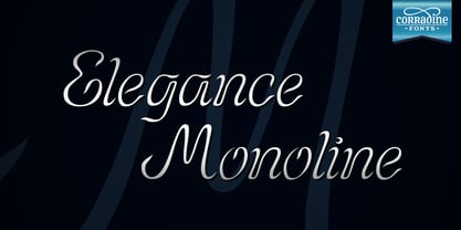 Elegance Monoline is ideal for invitations, greeting cards, logotypes, or anywhere a touch of elegance is desired.
 - Delancey JNL by Jeff Levine,
$29.00 Inline lettering from a vintage piece of sheet music inspired Delancey JNL, an Art Deco-flavored design.
 - Amariya by Monotype,
$40.99 Designed by Nadine Chahine, the Amariya™ typeface family is intended for long form, on-screen textual content. It supports the Arabic, Persian and Urdu languages. The design is consistent with traditional text typeface models popular in the Middle East, but has a lower level of stroke contrast optimized for on-screen reading. The family is available in nine weights ranging from a light hairline to a very bold black. The middle weights are intended for setting text copy while the extreme hairline and black designs are best suited for headlines, sub heads and similar applications. The Amariya family can be used for numerous projects from branding to blogs, in a variety of interactive design environments on both large and small screens. The fonts include the ITC Charter design by Matthew Carter as a Latin companion.
 - Pentathlon Pro by DBSV,
$80.00 Strait passages second part… I tried in this fifth (that's why she took the name "Pentathlon Pro”) consecutive font family to give her a character style with again a strait way of writing. Walking on the same considerations as the previous series (Khamai, Aeolus, Corset & Artios) I tried to give some sense of diversity for the strait passages of character: those fourteen style are the result. And in this family, the “Bold” with "Inlier" and “Bold Italic” with "Inlier Italic” engage in the same way as did the “Layered font families” in the previous series. Also I added a design statement for the twelve zodiac signs, only presented in the Bold, Inlier, Bold Italic and Inlier Italic style. This series is composed of fourteen styles with 628 glyphs each, with true italics and supports Latin, Greek and Cyrillic.
 - Bauhaus Arabic by Naghi Naghachian,
$112.00 Bauhaus is celebrating its centenary in this year. For the Bauhaus's 100th anniversary year, art and design museums and galleries around the world are hosting exhibitions and events. The publication of „Bauhaus Arabic“ font family is my contribution to celebrate this event. Bauhaus Arabic is a sans-serif font family designed by Naghi Naghashian in tree weights. Bauhaus Arabic Light, Bauhaus Arabic Medium and Bauhaus Arabic Bold. It is extremely legible even in very small size. This font family is a contribution to modernisation of Arabic typography, gives the font design of Arabic letters real typographic arrangement und provides more typographic flexibility. Bauhaus Arabic supports Arabic, Persian ( Farsi ) and Urdu. It also includes proportional and tabular numerals for the supported languages. Bauhaus Arabic design fulfills the following needs: A Explicitly crafted for use in electronic media fulfills the demands of electronic communication. B Suitability for multiple applications. Gives the widest potential acceptability. C Extreme legibility not only in small sizes, but also when the type is filtered or skewed, e.g., in Photoshop or Illustrator. Bauhaus Arabic’s simplified forms may be artificial obliqued in InDesign or Illustrator, without any loss in quality for the effected text. D An attractive typographic image. Bauhaus Arabic was developed for multiple languages and writing conventions. Bauhaus Arabic supports Arabic, Persian and Urdu. It also includes proportional and tabular numerals for the supported languages. E The highest degree of calligraphic grace and the clarity of geometric typography.
 - Elementis by Linotype,
$29.99German designer Hans-Jürgen Ellenberger originally developed the concept behind Elementis in 1975. Wanting to create an alternative typewriter script that was more round and natural, Elementis' design was born. True to its typewriter roots, Linotype's Elementis exhibits more character than one expects from that genre. The letters display a delightfully quirky nature, which is sure to lighten up any document. Elementis may be used in a number of point sizes: although the letters function best in large display settings, short passages of text in sizes of 12 point or less may also be created. This family has received a number of awards in various contests: Elementis was awarded an Honorable Mention in the 2003 International Type Design Contest, sponsored by Linotype GmbH. Additionally, Ellenberger received a Certificate of Typographic Excellence from the Type Directors Club in 2005; during their annual TDC2 type design competition, Elementis was selected as a "judge's choice." - Quador Display by Fontador,
$24.99 Quador Display is a serif, especially designed for contemporary typography on print and screen. The superellipse-based forms and high x-height allow large and open letterforms, perfectly adapted to the pixel grid on screen. The font contains 6 weights from light to ultrabold plus true italics. 1.049 glyphs include 282 ligatures, tabular, old style, fractions …, and a wide range of flexibility for latin language support for every typographical needs. Quador Display is a contemporary serif typeface, special for logotypes, brands, magazines and editorial.
 - Inversi by Hanken Design Co.,
$30.00 Inversi is a reverse-stress typeface that may be used as a display or text-face font for a wide range of subjects. Compared to other reverse-stress/reverse-contrast typefaces, Inversi's linear contrast is much lower which, at lower sizes, makes it a good options for text or captions. It has good language support, unique design, fractions, and three different widths. Inversi pairs well with HK Requisite. Use the narrow or condensed style when mixing with HK Requisite to give more contrast to the composition.
 - Queulat by Latinotype,
$- Queulat is a hybrid typeface that combines two different styles, reflecting charm, freshness and, especially, a strong personality. The font is inspired by Modern and Grotesk styles. The former is shown in some characteristic features such as teardrop terminals, which give the typeface an attractive unique look, making it an ideal choice for logotypes and labelling. The latter, with its rationality, makes Queulat a stable and strong face for headings and subheadings. The combination of styles can be clearly seen by comparing the regular with the alt version. The regular version is more simple than the alt one. Differently, the alternative version possesses more features of the Modern style, like teardrop terminals in ‘k’ and ‘v’. Queulat also comes with a Unicase version, in which a higher number of shapes can be found, resulting in a unique colourful display.
 - Ducatus by Scriptorium,
$12.00We wanted to make an ultra-thin, tall font with a rough, hand-drawn look and ended up with more than we bargained for. To get the font we wanted we started by developing a source font for the basic letter shapes and we ended up with a whole bunch of variations of the basic style. Thus was born the new Ducatus family of fonts, starting with Ducatus Light which developed into the Medium and Heavy versions, and the Medium weight was ultimately used as the basis for the Ducatus Rough font, which was the goal of the project in the first place. Ducatus Rough was created by modifying Ducatus Medium in Photoshop using Gallery Effects and several other filter packages, and then redoing the outlines from scratch in Fontographer. A lot of work, but the result is just what we wanted. - Exhibitionist by 38-lineart,
$16.00 Related to typography and art, we define exhibitionist as an innovative work that is able to invite attention. An Exhibitionist must have a strong character, dare to appear as it is, natural, simple and modern-minded. That is what is represented in this font, a handwriting with a natural rhythm and reflects the lifestyle of urban society. We want to give a definition of exhibitionist in a positive typography frame. This font is very simple, too much glyph will make you confused, we make a lot of glyphs but we've filtered out only selected glyphs, so all you do is activate the ligature on your software and feel the interesting handwriting rhythm. We are sure with this font, you will look more stunning and attract the interest of visitors to look more closely at your brand
 - Nocturne by Scholtz Fonts,
$19.95 The font is based on an alphabet from a mid1920s art deco book. The original seemed to have tapering strokes but it was too small to be sure; I made all strokes parallel & orthogonal and slightly modified the original in a number of other ways to bring it into the 21st Century. The designers of the original were Paul Carlyle and Guy Oring. Nocturne has all the elegance of the Deco fonts of the 1930s. It recalls the romantic, sophisticated Zeitgeist of the early 20th century, that nostalgic time "between the wars". Nocturne comes in two styles: Nocturne Regular, which uses the Art Deco convention of small x height, and long ascenders. This style is perfect for headers, posters, labels etc. Nocturne Book, which, with its higher x height and slightly wider characters, is extremely legible and suitable for small size text.