10,000 search results
(0.038 seconds)
- Broadside by Device,
$39.00 Broadside is a versatile, authoritative and functional family inspired by the sans serifs seen on ’40s and ’50s patriotic posters and period advertising. It is available in seven weights across condensed, normal and extended widths, each with reweighed italics. The type from this period was very often hand-drawn, and so differs considerably from poster to poster. Many American examples of this period use a Photo-Lettering style called Murray Hill and its derivatives, although their UK counterparts, designed by such luminaries as Abram Games or Tom Eckersley, are more stylistically diverse. Even though no single model is available to base a digitisation on, there are certain recurring stylistic quirks that give the type its unique flavour, and so the most interesting examples from several sources were be combined for the final family. Alternate short descenders, allowing for tighter line spacing, can be toggled on or off in the Opentype panel of Indesign or Illustrator. Tabular and lining numerals and a single-story ‘a’ are also available in all weights and styles.
 - Glade by Dear Alison,
$24.00 My latest typeface is a formal, copperplate script named Glade. Beginning as a project for a client who wanted several widths of a formal script style, the project never saw fruition. However, it did get me excited about the idea of a width family of steel nib scripts, ranging from extra narrow to extra wide, and the result is the Glade family. To give Glade a minor modern makeover from the original intent, the lowercase has been scaled up, and the Capitals scaled down for a more friendly personality. The character set has been expanded, and OpenType support has been added for unlimited fractions, ordinals, superiors and inferiors. So if you have the need for a formal connecting script, but are short on space, try Glade Narrow or Glade Extra Narrow. If space is not an issue, then the Regular, Wide or the generously gracious Extra Wide should do nicely. And if you get the whole family, well then you are set for anything that comes your way.
 - Grabnika Unix by DePlictis Types,
$46.00 Grabnika Unix is a unicase style typeface with a straight and a bit tall look and it has a residual influence of monospaced fonts. One of the major characteristics of this typeface are those sharp cuted ears and joints that appears repeating at some of the letters and gives him a distinctive personality and a minimalist design approach on other group of letters that creates an alternative interesting fill of the spaces. It is suitable for signage purpose and headlines or relatively short body texts and also for logo design and branding. It is a loud and fresh display that could give a certain distinctive and young personality to your designs. As a fun fact, the name of this font comes from the romanian word “grabnic” that means “fast” and I developed this font by chance as a custom lettering for a logo design project, so I saw it proper as an alternative in the actual wide font markets and I decide to finishing it as a multilingual support typeface. Enjoy!
 - Oddval by Type Forward,
$34.00 Oddval is a unique contemporary display geometric sans-serif with prominent ink traps and a smooth, masculine tone. Due to its modern and original style, it is well-suited for creative projects closely linked to innovation. Oddval has a strong presence in the text due to its high x-height, minimal stroke contrast, and slightly wide oval shapes. The Oddval type family includes 9 weights ranging from hairline to heavy, with corresponding Italics for a total of 18 fonts. These fonts are also available as a single variable font file, allowing you to create without limits. The typeface is designed with extensive language support, including Extended Latin, Cyrillic, and Greek, covering over 220 languages. It also includes advanced typographic features, such as standard and discretionary ligatures, a stylistic set, contextual alternates, tabular and small figures, fractions, and language localizations. Suitable for both print and on-screen media, Oddval is ideal for use in headlines and logotypes. It can also be set in short paragraphs to create a unique contemporary feel.
 - SF Seen by Sultan Fonts,
$9.99 "Seen" is the name of the gods in Kingdom of Hadhramaut 3,000 years ago Kingdom of Hadhramaut - Wikipedia "Seen" Font Family Will Add a Splash Of Historical Musnad writing To Your Designs Coming in 4 Styles: Regular,Medium,Bold and Black, "Seen" Font Family is a serif typeface designed by Sultan Maqtari. Each style of the font is incredible in its own way, with attractive curves, spacing, and ligatures. Ideal for bold headlines, short sentences, unique logos, and general graphics, this typeface will effortlessly add a hint of Musnad writing and a splash of Amazing past to any design. "سين" اسم آلهة في مملكة حضرموت قبل ٣٠٠٠ عام ستضيف مجموعة خطوط "سين" لمسة من كتابات المسند التاريخية إلى تصاميمك. تأتي عائلة الخطوط "سين" بأربعة أنماط: عادي،متوسط،عريض واسود ، وهي عبارة عن خط مزخرف صممه سلطان المقطري. كل نمط من الخط لا يصدق بطريقته الخاصة ، مع منحنيات جذابة ، ومسافات ، ووصلة ربط. مثالي للعناوين العريضة والجمل القصيرة والشعارات الفريدة والرسومات العامة ، سيضيف هذا الخط دون عناء لمسة من كتابة المسند ونفحة من الماضي المذهل إلى أي تصميم.
 - Belwe by ITC,
$29.99The typeface Belwe, created in 1926 by German typographer and teacher Georg Belwe, has an uncommon style that is difficult to describe. It is a synthesis of many different genres: it is a slab serif with Art Nouveau style but also with many blackletter influences. The angled serifs on the ascenders and the calligraphic flourishes on the the upper and lowercase V, W, and Ys reference marks made by pens. There are also many other special characters that are unlike any other designs. Have a look at the fun lowercase a, the quirky lowercase f and g, and the unique C, F, L, and R for the uppercase. This design works especially well for display sizes, but is also good for short amounts of text. The mood and image suggested by this typeface is great for menus, invitations, and signs when you want to send a personal and friendly message. It's Art Nouveau roots also give it a place in history for designs from the Victorian period up through the 1920's and 30's - Kuma Square by L'île Foundry,
$35.00 In Ancient Greek, Kuma means wave. This wavy, dynamic and poetic all-caps display typeface is useful for headlines or short texts. Kuma is the result of a graphic and perceptual game that, using experimentation as a working method, explores the possibilities of writing as an image. This grid-based typeface creates different shapes and directions, never predictable. There are different types of waves created by the wind. That's why there are three different versions of Kuma: Kuma, Kuma Rounded and Kuma Square. Each version is available in seven weights which can be combined together. In their black and white rhythm, they guarantee global readability and balance. Kuma Square was designed by Jérémy Ruiz. Supported languages: Afrikaans, Albanian, Basque, Bosnian, Breton, Catalan, Croatian, Czech, Danish, Dutch, English, Esperanto, Estonian, Faroese, Fijian, Finnish, Flemish, French, Frisian, German, Greenlandic, Hawaiian, Hungarian, Icelandic, Indonesian, Irish, Italian, Latin, Latvian, Lithuanian, Malay, Maltese, Maori, Moldavian, Norwegian, Polish, Portuguese, Provençal, Romanian, Romany, Sámi (Inari), Sámi (Luli), Sámi (Northern), Sámi (Southern), Samoan, Scottish Gaelic, Slovak, Slovenian, Sorbian, Spanish, Swahili, Swedish, Tagalog, Turkish, Welsh.
 - Cedi by Typogama,
$25.99 The Cedi Typeface is a single weight display font that is based on the fluid handwritten style of a work colleague. This design is a fast flowing script that is both lively and original yet equally legible due to it's defined letterforms and open forms. Despite working well in a regular format, during the design process I started to look at ligatures as a solution for solving some problematic combinations. However, this small implementation soon got vastly expanded as I started to focus on the rythm of the letterforms and how best to convey the hand drawn feature in the design. A common problem in most script fonts is the repeating letterforms that would be particularily un-natural for this manual typeface, therefore hinting at it's digital source. The ligature concept soon evolved into over 2400 ligatures, trying to cover all repeating glyphs as well as finding more harmious combiations. This design was created for use in short text settings and use at large point sizes suiting titles, screen use or logo designs.
 - Kuma Rounded by L'île Foundry,
$35.00 In Ancient Greek, Kuma means wave. This wavy, dynamic and poetic all-caps display typeface is useful for headlines or short texts. Kuma is the result of a graphic and perceptual game that, using experimentation as a working method, explores the possibilities of writing as an image. This grid-based typeface creates different shapes and directions, never predictable. There are different types of waves created by the wind. That's why there are three different versions of Kuma: Kuma, Kuma Rounded and Kuma Square. Each version is available in seven weights which can be combined together. In their black and white rhythm, they guarantee global readability and balance. Kuma Rounded was designed by Jérémy Ruiz. Supported languages: Afrikaans, Albanian, Basque, Bosnian, Breton, Catalan, Croatian, Czech, Danish, Dutch, English, Esperanto, Estonian, Faroese, Fijian, Finnish, Flemish, French, Frisian, German, Greenlandic, Hawaiian, Hungarian, Icelandic, Indonesian, Irish, Italian, Latin, Latvian, Lithuanian, Malay, Maltese, Maori, Moldavian, Norwegian, Polish, Portuguese, Provençal, Romanian, Romany, Sámi (Inari), Sámi (Luli), Sámi (Northern), Sámi (Southern), Samoan, Scottish Gaelic, Slovak, Slovenian, Sorbian, Spanish, Swahili, Swedish, Tagalog, Turkish, Welsh.
 - Axios Pro by TipoType,
$24.00 In Axios Pro the rational language of the early XX century geometric sanserifs is complemented with an structure deeply attached to the renaissance typefaces; the uppercase proportions proceed form the roman canon while its lowercase was constructed following the humanist ductus. This blend produce a typeface of modern, clean and contemporary appearance that has implicit on its core a classic vibe, nourishing the text with a timeless elegance.In use, the form and function balance of its design allow it freely travel through a diverse range of fields and possibilities like short text settings, brands, headlines or signage systems with grace and naturality. Axios Pro is available in variable font format and in 20 different individual styles (10 weights), with a set of more than 1000 glyphs per style, supports over 200 latin languages and including an extensive repertoire of opentype features like small caps, ligatures, stylistic alternates, proportional and tabular figures, swashes, borders and many other resources to please your typographic urges. Designed by Rodrigo López Fuentes & Sergio Leiva Whittle
 - Love Story by Latinotype,
$29.00 Love story is a display hairline typeface for use in big sizes and short texts. It’s inspired by different kinds of love and specially designed for Valentine’s day. Its soft curves and sweet style give it a lovely personality. Designed by Luciano Vergara and his wife Guisela Mendoza who has been studying ornaments since 2007 and has done her best for each project. You can see in her dingbats specially Printa and Abel designed for generate patterns. Now she integrated her passion to the ornament in a clean set which includes dingbats, ornaments and patterns. Luciano Vergara has designed very strong fonts with a particular work in the lines study and close to the geometry since 2005, getting a structure style, you can see in his fonts specially Regia and Kahlo. Now he integrated his study of lines, in a hairline font delicate, continuous and beautiful. In this story both designers have been merged their worlds creating a gorgeous product. This is a romantic type story, a love story.
 - Belwe Mono by ITC,
$29.99 The typeface Belwe, created in 1926 by German typographer and teacher Georg Belwe, has an uncommon style that is difficult to describe. It is a synthesis of many different genres: it is a slab serif with Art Nouveau style but also with many blackletter influences. The angled serifs on the ascenders and the calligraphic flourishes on the the upper and lowercase V, W, and Ys reference marks made by pens. There are also many other special characters that are unlike any other designs. Have a look at the fun lowercase a, the quirky lowercase f and g, and the unique C, F, L, and R for the uppercase. This design works especially well for display sizes, but is also good for short amounts of text. The mood and image suggested by this typeface is great for menus, invitations, and signs when you want to send a personal and friendly message. It's Art Nouveau roots also give it a place in history for designs from the Victorian period up through the 1920's and 30's
 - Rawhide by Canada Type,
$29.95 Rawhide is a fresh digitization and expansion of a very popular (yet uncredited) early 1970s film type called Yippie, which was commonly used in wild west cartoons and comics. Publishers of Lucky Luke, the famous Belgian comic by Morris, used these bouncy letters for the titling on a few of their soft cover editions, and different variations of it were used throughout the 1970s and 1980s by cartoon classic Looney Tunes and a variety of wild west animations and comics. It slowly disappeared without fanfare when desktop publishing became the norm. Here it is again now for the computer age, available as a high quality font with a complete character set that accommodates more than 20 Latin-based languages. In short, Rawhide comes with an impressive track record, and is a must for any funny cowboy design or off the wall wild west layout. This set of fonts contains a very expanded character set that includes full support for Central, Eastern and Western European languages, as well as Baltic, Turkish, Esperanto, Greek, Cyrillic and Vietnamese.
 - Waxahachie NF by Nick's Fonts,
$10.00This unusual take on a typical woodtype typeface is based on a 1950s Stenso lettering template and, appropriately, takes its name from a small town in Texas not far from Dallas, locally noted for its grand Victorian homes. - Zarrow by Ingrimayne Type,
$9.00 Zarrow is a novelty or letterbat font made up of arrows and other items from archery. It is caps only, but some of the characters on the lower-case keys alternatives to those on the upper-case keys.
 - Happy Dinosaur by Sipanji21,
$10.00 Happy Dinosaur is a sweet and chunky lettered display font. Its friendly feel makes this font incredibly versatile, fitting a wide range of contexts. Add it to your creative ideas and notice how it makes them stand out!
 - Funky Shed by PizzaDude.dk,
$20.00OMG it's the funky shed! The height and width of each character vary to make it look jumpy. At the same time, Funky Shed, has got a crunchy line which makes it even more funky to look at! - Spooky Green by Illushvara,
$13.00 Spooky Green is an incredibly unique and quirky display font. Its friendly feel makes this font incredibly versatile, fitting a wide range of contexts. Add it to your creative ideas and notice how it makes them stand out!
 - The King Of Romance by Creativework Studio,
$18.00 The King Of Romance is a classic and elegant handwritten font. It is enriched with alternative characters and ligatures that make this font even more beautiful. Add it to your favorite creative ideas and make them stand out!
 - Cross Stitch Discreet by Gerald Gallo,
$20.00 Cross Stitch Discreet is based on upper case characters 16 stitches tall and contains upper case characters A-Z, ampersand, exclamation and question marks, comma, period, colon, and semi-colon. The Gallo foundry now offers 174 font styles.
 - Guhly by Ingo,
$35.00 A modern Sans Serif — prosaic, designed geometrically, beautiful in large sizes All the dimensions of the font are based on Factor 10. The general principle of construction leads to slim forms and nearly equally wide characters. So the font appears very solid but is actually difficult to decipher in longer texts. Along with the ”normal“ Guhly Regular there are also the two versions Guhly Light and Guhly Bold, whereas in each only the vertical strokes [Guhly Light] or horizontal [Guhly Bold] have been changed in strength. The result is a very individual decorative effect which slightly reflects old circus and western scripts. The lower case characters in the version Guhly Book are, therefore, optimized to be suitable for longer texts in smaller font sizes — because after all, sometimes you should read a bit more than just the headline… The design of a shampoo bottle stands behind the creation of this sans serif display font. Prominent, clearly constructed forms with circular arcs define its appearance. This is a font primarily designed for use with capital letters — for all sorts of advertising purposes, headlines and titles. But lower case letters also belong to a good functional font; so, of course, Guhly includes them and ligatures for the more ”critical“ letter combinations as well as stylistic alternates for the letters K (or k), V (v) and o. As a decorative “encore”, the Guhly family also contains the “normal” weight in two variants: on the one hand the Guhly Cutout – these are letters without counter, as if the letters were cut out and the internal surfaces fell out; and on the other hand the Guhly stencil – as the name suggests, a stencil font with the typical bars that give a stencil the necessary cohesion.
 - Mr Eaves Modern by Emigre,
$59.00 Mr Eaves is the often requested and finally finished sans-serif companion to Mrs Eaves, one of Emigre’s classic typeface designs. Created by Zuzana Licko, this 2009 addition to the Emigre Type Library expands the versatility of the original Mrs Eaves with two complimentary families: Mr Eaves Sans and Mr Eaves Modern. Mr Eaves was based on the proportions of Mrs Eaves, but Licko took some liberty with its design. One of the main concerns was to avoid creating a typeface that looked like it simply had its serifs cut off. And while it matches Mrs Eaves in weight, color, and armature, Mr Eaves stands as its own typeface with many unique characteristics. The Sans version relates most directly to the original serif version, noticeably in the roman lower case letters a, e, and g, as well as in subtle details such as the angled lead in strokes, the counter forms of the b, d, p, and q, and the flared leg of the capital R, the tail of the Q. The distinctly loose-fitting letter spacing of Mrs Eaves was applied also to the Sans version. This, together with generous built-in line spacing due to a small x-height and extended ascenders and descenders, renders the same kind of lightness and airiness when setting text that is so characteristic of Mrs Eaves. Deviations from the original Mrs Eaves are evident in the overall decrease of contrast, as well as in details such as the flag and tail of the f and j, and the finial of the t, which were shortened to maintain a cleaner, sans serif look. And the lower case c had to be balanced out differently after it lost its top ball terminal. And with the loss of serifs, Mr Eaves set width is slightly narrower. Mr Eaves Italic also carries over many forms from its Mrs Eaves model, most notably the v, w, and z, which are unusually flamboyant for a sans italic design. It also utilizes lead in and terminal tails that are reminiscent of the serif italic. The biggest departure here is the width of the characters. The extra narrow gauge and delicate features seemed more appropriate for the Serif than the Sans. To allow for a comfortable fit, Mr Eaves Italic has a more robust design and wider character width. Meanwhile, the Modern family provides an overall less humanistic look, with simpler and more geometric-looking shapes, most noticeably in the squared-off terminals and symmetric lower case counters. This family has moved furthest from its roots, yet still contains some of Mrs Eaves’ DNA. The Modern Italic is free of tails, and overall the Modern exhibits more repetition of forms, projecting a cleaner look. This provides stronger differentiation from the serif version whenever a more contrasting look is desired. Each version (Sans and Modern) contains its own set of alternates providing unique options for applications such as headlines, word logos, letterheads, pull quotes, and other short text settings. Both the Sans and Modern come in six weights. The simpler forms of a sans-serif provide the opportunity of more weights than do serif letter forms, which are more complex in structure, making it difficult to accommodate additional weight without distortions. Regular and Bold match the original Mrs Eaves weights, while the Heavy provides an additional weight for extra emphasis.
 - Mr Eaves Sans by Emigre,
$59.00 Mr Eaves is the sans-serif companion to Mrs Eaves, one of Emigre’s classic typeface designs. Created by Zuzana Licko, this 2009 addition to the Emigre Type Library expands the versatility of the original Mrs Eaves with two complementary families: Mr Eaves Sans and Mr Eaves Modern. Mr Eaves was based on the proportions of Mrs Eaves, but Licko took some liberty with its design. One of the main concerns was to avoid creating a typeface that looked like it simply had its serifs cut off. And while it matches Mrs Eaves in weight, color, and armature, Mr Eaves stands as its own typeface with many unique characteristics. The Sans version relates most directly to the original serif version, noticeably in the roman lower case letters a, e, and g, as well as in subtle details such as the angled lead in strokes, the counter forms of the b, d, p, and q, and the flared leg of the capital R, the tail of the Q. The distinctly loose-fitting letter spacing of Mrs Eaves was applied also to the Sans version. This, together with generous built-in line spacing due to a small x-height and extended ascenders and descenders, renders the same kind of lightness and airiness when setting text that is so characteristic of Mrs Eaves. Deviations from the original Mrs Eaves are evident in the overall decrease of contrast, as well as in details such as the flag and tail of the f and j, and the finial of the t, which were shortened to maintain a cleaner, sans serif look. And the lower case c had to be balanced out differently after it lost its top ball terminal. And with the loss of serifs, Mr Eaves set width is slightly narrower. Mr Eaves Italic also carries over many forms from its Mrs Eaves model, most notably the v, w, and z, which are unusually flamboyant for a sans italic design. It also utilizes lead in and terminal tails that are reminiscent of the serif italic. The biggest departure here is the width of the characters. The extra narrow gauge and delicate features seemed more appropriate for the Serif than the Sans. To allow for a comfortable fit, Mr Eaves Italic has a more robust design and wider character width. Meanwhile, the Modern family provides an overall less humanistic look, with simpler and more geometric-looking shapes, most noticeably in the squared-off terminals and symmetric lower case counters. This family has moved furthest from its roots, yet still contains some of Mrs Eaves' DNA. The Modern Italic is free of tails, and overall the Modern exhibits more repetition of forms, projecting a cleaner look. This provides stronger differentiation from the serif version whenever a more contrasting look is desired. Each version (Sans and Modern) contains its own set of alternates providing unique options for applications such as headlines, word logos, letterheads, pull quotes, and other short text settings. Both the Sans and Modern come in three weights. The simpler forms of a sans-serif provide the opportunity of more weights than do serif letter forms, which are more complex in structure, making it difficult to accommodate additional weight without distortions. Regular and Bold match the original Mrs Eaves weights, while the Heavy provides an additional weight for extra emphasis.
 - MB GEOMETRIXA by Ben Burford Fonts,
$25.00 Inspired from geometric curves and circles, an audacious lower case display face with some alternate characters in Upper and Lower case glyphs. Great for Logos and Logotypes, headlines and larger text. Works well with smaller strap lines as well.
 - Carabelle by Typejockeys,
$25.00 Carabelle is based on the Nebiolo type foundry’s Calipso design. Newly redrawn and with many original details added, this old typeface has been revitalized. Noble and sweet, Carabelle plays the elegant companion for cup cake shops, wedding invitations or culinary tours through France and Italy.
 - Another Fool by PizzaDude.dk,
$15.00 Another font, Another Fool! This one made me think of cake - you know, a crisp crust and sprinkles on top. Perhaps the recipe includes blueberry and peanuts? Well, this fonts' recipe includes 6 different versions of each letter as well as multilingual support! Yummy!
 - Manicuore by PintassilgoPrints,
$29.00 Manicuore is a hand-drawn typeface inspired by Italian movie posters by the prolific movie poster artist Symeoni (a.k.a. Sandro Simeoni). Being a talented and skilled painter, portraitist and illustrator, Symeoni enjoyed a long and fruitful career and was remarkably productive during the sixties and seventies. He counts over 3,000 works to his credit, which truly fed the imagination of several generations. This all-caps font brings different lettershapes on upper and lower case slots, which work as alternates, providing handy options to spice up your compositions. When using it in OpenType savvy applications just turn on contextual alternates feature to instantly cycle lettershapes – a one click way for adding spontaneity while also preventing neighbor double letters from using the same glyph. To put the icing on the cake, Manicuore brings a cool set of graphic elements that match the typeface look and feel. An inspiring toolbox for creative lettering designs. Now... Lights! Camera! Action!
 - Polythem by Haksen,
$13.00 "Polythem" is a beautiful high bold script font that makes for gorgeous logos, posters, wedding invitations, blog posts, social media, and more! Polythem Script includes ligatures to make everything look totally hand-done, and alternates for each letter. Thanks for visited
 - Rogicha by Wildan Type,
$13.00 Rogicha is A modern stackable display font. The way you can uniquely stack different parts of this font makes it super fun to work! Perfect for all purposes. You make more creation design with opentype feature. so, Enjoy this font.
 - Mintage by Prioritype,
$19.00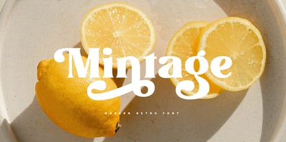 Introducing Mintage: Modern & retro font with a variety of alternative characters to make every word you make more eye-catching. Great for social media post designs, branding, merchandise, posters etc. Features: Uppercase, Lowercase, Numeral, Punctuation, Multilingual, Ligature, Alternates & PUA Encoded.
 - Hay Scary by HandletterYean,
$13.00 This is a Halloween-themed font. Its style will make your creativity stands out in your designs. Feel free to use it on any kind of creative design, and cherish your Halloween with this font to make it more festive.
 - Ardenwood by Scriptorium,
$18.00Ardenwood is based on a wood-carved alphabet from the early 1500s. It features gothic characters with elaborate floral decorations. The lower case has the more basic versions of the letters while the upper case characters are more extensively decorated. - Fiolyta by Agny Hasya Studio,
$10.00 Fiolyta is a modern and classy script typeface featured with upper case and lower case, numerals, punctuation, and OpenType Features. Perfect for your design projects like logos, branding, advertising, product designs, stationery, photography, art quotes, wedding designs, fashion designs, and more.
 - KlipJoint by Ingrimayne Type,
$14.95 KlipJoint is a novelty font in which all the characters are formed from paper clips. It does not have a true set of lower case letters, but in their place is a second and often different set of upper-case letters.
 - Tattooflash Marie by Otto Maurer,
$14.00 Tattooflash Marie is made for Tattoofans, Tattoostudios and Tattoo artists. Make your own tattoo flash with your Name or the Names of your children. The Font is made for your skin but you can also make Tattooposter, Tattooequipment and more.
 - Makota by Yukita Creative,
$14.00 The modern font Makota is perfect for use in luxury-related design projects. Its tall elegant typeface makes it ideal for branding and advertising, while its high legibility makes it perfect for use on websites, advertisements and other types of communication.
 - Disclover by Zang-O-Fonts,
$25.00Disclover came about when I was doodling on a pad of paper. I was thinking about contemporary font designs, and disclover came to mind. The original sketches were scanned and then re-drawn in Illustrator. The name is just made up. - Askale by Mantra Naga Studio,
$20.00 Askale - Victorian Vintage Display Font. This typeface has many alternatives with swashes that can make your lettering/logotype more attractive. Bold serifs and more swash on each character make this font even more unique. This font is very suitable to be applied, especially to logos, and various other formal forms such as invitations, labels, logos, magazines, books, greeting / wedding cards, packaging, fashion, make up, stationery, novels, labels or any type. advertising purposes.
 - Antique Vintage by Arendxstudio,
$15.00 Antique Vintage - Script font is a type of font that features thick and prominent strokes, giving it a bold and impactful appearance. The letters are usually interconnected, creating a flowing and handwritten look. The boldness of the font makes it stand out and grabs attention, making it a popular choice for headlines, titles, and logo designs. It exudes confidence, strength, and creativity, making it suitable for various design projects that require a strong visual impact.
 - Prolexia by Dyslexica,
$10.00 Prolexia is designed to make the font friendly towards those with dyslexia. All the characters are unique with no rotation or mirroring, this makes it harder for the mind to mix up similar glyphs. The characters are made with the illusion of perspective: this helps orient characters in the correct direction to make mental reorientation harder. Finally the o shape is somewhat flattened, this also helps to counteract mental rotation of characters.