8,026 search results
(0.025 seconds)
- Paint Kicks by Fargun Studio,
$12.00 Paint Kicks is a family of handmade typeface, with a rugged paint style. The font carries the spirit of street culture, with its rough and attractive forms
 - Breezy by Wiescher Design,
$19.00 »Breezy« is a brush script with very expressive strokes and surprising connections. »Breezy« is a great script if you really want to have that crude, rough feeling.
 - TC Europa by Monotype,
$29.99Europa gives a rectangular appearance to words. Strokes have lightly flaired terminals to give the effect of serifs. The Europa font is excellent for headlines in journals. - Longbeach by Cititype,
$17.00 Longbeach is a casual yet elegant brush font, it has natural brush stroke that perfect for branding project, household appliance design, product packaging, or other wonderful design
 - Envoy by Tim Rolands,
$20.00 Envoy is a serif type inspired primarily by Garalde oldstyle types like those of Claude Garamond. As such, it is particularly well suited for book and magazine text. Characteristic details more typical of Venetian oldstyle faces serve to give Envoy just a bit more personality. The base family includes regular, italic, bold, bold italic and small capitals. Expert sets add ligatures and alternate letterforms. Display sets include letterforms customized for titling. Originally designed in 1995 and 1996, for the 1996 Morisawa International Typeface Design Competition, Envoy was later revived, completed and publicly released in 1998. During the initial design, the family was known as Truman in honor of Northeast Missouri State University becoming Truman State University, but the name was changed to Envoy prior to entry in the competition.
 - Montauk by profonts,
$51.99 Montauk Pro is named after a small village in Suffolk County, New York on the South Shore of Long Island. It is the easternmost area in Long Island, and thus the easternmost area in New York State. It is home to Montauk Point State Park, site of the Montauk Point Lighthouse. It is named after the Montauk Indians. Montauk Pro is a casual, jaunty and quite beautiful handwriting script. It comes with six styles as light, light italic, regular, regular italic, bold and bold italic, each style with about 1.000 characters covering the complete Latin glyph set for West and East including Baltic and Turkish, including a large selection of ligatures, character combinations and alternates to make this beautiful script design a perfect font for OTF-savvy applications like e.g. InDesign or Quark Xpress 7.
 - Anca by DizajnDesign,
$49.00 Anca typeface started as a comission work for Fest Anca, an international animation festival. They needed something to complement the corporate identity of the festival. Inspiration came from a sketch made by my friend long time ago, which had a tremendous potential. As letters were digitized and the basic alphabet was completed, a very practical and universal typeface resulted. The whole type family has a playful and simple look with rounded stroke endings as well as long ascenders. The construction skeleton uses the minimum number of strokes and as a consequence, some original letter shapes (Q, w, j, &, A, §) were produced. Despite the fact that most letter shapes are based on geometry, some strokes are intentionally irregular, which creates a very natural feeling. Anca is appropriate for setting short paragraphs, headings and big inscriptions.
 - Abesif by Twinletter,
$12.00 Introducing Abesif sans serif font. This font is stretched from the normal theme, it is boring, while different, it seems strange. from there we design the appearance of this font that is not normal so that it is not boring and we display it differently but not look strange. so if you use this font it will look different from the others but it doesn't look strange because it has a normal design. so that it creates an impression that is easy for each of your audience to remember when they first see your project. This font is very suitable as text with displays for various kinds of branding, advertisements, posters, banners, packaging, news headlines, magazines, websites, logo design, banners, social media design and of course you can use a lot more.
 - Volterra by Blank Is The New Black,
$25.00 In today's typographic landscape, few would still consider Bodoni to have a "modern" feel, but there was once a time when it's vertical axis and thinned horizontal strokes were considered radical. Volterra—inspired by the forms of Bodoni—finishes what Bodoni started and eliminates the horizontal stroke altogether, breathing an elegant new energy into a 200-year-old classic. Named for the artist hired to paint loincloths over Michelangelo's "Last Judgement" when nudity in religious art was condemned, Volterra acknowledges that it is no easy feat picking up where a master left off. Volterra takes what has grown to feel traditional and transforms it into a delicate mixture of classic and modern, with razor-edged serifs and ultra-sharp strokes. Strictly a display face, the larger Volterra is used, the better it looks.
 - Fortezza by Eurotypo,
$22.00 Fortezza is a family of fonts inspired by the great masters who have created the Modern Roman style: Firmin Didot (1764 -1836) and Giambattista Bodoni (1740 -1813) Both typefaces can be similar, but a trained and close vision, show clear differences in the final result, like its weight and the degree of transition of the strokes. The type of Didot suggests greater warmth and elegance, they are characterized by extreme contrast in thick strokes and thin strokes, by the use of serifs very thin and by the vertical stress of the letters. while the Bodoni type conveys a greater robustness and hardness. Fortezza brings together the elegance and spirit of both types, but proposes a contemporary vision, establishing a distance with certain features typical of the baroque that was manifested at that time.
 - Hochland by Zealab Fonts Division,
$18.00 Hochland is a modern, condensed font, inspired by street urban style posters. It works well for headlines, logotypes, signs, posters, greeting card, letterhead, t-shirts, watermarks and more.
 - Sideron by Fontron,
$35.00Sideron is a first release and has some minor similarities to Broadway in its thick and thin strokes but is much squarer. There is also an Italic version. - Radio Broadcast JNL by Jeff Levine,
$29.00 An interesting hand lettered sans serif type style with a “brush stroke” feel was used for various article headlines in the October, 1938 issue of “Radio Stars” magazine.
 - Metropolis by Monotype,
$29.99Metropolis was designed by W. Schwerdtner and released in 1928. The tapered strokes give the impression of height. The Metropolis font family shares an attractive, informal headline design. - Hectonoid JNL by Jeff Levine,
$29.00Hectonoid JNL is a more radical version of Oblogram JNL, with a jumbled alphabet and heavier stroke weights. Both fonts are derived from Jeff Levine's Yorso Square JNL. - Diamante Robusto by César Modesto,
$- Diamante Robusto Font is my new font, where all the letters came out of this strange shape created without intention of being the inspiration for this new font.
 - Summer Display by Missin Glyphs,
$15.00 Inspired by the stroke movements of brush lettering ‘Summer Display’ is an energetic family featuring high-contrast and well-proportioned letter shapes suitable for large displays and headlines.
 - Song ASC Simplified by Ascender,
$523.99Song ASC is a Simplified Chinese font. Song ASC features a serif stroke style. The Song ASC font character set supports Latin-1, Simplified Chinese (code page 936). - Kezuri by Powerfonts,
$16.99 Kezuri is a great choice to give your project a unique feel. Modern yet edgy, Kezuri is suited to high tech applications as well as urban / street projects.
 - DT Sticky Stones by Dragon Tongue Foundry,
$10.00 Inspired by early cool cartoon fonts, early rock and hippie posters, I created the casual 'DT Stoner Toon' font. Then by adding strategic dots to add a little more quirkiness to the mix, I came up with this organic 'DT Sticky Stones' font. Please use with contextual ligatures turned on when possible. These letters like to adapt to their neighbours.
 - Elfabet - Unknown license

- WL Dot Matrix by Writ Large,
$5.00 WL Dot Matrix is another typographic flashback to computing of the mid 1980s, when 9-pin dot-matrix printers were the state of the art. Compatible with the cleaner WL Rasteroids family, WL Dot Matrix explores some of the common failure modes of old printers: smudging ribbons, slipped tractor feeds, and gummed up print heads.
 - Jacopo Mediaeval NF by Nick's Fonts,
$10.00This stately typeface takes its inspiration from Erbar Medieval, designed by Jakob Erbar for the Ludwig & Mayer foundry of Frankfurt am Main, released in 1914. Equally at home in headlines or text blocks, this face is both elegant and inviting. Both versions contain the complete Latin 1252, Central European 1250 and Turkish 1254 character sets. - Billion Brush by Gatype,
$14.00 Billion Brush is a handwritten font with a rough texture, the process of creating type by stroke with strong, fast strokes on paper to create the rough texture that is characteristic of Billion Brush, so it is a font with a rough, dry brush style. Anything made with this font is sure to be wrapped in ultra-contemporary style and elegance. We made some preview pictures as a guide for designing directions, please check them all Regards and thank you very much..
 - MSung PRC by Monotype HK,
$523.99 Song style typefaces originated in the age of woodblock printing in Song Dynasty. Being an essential Chinese type style for printing and publishing all since Ming Dynasty. Based on the Kaishu calligraphic script, its structure has evolved, regularised and standardised with thick stems (豎), thin horizontal strokes (橫) and triangular finials. Dots (點), hooks (勾) and downstrokes retained some features of calligraphy, hence an appropriate choice for continuous reading. The typeface is equipped with a variety of stroke weights, all highly legible .
 - ALS Kraft by Art. Lebedev Studio,
$63.00 A simple rough font. Kraft is a rough techno-style sans serif meant for setting text in all capitals. Instead of lowercase letters there are capitals of smaller height but with the same stroke width. They make tighter type. Characters are pressed really close together which creates the visual rhythm of very narrow and very wide openings. The wide strokes allow free use of graphics. This font is designed for putting on coarse surfaces, for breaking, crumbing, scratching, or making stencils on concrete.
 - MC Omnys by Maulana Creative,
$17.00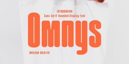 Omnys is a common sans serif with round soft edges stroke font. Bold stroke, fun character with a bit of ligatures and alternates. To give you an extra creative work. Omnys font support multilingual more than 100+ language. This font is good for logo design, Social media, Movie Titles, Books Titles, a short text even a long text letter and good for your secondary text font with script or serif. Make a stunning work with Omnys font. Cheers, Maulana Creative
 - Maggiore by Mysterylab,
$17.00 Maggiore Font is a versatile and unique display typeface with a style all its own. The convex strokes and concave stroke ends set up a singular interplay of blade-like sharpness and plump softness. Maggiore can work very well in loads of different contexts and applications: product labeling and branding, cosmetics, fashion, social media banners, the performing arts, t-shirt logos, and even quaint vintage futurism. Combining the unique with the highly legible, Maggiore will be a great addition to any font menu.
 - Bellmounts by Maulana Creative,
$15.00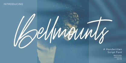 Bellmounts is a handwritten script font, with a rough stroke like a stamp effects, slanted and fun characters. It has Opentype features of ligatures, makes it a perfect choice for branding and digital designs. Use this font for logos, social media, websites, blogs, instagram, social media, business cards, branding, and more! Bellmounts font support multilingual more than 100+ language. and good pair for your secondary text font with sans or serif. Make a stunning work with Bellmounts rough stroke script font. Cheers, MaulanaCreative
 - Gopher Mono by Adam Ladd,
$25.00 Gopher Mono is a reverse contrast, monospace sans serif typeface ranging in weight from thin to black with italics. The design provides a unique look to the monospaced genre by using a contrast where the vertical strokes are a little thinner with horizontal strokes thicker. While monospaced fonts are typically used for smaller body text, the slightly unusual quirks of a reverse contrast design make it interesting enough to also use for display treatments so style and function are blended.
 - Rusthack by Arterfak Project,
$18.00 Rusthack is a friendly brush font, created with the playful feels of freestyle brush-lettering. This font comes from the manual brush stroke which has an informal stroke thickness that makes the font looks more natural. The versatile design, a combination of brush lettering, and handwriting that you can apply in many themes such as urban, apparel, youth, sports, holiday, food, fashion, vintage, you name it! Fonts featured : Uppercase Lowercase Numbers Punctuation Accented characters SS01 - SS02 Ligatures Thank you for watching
 - VVDS Praliner by Vintage Voyage Design Supply,
$15.00 PRALINER – New elegant font family with a lot of stylish alternates and ligatures. Really good looked for branding projects, packaging, headers, posters and signs. Playful and Stylish. Uppercase and lowercase initials. You can use it as for modern style typography and also it looks good in a vintage style projects. Especially when you combine strokes with shadow. A lot of alternates and ligatures give you a many unique variations for the same words. Comes with three widths with stroke styles.
 - Eloisa by StuArt,
$9.00 Eloisa is based on the penmanship of Andrea Stuart's eponymous aunt. The slow, meticulous strokes with which Eloisa writes is the result of formal (and meticulous) instruction in cursive writing back in her secondary education in an exclusive all-girls school. The interesting mix of smooth curves and sharp strokes combined with the slanted orientation make for an elegant yet dynamic visual appeal. Eloisa is perfect for branding, invitations, greetings, or any classy rendering of text you may imagine. Be classy!
 - Hologram by Kazer Studio,
$4.00 Hologram is a font inspired by a combination of the future and the past. The intention was to design a font that was most effective when applied to Largely Displayed text like Headings, rather than for smaller extended bodies of text. There are 3 distinctive styles offered in the Hologram font family. Each style contains over 350+ Glyphs per style with support for up to 26 Languages as well as specialised kerning & spacing. Display Sans: This style is the cleanest of the 3 fonts. There are no serifs attached to the ends of the strokes, although the stroke weight is varied from thick to thin depending on the letters. Display Serif: This style contains modern serifs at the ends of most character strokes that give more structure to the shapes. A majority of the serifs are horizontal in direction with few characters containing vertical serif details. Display Wedge: The most Bold of all is the Wedge Serif style offered. Featuring thick and thin triangular serifs at the ends of character strokes. This style is most effective in Large Displays & Titling uses. Designed by KAZER STUDIO
 - Gothico Antiqua by MADType,
$21.00 Gothico Antiqua is the result of grunging up one of my early sans-serif type designs. It strangely works very well and looks authentic at small to medium settings.
 - Bordeaux by Solotype,
$19.95This font was inspired by the lettering on a shop sign along a very classy shopping street in Bordeaux, France. There were similar styles among mid-nineteenth century types. - Relaxation JNL by Jeff Levine,
$29.00 Amongst the pages of a 1946 foreign publication entitled "100 Alphabets Publicitaires" ("100 Advertising Alphabets") is the casual brush stroke sans that was the design basis for Relaxation JNL.
 - Nearly Brush by ARToni,
$17.00 Nearly Brush is bold, stylish and elegant handwritten font with distinctive strokes. Its round letters will add a luxury spark to any design project that you wish to create!
 - Ars Nova by PintassilgoPrints,
$24.00 Ars Nova is an up-to-date incarnation of the Art Nouveau flair. Suited for striking typographic effects. Suited for some nostalgic pleasure. Specially suited for creative minds. Cheers!
 - Newshawk JNL by Jeff Levine,
$29.00Jeff Levine's Newshawk JNL emulates the tall, condensed headline fonts often used years ago when an urgent story broke and a newspaper rushed an "Extra" edition to the streets.
