1,754 search results
(0.017 seconds)
- LollyandJoys by Gioia Silvia Buracchini,
$19.99 LollyandJoys is a font born from the hand of a young illustrator and cartoonist. It arises from the need to be able to create your own font to make your illustrations and comics more linear; above all it is at the service of everyone to be able to create simple and essential projects with a handwritten font. Careful research was carried out on glyphs with ligatures to make the font more homogeneous and versatile. Research is the first fundamental step!
 - ZionTrain by AndrijType,
$33.00 Originally ZionTrain was built as a Cyrillic typeface for public transport navigation system. We wanted comprehensible, distinctive letterforms, that can help everybody on the way from Babylon to Zion. Here, on MyFonts, we present the ZionTrain STD versions with western latin including smallcaps and oldstyle figures in some faces in TrueType format; also western, central, baltic and turkish latin charsets, smallcaps, oldstyle numerals, few alternates, some arrows and fractions in ZionTrain OT OpenType format. Look how people use it: http://use.type.org.ua/tagged/ziontrain
 - Campton by René Bieder,
$30.00 Campton is an unconventional typeface based on the first steps of the newly born sans serif genre in the early twentieth century. Its character draws inspiration from Gill Sans and Johnston Sans while combining it with contemporary elements. The result is a modern and unorthodox family that is perfectly suited for graphic design application ranging from editorial and corporate design to web and interaction design. Campton comes in nine weights with matching italics and is equipped with a wide range of opentype features.
 - Brand by Lián Types,
$37.00 Jam jars; Warhol’s “Tomato Soup”; chalk lettering and baseball. Those were the triggers to make this soft chancery cursive turned into a script font. Brand is thought mainly for packaging but can be used in magazines and invitations also. It can be easily converted into a logo when using it and its features. Pro styles are loaded with the most complete sets of alternates, ligatures and ornaments; while Std styles are smaller versions of the font, with no decorative alternates.
 - Transit Display by KC Fonts,
$24.00 Transit Display is simply two fonts: Regular & Italic. It is an all uppercase based font that takes the grungy look that you love one step further by offering you that do it yourself eroded stamp look with a modern flair. Transit Display will work with any of your stylized design needs! Transit Display also has a larger character set for multilingual support. For a customized look to your works, switch between uppercase and lowercase for a change of grunge to the letters.
 - Gandhewa by Nirmalagraphics,
$14.00 Gandhewa is a font that I made in handwriting style. This font is inspired by my grandfather's writings. I made Gandhewa in a few steps that were long enough to finally become a beautiful font. Starting from rough sketches on paper using a ballpoint pen, I then redrawn and arranged the characters in the font creator. If you are looking for a natural, clean signature font, Gandhewa is perfect for you. Gandhewa is also equipped with 17 ligature and has multi-lingual support.
 - Woly Wonka by Flawlessandco,
$9.00 Introducing "Woly Wonka" - A Display Sans Font. Step into a world of whimsy and imagination with "Woly Wonka," a captivating display sans font that adds a touch of playfulness to your designs. There's some connected letters and some alternates that suitable for any graphic designs. This font support for some multilingual. Also contains uppercase A-Z and lowercase a-z, alternate character, numbers 0-9, and some punctuation. If you need help, just write me! Thanks so much for checking out my shop!
 - De Rotterdam by Roland Hüse Design,
$20.00 This font is a clean, modern sans serif bold. Named after “De Rotterdam”* this huge and super cool building (read the story below). Great for headlines, Posters, Flyers but also well legible at small size in large texts. Contains All European language accents and characters. --- The Story --- *This complex is located in the Kop Van Zuid district of Rotterdam, on Wilhelminapier. I was lucky to see this building from the beginning (2009) growing up (2013) That time when I was working and living here. I was always amazed by the design and how huge it is every time I took a look at it while driving or walking on the Erasmus Bridge. When I was going to work or just hiking around the city. It has a special meaning and message for me: I started creating fonts in my free time in 2010 when I came to this city to work. I was factory worker, dishwasher etc. I grew together with this amazing construction from brick to brick, step by step. By the time its construction finished, I was able to quit my day job and become a full time freelance designer.
 - Mandrel by insigne,
$39.99 From the realm of insigne, a new family has risen. By name, Mandrel. Courtly in character and elegant in appearance, the face finds great favor among those with whom it seeks audience. With confident air, Mandrel carries itself gracefully before each pair of eyes, never faltering or stumbling in its refined step. But while dressed with gentility, this elegant family is not faint of heart when challenged. Crafted well for high-impact resistance, Mandrel steps boldly and prominently into the arena of the reader’s eye, boasting its tall x-heights, high contrast, confident bends, and sharp serifs. Skillfully, it wields its sharp serif endings, cutting swiftly through opponents’ crude clutter, which fights for the reader’s attention. From Thin to Black, nine weights and their matching italics make up this noble family. Mandrel furthermore includes an abundant treasury of OpenType variables to adorn your text. Ligatures, old-style figures, and stylistic sets are available to accompany the family’s 500 glyphs and its support for more than 70 languages. Raise your cup to this new Mandrel! With strong serifs and high contrast, you’ll find this champion ready to take up your challenge in many a test ahead.
 - Rahere Informal by ULGA Type,
$18.99 Rahere Informal is a slab semi-serif typeface that has a seriously charming personality and a little spring in its step. Serifs bend and flick, giving the characters a spirited, almost calligraphic feel. It's lively and friendly without being whimsical, great for messages that need a casual but credible tone with a bit of zing in the mix. Rahere Informal is suitable for a wide range of applications such as information signage, packaging, advertising, brochures, catalogues, screen text, visual identities and opera festivals. Want an annual report that pleases the board, shareholders and investors? Set it in Rahere Informal - that’ll put a smile on everyone’s face. The family comes in six weights from light to extra bold with corresponding italics. The lighter weights are more delicate, an evenly-spaced flamboyance of flamingos basking in the sun. As the weights get heavier, characters transform into a tight-knit group of line dancing rhinos. All styles contain a set of swash caps, a few ligatures and alternatives. Nice. The character set covers most European languages plus Vietnamese. Each weight contains lining & non-aligning numerals in both proportional & tabular spacing. The tabular numerals share the same width across all weights and styles (matching Rahere Sans and Rahere Slab). If a companion sans serif is needed, Rahere Sans is the ideal partner. They are both part of the extended Rahere typeface family and have been designed to complement each other. Seriously charming, charmingly serious. Seriously, what more do you want from a typeface? Rahere, founder of St Barts in London The typeface is named after Rahere, a 12th-century Anglo-Norman priest, who founded the Priory of the Hospital of St Bartholomew, London in 1123. In 2007 I was successfully treated at Barts for relapsed testicular cancer so I’m indebted to all the doctors, nurses and support staff who work there. A special shout out to Orchid Cancer – a UK charity that helps men affected by cancer – who funded the research for my treatment.
 - Identity Check by Hanoded,
$15.00 Every time I bring my youngest son to his swimming lessons, I need to show my Covid Vaccination Pass; a QR code on my phone. I thought that I would be off the hook after I showed it the first time, but no, not at the swimming pool! It feels a bit like a bad comic book, so I decided to name this comic book style font Identity Check. Of course, I should have called it Covid Vaccination Check, but that is just too much and it probably won’t sell. Who wants a font called Covid?? ;-) Identity Check is a comic book style font. The glyphs are wider than I am used to (it seems I AM capable of learning new tricks), but the effect is rather nice. Identity Check comes with extensive language support, including Cyrillic and Vietnamese. Plus two sets of alternate glyphs, that cycle as you type.
 - Colin by Tickbite Type,
$18.99 Colin is a fresh, somewhat futuristic geometric sans serif type with a large x-height that, to me, communicates both seriousness and cheerfulness. It supports 70 languages incl. monotonic Greek and comes in 7 weights with a small number of alternate glyphs (ss01) for more flexibility. It features fractions, old style and tabular figures. Colin works great in titles, displays and short paragraphs. And where does it come from? To be honest, the reason for this font is a selfish one. I wanted a typeface where my initials (n and c) look identical, just rotated by 90 degrees. That didn’t completely work but, hey, it’s pretty close.
 - Fleabitten by Hanoded,
$15.00 I love going to flea markets and second-hand stores; in fact a lot of the furniture in our home is second hand (or pre-loved, a euphemism I find rather peculiar). I personally believe that buying used products is a good way to help this planet, as no new stuff needs to be made and the old stuff gets a second life. Fleabitten is a ‘western style’ serif font. You could use it to pimp the posters for your line dance festival, but hey, be creative! I am sure you’ll find some good use for this very nice pre-loved font. Yes, pre-loved: I loved it first!
 - Nomos Slab by Identity Letters,
$45.00 What is a brutalist typeface? The exact definition is anyone’s guess. Regardless, the Nomos superfamily is our take on the genre. Like the eponymous architectural style, Nomos is raw, direct, and honest. Its unrefined aesthetics reveal an orderly construction that is as firmly rooted in classic modernism as in the internet age—with simple, functional letterforms and the blunt convergence of diagonal and vertical stems. The low-contrast Nomos Slab subfamily has 18 styles and a set of 1000+ characters. Its tense curves let it shine in contemporary applications such as UI/UX design, AR/VR apps, and multimedia branding everywhere from banking to beverages. Pairs gracefully with Nomos Sans.
 - Quanty by Slava Antipov,
$29.00 Quanty is a new modern sans serif with a geometric touch and with some special, display forms. This modern font has unique fresh features. It is versatile in its use: suitable for headings and typing large amounts of text. Quanty has great uses in advertising, packaging, branding, posters, magazines, logos, web sites. Will go well with the Phonk typeface. OpenType features: Access All Alternates, Glyph Composition / Decomposition, Discretionary Ligatures, Denominators, Fractions, Standard Ligatures, Localized Forms, Numerators, Ordinals, Proportional Figures, Scientific Inferiors, Superscript, Tabular Figures
 - Frunch by Nasir Udin,
$22.00 Starve for tasty bold font? Say hello to Frunch! A delicious bold script font with a vintage vibe. Frunch comes to you with several alternate letters for you to play with and the complete set of lowercase-letter swashes that make your words look delicious and stand out. It's especially created for food & beverages branding as well as product packaging typography (e.g.: snack, honey, breakfast meal, milk, bread and cake). It's also perfect for poster, business cards, headline, restaurant menus, and much more. Have fun with Frunch!
 - Mielle CF by Connary Fagen,
$25.00 Flowing like warm honey, Mielle® CF is a playful cursive script perfect for logos, signage, and posters. Automatic ligatures and contextual letters flow across Mielle's six weights. Mielle® CF pairs well with simple, elegant typefaces that won’t compete for visual attention, such as Artifex CF and Artifex Hand CF. Please note that some contextual glyphs may not appear in the generated previews, but will work correctly in the full typeface. All typefaces from Connary Fagen include free updates, including new features, and free technical support.
 - Zira by Artcity,
$10.00 Zira is a playful hand-drawn font family designed by Daniel Bak (Artcity). It is available in three handy weights: regular, bold and screaming. It contains international language accent marks and diacriticals, including Greek and Cyrillic. Zira can be considered as smoothed serif version of Cornelius font. Zira as Cornelius as well is a chimpanzee character in the novel and movie series Planet of the Apes. Dr. Zira is a chimpanzee psychologist and veterinarian, who specializes in the study of humans, in the novel and subsequent movie series Planet of the Apes. Zira was played in the first three Apes movies by actress Kim Hunter. Unique among the Apes characters, Zira has blue eyes. Zira is the fiancée (later wife) of Cornelius, and both are ultimately responsible to the Minister of Science, Dr. Zaius. Zira's character and role are essentially the same in both the novel and the movies, though some story details differ. Her work in each involves both working with humans under laboratory conditions (e.g. learning and behavioural experiments), and working on them physically (lobotomy and other brain surgeries, vivisection, physical endurance and tolerance experiments, and subsequent autopsies). Zira is an outspoken liberal by nature, deploring war and militancy (and despising the gorillas, who seem to make both a way of life), and eager to seek and develop intelligence anywhere it can be found. Zira literally stands for her principles - or refuses to stand, as the case may be.
 - Tempestua by Sharkshock,
$115.00 Beauty….Style…. Sophistication…. Tempestua is a very chic display font suitable for a variety of purposes. This typeface is defined by wispy thin lines paired alongside broad strokes for maximum contrast. Some of the lowercase letters feature shaved off serifs as well as flattened tops. Elegant curves will keep eyes moving throughout ensuring viewers will be stopped in their tracks. Use Tempestua for a luxury brand logo, magazine, or movie title. This family is equipped with Basic Latin, Extended Latin/ diacritics, kerning, italics, and support for Polish.
 - Stepside by Sean Thorenson,
$12.00 Stepside is a slick retro display face with plenty of horsepower. Stepside’s heavy-duty type chassis of sturdy uprights and bold strokes was modified with sweet retro details like graceful curves and tapered fins. Inspired by street rods, custom vans and power wagons, Stepside modestly hides its muscle like a true sleeper. Take Stepside for a spin on logos, posters and t-shirts for a more classic look. Need more speed? Step on the gas with Stepside Italic — perfect for type in need of emphasis.
 - Noise Maker by Bogstav,
$15.00 Can noise be a beautiful sound? Well, I guess...because the other day when I was playing the good old Bleach album by Nirvana (which I consider lovely grunge music!) my wife yelled "Could you stop that noise?!" - and I answered "What noise?!" - ha-ha-ha! Anyway, I finished this font while listening to that particular lovely noise, and I knew that this crunchy, grungy, handmade and full of contextual alternates and multilingual font had to be named something with the word "noise" in it!
 - Pelinka by Jehoo Creative,
$18.00 Upholding aspects of geometric shapes Created Pelinka. Pelinka is a Sans serif Family that has a solid foundation of geometric shapes designed to be bold and flexible. This typeface has all the widths needed to meet various design needs, Condensed, Normal and Expanded each width has 9 weights. Pelinka also includes support for Cyrillic and Greek Alphabets. Opentype feature: aalt, frac, liga, locl, numr, onum,ordn, salt, sinf, ss01, ss02, subs, sups, kern, mark. Language support for the Americas, most of Europe,Cyrillic and Greek.
 - Vonique 43 by Sharkshock,
$125.00 Vonique 43 is a stylish display font designed to stop passerby in their tracks. Curvaceous lowercase members define this font along with a consistently thin line weight throughout. Most are elegantly styled after circles featuring very short descenders and matching the cap height of capital letters. Vonique 43, like its predecessors, was not designed for everyday text, but eye catching logos. It's equipped with support for many different languages including Russian and Greek. Use it for a luxury brand, clothing line, or a company logo.
 - SpillProof by Comicraft,
$29.00Put on your top hat, tie up your white tie, brush off your tails and surrender your serifs at the door! We've popped open a bottle of French Champagne for you, but don't worry, because our latest stylishly handsome, devilishly clever offering doesn't just offer thrills and chills, it’s also Spillproof! So step out and breathe an atmosphere that simply reeks with class and distinction, What a swell font for party invitations, soirees, nightclubs and weddings this is! See the families related to SpillProof: Spills. - Patisserie by Thinkdust,
$10.00 Patisserie is exactly the font you might expect to see on chalkboards outside Parisian cafés; tall, elegant and enticing. The lithe, thin and graceful characters of this font compliment the hand-drawn style to create a typeface that is both casual and professional. Excellent for display work and larger sizes, to really show off the slightly rough edges, Patisserie supports over 26 languages with full punctuation and character sets. Step on in for a traditional, hand-made, French fontant, or whatever else you fancy.
 - Revla Serif by Eclectotype,
$40.00 Meet Revla Serif, an unashamedly spirited font, with a spring in its step and a lust for life. Loosely based on a few letterforms from a mid century poster, it takes the feel of Madison Avenue print ads and runs with it. OpenType acrobatics ensure letters don't repeat monotonously, using the contextual alternates feature. Also included for your viewing pleasure - automatic fractions, case sensitive forms and one solitary stylistic alternate, an alternative ampersand. And that's it! Put the fun back into your text with Revla Serif.
 - Epicgant by Viaction Type.Co,
$25.00 Epicgant is a sans serif font with elegant characters. Epicgant is perfect for your elegant-themed work, suitable also for elegant vintage. This font is available in two font style variants, making it easy to do work on various design themes. Epicgant is equipped with multilingual accents. Check out the latest Viaction Type.Co font products : Matrole : https://www.myfonts.com/fonts/viaction-type/matrole/ Baskar : https://www.myfonts.com/fonts/viaction-type/baskar-stc/ Get it now Epicgant Family fonts, to add to your collection and work solutions. Thanks.
 - MVB Chanson d'Amour by MVB,
$39.00An old book found at a Paris bouquiniste contained samples of the typeface “Caractère de finance,” a bâtarde design by 18th century typefounder Pierre Simon Fournier. Rather than revive the type, Kanna Aoki decided to reinvent it, using a felt pen to achieve a rustic, handwritten quality, departing from the 18th century model as she saw fit. MVB Chanson d'Amour conveys a soulful elegance that stops short of the ostentatious, overwrought found in many formal scripts. It is lovely and sweet, but never saccharine. - Atlantis by Solotype,
$19.95This is Solotype's alternative sans serif version of the once popular caps-only font Atlanta issued by the Central Type Foundry in St. Louis in 1885. As we often do, we have created a lowercase, adding to its versatility. - Brassens by Typorium,
$53.00 Le Typorium présente une nouvelle famille de caractères calligraphiques basés sur une écriture étudiée à travers les manuscrits et autographes de Georges Brassens, poète et musicien (1921-1981). Son tracé, rigoureux et appliqué, souvent minutieux, est à l’image d’une œuvre unique et singulière, immédiatement reconnaissable. Le script Brassens offre des fonctionnalités OpenType telles que des caractères alternatifs pour les majuscules et les minuscules afin de renforcer la fluidité d’une écriture manuelle, des chiffres alternatifs, des fractions et un jeu de caractères accentués étendu pour prendre en charge de nombreuses langues étrangères. Trois graisses ont été créées afin d’offrir une large palette de possibilités graphiques. 60 images d’un poète qui a cassé sa pipe à l’âge de 60 ans., classées en trois séries de vignettes (pictogrammes, symboles, portraits), elles illustrent l’univers imagé et la richesse symbolique de la poésie de Georges Brassens où les représentations mythologiques et allégoriques y tiennent une part importante. Georges Brassens est un poète, auteur-compositeur-interprète né à Sète le 22 octobre 1921, mort à Saint-Gély-du-Fesc le 29 octobre 1981 et enterré au cimetière Le Py de Sète. Auteur de plus de deux cents chansons populaires, il met en musique et interprète ses poèmes en s’accompagnant à la guitare. Outre ses propres textes, il met également en musique des poèmes de François Villon, Victor Hugo, Paul Verlaine, Paul Fort, Antoine Pol, ou encore Louis Aragon. Il reçoit le Grand Prix de Poésie de l’Académie Française e 1967. Un grand nombre d’écoles, salles de spectacle, voies, parcs et jardins portent également son nom, dont à Paris le parc Georges-Brassens, tout proche de l’impasse Florimont où il vécut ses premières années parisiennes, de sa maison de la rue Santos-Dumont et du café Les Sportifs Réunis – Chez Walczak – rue Brancion qui lui inspira « Le Bistrot ». À Sète, l’Espace Georges Brassens ainsi que de nombreux festivals et associations redonnent vie au poète et à son œuvre. The Typorium presents a new calligraphic typeface family based on a writing studied through the manuscripts and autographs of Georges Brassens, poet and musician (1921-1981). Its layout, rigorous and applied, often meticulous, is in the image of a unique and singular work, immediately recognizable. Brassens script offers OpenType features such as alternate characters for upper and lower case to enhance the fluency of handwriting, alternate numbers, fractions and an extended accented character set to support many foreign languages. Three weights have been created to offer a wide range of graphic possibilities. 60 images of a poet who broke his pipe (French expression for passing away) at the age of 60, classified into three series of vignettes (pictograms, symbols, portraits), they illustrate the imagery world and the symbolic richness of Georges Brassens poetry where mythological and allegorical representations hold an important part. Georges Brassens is a poet, singer-songwriter born in Sète on October 22, 1921, died in Saint-Gély-du-Fesc on October 29, 1981 and buried in Le Py cemetery of Sète. Author of more than two hundred popular songs, he sets to music and performs his poems, accompanying himself on the guitar. In addition to his own texts, he also sets to music poems by François Villon, Victor Hugo, Paul Verlaine, Paul Fort, Antoine Pol, or Louis Aragon. He received the Grand Prix of Poetry from the Académie Française in 1967. A large number of schools, theaters, streets, parks and gardens also bear his name, including in Paris the Georges-Brassens park, very close to the impasse Florimont where he lived his first years in Paris, his house in the rue Santos-Dumont and the café Les Sportifs Réunis - Chez Walczak - rue Brancion which inspired "Le Bistrot". In Sète, the Espace Georges Brassens as well as numerous festivals and associations bring the poet and his work back to life.
 - Bushwhacked NF by Nick's Fonts,
$10.00Central Type Foundry of St. Louis issued this quirky little gem under the name of Quaint Roman around the turn of the twentieth century. This version is a little less gnarly than the original, but retains all of its eccentric charm. - Black Grotesk by ParaType,
$30.00 Designed at ParaType in 1997 by Tagir Safayev. Based on Gasetny Chorny (“Newspaper Black”), of Ossip Lehmann foundry, St.-Petersburg, 1874, and Kompakte Grotesk of Haas. An old-fashioned German sans serif “Grotesque”. For use in advertising and display typography.
 - Smoothing by Hanzel Space,
$25.00 Smoothing is a stylish modern calligraphic font in an original handwriting style. It's perfect for branding, wedding invitations and cards, and maybe for red wine labels. Smoothing includes a full set of beautiful upper and lower case letters, numbers, a wide variety of punctuation marks and 46 ligatures. All lowercase letters include initial and final strokes, giving a realistic handwritten style. What did you get, honey? Full Set of standard alphabet and punctuation Extra set of ending swashed lowercase Handwritten ligatures Thanks so much for checking out my shop! Happy creating! Cheers! Hanief - Hanzel Space
 - MollyO by Atlantic Fonts,
$28.00 MollyO font family is based on the original, reliably cool handwriting of illustrator (and dear friend), MollyO of mollyOcards. Like MollyO herself, this font is unique, unpretentious, and beautiful. Part printed and part script, it has the authentic connections and stops of a contemporary, casual font. For the truest handwritten feel, keep discretionary ligatures on, or turn them off where you want more evenness. MollyO is expressive in all-caps, available in two weights, and with effortless warmth and inky flow, will bring a wide range of creative projects to life.
 - Nipon by URW Type Foundry,
$39.99 Nipon has an affiliation with the Far East. The first character I designed for this alphabet was the capital P. The stepped thin lines are linking to the Japanese characters and the circle shape is a classic Japanese element which means literally: the origin of the Sun, Nippon. So this is where the name comes from, I skipped one P in the name, so my Nipon gets his own identity. Next to this oriental look it also carries a light resemblance with a juwel box. Precious and elegant shapes for the gentle touch in writing.
 - Consent by Sarid Ezra,
$15.00 Consent is an editorial serif font with unique lowercase. With special features, Consent will make your project more stand out and elegant. This font suitable for brand or title of the magazine. You also can use this font for logo, branding, and also versatile for any project! No need a complicated step for using the features. Just type in lowercase, uppercase, or both! You can also access the additional features from opentype ligatures. Just type equal + number (1-4) for the magic. Example =3. Try it in the type sample below!
 - Workstation Clutter by Zang-O-Fonts,
$25.00This typeface came about when playing with felt tip marker settings in Corel Painter and is derivative of my own handwriting. Up until Workstation Clutter, all of my fonts were designed on paper, then scanned or reproduced into a digital format. With the use of Painter, the non-digital steps were removed, making this the first fully-digital Zang-O-Fonts typeface. Brian J Bonislawsky of the Astigmatic One Eye Typographic Institute helped round out the character set and additional needed characters. The name was inspired by an ex-girlfriend's disorganized desk. - Soreng by Gatra Std,
$10.00 Cute handwriting "soreng" Handwritten Display Font! If you are needing a touch of casual modern display for your designs, this font was created for you! What's Included: Uppercase and Lowercase Number and Punctuation Support Language This font works best in a program that supports OpenType features such as Adobe Indesign, Adobe Illustrator CC and CS, or Adobe Photoshop CC and CS also CorelDraw More Questions? Here are some (potential) answers! Do not to resell this font in any way. Multilingual Support is included for Western European Languages Have a Wonderful Day, Gatra Std
 - Badjigoer by Gatra Std,
$10.00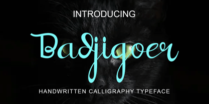 Introducing a cute handwriting "Badjigoer" Handwritten Calligraphy Typeface! If you are needing a touch of casual modern display for your designs, this font was created for you! What's Included: Uppercase and Lowercase Number and Punctuation Support Language This font works best in a program that supports OpenType features such as Adobe Indesign, Adobe Illustrator CC and CS, or Adobe Photoshop CC and CS also CorelDraw More Questions? Here are some (potential) answers! Do not to resell this font in any way. Multilingual Support is included for Western European Languages Have a Wonderful Day, Gatra Std
 - Rafting by Gatra Std,
$10.00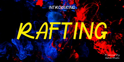 Introducing a cute handwriting "RAFTING" Handwritten Display Font! If you are needing a touch of casual modern display for your designs, this font was created for you! What's Included: Uppercase and Lowercase Number and Punctuation Support Language This font works best in a program that supports OpenType features such as Adobe Indesign, Adobe Illustrator CC and CS, or Adobe Photoshop CC and CS also CorelDraw More Questions? Here are some (potential) answers! Do not to resell this font in any way. Multilingual Support is included for Western European Languages Have a Wonderful Day, Gatra Std