1,338 search results
(0.006 seconds)
- FairyTale by Comicraft,
$29.00 In its beauty, Comicraft's Fairytale font is without rival in the heavens, the earth, or the stuff of men's dreams! A wee thing it may be, but 'tis like a star pulled from the sky. Luminescent. Radiant. Perfect. Yes! PARADISE can be yours...from the pages of "Captain Stoneheart and the Truth Fairy," comes a font that might very well change your life forever... it's a dream, a myth, a neverending story, it's a FairyTale! Words by Joe Kelly & art by Chris Bachalo from Captain Stoneheart and the Truth Fairy
 - Digideco by astroluxtype,
$20.00 Retro-futuristic robot terminal type. The 1930s Moderne Streamline decade meets the digital domain in this weird font. Use it in an ad for Ford Tri-Motor Airplane or a story about an out of control 1980s computer monster. Which? Help it find its place- as it is lost in time. Digideco is a minimal font set that includes upper and lowercase letterforms which can be used at various sizes but, we consider it a headline/display font, best applied larger than 36 points in size. Shall we play a game?
 - Guttie by Yukita Creative,
$14.00 Guttie Display Typeface says something about graphics and usability. People tell stories for a reason. We want to convey certain information, change a reader's opinion or make them feel something; Guttie Display Typeface helps you to do all this easily. --- It's all about visuals and functionality. For example, people will use words to convey information, convince readers of something specific, or share emotions they are feeling right now. --- - Fonts can be read from a much larger distance than regular fonts - Elegant letters give the impression of luxury - Smooth curves for elegant typography
 - Guadalupe by Rodrigo Navarro Bolado,
$32.00 Article to appear on the font family page: According to the Catholic faith, a well known náhuatl story called "Nican Mopohua" (translated as "Here it's narrate") about the Marianas apparitions on the Tepeyac's hill, to the north of the actual Mexico City. After four apparitions, La Virgen de Guadalupe (LVG) told Juan Diego (JD) that he must introduce himself to the first Bishop of Mexico. JD took in his "ayate" some roses (that aren't natives to Mexico's barren territories) and when he dropped them in front of the bishop, the image of LVG appeared in front of him with indigenous features. I’ve worked a lot in this font that appears to came out of nowhere, just like the image of LVG itself, the fact is that I started first sketching some flowers, because I wanted to do something related to this mexican story, so, taking some features from this flowers I started sketching some letters, for example “r” and “i” and the counter forms for some letters like “a” and “o” (that I didn’t use by the way) and the punctuation marks, all inspired by this leaf forms. Lighter weight coming soon! Hope you like it. Any comments: rodrigonabo@gmail.com
 - Amys Hand by Kustomtype,
$15.00 "The Amy Winehouse Script" unveils a unique window into the artistic and personal world of the iconic British singer and songwriter, Amy Winehouse. Renowned for her soulful voice and heartfelt lyrics, Amy's handwriting, a lesser-known facet of her life, offers a captivating story. Amy's script mirrors her artistic and unconventional spirit, marked by artistic flourishes and cursive elegance, echoing her expressive personality. Her cursive style, chosen for its fluidity, mirrors her singing, creating a deep connection between her music and script. Her individualistic script is characterized by varied letter sizes and shapes, reflecting her nonconformist nature and her desire to stand out. It can be messy, much like her turbulent life, representing her emotional journey, marked by highs and lows. Amy's handwriting evolved with her emotional state, sometimes appearing chaotic during difficult times. It's important to note the limited public samples, making it challenging to draw definitive conclusions. "The Amy Winehouse Script" invites you to explore uncharted territories of her life and artistry, offering fresh insights into her unspoken expressions and enduring intrigue. In every line, you can hear the music of her words and the story of her script, reminding us how art transcends boundaries, leaving an indelible mark.
 - Dream Within A Dream by Storm Type Foundry,
$55.00 Dream Within a Dream was the title of exhibition of Czech art inspired by the work of Edgar Allan Poe curated by Otto M Urban and Veronika Hulíková. Three dozens of artists exhibited their works in the Czech National Gallery in 2020. The cataloguje was printed with the use of the present typeface. Artists took significant interest in Poe's literary oeuvre only after the writer's untimely death. This was mainly thanks to the poet Charles Baudelaire who translated Poe's works to French. As early as in the second half of the 19th century, prominent artists such as Edouard Manet, Odilon Redon, James Ensor and Gustave Doré created remarkable artworks inspired by Poe. Although the first Czech translations of Poe's woks date to the 1850s, artworks inspired by them only appeared several decades later, at the turn on the 20th century. Poe's poems and short stories inspired František Kupka and soon after him, Josef Váchal, Jan Konůpek and František Kobliha. Alfred Kubin, a German artist born in Bohemia, made illustrations for the German translation of Poe's collected stories. Later on, Alén Diviš and František Tichý created further Poe-inspired artworks. Poe was a source of inspiration for Jan Švankmajer and more recently, František Štorm and Jaroslav Róna.
 - Acarau Display by Tipogra Fio,
$30.00 Acarau is a 6 fonts display typeface with high reverse contrast—since from Roman capitals and calligraphy, usually Latin alphabet letters have thiner horizontal steams and thicker verticals, these features being optical or visual—quite adequate for logos, headlines and posters. Moreover, the style of the typeface is inspired by Italics form factor: lowercase letters having less strokes to make their shapes; A has one story; E has one stroke shape, such as K, G, Y and Z; F has a descent. To give it more calligraphic feeling, there is contrast for uppercases as well, this is very perceived by the diagonal letters like A, K, M, N, V, W, X, Y and Z. J also has a descent. Q and R have natural swashes, but they have alternates in case the costumer want to go for more usual forms—including accent marked letters. Acarau is a 12 months project, the contrast for uppercases were increasing as the process was made. In the middle it is found suitable blend the letter shapes with the history of Brazilian music from the 70’s and 80’s, since the font has a tropical, warm, spicy and nostalgic feeling. Songs from bands and singers that emerged on Rio de Janeiro like Paralamas do Sucesso, Cazuza, Lulu Santos and Kid Abelha bring the beach accent and rhythm that this font has. OpenType features complement the set, which has Multi-Lingual support for a comprehensive Latin set, including Vietnamese—meaning more than 640 glyphs: Case-Sensitive forms, so symbols can properly align to uppercase letters; Ligatures, to better reading for z_y and L_I, and style for s_s, w_w_w; also for ease arrows and punctuation typing; Stylistic Set 1: two story a—including accent marked letters; Stylistic Set 2: two story g—including accent marked letters; Stylistic Set 3: diagonal (usual) z—including accent marked letters; Stylistic Set 4: flower i and j dots; Contextual alternates; Terminal forms, for R and Q; Ordinals.
 - Rufina STD by TipoType,
$13.00 Rufina was as tall and thin as a reed. Elegant but with that distance that well-defined forms seem to impose. Her voice, however, was sweeter, closer, and when she spoke her name, like a slow whisper, one felt like what she had come to say could be read in her image. Rufina's story can only be told through a detour because her origin does not coincide with her birth. Rufina was born on a Sunday afternoon while her father was drawing black letters on a white background, and her mother was trying to join those same letters to form words that could tell a story. But her origin goes much further back, and that is why she is pierced by a story that precedes her, even though it is not her own. Maybe her origin can be traced back to that autumn night in which that tall man with that distant demeanor ran into that woman with that sweet smile and elegant aspect. He looked at her in such a way that he was trapped by that gaze, even though they found no words to say to each other, and they stayed in silence. Somehow, some words leaked into that gaze because since that moment they were never apart again. Later, after they started talking, projects started coming up and then coexistence and arguments, routines and mismatches. But in that chaos of crossed words in their life together, something was stable through the silence of the gazes. In those gazes, the silent words sustained that indescribable love that they didn't even try to understand. And in one of those silences, Rufina appeared, when that man told that woman that he needed a text to try out his new font, and she saw him look at her with that same fascination of the first time, and she started to write something with those forms that he was giving her as a gift. Rufina was as tall and thin as a reed, wrote her mother when Rufina was born.
 - ITC Cheltenham by ITC,
$40.99 ITC Cheltenham font in its present form is the work of designer Tony Stan. Originally designed by architect Bertram Goodhue, it was expanded by Morris Fuller Benton and completed by Stan in 1975 with a larger x-height and improved italic details. ITC Cheltenham font is an example of an up-to-date yet classic typeface. In 1993 Ed Benguiat added the Handtooled weights to this family. ITC Cheltenham® font field guide including best practices, font pairings and alternatives.
 - Shallow Thoughts by Dumadi,
$18.00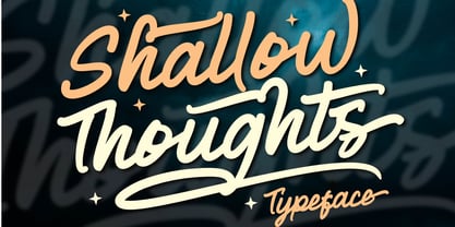 Shallow Thoughts is a modern script typeface created to enhance your designs. This font offers a simple yet stunning style with support Uppercase, Lowercase, Number, Symbol, Ligature, Multilingual, Alternative Style, SS01, ss02, ss03, and ss04. Shallow Thoughts very suitable for event titles, t-shirt design, posters, web, banner, book covers, social media, and other designs. Compatible with design studios such as Photoshop, Affinity Design, Adobe Illustrator or Silhouette. It makes it great for creative projects, Thank you, Toni Dzulham - Dumadistyle
 - Brecia Lovely by Arterfak Project,
$23.00 Introducing our latest experiment, “Brecia Lovely,” a hybrid font that combines script font (as uppercase) and slim serif (as lowercase). It features beautiful ligatures and special characters that provide a dynamic, elegant, and luxurious impression. Inspired by fashion magazines and modern typography, Brecia Lovely offers elegance that you can use in your designs, such as posters, flyers, stories, magazines, blogs, editorials, titles, displays, and more. It is a classy font that you can combine with 50+ ligatures and 60+ alternates. What you will get: Uppercase Lowercase Numbers Symbols & punctuation Stylistic alternates Ligatures Multilingual support Thank you for visiting, happy designing
 - Meritta Serif by Joelmaker,
$18.00 Meritta Serif is a multi purpose font. It is built with the inspiration of a vintage letter so that the authors compose it with a unique blend of ligatures and a little swirly embedding. The modern font is formed and ready to make a statement by adding elegant and unique flair to your next design project. Meritta Serif can be used for various purposes such as Magazine Title, Poster, Logo, T-Shirt, Sub Title, Business cards, Magazines, Book Covers, Wedding Invitations,Templates Instagram Story Post, Greeting Cards, Quotes, etc. Features: - Stylistic Alternates - Swashes - Titling Alternates - Stylistic Set (ss01 - ss07) - Ligatures - Discretionary Ligatures
 - Mellofian by Keristyper Studio,
$14.00 Proudly present Mellofian a romantic script font Inspired by drama and love story. This font is good for logo design, Social media, Movie Titles, Books Titles, short text even long text letters, and good for your secondary text font with the script, sans, or serif. Featured: Standard Uppercase & Lowercase Numeral & Punctuation Multilingual : ä ö ü Ä Ö Ü ß ¿ ¡ Alternate & Ligature PUA encoded We recommend programs that support the OpenType feature and the Glyphs panel such as Adobe applications or Corel Draw. so you can use all the variations of the glyphs. Hope you enjoy our fonts!
 - Saint Regus by Sonar Hubermann,
$22.00 The story begin from Condensed, Standard & Expanded style. Saint Regus built and designed with a super family typeface in mind. Its still growing and growing by uniquely bold charismatic persona. The family itself have total 8148 glyphs with a standard glyphs and multilingual context.The possibilities are have a huge prospect in various design project, digital and print. Saint Regus development tried to explore the impact by its proportional display form. The project started from a Standard weights (Roman) and then it become a big families with 21 styles that you can use for a large design assets in any kind of design works.
 - HS Rahaf by Hiba Studio,
$60.00Rahaf is my little daughter's name; the word 'Rahaf' means kindness, sensitive and loving in Arabic. Thus, HS Rahaf is an Arabic display and text typeface. It is useful for headlines, books cover and other graphic projects. It gives the feeling and impression of hand-lettering. So it can be used for text when hand writing is needed, like in caricature texts and children stories and books. HS Rahaf is characterized by simplicity, clarity of reading and beautiful flaunt. It contains many ligatures which increase and modify its beauty. The font supports Arabic, Persian, Urdu, Kurdish and Pashto languages. - ITC Lingo by ITC,
$29.99I've been obsessed with type since I was very young, says designer Pelle Piano. “In fact, when I was ten, I used to sneak into stores who sold Letraset sheets, and I actually stole their catalog with all the typefaces. They were perfect good-night stories for me - alphabet after alphabet!” In ITC Lingo, Piano tried out the effect of taking a very rigid underlying letter shape and representing it with “really sloppy outlines.” The underlying form is a condensed Bodoni-like alphabet, with high contrast between thick and thin strokes, but the effect of Lingo is sketchy and informal. - Tarte Tatin by Hanoded,
$15.00 A Tarte Tatin is a French upside down apple pie. The story goes that one of the Tatin sisters (who ran Hôtel Tatin in Lamotte-Beuvron 169 km south of Paris), was baking a regular apple pie, but put the apples first and, realising her mistake, tried to rescue the dish by adding the pastry and sticking it in the oven. Tarte Tatin is a really nice all caps font. It was made with a Japanese brush pen on rough paper. Tarte Tatin comes with extensive language support and a set of alternates for the lower case letters.
 - Urbane Condensed by Device,
$39.00 Urbane Condensed is an addition to the popular Urbane series, a versatile all-purpose sans-serif family of six weights plus italics. Perfect for headlines and running text, it is clear, classic and authoritative. It explores the same idea-space as early geometric modernist sans such as Futura, Erbar, Spartan and Elegant Sans, with a single-story a, a contemporary high x-height and very slightly condensed bowls. Unusually for a geometric moderne sans, letter-widths are optically balanced, giving an even colour in setting. Includes a full international character set, lining, tabular and old-style numerals.
 - Urbane Rounded by Device,
$39.00 Urbane Rounded is a curved, friendly version of Urbane, a versatile all-purpose sans-serif family of six weights plus italics. It explores the same idea-space as early geometric modernist sans such as Futura, Erbar, Spartan and Elegant Sans, with a single-story a, a contemporary high x-height and very slightly condensed bowls. Perfect for headlines and running text, it is clear, classic and authoritative. Unusually for a geometric moderne sans, letter-widths are optically balanced, giving an even colour in setting. Includes a full international character set, lining, tabular and old-style numerals.
 - Holiday Harmony by Putracetol,
$22.00 Introducing “Holiday Harmony,” a quirky Christmas-themed font that encapsulates the joy and spirit of the holiday season. This display font, crafted with precision, is unique and playful, making it a perfect choice for a wide range of festive applications. Each letter is designed with elements reminiscent of Christmas – from jolly Santa Claus to graceful reindeers, snowflakes to gifts wrapped with love. With nine distinct variations, “Holiday Harmony” offers versatility; each style resonating the warmth and happiness associated with Christmas. It’s not just a font but an experience, bringing stories to life with its all-caps and crafting-friendly design.
 - Korolev Rough by Device,
$39.00 Korolev Rough is an inky, distressed version of Korolev , designed to mimic vintage letterpress, photocopies or hot metal on rough paper. A 20-weight sans serif family based on lettering by an anonymous Soviet graphic designer from the propaganda displays at the Communist Red Square parade in 1937, it has been named in honor of Sergey Pavlovich Korolyov, or Korolev, considered by many to be the father of practical astronomics. Every weight and style comes with an alternate double-story “a”. The complete Korolev family includes standard, italic, condensed, and compressed versions, each in five weights.
 - Seven Seas by Hanoded,
$15.00 Some time ago, my son asked me to name all Seven Seas. I had to think for a bit, because I can think of more than 7 seas (the North Sea, the Caspian Sea, the South China Sea, the Sea Of Okhotsk, etc.), but apparently these are not part of the BIG Seven. It turns out that even oceans count as ‘seas’. Long story short, I created a font, had to think of my son’s question and named the font Seven Seas. Seven Seas is a hand made serif that comes with swashed alternatives for a lot of glyphs.
 - Ainda by Resistenza,
$45.00 We always had a crush for multilinear fonts and a great love story with script types. So we decided to bring them together and create Ainda. A new multiline script font based on and English copperplate skeleton. A modern approach to classic flourished scripts, designed with a slanted angle that gives dynamism and creates a ribbon effect when the lines come together in the connections, adding depth and perspective. Ainda family includes 2 weights, Regular & Bold. This Display font will light your layout with a contemporary and elegant flair. Highly recommend to use it on big sizes.
 - Marydale by Three Islands Press,
$29.00 While helping produce a trade magazine years ago, I admired the hand-lettering of the art director -- a woman named Marydale -- and suggested she let me model a font after her penmanship. She agreed and drew out the alphabet, and I launched an old copy of Fontographer and (to shorten a long story) ended up developing my very first digital typeface. Which has since, astonishingly, become famous worldwide. So now the real Marydale gets the mixed blessing of seeing her handwriting (and name) plastered all over the planet. Full release has regular, bold, and black weights.
 - Baroque Mortale by Letterhead Studio-YG,
$45.00 Letterhead Studio makes both fonts and design with own fonts. The studio is started in 1998 by Yuri Gordon, Valery Golyzhenkov and Olga Vassilkova. We work in graphic design, branding and type design. Our collection of Cyrillic fonts includes more than 330 faces, generally it is display fonts. Letterhead is one of leading developers of custom-made fonts, lettering and digital calligraphy in Russia. Among clients of studio are magazines like Rolling Stone, Esquire, GQ, Empire, Interni, Harpers Bazaar. Also we develop corporate fonts, more often for banks. Letterhead co-operated with Gazprombank, Rosbank, the Alpha-group, Trust, Menatep, Orgres-Nordea and others.
 - Rastely by Craft Supply Co,
$20.00 Unleash Your Joy with Rastely Dive into the fun with Rastely – Funky Typeface. It’s a joyful escape, perfect for creative minds. Inspired by psychedelic vibes, this font keeps it chill. Its playful curves promise a good time. Every letter brings a smile, designed for fun at first sight. Playful to the Core Rastely isn’t just a font; it’s a party invitation. Crafted with a relaxed approach, it’s easy-going yet bold. Let each character tell a story of cheer. Imagine your projects with a touch of whimsy. Moreover, its easy legibility makes it perfect for all ages.
 - Merlin by Linotype,
$29.00Linotype Merlin is part of the Take Type Library, which features the winners of Linotype’s International Digital Type Design Contest from 1994 to 1997. This font was designed by Anne Boskamp and its alphabet consists exclusively of capital letters. At the same time aggressive and sensitive, Merlin looks as though it were scratched onto paper with a pen tip saturated with ink. Like characters from another time, the letters fall into place and make an impression which is both vulnerable and strong, lively and reserved. Merlin’s historical roots lie in the archaic pictograms in the caves of Stone Age civilizations. - Timernis by Aga Silva,
$19.99 Timernis is humanist multilingual contrast sans serif available in eight weights from thin to black. All caps have this super elegant, classic proportions old school look and is based on 1940 stone engraving commemorative plaque. The engraving itself boasted sophisticated clean look and was a joy to look at. All caps: Would suit display usage such as: signage, titles, headers, engravings, high end packaging. Do try putting space between the letters in your selected word for suave and chic feel. Expanded round shapes are prevalent in lowercase, which is legible in small sizes and pleasant to the eye.
 - Chippewa Falls by Chank,
$49.00 In the spirit of the old days, before water sparkled and before typefaces were known as fonts, Chank is proud to introduce Chippewa Falls the font. This font comes with fancy swirly uppercase letters and stout small caps for lowercase, as well as a heart-warming story. Chank rescued this former custom font from an abandoned design proposal. He gave it some TLC and before long a retro typeface emerged, with lettering worthy of good old fashioned sleigh rides and candy canes. Enjoy this font as you would a cup of hot cocoa next to a potbelly stove on a snowy day.
 - Duck Footprint by AaAAaAlena,
$10.00 This font looks like a natural gel pen handwriting. It supports both uppercase and lowercase Cyrillic and Latin alphabets, numeral, punctuation, symbols, currencies. The story of creating is short: I made a font that would support the concept of the website. And then it seemed to me that this font could have more uses, so I decided to share it. You can use it for any creative project, I’m not going to list examples not to limit you. I am sure that with this font you will convey the vibe you want. Just use imagination, and your masterpiece will look perfect)
 - Steradian by Emtype Foundry,
$69.00 Steradian is an exploration of the geometric genre and although it has a geometric base, the widths between letters are not much different across the weights. That is due to the process, in which the proportions of the heavier weights paved the way for the lighter ones. It also has a series of details that make Steradian stand out and gives it a special touch. Some of its main features are the double-story ‘a’, its closed apertures and some of the capitals have a distinct personality (such as the G and Q). Read more about the design process at the Emtype’s Blog.
 - ITC Lintball by ITC,
$29.99Eric Stevens's latest typeface, ITC Lintball, combines two unusual features: its letterforms are based on the serifless lettering inscribed in stone by the ancient Greeks, yet the wobbly edges of the strokes, and especially the slightly wider “lintballs” on the ends, suggest lettering done on paper with a modern felt-tip pen. The ball motif is carried through in the fat dot under the raised capital O, and in the similar dot used in place of a crossbar in the capital A. There's an angularity to many of the strokes, especially in the lowercase, that gives Lintball its distinctive character. - East Variable by Tarallo Design,
$73.99 East Variable is a condensed sans serif typeface. It is timeless, but with a subtle nostalgia of vintage jazz albums, film titles, newspapers, and signage. The light weight has excellent legibility at small sizes. The Extra Bold weight will capture attention. East is versatile, but would be a good choice for film titles, labels, publications, or any context where space is limited. It has variable axes of weight and slant. The OpenType features include stylistic sets, a one-story 'a', hooked letters, seriffed uppercase 'I' and '1', a slashed zero, raised colon and punctuation (Spanish), German eszett, ligatures, and vertical fractions.
 - Nordic Tale by Struvictory.art,
$14.00 We would like to introduce our new Christmas typeface Nordic Tale. The font is created with love for the Scandinavian aesthetics, it is decorated with Nordic patterns. Every letter of the folkart font is a separate cultural story. The typeface includes Decorative, Blank and Symbol versions. The font is easy to use in various design programs or without any program. Nordic Tale font is suitable for lettering posters and cards, tourist brochures, photo overlays, Christmas and cozy winter design. The font works great both for printing clothes and interior decoration. Also use individual letters and symbols to create logos and monograms.
 - Pacaembu by Naipe Foundry,
$60.00 Pacaembu is a sans serif typeface that finds its roots in Brazilian football. This seven weight family began as a study of the stone lettering found in the Paulo Machado de Carvalho Municipal Stadium, affectionately known as the Estádio Pacaembu, a real gem of the Art-Deco style inaugurated in 1940. These art-deco letters, like football itself, were brought to Brazil by Europeans and out there in the tropics found a totally unique personality. Pacaembu is a celebration of Brazilian Football, it’s unique flavours, moves, sights and colors which have been delighting fans for generations.
 - Clephons by Zamjump,
$13.00 Introducing, Clephons is a captivating serif display font that exudes timeless elegance. Crafted as an all-capital typeface, this font is a homage to vintage letterforms, blending classic charm with a touch of modern sophistication. Perfectly tailored for branding, headlines, logos, and designs with a classic or vintage theme, Clephons effortlessly captures the essence of a bygone era. Its distinctive serifs and refined details make it a versatile choice for projects that demand a touch of retro flair. Elevate your designs with Clephons, where every character tells a story of refined aesthetics and enduring style. **Uppercase
 - Feel Script by Sudtipos,
$79.00 Feel Script is based on lettering that calligrapher and logo designer Rand Holub created for Intertype for his face Monterey. Fortunately, I didn’t have the technological limitations today that Intertype had back then. Holub’s lettering is presented in its entirety within Feel Script. Some letterforms were redrawn from vintage American magazine ads (some by Holub himself), along with many new alternates, ligatures, ending forms, and strangely beautiful character combinations. The experience I’ve accumulated from my previous calligraphy typefaces (Ministry Script, Affair, Buffet Script, Burgues Script, et al.) made it easier for me to apply Holub’s lettering in a new context using OpenType technology. The usual extended treatment was given to Feel Script, all the way into the implementation of three-letter ligatures and the dreamiest swashes I could imagine. I changed some of the connections between the lowercase letters in order to fit Holub’s calligraphy as opposed to the limited Intertype metal attempt. I hope you like Feel Script. I also hope what I contributed to this particular Holub design is somewhat of a happy ending to a calligraphy story that crosses many technologies. From the pen to computer Bézier. My part of this story stops here ... and yours begins. Feel Script has more than 1200 glyphs including: stylistic alternates, contextual alternates, titling alternates, swashes, and ligatures. Check out the PDF!
 - DT Skiart Serif Mini by Dragon Tongue Foundry,
$9.00 ‘Skiart Serif Mini’ is now available online. Originally inspired by the san serif font ‘Skia’ by Mathew Carter for Apple. ‘Skiart’ was designed to feel more like a serifed font, but without any serifs. It took a step between sans serif and serif fonts. Next on the path towards a serif font comes Skiart Serif Mini, with tiny serifs added. This is a true serif font, all be it on the small side. It remains fully readable and feels as clean and normal as any of the best body copy serifs, and yet still has the strong solid bones of all the other Skiart font familys. If compared to one of the more commonly used serifs like ‘Times New Roman’, the ‘Skiart Serif Mini’ lowercase is more open with a taller x-height, increasing its readability and friendliness. The serifs are smaller and less distracting. They are not pretending to be ligatures. Where ‘Times’ makes its p q b d forms out of a barely touching oval and stem, the ‘Serif Mini’ forms are much more firmly attached, appearing clearly as single letters. The standard setting for the g’s are round single storied, (the italic a’s are also), feeling warmer and more inviting in the ‘Serif Mini’ font. Much more friendly than the stuffy double storied versions in fonts such as ‘Times’ etc.
 - FS Benjamin by Fontsmith,
$80.00 Stone and steel FS Benjamin is a flared serif typeface designed by Stuart de Rozario. Consisting of 12 styles ranging from Light, Book, Regular, Medium, SemiBold and Bold with Italics it has clear, delicate letterforms, punctuated with brutal chiselled angles. With a pure and crafted feel to the forms the typeface has traditional roots but has been designed to work in a contemporary setting. Archetypal proportions in terms of x-height to cap height and ascender to descender ratio, allow the typeface to feel familiar and be legible in all platforms. Delicate brutalism Inspired by the contrasts of London and named after Big Ben, FS Benjamin was designed by Stuart de Rozario and founder, Jason Smith. Walking around London Jason was inspired by the juxtaposition of the old and the new. Glass and steel architecture can often be found amongst traditional signage and coats of arms seen around the City. These surroundings sparked an idea to create a modern design based on an alphabet that would traditionally be carved from stone. “Much of the typography we see today is so similar. I thought what if we created a typeface with traditional roots but modernised it to sit amongst the punk and noise of the streets of London? Old with new. Business with busyness. This is what London is all about.” Jason Smith
 - Rufina by TipoType,
$16.00 Rufina was as tall and thin as a reed. Elegant but with that distance that well-defined forms seem to impose. Her voice, however, was sweeter, closer, and when she spoke her name, like a slow whisper, one felt like what she had come to say could be read in her image. Rufina’s story can only be told through a detour because her origin does not coincide with her birth. Rufina was born on a Sunday afternoon while her father was drawing black letters on a white background, and her mother was trying to join those same letters to form words that could tell a story. But her origin goes much further back, and that is why she is pierced by a story that precedes her, even though it is not her own. Maybe her origin can be traced back to that autumn night in which that tall man with that distant demeanor ran into that woman with that sweet smile and elegant aspect. He looked at her in such a way that he was trapped by that gaze, even though they found no words to say to each other, and they stayed in silence. Somehow, some words leaked into that gaze because since that moment they were never apart again. Later, after they started talking, projects started coming up and then coexistence and arguments, routines and mismatches. But in that chaos of crossed words in their life together, something was stable through the silence of the gazes. In those gazes, the silent words sustained that indescribable love that they didn’t even try to understand. And in one of those silences, Rufina appeared, when that man told that woman that he needed a text to try out his new font, and she saw him look at her with that same fascination of the first time, and she started to write something with those forms that he was giving her as a gift. Rufina was as tall and thin as a reed, wrote her mother when Rufina was born. Photo (Fragilité): Karin Topolanski / Post: Raw (www.raw.com.uy) - María Pérez Gutiérrez