9,272 search results
(0.016 seconds)
- ITC Bodoni Seventytwo by ITC,
$29.99Giambattista Bodoni (1740-1813) was called the King of Printers; he was a prolific type designer, a masterful engraver of punches and the most widely admired printer of his time. His books and typefaces were created during the 45 years he was the director of the fine press and publishing house of the Duke of Parma in Italy. He produced the best of what are known as modern" style types, basing them on the finest writing of his time. Modern types represented the ultimate typographic development of the late eighteenth and early nineteenth centuries. They have characteristics quite different from the types that preceded them; such as extreme vertical stress, fine hairlines contrasted by bold main strokes, and very subtle, almost non-existent bracketing of sharply defined hairline serifs. Bodoni saw this style as beautiful and harmonious-the natural result of writing done with a well-cut pen, and the look was fashionable and admired. Other punchcutters, such as the Didot family (1689-1853) in France, and J. E. Walbaum (1768-1839) in Germany made their own versions of the modern faces. Even though some nineteenth century critics turned up their noses and called such types shattering and chilly, today the Bodoni moderns are seen in much the same light as they were in his own time. When used with care, the Bodoni types are both romantic and elegant, with a presence that adds tasteful sparkle to headlines and advertising. ITC Bodoni™ was designed by a team of four Americans, after studying Bodoni's steel punches at the Museo Bodoniana in Parma, Italy. They also referred to specimens from the "Manuale Tipografico," a monumental collection of Bodoni's work published by his widow in 1818. The designers sought to do a revival that reflected the subtleties of Bodoni's actual work. They produced three size-specific versions; ITC Bodoni Six for captions and footnotes, ITC Bodoni Twelve for text settings, and ITC Bodoni Seventytwo - a display design modeled on Bodoni's 72-point Papale design. ITC Bodoni includes regular, bold, italics, Old style Figures, small caps, and italic swash fonts. Sumner Stone created the ornaments based on those found in the "Manuale Tipografico." These lovely dingbats can be used as Bodoni did, to separate sections of text or simply accent a page layout or graphic design." - TT Ricordi Marmo by TypeType,
$29.00 TT Ricordi Marmo useful links: Specimen | Graphic presentation | Customization options TT Ricordi Marmo extends the series of experimental projects within the TT Ricordi fonts collection. The main goal of the TT Ricordi project is to look for gems in old signs and on stone and bringing those inscriptions back to life in the form of contemporary fonts with the umbrella name TT Ricordi. TT Ricordi Marmo is an original experimental project by Eugene Tantsurin inspired by inscriptions at Basilica di Santa Croce in Florence. Working on it, we wanted to create a contemporary typeface that would unite the elements of a Florentine sans-serif mixed with more traditional visual solutions typical for the period's serifs. As a result, we got a bright and somewhat provocative typeface with irregular serif distribution, some unusual contours and a free spirit. In small body size TT Ricordi Marmo makes a neutral impression, but as the size gets bigger, the user is taken on a playful quest to search for interesting moves, graphic peculiarities and unusual solutions. TT Ricordi Marmo is great for poster design, packaging, and setting large and medium-sized inscriptions. Thanks to its idiosyncrasy, the typeface may look nice both at a poster in a grand academic theater and at an acid rave party. You can find a set of icon patterns that can be used in several ways. First, you can substitute letters with these patterns, thus getting an inscription with a visible graphic element. Then you can also construct borders and interval marks, or just use them as icons. All patterns are perfectly adapted to the design of letters in the font. TT Ricordi Marmo consists of 2 styles and one variable font. Each of the styles contains over 630 glyphs and 18 OpenType features. As we have conceived TT Ricordi Marmo as a poster typeface from the very beginning, it features small capitals instead of lowercase characters. In addition, the typeface has a set of interesting ligatures, stylistic alternates, pointers, hands, and pattern icons. TT Ricordi Marmo OpenType features list: AALT, CCMP, LOCL, NUMR, ORDN, TNUM, PNUM, CASE, SS01 (Alternative latin E), SS02 (Alternative Eszett), SS03 (Alternative Cyrillic I), SS04 ( Alternative Amper- sand), SS05 (Romanian Comma Accent), SS06 (Dutch IJ), SS07 (Catalan Ldot), DLIG, CALT, SALT.
 - ITC Bodoni Twelve by ITC,
$29.99Giambattista Bodoni (1740-1813) was called the King of Printers; he was a prolific type designer, a masterful engraver of punches and the most widely admired printer of his time. His books and typefaces were created during the 45 years he was the director of the fine press and publishing house of the Duke of Parma in Italy. He produced the best of what are known as modern" style types, basing them on the finest writing of his time. Modern types represented the ultimate typographic development of the late eighteenth and early nineteenth centuries. They have characteristics quite different from the types that preceded them; such as extreme vertical stress, fine hairlines contrasted by bold main strokes, and very subtle, almost non-existent bracketing of sharply defined hairline serifs. Bodoni saw this style as beautiful and harmonious-the natural result of writing done with a well-cut pen, and the look was fashionable and admired. Other punchcutters, such as the Didot family (1689-1853) in France, and J. E. Walbaum (1768-1839) in Germany made their own versions of the modern faces. Even though some nineteenth century critics turned up their noses and called such types shattering and chilly, today the Bodoni moderns are seen in much the same light as they were in his own time. When used with care, the Bodoni types are both romantic and elegant, with a presence that adds tasteful sparkle to headlines and advertising. ITC Bodoni™ was designed by a team of four Americans, after studying Bodoni's steel punches at the Museo Bodoniana in Parma, Italy. They also referred to specimens from the "Manuale Tipografico," a monumental collection of Bodoni's work published by his widow in 1818. The designers sought to do a revival that reflected the subtleties of Bodoni's actual work. They produced three size-specific versions; ITC Bodoni Six for captions and footnotes, ITC Bodoni Twelve for text settings, and ITC Bodoni Seventytwo - a display design modeled on Bodoni's 72-point Papale design. ITC Bodoni includes regular, bold, italics, Old style Figures, small caps, and italic swash fonts. Sumner Stone created the ornaments based on those found in the "Manuale Tipografico." These lovely dingbats can be used as Bodoni did, to separate sections of text or simply accent a page layout or graphic design." - ITC Bodoni Ornaments by ITC,
$29.99Giambattista Bodoni (1740-1813) was called the King of Printers; he was a prolific type designer, a masterful engraver of punches and the most widely admired printer of his time. His books and typefaces were created during the 45 years he was the director of the fine press and publishing house of the Duke of Parma in Italy. He produced the best of what are known as modern" style types, basing them on the finest writing of his time. Modern types represented the ultimate typographic development of the late eighteenth and early nineteenth centuries. They have characteristics quite different from the types that preceded them; such as extreme vertical stress, fine hairlines contrasted by bold main strokes, and very subtle, almost non-existent bracketing of sharply defined hairline serifs. Bodoni saw this style as beautiful and harmonious-the natural result of writing done with a well-cut pen, and the look was fashionable and admired. Other punchcutters, such as the Didot family (1689-1853) in France, and J. E. Walbaum (1768-1839) in Germany made their own versions of the modern faces. Even though some nineteenth century critics turned up their noses and called such types shattering and chilly, today the Bodoni moderns are seen in much the same light as they were in his own time. When used with care, the Bodoni types are both romantic and elegant, with a presence that adds tasteful sparkle to headlines and advertising. ITC Bodoni™ was designed by a team of four Americans, after studying Bodoni's steel punches at the Museo Bodoniana in Parma, Italy. They also referred to specimens from the "Manuale Tipografico," a monumental collection of Bodoni's work published by his widow in 1818. The designers sought to do a revival that reflected the subtleties of Bodoni's actual work. They produced three size-specific versions; ITC Bodoni Six for captions and footnotes, ITC Bodoni Twelve for text settings, and ITC Bodoni Seventytwo - a display design modeled on Bodoni's 72-point Papale design. ITC Bodoni includes regular, bold, italics, Old style Figures, small caps, and italic swash fonts. Sumner Stone created the ornaments based on those found in the "Manuale Tipografico." These lovely dingbats can be used as Bodoni did, to separate sections of text or simply accent a page layout or graphic design." - ITC Bodoni Brush by ITC,
$29.99Giambattista Bodoni (1740-1813) was called the King of Printers; he was a prolific type designer, a masterful engraver of punches and the most widely admired printer of his time. His books and typefaces were created during the 45 years he was the director of the fine press and publishing house of the Duke of Parma in Italy. He produced the best of what are known as modern" style types, basing them on the finest writing of his time. Modern types represented the ultimate typographic development of the late eighteenth and early nineteenth centuries. They have characteristics quite different from the types that preceded them; such as extreme vertical stress, fine hairlines contrasted by bold main strokes, and very subtle, almost non-existent bracketing of sharply defined hairline serifs. Bodoni saw this style as beautiful and harmonious-the natural result of writing done with a well-cut pen, and the look was fashionable and admired. Other punchcutters, such as the Didot family (1689-1853) in France, and J. E. Walbaum (1768-1839) in Germany made their own versions of the modern faces. Even though some nineteenth century critics turned up their noses and called such types shattering and chilly, today the Bodoni moderns are seen in much the same light as they were in his own time. When used with care, the Bodoni types are both romantic and elegant, with a presence that adds tasteful sparkle to headlines and advertising. ITC Bodoni™ was designed by a team of four Americans, after studying Bodoni's steel punches at the Museo Bodoniana in Parma, Italy. They also referred to specimens from the "Manuale Tipografico," a monumental collection of Bodoni's work published by his widow in 1818. The designers sought to do a revival that reflected the subtleties of Bodoni's actual work. They produced three size-specific versions; ITC Bodoni Six for captions and footnotes, ITC Bodoni Twelve for text settings, and ITC Bodoni Seventytwo - a display design modeled on Bodoni's 72-point Papale design. ITC Bodoni includes regular, bold, italics, Old style Figures, small caps, and italic swash fonts. Sumner Stone created the ornaments based on those found in the "Manuale Tipografico." These lovely dingbats can be used as Bodoni did, to separate sections of text or simply accent a page layout or graphic design." - ITC Bodoni Six by ITC,
$40.99Giambattista Bodoni (1740-1813) was called the King of Printers; he was a prolific type designer, a masterful engraver of punches and the most widely admired printer of his time. His books and typefaces were created during the 45 years he was the director of the fine press and publishing house of the Duke of Parma in Italy. He produced the best of what are known as modern" style types, basing them on the finest writing of his time. Modern types represented the ultimate typographic development of the late eighteenth and early nineteenth centuries. They have characteristics quite different from the types that preceded them; such as extreme vertical stress, fine hairlines contrasted by bold main strokes, and very subtle, almost non-existent bracketing of sharply defined hairline serifs. Bodoni saw this style as beautiful and harmonious-the natural result of writing done with a well-cut pen, and the look was fashionable and admired. Other punchcutters, such as the Didot family (1689-1853) in France, and J. E. Walbaum (1768-1839) in Germany made their own versions of the modern faces. Even though some nineteenth century critics turned up their noses and called such types shattering and chilly, today the Bodoni moderns are seen in much the same light as they were in his own time. When used with care, the Bodoni types are both romantic and elegant, with a presence that adds tasteful sparkle to headlines and advertising. ITC Bodoni™ was designed by a team of four Americans, after studying Bodoni's steel punches at the Museo Bodoniana in Parma, Italy. They also referred to specimens from the "Manuale Tipografico," a monumental collection of Bodoni's work published by his widow in 1818. The designers sought to do a revival that reflected the subtleties of Bodoni's actual work. They produced three size-specific versions; ITC Bodoni Six for captions and footnotes, ITC Bodoni Twelve for text settings, and ITC Bodoni Seventytwo - a display design modeled on Bodoni's 72-point Papale design. ITC Bodoni includes regular, bold, italics, Old style Figures, small caps, and italic swash fonts. Sumner Stone created the ornaments based on those found in the "Manuale Tipografico." These lovely dingbats can be used as Bodoni did, to separate sections of text or simply accent a page layout or graphic design." - bladeline - 100% free

- FETTECKE - 100% free

- ChromosomeLight - Unknown license

- Quickie - 100% free

- ChromosomeHeavy - Unknown license

- Bredals by MrLetters,
$23.00 Introducing. Bredals Esport Display Font Feel free to message us if you have any questions or issues at email: hello.mrletters@gmail.com Thank You
 - Social Gathering JNL by Jeff Levine,
$29.00 Social Gathering JNL is modeled from the Art Deco hand-lettered title of a vintage piece of sheet music entitled "Three of Us".
 - Lomidrevo by Juraj Chrastina,
$39.00 Lomidrevo is a grunge stencil family derived from Valibuk. In the free demo version, you can see numbers and lowercase letters without kerning.
 - Azote by Thomas Jockin,
$30.00 One line, two lines, three lines. Inspired by the 1968 Mexican Olympics, Azote is a multiline typeface family that adds lines for weight.
 - Rainbowie by Stephan Kamperman,
$18.00 Rainbowie is a font that's ideally used for festivals, artists and logos. It has 3 different widths to make it ideal to use in small and wide spaces. The font has a stencil style that can be used in suprising ways for an unique touch in your design. It also provides several special characters with a star, sun, cloud, trees, guitar, lightning bold and heart.
 - Summer Monogram by Yoga Letter,
$16.00 "Summer Monogram" is a combination of script and monogram fonts with coconut tree and beach decorations in the monogram letters. This font is very unique and beautiful, so it is perfect for summer moments. This font is equipped with monograms, basic characters, swash, titling, alternates, multilingual support, numerals and punctuations. Very suitable for summer, spring, autumn, mother's day, christmas, holiday, winter, wedding and other moments.
 - Fundevogel by Hanoded,
$15.00 Fundevogel is a Brothers Grimm fairytale about a boy who was found in a tree. The story, of course, has all the obligatory characters in it: a fair maiden, a wicked cook, an old forester and lots and lots of shapeshifting. And, yes, a happy end! Fundevogel font is a handmade fairytale font. It comes with extensive language support and all the cuteness you could wish for.
 - Qoronfull Arabic by Boharat Cairo,
$20.00 Qoronfull is an exuberant industrial display typeface, full of curves that create neat alignments. and it's our second collaboration with Hey Porter! Qoronfull means clove, (a dried flower buds spice tree native to Indonesia), Qoronfull's esthetics, curves, and lines are representing the flowers, leaves, and stems of clove, applied on a strong base of Arabic Kufi calligraphy style, with a big group of type compositions and ligatures.
 - Social Gothic by Canada Type,
$29.95When Social Gothic first launched in 2007 as a basic single font, it became an instant branding and advertising favourite. It was used widely by a few major fashion outlets and department stores, then soared to new heights of exposure when it became the billboard-cause standard face for a few charity outfits and political organizations throughout Canada’s major urban centres. Social Gothic is a unicase font that combines standard sans serif elements with some distinct “wooden” shapes and oval lowercase components, to make for a totality that achieves a handmade look while maintaining a clean, legible, understated and easy message delivery. It is a gothic with quite a few humanist leanings, something seldom found in the sans serif genre. This retail Social Gothic family is the re-conceptualized, refined and optimized redux of the many bespoke versions that were commissioned and customized for various proprietary brands and projects over the years. The remastered set consists of four multi-script weights, rough and soft variations, and a very unique stencil treatment. Each of the Social Gothic fonts contains over 550 glyphs and support for Latin, Greek and Cyrillic languages. - Homework by DAAZ,
$9.00 Homework font was specially conceived/designed for teaching cursive writing. This resource allows tutors and parents to create worksheets for individual or class teaching. Associated with the dashed version of the font, students can learn and exercise their handwriting abilities. All capital letters, excluding I, F, T and P, link to any following small letter: the sequence of the previous letter stroke always follows the angle of the initial stroke of the subsequent letter. This, in the real world, means that words built with the font can be handwritten without having to lift the pen from the paper (except to cross t and f and dot i and j) or interrupt the writing flow. All the letters are base aligned and all small letters have the same ‘x’ height in order to fit a ruled worksheet. Homework font letter stroke widths are uniform in order to emulate regular pens. Homework font also mimics genuine handwriting, making it useful for online stores gift cards, thank you cards and all applications where a real world feel is desired. The Homework font also performs well on long texts.
 - Martini at Joe's by steve mehallo,
$19.56 Googie Architecture, also known as "Midcentury Coffee Shop Modern," was born in California during the Atomic Age. Martini at Joe's is based on lettering from several historic Googie sources - many of which no longer exist. The futuristic Martini at Joe's collection was named for Northern California's famous Italian-themed "Joe's" restaurants, some of which are still serving up large portions of charbroiled beef steak, canned buttered veggies and pretty decent martinis. Martini at Joe's contains many fabulous typographic extras – and is available in single font packages or as a 15 font interchangeable Megaset (with "italic-esque" obliques and "retro obliques"). Martini at Joe's is perfect for use as commercial signage, on the menu for your coffee shop, supper club, tiki bar, fish grotto, smorgy, space port or destination casino. It also holds its own in any vintage store, on greeting cards, t-shirts, hi-brow gallery announcements, product skins, your 'zine masthead, on the faceplate of your futuristic microwave oven, tv dinner packaging, at millionaire's conferences or even embellishing the fuselage of your latest jet airline venture. Martini at Joe's: there's no better way to say, "Hold the olive, I'm having a moment."
 - HWT Bon Air by Hamilton Wood Type Collection,
$24.95 Bon Air was one of a series of script typefaces cut into wood by the Hamilton Manufacturing Company for the Morgan Sign Machine Co. (makers of the Line-o-Scribe showcard press) in the mid 20th Century. These were some of the last new designs cut into wood by Hamilton until the museum revival in the early 2000s. Bon Air was created in 1958 and trademarked in 1961. The wood type made for Morgan was used largely in department stores to make their own signage. The script styles are reminiscent of sign painters alphabets and evoke a Mad Men era advertising aesthetic. The font was only cut in four sizes: 12, 18, 36 and 72 line. It was distributed by Morgan for use in their presses, but as type high wood type, it could be used on any press. The font was issued with several alternate letters and ligatures to simulate the effect of hand lettering. Its lively strokes and odd details give it an exotic flavor suitable for advertising display work. The digital version includes all of the original alternates plus new characters to fill out a full European character set.
 - Sketchen by Mike Zuidgeest,
$10.00 Hey there! As the proud creator of Sketchen, I'm stoked to introduce you to my latest font creation! Sketchen is a sketch style font that's just perfect for outdoor advertising and menus. Imagine a beachy vibe, summer vibes, and a whole lot of fun – that's what Sketchen brings to the table! I designed Sketchen to capture the essence of summertime and the carefree attitude of beach life. With its playful, hand-drawn style, Sketchen adds a whimsical touch to any design project. Whether you're creating a menu for a tiki bar or promoting a surf competition, Sketchen is the perfect font to convey a sunny, laid-back feeling. Sketchen's bold, eye-catching letters ensure that your designs won't be missed. And with its relaxed, playful vibe, it's sure to make a splash in any setting. So why not give Sketchen a try and see what kind of summery designs you can come up with? With Sketchen, you can add a touch of fun to all your outdoor advertising and menu design projects. So let your creativity run wild and see where Sketchen takes you!
 - VLNL Beatbox by VetteLetters,
$30.00 VLNL Beatbox is a solid tech heavy straight stencil-face with a lot of character. It was originally designed as a logo for dj Markus Schultz back in 2004, who rejected it. His management couldn't read it, or thought people wouldn’t be able to read it. But Chef Donald DBXL found the concept interesting enough to finish it and has used it in many projects since. It was the identity font for the Battle of Amsterdam, a talent showcase in beat boxing and other skills. Beatboxing is a style of hiphop music (beats) made with the mouth and a microphone. A box is a handy container to store stuff. Like food, or fonts. We use a lot of boxes at the VetteLetters office. VLNL Beatbox is best deployed big, like in logos or headlines. Or flyers, album covers, posters and signage. As a display and headline typeface it’s got a lot of character. We could definitely see it painted on the side of a tank, or an airplane. It’s heavy, but not at all dangerous. Use it without risk. VLNL Beatbox comes in two variations; Regular and Small (smallcaps)
 - Last Dance by Wing's Art Studio,
$10.00 Last Dance: Redux - The 80s Feel-Good Script Font - Updated! Welcome to Last Dance: Redux, a new and improved version of my popular brush-script font inspired by 80s movie posters, VHS covers and Friday nights at the video store! This hand-drawn script aims to capture the feel-good vibes of movie blockbusters that won our teenage imaginations, while serving as the go-to font for recreating this unique and nostalgic period. The original Last Dance font features a gritty, hand-drawn texture that looks equally at home on an aerobics competition poster or steamy urban thriller - making great titles that look distinctly cinematic. Last Dance: Redux takes that original design and strips it back to it’s bare essentials resulting in a clean, uniform look that improves letter flow and readability. It’s also much lighter on system resources making it the preferred choice when using extensively across print and web projects. Both versions come with upper and lowercase characters along with punctuation, numerals and language support, plus two full sets of alternatives and a selection of underlines. Check out the visuals to see it in action!
 - Rhositania by Mercurial,
$19.00 Hello.. Rhositania is a simple and classy font, comes with a variety of uniqueness and beauty, opentype features such as stylistic alternates, initial and final forms, and ligatures. We keep this font looking elegant, classy, easy to read, stylish, easy to remember, and easy to use. Rhositania Font is the right choice for watermarks on photography, signature or signature logo design, quotes, album covers, business cards, and many other design projects. From business cards to photo watermarks, Rhositania are here to increase your work to the highest level. Rhositania requires no special software to use or access the alternate letters. You can even use Rhositania in basic writing apps like Word For those with Opentype capable software ( Photoshop CC or any version of Illustrator/ Indesign), Rhositania also comes with Opentype features such as access to all the alternate letters and double letter ligatures. Features : Uppercase & Lowercase, International Languange & Symbols Support Punctuation & Number PUA Unicode Range, Standard Ligatures, Discretionary Ligatures, Stylistic Alternates, Swash & many more character. Don't forget to visit our store and see other products we will be happy if you don't hesitate to put likes and comments.
 - Alio by R9 Type+Design,
$40.00 Alio™– Let Your Creativity Flow. Inspired by sleek sans serifs and flowing cursives, Alio™ features the best of both worlds. The hybrid modular design of this display type gives you tons of alternates and options to play. Just let your creativity flow and enjoy creating a broad range of styles from minimalistic modern to decorative flourish. *Alio Pro* comes loaded with extensive ligatures and alternates. When combined this display type with Alio Decor, you can let your creativity flow to the max. Together, you can create stunning flourish designs and unique type treatment to your projects. The Pro also supports most Latin-based languages. Heck, it even covers Chinese PinYin. Perfect for the logo, branding, poster, book cover, store sign, and packaging. [6 weights/12 font styles. 750+ glyphs each] *Alio Decor* is more than just an Alio Pro’s sidekick. You can enjoy creating flourish designs exclusively with Alio Decor. [6 weights/12 font styles, 300+ glyphs each] *Alio Std* features selected glyphs from Alio Pro (fewer ligatures and alternates). Perfect for web headlines and subheads, and minimalistic, modern print designs. [6 weights/12 font style, 400+ glyphs each]
 - The SKULL TS 2 font, designed by the notable font designer Billy Argel, stands out as an emblematic representation of creativity melded with an edgy, gothic aesthetic, reflecting Argel's penchant for...
- Beorcana Pro by Terrestrial Design,
$40.00 Beorcana can be classified as a serifless roman, a stressed sans, a glyphic sans, or calligraphic sans. However it is classified, Beorcana derives not only from other stressed sans designs like Lydian, Amerigo and Optima, but also utilizes classic Renaissance proportions in both Roman and Italic, which facilitate extended reading. Beorcana is available in Display, regular Text and Micro styles. Beorcana’s Text styles offer comfort and liveliness in books, dictionaries, magazines and other reading-intensive settings. Display styles offer a stately and organic flavor for any application. Micro styles perform in tight and dense settings like dictionaries, bibles, maps and fine print. The name Beorcana is a variant of the Icelandic word for the Birch tree, and the related words for the Icelandic rune. Many variant spellings are used for the tree and the rune: Beorc, Berkanan, Birkana, Bercano, Bjork, Bjarka. The Birch was revered as a symbol of renewal, due to its role as a pioneer species in burned, boggy or otherwise unforested areas.
 - World Madly by Putracetol,
$16.00 World Madly - Display Font is a delightful and quirky typeface designed with an environmental theme in mind. This font exudes a sense of fun and playfulness with its rounded and condensed letterforms, making it a perfect choice for projects related to nature and the Earth. Featuring a remarkable array of ten alternative font versions, each inspired by elements of the Earth and plant life such as tree trunks, leaves, globes, roots, and trees, World Madly is purposefully created for Earth Day-themed designs. It seamlessly integrates into projects with themes centered around nature, green initiatives, and the Earth. This font is an ideal choice for creating designs like Earth Day-themed invitations, birthday invites, party decorations, logos, stickers, clothing, packaging, children's books, magazines, and more. With its crafty and playful style, World Madly lets you express your love for the planet and the environment in your creative projects, adding a touch of eco-consciousness.
 - Beorcana Std by Terrestrial Design,
$20.00 Beorcana can be classified as a serifless roman, a stressed sans, a glyphic sans, or calligraphic sans. However it is classified, Beorcana derives not only from other stressed sans designs like Lydian, Amerigo and Optima, but also utilizes classic Renaissance proportions in both Roman and Italic, which facilitate extended reading. Beorcana is available in Display, regular Text and Micro styles. Beorcana’s Text styles offer comfort and liveliness in books, dictionaries, magazines and other reading-intensive settings. Display styles offer a stately and organic flavor for any application. Micro styles perform in tight and dense settings like dictionaries, bibles, maps and fine print. The name Beorcana is a variant of the Icelandic word for the Birch tree, and the related words for the Icelandic rune. Many variant spellings are used for the tree and the rune: Beorc, Berkanan, Birkana, Bercano, Bjork, Bjarka. The Birch was revered as a symbol of renewal, due to its role as a pioneer species in burned, boggy or otherwise unforested areas.
 - SlabFace 2010 - 100% free

- Raspoutine Classic - Unknown license

- republic - 100% free

- Talvez assim - Personal use only

- Exus Pilot - Personal use only

- Walbaum Antiqua Pro by RMU,
$40.00 Walbaum Antiqua Pro is an RMU redesign of a German font classic, with three different number forms and small caps throughout all font styles.
 - Andron Freefont by SIAS,
$- Try out one of the most distinguished text faces for free! Andron is a new design inspired by the best of classical Roman typefaces.
 - Good Thinking by Letterara,
$14.00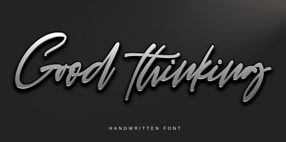 Good Thinking is a beautifully designed handwritten font that’s both authentic and charming. Use it to turn any design project into a true standout!


