10,000 search results
(0.013 seconds)
- ITC Novarese by ITC,
$40.99 Novarese font is the work of designer Aldo Novarese. He created 218 typeface cuts but as he was writing his book, Alfabeta, he decided to include only those he considered indispensable. He divided his fonts into 4 categories and in the designing of Novarese, took the best characteristics of each group and combined them into this font. In the style of Latin stone scripts of the second century BC. Novarese is a well-balanced and relatively wide text font with classic forms. ITC Novarese™ font field guide including best practices, font pairings and alternatives.
 - Blackrocky by Letterara,
$18.00 Blackrocky is a natural dry brush font. a tough-looking font with natural strong brush touch ready to rock every design you make. this font has a striking look and a good flow font that can add a stylish to your designs. It’s perfect for logos, quotes, posters, packaging, movie title, youtube banner, clothing, and every other design which needs a strong touch. It is PUA encoded which means you can access all of the glyphs with ease! Add it confidently to your projects, and you will love the results.
 - Talent Show JNL by Jeff Levine,
$29.00 A 1930s hand-lettered poster for the play "The Cradle Will Rock", put on by the WPA (Works Progress Administration) Federal Theater Project is the source material for Talent Show JNL; available in both regular and oblique versions. Originally, the "R" and "L" had fish hook bends, but those two letters were revised to be more traditional in structure. The obvious Art Deco influence, along with what sign painters refer to as "stovepipe lettering" (straight lines with curved [bent] corners) is a simple, clean approach to retro-influenced titling.
 - Diorite by Three Islands Press,
$24.00Diorite is modern face built on classical letterforms -- but left with a bit of residual roughness. Some might call Diorite forthright, others brutal. (It reminded the designer of the dark, hard igneous rock of the same name, treasured by the ancient Egyptians for statuary.) The typeface has a relatively chunky, four-style family; the italics are true cancellaresca corsiva, also writ heavy. "The cancellaresca is of course a Gothic design," notes the designer. "Just use a broader pen, and you'll see!" Has four styles: regular, bold, cursive, and cursive bold. - Old Time Nouveau JNL by Jeff Levine,
$29.00 The 1914 sign lettering instruction book “Art Alphabets and Lettering” by J. M. Bergling showcased many hand lettered alphabets as an inspiration to both up-and-coming and established sign painters. One page in particular featured a classic free-form Art Nouveau style with rounded shapes. This style of lettering was emulated in the 1960s by designers of rock concert posters, so the style is reminiscent of the Art Nouveau period as well as the 1960s. Old Time Nouveau JNL is available in both regular and oblique versions.
 - Waffelstein by Fontease,
$11.99 Waffelstein is a modern geometric typeface inspired by the passion for eating waffles, the old fraktur fonts, some heavy rock bands, some PC games and the graphical perspective in general. Although it is somewhat decorative by nature, Waffelstein includes extended Latin language support, but also Cyrillic and Greek. Designed with OpenType features like glyph alternates and ligatures, Waffelstein is perfectly suited for graphic design and any display use. It could easily work for army, bands, breweries, cinema, gamers, metalheads, militaries, movies, posters, pubs, quotes, t-shirts, zeppelins and many more.
 - Revans by Arterfak Project,
$15.00 Revans is a strong serif font with medium contrast. Inspired by the High Octane Rock genre and modern-classic fashion. Carefully designed with a short ascender to give a solid look, also the sharp serif makes the letters look more strong. Revans is a display-type which perfect for a headline, sub-headline, and short body text for a magazine, books, fashion, quotes, hipster t-shirt, signboard, logo, and etc . Available in 5 weights: Light, Normal - Medium - SemiBold and Bold, complete with the slant style. A great choice for a brave concept!
 - Kinstag by Alphabet Agency,
$15.00 Kinstag is a all caps serif display font. The typography was originally developed during work on a country rock music project. The initial characters were then evolved into a workable font for use in rural, rustic, vintage, outdoor and adult beverage related themes. The thick serif with an angled edge is a key characteristic of the font; pairing fantastically well with the thick stems and spurs protruding from them. These elements all work together to give the font a strong bold expression as well as a unique look.
 - Mockejoe Font by Tebaltipis Studio,
$13.00 MOCKEJOE FONT was born in the modern era which was inspired by the letters found in various print and digital media. Comes with a modern and futuristic style that will rock your great design! It is suitable for you to use in logotype designs, posters, typography, t-shirts, tickets, and other modern designs. The alternative characters in this font were divided into several OpenType features such as Stylistic Alternates, Stylistic Sets, and Ligature. The OpenType features can be accessed by using the OpenType program such as Adobe Illustrator, Adobe Photoshop, and Adobe InDesign.
 - Ongunkan Sweden Dalecarlian Run by Runic World Tamgacı,
$50.00 The Dalecarlian runes, or dalrunes, was a late version of the runic script that was in use in the Swedish province of Dalarna until the 20th century.The province has consequently been called the "last stronghold of the Germanic script. When Carl Linnaeus visited Älvdalen in Dalarna in 1734, he made the following note in his diary: The peasants in the community here, apart from using rune staves, still today write their names and ownership marks with runic letters, as is seen on walls, corner stones, bowls, etc. Which one does not know to be still continued anywhere else in Sweden. The Dalecarlian runes were derived from the medieval runes, but the runic letters were combined with Latin ones, and Latin letters would progressively replace the runes. At the end of the 16th century, the Dalecarlian runic inventory was almost exclusively runic, but during the following centuries more and more individual runes were replaced with Latin characters. In its last stage almost every rune had been replaced with a Latin letter, or with special versions that were influenced by Latin characters.
 - Jukebox Hero by Grype,
$19.00 As one of the most popular rock bands of the world, Foreigner has rocked the charts with 10 multi-platinum albums and sixteen top 30 hits in the last 40 years. But one might ask what a band this successful has been missing all these years? No head games here...a consistent typeface based on their logo is the answer. As fans of Foreigner, we've taken the essence of their iconic logotype and expanded it out into a full typeface in regular and bold weights to celebrate their 40th anniversary tour. The Jukebox Hero Family celebrates the typographic stylings of Foreigner, with the soft rounded terminals and an open geometric feel, including the unique stencil flavor of the original logo. It inherited the friendly stylings of the all Capitals logo that inspired it, and goes on to include a full standard character set with expansive international support of latin based languages, and two weights jumping from regular to a beefy bold. This family is ready to rock the charts for your designs towards that of a modern, comfortable appeal. Here's what's included with Jukebox Hero Family bundle: 413 glyphs - including Capitals, Lowercase, Numerals, Punctuation and an extensive character set that covers multilingual support of latin based languages. (see the 3rd graphic for a preview of the characters included) 2 weights: Regular & Bold. Fonts are provided in TTF & OTF formats. The TTF format is the standard go to for most users, although the OTF and TTF function exactly the same. Here's why Jukebox Hero Family bundle is for you: You're a die-hard Foreigner fan, and have a case of "Double Vision" and need both font weights. You're looking for a stylish and sophisticated soft sans-serif stencil typeface family. You've been waiting for fonts like these. You're looking for a Sci-fi vibe typeface that has a look that feels familiar. You just like to collect quality fonts to add to your design arsenal
 - Show Card Freehand JNL by Jeff Levine,
$29.00 The title and credits for the 1951 Dick Powell and Rhonda Fleming film “Cry Danger” were hand lettered in a freehand brush lettering often seen on store signs and show cards. Serving as the model for Show Card Freehand JNL, this pleasant and casual typeface is available in both regular and oblique versions.
 - Ornaments of Paris by Outside the Line,
$19.00 The Ornaments of Paris were inspired by a recent trip to Paris. Each tiny Paris icon is distilled from a church, a fence, a doorway, a railing, the Louvre, graphics in a store window, a feeling, a rainy day, a glass of wine... For more of the similar see Fleurons of Paris.
 - Bllides by Maulana Creative,
$14.00 Bllides is a Handwritten Marker font casual and clean stoke font with alternate and opentype features Ligatures inspired by the 60's notes letterform. It support multilingual more than 100+ language. This font is suitable for logo design and any awesome project you create. Make stunning work with Bllides Handwritten font. Cheers, MaulanaCreative
 - Folio by Bitstream,
$29.99Designed by Konrad Bauer and Walter Baum in 1956, Folio was the first popular Swiss Sanserif; the positive black shapes of the letters appear to be locked inevitably into the correct position by the firm and positive white shapes that surround them. - Ongunkan South Picene by Runic World Tamgacı,
$50.00 South Picene (also known as Paleo-Sabellic, Mid-Adriatic or Eastern Italic) is an extinct Italic language belonging to the Sabellic subfamily. It is apparently unrelated to the North Picene language, which is not understood and therefore unclassified. South Picene texts were at first relatively inscrutable even though some words were clearly Indo-European. The discovery in 1983 that two of the apparently redundant punctuation marks were in reality simplified letters led to an incremental improvement in their understanding and a first translation in 1985. Difficulties remain. It may represent a third branch of Sabellic, along with Oscan and Umbrian (and their dialects), or the whole Sabellic linguistic area may be best regarded as a linguistic continuum. The paucity of evidence from most of the 'minor dialects' contributes to these difficulties. The corpus of South Picene inscriptions consists of 23 inscriptions on stone or bronze dating from as early as the 6th century BC to as late as the 4th century BC. The dating is estimated according to the features of the letters and in some cases the archaeological context. As the known history of the Picentes does not begin until their subjugation by Rome in the 3rd century, the inscriptions open an earlier window onto their culture as far back as the late Roman Kingdom. Most are stelai or cippi of sandstone or limestone in whole or fragmentary condition sculpted for funerary contexts, but some are monumental statues.
 - Ministry by Device,
$39.00 A 14-weight sans family based on the original British ‘M.O.T.’ (Ministry of Transport) alphabet. A capitals-only, single-weight design was drawn up around 1933 for use on Britain’s road network, and remained in use until Jock Kinnear and Margaret Calvert’s ‘Transport Alphabet’ was introduced for Britain's first motorway in 1958. The identity of the original designer is not preserved; however, Antony Froshaug in a 1963 ‘Design’ magazine article mentions Edward Johnston as an advisor. Speculation that it was based on Johnston’s London Transport alphabet is discussed in archived government documents from 1957: “So far as I am aware, the Ministry alphabet was not based on Johnston’s design; indeed, it has been suggested that Gill got his idea from Johnston. Our alphabet was based on advice from Hubert Llewellyn-Smith (then chairman of the British Institute of Industrial Art) and Mr. J. G. West, a senior architect of H. M. Office of Works.” A 1955-57 revision of the alphabet which polished the somewhat mechanical aspects of the original may be the work of stone carver and typographer David Kindersley. For the digitisation, Rian Hughes added an entirely new lower case, italics and a range of weights. The lower case mimics the forms of the capitals wherever possible, taking cues form Gill and Johnston for letters such as the a and g, with single-tier versions in the italic. A uniquely British font that is now available in a versatile family for modern use.
 - Rassum Frassum by Comicraft,
$19.00 In the immortal words of Homer Simpson, "It's easy to complain... and so much FUN, too! Woo-HOO!" Now your characters can grumble, mumble and mutter in barely audible tones as they dredge up some bit of misery from their lives, unleash a rambling river of criticism and complaints about the state of their health, or the government, garbling as much graphic detail as time and your imagination will allow! Or perhaps your creations are issuing drunken slurs as they wake up outside their own fricka-frackin' houses cuddling wheelie bins, covered in glitter, wearing a shiny hat and budgie smugglers over their jeans while holding the reins to a miniature horse. So moan, groan, gossip incoherently or swear under your whiskey-soaked breath like a trooper... courtesy of those Rassum Frassum font lovers at Comicraft. >Hic!
 - Beverly Hills by Monotype,
$29.99Beverly Hills is an all-caps display face in the Art Deco style. Its design features dramatically low crossbars, and each letter has a fine inline highlight. The most prominent letters in this typeface are clearly the E, F, G, and K, while the elegantly narrow S is sure to delight. A classy offering like Beverly Hills should only be set very large, either as a magazine headline, a store sign, or on the cover of a fine invitation. If you like Beverly Hills, you make enjoy other high-contrast Art Deco designs in Linotype's library, including ITC Anna, Avenida, Broadway, Jazz, and ITC Manhattan. - Fleabitten by Hanoded,
$15.00 I love going to flea markets and second-hand stores; in fact a lot of the furniture in our home is second hand (or pre-loved, a euphemism I find rather peculiar). I personally believe that buying used products is a good way to help this planet, as no new stuff needs to be made and the old stuff gets a second life. Fleabitten is a ‘western style’ serif font. You could use it to pimp the posters for your line dance festival, but hey, be creative! I am sure you’ll find some good use for this very nice pre-loved font. Yes, pre-loved: I loved it first!
 - Poespa Indah by IKIIKOWRK,
$17.00 Introducing Poespa Indah - Old Type, created by ikiiko. Poespa Indah was inspired by vintage store signs in the classic era of indonesia around the 60s. In particular, this typeface is designed to give a formal yet old style look. Poespa Indah has a sans serif typeface with bold to light contrast. This typeface is perfect for an formal layout, newspaper, magazine cover, and also good for vintage product, quotes, or simply as a stylish text overlay to any background image. What's included? Uppercase & Lowercase Number & Punctuation Multilingual Support Works on PC & Mac Enjoy our font and if you have any questions, you can contact us by email : ikiikowrk@gmail.com
 - EbuScript by Type-Ø-Tones,
$40.00 EbuScript by José Manuel Urós. OpenType, 1 style The very first font of Type-Ø-Tones, EbuScript, comes from the pen of José Manuel Urós —nicknamed Ebú in those times. Now it is still in our catalogue thanks to a completed and improved version.
 - Mandy Hand by Australian Type Foundry,
$25.00 MandyHand is a lighthearted handwriting font with a casual tone. It contains four sets of alternates to accurately imitate the variations in handwriting, with OpenType code to randomise repeat letters. This font also contains full language support for all Latin languages including all European langauges.
 - School Age by Jeff Levine,
$29.00 The “Trixy Toy Educator” was a 1930s-era set of letters and numbers (along with a few animal shapes) for teaching children, and was manufactured by the Durrel Company of Gardner, Massachusetts. Die cut from thick cardboard, the 40 piece set also included a rack to display the characters, presumably for little ones to practice the correct order of the alphabet and basic numerals or to spell simple words like ‘dog’ or ‘cat’. Whomever came up with the idea, they used the most rudimentary and unusual ‘type design’ shapes in the A-Z and 0-9, but they were just odd enough to inspire a digital type version of them. School Age JNL is available in both regular and oblique versions.
 - Blushed by Supfonts,
$17.00 Hello, friends. I keep experimenting with handwritten fonts, shapes and lines. I want the font to set the tone, the atmosphere, and look like an inscription made in a hurry, but it is well read. Blushed combines all these qualities. Simple and clear, looks at ease. It is perfect for signatures or design, where you do not need a strict style. Test it out below to see how it could look for your next project! Includes: Uppercase and lowercase Numbers and punctuation Foreign language support Ligatures Check out my blog: https://www.instagram.com/zloillev pinterest.com/dmitriychirkov7 Enjoy
 - Capo by Alias,
$60.00 The intention with Capo was to make a typeface with a pinched, angled connection between curves and verticals. We have explored this incised, cut motif previously on typefaces, most notably Noah, Sabre and Harbour. These have focussed more specifically on stone-cut forms. For Capo we wanted to mix the expressive quality of its ‘pinch’ idea with an overall aesthetic that could be applied to text rather than headline. So Capo has something of the function and warm, organic quality of Grotesque style typefaces. In Capo’s Bold and Black weights the sharpness of the letter shapes is more dramatic and emphasised, making for great effect for large-sized text. Why Capo? A capo is a device used on the neck of a stringed (typically fretted) instrument to shorten the playable length of the strings by pinching or clamping them in place, hence raising the pitch.
 - Egyptian Hieroglyphics – Deities by Deniart Systems,
$30.00 Give your documents a sense of history. The study of the ancient Egyptian Hieroglyphics has been an ongoing fascination by scholars and Egyptology buffs for literally centuries. The discovery of the Rosetta stone in 1799 provided an incredible breakthrough in deciphering the hieroglyphs, however there continues to be conflicting opinions on the literal translation of both the phonetic and ideographic symbols. As such, the interpretation provided in this manual represents an assembly of the most popular transcriptions. This series contains 62 assorted gods and deities as well as a few well known kings or pharaoh's from the New Dynasty. It is important to note that most of the gods and deities were represented in many different forms throughout the centuries and regions of Ancient Egypt, and these are but some of these representations. NOTE: this font comes with an interpretation guide in pdf format.
 - Rezak by TypeTogether,
$36.00 Nothing is hidden in the simplistic forms and overt aesthetic of Anya Danilova’s Rezak font family. Rezak is not a type family directly from the digital world, but was inspired by the stout presence of cutting letters out of tangible material: paper, stone, and wood. With only a few cuts, the shapes remain dark and simple. With more cuts, the shapes become lighter and more defined, resulting in a dynamic type family not stuck within one specific category. The Black and medium weights began as one approach before separating into display and text categories. The four text weights were created through pendulum swings in design direction that experimented with contrast, angles, tangent redirections, and the amount of anomalies allowed. The text weights are vocal when set larger than ten points and subtle at smaller sizes. The tech-heavy Incised display style came last, employing a surprising range of trigonometric functions to make it behave exactly as desired. Its look can result in something distinctive and emotional or completely over-the-top. Most normal typefaces change only in thickness; Rezak changes in intention, highlighting the relationship between dark and light, presence and absence, what’s removed and what remains. Rezak’s Black and Incised display styles are like a shaft of light in reverse and are perfect in situations of impact: websites, headlines and large text, gaming, call-outs, posters, and packaging. The tone works for something from youthful or craft-oriented to organic and natural products. Try these two in logotypes, complex print layering, branding, and words-as-pattern for greater experimentation. The text styles are bold, energetic, well informed, and round out the family with four weights (Regular, Semibold, Bold, Extrabold) and matching italics for a family grand total of ten. These jaunty styles work well in children’s books, call-outs, movie titles, and subheads for myriad subjects such as architecture, coffee, nature, cooking, and other rough-and-tumble purposes. Rezak’s crunchy letters are meant to expose rough, daring, or dramatic text. A further benefit is that this family is not sequestered within one specific genre or script, so it can be easily interpreted for other scripts, such as its current Latin and extended Cyrillic which supports such neglected languages as Abkhaz, Itelmen, and Koryak. Rezak’s push toward creativity and innovation, with an eye on typography’s rich history, reinforces our foundry’s mission to publish invigorating forms at the highest function and widest applicability.
 - Kremlin Grand Duke - Unknown license

- This Man This Monster by Comicraft,
$19.00 Half Man, Half Monster, Comicraft’s latest variable font hybrid is not only your burly, hard-edged, upfront and blunt buddy, it’s also your rough-hewn, tough and grim, rocky-featured pal! Not just Two-in-One, our latest offering brings together Four Fantastic Faces!
 - Sportsboard JNL by Jeff Levine,
$29.00 Sportsboard JNL is a serif font alternate to the popular Flipboard JNL, which emulates the electronic flip-character message boards found at airports, sporting venues and used for election tallies. The type design used for this version of a flipboard display is Sports Jock JNL.
 - Flower Glory by Prioritype,
$19.00 Cheerful and cute font with a unique cutout style. Can be adjusted up and down each typing by enabling and disabling caps lock. Perfect for quotes, cover designs, merchandise, posters, creative posts, birthday cards and so on. Features: Uppercase, Lowercase, Numeral, Punctuation & Multilingual. Thanks!
 - Solasta by VP Creative Shop,
$20.00 Introducing Solasta - organic script Solasta is organic and modern script loaded with ligature glyphs and multilingual support. It's a very versatile font that works great in large and small sizes. This font is perfect for branding projects, home-ware designs, product packaging, magazine headers - or simply as a stylish text overlay to any background image. FEATURES Uppercase, lowercase, numeral, punctuation & Symbol ligature glyphs Multilingual support No special software is required to type out the standard characters of the Typeface. Canva friendly Feel free to contact me if you have any questions! Mock ups and backgrounds used are not included. Thank you! Enjoy!
 - Bubbble Gum by VP Creative Shop,
$15.00 Introducing Bubbble Gum - sans serif typeface - 9 fonts Bubbble Gum is modern, rounded typeface with 9 fonts, regular, italic and multilingual support. It's a very versatile font that works great in large and small sizes. Bubbble Gum is perfect for branding projects, home-ware designs, product packaging, magazine headers - or simply as a stylish text overlay to any background image. Uppercase, Lowercase numeral, punctuation & Symbol Hairline Light Regular Bold Black Italic ( Hairline, light, regular, black ) Ligature glyphs Multilingual support Feel free to contact me if you have any questions! Mock ups and backgrounds used are not included. Thank you! Enjoy!
 - Stolid by VP Creative Shop,
$20.00 Introducing Stolid - modern script Stolid is organic and casual script loaded with ligature glyphs and multilingual support. It's a very versatile font that works great in large and small sizes. This font is perfect for branding projects, home-ware designs, product packaging, magazine headers - or simply as a stylish text overlay to any background image. FEATURES Uppercase, lowercase, numeral, punctuation & Symbol ligature glyphs Multilingual support No special software is required to type out the standard characters of the Typeface. Canva friendly Feel free to contact me if you have any questions! Mock ups and backgrounds used are not included. Thank you! Enjoy!
 - Perfectly Splendid by VP Creative Shop,
$20.00 Introducing Perfectly Splendid serif typeface - 5 weights Perfectly Splendid is magical, sophisticated typeface with 5 fonts to enchant your next project. Very versatile fonts that works great in large and small sizes. Basic latin and advanced latin character sets are supported! Perfectly Splendid is perfect for branding projects, home-ware designs, product packaging, magazine headers - or simply as a stylish text overlay to any background image. Uppercase numeral, punctuation & Symbol Hairline, Light, Regular, Bold, Black Ligatures Multilingual support Feel free to contact me if you have any questions! Mock ups and backgrounds used are not included. Thank you! Enjoy!
 - Ferly by VP Creative Shop,
$20.00 Introducing Ferly - Elegant serif font Ferly is luxury and fragile font with multilingual support. It's a very versatile font that works great in large and small sizes. This font is perfect for branding projects, home-ware designs, product packaging, magazine headers - or simply as a stylish text overlay to any background image. FEATURES Uppercase, numeral, punctuation & Symbol Multilingual support No special software is required to type out the standard characters of the Typeface. Canva friendly Feel free to contact me if you have any questions! Mock ups and backgrounds used are not included. Thank you! Enjoy!
 - Moue by VP Creative Shop,
$12.00 Introducing Moue - display typeface - 3 styles Moue is bold and weird typeface with 3 fonts and multilingual support. It's a very versatile font that works great in large and small sizes. This font is perfect for branding projects, home-ware designs, product packaging, magazine headers - or simply as a stylish text overlay to any background image. FEATURES Uppercase, lowercase, numeral, punctuation & Symbol 3 styles Multilingual support No special software is required to type out the standard characters of the Typeface. Canva friendly Feel free to contact me if you have any questions! Mock ups and backgrounds used are not included. Thank you! Enjoy!
 - Kith by VP Creative Shop,
$20.00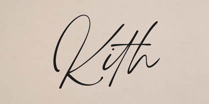 Introducing Kith - handmade script Kith is handmade and organic script loaded with ligature glyphs and multilingual support. It's a very versatile font that works great in large and small sizes. This font is perfect for branding projects, home-ware designs, product packaging, magazine headers - or simply as a stylish text overlay to any background image. FEATURES Uppercase, lowercase, numeral, punctuation & Symbol ligature glyphs Multilingual support No special software is required to type out the standard characters of the Typeface. Canva friendly Feel free to contact me if you have any questions! Mock ups and backgrounds used are not included. Thank you! Enjoy!
 - Boldfire by VP Creative Shop,
$15.00 Introducing Boldfire - creative font duo Boldfire is elegant and organic typeface with multilingual support. It's a very versatile font that works great in large and small sizes. This font duo is perfect for branding projects, home-ware designs, product packaging, magazine headers - or simply as a stylish text overlay to any background image. FEATURES Uppercase, lowercase, numeral, punctuation & Symbol Regular Script Multilingual support No special software is required to type out the standard characters of the Typeface. Canva friendly Feel free to contact me if you have any questions! Mock ups and backgrounds used are not included. Thank you! Enjoy!
