2,418 search results
(0.018 seconds)
- Sync by Peter Huschka,
$28.99 The Sync font family is a layered system for chromatic typesetting. With its stylistic variety it enables a wide range of eye-catching combinations with colors and patterns. The very first sketches were inspired by some hand-painted characters on a weathered beach sign at the French Côte d’Argent and currently the font family comes with a total of 28 single fonts. The primary font »Sync Base« is a powerful, condensed Sans Serif. Sharp cut edges, narrow wedge-shaped counters and low ascenders and descenders make the compact character of the typeface. In perfect sync with the primary font, the family includes the retro styles Lines, Engravings, Stripes and Shadows and the texture styles Invisible and Jungle. Each one of them with multiple fonts. As all Sync fonts have the same metrics, they can easily be layered in different colors to create the desired effects by using graphic applications that allow utilizing layers. Sync fonts work especially well in larger sizes and were designed for large display purposes, covers, branding, packaging, headlines, editorials, advertising, posters and the like. Check the gallery for examples. By the way, the graphics in some of the visuals come from the Linotype »Picture Yourself™« collection designed by Karin Huschka and Peter Huschka. Sync & enjoy!
 - Bullets by Wiescher Design,
$6.00 BulletNumbers come in very handy for all kinds of lists that don't exceed 100 categories. I have long since been using my own Bullets in positive and negative and four styles, serif, sans, engravers and script, a fitting one for every occasion. Now I added six more designs and perfected the Bullets for all of you. The following is a »must read«! Here is how to use them: (Important! Set letterspacing to '0', otherwise the two digit numbers will have gaps!!!) The numbers 1-0 reside on the standard keys. Two digit numbers 01-99 can be composed out of left and right half circles by using (lowercase) 'abcdefghij' for the first digit (left half circle) and 'lmnopqrstu' for the second digit (right half circle). The critical pairs (all combinations with 1) can be found in various places. Type '!' for 10, '#' for 11, '$' 12, '%' for 13, '&' for 14, '(' for 15, ')' for 16, '*' for 17, '+' for 18, ',' for 19, '-' for 21, '.' for 31, '/' for 41, ':' for 51, ';' for 61, '?' for 81, '_' for 91. The two arrows are on the < and > keys. '100' can be found with shift+option+1. Last but not least, the capital letter bullets A-Z can be found on the shift+letter A-Z. Your very practical Gert Wiescher
 - Bullet Numbers by Wiescher Design,
$9.50 This is a must read!!! BulletNumbers come in very handy for all kinds of lists that don't exceed 100 categories. I have long since been using my own BulletNumbers in positive and negative and four styles, serif, sans, engravers and script, a fitting one for every occasion. Now I perfected them for all of you. Here is how to use them: (Important! Set letterspacing to '0', otherwise the two digit numbers will overlap!!!) The numbers 1-0 reside on the standard keys. Two digit numbers 01-99 can be composed out of left and right half circles by using (lowercase) 'abcdefghij' for the first digit (left half circle) and 'lmnopqrstu' for the second digit (right half circle). The critical pairs (all combinations with 1) can be found in various places. Type '!' for 10, '#' for 11, '$' 12, '%' for 13, '&' for 14, '(' for 15, ')' for 16, '*' for 17, '+' for 18, ',' for 19, '-' for 21, '.' for 31, '/' for 41, ':' for 51, ';' for 61, '?' for 81, '_' for 91. The two arrows are on the < and > keys. '100' can be found with shift+option+1. Last but not least, the capital letter bullets A-Z can be found on the shift+letter A-Z. Yours very practical Gert Wiescher
 - Silvestre Weygel by Intellecta Design,
$20.90 A complete figurative alphabet was published by one Peter Flotner (ca. 1485-1546) in 1534. In Flotner’s alphabet, naked or nearly-naked figures are posed singly or disposed in pairs to form the various letters. Unlike de Grassi’s alphabet, we find only human figures here, no other animals. And unlike Tory’s illustrations, these letters seem an end in themselves, rather than the means of demonstrating a design strategy. Flotner’s alphabet was imitated by other engravers. The letters G and N are reproduced from an alphabet published by one Martin Weygel in Bavaria in 1560. Peter Flötner , c.1485-1546, German medalist and artisan, possibly Swiss by birth. He was active in decorative sculpture, wood carving, and other crafts, making medals and plaques and furnishing designs of classical motifs for silversmiths. He was in Nuremberg by 1522 and did most of his work there, although he made two trips to Italy. Flötner is now regarded as a pioneer of the German Renaissance. His Kunstbuch was published in 1549. In the Metropolitan Museum are five of his bronze plaques illustrating biblical episodes. A stylistical tip : Use this caps with SchneiderBuchDeutsch, as shown in the banners above, to create a perfect historiated layout.
 - Aviano Wedge by insigne,
$24.99 Firm and resolute, the sharp, triangular wedge serifs of the new Aviano Wedge stamps your copy with the confidence of late 19th century luxury, wealth, and power. Indicative of banknotes and financial strength, the large, elegant Aviano Wedge is composed in the Latin style. Aviano Wedge takes its original footing from period signage found on a building in Asheville, NC. While shaped largely by engraved faces, the elegant Aviano Wedge maintains the extra-wide comfort and ease found with the rest of the Aviano series. Aviano Wedge comes in six different weights and is packed with OpenType features. As a complement to these characters, Aviano Wedge includes 40 discretionary ligatures for artistic typographic compositions. To see these features in action, please see the informative .pdf brochure. OpenType capable applications such as Quark or the Adobe Creative suite can take full advantage of the automatically replacing ligatures and alternates. Aviano Wedge also includes support for all Western European languages. This new face has also been designed to pair well with the rest of the Aviano series, including our best-selling Aviano, Aviano Serif, Aviano Sans, Aviano Didone, Aviano Flare, Aviano Contrast, and Aviano Slab. Use it alone, or combine Aviano Wedge with any of these other fonts to build the strong presence you’re looking for.
 - Eurotypo Bodoni by Eurotypo,
$48.00 Talking about the numerous types that today bear the name of Giambattista Bodoni are a kind of tribute as much to his reputation as a printer as to his ability as designer and engraver. In fact, all of them tent to be more in the way or style of Bodoni than simply copy of his letterforms. Like many other type designers, we’ve been seduced also to develop our own point of view of his work, nowadays enriched by some features of OpenType format that allows a variety of combinations: standard ligatures, discretional ligatures, stylistic alternates and old styles figures. Whereas the Bodoni serif in the capitals was of the same weight as the thin stroke but joined with a very slight fillet (Bracket) and the lowercase serif were like his French rivals, the Didots, featured straight- edged serifs that were unbracketed. The ascenders and descenders of this new Bodoni are shorter, giving in this way, more space for enlarge x high. Specially designed for editorial design and advertising, can be used in magazines, annual reports and all kind of fine print materials or web pages. The beauty of his letterforms can enrich headlines; this font can also be used as body text for its good legibility and accurate kerning.
 - 1812 by Apostrof,
$40.00 '1812' type family is a revival and further development of the typeface '1812' by Lehmann Type Foundry (St. Petersburg). It was created for the centenary of the French invasion of Russia, known in Russia as the Patriotic War of 1812 along the lines of decorative engraved inscriptions and ornamented typefaces of that time, presumably by the artist Alexandre Benois. It was used mainly for the decoration of luxurious elegant publications. Later, in 1917, this typeface was used on the Russian Provisional Government banknotes. In the Soviet period of time '1812' appeared to be one of the few typefaces included in the first Soviet type standard OST 1337. It was produced for manual typesetting until the early 1990s. This typeface could be seen on Soviet letterheads, forms, posters and even air tickets. The digital version development was launched in 2010. The original version was supplemented with lowercase letters and alternative symbols, the extended Latin and Cyrillic alphabets were fully supported. The font was evolved into a family of 14 decorative styles which can refine any design giving it a festive and elegant but at the same time strict and nostalgic look. Despite its decorative nature, '1812' is perfectly readable in small emphasized text blocks due to its classic shape and careful spacing.
 - ATF Poster Gothic by ATF Collection,
$59.00 ATF Poster Gothic is an expansion of a typeface designed in 1934 by Morris Fuller Benton for American Type Founders. The one-weight design was a slightly condensed display companion to Benton’s ubiquitous Bank Gothic family. This new family of aggressively rectilinear headline types expands the design’s possibilities, offering 30 fonts. The all-cap design sports square corners in the counters, creating tension between angular and curved details; this feature, and the generally rectangular shape of the whole alphabet, makes ATF Poster Gothic distinctive on the page or screen, while its relationship to Bank Gothic makes it seem somehow familiar. Vertical strokes on the C, G, J, and S, as well as on several of the numerals, are cut off at an angle, which suggest the curves those strokes might typically display if the characters were less boxy in design and more along the lines of late-19th-century headline faces. Certain weights also recall the style of lettering used on athletic team jerseys, television crime dramas, action & adventure movie titles, and engraved stationery. With three widths and five weights, ATF Poster Gothic is distinctive and versatile at the same time. The full family is also available in a “Round” version, with corners subtly rounded for a softer, more “printed” feel.
 - Brutal Milk No 1 by Casloop Studio,
$9.00 Introducing Brutal Milk Font Collection where prominence, trustworthiness, and sophistication converge. Brutal Milk is a captivating grotesque typeface that seamlessly blends the robust aesthetics of brutalism with the sleek sophistication of Swiss Design and the nostalgia of Y2K. This collection featuring three distinctive variants – Brutal Milk No1, Brutal Milk No2, and Brutal Milk No3 – offers a unique typographic journey for extraordinary design. Let's break down what we present in this work - Brutal Milk No.1 | Modern Elegance with a Brutal Twist Aims for body text with the perfect balance of elegance and modernity. Brutal Milk No.1 is meticulously crafted for optimal readability, making it an ideal choice for a wide range of applications. - Brutal Milk No.2 | Softened Brutalism for Approachable Headers Aims for display/header text with a gentle and approachable impression. Brutal Milk No.2 is crafted to add a touch of warmth to your designs, making it perfect for conveying a friendly and inviting tone. - Brutal Milk No.3 | Rigid Rebellion for Prominent Headers Make a bold statement with headers that exude firmness. Brutal Milk No.3 is designed to capture attention with its rigid impression, injecting a sense of prominence and confidence into a visual identity. The Features The Brutal Milk Font Collection comes loaded with features such as case-sensitive forms, discretionary ligatures, ordinals, fractions, denominators, numerators, superscripts, and scientific inferiors – ensuring flexibility in design needs. Language Support From Western and Central European languages to South Eastern European, South American, Oceanian, and even Esperanto, Brutal Milk Collections caters to a diverse range of linguistic needs. Brutal Milk stands as a testament to versatility and innovation. Whether you're crafting a sleek logo, establishing a brand identity, adorning decor, creating impactful posters, delivering compelling presentations, designing dynamic websites, refining UI/UX experiences, or engaging in graphic design endeavour. The impressions it imparts—modern, minimal, youthful, funky, groovy, trendy, hip, fly, and undeniably cool—speak volumes about its adaptability to contemporary design trends. Redefine the boundaries of creativity and immerse yourself in the dynamic world of Brutal.
 - Brutal Milk No 2 by Casloop Studio,
$9.00 Introducing Brutal Milk Font Collection where prominence, trustworthiness, and sophistication converge. Brutal Milk is a captivating grotesque typeface that seamlessly blends the robust aesthetics of brutalism with the sleek sophistication of Swiss Design and the nostalgia of Y2K. This collection featuring three distinctive variants – Brutal Milk No1, Brutal Milk No2, and Brutal Milk No3 – offers a unique typographic journey for extraordinary design. Let's break down what we present in this work - Brutal Milk No.1 | Modern Elegance with a Brutal Twist Aims for body text with the perfect balance of elegance and modernity. Brutal Milk No.1 is meticulously crafted for optimal readability, making it an ideal choice for a wide range of applications. - Brutal Milk No.2 | Softened Brutalism for Approachable Headers Aims for display/header text with a gentle and approachable impression. Brutal Milk No.2 is crafted to add a touch of warmth to your designs, making it perfect for conveying a friendly and inviting tone. - Brutal Milk No.3 | Rigid Rebellion for Prominent Headers Make a bold statement with headers that exude firmness. Brutal Milk No.3 is designed to capture attention with its rigid impression, injecting a sense of prominence and confidence into a visual identity. The Features The Brutal Milk Font Collection comes loaded with features such as case-sensitive forms, discretionary ligatures, ordinals, fractions, denominators, numerators, superscripts, and scientific inferiors – ensuring flexibility in design needs. Language Support From Western and Central European languages to South Eastern European, South American, Oceanian, and even Esperanto, Brutal Milk Collections caters to a diverse range of linguistic needs. Brutal Milk stands as a testament to versatility and innovation. Whether you're crafting a sleek logo, establishing a brand identity, adorning decor, creating impactful posters, delivering compelling presentations, designing dynamic websites, refining UI/UX experiences, or engaging in graphic design endeavour. The impressions it imparts—modern, minimal, youthful, funky, groovy, trendy, hip, fly, and undeniably cool—speak volumes about its adaptability to contemporary design trends. Redefine the boundaries of creativity and immerse yourself in the dynamic world of Brutal.
 - As of my last update in early 2023, Rosetta Tones isn't recognized as a widely known or established font, but let’s imagine what it could be, drawing from its evocative name that hints at a blend of ...
- J.M. Nexus Grotesque - Personal use only

- Dotine by Gatype,
$16.00 Introducing Serif-style Dotine Display It's a beautiful font that will engage your audience and make your promotions and projects stand out. It comes with different ligature characters. Bring your brand to life and add a touch of modernity and style with the Dotine font. customize it for your title, logo, business card, printed quote, all kinds of invitations, cards, packaging and your website or social media branding. Please contact us if you have any questions, we are happy to help you! Thank You!
 - Children Friends by Nirmana Visual,
$19.00 Introducing our playful and whimsical handwritten children font, perfect for bringing joy and imagination to any design project. Our font is the perfect choice for creating fun and engaging designs for children's books, educational materials, and playful branding projects. With its charming and quirky handwritten style, our font captures the innocence and creativity of childhood, inspiring imagination and wonder. The organic curves and playful details create a sense of spontaneity and fun, making it perfect for designs that need to capture a child's attention.
 - Happy Space by Epiclinez,
$18.00 Introducing the Happy Space lettering font - a fun and vibrant addition to any design project. With its playful aesthetic, this font is perfect for creating eye-catching logotypes, memorable branding, engaging product packaging, and attention-grabbing headlines. Imagine your brand standing out in a sea of sameness with the unique personality of Happy Space guiding the way. Happy Space features : Standard Latin All-Caps Numbers, symbols, and punctuations Multilingual Support. Fully accessible without additional design software Simple Installations Works on PC & Mac Thank You.
 - Orange Blast by Olivetype,
$18.00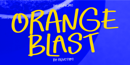 Experience the vibrant energy of Orange Blast, a playful handwritten display font that can make your designs pop! With its bold and dynamic strokes, this font is perfect for adding a playful yet professional touch to any project. Whether you’re designing logos, posters, or social media graphics, Orange Blast delivers a burst of creativity that captivates and engages your audience. Orange Blast features : Standard Latin Numbers, symbols, and punctuations Multilingual Support. Fully accessible without additional design software Simple Installations Works on PC & Mac Thank You.
 - Ongunkan Carian by Runic World Tamgacı,
$50.00 Caria (/ˈkɛəriə/; from Greek: Καρία, Karia, Turkish: Karya) was a region of western Anatolia extending along the coast from mid-Ionia (Mycale) south to Lycia and east to Phrygia. The Ionian and Dorian Greeks colonized the west of it and joined the Carian population in forming Greek-dominated states there. Carians were described by Herodotus as being of Minoan descent, while he reports that the Carians themselves maintained that they were Anatolian mainlanders intensely engaged in seafaring and were akin to the Mysians and the Lydians
 - ITC Zinzinnati by ITC,
$29.99ITC Zinzinnati is based on a font called Ohio, released in 1924 by Die Schriftguss A.G. Typical of the Plakatstil letterforms of the time, the original font had a rough outline, as if drawn with a brush. Nick Curtis has smoothed the rough edges, which enhances the design's playful curves and engaging charm. As for the name: it's the punchline to an old vaudeville routine that starts with the question, Name a city in Ohio that begins with a 'Z.'" Pie in the face, comin' atcha!" - Ghost Halloween by Ake,
$18.00 Halloween Font is a delightful brush-style display font. With its cute and charming appeal, this typeface is perfect for adding a touch of whimsy to your designs. The authentic brush strokes give it a personal and realistic feel, making it an ideal choice for various creative projects. From Halloween-themed designs to children's books, party invitations, posters, and more, Ghost Halloween Font will bring a playful and engaging vibe to your creations. Get ready to make your designs stand out with this adorable and versatile font!
 - Reigo by Digitype Studio,
$20.00 Reigo is a serif font with gentle curves giving it a soft, warm, classy, organic. Reigo comes with 7 Uprights & 7 Matching italics with OpenType features such as Ligatures, Discretionary Ligatures, Stylistic Alternates, and More OpenType Features and is equipped with PUA encoded. With a large selection of advanced & classic styles, we hope to give users flexibility and creativity in terms of style and appearance of text and help realize effective and engaging communications. If you have further questions, we'd be happy to help. Regards
 - Magenos Soft by Graphite,
$18.00 Magenos Soft is the rounded version of Magenos typeface family. It is a modern geometric sans serif family characterized by its simplicity and extensive functionality. With its open apertures, geometric architecture and low contrast strokes, it expresses a sincere tone with a modernistic, neutral, yet friendly personality. It has been designed to work well for a wide range of applications and is a reliable workhorse. Equally suitable for print and screen usage, it works well for both text and display at a wide range of point sizes. The addition of true italics gives the whole family a dynamic edge and flexibility. Magenos Soft comes with many OpenType features including stylistic alternates, standard ligatures, oldstyle and lining (proportional and tabular) numerals, slashed zero and a variety of symbols, making it a perfect choice for contemporary and professional typography.
 - Rigatoni by Sudtipos,
$39.00 Rigatoni is a didone display family with exceptional readability. Based on a German mid-century lettering specimen by Nerdinger, designer Alejandro Paul expanded the face into an extensive family, with 5 weights, italics, and a 2 weights stencil version. Its tall letterforms and sturdy serifs give it a noble bearing when set in all caps; in the lower case its large x-height and spacious counters imbue it with a welcoming tone. A plethora of alternate and swash characters let you create distinctive settings for identities, labels, titles, and headlines. Use the shorter ascender and descender variants for aesthetic effects, or to prevent collisions in tightly stacked text. Since we've imagined Rigatoni being used for restaurants, menus, and food packaging, Sudtipos asked to designer Esteban Diácono to create some 3D visualizations. Ale’s type has never looked saucier!
 - Rassum Frassum by Comicraft,
$19.00 In the immortal words of Homer Simpson, "It's easy to complain... and so much FUN, too! Woo-HOO!" Now your characters can grumble, mumble and mutter in barely audible tones as they dredge up some bit of misery from their lives, unleash a rambling river of criticism and complaints about the state of their health, or the government, garbling as much graphic detail as time and your imagination will allow! Or perhaps your creations are issuing drunken slurs as they wake up outside their own fricka-frackin' houses cuddling wheelie bins, covered in glitter, wearing a shiny hat and budgie smugglers over their jeans while holding the reins to a miniature horse. So moan, groan, gossip incoherently or swear under your whiskey-soaked breath like a trooper... courtesy of those Rassum Frassum font lovers at Comicraft. >Hic!
 - Psychotropic Experience by Mysterylab,
$12.00 Here's a unique and unusual font pack in the tradition of late 1960s psychedelic poster and album cover styles. Perfect for that flaming psychedelia vibe from the Haight-Ashbury scene in the Summer of Love era. Combine Regular and Fill versions to create a two-toned design for a super offbeat and eye-catching look. Once loaded on your system, the three versions of the font show in your menu as the following three "weights": Psychotropic Experience Regular, Psychotropic Experience Fill, and Psychotropic Experience Solid. The 3-alphabet collection works together seamlessly to allow you to assign one color to the body of the letter, and a second color to the inset fill areas. Just copy your text block, paste in place, reassign the font to the Fill version, choose a complimentary color, and off you go. All caps Fonts.
 - Pinksoda by Balpirick,
$15.00 Pinksoda is a notable and quotable font. Introducing our custom font creation service that offers you the opportunity to bring your favorite quotes and notes to life, in a unique way. At our custom font service, we specialize in creating handcrafted fonts that perfectly capture the essence of your personal style. We create handwritten fonts that convey the perfect tone and reflect your individuality. Whether it's a favorite quote, a special note, or a cherished message, we work tirelessly to create custom fonts that capture the true essence of your sentiment. Our custom-handwritten fonts are ideal for creating personalized stationery, invitations, greeting cards, posters and social media graphics. Whatever the occasion, our fonts are the perfect way to add a touch of charm and personality to your designs. - also multilingual support Enjoy the font! Feel free to comment or feedback! Thank you!
 - Binnek by Twinletter,
$17.00 Binnek is the perfect font for any sporting event. This font, combined with the immense popularity of outdoor sports, has generated a huge demand for typography solutions suitable for use in outdoor advertising media. Binnek features 6 different styles from sans, and slabs, to sharp edges, as well as beveled variations, the result is a versatile display typeface that can be used in high-speed situations while still taking advantage of a contemporary tone. Using this font also tells everyone that you mean business. What’s Included : - File font - All glyphs Iso Latin 1 - Alternate, Ligature - Simple installations - We highly recommend using a program that supports OpenType features and Glyphs panels like many Adobe apps and Corel Draw, so you can see and access all Glyph variations. - PUA Encoded Characters – Fully accessible without additional design software. - Fonts include Multilingual support
 - Rebrand by Latinotype,
$29.00 Rebrand is all about geometry, a typography that boosts confidence. However, contrary to pure, cold mathematics, this font seeks a more jovial and friendly face. The goal with Rebrand is to offer a Geometric Sans Serif font that can work in various instances, from symbols and titles, to text, and everything in between. It also creates a whole lot of personality, ideal for branding. There are two versions: Display, which is more fluid and dynamic with nine programmed weights for a wide array of intensity. This version also has various alternative characters and swashes. Text, which has the same attitude as Display, but is a little more serious with seven programmed weights to provide distinctive extremes and subtle variations among the mid-tones. Both cover basic Cyrillic and come in small caps. Both create one phenomenal typography: Rebrand.
 - Tradesman by Grype,
$16.00 Rough-hewn industrial geometric typefaces have been used and admired from early wood types through the digital age of Machine and beyond, but they have lacked an expansive enough family to become a true workhorse. The Tradesman family finds its origin of inspiration in the Craftsman tool company logo, and from there expands to type megafamily. Tradesman celebrates the angular octagonal forms of industrial lettering, transcending its brand inspired origin to give birth to a font family that pulls on modern and historical styles. It inherited its reliably tough tone from the all capitals lettering that inspired it, and goes on to include a lowercase, small caps style, and a comprehensive range of widths and weights, creating a straightforward, uncompromising collection of typefaces that lend a solid foundation and a broad range of expression for designers.
 - Borex by Twinletter,
$17.00 Introducing Borex, the ultimate font for all your sport racing needs. With its bold and dynamic letterforms, it captures the excitement and energy of the race track. And with four unique variations, including regular, slant, and taper styles, you can customize your designs to fit the tone and theme of your project. Not to mention, the font also comes equipped with alternate characters and unique ligatures to add an extra touch of creativity. So rev up your designs with Borex and get ready for the finish line! What’s Included : - File font - All glyphs Iso Latin 1 - Alternate, Ligature - Simple installations - We highly recommend using a program that supports OpenType features and Glyphs panels like many Adobe apps and Corel Draw so that you can see and access all Glyph variations. - PUA Encoded Characters – Fully accessible without additional design software. - Fonts include Multilingual support
 - Rainmaker Script by Fenotype,
$35.00 I started Rainmaker Script by hand sketching a huge amount of letters to find the right tone. After having enough I picked the characters that I liked and begun composing a font out of them. With this method I ended up with the Rainmaker Script - an elegant signature style connected script with natural variation in the rhythm. Rainmaker Script is great for branding, headlines and packaging. It’s equipped with (automatic) Contextual Alternates that keep the flow natural and variable. There’s also Swash, Stylistic and Titling Alternates, and even more alternates can be found for some characters from the Glyph Palette. From the Glyph Palette you’ll also find a handful of ending swooshes and ornamental strokes that can be combined with the font. All the extras in Rainmaker Script are PUA encoded so you can access them in most graphic design software.
 - Seol Sans Variable by Monotype,
$1,049.99The Seol Sans design offers a fresh palette for designers working with the Korean alphabet, particularly those looking to pair Latin and Korean alphabet (or Hangul) forms without creating typographic friction. The choices for Hangul fonts that work well with humanist Latin typefaces are limited. As Monotype’s first original Korean design, the Seol Sans typeface is a humanist take on the traditional rigid and hard designs of Hangul characters. The Seol Sans design more closely resembles the natural curve of hand-written characters. Seol Sans features Neue Frutiger for its Latin glyphs, and works harmoniously with Neue Frutiger World and Monotype’s CJK typefaces Tazugane Info (Japanese) and M XiangHe Hei (Chinese). Seol Sans is a great choice for global brands using a Sans Serif design looking to maintain their visual identity, and communicate with a consistent tone of voice in the Korean market.¶ - Atto Sans by Wilton Foundry,
$29.00I set out to design a contemporary font that is condensed with thick and thin strokes. The highly structured forms of this condensed font was made more interesting and softer by giving it a slightly calligraphic tone and by adding round corners. Atto's express purpose is to be both utilitarian, compact and technical but with a friendly face. The name "atto" was adopted since it refers to the measurement of "smallness" or detail. You will no doubt discover all the many pleasant nuances within Atto. Adopted in 1964, "atto" comes from the Danish "atten", meaning eighteen. Atto - (symbol a) a SI prefix to an unit and means that it is 10 to the power- 18 times this unit. Examples are one attosecond or one attometer/attometre. Atto is available in for Mac and Windows in Postscript, Truetype and Opentype. - VIP by Canada Type,
$29.95 VIP is a humanist sans serif uppercase and figures combined with a freshly redrawn revival of the classic Constanze initials originally designed by Joachim Romann for Stempel in 1956. As well as a vehicle to revive the Constanze initials, VIP was inspired by modern typography found in many artful books, on many product packages, and on the windows and literature of high-end restaurants, jewelry stores, haute couture fashion sellers, architecture firms and trendy brand name establishments. If you've walked through the soho or downtown of any major metropolitan, you've seen them: Widely tracked words or lines starting with a script majuscule and going on with clean and comfortable sans serif caps. If classy modern combination typography is your thing, you will find much pleasure in using VIP. VIP was updated with expanded language support in 2012. It now supports a very wide range of codepages, including Cyrillic, Greek, Central and Eastern European, Turkish, Baltic, Vietnamese, and of course Celtic/Welsh.
 - Alta California by steve mehallo,
$18.80 Alta California became designer steve mehallo's "vector-based artist's response" to the early Apple Macintosh bitmapped font San Francisco. Alta California was developed using "sampled" wood type and letters from numerous historical sources. The name comes from the Alta California newspaper, the first daily published in California, one of a dubious Barbary Coast nature, a sheet that shaped the bias of San Franciscans and attracted its own grade of reporters, including a printing specialist who went under the nom de plume Mark Twain. Alta California's edges were meticulously redrafted by hand, with letterpress-inspired fallout and 19th century pointing hands. The final collection of rough hewn letters jump, dive, fall, zag and zig. Alta California looks great on greeting cards, food packaging, as retail signage for boutiques, vintage stores or at D.I.Y. sales, on band posters or club cards, in and around historical quarters, or for use on any ransom note that needs to evoke a wild west look and feel.
 - Structural Glass JNL by Jeff Levine,
$29.00 A page from the 1931 Vitrolite catalog showing illustrations of store fronts and building exteriors utilizing the material provided a classically Art Deco type example. The business name “Sylvin” did not offer many characters to work with, so completion of the digital type design was simply left to imagination. The end result is Structural Glass JNL, which is available in both regular and oblique versions According to Wikipedia: “Pigmented structural glass, also known generically as structural glass and as vitreous marble, and marketed under the names Carrara glass, Sani Onyx, and Vitrolite, among others, is a high-strength, colored glass. Developed in the United States in 1900, it was widely used around the world in the first half of the 20th century in Art Deco and Streamline Moderne buildings. It also found use as a material for signs, tables, and areas requiring a hygienic surface. Over time, the trademarked name “vitrolite” became a generic term for the glass.”
 - Showboat by Canada Type,
$25.00You are looking at the friendliest, happiest and most faithful of puppies. It comes to greet you as soon as your eyes see it, radiates its joy, wags its tail, jumps in circles, and begs to be played with. Showboat is a very unique bragger of a font. Its bouncy metrics and whimsical shapes are a sure formula for attention. People will soak it in and feel happy while they do. How can anyone greet such happy letters with anything other than a smile? No matter how many fonts your design box has, you can be sure that none of them is this radiant, lively or cute. This happy camper comes in four fonts: two weights and a large number of corresponding ligatures and alternates. Showboat can be used in a vast number of design applications; flyers and webs for parties, pre-teen and teen events, scrapbooking, candy branding, posters, children's publications and web sites, pet stores and products, toys, and many many other things. - The Exileon by Maculinc,
$13.00 The Exileon is a Script&Serif Font with a modern style. Soft curves are combined with high contrast glyphs, conveying both feminine and masculine qualities. This font consists of 3 Regular Serif Fonts, Italic Serif and Script, with many unique ligatures provided. Great in layout design for quotes or body copy, best used as a display for headings, logos, branding, magazines, product packaging, and invitations. Mix between Script and Serif to create a unique and very beautiful look, and add italics to complete the sentence you want. What do you get: The Exileon Serif Regular and Italic, Exileon Script, Accessible in Adobe Illustrator, Adobe Photoshop, Adobe InDesign, even works in Microsoft Word. Encoded Characters Fully accessible without additional design software. Fonts include multilingual support. Images used : All photos/images/vectors used in the preview are excluded, for illustration purposes only. Feel free to follow, like and share. thank you very much for checking my store!
 - VLNL Bon Bon by VetteLetters,
$35.00 Exuberantly delicious and lusciously sweet! VLNL Bon Bon embodies the perfect after dinner treat. Chocolate is a known aphrodisiac and bonbons are its most romantic carrier. Bonbon is not for nothing the French word for ‘good’ twice! You could definitely consider VLNL Bonbon the typographic equivalent of these exquisite chocolate sweets. Inspired by lettering on an Amsterdam church facade and a ladies clothing store window, Donald DBXL Beekman started drawing the first incarnation of Bon Bon already in 2004. The original idea was an alphabet design with slanted oval inner shapes and extremely long and striking serifs. This proved to be a quite demanding design job, so It took Bon Bon some time to get finished. But now it’s here in all its extravagant glory. Most recently a number of lowercase characters were added to make Bon Bon more versatile. Totally insane and over-top-the-top it has been called. But hey, we all love Bon Bon. Don't we?
 - ITC Chino by ITC,
$40.99 ITC Chino is a type family (Display & Text) designed by Hannes von Döhren and Livius Dietzel. ITC Chino Pro brings legibility and distinction to text copy. It is also a friendly design that will invite readers into content at large or small sizes. It is a melding of soft brush stokes and crisp edges. This is readily apparent in the bolder italic weights where the straight stems provide a counterpoint to the cursive terminals. The Typefamily is highly legible in a wide range of sizes. The text side of the family contains five weights of roman, each with an italic companion. Ranging from Light to Black, ITC Chino Pro provides a rich typographic palette. The OpenType fonts have an extended character set to support Central and Eastern European as well as Western European languages. Each font includes small caps, fractions, old style-, lining-, tabular numbers, scientific superior/inferior figures and a set of arrows.
 - Endless Sunrise by Wing's Art Studio,
$10.00 A hand-made retro script font duo inspired by 80s action movies! This hand-made, retro styled script font was born from a childhood watching countless 80s action movies. Stories of inspirational heroism and competition, all set against impossibly beautiful Summer sunsets. And no self-respecting 80s movie would be without the coolest title design, setting the stage with a seemingly spontaneous glide of the designer’s brush. Endless Sunrise aims to capture this spirit through it’s loose, hand-drawn design and complimentary sans-serif. It comes with a complete set of alternatives and underlines for true customisation, meaning you’ll never have to repeat an E or an I; the tale-tell signs that give away other script fonts. It also features uppercase and lowercase characters, along with numerals, punctuation and language support. An awesome font that will work equally well across film, sports, music, merch and more! Find more from The Video Store Collection at Wingsart Studio
