10,000 search results
(0.043 seconds)
- Mysthiqa by Essentials Studio,
$16.00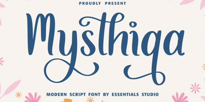 Introducing by Essentials Studio Mysthiqa Is a Modern Script Font Mysthiqa is perfect for product packaging, branding project, megazine, social media, wedding, or just used to express words above the background. Enjoy the font, feel free to comment or feedback, send me PM or email
 - Moodystone by Adante Creative,
$23.00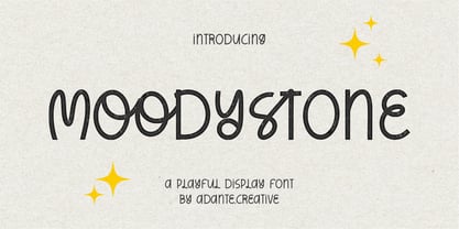 Moodystone A Playful Display Font Moodystone is perfect for product packaging, branding project, magazine, social media, wedding, or just used to express words above the background. Moodystone also multilingual support. Enjoy the font, feel free to comment or feedback, send me PM or email.
 - PT Script Earthquake by ParaType,
$25.00Based on informal handwriting. For use in advertising and display typography. Part of a Handwritten Set that includes 12 fonts carefully selected to represent various styles of writing. These fonts will expand your design capabilities by adding a personal touch to your computer typography. - Rhiccus by Patria Ari,
$19.00 Rhiccus is inspired from vintage and classic look. This font is suitable for any design like branding, print templates, fashion, print templates, & more. With more than 9 variants, this font works well to mix and match with each other to best fit the occasion.
 - Gordito by AdultHumanMale,
$10.00 Gordito is a graffiti style bubble font. A little chubby and hopefully a little cute. I wanted this to look fun and maybe like a vandal Smurf has started to ‘Tag’ the Smurf village. The font contains various Glyphs including the Euro symbol. Have Fun.
 - XKnightMares by Ingrimayne Type,
$6.00 There are three XKnightMares fonts. Each has rather formal chess fonts. The key layout is a bit complicated; see the key guide for detailed information on how to position pieces correctly. In addition to making chess boards, some of the pieces make interesting decorations.
 - PT Script Fog by ParaType,
$25.00Based on informal handwriting. For use in advertising and display typography. Part of a Handwritten Set that includes 12 fonts carefully selected to represent various styles of writing. These fonts will expand your design capabilities by adding a personal touch to your computer typography. - Signaday by Allouse Studio,
$16.00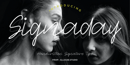 Proudly Present, Signaday a Modern Monoline Handwritten Font. Signaday is perfect for product packaging, branding project, megazine, social media, wedding, or just used to express words above the background. Enjoy the font, feel free to comment or feedback, send me PM or email. Thank You!
 - Zamon by Java Pep,
$17.00 Proudly present the newest modern serif font called Zamon. This font is elegant and perfect for the headline, title, logotype, fashion, quote text, publishing, etc. Zamon also comes in an oblique style so you can pair it to make contrast and to highlight purpose.
 - Scriptone by Attractype,
$19.00 Scriptone is a attractive handwritten font with standard alphabet, punctuation and multilanguage support including ligatures and alternates to maintain a natural and artistic impression. Scriptone font is included right and left swash, so that it can add a beautiful art image to your work.
 - Donsky by Lemonthe,
$14.00 Donsky is a dry brush font. Suitable for any projects such as logos, branding projects, product packaging, mugs, quotes, posters, shopping bags, t-shirts, book covers, labels, photography, watermark, and more. Use this gorgeous and unique handwritten font to bring any DIY project to life!
 - PT Script Stream by ParaType,
$25.00Based on informal handwriting. For use in advertising and display typography. Part of a Handwritten Set that includes 12 fonts carefully selected to represent various styles of writing. These fonts will expand your design capabilities by adding a personal touch to your computer typography. - Jacky Hand by Open Window,
$4.95 Jacky Hand is a waxy new font totally drawn by my 6 year old son while practicing his handwriting. This is a totally diverse font perfect for a wide range of uses from horror posters to childlike naiveté, or to inject some preppy school spirit.
 - PT Script Eclipse by ParaType,
$25.00Based on informal handwriting. For use in advertising and display typography. Part of a Handwritten Set that includes 12 fonts carefully selected to represent various styles of writing. These fonts will expand your design capabilities by adding a personal touch to your computer typography. - Beauty Switzerland Duo by Lettersiro,
$18.00 Beauty Switzerland is an elegant, delicate and distinct script font. It will add a luxury spark to any design project that you wish to create! This font is PUA encoded which means you can access all of the amazing glyphs and ligatures with ease!
 - Sallyna Cattalya by Essentials Studio,
$16.00 Sallyna Cattalya Is a A Monoline Signature Font Sallyna Cattalya is perfect for product packaging, branding project, megazine, social media, wedding, or just used to express words above the background. Enjoy the font, feel free to comment or feedback, send me PM or email.
 - Poeta Color by Tarallo Design,
$14.99 Poeta Color is an ornamental font for making patterns and decorating text. It contains floral and nature motifs. The symbols are versatile enough for simple decoration or thematic seasonal and holiday moods. Designers can use Poeta to make unique lines, fields, borders, or ornamentation within or around text. Try replacing a basic straight line with repeated symbols. Make a background to add visual interest to a design. Use the forms to decorate a chapter title or to mark the end of a magazine article. Replace a letter in a word with a symbol to create a memorable statement. This font began with sketches of patterns seen in ceramic tiles around Sicily. It is named Poeta because Sicily is an island rich in poetry traditions. Below is some helpful technical information. Using this font is simple. Install it and type. Symbols will appear instead of letters. Choose the precise symbols through a software’s glyph palette. Use the type/character menu controls to vary the spacing and density of patterns. All fonts are vector-based, OpenType, and fully scalable. Six of the fonts have different color or grey combinations. One of the fonts (solid) is a standard font. The font previews on this website will only display the font in black. See the slides to get an idea of the colors. Be assured that the colors are present in the files and will appear when loaded on the computer. The colors that are in each font: Primary: red, yellow, blue Secondary: orange, green, purple Tertiary: red-orange, yellow-orange, yellow-green, blue-green, blue-violet, red-violet Diverse: many different warm and cool colors Grey: three different greys from light to dark Gradient: a greyscale gradient Solid: standard font and can be colored normally Software that supports color SVG fonts: Photoshop, since 2017 llustrator, since 2018 InDesign, since 2019 QuarkXPress, since 2018 Pixelmator Sketch
 - TA Bankslab by Tural Alisoy,
$33.00 The building of the Northern Bank of St. Petersburg's Baku branch was built in 1903-1905. It was the first Art Nouveau-style building in Baku, Azerbaijan. Later the bank was transformed into the Russian-Asian Bank. After the oil boom in Baku in the 19th century, branches of many banks and new banks were opened in the city. The branch of the Northern Bank of St. Petersburg was among the first banks that was opened in Baku. N.Bayev was the architect of the building for the branch of the Northern Bank of St. Petersburg located at Gorchakovskaya 3 in 1903-1905. The building currently houses the Central Branch of the International Bank of Azerbaijan. My purpose in writing this is not to copy and paste the information from Wikipedia. What attracted me to the building was the word "Банкъ" (Bank) written in Cyrillic letters, which was also used in Azerbaijan during the Soviet era. The exact date of the writing is not known. Every time I pass by this building, I always thought of creating a font of this writing someday. I had taken a photo of the building and saved it on my phone. I did a lot of research on the font and asked a lot of people. However, some did not provide information at all and some said they did not have any information. I was interested in the history of this font but I do not know if this font really existed or it was created by the architect out of nowhere. If there was such a history of this font, I wanted to recreate this font and make it available. If not, I had to create it from scratch in the same way, using only existing letters on the building. Finally, I made up my mind and decided to develop the font with all letters I have got. It was difficult to create a font based on the word, Банкъ. Because in the appearance of the letters, the midline of the letters on A, H, K was very distinct, both in the form of inclination and in more precise degrees. The serif part of the letters, the height of the upper and lower sides, differed from each other. I don't know whether it was done this way when the building was constructed or it happened over time. I prepared and kept the initial version of the font. I took a break for a while. I started digging on the story of the font again. Meanwhile, I was researching and got inspired by similar fonts. Unfortunately, my research on the font's history did not yield any results. I decided to continue finishing up the font. After developing the demo, I created the font by keeping certain parts of these differences in the letters. In addition, I had to consider the development of letters in the Cyrillic, as well as the Latin alphabet, over the past period. Thus, I began to look at the appearance of slab-serif or serif fonts of that time. In general, as I gain more experience in developing fonts, I try to focus on the precision of the design for each font. In recent years, I specifically paid attention to this matter. YouTube channel and articles by Alexandra K.'s of ParaType, as well as, information and samples from TypeType and Fontfabric studios on the Cyrillic alphabet were quite useful. I gathered data regarding the Latin alphabet from various credible sources. I do not know if I could accomplish what I aimed at but I know one thing that I could develop the font. Maybe someday I'll have to revise this font. For now, I share it with you. I created the font in 10 styles. 7 weight from Thin to Extra Black, an Outline, Shadow, and Art Nouveau. The Art Nouveau style was inspired by the texture in the background used for the text on the building. The texture I applied to capital letters adds beauty to the font. If you like the font feel free to use it or simply let me know if your current alphabet doesn't support this font.
 - TA Bankslab Art Nouveau by Tural Alisoy,
$40.00 TA Bankslab graphic presentation at Behance The building of the Northern Bank of St. Petersburg's Baku branch was built in 1903-1905. It was the first Art Nouveau-style building in Baku, Azerbaijan. Later the bank was transformed into the Russian-Asian Bank. After the oil boom in Baku in the 19th century, branches of many banks and new banks were opened in the city. The branch of the Northern Bank of St. Petersburg was among the first banks that was opened in Baku. N.Bayev was the architect of the building for the branch of the Northern Bank of St. Petersburg located at Gorchakovskaya 3 in 1903-1905. The building currently houses the Central Branch of the International Bank of Azerbaijan. My purpose in writing this is not to copy and paste the information from Wikipedia. What attracted me to the building was the word "Банкъ" (Bank) written in Cyrillic letters, which was also used in Azerbaijan during the Soviet era. The exact date of the writing is not known. Every time I pass by this building, I always thought of creating a font of this writing someday. I had taken a photo of the building and saved it on my phone. I did a lot of research on the font and asked a lot of people. However, some did not provide information at all and some said they did not have any information. I was interested in the history of this font but I do not know if this font really existed or it was created by the architect out of nowhere. If there was such a history of this font, I wanted to recreate this font and make it available. If not, I had to create it from scratch in the same way, using only existing letters on the building. Finally, I made up my mind and decided to develop the font with all letters I have got. It was difficult to create a font based on the word, Банкъ. Because in the appearance of the letters, the midline of the letters on A, H, K was very distinct, both in the form of inclination and in more precise degrees. The serif part of the letters, the height of the upper and lower sides, differed from each other. I don't know whether it was done this way when the building was constructed or it happened over time. I prepared and kept the initial version of the font. I took a break for a while. I started digging on the story of the font again. Meanwhile, I was researching and got inspired by similar fonts. Unfortunately, my research on the font's history did not yield any results. I decided to continue finishing up the font. After developing the demo, I created the font by keeping certain parts of these differences in the letters. In addition, I had to consider the development of letters in the Cyrillic, as well as the Latin alphabet, over the past period. Thus, I began to look at the appearance of slab-serif or serif fonts of that time. In general, as I gain more experience in developing fonts, I try to focus on the precision of the design for each font. In recent years, I specifically paid attention to this matter. YouTube channel and articles by Alexandra K.'s of ParaType, as well as, information and samples from TypeType and Fontfabric studios on the Cyrillic alphabet were quite useful. I gathered data regarding the Latin alphabet from various credible sources. I do not know if I could accomplish what I aimed at but I know one thing that I could develop the font. Maybe someday I'll have to revise this font. For now, I share it with you. I created the font in 10 styles. 7 weight from Thin to Extra Black, an Outline, Shadow, and Art Nouveau. The Art Nouveau style was inspired by the texture in the background used for the text on the building. The texture I applied to capital letters adds beauty to the font. If you like the font feel free to use it or simply let me know if your current alphabet doesn't support this font.
 - Moonlight And Wine by The Gelato,
$12.00 The Moonlight & Wine Font is a Handwritten Monoline Font that is perfect for the Neon effect! It can be used as a Neon Handwritten Script Font, Monoline Script Font, Signature Script Font, Summer Handwriting Font, Neon Party Font, Neon Signboard Font, Neon Banner Font, Neon Font for Party Invitations, DJ Logo Font, Y2K Neon Font, Neon Sign Font, Neon Light Font, Neon Wedding Font Perfectly suitable for numerous use such as quotations, banners, logos, product packaging, titles, headers, Business cards, menu lists, and invitation cards! _________________________________ Language Support: Multilingual Support _________________________________ **The preview images are to showcase fonts only and are NOT included.** **The Font comes with a solid version. To add a NEON effect, You can use programs like Canva, Illustrator, Photoshop etc.** _________________________________ 🍦COMPATIBLE PROGRAMS (NOT LIMITED TO): Canva Pro, GoodNotes, Notability, Keynote, Pages, Numbers, Procreate, Photoshop, Illustrator, Cricut, Silhouette, InDesign, Microsoft Word, and more! ++ _________________________________
 - Black Witcher by Ditatype,
$29.00 Black Witcher is a spine-chilling display font that will cast a spell of fear on your designs. With its big letters and bold weight, this font demands attention and exudes an aura of dread. The horror theme is brought to life with meticulously crafted tree root details on each letter, adding a nightmarish and eerie touch to the font. Each letter in this font is bold and impactful, making a powerful statement in your designs. The large size of the letters enhances the font's haunting presence. The tree root details in Black Witcher give the font a sinister and otherworldly appearance, as if the letters are entangled with ancient and malevolent roots. These haunting details add a sense of mystery and foreboding, immersing the viewer into a world of dark and chilling horrors. For the best legibility you can use this font in the bigger text sizes. Enjoy the available features here. Features: Alternates Multilingual Supports PUA Encoded Numerals and Punctuations Black Witcher fits in headlines, logos, movie posters, flyers, invitations, branding materials, print media, editorial layouts, headers, and any horror-themed project. Find out more ways to use this font by taking a look at the font preview. Thanks for purchasing our fonts. Hopefully, you have a great time using our font. Feel free to contact us anytime for further information or when you have trouble with the font. Thanks a lot and happy designing.
 - Freaky Vibes by Blankids,
$20.00 Elevate your design with the distinctive charm of “Freaky Vibes Font”, a unique font that seamlessly blends rugged textures with contemporary style. This versatile font is meticulously crafted to add character and personality to your projects, making it an ideal choice for various creative applications. Key Features: Unique Texture: The font boasts a captivating rough texture that exudes authenticity and individuality, setting it apart from conventional typefaces. Versatility: “Freaky Vibes Font” is designed to meet diverse design needs. Whether you’re working on branding, logotypes, displays, posters, or even food-related projects, this font is your go-to choice for a touch of rustic elegance. Bold Presence: Make a statement with the bold and impactful presence of “Freaky Vibes Font.” Its strong and confident strokes command attention, ensuring your message is conveyed with style. Perfect for: Branding: Establish a memorable and distinctive brand identity with the unique flair of “Freaky Vibes Font.” Logotypes: Craft logos that stand out and leave a lasting impression with this font’s rugged yet refined aesthetic. Display and Poster Design: Infuse your designs with a bold and eye-catching appeal, perfect for grabbing attention in displays and posters. Food-related Projects: Capture the essence of artisanal and rustic culinary experiences with a font that complements the visual language of the food industry. Embrace the rustic charm and modern appeal of “Freaky Vibes Font” – a font that goes beyond letters and becomes a visual signature for your creative endeavors.
 - Axteroid by PizzaDude.dk,
$20.00Axteroid was made to look like something that was teleported from a computergame from way-back in the 80s. To make it more 21st century-like, I have spiced the font up with some OpenType alternate letters and ligatures! You will need to use OpenType supporting applications to use the autoligatures. - Mordings JNL by Jeff Levine,
$29.00Mordings JNL is an odd-lot collection of images. These assorted dingbats are leftover art that never quite made it to one particular dingbat font category, but together comprise an eclectic assortment. Topics range from weather to vintage-style restaurant menu icons to decorative embellishments to an old-fashioned telephone dial. - Reduza Infinity by Brave Lion Fonts,
$14.00 Reduza Infinity is a modern and futuristic font, created for you to make fancy designs. It is very useful to create movie posters or sci fi book covers. Reduza supports many languages and looks forward to be used by you.
 - Analfabeto by Type-Ø-Tones,
$40.00 The Brazilian illustrator, Flavio Morais, devised this amusing display alphabet to have his own font for his former website. We helped to digitalize it and encouraged him to complete it with a series of “chiringuito” drawings. More about his work here.
 - Typewrither by PizzaDude.dk,
$20.00Typewrither is not your every-day-typewriter-font. It comes with almost 200 different ligatures to help avoiding repeating letters - this includes ligatures for both lowercase, uppercase and numbers. You will need to use OpenType supporting applications to use the autoligatures. - Sassoon Book by Sassoon-Williams,
$48.00 Semi-Serif Roman and Italic for typefaces for setting legible children’s reading books. A gentle introduction for young readers to seriffed letterforms they will encounter. Free to download resources: How to access Stylistic Sets of alternative letters in these fonts
 - Dear Sunshine by Almarkha Type,
$29.00 Dear Sunshine is sweet and playful, but also elegant. This versatile script font has a wide range of applications ranging from greeting cards to kids’ crafts, and is guaranteed to add a sweet touch to your next design. Thank You.
 - Skratzy by PizzaDude.dk,
$20.00I had a cramp in my hand doing this font! Contains authentic scribbling! :) Comes with more than 80 different ligatures, to make it look more like real scribbling! You will need to use OpenType supporting applications to use the autoligatures. - Rutter by Letterara,
$14.00 Rutter is a handwritten brush font bursting with energy. It features extra attention to quick strokes and sharp details. To stay up to date for my latest job, follow me and let’s be friends because there will be many promos.
 - Unstable by A New Machine,
$25.00 This almost-all-caps display font features a variable baseline to give it an unstable look. Also, the upper and lower cases differ slightly and can be used to add some alternates in words with letters next to each other.
 - Malamondo by Fenotype,
$19.95 Malamondo is a versatile and effective all caps display font. Each version has 200 interlock ligatures that will help you to create custom looking designs. To access the ligatures you only need to write in CAPS in any Opentype supporting program.
 - Banquet by Solotype,
$19.95In our early days of type hunting, we considered this to be the prize of our collection. Fonts of this late Victorian period seem to have less ruffles and flourishes than the earlier ones, which makes them easier to read. - Frazzle by Paul O'Connell,
$9.95 This roughly hand drawn font was created to give that loose scribbled effect look and to imitate a typically hand written style. Designed and produced by Paul O'Connell of POCT, it is a typeface purely for fun to experiment with.
 - April Rain by Scrowleyfonts,
$16.00 April rain is a delicate, elegant font with teardrop line endings. It is designed to be interesting and a little unusual while remaining robust enough to be used in a variety of contexts from titling and lists to short paragraphs.
 - Relaxa by ahweproject,
$10.00 Relaxa is a fun, retro-style script display font that is ready to take your designs to the next level. Add it to your vintage-inspired posters, stickers, apparel, or social media posts and you will definitely impress your audience.
 - Sticky Melody by Nathatype,
$29.00 Sticky Melody is a charming display font that combines cuteness with a bold and prominent style. With its thick weight, rounded shapes, and distinct contrast, this typeface is designed to capture attention and infuse your designs with a playful and lively energy. The thick weight of Sticky Melody gives each letter a robust and substantial presence, making it stand out effortlessly. The rounded shapes add a touch of softness and friendliness, creating an endearing and approachable feel. The font's unique feature lies in its prominent contrast, which accentuates the curves and contours of each character, elevating the overall visual impact. Let the thick weight, rounded shapes, and prominent contrast of this font bring your creative visions to life, ensuring that your message stands out in the most charming and captivating way possible. You can use it in big text sizes to be greatly legible and enjoy the available features here. Features: Stylistic Sets Ligatures Multilingual Supports PUA Encoded Numerals and Punctuations Sticky Melody fits in children's books, toy packaging, posters, headlines, logos, social media designs, and any design project that require a touch of delightful playfulness. Find out more ways to use this font by taking a look at the font preview. Thanks for purchasing our fonts. Hopefully, you have a great time using our font. Feel free to contact us anytime for further information or when you have trouble with the font. Thanks a lot and happy designing.
 - Dust Mites - Unknown license

- Bloktype - Unknown license


