6,669 search results
(0.029 seconds)
- New Daily by URW Type Foundry,
$39.99 Marit Otto about New Daily: This typeface design has a modern but yet classic appearance. That is why she listens to the name New Daily. I took some elements from the Art Nouveau and Art Deco (type) styles. And modernized it by cultivating the beautiful curved features of both styles and playing with the stylish fluid lines and open structures. By adding a bit of the no-nonsense office look of a typeface like Nimbus Sans a new but familiar look occurs. This typeface is very readable and useful for many purposes. It has a playful distinguished character.
 - Honest Sky by Nathatype,
$29.00 Show your lovely, unique points of view with this font script. Honest Sky is a script font made from handwriting to show modern, elegant designs to any of your designs. The letters are created in interconnected cursive styles with a lot of curved wipes. The lines’ proportions and thickness are consistent enough. Use Honest Sky for big-sized texts for a legibility reason. Enjoy the available features in this font. Features: Stylistic Sets Ligatures Multilingual Supports PUA Encoded Numerals and Punctuations Honest Sky fits for various design projects, such as posters, banners, logos, magazine covers, quotes, headings, printed products, merchandise, social media, etc. Find out more ways to use this font by taking a look at the font preview. Thanks for purchasing our fonts. Hopefully, you have a great experience using our font. Feel free to contact us for further information when you have a problem using the font. Thank you. Happy designing.
 - Rapuntaz by IbraCreative,
$17.00 Rapuntaz – A Handwritten Signature Script Font Rapuntaz is an exquisite handwritten signature script font that embodies elegance and sophistication. With its graceful strokes and fluid curves, each letter exudes a sense of personalized artistry, mimicking the nuanced movements of a pen gliding effortlessly across paper. The font captures the essence of a carefully crafted signature, adding a touch of refinement to any design or document. Rapuntaz seamlessly blends cursive elements with a contemporary flair, resulting in a timeless and versatile typeface that conveys both individuality and class. Whether used for formal documents, invitations, or branding, Rapuntaz lends an air of authenticity and style to every project it graces. Rapuntaz is perfect for branding projects, logo, wedding designs, social media posts, advertisements, product packaging, product designs, label, photography, watermark, invitation, stationery, game, fashion and any projects. Fonts include multilingual support for; Afrikaans, Albanian, Czech, Danish, Dutch, English, Estonian, Finnish, French, German, Hungarian, Italian, Latvian, Lithuanian, Norwegian, Polish, Portuguese, Slovak, Slovenian, Spanish, Swedish.
 - Clarence by Protimient,
$35.00Clarence is a modern, original typeface that has been designed to have a warm and slightly antiquated feel. It is slightly too idiosyncratic for great lengths of continuous text but does work very well at both small and display sizes. The serif structure takes some inspiration from architectural buttresses (a structure built against a wall to provide support or reinforcement). The serifs only protrude a small way from the body of the letter, which serves to ground the letter and, because the serifs bracket (the curve) joins the vertical at a relatively great distance from the tip of the serif, it remains subtle. The italic variant draws on the roman but has a more pronounced and curvier serif structure, analogous to the cursive element expected of an italic. This serif structure is present throughout the italic, even extending into the uppercase, making it more of a true italic than the commonplace sloped roman. - GrandPrix - Unknown license

- Ideal Gothic by Storm Type Foundry,
$44.00At the turn of the 20th century monolinear alphabets were often despised for their dullness. Typographers, therefore, took great pains to breathe some kind of individuality into the monotonous sans-serif scheme. They started with subtle differentiation in the thickness of vertical and horizontal strokes and finished by improving details. By this they arrived at a more decorative appearance of the type face which thus became more regardful of the eye of the bourgeoisie. Ideal Gothic is no exception. It is characterized by a correct stiffness which will improve the morals of every idea printed by this type face. The awkward curves of the italics are a little suggestive of openwork iron products or the bent iron of the decorative little railings in a Prague park. The so-called "hidden" and, furthermore, curved serifs complete the inconspicuous "charm" of this type face. All its above-mentioned features, however, suddenly turn into advantages when we need to design a magazine, a brochure or an annual report, in short whenever illustrations dominate. It is not by accident that the basic design of "Ideal Gothic" has such a light tonal value - it competes neither with fine pencil sketches, nor with sentimental landscapes. It is very suitable for business cards and corporate identity graphics. - Artusi by Zetafonts,
$39.00 Pellegrino Artusi was a celebrated Italian food writer, who is credited with the creation of one of the most influential cookbooks in the history of Italian cuisine. Taking inspiration from his legacy, Francesco Canovaro decided to work on a typographic homage to the delicacy and finesse of Italian traditional cuisine. Aptly named Artusi, the typeface is an enchanting combination of traditional Italian style, contemporary refinement and a playful touch of innovation. It is a transitional serif typeface with both text and display versions, developed on a wide range of seven weights and including a huge range of alternates, OpenType features and ligatures. Each weight of Artusi works like a different course in a balanced meal. Lighter weights are our starters, with their high contrast between thicks and thins, delicate curves, balanced proportions and subtle spiky serifs. The main course are naturally the regular and bold weights, where traditional Italian old style is enriched with a peppery kick of modern details. For dessert, the heavy weights offer luscious curves, opulent calligraphic swashes and eye-catching details, suitable for packaging and logos. When it comes to typography, let Pellegrino Artusi’s legacy inspire you. From packaging to web pages, Artusi typeface will bring a feeling of tradition, craft and quality to any project. Because, as Pellegrino would say, “To make a great impression, you have to choose the finest ingredients”... Buon Appetito!
 - Viareggio by Hanoded,
$15.00 Viareggio is a city in Northern Tuscany, Italy. Viareggio is famous for its carnival and its mascot, the clown Burlamacco (designed by Uberto Bonetti in 1930). Viareggio font was based on the hand lettering found on a 1931 poster, advertising the carnival. Viareggio font comes with extensive language support.
 - So Unusual JNL by Jeff Levine,
$29.00 The hand lettered credits for the 1942 film comedy “I Married a Witch” were so unusual (with their mix of rounded and flat terminals and varying character shapes) that the only logical name for a digital revival would be So Unusual JNL… which is available in both regular and oblique versions.
 - Telegraph by Solotype,
$19.95Charles Beeler Jr. designed this in 1895 for Mackellar, Smiths and Jordan, which was part of the American Type Founders combine. The font had a short life because five years later ATF began an "off with the old, on with the new" program, and this font was an early victim. - Wave by Jennifer Delaney Designs,
$23.00 WAVE is characterized by curved lines and intricate details. Each character was individually made in Illustrator and Type Tool using my original illustrations. Wave is a decorative font best used for titles or short bursts of texts in large point settings. The typeface is based on the uppercase letterforms, but I have also created lowercase letters, numbers, and glyphs. The motion lines used in the making of Wave mirror an art deco-style. Inspired by an illustration of a large wave, I was fascinated that by using only lines and solid colors we as artists can depict the translucency and ever-changing movement of waves. I began by delicately sketching out all of the letters using graph paper and micron pens. My work always begins with traditional media. I'm an illustrator, freelance artist, and graphic designer from Chicago, IL. I studied at Texas Christian University, and received my Bachelors of Arts in Graphic Design from Columbia College Chicago. Visit www.jennyddesigns.com for more! :)
 - Quars by Letterjuice,
$66.00 Quars is a text and display typeface family designed to work on magazines. However, it is also suitable for books and other editorial material. It has a strong personality with elegant, sharp and contemporary features. This typeface comes from several subtle influences, from the contrast of the Scotch Romans to the sharpness of contemporary Dutch designers. Quars is a crystal clear and neat typeface full of small details, its structure is bursting with curves and accurate features which gives it its firm personality. Its italic experiments with the boundaries of italics themselves; with just 1 degree of slant Quars Italic accomplishes its purpose of highlighting pieces of text within its Roman. This carefully thought out inclination protects the uppercase from the usual distortion which Italic caps suffer. It offers a generous glyph set with many ligatures specially crafted for titling and ornaments based on anonymous metal types found in the drawers of an old printing workshop in a coast town near Barcelona.
 - MMC Insignia by MMC-TypEngine,
$30.00 MMC Insignia, is an Iconic & Emblematic Neogothic Geometric Capitals Display… Assembled by Trivial Squares and Diagonals Symbols Pattern from a puzzled grid Aftermath!! Includes Stylistic Alternates!! +Extra Monospaced Figures. In 22 styles, with Obliques, both for single display and layer Typesetting, plus OpenType Features & Bonus Blocks Fonts! MMC Insignia is a Small Caps Typeface, which default lowercases character set is included in the Pro family, its cursive version, apart from it, has also Exclusive Stylistic Alternates… Its atmosphere stands by on both Corporative to Decorative, Modern, Fashion, Federalist, Bohemian, Romantic, Ludic, Treasured Look, Etc. This Display font-family is the result of the repeated applications of this unique infamous Icon or Symbol, of two counterpointed triangles, implicit as hourglasses, in order to compose an innovative and unprecedented typographic pattern and modulation concept through the letterforms, in an extremely Geometric style. The Graphic Sign used throughout this type, is a remarkable trend used already in Logos of different businesses, whose most famous case refers to a famous International Bank, which doesn’t need to be mentioned, as it is instantly associated! This characteristic innovation was the main motivation while creating this type. Usage Suggestions: Type Fancy Titling texts, Display Remarkable Logos, Branding Projects, Labels, Emblems, Fashion Patterns, or in everything Noble and designed for Excellence as a type of Insignia, or distinguished marks and attributes of Royalty and Power!! That’s also forwardly, the reason why it was named MMC Insignia… TIPS: 1-Combine styles into innumerous possibilities of Chromatic Typesetting, by ‘central pasting’ layers… You may dislocate layers for improvisations! 2-USE BLOCK “FREE-STYLES” 1 & 2 also to add default 3D! Change 3D directions by switching Block 1 to Block 2, that way you can Zig-Zag words and lines. *Also shift the block layer up to bottom limit, it makes the 3D direction turn upside down. Greetings! André, MMC-TypEngine.
 - Luxus Brut Sparkling by phospho,
$25.00 Luxus Brut Sparkling developed from sketches for a bolder version of Luxus Brut that I made for a poster design. Interventions like slightly tightening the (still generous) spacing and amplifying the contrast between thick and thin strokes ended in a complete rework of the original font. All the shapes have been redrawn in respect of their distinctive origin in mid 1900’s signage lettering. It has now even more timeless elegance!
 - WestWarp by EVCco,
$20.00 Thick horizontals reminiscent of certain Egyptian or western-themed display faces warp into stretched-out glyphs and strange elliptical forms in this haphazard, page-filling font. Sure to evoke images of saturday morning cartoons, zany retro advertisements, and various other expressions of mid-20th century whimsy . Comes packaged in both TrueType and OpenType formats with standard complement of alpha-numeric glyphs, punctuation marks, mathematical symbols, and European diacritics.
 - Multihalf by Luxfont,
$21.00 Introducing Neotype. Abstract font family with colored halves. An interesting and unusual fonts in the glitch style. Combination of clear shapes with soft gradients. Geometric color stylization of letters. Features: - Uppercase and lowercase the same size but different colors. - Transparency in letters. - Kerning. IMPORTANT: - Check the glyphs in the font before buying! - SVG fonts contain raster letters. - Check it www.colorfonts.wtf - Try a FREE DEMO version before buying. ld.luxfont@gmail.com
 - Joost by Type-Ø-Tones,
$60.00 This is a relaunch version of Joost, a milestone of the Type-Ø-Tones catalogue. This revival of Joost Schmidt’s typeface now has a capital set, a new weight and some OpenType features. Not to mention alternate glyphs for M, N, Ñ, and W characters. The inspiration came from the 'bauhaus dessau im gewerbemuseum' basel exhibition poster, designed in 1929 by Franz Ehrlich after a sketch by Joost Schmidt.
 - WILD2 Keetoowah by Fontry West,
$10.00 Keetoowah evolved from a just a few letters in a sketch for a sorority t-shirt design. They loved it and kept asking for more of the same. The only solution was to make a font. These characters were made to be broken up, two toned, rotated, merged and jammed together. But, Keetoowah has a serious side. It has a great Southwestern flavor like smokey BBQ and patterned blankets.
 - Lowbridge Hand by Blake Cotterill,
$- I designed Lowbridge Hand for product designers, fashion designers, architects, garden designers and anyone who wants to annotate their sketches and drawings. This is something I wish I had when I was a design student. It has different weights allow you to better match your pen size used on your drawings or to emphasise text. It is an all caps font. I hope you enjoy using Lowbridge Hand for your drawings.
 - Uplink by Sudtipos,
$59.00 Uplink is decorative upright lettering with heavy calligraphic influences and clear friendly forms. Alternate forms with artificial "tail" connections, swashing their way from one letter across the vertical stroke of the next, add an unusual yet distinctly human detail to the forms that shape the words. Uplink's reserved humor can be a little tolerant of mechanical abuses like shearing or stretching, which makes it ideal for food product packaging design.
 - Mentah 1 by Sulthan Studio,
$10.00 This sketch font Sans serif was born from the lines in the font that we created for the (Rajin) font and we redeveloped it into a different style with a more minimalist and more powerful setting and looks stunning for any smooth and bold writing that can be used anywhere in your work This font has complete uppercase and lowercase letters with 4 thicknesses, numbers, punctuation, and also language support
 - Annexia by Koshemare Studio,
$10.00 Annexia is a serif font with a several styles from Light to Bold. Serifs and stretched letters connect two times the past and the future, creating a perfect present. This font doesn't have a specific mood. Depending on the tasks, it can show itself in different ways. The font is perfect for both text, headlines, and branding. The font was designed by Pavel Bruev and released by Koshemare studio in 2021
 - Azest by Pesotsky Victor,
$10.00 "AZEST" FONT — NEW, GROTESQUE This is a simple font, with a small number of accidental elements. The proportions are slightly stretched in width. One regular font. It can be put in interfaces or in communication materials, it will not be too active, but it will not slip into neutrality. Supports Cyrillic and some other scripts. Lowercase and uppercase characters, numbering, punctuation and diacritics, in general: all the necessary signs.
 - Jokerman by ITC,
$40.99Jokerman is the work of British designer Andrew Smith. It is a wild and energetic font that is effective when set in all caps, or as mixture of caps and lowercase. Included are a number of alternate letters and funky forms. Jokerman is a fanciful display font that exudes excitement and vitality. - Good Night JNL by Jeff Levine,
$29.00 The beautiful hand lettering on the sheet music cover for Will R. Anderson's "Good Night Dear" (circa 1908) features quaint, semi-calligraphic lettering in the Art Nouveau Style. The song itself was popularized by Billie Burke [best remembered as the Good Witch in “The Wizard of Oz”] in the musical comedy "Love Watches".
 - Gill Facia by Monotype,
$29.99 Based on lettering from Eric Gill for the British bookseller WH Smith, Colins Banks made the Gill Facia family for Monotype in 1996. This lettering from Eric Gill was one of the first alphabets that was used for corporate branding. Gill Facia is an elegant signage face for advertisements and for displays.
 - FS Pimlico by Fontsmith,
$80.00 Born in the 70s Personal influences are unavoidable in type design and usually find their way through into finished fonts. At Fontsmith, one period in particular provides inspiration, according to FS Pimlico designer, Fernando Mello. “Jason and Phil have always known that I’m very into the visual language of the 70s. I know that Jason shares my love of the 70s and Phil will sometimes admit to being a fan, too. I think that’s the reason they were both so supportive in the development of this font. “And, of course, we all share an interest in good-humoured and intelligent design. We like to think it’s a Fontsmith characteristic.” Back from black FS Pimlico started in an unusual place: with a tubby, penguin-like lowercase “a” that Fernando Mello had been sketching. From “a” grew the rest of the alphabet – a bubbly, fat, friendly family with a brush-written quality that became FS Pimlico Black. The black weight certainly isn’t the normal starting point for creating a regular and bold weight, but Fernando pressed on, driven by a glut of influences: brush-writing; Letraset and early digital systems catalogues; the type of Herb Lubalin and Tony di Spigna; 70s clothes and vinyl; and 70s revival disco nights in London’s Pimlico and Vauxhall. Natural or flourished Not often do fonts come along that seem to span the ages. FS Pimlico is at home in an office environment providing a fresh clear identity in communications or providing text that’s clear and easy to read. But it likes to party, too, 70s style. With the OpenType features switched on, a designer can totally change the look of their work, and create point-of-sale, headlines and titles that stand out and get noticed.
 - FS Pimlico Variable by Fontsmith,
$249.99Born in the 70s Personal influences are unavoidable in type design and usually find their way through into finished fonts. At Fontsmith, one period in particular provides inspiration, according to FS Pimlico designer, Fernando Mello. “Jason and Phil have always known that I’m very into the visual language of the 70s. I know that Jason shares my love of the 70s and Phil will sometimes admit to being a fan, too. I think that’s the reason they were both so supportive in the development of this font. “And, of course, we all share an interest in good-humoured and intelligent design. We like to think it’s a Fontsmith characteristic.” Back from black FS Pimlico started in an unusual place: with a tubby, penguin-like lowercase “a” that Fernando Mello had been sketching. From “a” grew the rest of the alphabet – a bubbly, fat, friendly family with a brush-written quality that became FS Pimlico Black. The black weight certainly isn’t the normal starting point for creating a regular and bold weight, but Fernando pressed on, driven by a glut of influences: brush-writing; Letraset and early digital systems catalogues; the type of Herb Lubalin and Tony di Spigna; 70s clothes and vinyl; and 70s revival disco nights in London’s Pimlico and Vauxhall. Natural or flourished Not often do fonts come along that seem to span the ages. FS Pimlico is at home in an office environment providing a fresh clear identity in communications or providing text that’s clear and easy to read. But it likes to party, too, 70s style. With the OpenType features switched on, a designer can totally change the look of their work, and create point-of-sale, headlines and titles that stand out and get noticed. - Alpha Bravo by Wiescher Design,
$39.50 AlphaBravo was born on a napkin. I was just doodling, playing around with letterforms when the ballpoint glided a little bit too far and suddenly I had my first letter with the dash sticking out on the left of the e’s horizontal line. I quickly checked on how many letters I could let a line stick out! Then I wrote a couple of words that way and letters joined in the most unusual places, creating new closed forms. I gave the font a try and quickly discovered, that I had stumbled onto an interesting new typeface. I didn't know how to call it, so I simply used the first two letters of the alphabet, Alpha and Bravo. Looking forward to Charlie and Delta, your very curious, Gert Wiescher.
 - Sempione by CAST,
$45.00 Sempione is a spanking new sanserif family suitable for publishing and advertising that looks great in small and large sizes. Its two main styles, Grotesk and Modern, are inspired by the early grots and 20th-century sanserifs. They come in seven weights with the matching italics, Grotesk Cursive and Modern Slanted. The considerable variety of letterforms and styles, along with some peculiar stylistic sets, will be appreciated by designers looking for more freedom of choice.
 - Luna Love by Attype Studio,
$10.00 Introducing Luna love - Inspired by Star on the space & cute display, Luna love is handwritten font cursive that perfect for children product. come with star layered font, make combination of this font to create amazing design! Two style Font: regular & Display Luna love is perfect for children product, branding, logo, invitation, stationery, wedding, product packaging, merchandise, monogram, blog design, game titles, cute style design, Book/Cover Title and more. Features : - Multilingual Support - stylistic set
 - Abigail Script by Roland Hüse Design,
$15.00 Abigail Script is a handwritten, monoline cursive font. All the uppercase letters has stylistic alternates and some lowercase letters as well, ligatures and positional forms. Also have a few ornaments in place of numbers 1-9 best fit under words up to 5-6 characters long. See the gallery for preview. It contains Eastern and Western European accented characters. I hope you like this font, good luck with your project and let the creativity flow!
 - Barito by Authentype,
$14.00 The Barito Serif 9 font is full of cursive typefaces with sharp, bold lines that create an optical illusion that appears to intimidate the reader. Barito serif font comes with many languages like Cyrillic • Greek • Latin and is perfect for designing books, magazines, titles for online advertising media websites and much more. The barito serif font not only comes with 9 weights, but is also accompanied by an italic for complement and confirmation.
 - Australis Pro Swash by Latinotype,
$29.00 Australis Swash is a new variant that adds to the family of Australis Pro and it brings a touch of whimsy and mannerism to the shape of the cursive letters. Its purpose is purely playful because Australis Swash has some useful Opentype features as standard ligatures, discretionary ligatures and contextual alternates to use them in headlines or as a base for brands and lettering in general. Designed by Francisco Gálvez Pizarro in 2013.
 - TT Neoris by TypeType,
$39.00 The future of Neo-Grotesques is now! Introducing TT Neoris—a new ambitious font from TypeType. TT Neoris is an ideal sans with: 21 font styles: 10 upright, 10 italics, and 1 variable font; 1832 characters; 41 OpenType features; 14 stylistic sets with Soft character and Upright cursive in Latin and Cyrillic character sets; 230+ languages support; Special condensed italics designed to create a 'highlighting' effect when used in specific text segments.
 - Younglines by Maulana Creative,
$12.00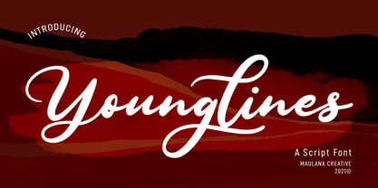 Younglines is a cursive script font. With contrast bold stroke, slanted and fun character with a bit of ligatures. To give you an extra creative work. Younglines font support multilingual more than 100+ language. This font is good for logo design, Social media, Movie Titles, Books Titles, a short text even a long text letter and good for your secondary text font with sans or serif. Make a stunning work with Younglines font. Cheers, MaulanaCreative
 - Lieberates by Maulana Creative,
$14.00 Lieberates is a cursive script font. With high contrast stroke, fun character with a bit of ligatures. To give you an extra creative work. Lieberates font support multilingual more than 100+ language. This font is good for logo design, Social media, Movie Titles, Books Titles, a short text even a long text letter and good for your secondary text font with sans or serif. Make a stunning work with Lieberates font. Cheers, MaulanaCreative
 - ITC Bookman by ITC,
$40.99 ITC Bookman font was designed by Edward Benguiat, whose goal was to design a typeface that had a clear resemblance to previous Bookman faces but was different and more versatile. This typeface retains all the traits of the original and adds a large x-height and moderate stroke contrast for optimal legibility. ITC Bookman font also has italics which are true cursive forms, as opposed to oblique roman characters. Featured in: Best Fonts for Tattoos
 - Postman by Juan I. Siwak,
$20.00 Postman is a typeface inspired by old documents, banknotes and leading product brands. It has cursive and elegant capital letters and its lowercase letters are actually small caps of geometric shapes as if they were made of metal and nailed with bolts. It is ideal for classic products that consider nobility and tradition among their virtues. It evokes classic products that lasted over time. Includes OpenType features, like ligatures, alternates, and more.
 - Cosbycorwin by Maulana Creative,
$11.00 "Cosbycorwin" is a slanted cursive script font. With light contrast stroke, fun character with a bit of ligatures. To give you an extra creative work. "Cosbycorwin" font support multilingual more than 100+ language. This font is good for logo design, Social media, Movie Titles, Books Titles, a short text even a long text letter and good for your secondary text font with sans or serif. Make a stunning work with "Cosbycorwin" font. Cheers, MaulanaCreative
