6,670 search results
(0.034 seconds)
- Sunsive by Yukita Creative,
$14.00 Sunsive Sans Serif Font family is the perfect choice for clean, minimalist, and professional designs. With a variety of weights and styles, it's suitable for headlines, body, web, print, and modern branding. This font provides a bold and elegant look to your graphic projects. Sunsive Sans Serif Font family provides a variety of variations from Regular to Black, allowing you to customize the appearance of the text according to your needs. From simple Regular to powerful Black, each weight provides flexibility in designing text with a professional, modern touch.
 - Cuisine by Sudtipos,
$45.00 Cuisine originated from a how-to lettering book from the 1950s. It suggests the script style found on food and beverage labels in the early 20th century. This creamy font does for food advertising what Bodoni does for haute couture. Its simmering, hand-scribed charm captures the complexity of wine and the robust energy of coffee. It shines on luxe food packaging or high-end menus
 - Curser by Morganismi,
$12.00 Curser is an oldish-looking typewriter font, decayed and scary. The special characters give an expression that they have been made using the common keys and moving the paper. Curser supports West and Central European languages as well as Baltic, Turkish and Romanian.
 - Carnival by House Industries,
$33.00 Unlike the modest fonts in your menu content with discreetly imparting information, Carnival is conspicuous by design. Deliberately engineered to attract eyeballs, the typeface’s unmistakable silhouette produces a dramatic visual texture that stands out in print, on screen, or in any environment where your message demands to be noticed. The steady yet vibrant rhythm created by its letterforms also makes Carnival ideal for fashioning alphabet patterns and graphic devices. Flaunting a lean slender body anchored by stout stroke endings, Carnival turns conventional typographic thinking on its head by inverting the relative thickness of its stems and serifs. This reverse-contrast approach stretches all the way back to the roots of modern advertising, when similar types became the favorite for posters, packaging, and loads of consumer products during the 1800s. The striking style prevailed well into the next century, as Harold Horman, co-founder of New York City-based Photo-Lettering. Inc., modernized a version for the company’s popular film-typesetting service in the early 1940s. Digitized and expanded by Dan Reynolds in 2013, Carnival had previously been used exclusively for House Industries projects. Now you can get in on the action, and use this stunning slice of type history anytime you want your work to turn heads. SUGGESTED USES Carnival’s unique character commands attention, making it the perfect voice for promotional pieces, editorial design, labels, packaging, posters, and any other application that needs to strike the right tone. Like all good subversives, House Industries hides in plain sight while amplifying the look, feel and style of the world’s most interesting brands, products and people. Based in Delaware, visually influencing the world.
 - Cursivo Saxonio by Intellecta Design,
$21.90 Cursivo Saxonio is a typeface inspired in the famous book The Case of Charles Dexter Ward, by H P Lovecraft. It shows better than I get with my studies the authentic "Insularis" or "Cursivo Saxonio" handlettering of the VIII and XI centuries used by some people in Britain. The text on the accompanying poster reads: “Corwinus necandus est. Cadaver aq(ua) forti dissolvendum, nec aliq(ui)d retinendum. Tace ut potes”
 - Wilke Kursiv by Canada Type,
$24.95 Martin Wilke’s underrated yet influential deco classic from 1932 has both feet firmly planted in the high traditions of Western European calligraphy while carefully and subtly introducing some traits from the sweeping geometric/minimalist vision of the time. In a way, it was one of the representatives of the European anti-type typefaces of that era, when print media was searching for the elusive aesthetic balance between humanism and geometry. This typeface enjoyed some popularity in Germany for a few years, and went on to influence further type designs in Holland and Italy. After the second World War, the black hole that swallowed a big chunk of Europe’s print culture, new influences and technologies overtook the scene, and selective historical emphasis ensued, highlighting some of the era’s designs and overlooking others. Further selective picking in the digital era all but buried Wilke’s body of work - unfairly so, because he was just as important in German type history as Bernhard, Post, Schneidler, Tiemann and Trump. The original metal Wilke Kursiv came in one weight. This digital version goes a long way in expanding on that original offering. Now Wilke’s masterpiece comes in three weights, and with a full Pro treatment including swash caps, small capitals, five types of figures, automatic fractions, and plenty of other OpenType niceties. Each of the Wilke Kursiv Pro fonts comes with over 700 characters, and contains support for most Latin-based languages. Also available are three non-Pro fonts in each weight.
 - Tasci Kursiv by Abdullah Tasci,
$30.00Tasci Kursiv is a typeface which is transformed from the designer’s own calligraphy. - Cabarga Cursiva by ITC,
$29.00Cabarga Cursiva is the work of the father and son team of Demetrio E. Cabarga and Leslie Cabarga, both New York designers. The details of the sharp strokes almost give the impression of a knife blade, whether straight or curved like a scimitar. The capitals should be used only as initials and are complemented by a robust lower case alphabet as well as alternate forms and ligatures. - Behrens Kursiv by RMU,
$30.00 Behrens Kursiv - the great add-on to Behrensschrift.
 - Cursive Handwriting Tryout - Unknown license

- Fiasco Cursive Font by BeckMcCormick,
$14.00 Introducing Fiasco Script, a bouncy modern calligraphy font. Fiasco is a clean cursive font with a feminine aesthetic, making it a perfect choice for designing feminine logos & branding, cute paper products like wedding invitation suites, or for displaying headlines on your website. Fiasco can also be used for other print design like magazines and flyers or printed marketing materials. This font can also be used for digital marketing materials and social media items! Fiasco Script’s clean edge makes it a great candidate for craft projects on your Cricut or Silhouette machine; it cuts beautifully! Fiasco Script includes: - full upper + lowercase characters - numbers + punctuation - 2 ligatures — ox, tt - PUA-encoding Extensive Language Support: Western European, Central European, South Eastern European, South American, Oceanian, Vietnamese, Esperanto Fiasco Script can be used with graphic design programs such as Illustrator or Photoshop, word processing programs like Pages or Word, Design Space for Cricut, Silhouette, Procreate, Canva Pro, Glowforge, GoodNotes, & more. This font is an installable for desktop & laptop machines, as well as iPads or iPhones. See below for links to help with installation.
 - LD Cursive Flourish by Illustration Ink,
$3.00LD Cursive Flourish is the ultimate in casual elegance. This handwritten script comes complete with fancy flowing flourishes. Intricate and so unique! See LD Cursive for this font without flourishes. - Maple Lane Cursive by Okaycat,
$29.95 Okaycat presents "Maple Lane Cursive". You can mix and match with Forest Cursive and Maple Lane from Okaycat. Maple Lane Cursive is a wonderful connected letter cursive script arriving with fancy & upright styles. Maple Lane Cursive features beautiful style & luxurious curves. Maple Lane Cursive is extended, containing West European diacritics & ligatures, making it suitable for multilingual environments & publications.
 - OL Hebrew Cursive by Dennis Ortiz-Lopez,
$30.00 This font contains every variant found in the Hebrew Bible such as the “mutilated” Waw in Numbers 25: verse 12, the small Heh in Genesis 2: verse 4 and the Nun Inversum before Numbers 10: verse 35 and after verse 36 and elsewhere as well as oversized consonants and various double-wide consonants used in inscriptions.
 - Cursive Signa Script by Pedro Teixeira,
$8.00 One of the rare, huge script, true cursive and signature family. It has 30 styles, that range between weight and slant, and with alternates. It can be use in a lot of projects, like logos, end of a statement, pairing with a beautiful sans serif like Aleante, in a title, invites and so on. Check how it work: https://youtu.be/HinnXZo5tzw
 - Cal Cursive Modern by Posterizer KG,
$16.00 Calligrapher Cursive Modern, is one of the calligraphic group of fonts called “21 alphabets for Calligraphers“. All graphemes are taken from calligraphic pages written on Cursive Modern calligraphic style. This font is ideal for calligraphic sketches or for imitation of ancient manuscripts. Cal Cursive Modern contains all the Latin and Cyrillic glyphs.
 - Rolling Ball Cursive by Gerald Gallo,
$20.00 Rolling Ball Cursive simulates a handwritten style executed with one of the many types of rolling ball pens now available.
 - Cal Humanistic Cursive by Posterizer KG,
$16.00 Calligrapher Humanistic Cursive is one of the calligraphic group of fonts called “21 alphabets for Calligraphers“. All graphemes are taken from calligraphic pages written on traditional cursive calligraphic stile. This font is ideal for calligraphic sketches or for imitation of ancient manuscripts. It contains all the Latin and specially-created Cyrillic glyphs.
 - Argentina Cursive NF by Nick's Fonts,
$10.00 Here's an elegant addition to Argentina NF, carefully crafted after the pattern provided by master type designer Morris Fuller Benton in 1919. Both versions of this font support the Latin 1252, Central European 1250, Turkish 1254 and Baltic 1257 codepages.
 - Museum Tertia Cursive by T4 Foundry,
$21.00Museum Tertia Cursive is inspired by a beautiful set of 126 matrices in the Swedish Norstedts type collection. These types were probably manufactured in Germany before 1750. The matrices are part of a set imported to Sweden by J.P. Lindh from Breitkopf & Härtel 1818. Now this exquisite design is available again, thanks to type designer Torbjörn Olsson. Please note modern additions like the ?-mark, @-sign and €-sign. Museum Tertia Cursive is an OpenType creation, for both PC and Mac. Swedish type foundry T4 premiere new fonts every month. Museum Tertia Cursive is our eighth introduction. Museum Tertia Cursive is part of the growing Museum type family. Museum also includes three different border fonts, an ornament font with some of Granjon's arabesques and a flowery Fournier font with Rococo capitals. - Stretch - Unknown license

- Glitch by Roman Polishchuk,
$30.00 Glitch is an accentuated modern typeface. It emphasizes the digital identity of your product. More often than not, pixel fonts look rough. Glitch has a more elegant, subtle shape, improving perception. Gitch is suitable for crypto projects, programmers, and game design. It also has its place in printing, web design, and media.
 - Stitka by ARToni,
$19.00 Stitka is a chic, refined script font that emanates sophistication and elegance. Its stylish and ligatures make this font the perfect match for any project.
 - Sketch by T-26,
$19.00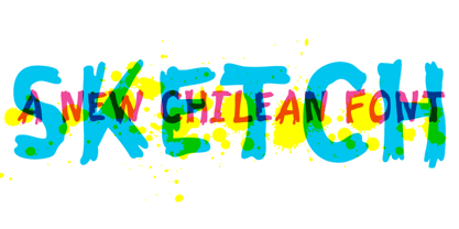
- Sketching by Graphicfresh,
$16.00 This time we designed a font of ink streaks on paper and named it Sketching. We loved creating it because this is a work of art in itself, making it through a long process. Every letter we made has always maintained its distinctive style. We hope you are all happy with our latest font.
 - Snatch by Latinotype,
$29.00 Snatch is a dynamic and expressive type system designed for impassioned and unprejudiced creative directors who look to combine the rough with the sexy. The font is well-suited for publishing projects, branding and packaging. Snatch is composed of three sections: a group of sharp-shaped uppercase fonts (small caps and all caps) in 5 weights, a set of script catchwords and eclectic sets of dingbats and flags that communicate the blue-sky thinking and feel of the project. Snatch—a collaborative project between Bercz and Latinotype Team—is the wild, condensed sister of BOWIE and it was developed by Valentina Vega, Rodrigo Fuenzalida and César Araya, under the supervision of Dany Berczeller, Daniel Hernández y Luciano Vergara. The family consists of 5 weights, ranging from Thin to Black, and comes with a 679-character set that supports 206 languages.
 - Snatched by Cititype,
$16.00 'Snatched' is a spontaneous handwriting. This name is taken from the slang term in the 2022 era to describe someone or something in a positive manner. This font consists of the same uppercase and lowercase, often referred to as 'all capital letterform', complete with numerals and punctuation. Composed in tends to widen form which is more like the typical handwriting of architects. This font looks like it was written with a marker or technical pen, very bold stylish and legible. For designers this is an interesting thing, the design looks very natural and rhythmic to beautify presentations and blue prints. Can be installed for CAD programs, Sekthup and other applications. This font is very suitable for various media related to handmade, craft businesses, logos, quotes, prints, social media posts, indie business, outdoor sports and other applications to strengthen the impression of handwriting and demand attention.
 - Dritch by Grontype,
$14.00 Dritch. is a mystical font with a unique and modern geometric style. It is suitable for logos, quotes, social media posts, film titles and stationary. It works with different themes such as mystical, tribal, ethnic, magical, and fantasy. Enjoy! is a fresh, geometric, sans-serif font family. The geometric, near-monoline construction lends a classic durability, tempered by softened edges and vibrant shapes. Friendly and charismatic in lowercase; sophisticated and authoritative in uppercase. Hard lines and sharp corners mesh with smooth, rounded letterforms, while humanist nuances add warmth
 - Scotch by Positype,
$29.00 Clean, crisp, rational, familiar, modern… serifed. Positype Scotch reaches back to history just enough to produce something warm and easy on the eyes. No corners were cut, no quick tricks… this type suite was drawn for specificity: Text, Display, and Deck… ALL in 3 widths that now include Condensed and Compressed. Each unique, each inter-connected, each part of the whole. Scotch Text is offered in 6 weights with matching true italics. Drawn for economy and an easy read, the family is a workhorse for long-passage text settings. 4 sets of numerals, well-proportioned small caps, and a plethora of extras round out each font. Scotch Display is not just a thinner version of Scotch Text wrapped in a higher contrast. Display sports shorter ascenders and descenders, a unique footprint, great contrast, and a more folded, calligraphic italics. Display subtly oozes sophistication and provides an attractive, exhuberant companion to Scotch Text. Scotch Deck rounds out the offering by choosing to be specific to its offering. Deck utlitizes traits and proportions shared between Text and Display, but alters its overall mass to balance out the needs for settings that require subheadlines, callouts and other similar uses. Essentially, something not so high-contrast and not so stress dense that works great for middle-sizes.
 - Kingthings Xstitch - 100% free

- Kill Switch - Unknown license

- Switched On by Type Innovations,
$39.00 Switched On and Switched Off where two fonts developed by placing points on a pre-defined square grid template. The experiment was to explore all the variations possible by just using straight connecting lines on a grid. I stumbled on the final concept, almost accidentally, and was amazed by the numerous possibilities. Both designs where created to work together. By adjusting the stroke and inline proportions between the two fonts, I was able to achieve a good overall color balance between 'Switched On' (dark letters on a light background), and the 'Switched Off' design as a knockout treatment (light letters on a dark background). Used in this way, both fonts visually appear similar in overall weight and proportion. They harmonize well together. Used separately, they make for some interesting visual effects and headline treatments. The fonts are best used at large point sizes, but they are still legible in a variety of smaller sizes. I think that by experimenting with these two fonts one can achieve some stunning visual effects. Explore and have fun.
 - Switch Sister by Maulana Creative,
$12.00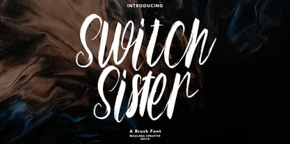 Switch Sister is a Brush Script font. With rough brush stroke, slant and fun character with a bit of ligatures. To give you an extra creative work. Switch Sister font support multilingual more than 100+ language. This font is good for logo design, Social media, Movie Titles, Books Titles, a short text even a long text letter and good for your secondary text font with sans or serif. Make a stunning work with Switch Sister font. Cheers, MaulanaCreative
 - Cross Stitch Regal by Gerald Gallo,
$20.00 Cross Stitch Regal is based on upper case characters 25 stitches tall and contains upper case characters A-Z, ampersand, exclamation and question marks, comma, period, colon, and semi-colon.
 - Cross Stitch Solid by Gerald Gallo,
$20.00 Cross Stitch Solid is based on upper case characters 14 stitches tall and contains the characters A-Z, numbers 0-9, and ampersand.
 - Cross Stitch Carefree by Gerald Gallo,
$20.00 Cross Stitch Carefree is based on upper case characters 10 stitches tall and contains the characters A-Z and period. Several characters extend above the capital line or below the base line.
 - Cross Stitch Medieval by Gerald Gallo,
$20.00 Cross Stitch Medieval is not intended for text use. It was designed specifically for use as fancy monograms or initials. Cross Stitch Medieval has an uppercase alphabet, 9 stitches tall, located under the shift+character set keys.
 - Cross Stitch Noble by Gerald Gallo,
$20.00 Cross Stitch Noble is based on upper case characters 43 stitches tall and contains the characters A-Z and period.
 - Cross Stitch Elaborate by Gerald Gallo,
$20.00 Cross Stitch Elaborate is based on upper case characters 25 stitches tall. It is not intended for text use. It was designed specifically for use as fancy monograms or initials. Cross Stitch Majestic has an uppercase alphabet located under the shift+character set keys.
 - Cross Stitch Coarse by Gerald Gallo,
$20.00 Cross Stitch Coarse is based on upper case characters 5 stitches tall and contains the upper case characters A-Z, numbers 0-9, ampersand, exclamation and question marks, comma, and period. Also, under the character set are all possible combinations of stitches 5 high from 1 through 5, which allows for the creation of custom glyphs. If the font is set at solid leading, lines following will align and mesh with stitches above. When setting lines of copy, extra leading is required to separate individual lines.


