10,000 search results
(0.02 seconds)
- Nikoovers by madeDeduk,
$15.00 Nikoovers Font is a modern rounded sans that exudes simplicity and versatility. Its clean and geometric letterforms make it ideal for various design applications, from corporate branding to editorial layouts. Feature Uppercase & Lowercase Number & Symbol International Glyphs Multilingual support Alternative Ligature Feel free to drop us a message any time and follow my shop for upcoming updates Hope you enjoy it.
 - Walrus Gumbo NF by Nick's Fonts,
$10.00An unnamed alphabet from wacko lettering artist Otto Heim’s 1925 opus, Farbige Alphabete, provided the pattern for this delightful, if slightly deranged, typeface. Use it any time you want to add mirth and merriment to a project. Both versions include the complete Unicode Latin 1252, Central European 1250 and Turkish 1254 character sets, as well as localization for Lithuanian, Moldovan and Romanian. - Becker Monoline Modern NF by Nick's Fonts,
$10.00The first in a series of typefaces based on the work of legendary lettering artist Alf Becker, whose works appeared in Signs of the Times magazine for almost thirty years. Originally titled "Extreme Thin Gothic", this was Becker’s 185th design for the magazine. Both versions of the font include the 1252 Latin and 1250 CE character sets (with localization for Romanian and Moldovan). - Marticus by TypeClassHeroes,
$14.00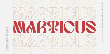 Introducing Marticus is a Groovy Sans, Comes with unique style and access your OpenType features to access the large selection of alternate letters and ligatures. Use this font for any branding, product packaging, invitation, quotes, t-shirt, label, poster, logo etc. Feature Uppercase & Lowercase Number & Symbol International Glyphs Multilingual support Alternative Ligature Feel free to drop us a message any time Cheers!!
 - Fancy Show Card JNL by Jeff Levine,
$29.00 A playful, casual take on round nib pen lettering was spotted amongst some online scans from an old lettering book. The free-form and stylized shapes of the letters and numbers are reminiscent of old-time show cards, movie titles and signage in vogue around the early 1900s through the 1920s. Fancy Show Card JNL is available in both regular and oblique versions.
 - Penman by Page Studio Graphics,
$25.00The Penman fonts are partially based on the 19th century penmanship of one of the designer’s ancestors, and originally created for a personal mailing with an “old-times tradition” flavor. The fonts are lightly pair-kerned, in order to control punctuation and numeral spacing. Auto-kerning should be turned on, and tracking should be checked to make sure all characters join well. - Hellrose by madeDeduk,
$12.00 Hellrose is a scratches hand drawn font contains 50+ ligatures with three alternative. Hellrose is great for branding, posters, logos, invitation, writing and headings. Feature Uppercase & Lowercase Number & Symbol International Glyphs Multilingual support Ligature Thanks so much for checking out my shop and feel free to drop us a message any time and follow my shop for upcoming updates. Hope you enjoy it.
 - Soulfinger PB by Pink Broccoli,
$16.00 Soulfinger PB is a another frisky offbeat typeface from Pink Broccoli, this time inspired by a vintage paperback cover of Patricia Highsmith's "A Pleno Sol". Soulfinger is a flare serif with just enough visual dance to it without going off the rails. It's simply a celebration of the original vintage paperback titling, letting it's freak flag fly, so to speak.
 - Mighty Dust by madeDeduk,
$12.00 mighty dust is a blackletter. There's come with 3 style font with much alternative inside. Suitable to create any branding, product packaging, invitation, quotes, t-shirt, label, poster, logo etc. Feature otf. and ttf. file woff and woff2. file Uppercase & Lowercase Number & Symbol International Glyphs Multilingual support Alternative Ligature Feel free to drop us a message any time Hope you enjoy it.
 - Penman B by Page Studio Graphics,
$25.00The Penman fonts are partially based on the 19th century penmanship of one of the designer’s ancestors, and originally created for a personal mailing with an “old-times tradition” flavor. The fonts are lightly pair-kerned, in order to control punctuation and numeral spacing. Auto-kerning should be turned on, and tracking should be checked to make sure all characters join well. - Catty Wumpas NF by Nick's Fonts,
$10.00Ross F. George, the lettering wizard behind many an edition of Speedball lettering books, called this quirky creation "Spatter and Spot Roman". In this version, the spatters go, but the spots remain, and a good time is had by all. Both versions of the font include the 1252 Latin and 1250 CE character sets (with localization for Romanian and Moldovan). - Mooners by Burntilldead,
$14.00 Make your design as a time machine with "Mooners" typeface. Inspired by the decorative victorian advertising poster, Mooners came to make make your document, poster, logo, etc... perfectly have a vintage victorian vibes. It's a solid combination that can bring your design, logo, document, website, etc. back to 1800 decade. Multilingual fonts-family and playful one with 165 alternate characters.
 - Candice by ITC,
$29.99Alan Meeks designed the Candice typeface in 1976. A groovy swirl of a font, Candice looks like an ice cream sundae topped with whipped cream. Candace is often seen on album covers, and has come to be associated with innumerable party hits from the 1970s. One thing is for sure: Candice is a child of it's times - flashy, lively, and fun! - Telecomm NF by Nick's Fonts,
$10.00 This font is actually two different fonts. The uppercase mimics the typeface used once upon a time in Teletypes, and the lowercase is patterned after the face used during the first half of the twentieth century by Western Union for their telegrams. Both flavors of this font feature the 1252 Latin, 1250 Central European, 1254 Turkish and 1257 Baltic character sets.
 - Kangmas by Azzam Ridhamalik,
$12.00 Introducing Kangmas, a nostalgic retro serif font with regular and true italic style. This font has rounded serif inspired by all the retro aesthetics making a comeback and the awesome classic "Cooper Black" typeface, but includes more modern letter shapes in it. The combination make it has a nostalgic retro vibes and also gives modern looks at the same time.
 - Emirah by madeDeduk,
$11.00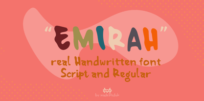 Introducing Emirah is a cute handwritten font with a matching script and regular will be perfect for book, title branding, product packaging, invitation, quotes, t-shirt, label, poster, logo etc. Feature Uppercase & Lowercase Number & Symbol International Glyphs Multilingual support Ligature Feel free to drop us a message any time and follow my shop for upcoming updates Hope you enjoy it.
 - Song Stylist JNL by Jeff Levine,
$29.00 The 1907 novelty song "Since Arrah Wanna Married Barney Carney" (about an Irishman taking an Indian maiden as his bride) had its title hand-lettered in a sans serif style that reflected both the Art Nouveau flavor of the time and a hint of what was to come during the Art Deco movement. This is now Song Stylist JNL and it's oblique counterpart.
 - Farmhouse Haystack by Hipfonts,
$17.00 Welcome to the cosmic dance of typography with Groove Galaxy, a captivating and thrilling rounded vintage typeface that swirls you into a time warp of retro charm reminiscent of the beloved 1970s. Just like stars twinkling in the night sky, each letter of Groove Galaxy emanates a mesmerizing aura, pulling you into a captivating journey through the groovy days of the past.
 - Xtencil lc by John Moore Type Foundry,
$25.00 Xtencil is a typeface inspired by the shapes of the drawing templates letters, based on the letter forms from my teacher Milton Glaser who at the same time was influenced by the modernism of Paul Renner. Xtencil is a round letter to create funny signs, ideal for posters and headlines. Xtencil not come as a drawing template, but as OpenType typography.
 - SUSHI by Fontsphere,
$5.00 SUSHI is an unusual font family (2 styles), created by Bartosz Panek. The idea was created while working on the design of a certain logo. With time, a whole font was created from modular elements, which in its form brings associations with food, fish and sushi. The font contains uppercase characters, numerals and a large range of punctuation (over 220 glyphs).
 - Ongunkan Elder Futhark Viking by Runic World Tamgacı,
$50.00 Vikings or Norses are Scandinavian pirate and merchant tribes. Actually, "Viking" or "Nors" is not a nation name; It is the name given to Dans, Norwegians, Swedes and other Scandinavians regardless of who they are. The Elder Futhark here is a runic script - a version of the Viking script. I will upload other versions over time. Write nice things with pleasure.
 - Taurus by Fenotype,
$30.00 Save time and effort – choose your type wisely. Use Taurus and you’ll achieve impact without having to resort to cheap tricks. We have done the work for you: just type out words using Taurus and you’ll have a logo for a Wall Street law firm – or for that precious vintage Barolo. Refinement. Sophistication. Seriousness. Sex appeal. Taurus has it all.
 - Nightspot JNL by Jeff Levine,
$29.00 Nightspot JNL was modeled from one of many display alphabets created by the late sign painter and lettering expert Alf Becker. His work has graced the pages of Signs of the Times® magazine for decades. Special thanks to Tod Swormstedt of the American Sign Museum and ST Publications, Inc. in Cincinnati, Ohio for providing the source material for this typeface.
 - Olde Megrat NF by Nick's Fonts,
$10.00This rough-hewn offering is patterned after Antikva Margaret, designed by Zoltán Nagy for VGC in the mid-60s. Its energetic and, at times, eccentric letterforms make this face a perfect choice for headlines and subheads that will be noticed. Both versions include the complete Latin 1252, Central European 1250 and Turkish 1254 character sets, as well as localization for Moldovan and Romanian. - Une Nuit Parisienne by Megami Studios,
$10.00 This font is based on a lot of the downtempo culture in Paris. Smoky bars, jazz clubs, that sort of thing. How a font can be influenced by intangibles is a question that I can't quite answer, but I can say that when I created it, it strongly reminded me of a couple of times spent in Paris back in the mid-90s.
 - Bergell by ITC,
$29.00Inspired by the work of famed Swiss artist Alberto Giacometti, the German designer Thomas Finke created Bergell, a lively and natural script face. Bergell's calligraphic style is both dynamic and elegant, like the kind of special, festive handwriting many desire, but few ever manage to achieve. Why spend so much time at your drawing table when there are great fonts like this one? - Garp Miska by madeDeduk,
$11.00 Gary Miska is a cute font with two style neu and regular fun happiness look and will makes this font suitable for your any project design. Feature Uppercase & Lowercase Number & Symbol International Glyphs Multilingual support ligature Feel free to drop us a message any time and follow my shop for upcoming updates Shoot me on email at: dedukvic@gmail.com Hope you enjoy it.
 - MPI Arcadian by mpressInteractive,
$5.00 Arcadian was first produced in wood type around 1870 by William H. Page & Company. It is a semi-ornamented face based on a French Clarendon, with dots added to the median and the tops and bottoms of the letters. It has a distinctly “Old West” feel, and was likely used to add a little pizzazz to advertising and broadsides of the time.
 - Nimous Daven by madeDeduk,
$12.00 Nimous Daven is a distinct hand drawn font contains 50+ ligatures with two alternative. Nimous Daven is great for branding, posters, logos, invitation, writing and headings. Feature Uppercase & Lowercase Number & Symbol International Glyphs Multilingual support Alternative Ligature Thanks so much for checking out my shop and feel free to drop us a message any time and follow my shop for upcoming updates
 - Masserini by Studio Sun,
$16.00 Masserini is inspired by the 20's art deco era of colorful posters, fonts, and typography with a vintage flair. With its strong geometric shapes and letters, like a style of sans serif that was used in signs and posters during that time period. This collection consists of a variety of widths, weights, and variants to suit your creative needs.
 - Picto Handwriting by SoftMaker,
$15.99 Digitized handwriting fonts are a perfect way to give documents the “very special touch”. Invitations look simply better when handwritten than when printed in bland Arial or Times New Roman. Short handwritten notes look authentic and appealing. There are numerous occasions where handwritten text makes a better impression. “Picto Handwriting” comes with beautiful handwritten pictograms that let you quickly spruce up your designs.
 - Louise by Hanoded,
$15.00 Louise font was based on the art of Louise Marie (lou) Loeber, a Dutch painter. She was born in Amsterdam in 1894 and flirted with several styles like De Stijl, Cubism and Bauhaus. Her artworks are characterized by a sober use of geometric shapes; lines, rectangles and triangles. Louise font consists of Caps, but the lower and upper case glyphs are quite different. Louise comes with extensive language support.
 - Ka Gaytan by Karandash,
$26.00 Gaytan (Bulgarian for braid) is a fresh new insight on archaic letterforms. A family of two unicase typefaces - a modern looking sans and more classic looking serif, equipped with many alternates, so they can suit any typographic taste. Gaytan's unique design was inspired by Old Church Slavonic Cyrillic, Bulgarian Ustav and the Russian Vyaz stiles, as well as the avant-garde works of Bulgarian type designers in late 1970s.
 - Comenia Serif Pro by Storm Type Foundry,
$69.00Comenia was developed as typographic system for use on all levels of schools and universities. It introduces new aesthetic standards aimed at improving reading and writing skills and the perception of texts for pupils, students, teachers, office and IT staff at schools. It offers a clear, intelligible and universal graphic tool for layout of primers, textbooks, educational texts and materials, for electronic typography and for the information systems. - Rival by Mostardesign,
$25.00 Rival – A serif font family with contemporary distinctive signs Rival is a modern serif font family inspired by characters drawn with a round nib, it has many distinctive signs such as broken curves, slightly curved downstrokes, curved diagonals, and curved, slanted axes. All these typographic tokens gives Rival a modern and contemporary aspect for all kinds of graphic projects. It comes in 7 weights with corresponding italics and it’s suited for multiple purposes including display and editorial use, especially for advertising, long text, packaging and branding. Rival provides advanced typographical support with OpenType features such as small caps, ligatures, discretionary ligatures, old style figures, case-sensitive forms, slashed zero, fractions, and pro kerning.
 - Sure! The New Alphabet font is an intriguing and avant-garde typeface with a fascinating history and purpose behind its design. Created in 1967 by Wim Crouwel, a notable figure in the Dutch graphic d...
- Macromedia - Unknown license

- Areplos by Storm Type Foundry,
$53.00To design a text typeface "at the top with, at the bottom without" serifs was an idea which crossed my mind at the end of the sixties. I started from the fact that what one reads in the Latin alphabet is mainly the upper half of the letters, where good distinguishableness of the individual signs, and therefore, also good legibility, is aided by serifs. The first tests of the design, by which I checked up whether the basic principle could be used also for the then current technology of setting - for double-sign matrices -, were carried out in 1970. During the first half of the seventies I created first the basic design, then also the slanted Roman and the medium types. These drawings were not very successful. My greatest concern during this initial phase was the upper case A. I had to design it in such a way that the basic principle should be adhered to and the new alphabet, at the same time, should not look too complicated. The necessary prerequisite for a design of a new alphabet for double-sign matrices, i.e. to draw each letter of all the three fonts to the same width, did not agree with this typeface. What came to the greatest harm were the two styles used for emphasis: the italics even more than the medium type. That is why I fundamentally remodelled the basic design in 1980. In the course of this work I tried to forget about the previous technological limitations and to respect only the requirements then placed on typefaces intended for photosetting. As a matter of fact, this was not very difficult; this typeface was from the very beginning conceived in such a way as to have a large x-height of lower-case letters and upper serifs that could be joined without any problems in condensed setting. I gave much more thought to the proportional relations of the individual letters, the continuity of their outer and inner silhouettes, than to the requirements of their production. The greatest number of problems arose in the colour balancing of the individual signs, as it was necessary to achieve that the upper half of each letter should have a visual counterbalance in its lower, simpler half. Specifically, this meant to find the correct shape and degree of thickening of the lower parts of the letters. These had to counterbalance the upper parts of the letters emphasized by serifs, yet they should not look too romantic or decorative, for otherwise the typeface might lose its sober character. Also the shape, length and thickness of the upper serifs had to be resolved differently than in the previous design. In the seventies and at the beginning of the eighties a typeface conceived in this way, let alone one intended for setting of common texts in magazines and books, was to all intents and purposes an experiment with an uncertain end. At this time, before typographic postmodernism, it was not the custom to abandon in such typefaces the clear-cut formal categories, let alone to attempt to combine the serif and sans serif principles in a single design. I had already designed the basic, starting, alphabets of lower case and upper case letters with the intention to derive further styles from them, differing in colour and proportions. These fonts were not to serve merely for emphasis in the context of the basic design, but were to function, especially the bold versions, also as independent display alphabets. At this stage of my work it was, for a change, the upper case L that presented the greatest problem. Its lower left part had to counterbalance the symmetrical two-sided serif in the upper half of the letter. The ITC Company submitted this design to text tests, which, in their view, were successful. The director of this company Aaron Burns then invited me to add further styles, in order to create an entire, extensive typeface family. At that time, without the possibility to use a computer and given my other considerable workload, this was a task I could not manage. I tried to come back to this, by then already very large project, several times, but every time some other, at the moment very urgent, work diverted me from it. At the beginning of the nineties several alphabets appeared which were based on the same principle. It seemed to me that to continue working on my semi-finished designs was pointless. They were, therefore, abandoned until the spring of 2005, when František Štorm digitalized the basic design. František gave the typeface the working title Areplos and this name stuck. Then he made me add small capitals and the entire bold type, inducing me at the same time to consider what to do with the italics in order that they might be at least a little italic in character, and not merely slanted Roman alphabets, as was my original intention. In the course of the subsequent summer holidays, when the weather was bad, we met in his little cottage in South Bohemia, between two ponds, and resuscitated this more than twenty-five-years-old typeface. It was like this: We were drinking good tea, František worked on the computer, added accents and some remaining signs, inclined and interpolated, while I was looking over his shoulder. There is hardly any typeface that originated in a more harmonious setting. Solpera, summer 2005 I first encountered this typeface at the exhibition of Contemporary Czech Type Design in 1982. It was there, in the Portheim Summer Palace in Prague, that I, at the age of sixteen, decided to become a typographer. Having no knowledge about the technologies, the rules of construction of an alphabet or about cultural connections, I perceived Jan Solpera's typeface as the acme of excellence. Now, many years after, replete with experience of revitalization of typefaces of both living and deceased Czech type designers, I am able to compare their differing approaches. Jan Solpera put up a fight against the digital technology and exerted creative pressure to counteract my rather loose approach. Jan prepared dozens of fresh pencil drawings on thin sketching paper in which he elaborated in detail all the style-creating elements of the alphabet. I can say with full responsibility that I have never worked on anything as meticulous as the design of the Areplos typeface. I did not invent this name; it is the name of Jan Solpera's miniature publishing house, in which he issued for example an enchanting series of memoirs of a certain shopkeeper of Jindrichuv Hradec. The idea that the publishing house and the typeface might have the same name crossed my mind instinctively as a symbol of the original designation of Areplos - to serve for text setting. What you can see here originated in Trebon and in a cottage outside the village of Domanín - I even wanted to rename my firm to The Trebon Type Foundry. When mists enfold the pond and gloom pervades one's soul, the so-called typographic weather sets in - the time to sit, peer at the monitor and click the mouse, as also our students who were present would attest. Areplos is reminiscent of the essential inspirational period of a whole generation of Czech type designers - of the seventies and eighties, which were, however, at the same time the incubation period of my generation. I believe that this typeface will be received favourably, for it represents the better aspect of the eighties. Today, at the time when the infection by ITC typefaces has not been quite cured yet, it does absolutely no harm to remind ourselves of the high quality and timeless typefaces designed then in this country.In technical terms, this family consists of two times four OpenType designs, with five types of figures, ligatures and small capitals as well as an extensive assortment of both eastern and western diacritics. I can see as a basic text typeface of smaller periodicals and informative job-prints, a typeface usable for posters and programmes of various events, but also for corporate identity. Štorm, summer 2005 - Black Drum by Coniglio Type,
$19.95 Black Drum is a rare revival typewriter face, made digital from analog samples gathered with great care by Coniglio Type. A time and place; type and life. Black Drum is contemporary designer type, made from the struck steel hammers of an Art Deco Period san serif face transferred from a mechanical 1926 custom editor Royal Portable typewriter. Anna Conroy of Type Heritage, LLC, Philadelphia comments on Black Drum and its new place in time today: “Wow! nice lookin’ face Joseph! —Perfect, somewhere between Cable; [Rudolph Koch, 1927] (which was about the first transatlantic telegraph cable) with its raised x-height; and Futura [Paul Renner, 1928]. Yup, it has that great “Monopoly Game” question mark -- and all on a period-piece typewriter! You should have no trouble grafting that sorely needed Euro symbol.” –And he very well did! Author: Joseph Coniglio Producer: Coniglio Type MyFonts debut: October 2021
 - Identity Check by Hanoded,
$15.00 Every time I bring my youngest son to his swimming lessons, I need to show my Covid Vaccination Pass; a QR code on my phone. I thought that I would be off the hook after I showed it the first time, but no, not at the swimming pool! It feels a bit like a bad comic book, so I decided to name this comic book style font Identity Check. Of course, I should have called it Covid Vaccination Check, but that is just too much and it probably won’t sell. Who wants a font called Covid?? ;-) Identity Check is a comic book style font. The glyphs are wider than I am used to (it seems I AM capable of learning new tricks), but the effect is rather nice. Identity Check comes with extensive language support, including Cyrillic and Vietnamese. Plus two sets of alternate glyphs, that cycle as you type.
